Introduction
This vignette showcases the visualization capabilities of FastCCCR, developed by Zaoqu Liu. Effective visualization is crucial for interpreting cell-cell communication results.
Simulating Example Results
First, let’s create simulated CCC results for demonstration:
# Create simulated significant interactions
set.seed(42)

cell_types <- c("T_cell", "B_cell", "Macrophage", "Dendritic", "NK_cell", "Fibroblast")
n_pairs <- length(cell_types)^2

# Generate all pairs
pairs <- expand.grid(sender = cell_types, receiver = cell_types)
pairs$pair <- paste(pairs$sender, pairs$receiver, sep = "|")

# Simulate interactions
n_interactions <- 50
interactions <- data.table(
  pair = sample(pairs$pair, n_interactions, replace = TRUE),
  LRI_ID = paste0("LRI_", sprintf("%03d", 1:n_interactions)),
  ligand = paste0("Ligand_", sample(LETTERS[1:10], n_interactions, replace = TRUE)),
  receptor = paste0("Receptor_", sample(letters[1:10], n_interactions, replace = TRUE)),
  pvalue = runif(n_interactions, 0, 0.1),
  comm_score = runif(n_interactions, 0.1, 1.0)
)

# Add sender/receiver columns
interactions[, sender := sapply(strsplit(pair, "\\|"), `[`, 1)]
interactions[, receiver := sapply(strsplit(pair, "\\|"), `[`, 2)]

# Filter significant
sig_interactions <- interactions[pvalue < 0.05]
cat("Number of significant interactions:", nrow(sig_interactions), "\n")
#> Number of significant interactions: 33
Communication Network Plot
Basic Network
# Count interactions per pair
pair_counts <- sig_interactions[, .N, by = .(sender, receiver)]

# Create adjacency matrix
adj_matrix <- dcast(pair_counts, sender ~ receiver, value.var = "N", fill = 0)
rownames_adj <- adj_matrix$sender
adj_matrix <- as.matrix(adj_matrix[, -1])
rownames(adj_matrix) <- rownames_adj

# Plot using base R
library(igraph)

# Create graph
g <- graph_from_adjacency_matrix(adj_matrix, mode = "directed", weighted = TRUE)

# Color palette for cell types
cell_colors <- c(
  "T_cell" = "#E64B35",
  "B_cell" = "#4DBBD5",
  "Macrophage" = "#00A087",
  "Dendritic" = "#3C5488",
  "NK_cell" = "#F39B7F",
  "Fibroblast" = "#8491B4"
)

V(g)$color <- cell_colors[V(g)$name]
V(g)$size <- 30
E(g)$width <- E(g)$weight * 2
E(g)$arrow.size <- 0.5

# Plot
par(mar = c(1, 1, 2, 1))
plot(g,
     layout = layout_in_circle,
     vertex.label.color = "black",
     vertex.label.cex = 0.9,
     edge.curved = 0.2,
     main = "Cell-Cell Communication Network")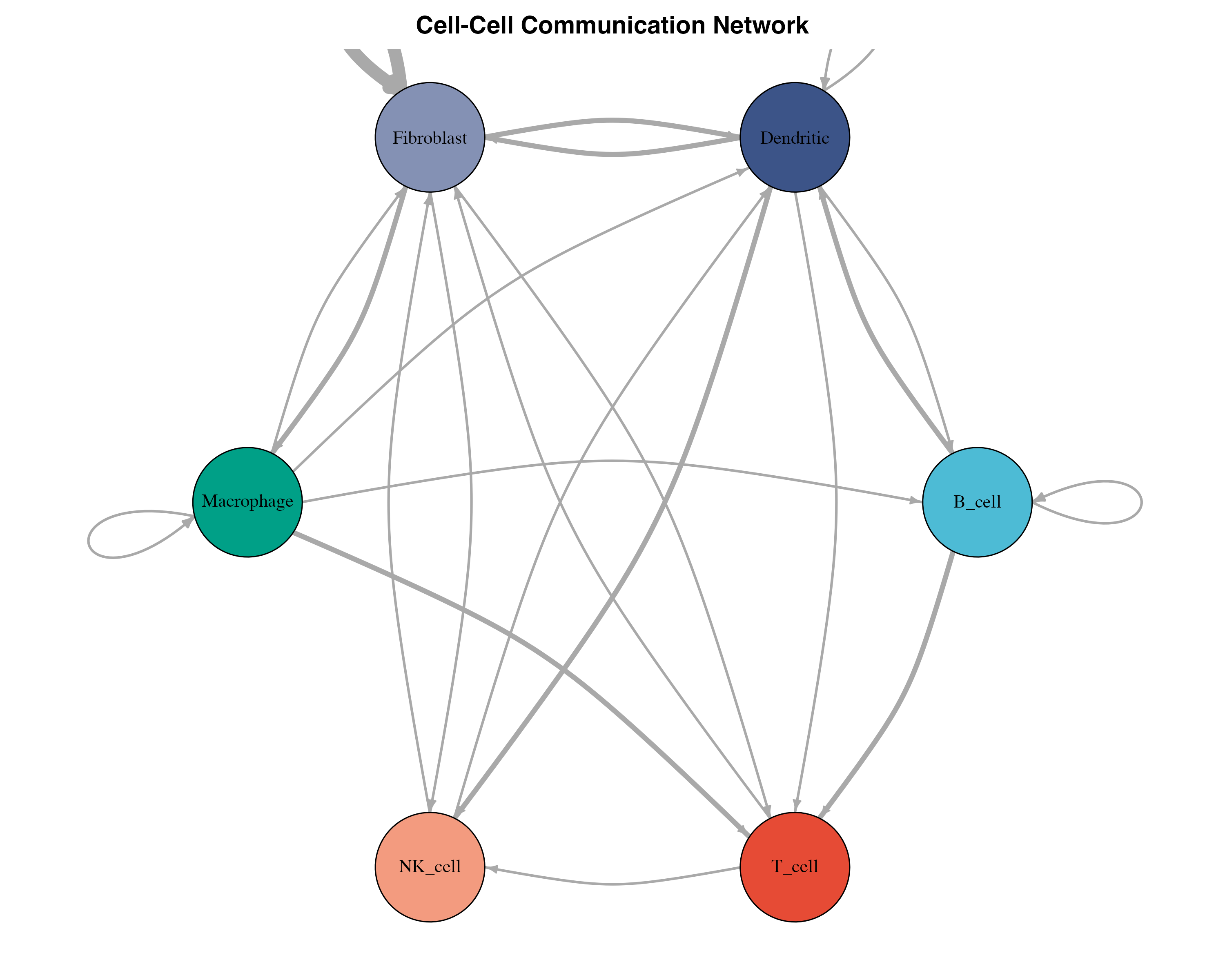
Network Statistics
# Network metrics
cat("Network Statistics:\n")
#> Network Statistics:
cat("  Nodes:", vcount(g), "\n")
#>   Nodes: 6
cat("  Edges:", ecount(g), "\n")
#>   Edges: 22
cat("  Density:", round(edge_density(g), 3), "\n")
#>   Density: 0.733

# Degree analysis
in_degree <- degree(g, mode = "in")
out_degree <- degree(g, mode = "out")

degree_df <- data.frame(
  cell_type = names(in_degree),
  incoming = in_degree,
  outgoing = out_degree
)

print(degree_df)
#>             cell_type incoming outgoing
#> B_cell         B_cell        3        3
#> Dendritic   Dendritic        5        5
#> Fibroblast Fibroblast        5        5
#> Macrophage Macrophage        2        5
#> NK_cell       NK_cell        3        2
#> T_cell         T_cell        4        2
Heatmap Visualization
Interaction Count Heatmap
# Prepare matrix for heatmap
heatmap_data <- dcast(pair_counts, sender ~ receiver, value.var = "N", fill = 0)
heatmap_mat <- as.matrix(heatmap_data[, -1])
rownames(heatmap_mat) <- heatmap_data$sender

# Create heatmap with ggplot2
heatmap_long <- melt(as.data.table(heatmap_mat, keep.rownames = "sender"),
                     id.vars = "sender",
                     variable.name = "receiver",
                     value.name = "count")

ggplot(heatmap_long, aes(x = receiver, y = sender, fill = count)) +
  geom_tile(color = "white", linewidth = 0.5) +
  geom_text(aes(label = ifelse(count > 0, count, "")),
            color = "white", size = 4) +
  scale_fill_gradient2(low = "#f7fbff", mid = "#6baed6", high = "#08306b",
                       midpoint = max(heatmap_long$count) / 2,
                       name = "# Interactions") +
  labs(title = "Cell-Cell Communication Heatmap",
       subtitle = "Number of significant interactions between cell types",
       x = "Receiver Cell Type",
       y = "Sender Cell Type") +
  theme_minimal(base_size = 12) +
  theme(
    axis.text.x = element_text(angle = 45, hjust = 1, size = 11),
    axis.text.y = element_text(size = 11),
    panel.grid = element_blank(),
    plot.title = element_text(face = "bold", size = 14),
    legend.position = "right"
  ) +
  coord_fixed()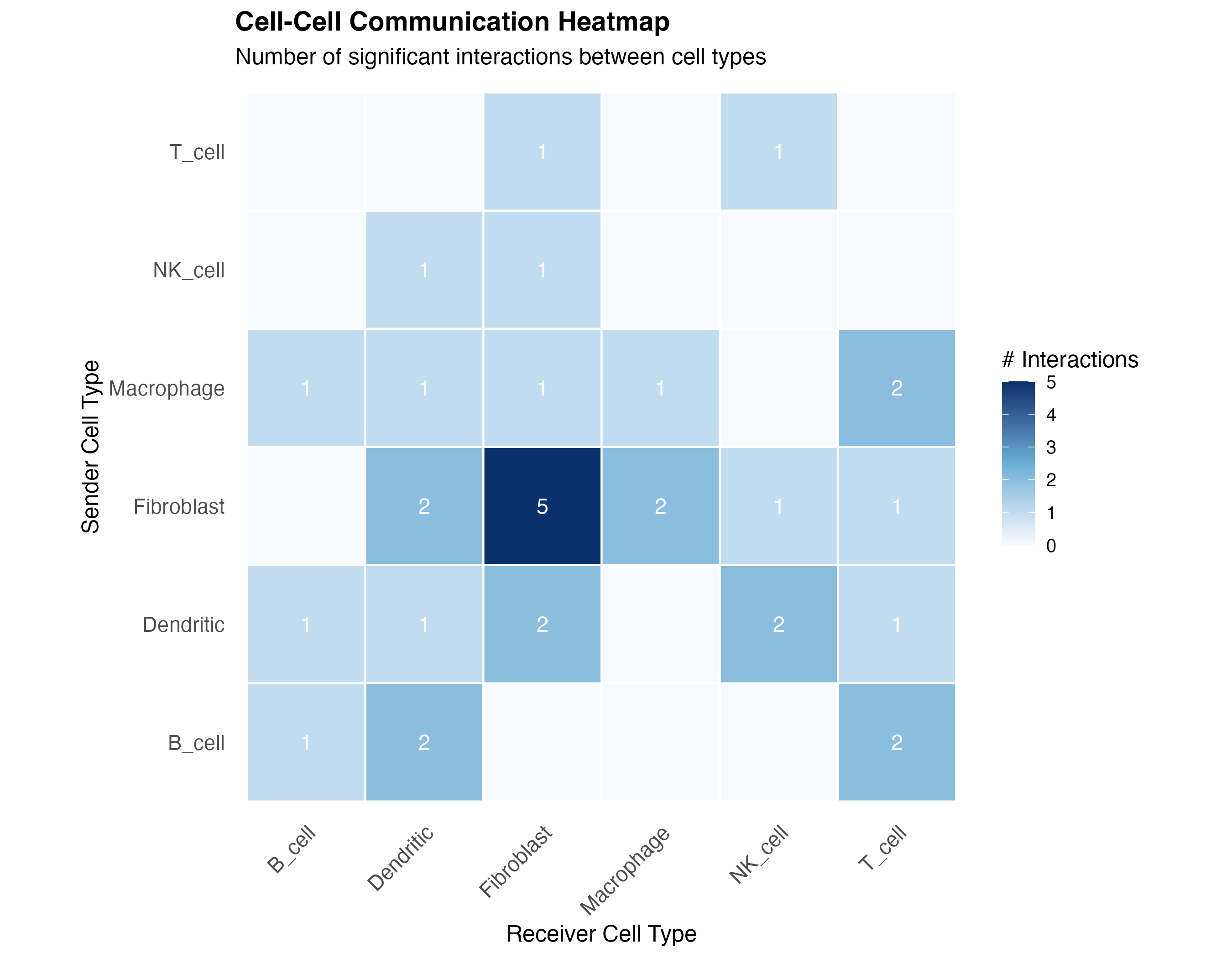
Interaction Strength Heatmap
# Average interaction strength per pair
strength_data <- sig_interactions[, .(
  mean_score = mean(comm_score),
  n_interactions = .N
), by = .(sender, receiver)]

strength_long <- strength_data[, .(sender, receiver, value = mean_score)]

ggplot(strength_long, aes(x = receiver, y = sender, fill = value)) +
  geom_tile(color = "white", linewidth = 0.5) +
  geom_text(aes(label = round(value, 2)), color = "black", size = 3.5) +
  scale_fill_viridis_c(option = "plasma", name = "Mean Score") +
  labs(title = "Mean Interaction Strength",
       subtitle = "Average communication score between cell type pairs",
       x = "Receiver Cell Type",
       y = "Sender Cell Type") +
  theme_minimal(base_size = 12) +
  theme(
    axis.text.x = element_text(angle = 45, hjust = 1, size = 11),
    axis.text.y = element_text(size = 11),
    panel.grid = element_blank(),
    plot.title = element_text(face = "bold", size = 14)
  ) +
  coord_fixed()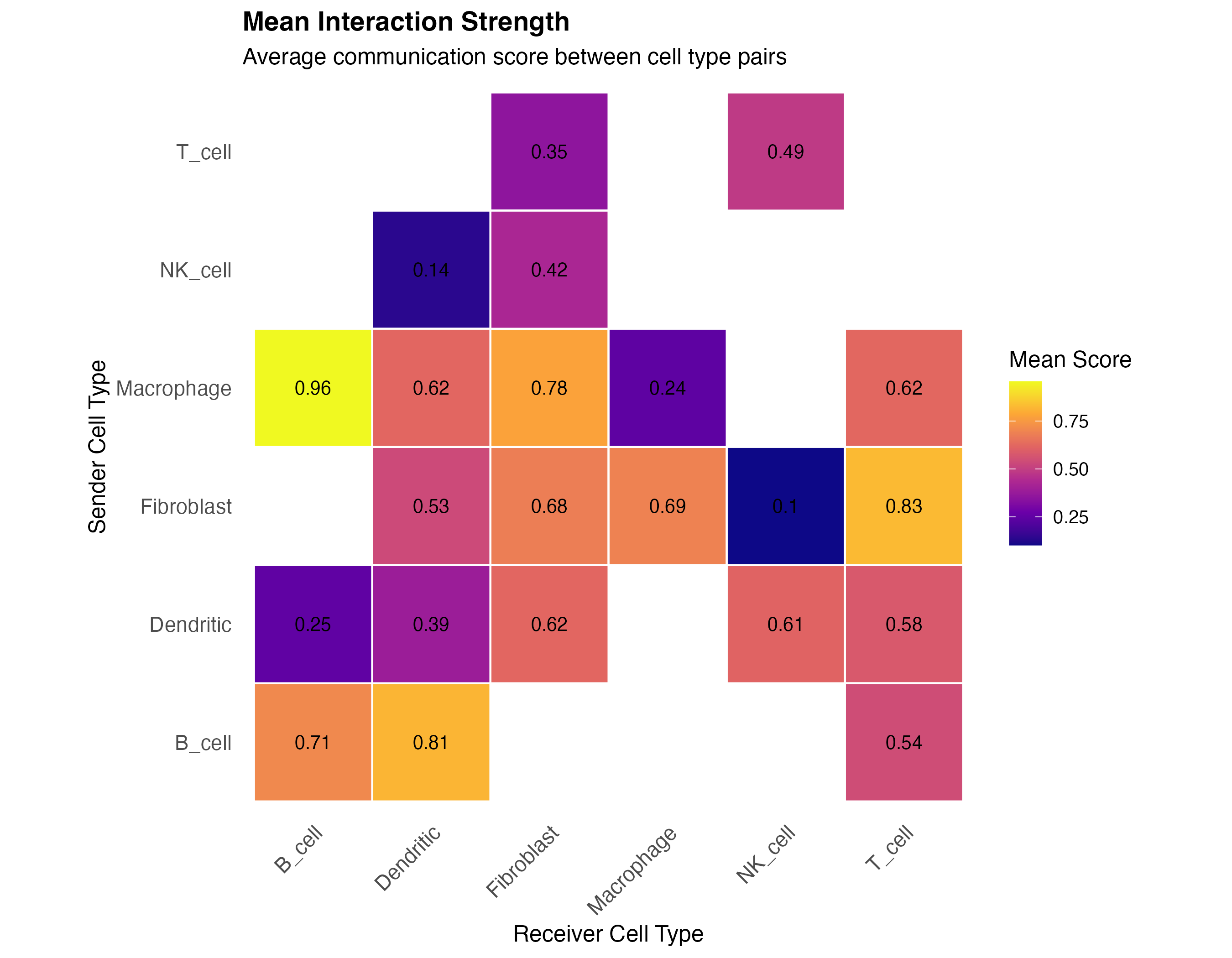
Ligand-Receptor Analysis
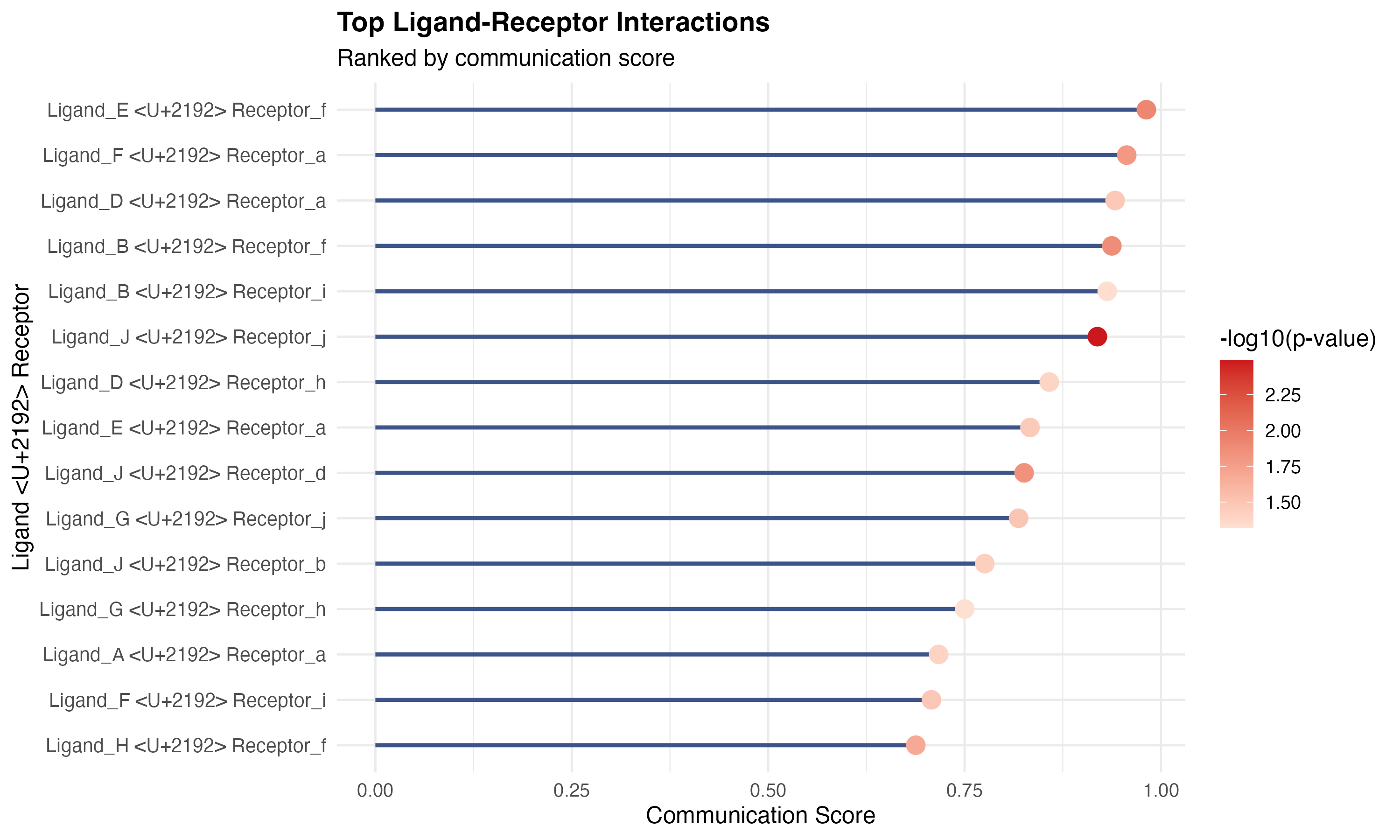
Top L-R Pairs
# Top interactions by score
top_interactions <- sig_interactions[order(-comm_score)][1:min(15, .N)]
top_interactions[, lr_pair := paste(ligand, receptor, sep = " → ")]

ggplot(top_interactions, aes(x = reorder(lr_pair, comm_score), y = comm_score)) +
  geom_segment(aes(xend = lr_pair, yend = 0), color = "#3C5488", linewidth = 1) +
  geom_point(aes(color = -log10(pvalue)), size = 4) +
  scale_color_gradient(low = "#FEE0D2", high = "#CB181D",
                       name = "-log10(p-value)") +
  coord_flip() +
  labs(title = "Top Ligand-Receptor Interactions",
       subtitle = "Ranked by communication score",
       x = "Ligand → Receptor",
       y = "Communication Score") +
  theme_minimal(base_size = 12) +
  theme(
    plot.title = element_text(face = "bold", size = 14),
    axis.text.y = element_text(size = 10)
  )
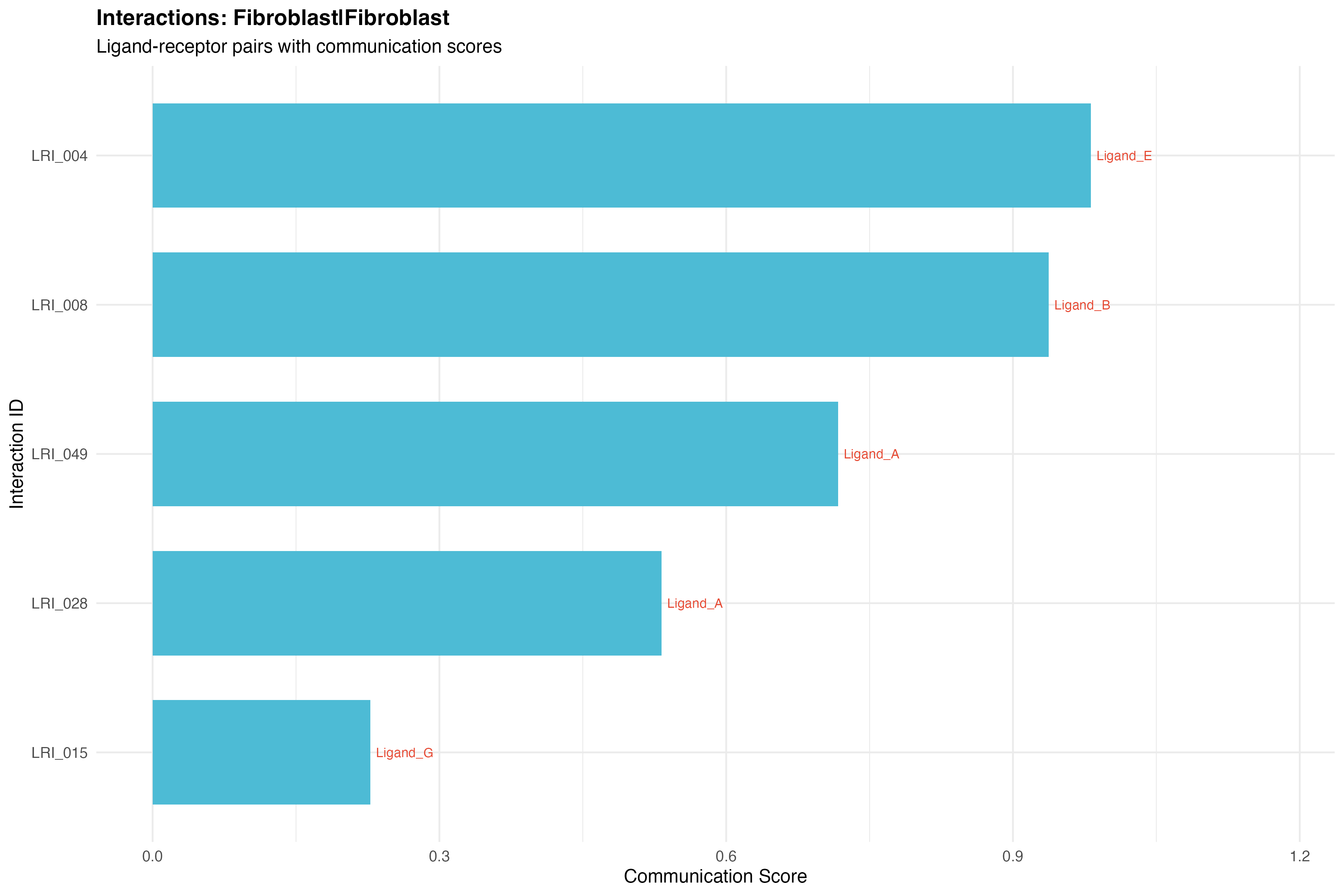
L-R by Cell Type Pair
# Select a specific pair
selected_pair <- pair_counts[which.max(N), paste(sender, receiver, sep = "|")]
pair_data <- sig_interactions[pair == selected_pair]

if (nrow(pair_data) > 0) {
  ggplot(pair_data, aes(x = reorder(LRI_ID, comm_score), y = comm_score)) +
    geom_bar(stat = "identity", fill = "#4DBBD5", width = 0.7) +
    geom_text(aes(label = ligand), hjust = -0.1, size = 3, color = "#E64B35") +
    coord_flip() +
    labs(title = paste("Interactions:", selected_pair),
         subtitle = "Ligand-receptor pairs with communication scores",
         x = "Interaction ID",
         y = "Communication Score") +
    theme_minimal(base_size = 12) +
    theme(
      plot.title = element_text(face = "bold", size = 14)
    ) +
    expand_limits(y = max(pair_data$comm_score) * 1.2)
}
Distribution Visualization
P-value Distribution
ggplot(interactions, aes(x = pvalue)) +
  geom_histogram(aes(y = after_stat(density)),
                 bins = 30, fill = "#00A087", alpha = 0.7, color = "white") +
  geom_density(color = "#E64B35", linewidth = 1) +
  geom_vline(xintercept = 0.05, linetype = "dashed", color = "red", linewidth = 1) +
  annotate("text", x = 0.06, y = Inf, label = "α = 0.05",
           hjust = 0, vjust = 2, color = "red", size = 4) +
  labs(title = "P-value Distribution",
       subtitle = "Distribution of interaction p-values",
       x = "P-value",
       y = "Density") +
  theme_minimal(base_size = 12) +
  theme(plot.title = element_text(face = "bold", size = 14))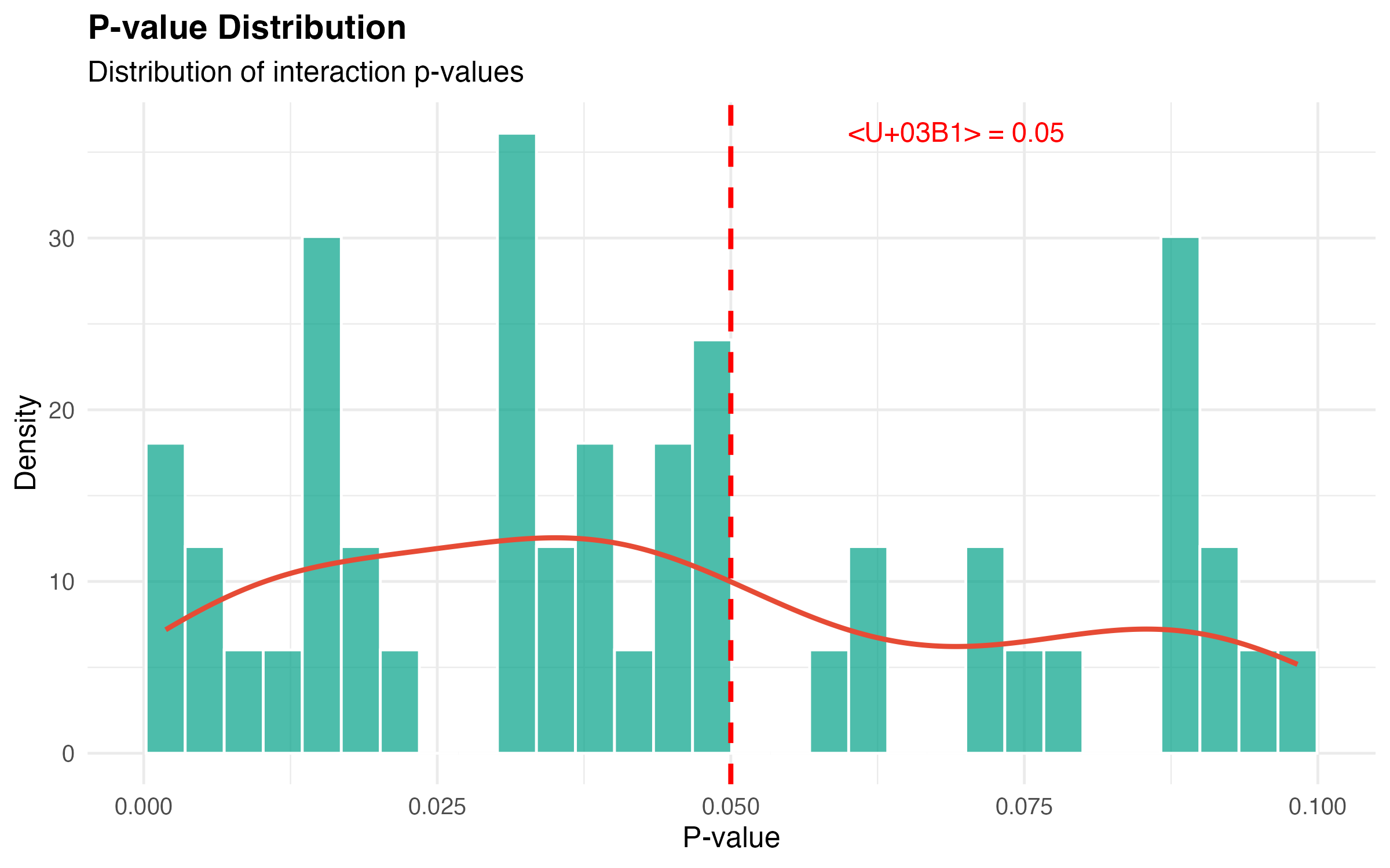
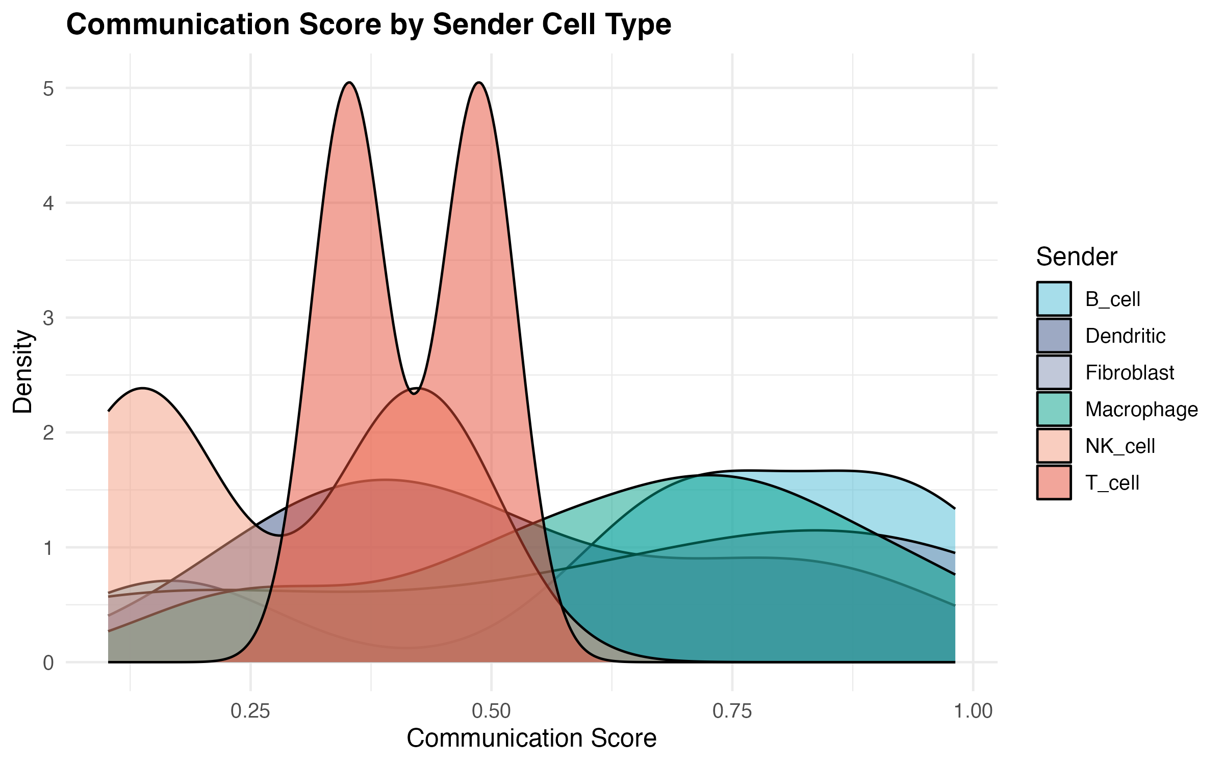
Communication Score Distribution
ggplot(sig_interactions, aes(x = comm_score, fill = sender)) +
  geom_density(alpha = 0.5) +
  scale_fill_manual(values = cell_colors, name = "Sender") +
  labs(title = "Communication Score by Sender Cell Type",
       x = "Communication Score",
       y = "Density") +
  theme_minimal(base_size = 12) +
  theme(
    plot.title = element_text(face = "bold", size = 14),
    legend.position = "right"
  )
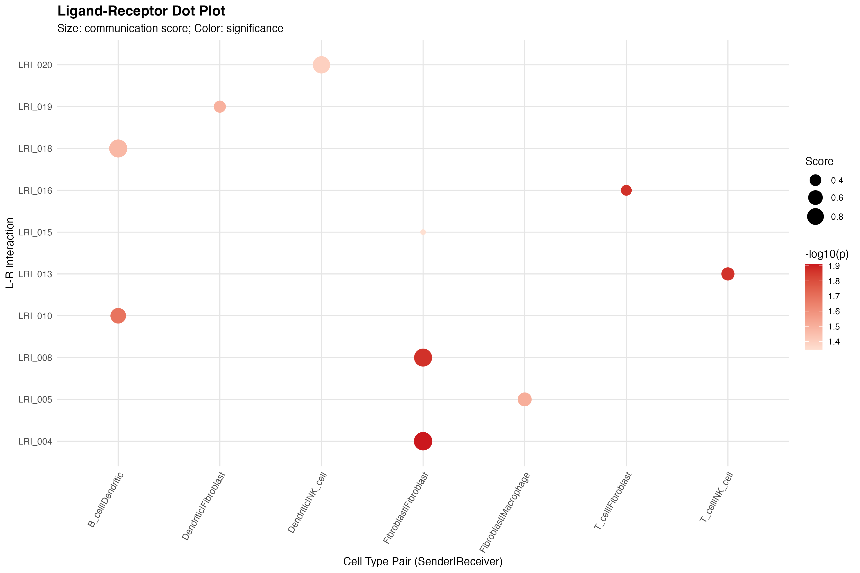
Dot Plot
CCC Dot Plot
# Select top interactions
top_lri <- sig_interactions[, .N, by = LRI_ID][order(-N)][1:10, LRI_ID]
dotplot_data <- sig_interactions[LRI_ID %in% top_lri]

ggplot(dotplot_data, aes(x = pair, y = LRI_ID)) +
  geom_point(aes(size = comm_score, color = -log10(pvalue))) +
  scale_size_continuous(range = c(2, 8), name = "Score") +
  scale_color_gradient(low = "#FEE0D2", high = "#CB181D",
                       name = "-log10(p)") +
  labs(title = "Ligand-Receptor Dot Plot",
       subtitle = "Size: communication score; Color: significance",
       x = "Cell Type Pair (Sender|Receiver)",
       y = "L-R Interaction") +
  theme_minimal(base_size = 11) +
  theme(
    axis.text.x = element_text(angle = 60, hjust = 1, size = 9),
    axis.text.y = element_text(size = 9),
    plot.title = element_text(face = "bold", size = 14),
    panel.grid.major = element_line(color = "grey90"),
    legend.position = "right"
  )
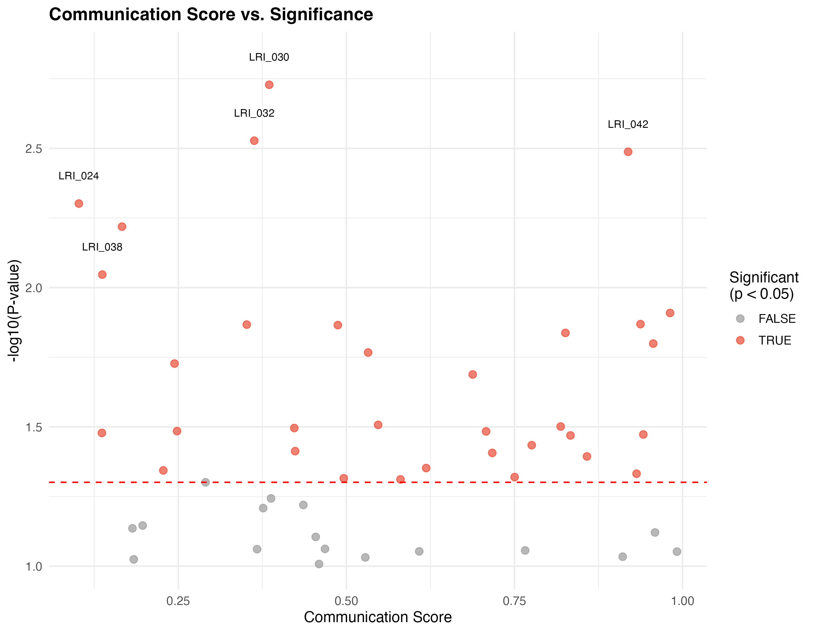
Volcano-like Plot
# Create volcano-like plot
interactions[, significant := pvalue < 0.05]

ggplot(interactions, aes(x = comm_score, y = -log10(pvalue))) +
  geom_point(aes(color = significant), alpha = 0.7, size = 2.5) +
  scale_color_manual(values = c("TRUE" = "#E64B35", "FALSE" = "grey60"),
                     name = "Significant\n(p < 0.05)") +
  geom_hline(yintercept = -log10(0.05), linetype = "dashed", color = "red") +
  geom_text(data = interactions[pvalue < 0.01][1:5],
            aes(label = LRI_ID), size = 3, nudge_y = 0.1) +
  labs(title = "Communication Score vs. Significance",
       x = "Communication Score",
       y = "-log10(P-value)") +
  theme_minimal(base_size = 12) +
  theme(
    plot.title = element_text(face = "bold", size = 14),
    legend.position = "right"
  )
Summary Statistics
# Summary table
summary_stats <- sig_interactions[, .(
  n_interactions = .N,
  mean_score = round(mean(comm_score), 3),
  median_score = round(median(comm_score), 3),
  min_pvalue = format(min(pvalue), scientific = TRUE, digits = 2)
), by = sender]

knitr::kable(summary_stats,
             caption = "Summary of Significant Interactions by Sender Cell Type",
             col.names = c("Sender", "N Interactions", "Mean Score",
"Median Score", "Min P-value"))| Sender | N Interactions | Mean Score | Median Score | Min P-value |
|---|---|---|---|---|
| Fibroblast | 11 | 0.616 | 0.717 | 5e-03 |
| B_cell | 5 | 0.685 | 0.708 | 3.3e-03 |
| T_cell | 2 | 0.420 | 0.420 | 1.4e-02 |
| Dendritic | 7 | 0.525 | 0.423 | 1.9e-03 |
| Macrophage | 6 | 0.640 | 0.684 | 1.6e-02 |
| NK_cell | 2 | 0.280 | 0.280 | 9e-03 |
Custom Visualization Tips
Color Palettes
# Recommended color palettes for CCC visualization
palettes <- list(
  cell_types = c(
    "T_cell" = "#E64B35", "B_cell" = "#4DBBD5",
    "Macrophage" = "#00A087", "Dendritic" = "#3C5488",
    "NK_cell" = "#F39B7F", "Fibroblast" = "#8491B4"
  ),
  significance = c("Significant" = "#E64B35", "Non-significant" = "grey60"),
  heatmap = c("low" = "#f7fbff", "mid" = "#6baed6", "high" = "#08306b")
)

cat("Recommended palettes stored in 'palettes' list\n")
#> Recommended palettes stored in 'palettes' list
Session Information
sessionInfo()
#> R version 4.4.0 (2024-04-24)
#> Platform: aarch64-apple-darwin20
#> Running under: macOS 15.6.1
#>
#> Matrix products: default
#> BLAS:   /Library/Frameworks/R.framework/Versions/4.4-arm64/Resources/lib/libRblas.0.dylib
#> LAPACK: /Library/Frameworks/R.framework/Versions/4.4-arm64/Resources/lib/libRlapack.dylib;  LAPACK version 3.12.0
#>
#> locale:
#> [1] C
#>
#> time zone: Asia/Shanghai
#> tzcode source: internal
#>
#> attached base packages:
#> [1] stats     graphics  grDevices utils     datasets  methods   base
#>
#> other attached packages:
#> [1] igraph_2.2.1      ggplot2_4.0.1     data.table_1.18.0 FastCCCR_1.0.0
#>
#> loaded via a namespace (and not attached):
#>  [1] sass_0.4.10        future_1.69.0      generics_0.1.4     lattice_0.22-7
#>  [5] listenv_0.10.0     digest_0.6.39      magrittr_2.0.4     evaluate_1.0.5
#>  [9] grid_4.4.0         RColorBrewer_1.1-3 fastmap_1.2.0      jsonlite_2.0.0
#> [13] Matrix_1.7-4       viridisLite_0.4.2  scales_1.4.0       codetools_0.2-20
#> [17] textshaping_1.0.4  jquerylib_0.1.4    cli_3.6.5          rlang_1.1.7
#> [21] parallelly_1.46.1  withr_3.0.2        cachem_1.1.0       yaml_2.3.12
#> [25] otel_0.2.0         tools_4.4.0        parallel_4.4.0     dplyr_1.1.4
#> [29] globals_0.18.0     vctrs_0.7.1        R6_2.6.1           lifecycle_1.0.5
#> [33] fs_1.6.6           htmlwidgets_1.6.4  ragg_1.5.0         pkgconfig_2.0.3
#> [37] desc_1.4.3         pkgdown_2.1.3      bslib_0.9.0        pillar_1.11.1
#> [41] gtable_0.3.6       glue_1.8.0         Rcpp_1.1.1         systemfonts_1.3.1
#> [45] xfun_0.56          tibble_3.3.1       tidyselect_1.2.1   knitr_1.51
#> [49] dichromat_2.0-0.1  farver_2.1.2       htmltools_0.5.9    labeling_0.4.3
#> [53] rmarkdown_2.30 compiler_4.4.0 S7_0.2.1Author: Zaoqu Liu
Email: liuzaoqu@163.com
GitHub: https://github.com/Zaoqu-Liu