Overview
SecAct provides a comprehensive suite of visualization functions for exploring secreted protein activity results. This gallery showcases all available plotting functions with customization options.
library(SecAct)
library(ggplot2)

# Load and process data
data_path <- system.file("extdata/GSE100093.IFNG.expr.gz", package = "SecAct")
expr <- read.table(gzfile(data_path), sep = "\t", header = TRUE, row.names = 1)

# Run activity inference
result <- SecAct.activity.inference(expr[, 1:8], lambda = 5e5, nrand = 100)
Activity Heatmaps
Basic Heatmap
# Select top 20 most variable secreted proteins
var_sp <- apply(result$zscore, 1, var)
top20 <- names(sort(var_sp, decreasing = TRUE))[1:20]

SecAct.heatmap.plot(result$zscore[top20, ])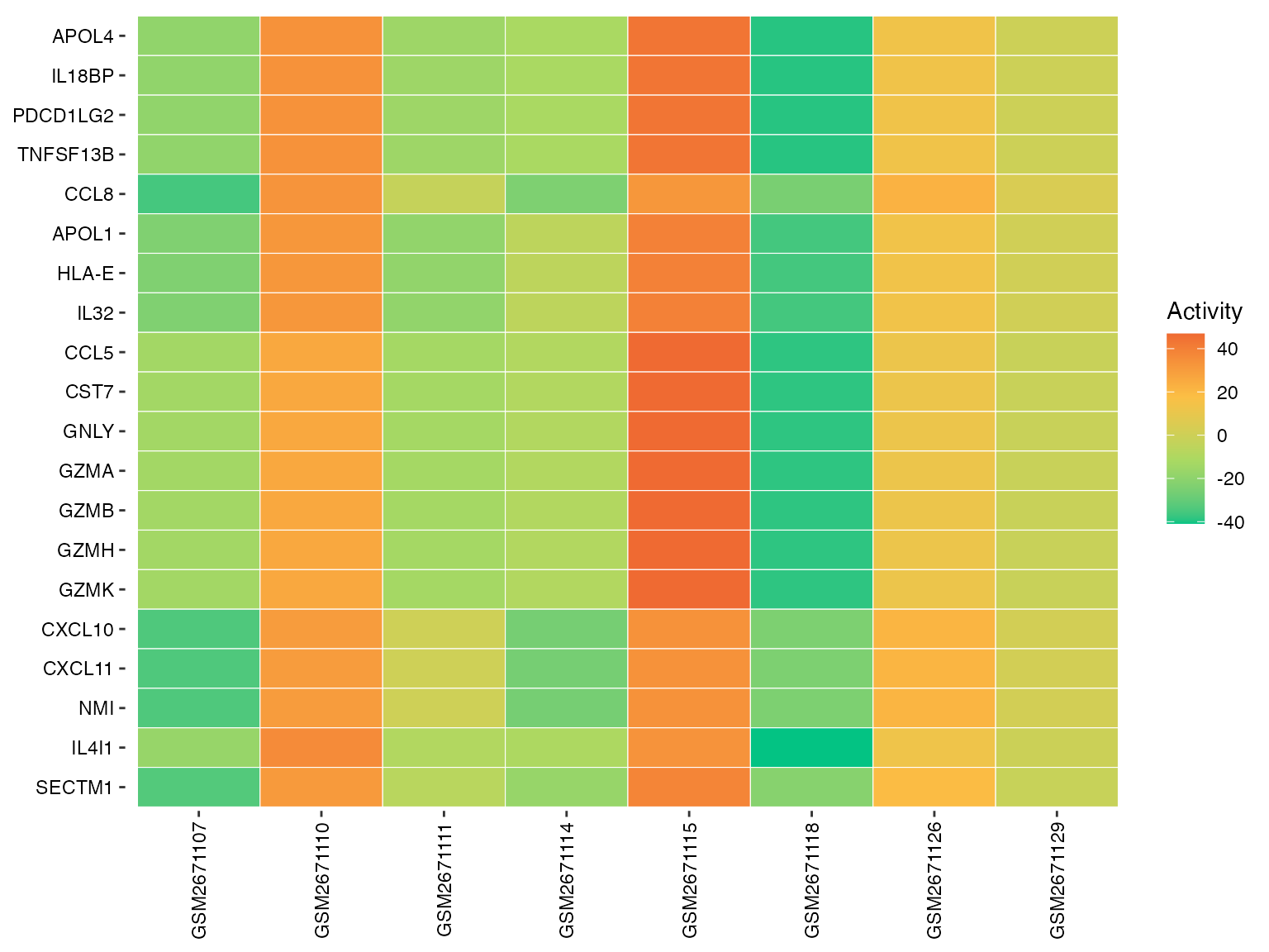
Basic activity heatmap
Customized Colors
# Use different color scheme
SecAct.heatmap.plot(
  result$zscore[top20, ],
  title = "Secreted Protein Activity",
  colors = c("#2166AC", "#F7F7F7", "#B2182B")  # Blue-white-red
)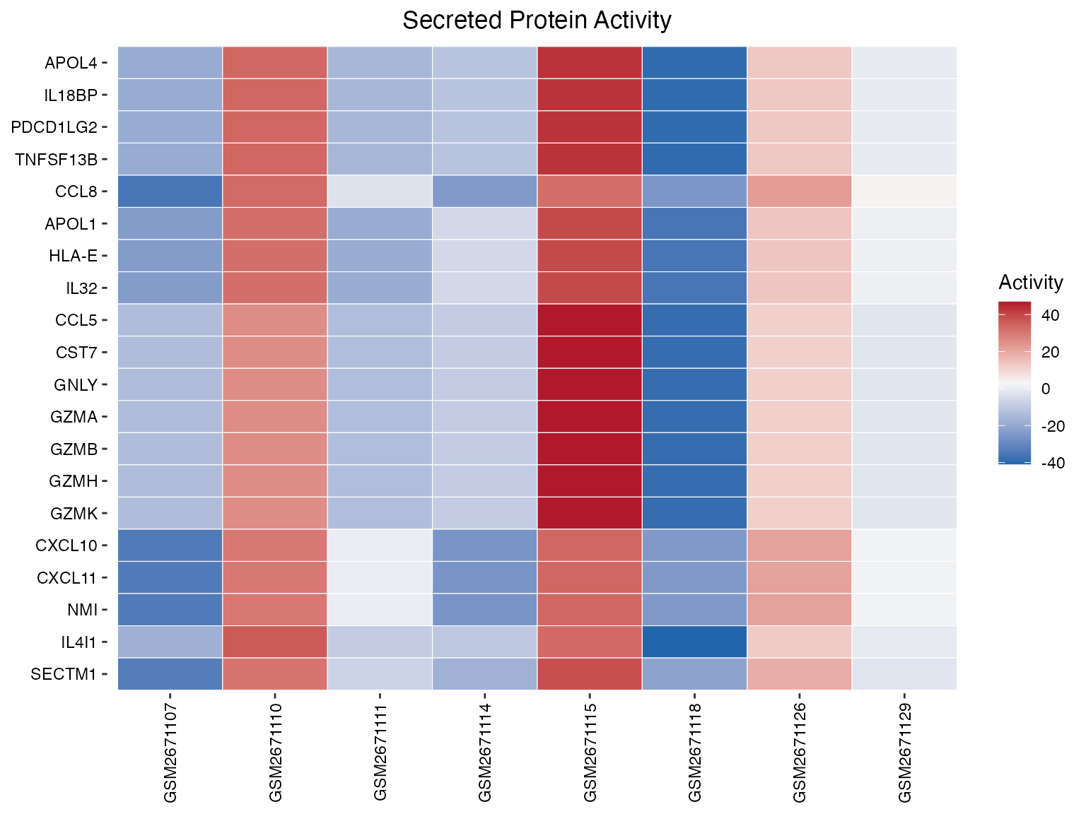
Heatmap with custom color palette
Divergent Scale
# Center around zero for better visualization
SecAct.heatmap.plot(
  result$zscore[top20, ],
  title = "Activity Z-scores",
  colors = c("#4575B4", "#91BFDB", "#E0F3F8", "#FFFFBF",
             "#FEE090", "#FC8D59", "#D73027")
)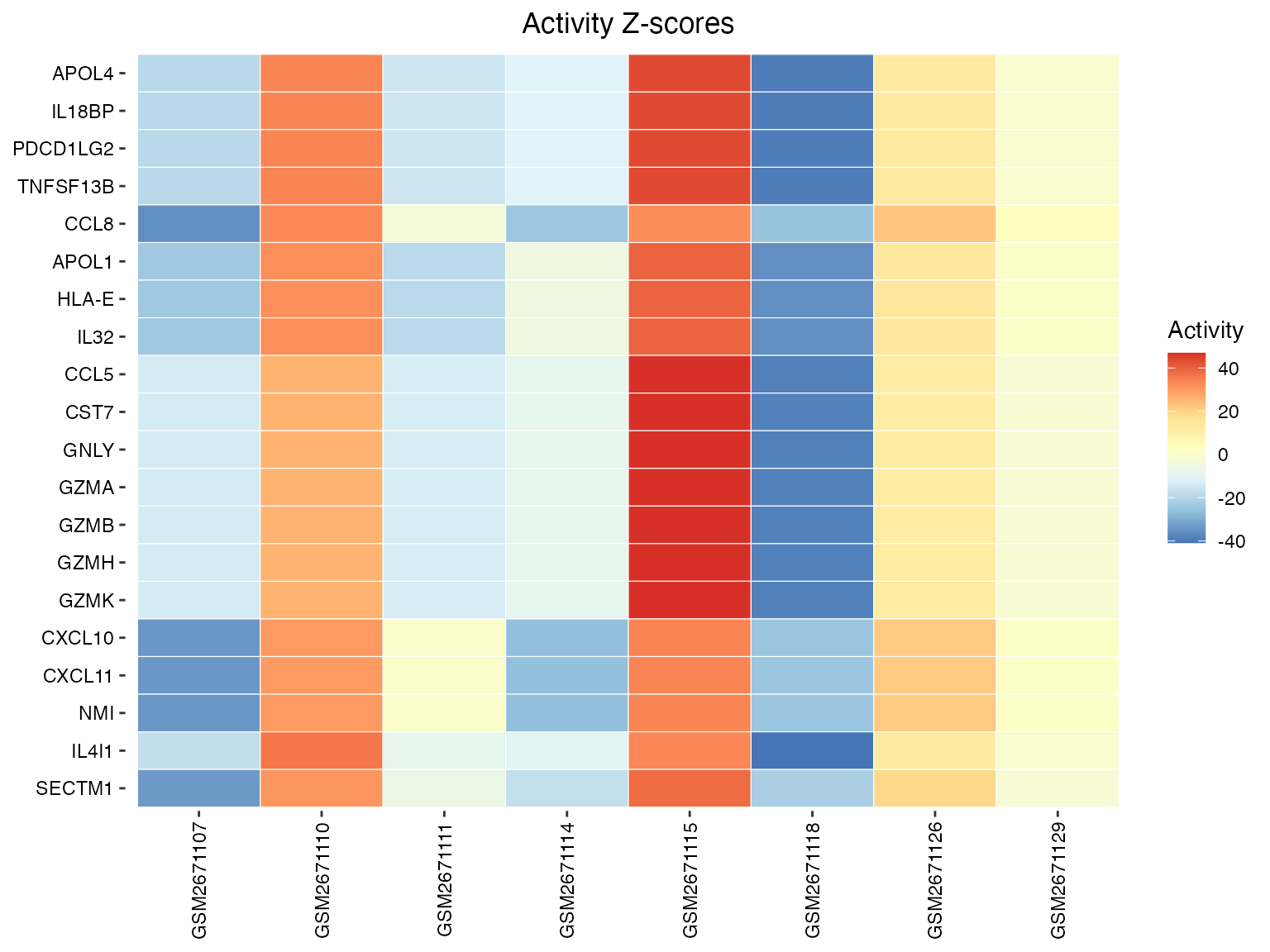
Heatmap with divergent scale
Bar Plots
Basic Bar Plot
# Get top up/down regulated secreted proteins
activities <- result$zscore[, 1]
n <- 10
top_up <- names(sort(activities, decreasing = TRUE))[1:n]
top_down <- names(sort(activities))[1:n]
selected <- c(top_up, top_down)

SecAct.bar.plot(activities[selected])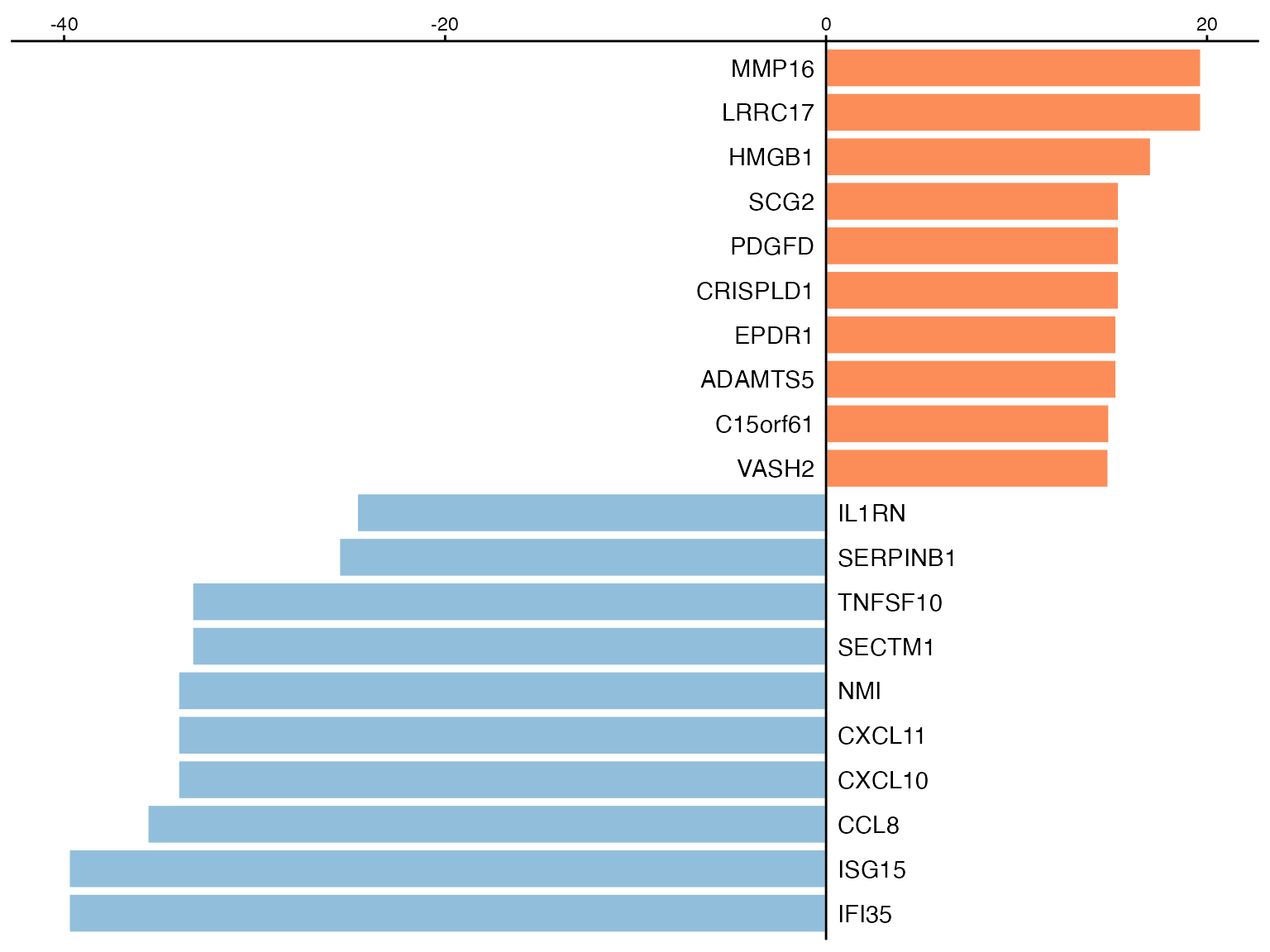
Basic bar plot
With Title
SecAct.bar.plot(
  activities[selected],
  title = "Sample 1: Top Active Secreted Proteins"
)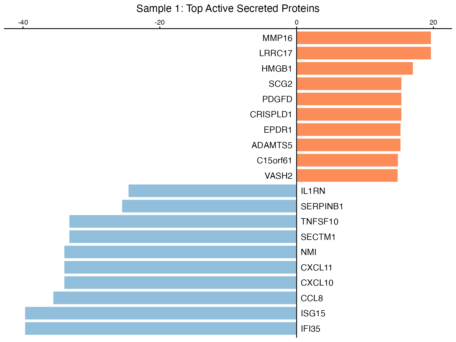
Bar plot with custom title
Custom Colors
SecAct.bar.plot(
  activities[selected],
  title = "Activity Change",
  colors = c("#3288BD", "#D53E4F")  # Blue for down, red for up
)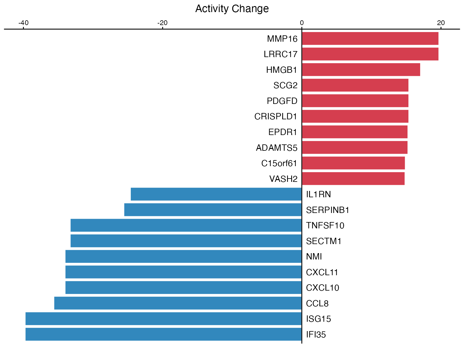
Bar plot with custom colors
Lollipop Plots
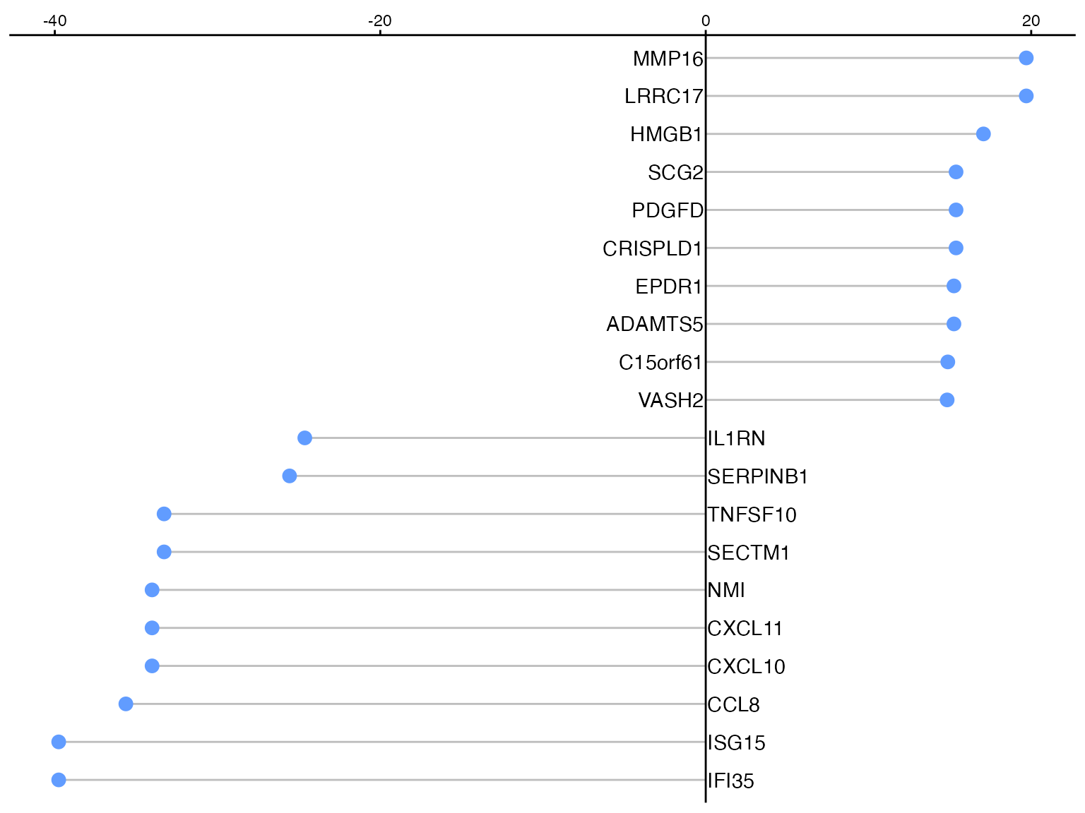
With Title
SecAct.lollipop.plot(
  activities[selected],
  title = "Secreted Protein Activity Rankings"
)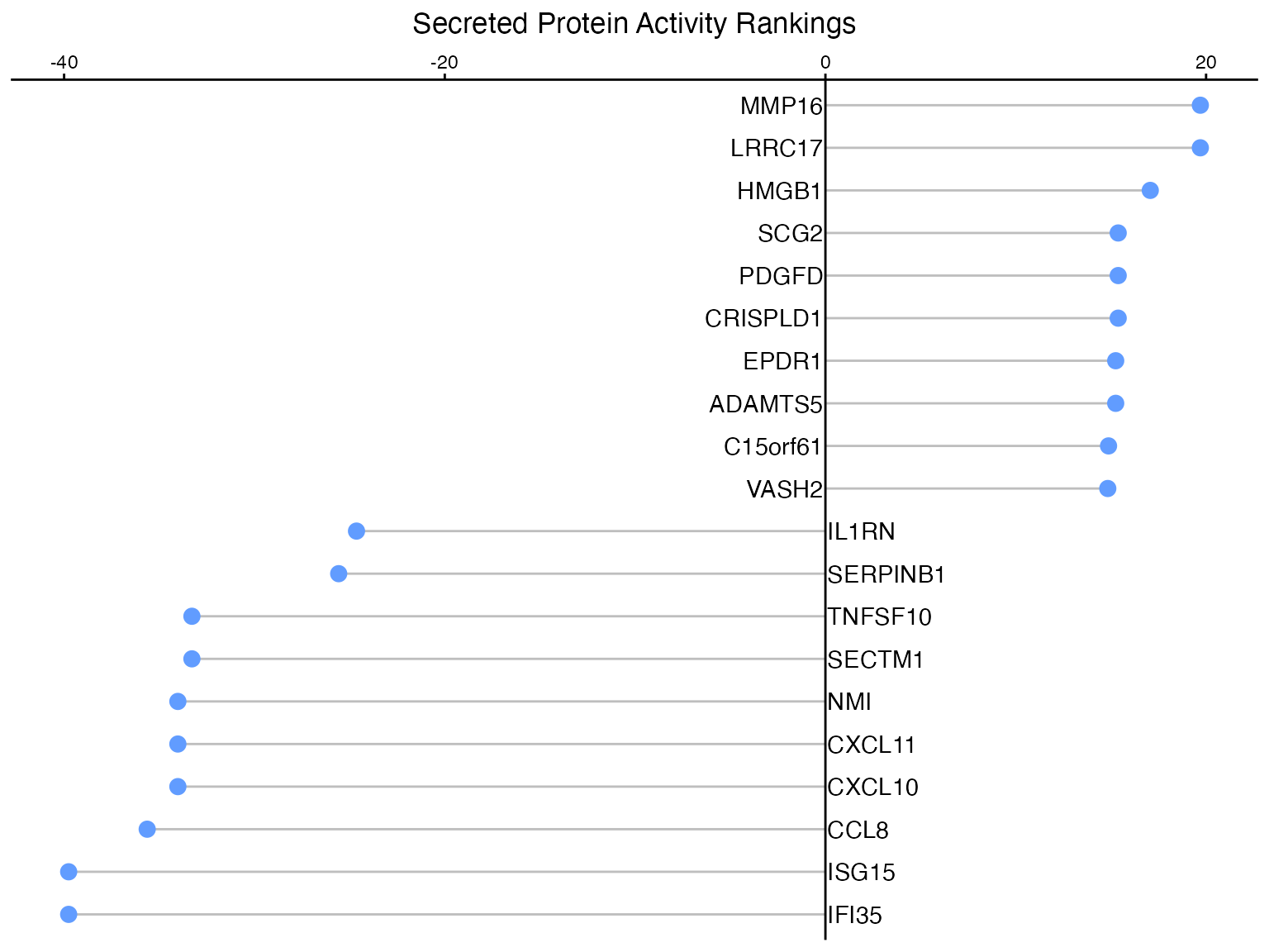
Lollipop plot with title
Combining Plots
Side-by-Side Comparison
# Compare two samples
sample1_act <- result$zscore[selected, 1]
sample2_act <- result$zscore[selected, 2]

p1 <- SecAct.bar.plot(sample1_act, title = "Sample 1")
p2 <- SecAct.bar.plot(sample2_act, title = "Sample 2")

# Use patchwork to combine
if(requireNamespace("patchwork", quietly = TRUE)) {
  patchwork::wrap_plots(p1, p2, ncol = 2)
}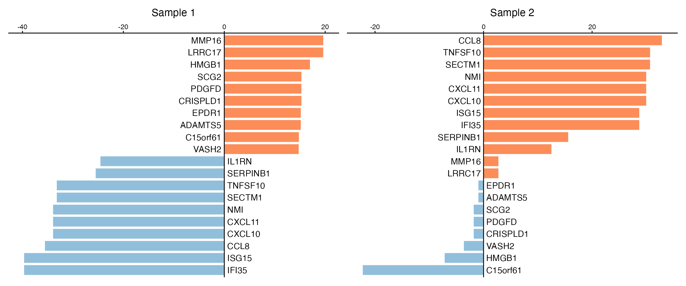
Comparing multiple samples
Publication-Ready Figures
Customized Theme
# Create a polished visualization
activities_df <- data.frame(
  protein = factor(names(activities[selected]), levels = names(sort(activities[selected]))),
  zscore = activities[selected],
  direction = ifelse(activities[selected] > 0, "Upregulated", "Downregulated")
)

ggplot(activities_df, aes(x = protein, y = zscore, fill = direction)) +
  geom_bar(stat = "identity", width = 0.8) +
  coord_flip() +
  scale_fill_manual(values = c("Downregulated" = "#4575B4", "Upregulated" = "#D73027")) +
  labs(
    title = "Secreted Protein Activity Profile",
    subtitle = "Sample 1 vs Background",
    x = NULL,
    y = "Activity Z-score",
    fill = "Direction"
  ) +
  theme_minimal(base_size = 12) +
  theme(
    plot.title = element_text(face = "bold", hjust = 0.5),
    plot.subtitle = element_text(hjust = 0.5, color = "gray50"),
    panel.grid.major.y = element_blank(),
    panel.grid.minor = element_blank(),
    legend.position = "bottom"
  )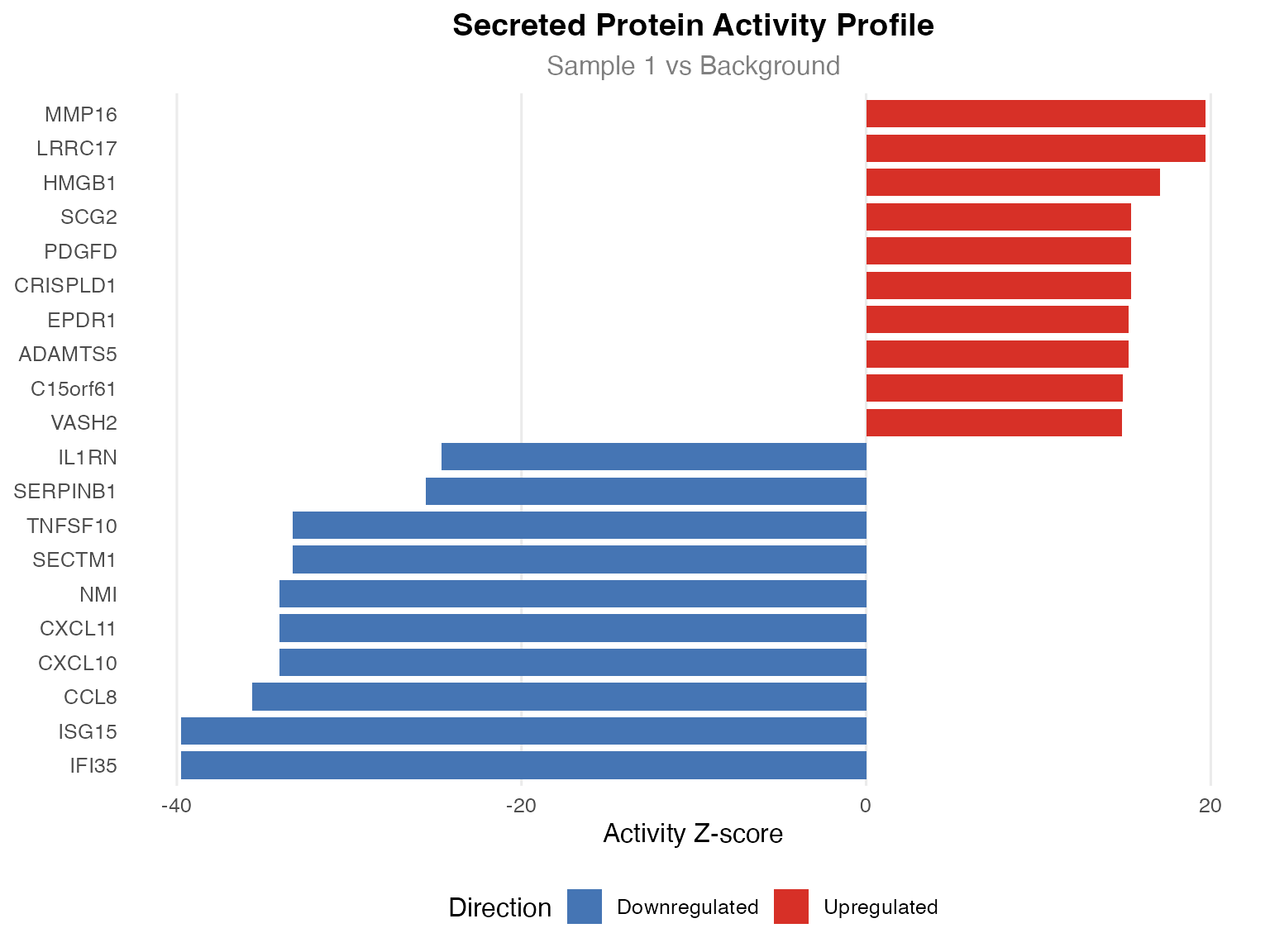
Publication-quality visualization
Statistical Visualization
P-value Distribution
pvals <- as.vector(result$pvalue)

par(mfrow = c(1, 2))

# Histogram
hist(pvals, breaks = 50, col = "steelblue", border = "white",
     main = "P-value Distribution", xlab = "P-value",
     xlim = c(0, 1))
abline(v = 0.05, col = "red", lty = 2, lwd = 2)

# QQ plot
qqplot(qunif(ppoints(length(pvals))), pvals,
       main = "P-value QQ Plot",
       xlab = "Expected (Uniform)", ylab = "Observed")
abline(0, 1, col = "red", lty = 2)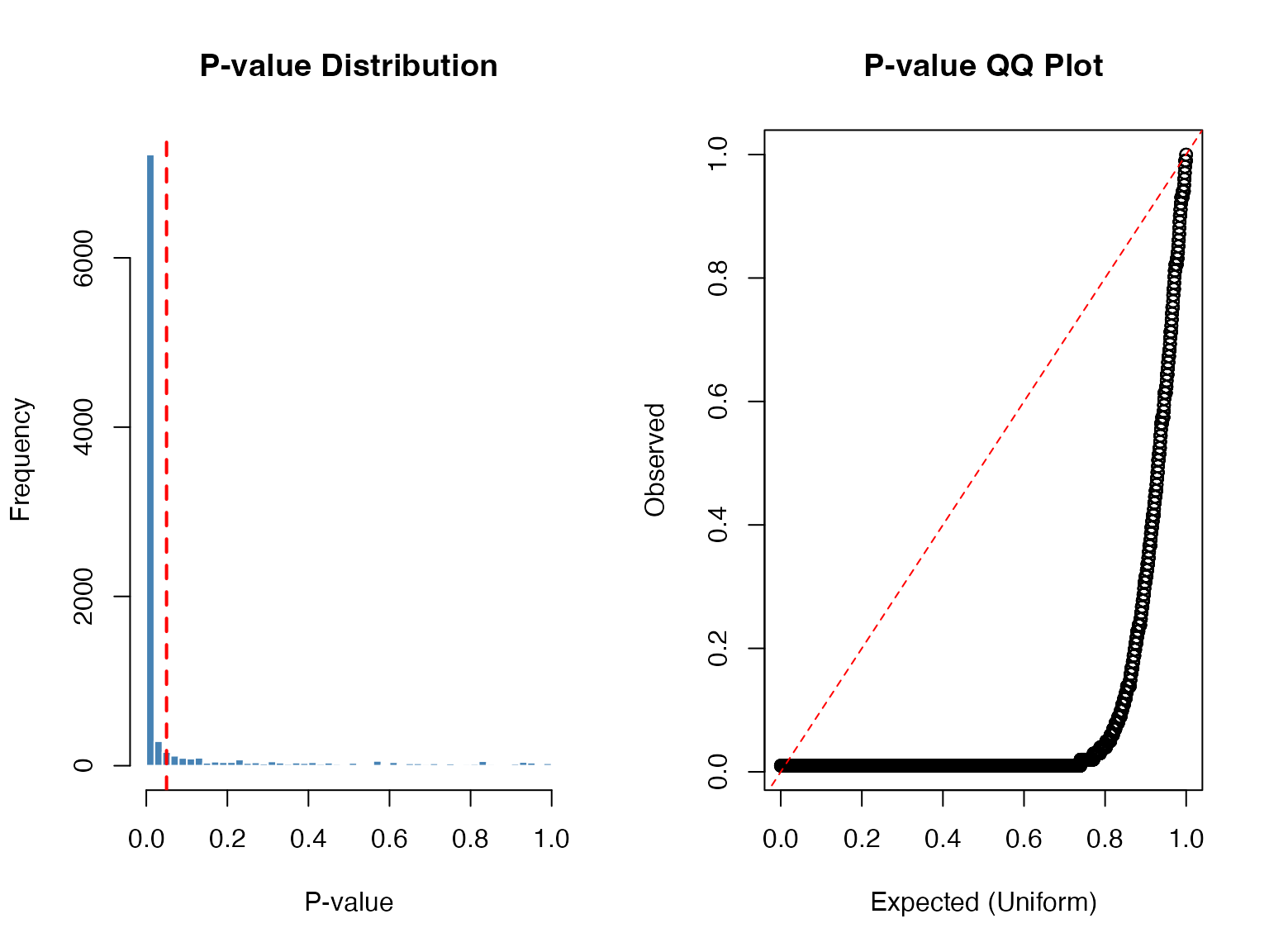
P-value distribution
Volcano Plot
# Create volcano plot data
volcano_data <- data.frame(
  zscore = result$zscore[, 1],
  pvalue = result$pvalue[, 1],
  neg_log_p = -log10(result$pvalue[, 1])
)
volcano_data$significant <- abs(volcano_data$zscore) > 2 & volcano_data$pvalue < 0.05

ggplot(volcano_data, aes(x = zscore, y = neg_log_p, color = significant)) +
  geom_point(alpha = 0.6, size = 1.5) +
  scale_color_manual(values = c("FALSE" = "gray70", "TRUE" = "red")) +
  geom_hline(yintercept = -log10(0.05), linetype = "dashed", color = "blue") +
  geom_vline(xintercept = c(-2, 2), linetype = "dashed", color = "blue") +
  labs(
    title = "Volcano Plot",
    x = "Activity Z-score",
    y = "-log10(P-value)",
    color = "Significant"
  ) +
  theme_minimal() +
  theme(legend.position = "bottom")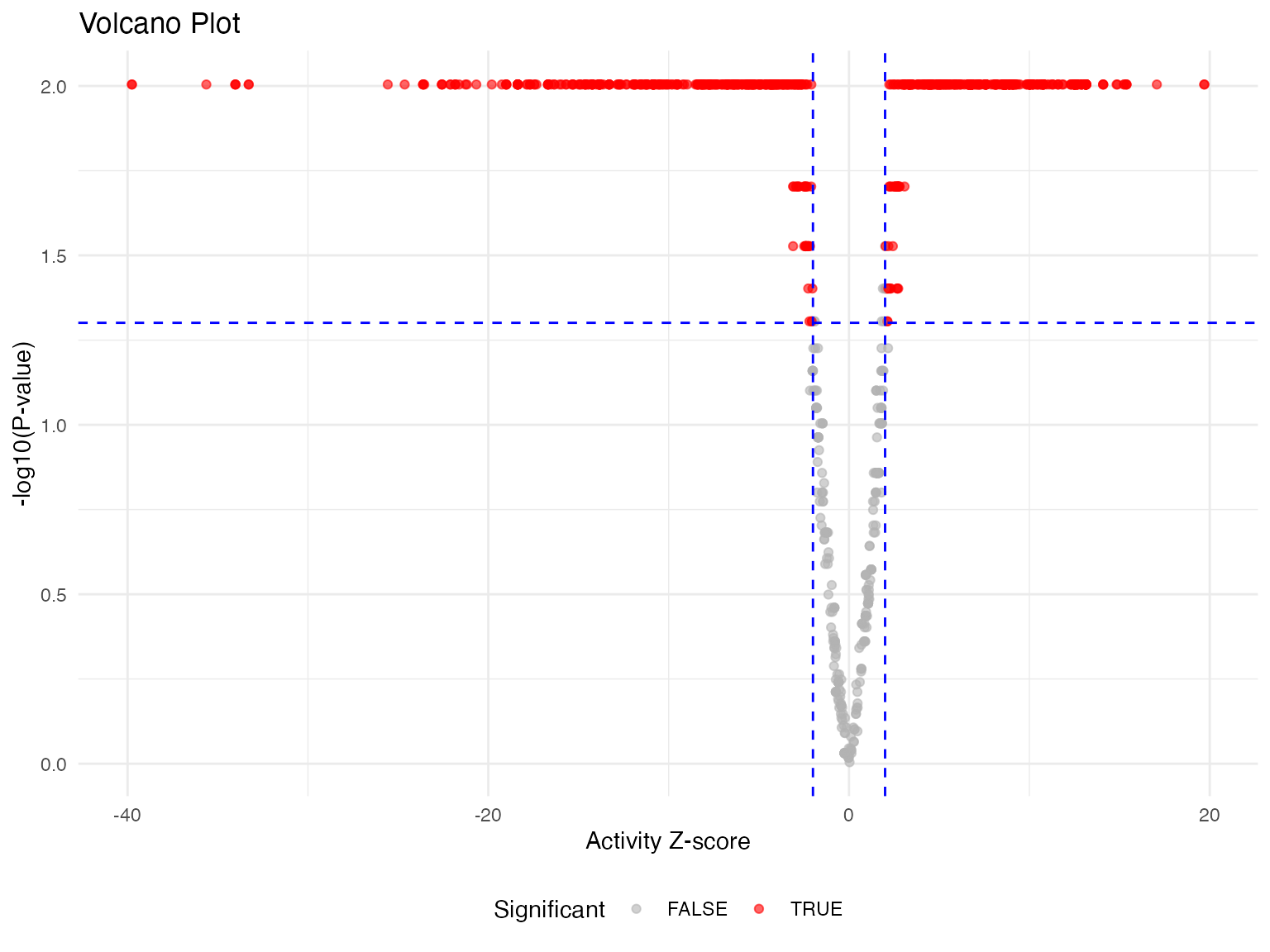
Volcano plot of activity results
Sample Correlation
# Calculate sample correlation
sample_cor <- cor(result$zscore, method = "spearman")

# Simple heatmap using base R
heatmap(sample_cor,
        main = "Sample Activity Correlation",
        col = colorRampPalette(c("#4575B4", "white", "#D73027"))(100),
        symm = TRUE)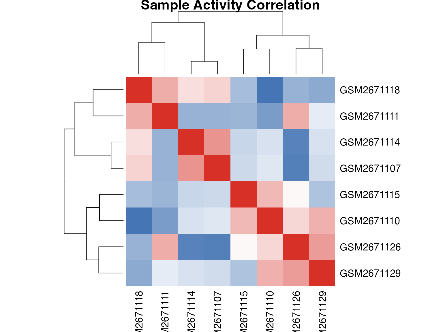
Sample correlation heatmap
Tips for Better Visualizations
1. Choose Appropriate Color Palettes
# Demonstrate different palettes
par(mfrow = c(1, 3), mar = c(2, 2, 2, 1))

# Sequential (for magnitude)
image(1:100, 1, as.matrix(1:100), col = colorRampPalette(c("white", "#D73027"))(100),
      main = "Sequential", xaxt = "n", yaxt = "n", xlab = "", ylab = "")

# Divergent (for positive/negative)
image(1:100, 1, as.matrix(-50:49), col = colorRampPalette(c("#4575B4", "white", "#D73027"))(100),
      main = "Divergent", xaxt = "n", yaxt = "n", xlab = "", ylab = "")

# Qualitative (for categories)
image(1:8, 1, as.matrix(1:8), col = RColorBrewer::brewer.pal(8, "Set2"),
      main = "Qualitative", xaxt = "n", yaxt = "n", xlab = "", ylab = "")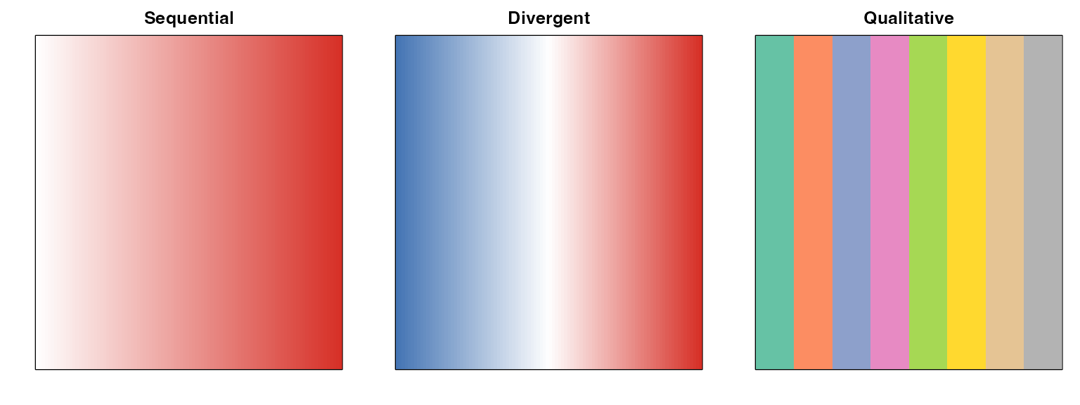
Session Info
sessionInfo()
#> R version 4.4.0 (2024-04-24)
#> Platform: aarch64-apple-darwin20
#> Running under: macOS 15.6.1
#>
#> Matrix products: default
#> BLAS:   /Library/Frameworks/R.framework/Versions/4.4-arm64/Resources/lib/libRblas.0.dylib
#> LAPACK: /Library/Frameworks/R.framework/Versions/4.4-arm64/Resources/lib/libRlapack.dylib;  LAPACK version 3.12.0
#>
#> locale:
#> [1] C
#>
#> time zone: Asia/Shanghai
#> tzcode source: internal
#>
#> attached base packages:
#> [1] stats     graphics  grDevices utils     datasets  methods   base
#>
#> other attached packages:
#> [1] ggplot2_4.0.1 SecAct_1.0.1
#>
#> loaded via a namespace (and not attached):
#>  [1] gtable_0.3.6       jsonlite_2.0.0     dplyr_1.1.4        compiler_4.4.0
#>  [5] Rcpp_1.1.1         tidyselect_1.2.1   stringr_1.6.0      dichromat_2.0-0.1
#>  [9] jquerylib_0.1.4    systemfonts_1.3.1  scales_1.4.0       textshaping_1.0.4
#> [13] yaml_2.3.12        fastmap_1.2.0      plyr_1.8.9         R6_2.6.1
#> [17] patchwork_1.3.2    labeling_0.4.3     generics_0.1.4     knitr_1.51
#> [21] htmlwidgets_1.6.4  tibble_3.3.1       desc_1.4.3         bslib_0.9.0
#> [25] pillar_1.11.1      RColorBrewer_1.1-3 rlang_1.1.7        stringi_1.8.7
#> [29] cachem_1.1.0       xfun_0.56          fs_1.6.6           sass_0.4.10
#> [33] S7_0.2.1           otel_0.2.0         cli_3.6.5          withr_3.0.2
#> [37] pkgdown_2.1.3      magrittr_2.0.4     digest_0.6.39      grid_4.4.0
#> [41] lifecycle_1.0.5    vctrs_0.7.0        evaluate_1.0.5     glue_1.8.0
#> [45] farver_2.1.2       ragg_1.5.0         reshape2_1.4.5     rmarkdown_2.30
#> [49] tools_4.4.0        pkgconfig_2.0.3    htmltools_0.5.9