COMMOTR: Visualization Gallery
Zaoqu Liu
2026-01-25
Source:vignettes/visualization.Rmd
visualization.RmdIntroduction
This gallery showcases the visualization capabilities of
COMMOTR for analyzing and presenting cell-cell
communication results. All plots are built with ggplot2 for
maximum customization.
Demo Data Setup
set.seed(42)

# Create realistic spatial transcriptomics simulation
n_cells <- 150

# Create 3 spatial clusters
cluster_centers <- matrix(c(20, 50, 80, 50, 20, 80), ncol = 2, byrow = TRUE)
cluster_sizes <- c(50, 50, 50)

coords <- do.call(rbind, lapply(1:3, function(i) {
  n <- cluster_sizes[i]
  cbind(
    rnorm(n, cluster_centers[i, 1], 10),
    rnorm(n, cluster_centers[i, 2], 10)
  )
}))
coords[, 1] <- pmin(pmax(coords[, 1], 0), 100)
coords[, 2] <- pmin(pmax(coords[, 2], 0), 100)
rownames(coords) <- paste0("Cell", 1:n_cells)
colnames(coords) <- c("spatial_1", "spatial_2")

# Simulated signal results (for visualization demo)
coords_plot <- as.data.frame(coords)
coords_plot$cluster <- factor(c(rep("TGFb_Sender", 50),
                               rep("Receptor", 50),
                               rep("Wnt_FGF_Sender", 50)))

# Simulate sender/receiver signals
coords_plot$sender_signal <- c(rnorm(50, 3, 0.5), rnorm(50, 1.5, 0.3), rnorm(50, 2.5, 0.4))
coords_plot$receiver_signal <- c(rnorm(50, 1, 0.3), rnorm(50, 3.5, 0.5), rnorm(50, 1.2, 0.3))

# Simulated vector field
vf_tgfb <- matrix(0, n_cells, 2)
vf_tgfb[1:50, 1] <- rnorm(50, 0.8, 0.2)   # TGFb senders point right
vf_tgfb[1:50, 2] <- rnorm(50, 0.3, 0.2)
vf_tgfb[101:150, 1] <- rnorm(50, -0.6, 0.2)  # Wnt senders point left
vf_tgfb[101:150, 2] <- rnorm(50, 0.2, 0.2)

# Simulated cluster communication matrix
comm_mat <- matrix(c(1.5, 0.8, 0.4, 3.2, 0.5, 0.3, 0.6, 2.8, 0.9), 3, 3)
rownames(comm_mat) <- colnames(comm_mat) <- c("TGFb_Sender", "Receptor", "Wnt_FGF_Sender")
pval_mat <- matrix(c(0.12, 0.08, 0.45, 0.001, 0.32, 0.55, 0.22, 0.002, 0.18), 3, 3)
rownames(pval_mat) <- colnames(pval_mat) <- rownames(comm_mat)

# Simulated pathway signals
sender_sum <- data.frame(
  total = coords_plot$sender_signal,
  TGFb = c(rnorm(50, 2.5, 0.4), rnorm(50, 0.8, 0.2), rnorm(50, 0.5, 0.2)),
  WNT = c(rnorm(50, 0.6, 0.2), rnorm(50, 0.9, 0.2), rnorm(50, 2.2, 0.4)),
  FGF = c(rnorm(50, 0.4, 0.1), rnorm(50, 0.7, 0.2), rnorm(50, 1.8, 0.3)),
  BMP = c(rnorm(50, 1.5, 0.3), rnorm(50, 0.6, 0.2), rnorm(50, 0.4, 0.1))
)
receiver_sum <- data.frame(
  total = coords_plot$receiver_signal,
  TGFb = c(rnorm(50, 0.5, 0.2), rnorm(50, 2.8, 0.4), rnorm(50, 0.3, 0.1)),
  WNT = c(rnorm(50, 0.3, 0.1), rnorm(50, 2.0, 0.3), rnorm(50, 0.5, 0.2)),
  FGF = c(rnorm(50, 0.2, 0.1), rnorm(50, 1.5, 0.3), rnorm(50, 0.4, 0.1)),
  BMP = c(rnorm(50, 0.4, 0.1), rnorm(50, 1.8, 0.3), rnorm(50, 0.3, 0.1))
)

signal_tgfb <- sender_sum$TGFb
1. Spatial Distribution Plots
1.1 Cell Type Distribution
# Custom color palette
cluster_colors <- c("TGFb_Sender" = "#E63946",
                   "Receptor" = "#457B9D",
                   "Wnt_FGF_Sender" = "#2A9D8F")

ggplot(coords_plot, aes(x = spatial_1, y = spatial_2)) +
  geom_point(aes(color = cluster), size = 3, alpha = 0.8) +
  scale_color_manual(values = cluster_colors, name = "Cell Type") +
  labs(title = "Spatial Distribution of Cell Types",
       subtitle = "Three distinct clusters with different signaling roles",
       x = "Spatial X", y = "Spatial Y") +
  theme_minimal(base_size = 12) +
  theme(
    panel.grid.minor = element_blank(),
    legend.position = "right",
    plot.title = element_text(face = "bold")
  ) +
  coord_fixed()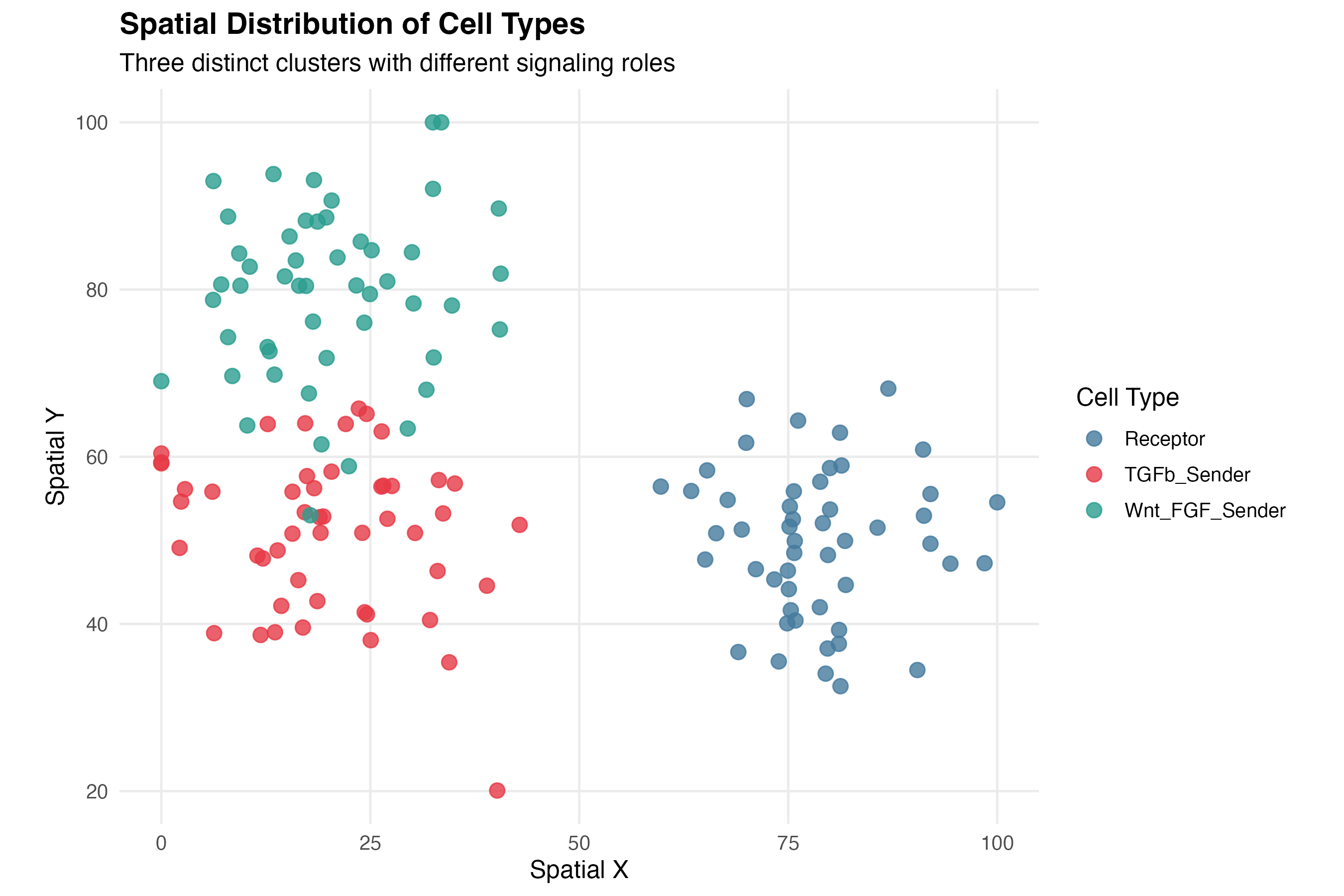
1.2 Communication Signal Heatmap
# Signal data already prepared above

# Sender signal
p_sender <- ggplot(coords_plot, aes(x = spatial_1, y = spatial_2)) +
  geom_point(aes(color = sender_signal), size = 3) +
  scale_color_viridis_c(option = "inferno", name = "Signal") +
  labs(title = "Sender (Outgoing) Communication",
       x = "Spatial X", y = "Spatial Y") +
  theme_minimal() +
  coord_fixed()

# Receiver signal
p_receiver <- ggplot(coords_plot, aes(x = spatial_1, y = spatial_2)) +
  geom_point(aes(color = receiver_signal), size = 3) +
  scale_color_viridis_c(option = "viridis", name = "Signal") +
  labs(title = "Receiver (Incoming) Communication",
       x = "Spatial X", y = "Spatial Y") +
  theme_minimal() +
  coord_fixed()

print(p_sender)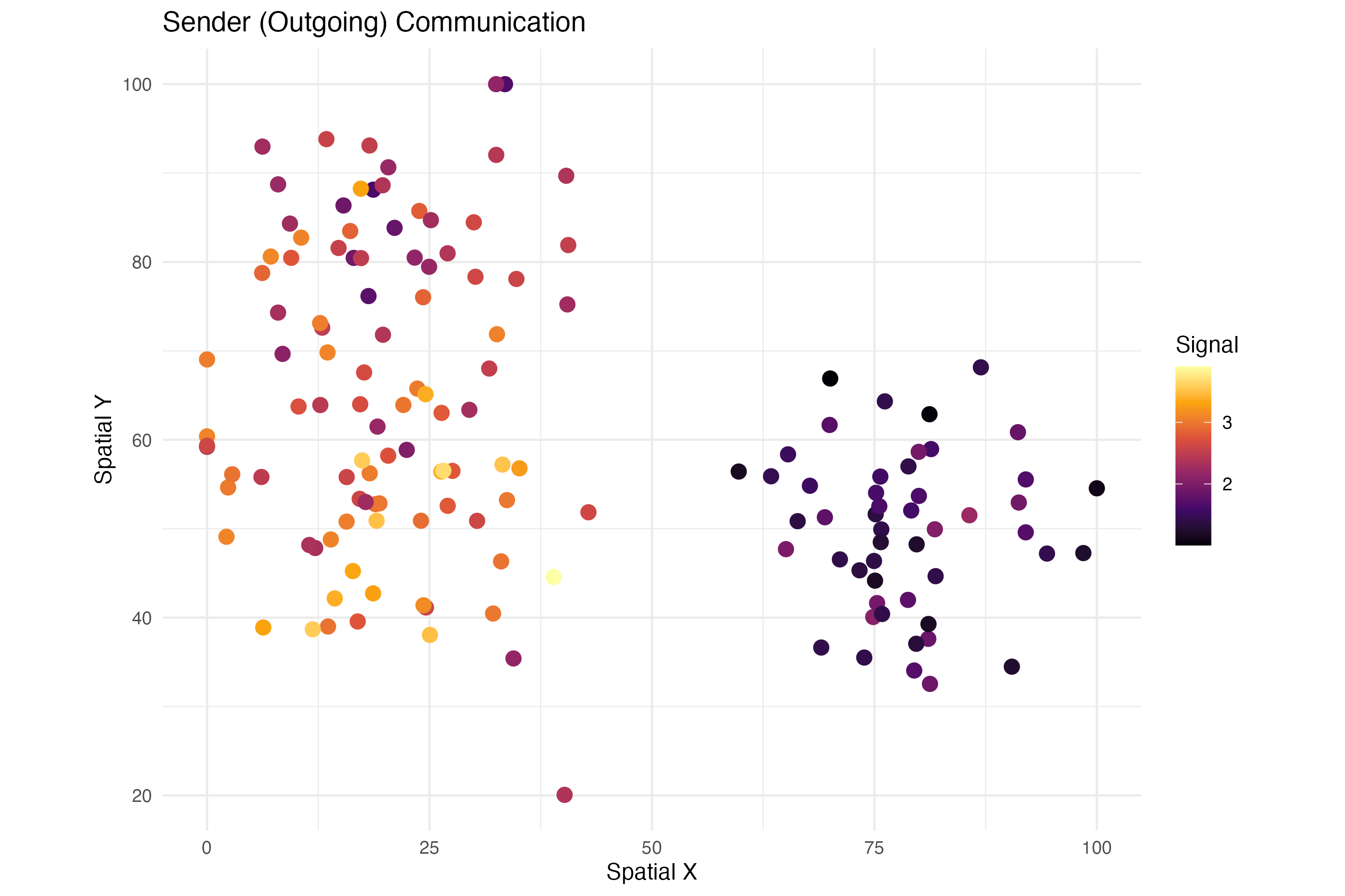
print(p_receiver)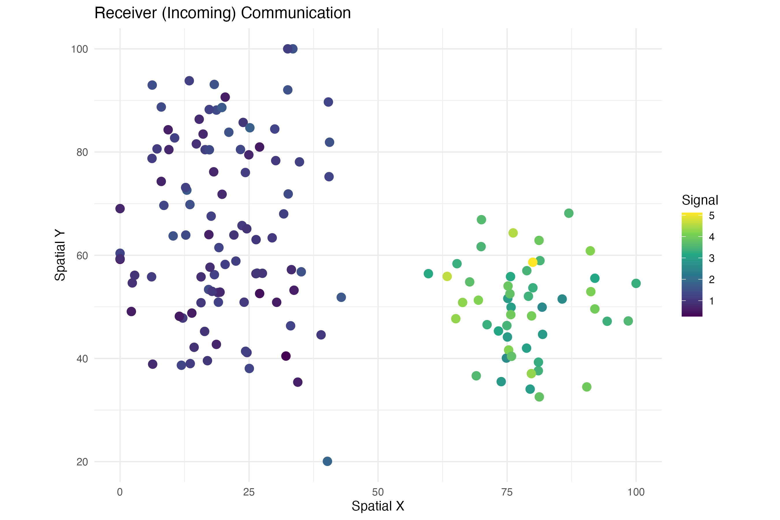
2. Vector Field Visualizations
2.1 Communication Direction Arrows
# Vector field data prepared above (vf_tgfb, signal_tgfb)

# Create arrow data
arrow_df <- data.frame(
  x = coords_plot$spatial_1,
  y = coords_plot$spatial_2,
  vx = vf_tgfb[, 1] * 8,
  vy = vf_tgfb[, 2] * 8,
  signal = signal_tgfb,
  cluster = coords_plot$cluster
)

# Filter to show only cells with meaningful signal
arrow_df_filtered <- arrow_df[arrow_df$signal > quantile(arrow_df$signal, 0.4), ]

ggplot() +
  # Background points (all cells)
  geom_point(data = coords_plot, aes(x = spatial_1, y = spatial_2),
             color = "gray80", size = 2) +
  # Arrows
  geom_segment(data = arrow_df_filtered,
               aes(x = x, y = y, xend = x + vx, yend = y + vy, color = signal),
               arrow = arrow(length = unit(0.12, "cm"), type = "closed"),
               linewidth = 0.9) +
  # Arrow origin points
  geom_point(data = arrow_df_filtered, aes(x = x, y = y, fill = cluster),
             shape = 21, size = 2.5, color = "white") +
  scale_color_gradient(low = "#fee0d2", high = "#de2d26", name = "TGFb\nSignal") +
  scale_fill_manual(values = cluster_colors, name = "Cluster") +
  labs(title = "TGFb Communication Direction Vector Field",
       subtitle = "Arrows indicate ligand→receptor signal flow direction",
       x = "Spatial X", y = "Spatial Y") +
  theme_minimal(base_size = 12) +
  theme(
    panel.grid = element_blank(),
    plot.title = element_text(face = "bold")
  ) +
  coord_fixed()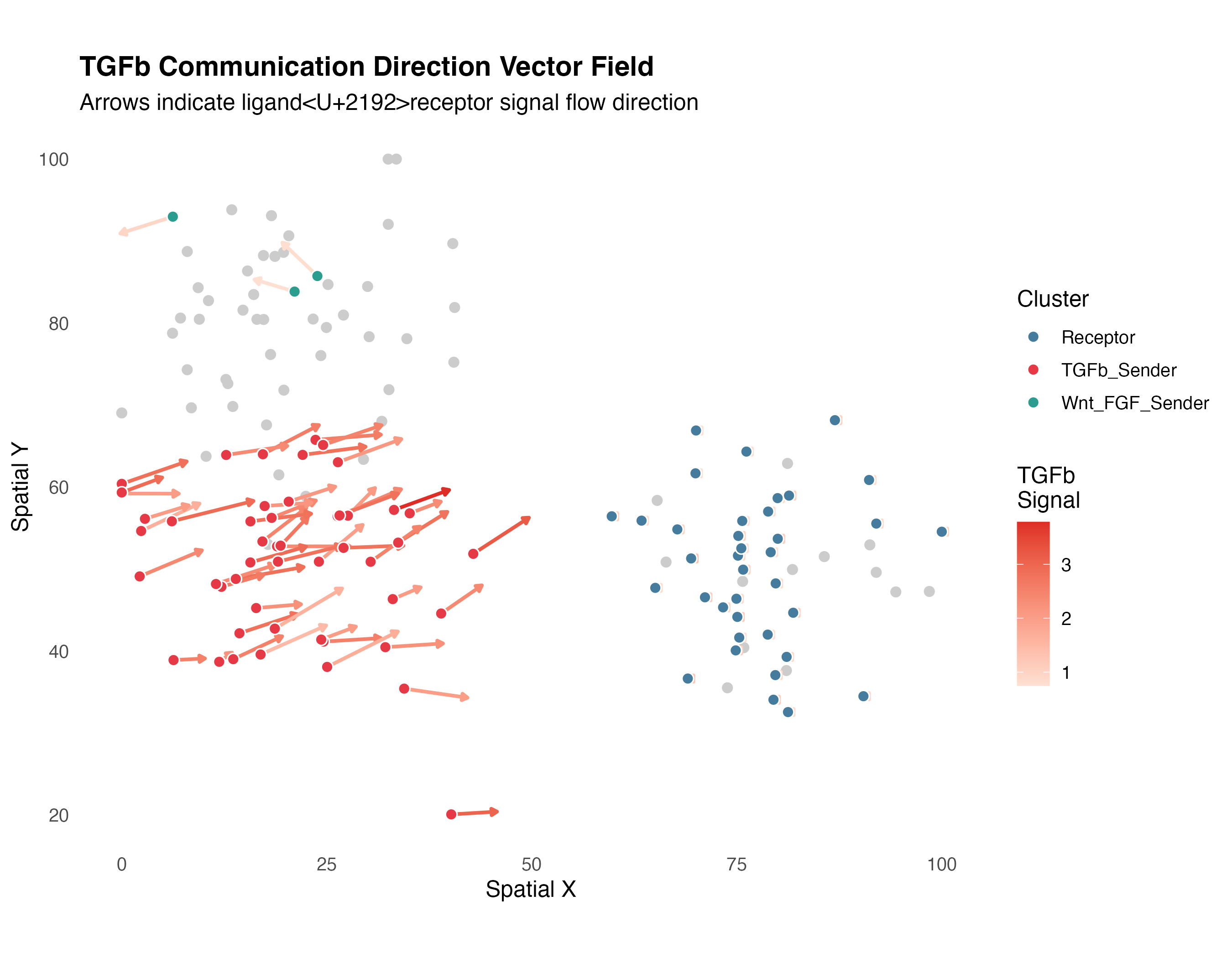
2.2 Streamline-Style Visualization
# Create smoothed vector field on grid
grid_size <- 15
x_seq <- seq(min(coords_plot$spatial_1), max(coords_plot$spatial_1), length.out = grid_size)
y_seq <- seq(min(coords_plot$spatial_2), max(coords_plot$spatial_2), length.out = grid_size)
grid_df <- expand.grid(x = x_seq, y = y_seq)

# Interpolate vectors to grid points (simple nearest-neighbor)
for (i in seq_len(nrow(grid_df))) {
  dists <- sqrt((coords_plot$spatial_1 - grid_df$x[i])^2 +
                (coords_plot$spatial_2 - grid_df$y[i])^2)
  weights <- exp(-dists / 15)
  weights <- weights / sum(weights)

  grid_df$vx[i] <- sum(weights * vf_tgfb[, 1]) * 5
  grid_df$vy[i] <- sum(weights * vf_tgfb[, 2]) * 5
  grid_df$magnitude[i] <- sqrt(grid_df$vx[i]^2 + grid_df$vy[i]^2)
}

# Filter weak vectors
grid_df <- grid_df[grid_df$magnitude > quantile(grid_df$magnitude, 0.3), ]

ggplot() +
  geom_point(data = coords_plot, aes(x = spatial_1, y = spatial_2, color = cluster),
             size = 2, alpha = 0.6) +
  geom_segment(data = grid_df,
               aes(x = x, y = y, xend = x + vx, yend = y + vy),
               arrow = arrow(length = unit(0.1, "cm")),
               color = "black", alpha = 0.7, linewidth = 0.5) +
  scale_color_manual(values = cluster_colors, name = "Cluster") +
  labs(title = "TGFb Communication Flow Field",
       subtitle = "Grid-interpolated vector field showing dominant flow directions",
       x = "Spatial X", y = "Spatial Y") +
  theme_minimal(base_size = 12) +
  theme(panel.grid = element_blank()) +
  coord_fixed()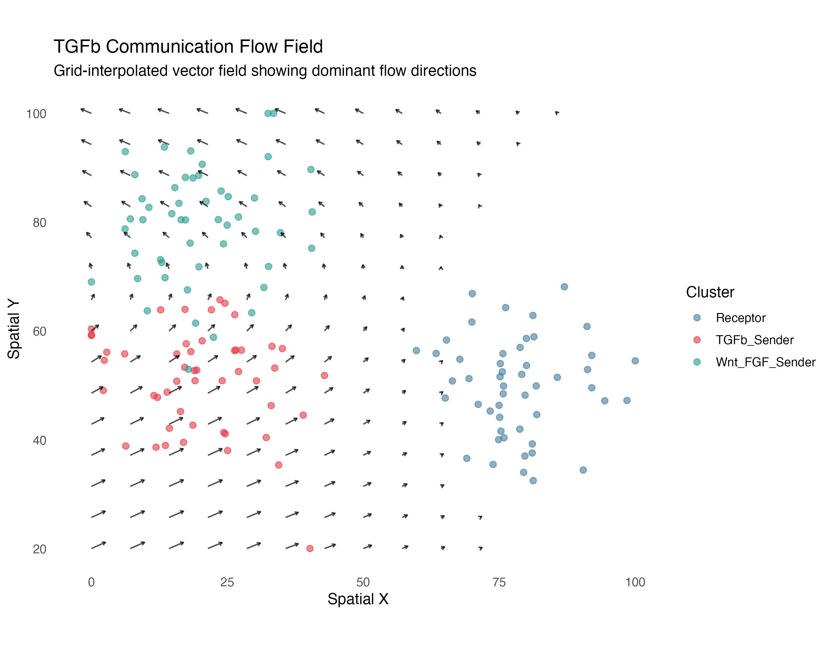
3. Cluster Communication Plots
3.1 Communication Heatmap
# Cluster communication data prepared above (comm_mat, pval_mat)

# Convert to long format
heatmap_df <- expand.grid(
  Sender = rownames(comm_mat),
  Receiver = colnames(comm_mat),
  stringsAsFactors = FALSE
)
heatmap_df$Communication <- as.vector(comm_mat)
heatmap_df$pvalue <- as.vector(pval_mat)
heatmap_df$label <- sprintf("%.1f%s",
                           heatmap_df$Communication,
                           ifelse(heatmap_df$pvalue < 0.05, "*", ""))

ggplot(heatmap_df, aes(x = Receiver, y = Sender)) +
  geom_tile(aes(fill = Communication), color = "white", linewidth = 1.5) +
  geom_text(aes(label = label), color = "white", size = 4, fontface = "bold") +
  scale_fill_gradient2(low = "#f7fbff", mid = "#6baed6", high = "#08306b",
                      midpoint = median(heatmap_df$Communication),
                      name = "Communication\nStrength") +
  labs(title = "TGFb Cluster Communication Matrix",
       subtitle = "* indicates significant (p < 0.05)",
       x = "Receiver Cluster", y = "Sender Cluster") +
  theme_minimal(base_size = 12) +
  theme(
    axis.text.x = element_text(angle = 45, hjust = 1),
    panel.grid = element_blank(),
    plot.title = element_text(face = "bold")
  ) +
  coord_fixed()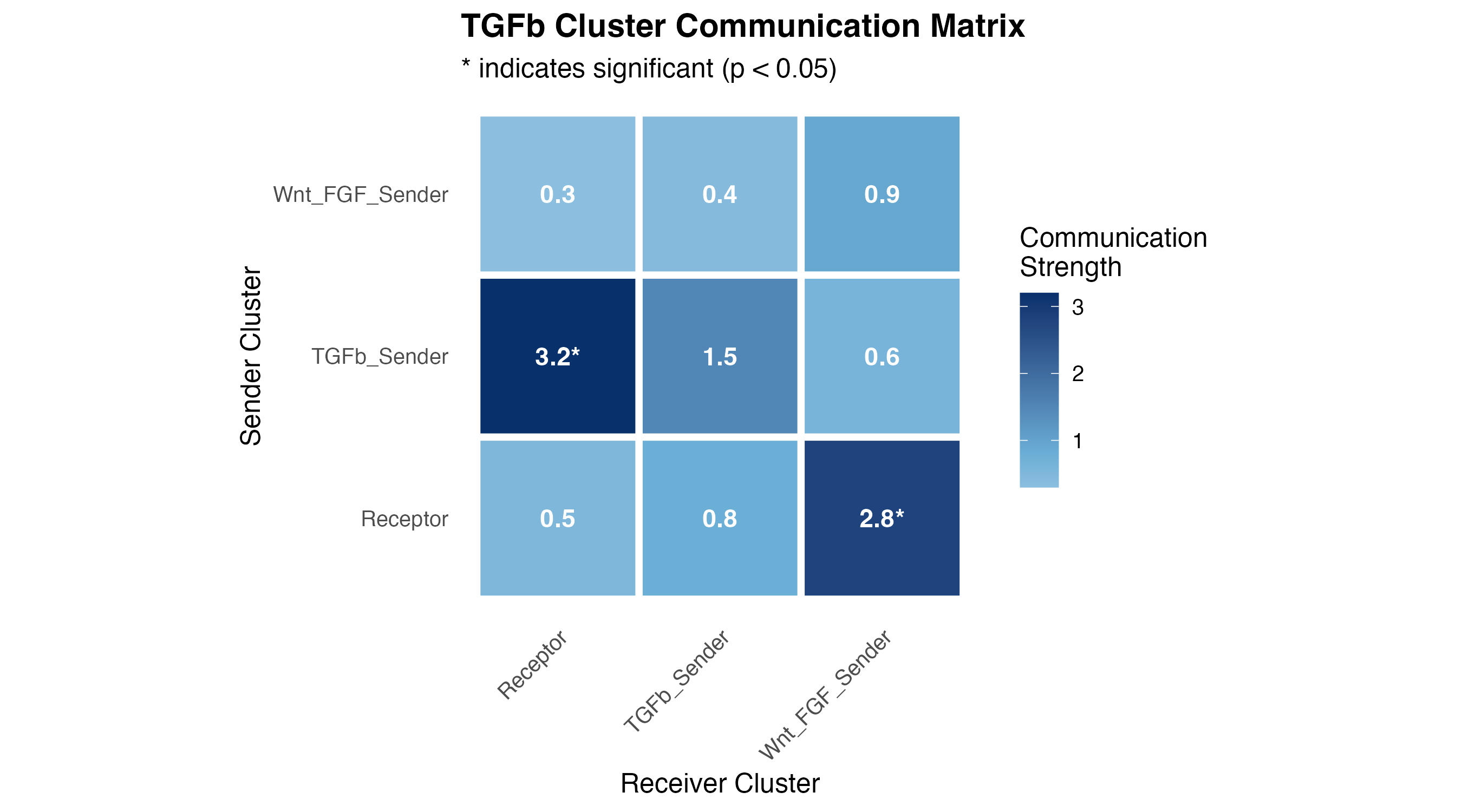
3.2 Network Diagram
# Compute cluster centroids
centroids <- aggregate(cbind(spatial_1, spatial_2) ~ cluster, coords_plot, mean)

# Create edge data from communication matrix (exclude self-loops)
edges <- heatmap_df[heatmap_df$Communication > 0 & heatmap_df$Sender != heatmap_df$Receiver, ]
edges <- merge(edges, centroids, by.x = "Sender", by.y = "cluster")
names(edges)[names(edges) %in% c("spatial_1", "spatial_2")] <- c("x_start", "y_start")
edges <- merge(edges, centroids, by.x = "Receiver", by.y = "cluster")
names(edges)[names(edges) %in% c("spatial_1", "spatial_2")] <- c("x_end", "y_end")

# Normalize for visualization
edges$width <- edges$Communication / max(edges$Communication) * 3

ggplot() +
  # Edges (communication)
  geom_curve(data = edges,
             aes(x = x_start, y = y_start, xend = x_end, yend = y_end,
                 linewidth = width, alpha = Communication),
             curvature = 0.2,
             arrow = arrow(length = unit(0.3, "cm"), type = "closed"),
             color = "#E63946") +
  # Nodes (clusters)
  geom_point(data = centroids, aes(x = spatial_1, y = spatial_2, fill = cluster),
             shape = 21, size = 15, color = "white", stroke = 2) +
  geom_text(data = centroids, aes(x = spatial_1, y = spatial_2, label = cluster),
            size = 3, fontface = "bold") +
  scale_fill_manual(values = cluster_colors, guide = "none") +
  scale_linewidth_continuous(range = c(0.5, 3), guide = "none") +
  scale_alpha_continuous(range = c(0.4, 0.9), name = "Communication") +
  labs(title = "TGFb Communication Network",
       subtitle = "Arrow width indicates communication strength",
       x = "Spatial X", y = "Spatial Y") +
  theme_void(base_size = 12) +
  theme(
    plot.title = element_text(face = "bold", hjust = 0.5),
    plot.subtitle = element_text(hjust = 0.5)
  ) +
  coord_fixed()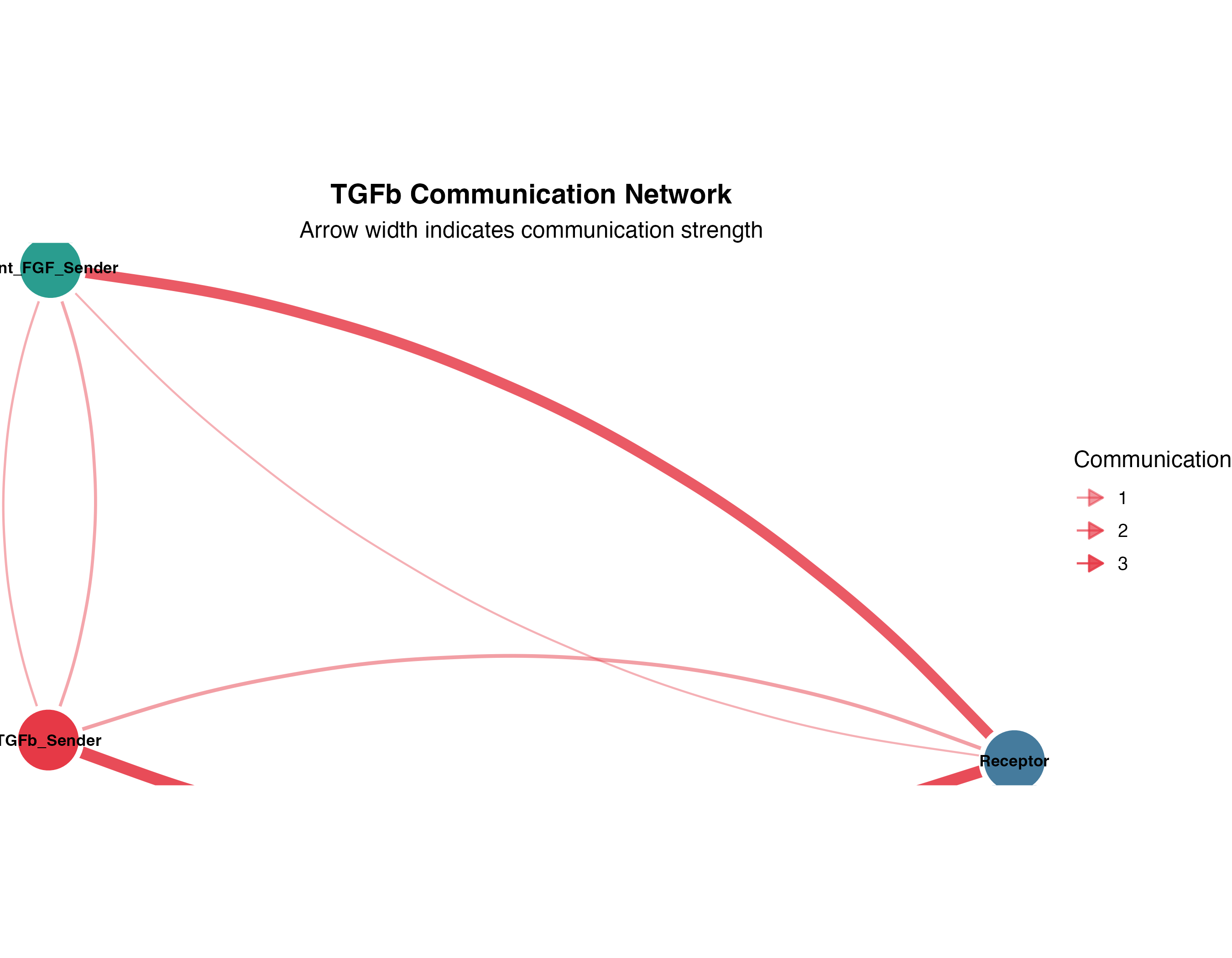
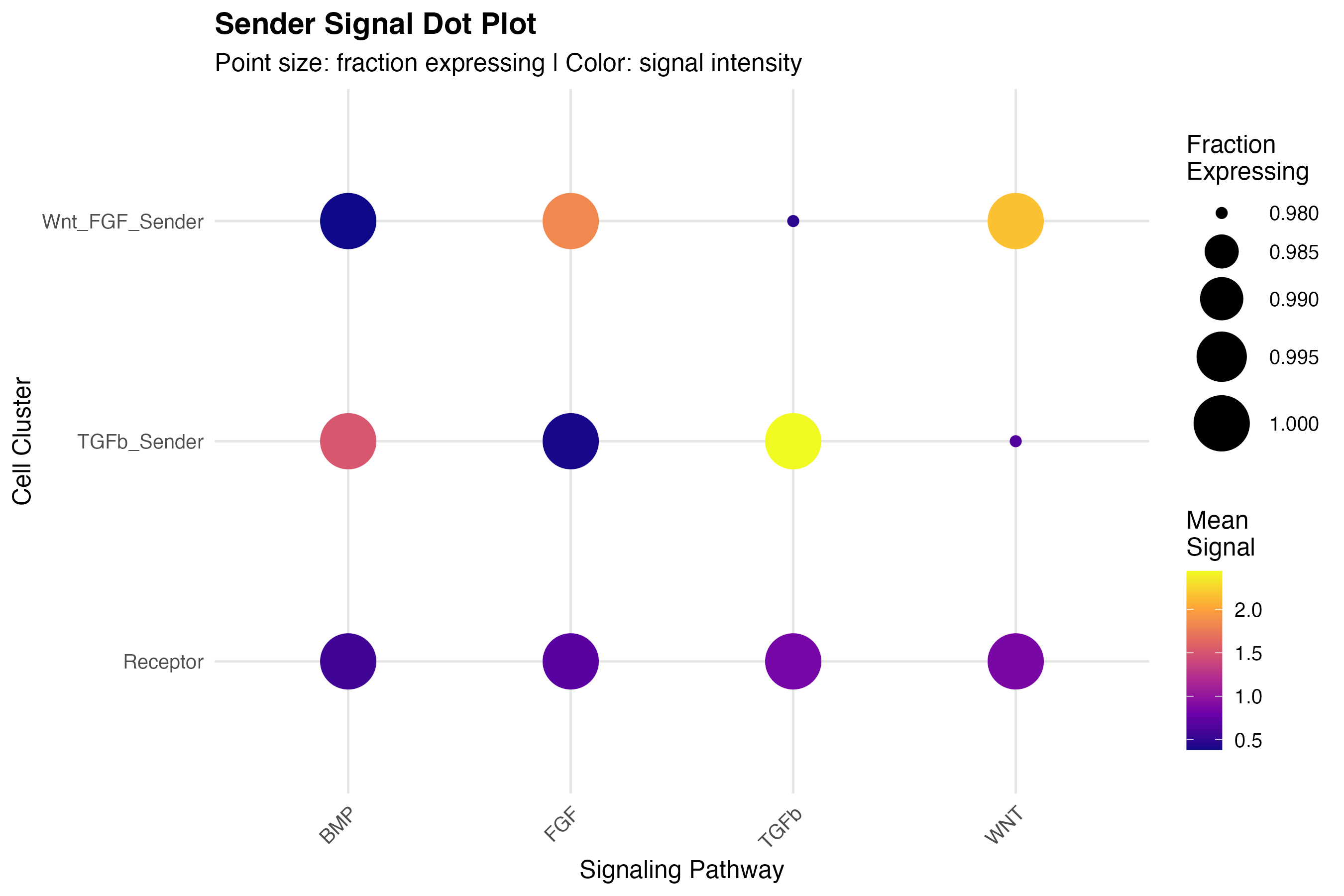
4. Multi-Pathway Comparisons
4.1 Dot Plot
# Prepare data for all pathways (sender_sum prepared above)
pathways <- c("TGFb", "WNT", "FGF", "BMP")

# Long format for all pathways
dotplot_df <- do.call(rbind, lapply(pathways, function(pw) {
  if (pw %in% colnames(sender_sum)) {
    data.frame(
      cluster = coords_plot$cluster,
      pathway = pw,
      signal = sender_sum[[pw]]
    )
  }
}))

# Aggregate by cluster and pathway
agg_df <- aggregate(signal ~ cluster + pathway, dotplot_df,
                   FUN = function(x) c(mean = mean(x), pct = mean(x > 0)))
agg_df <- do.call(data.frame, agg_df)
names(agg_df) <- c("cluster", "pathway", "mean_signal", "pct_expressing")
agg_df$pct_expressing <- pmin(agg_df$pct_expressing, 1)

ggplot(agg_df, aes(x = pathway, y = cluster)) +
  geom_point(aes(size = pct_expressing, color = mean_signal)) +
  scale_size_continuous(range = c(2, 12), name = "Fraction\nExpressing") +
  scale_color_viridis_c(option = "plasma", name = "Mean\nSignal") +
  labs(title = "Sender Signal Dot Plot",
       subtitle = "Point size: fraction expressing | Color: signal intensity",
       x = "Signaling Pathway", y = "Cell Cluster") +
  theme_minimal(base_size = 12) +
  theme(
    panel.grid.major = element_line(color = "gray90"),
    axis.text.x = element_text(angle = 45, hjust = 1),
    plot.title = element_text(face = "bold")
  )
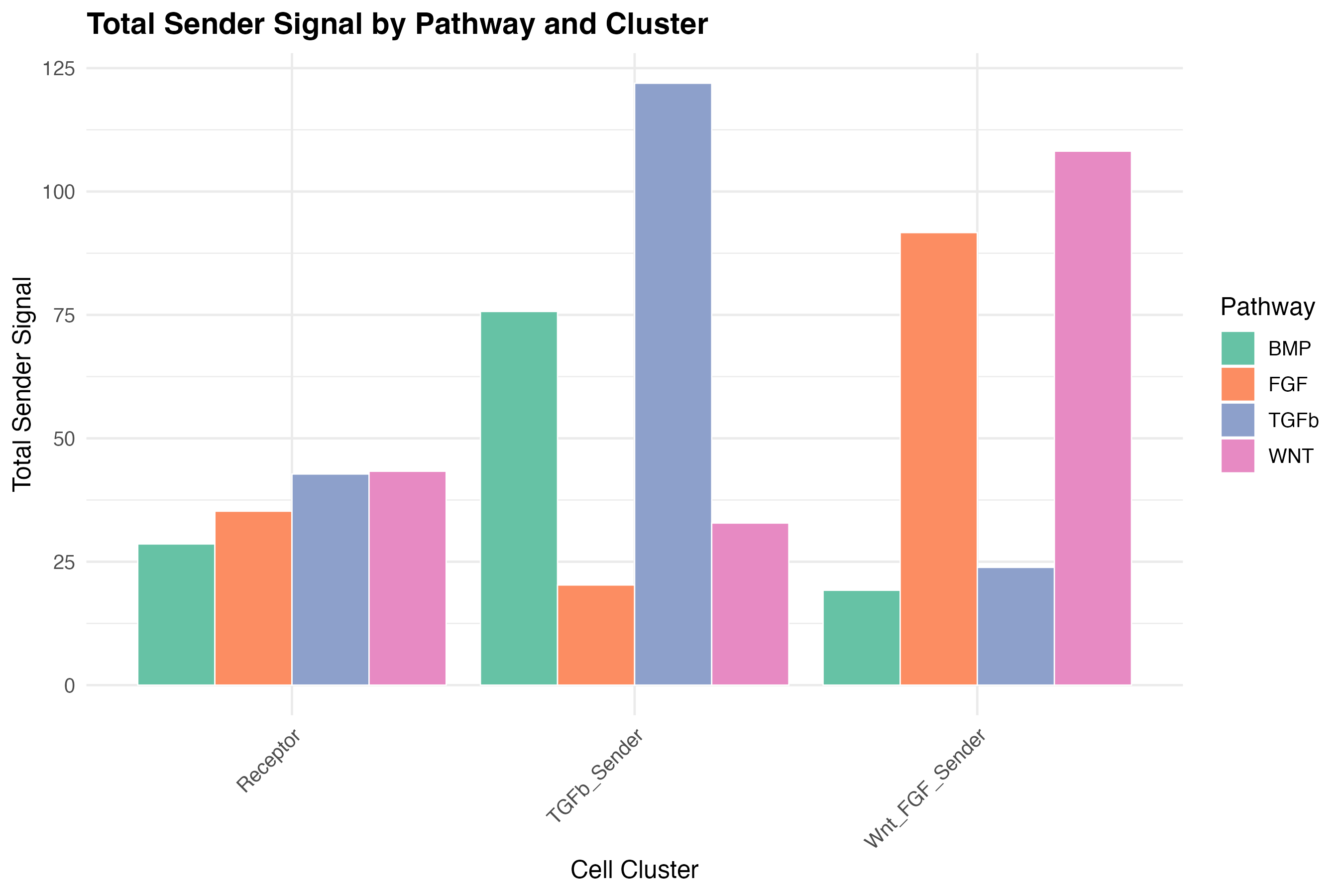
4.2 Bar Plot Comparison
# Calculate total signal per cluster per pathway
bar_df <- aggregate(signal ~ cluster + pathway, dotplot_df, sum)

ggplot(bar_df, aes(x = cluster, y = signal, fill = pathway)) +
  geom_bar(stat = "identity", position = "dodge", color = "white", linewidth = 0.3) +
  scale_fill_brewer(palette = "Set2", name = "Pathway") +
  labs(title = "Total Sender Signal by Pathway and Cluster",
       x = "Cell Cluster", y = "Total Sender Signal") +
  theme_minimal(base_size = 12) +
  theme(
    axis.text.x = element_text(angle = 45, hjust = 1),
    plot.title = element_text(face = "bold")
  )
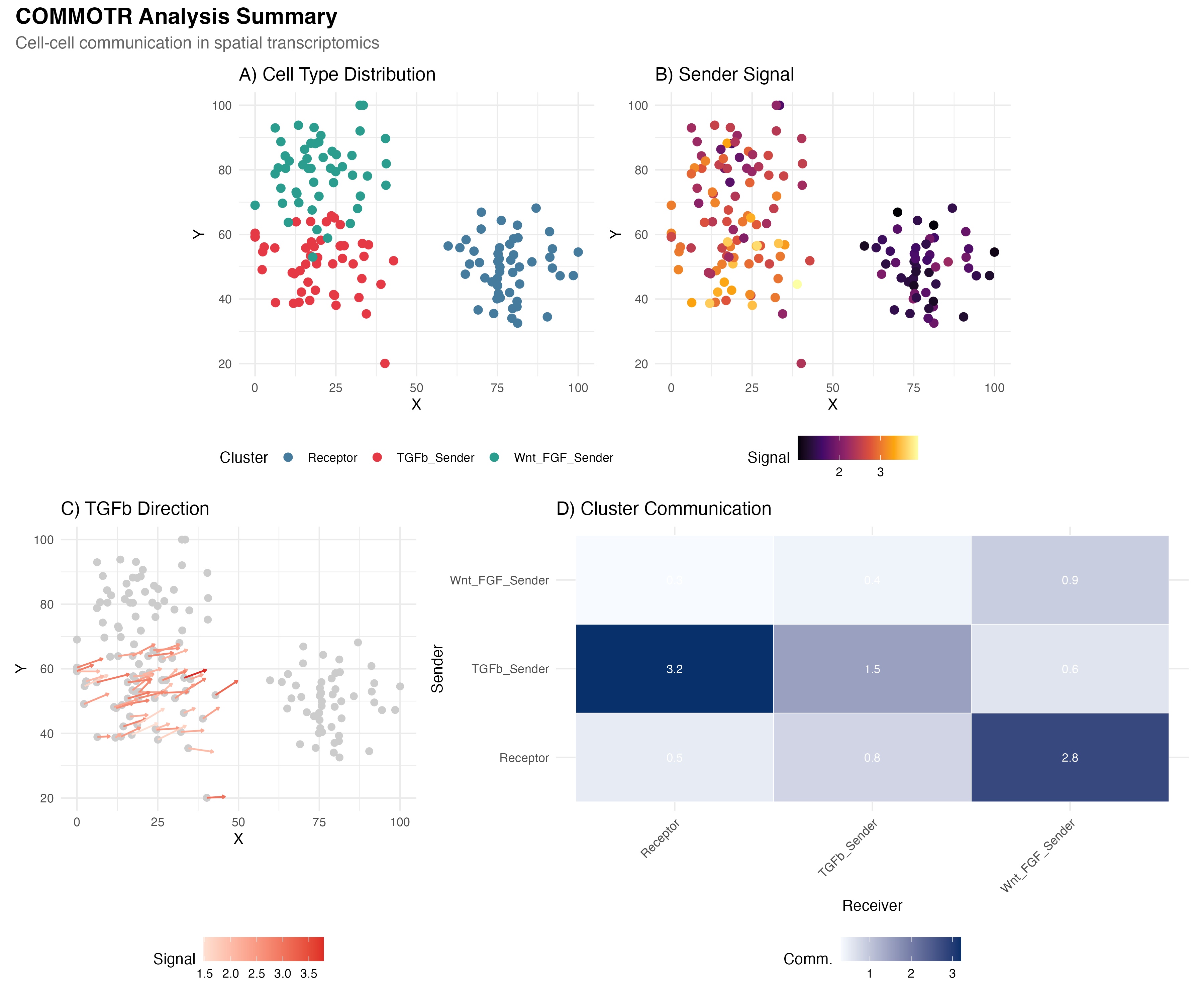
5. Publication-Ready Combined Figure
library(patchwork)

# Panel A: Spatial clusters
p_a <- ggplot(coords_plot, aes(x = spatial_1, y = spatial_2)) +
  geom_point(aes(color = cluster), size = 2.5) +
  scale_color_manual(values = cluster_colors, name = "Cluster") +
  labs(title = "A) Cell Type Distribution", x = "X", y = "Y") +
  theme_minimal() +
  theme(legend.position = "bottom") +
  coord_fixed()

# Panel B: Sender signal
p_b <- ggplot(coords_plot, aes(x = spatial_1, y = spatial_2)) +
  geom_point(aes(color = sender_signal), size = 2.5) +
  scale_color_viridis_c(option = "inferno", name = "Signal") +
  labs(title = "B) Sender Signal", x = "X", y = "Y") +
  theme_minimal() +
  theme(legend.position = "bottom") +
  coord_fixed()

# Panel C: Vector field (simplified)
p_c <- ggplot() +
  geom_point(data = coords_plot, aes(x = spatial_1, y = spatial_2),
             color = "gray80", size = 2) +
  geom_segment(data = arrow_df_filtered[1:min(50, nrow(arrow_df_filtered)), ],
               aes(x = x, y = y, xend = x + vx, yend = y + vy, color = signal),
               arrow = arrow(length = unit(0.08, "cm")), linewidth = 0.6) +
  scale_color_gradient(low = "#fee0d2", high = "#de2d26", name = "Signal") +
  labs(title = "C) TGFb Direction", x = "X", y = "Y") +
  theme_minimal() +
  theme(legend.position = "bottom") +
  coord_fixed()

# Panel D: Cluster heatmap
p_d <- ggplot(heatmap_df, aes(x = Receiver, y = Sender)) +
  geom_tile(aes(fill = Communication), color = "white") +
  geom_text(aes(label = round(Communication, 1)), color = "white", size = 3) +
  scale_fill_gradient(low = "#f7fbff", high = "#08306b", name = "Comm.") +
  labs(title = "D) Cluster Communication") +
  theme_minimal() +
  theme(axis.text.x = element_text(angle = 45, hjust = 1),
        legend.position = "bottom")

# Combine
(p_a | p_b) / (p_c | p_d) +
  plot_annotation(
    title = "COMMOTR Analysis Summary",
    subtitle = "Cell-cell communication in spatial transcriptomics",
    theme = theme(
      plot.title = element_text(face = "bold", size = 16),
      plot.subtitle = element_text(size = 12, color = "gray40")
    )
  )
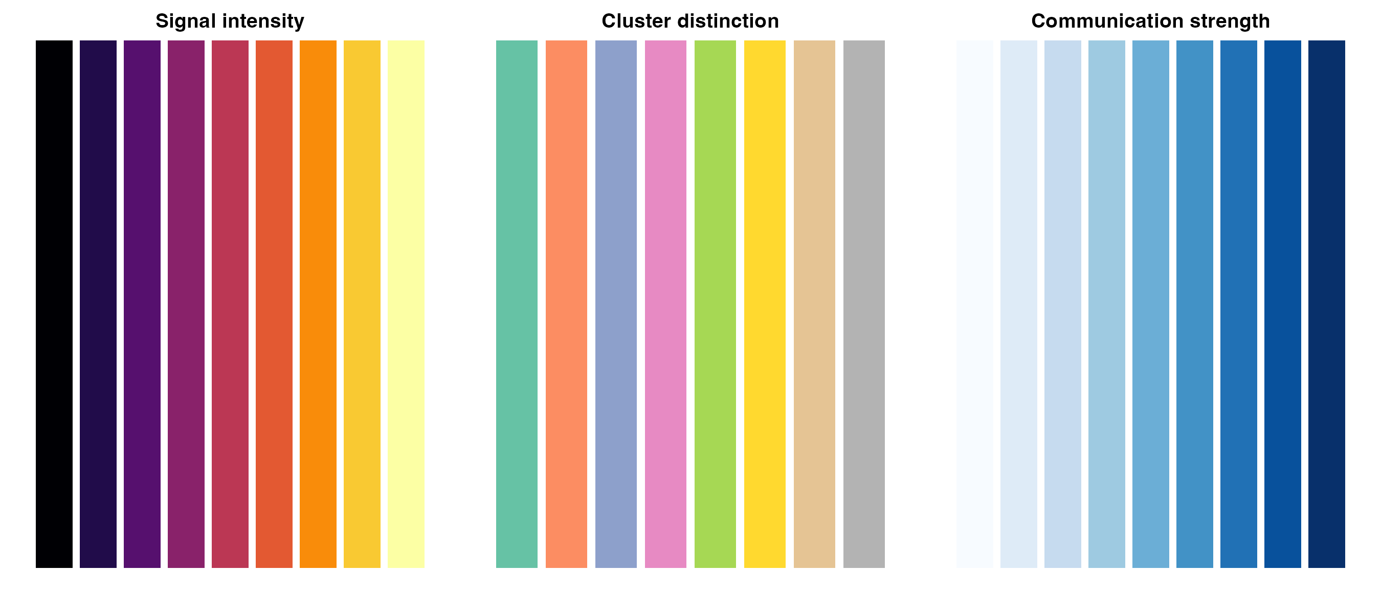
Customization Tips
Color Palettes
# Recommended palettes for communication analysis
palettes <- list(
  "Signal intensity" = viridis::inferno(9),
  "Cluster distinction" = RColorBrewer::brewer.pal(8, "Set2"),
  "Communication strength" = RColorBrewer::brewer.pal(9, "Blues")
)

par(mfrow = c(1, 3), mar = c(2, 1, 2, 1))
for (name in names(palettes)) {
  barplot(rep(1, length(palettes[[name]])), col = palettes[[name]],
          border = NA, main = name, axes = FALSE)
}
Export Settings
For publication-quality figures:
# High-resolution PNG
ggsave("figure.png", width = 10, height = 8, dpi = 300)

# Vector format (PDF)
ggsave("figure.pdf", width = 10, height = 8)

# For journals requiring specific dimensions
ggsave("figure_nature.pdf", width = 180, height = 150, units = "mm")
Developed by Zaoqu Liu | GitHub | liuzaoqu@163.com