Visualization Guide
Zaoqu Liu
2026-01-23
Source:vignettes/visualization-guide.Rmd
visualization-guide.RmdOverview
MultiK provides rich visualizations to aid in the interpretation of clustering results. This vignette demonstrates the various plots and how to interpret them.
1. Diagnostic Plots (DiagMultiKPlot)
The DiagMultiKPlot() function generates a three-panel
figure for optimal K selection.
1.1 K Frequency Distribution
set.seed(42)
df <- data.frame(
  K = factor(rep(2:7, times = c(15, 80, 150, 90, 50, 15)))
)

ggplot(df, aes(x = K)) +
  geom_bar(fill = "#4A90D9", color = "black", width = 0.7) +
  geom_hline(yintercept = 100, linetype = "dashed", color = "red", linewidth = 1) +
  geom_text(stat = "count", aes(label = after_stat(count)), vjust = -0.5, size = 4) +
  labs(x = "Number of Clusters (K)",
       y = "Frequency",
       title = "Distribution of K Values",
       subtitle = "Higher frequency indicates more consistent K across resolutions\nRed line = 100 threshold") +
  theme_bw(base_size = 14) +
  theme(plot.title = element_text(face = "bold"),
        panel.grid.minor = element_blank())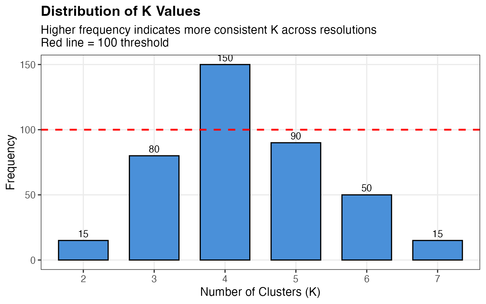
K frequency distribution across resolution parameters.
Interpretation:
- X-axis: Different K values encountered
- Y-axis: Number of times each K was observed
- Ideal pattern: Clear peak at a single K
- Red dashed line at 100 indicates a reasonable frequency threshold
1.2 Relative PAC (rPAC)
df_pac <- data.frame(
  K = factor(2:7),
  rPAC = c(0.15, 0.08, 0.25, 0.40, 0.65, 1.0)
)

ggplot(df_pac, aes(x = K, y = rPAC)) +
  geom_col(fill = "#E74C3C", color = "black", width = 0.7) +
  geom_point(size = 3) +
  geom_line(aes(group = 1), linewidth = 1) +
  geom_text(aes(label = sprintf("%.2f", rPAC)), vjust = -0.5, size = 4) +
  labs(x = "Number of Clusters (K)",
       y = "Relative PAC (rPAC)",
       title = "Clustering Stability Assessment",
       subtitle = "Lower rPAC indicates more stable clustering") +
  ylim(0, 1.1) +
  theme_bw(base_size = 14) +
  theme(plot.title = element_text(face = "bold"),
        panel.grid.minor = element_blank())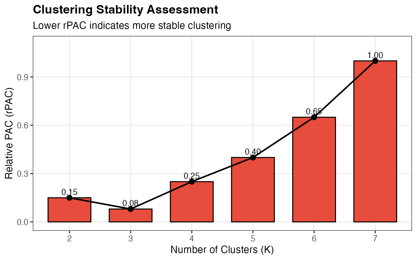
Relative PAC scores for each K.
Interpretation:
- Low rPAC (close to 0): Stable clustering
- High rPAC (close to 1): Unstable clustering
- Optimal K: Combines low rPAC with high frequency
1.3 Frequency vs. Stability Trade-off
df_trade <- data.frame(
  K = factor(2:7),
  stability = c(0.85, 0.92, 0.75, 0.60, 0.35, 0.0),
  frequency = c(15, 80, 150, 90, 50, 15)
)

# Find Pareto optimal
pareto_idx <- c()
for (i in 1:nrow(df_trade)) {
  dominated <- FALSE
  for (j in 1:nrow(df_trade)) {
    if (i != j) {
      if (df_trade$stability[j] >= df_trade$stability[i] &&
          df_trade$frequency[j] >= df_trade$frequency[i] &&
          (df_trade$stability[j] > df_trade$stability[i] ||
           df_trade$frequency[j] > df_trade$frequency[i])) {
        dominated <- TRUE
        break
      }
    }
  }
  if (!dominated) pareto_idx <- c(pareto_idx, i)
}
df_trade$optimal <- 1:6 %in% pareto_idx

ggplot(df_trade, aes(x = stability, y = frequency)) +
  geom_point(aes(color = optimal), size = 6) +
  geom_path(data = df_trade[order(df_trade$stability), ],
            linetype = 2, alpha = 0.5, linewidth = 0.8) +
  geom_text(aes(label = paste0("K=", K)), vjust = -1.2, size = 4.5, fontface = "bold") +
  geom_hline(yintercept = 100, linetype = "dashed", color = "gray50") +
  scale_color_manual(values = c("FALSE" = "gray50", "TRUE" = "#E74C3C"),
                     labels = c("FALSE" = "Dominated", "TRUE" = "Pareto Optimal"),
                     name = "") +
  labs(x = "Stability (1 - rPAC)",
       y = "Frequency",
       title = "K Selection: Frequency vs. Stability Trade-off",
       subtitle = "Red points = Pareto-optimal (recommended K values)") +
  theme_bw(base_size = 14) +
  theme(plot.title = element_text(face = "bold"),
        legend.position = "bottom")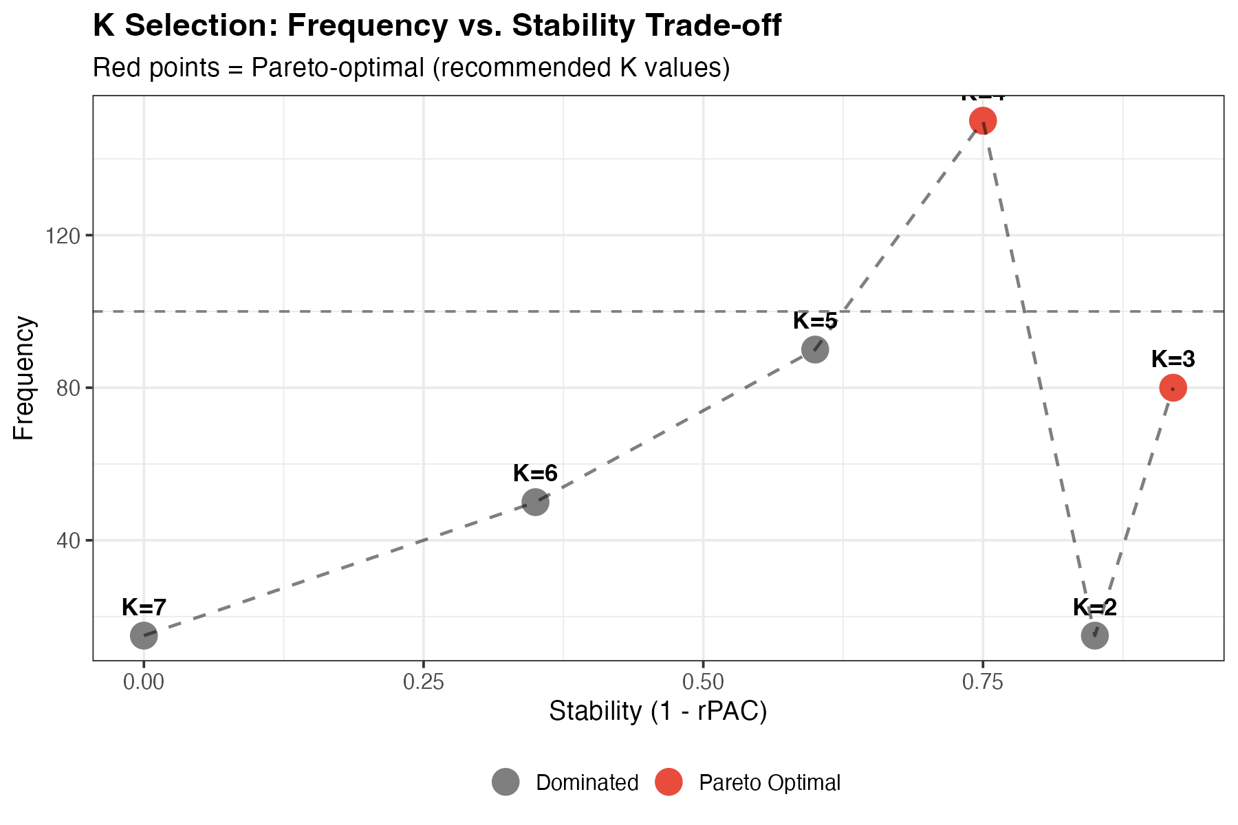
Multi-objective visualization for K selection.
Interpretation:
- Top-right corner: Ideal (high frequency, high stability)
- Pareto-optimal points are highlighted in red
- Recommended K: Red points represent the best trade-offs
2. SigClust Visualization (PlotSigClust)
The PlotSigClust() function displays cluster
relationships and statistical significance.
2.1 Hierarchical Dendrogram
# Create a conceptual dendrogram
df_dend <- data.frame(
  x = c(1, 3, 5, 2, 4),
  xend = c(1, 3, 5, 2, 4),
  y = c(0, 0, 0, 0.3, 0.3),
  yend = c(0.2, 0.25, 0.15, 0.5, 0.5),
  label = c("C1", "C2", "C3", NA, NA)
)

df_h <- data.frame(
  x = c(1, 3, 2, 4),
  xend = c(2, 2, 4, 4),
  y = c(0.2, 0.25, 0.5, 0.3),
  yend = c(0.3, 0.3, 0.5, 0.5)
)

df_points <- data.frame(
  x = c(2, 4),
  y = c(0.3, 0.5),
  sig = c(TRUE, FALSE)
)

ggplot() +
  # Vertical segments to leaves
  geom_segment(data = df_dend[1:3,], aes(x = x, y = y, xend = xend, yend = yend),
               linewidth = 1.5, color = "#2C3E50") +
  # Vertical segments to internal nodes
  geom_segment(data = df_dend[4:5,], aes(x = x, y = y, xend = xend, yend = yend),
               linewidth = 1.5, color = "#2C3E50") +
  # Horizontal connectors
  geom_segment(data = df_h, aes(x = x, y = y, xend = xend, yend = yend),
               linewidth = 1.5, color = "#2C3E50") +
  # Node points with significance
  geom_point(data = df_points, aes(x = x, y = y, fill = sig),
             shape = 21, size = 8, color = "black", stroke = 2) +
  # Leaf labels

  geom_text(data = df_dend[1:3,], aes(x = x, y = -0.05, label = label),
            size = 6, fontface = "bold") +
  # Legend annotations
  annotate("point", x = 5.5, y = 0.45, shape = 21, size = 6,
           fill = "black", color = "black") +
  annotate("text", x = 5.8, y = 0.45, label = "Significant (p < 0.05)",
           hjust = 0, size = 4) +
  annotate("point", x = 5.5, y = 0.35, shape = 21, size = 6,
           fill = "white", color = "black") +
  annotate("text", x = 5.8, y = 0.35, label = "Not significant",
           hjust = 0, size = 4) +
  scale_fill_manual(values = c("TRUE" = "black", "FALSE" = "white"), guide = "none") +
  scale_y_continuous(limits = c(-0.1, 0.6)) +
  scale_x_continuous(limits = c(0, 8)) +
  labs(title = "Cluster Dendrogram with SigClust Annotation",
       subtitle = "Node shape indicates statistical significance of cluster separation") +
  theme_void(base_size = 14) +
  theme(plot.title = element_text(face = "bold", hjust = 0.5),
        plot.subtitle = element_text(hjust = 0.5))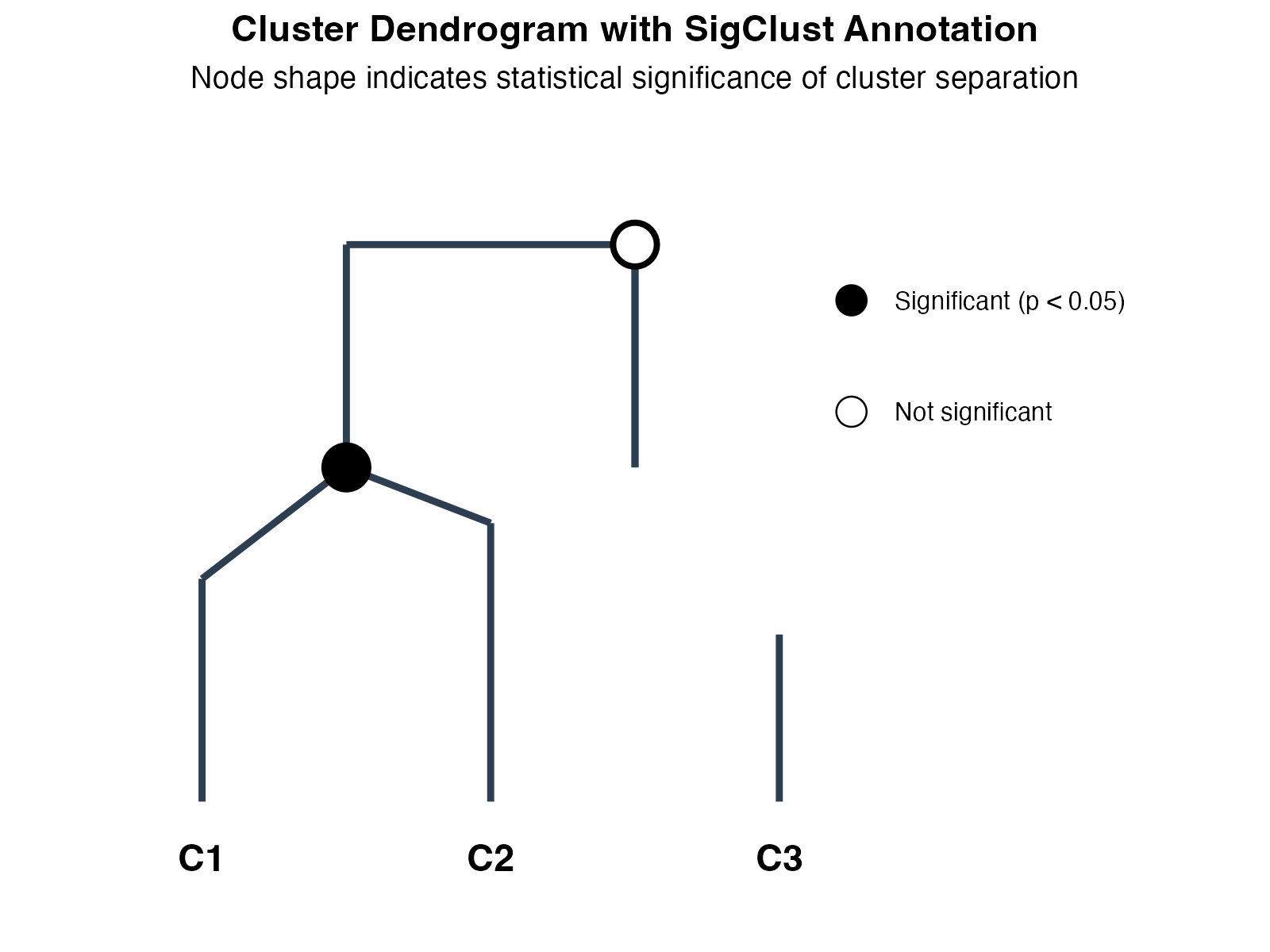
Cluster dendrogram with significance annotation.
Interpretation:
- Leaf nodes: Individual clusters (C1, C2, C3)
- Internal nodes: Cluster merges in hierarchy
- Filled circles (●): All pairwise tests significant (p < 0.05) - true distinct clusters
- Open circles (○): At least one non-significant comparison - potential subclasses
2.2 P-value Heatmap
mat <- matrix(c(NA, 0.001, 0.02, 0.035,
                0.001, NA, 0.08, 0.003,
                0.02, 0.08, NA, 0.012,
                0.035, 0.003, 0.012, NA), 4, 4, byrow = TRUE)
rownames(mat) <- colnames(mat) <- paste0("Cluster", 1:4)

df_heat <- expand.grid(Cluster1 = factor(rownames(mat), levels = rownames(mat)),
                       Cluster2 = factor(colnames(mat), levels = colnames(mat)))
df_heat$pvalue <- as.vector(mat)

ggplot(df_heat, aes(x = Cluster1, y = Cluster2, fill = pvalue)) +
  geom_tile(color = "white", linewidth = 1.5) +
  geom_text(aes(label = ifelse(is.na(pvalue), "-", sprintf("%.3f", pvalue))),
            size = 5, fontface = "bold") +
  scale_fill_gradient2(low = "#27AE60", mid = "#F1C40F", high = "#E74C3C",
                       midpoint = 0.05, limits = c(0, 0.1),
                       na.value = "grey85",
                       name = "P-value") +
  labs(x = "", y = "",
       title = "Pairwise SigClust P-values",
       subtitle = "Green = significant separation (p < 0.05), Red = similar clusters") +
  coord_fixed() +
  theme_minimal(base_size = 14) +
  theme(plot.title = element_text(face = "bold"),
        panel.grid = element_blank(),
        axis.text = element_text(size = 12, face = "bold"))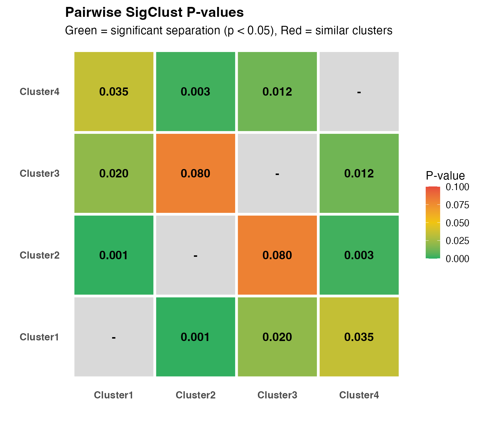
Pairwise SigClust p-value heatmap.
Interpretation:
- Green cells (p < 0.05): Significantly different clusters
- Yellow cells (p ≈ 0.05): Borderline significance
- Red cells (p > 0.05): Similar clusters (consider merging)
- Diagonal: NA (self-comparison)
3. Consensus Matrix Visualization
3.1 Understanding the Consensus Matrix
set.seed(42)

# Good clustering
n <- 30
blocks_good <- c(rep(1, 10), rep(2, 10), rep(3, 10))
mat_good <- matrix(0, n, n)
for (i in 1:n) {
  for (j in 1:n) {
    if (blocks_good[i] == blocks_good[j]) {
      mat_good[i, j] <- runif(1, 0.9, 1.0)
    } else {
      mat_good[i, j] <- runif(1, 0, 0.1)
    }
  }
}
diag(mat_good) <- 1

# Ambiguous clustering
mat_bad <- matrix(runif(n*n, 0.3, 0.7), n, n)
mat_bad <- (mat_bad + t(mat_bad)) / 2
diag(mat_bad) <- 1

# Create data frames
df_good <- expand.grid(Cell1 = 1:n, Cell2 = 1:n)
df_good$value <- as.vector(mat_good)
df_good$type <- "A) Clear Clusters (Low PAC)"

df_bad <- expand.grid(Cell1 = 1:n, Cell2 = 1:n)
df_bad$value <- as.vector(mat_bad)
df_bad$type <- "B) Ambiguous Clustering (High PAC)"

df_all <- rbind(df_good, df_bad)

ggplot(df_all, aes(x = Cell1, y = Cell2, fill = value)) +
  geom_tile() +
  scale_fill_gradient2(low = "#3498DB", mid = "white", high = "#E74C3C",
                       midpoint = 0.5, limits = c(0, 1),
                       name = "Co-clustering\nProbability") +
  facet_wrap(~type, ncol = 2) +
  labs(x = "Cell Index", y = "Cell Index") +
  coord_fixed() +
  theme_minimal(base_size = 12) +
  theme(strip.text = element_text(face = "bold", size = 12),
        panel.grid = element_blank())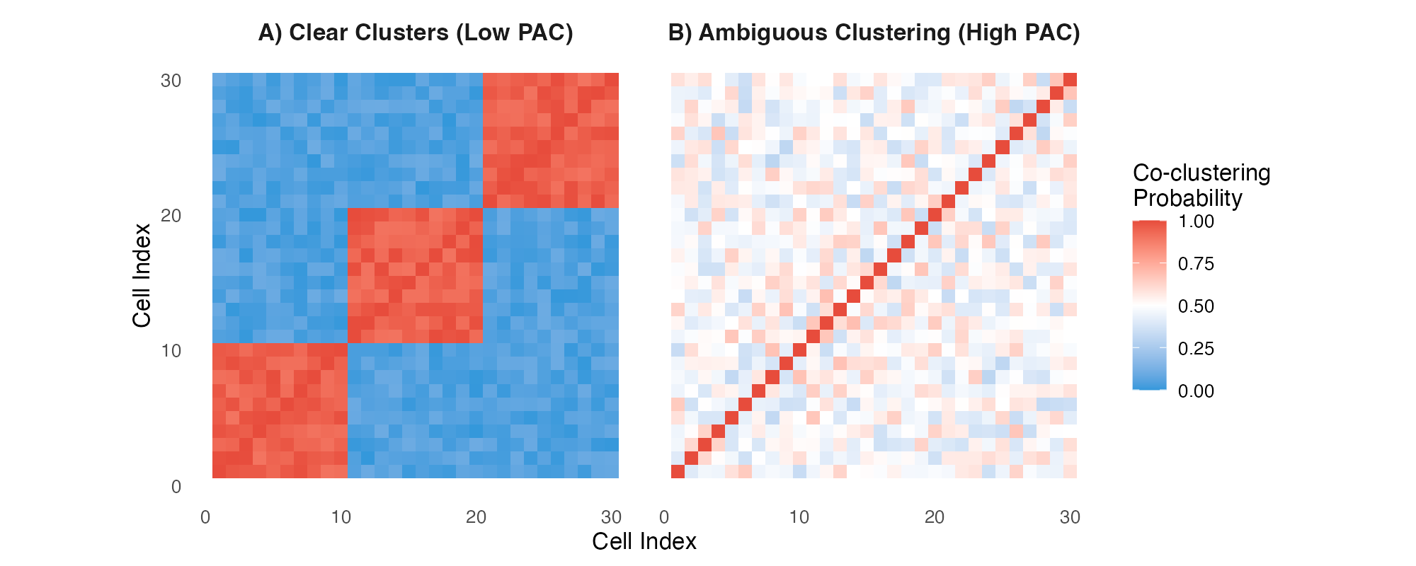
Consensus matrices: (A) Well-separated clusters, (B) Ambiguous clustering.
Interpretation:
- Panel A: Clear block-diagonal structure = well-separated clusters (low PAC)
- Panel B: Diffuse pattern = ambiguous clustering (high PAC)
- Red blocks: Cells consistently cluster together
- Blue regions: Cells never cluster together
4. Color Schemes
MultiK uses a consistent, colorblind-friendly palette:
colors <- c("#4A90D9", "#E74C3C", "#27AE60", "#F1C40F", "#9B59B6", "#1ABC9C")
names_col <- c("Primary\n(Blue)", "Alert\n(Red)", "Success\n(Green)",
               "Warning\n(Yellow)", "Accent\n(Purple)", "Teal")

df_colors <- data.frame(
  x = 1:6,
  color = colors,
  name = names_col
)

ggplot(df_colors, aes(x = x, y = 1, fill = color)) +
  geom_tile(width = 0.9, height = 0.6, color = "black", linewidth = 1) +
  geom_text(aes(label = name), y = 0.3, size = 3.5, lineheight = 0.9) +
  geom_text(aes(label = color), y = 1.5, size = 3, family = "mono") +
  scale_fill_identity() +
  theme_void() +
  coord_cartesian(ylim = c(-0.2, 2)) +
  labs(title = "MultiK Color Palette") +
  theme(plot.title = element_text(face = "bold", hjust = 0.5, size = 14))
5. Publication-Ready Figures
5.1 Saving Figures
# Generate plot
p <- DiagMultiKPlot(result$k, result$consensus)

# High-resolution PNG for presentations
ggsave("multik_diagnostic.png", p, width = 12, height = 4, dpi = 300)

# Vector PDF for publications
ggsave("multik_diagnostic.pdf", p, width = 12, height = 4)

# TIFF for journal submission
ggsave("multik_diagnostic.tiff", p, width = 12, height = 4, dpi = 600,
       compression = "lzw")