Introduction
This vignette demonstrates various ways to visualize SCENT results for publication-quality figures.
library(SCENT)
library(ggplot2)
library(viridis)

# Load data
data(net13Jun12.m)

# Simulate data with known structure
set.seed(2024)
n_genes <- 5500

# Create 3 cell populations with different potency levels
n_per_group <- 50

# High potency (stem-like): broad expression
exp_high <- matrix(rpois(n_genes * n_per_group, 5), nrow = n_genes)

# Medium potency: intermediate
exp_med <- matrix(rpois(n_genes * n_per_group, 3), nrow = n_genes)
exp_med[1:1000, ] <- rpois(1000 * n_per_group, 10)

# Low potency (differentiated): focused expression
exp_low <- matrix(rpois(n_genes * n_per_group, 2), nrow = n_genes)
exp_low[1:500, ] <- rpois(500 * n_per_group, 20)

# Combine
exp_all <- cbind(exp_high, exp_med, exp_low)
rownames(exp_all) <- head(rownames(net13Jun12.m), n_genes)
colnames(exp_all) <- paste0("Cell_", 1:ncol(exp_all))

# Cell annotations
cell_groups <- factor(
  rep(c("High Potency", "Medium Potency", "Low Potency"), each = n_per_group),
  levels = c("High Potency", "Medium Potency", "Low Potency")
)

# Compute scores
integ <- DoIntegPPI(exp_all, net13Jun12.m)
sr <- CompSRana(integ, local = TRUE)
ccat <- CompCCAT(exp_all, net13Jun12.m)

# Create data frame
df <- data.frame(
  Cell = colnames(exp_all),
  Group = cell_groups,
  SR = sr$SR,
  CCAT = ccat
)

cat("Data prepared:", nrow(df), "cells in", length(unique(df$Group)), "groups\n")
#> Data prepared: 150 cells in 3 groups
1. Distribution Plots
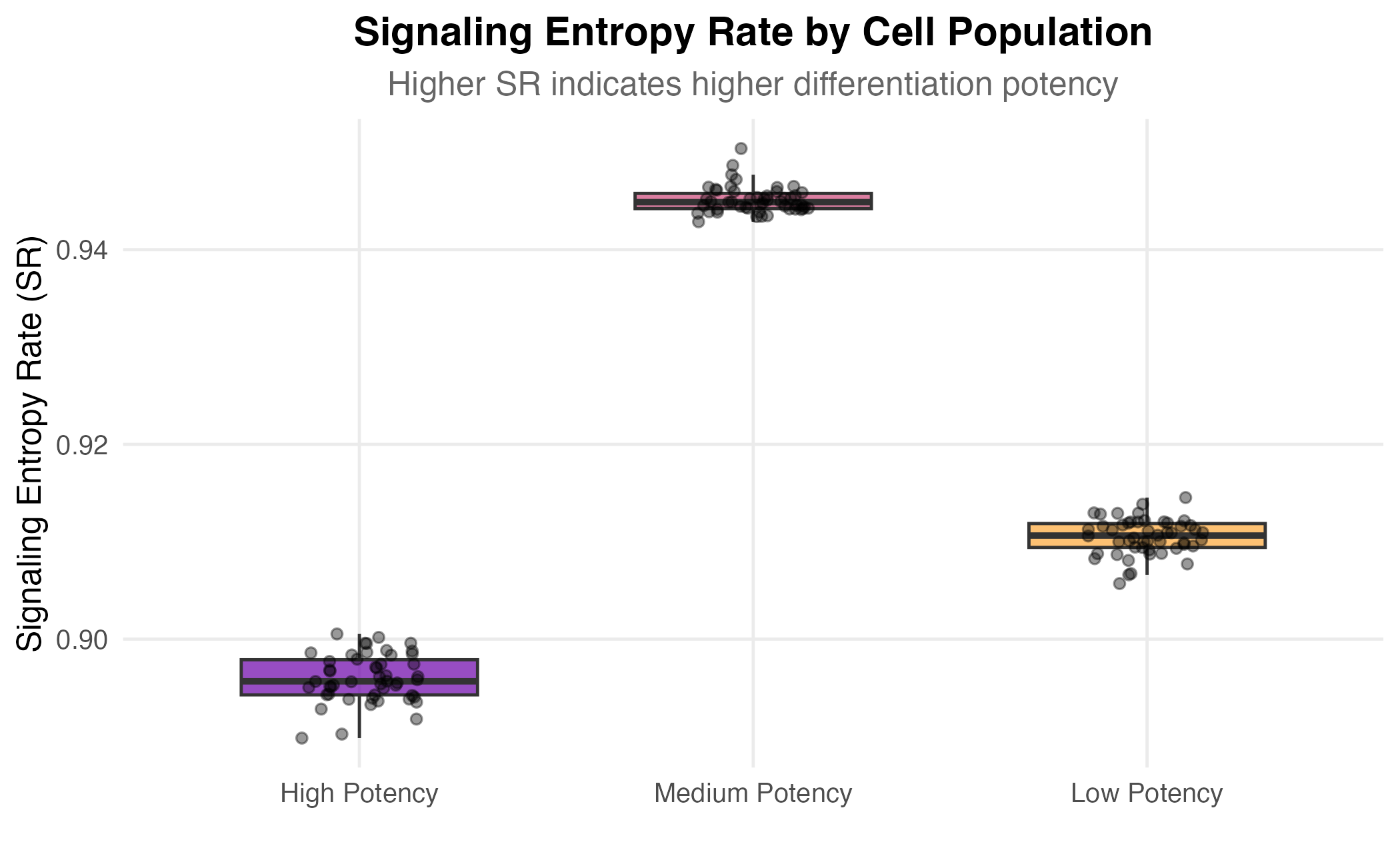
Box Plot with Individual Points
ggplot(df, aes(x = Group, y = SR, fill = Group)) +
  geom_boxplot(alpha = 0.7, outlier.shape = NA, width = 0.6) +
  geom_jitter(width = 0.15, alpha = 0.4, size = 1.5) +
  scale_fill_viridis_d(option = "plasma", begin = 0.2, end = 0.8) +
  labs(
    title = "Signaling Entropy Rate by Cell Population",
    subtitle = "Higher SR indicates higher differentiation potency",
    x = "",
    y = "Signaling Entropy Rate (SR)"
  ) +
  theme_minimal(base_size = 12) +
  theme(
    plot.title = element_text(face = "bold", hjust = 0.5),
    plot.subtitle = element_text(hjust = 0.5, color = "gray40"),
    legend.position = "none",
    panel.grid.minor = element_blank()
  )
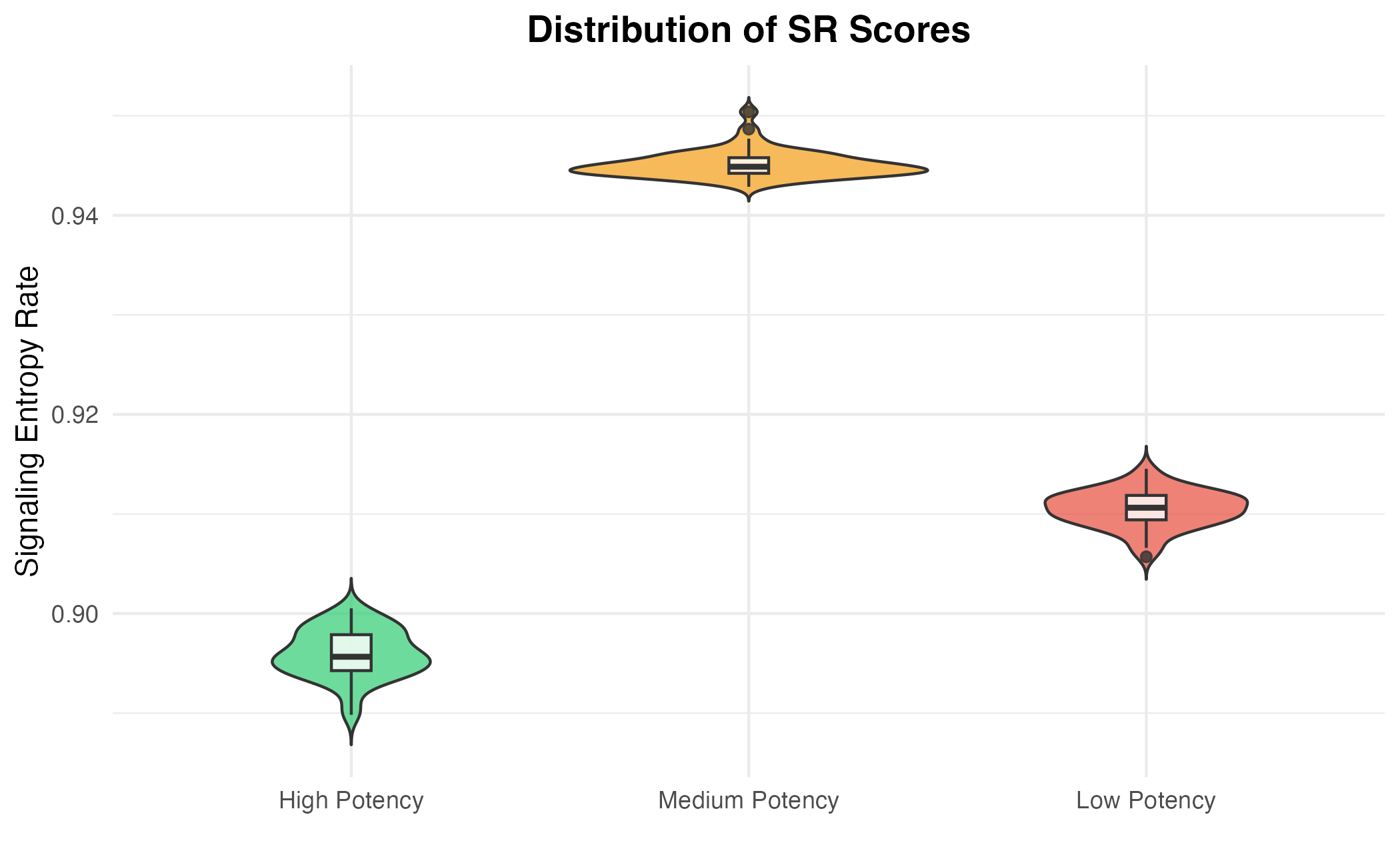
Violin Plot
ggplot(df, aes(x = Group, y = SR, fill = Group)) +
  geom_violin(alpha = 0.7, trim = FALSE) +
  geom_boxplot(width = 0.1, fill = "white", alpha = 0.8) +
  scale_fill_manual(values = c("#2ecc71", "#f39c12", "#e74c3c")) +
  labs(
    title = "Distribution of SR Scores",
    x = "",
    y = "Signaling Entropy Rate"
  ) +
  theme_minimal() +
  theme(
    plot.title = element_text(face = "bold", hjust = 0.5),
    legend.position = "none"
  )
2. Scatter Plots
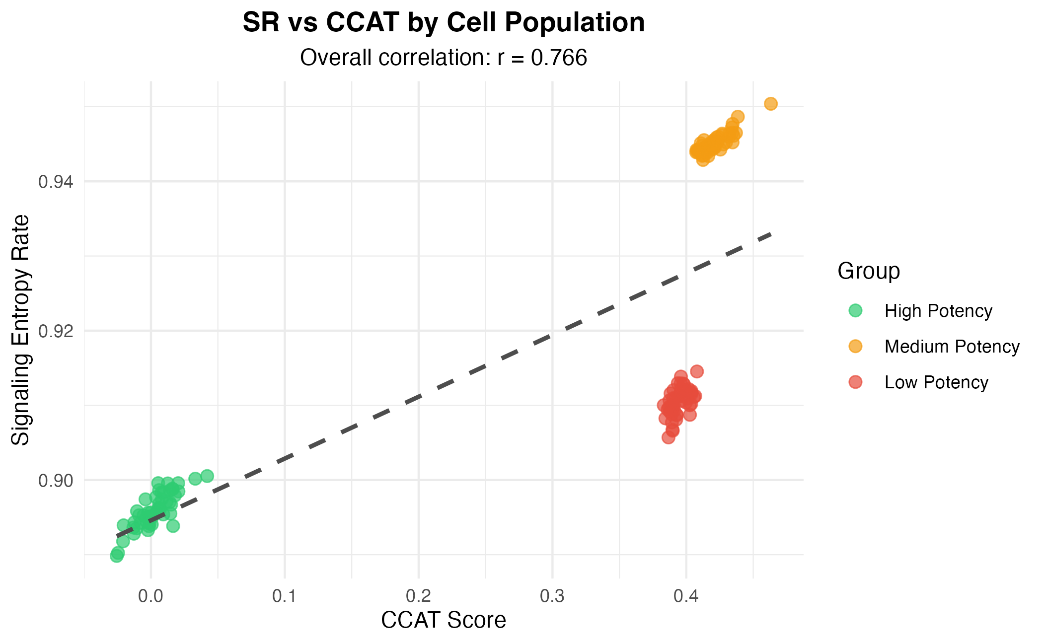
SR vs CCAT Correlation
ggplot(df, aes(x = CCAT, y = SR, color = Group)) +
  geom_point(alpha = 0.7, size = 2.5) +
  geom_smooth(method = "lm", se = FALSE, linetype = "dashed",
              aes(group = 1), color = "gray30") +
  scale_color_manual(values = c("#2ecc71", "#f39c12", "#e74c3c")) +
  labs(
    title = "SR vs CCAT by Cell Population",
    subtitle = paste("Overall correlation: r =",
                     round(cor(df$SR, df$CCAT), 3)),
    x = "CCAT Score",
    y = "Signaling Entropy Rate"
  ) +
  theme_minimal() +
  theme(
    plot.title = element_text(face = "bold", hjust = 0.5),
    plot.subtitle = element_text(hjust = 0.5),
    legend.position = "right"
  )
3. Density Plots
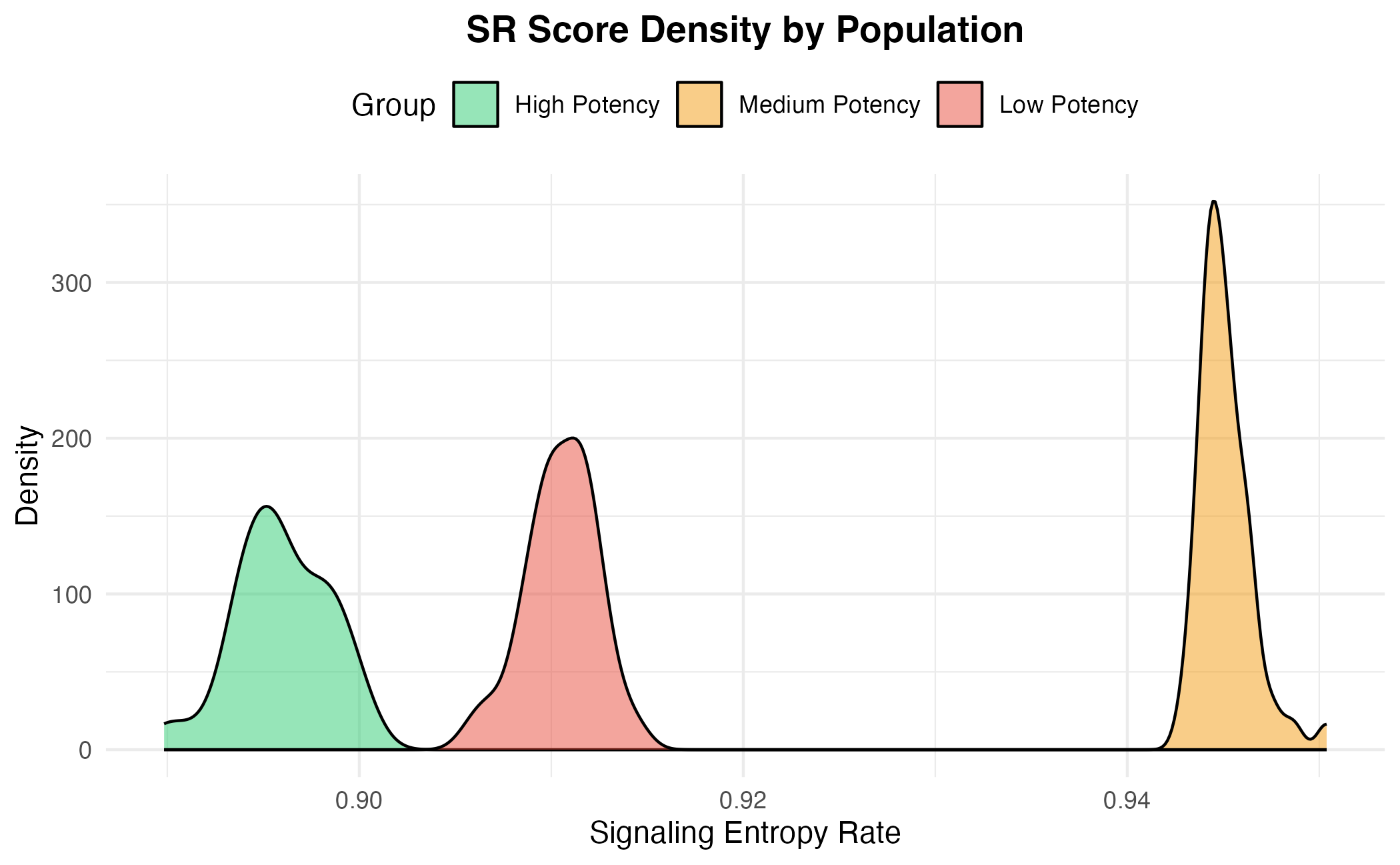
Overlapping Densities
ggplot(df, aes(x = SR, fill = Group)) +
  geom_density(alpha = 0.5) +
  scale_fill_manual(values = c("#2ecc71", "#f39c12", "#e74c3c")) +
  labs(
    title = "SR Score Density by Population",
    x = "Signaling Entropy Rate",
    y = "Density"
  ) +
  theme_minimal() +
  theme(
    plot.title = element_text(face = "bold", hjust = 0.5),
    legend.position = "top"
  )
Ridge Plot Style
ggplot(df, aes(x = SR, y = Group, fill = Group)) +
  geom_violin(scale = "width", trim = FALSE) +
  scale_fill_manual(values = c("#2ecc71", "#f39c12", "#e74c3c")) +
  labs(
    title = "SR Distribution Comparison",
    x = "Signaling Entropy Rate",
    y = ""
  ) +
  theme_minimal() +
  theme(
    plot.title = element_text(face = "bold", hjust = 0.5),
    legend.position = "none"
  ) +
  coord_flip()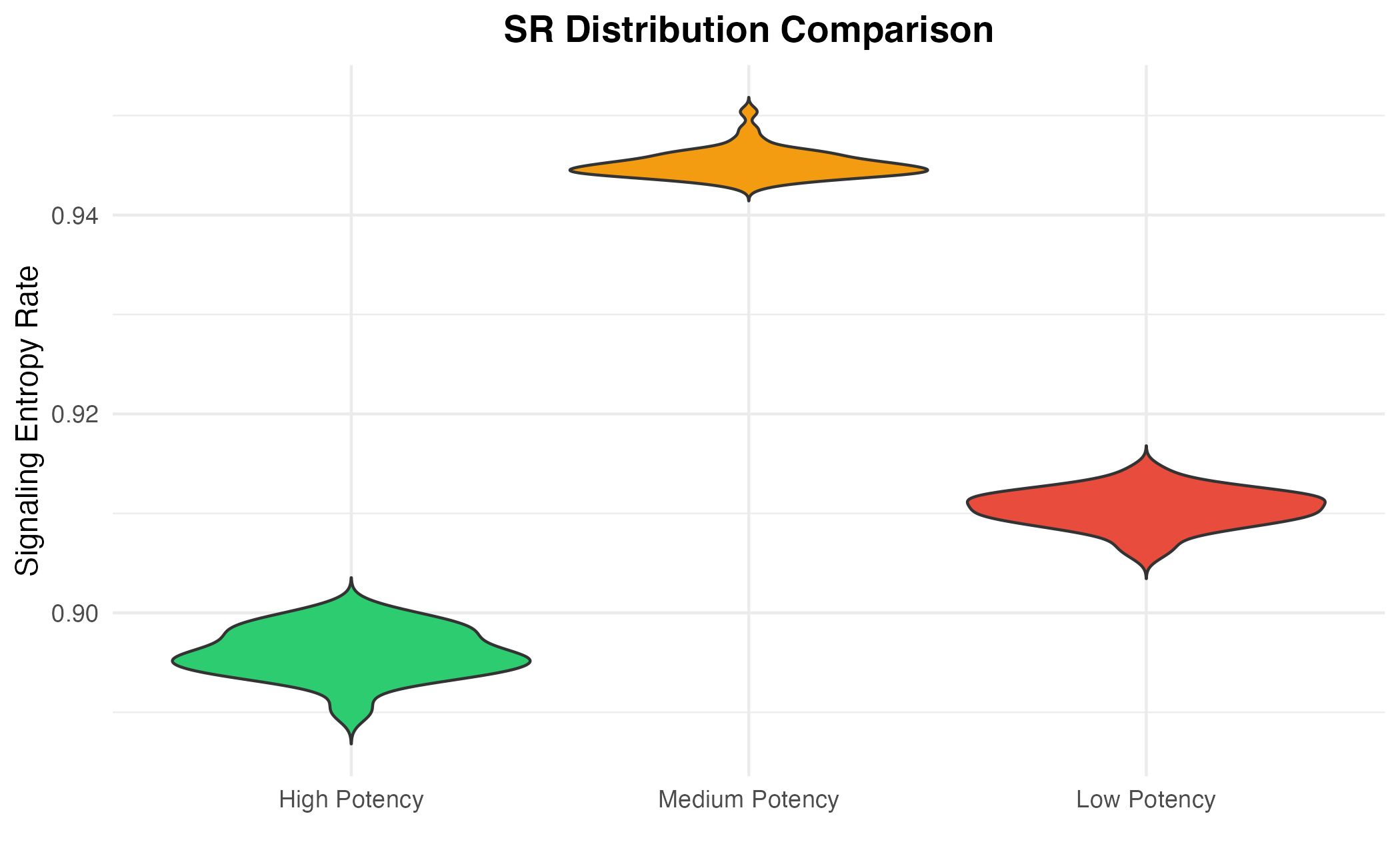
4. Statistical Comparison
# Pairwise comparisons
groups <- levels(df$Group)
cat("Statistical Comparisons (Wilcoxon test):\n\n")
#> Statistical Comparisons (Wilcoxon test):

for (i in 1:(length(groups)-1)) {
  for (j in (i+1):length(groups)) {
    g1 <- df$SR[df$Group == groups[i]]
    g2 <- df$SR[df$Group == groups[j]]
    test <- wilcox.test(g1, g2)
    cat(sprintf("%s vs %s: p = %.2e\n",
                groups[i], groups[j], test$p.value))
  }
}
#> High Potency vs Medium Potency: p = 7.07e-18
#> High Potency vs Low Potency: p = 7.07e-18
#> Medium Potency vs Low Potency: p = 7.07e-18
Significance Annotation
# Manual significance brackets
max_sr <- max(df$SR)

ggplot(df, aes(x = Group, y = SR, fill = Group)) +
  geom_boxplot(alpha = 0.7, outlier.shape = NA) +
  geom_jitter(width = 0.15, alpha = 0.3, size = 1) +
  scale_fill_manual(values = c("#2ecc71", "#f39c12", "#e74c3c")) +
  # Add significance annotations
  annotate("segment", x = 1, xend = 2, y = max_sr + 0.005, yend = max_sr + 0.005) +
  annotate("text", x = 1.5, y = max_sr + 0.008, label = "***", size = 5) +
  annotate("segment", x = 2, xend = 3, y = max_sr + 0.015, yend = max_sr + 0.015) +
  annotate("text", x = 2.5, y = max_sr + 0.018, label = "***", size = 5) +
  annotate("segment", x = 1, xend = 3, y = max_sr + 0.025, yend = max_sr + 0.025) +
  annotate("text", x = 2, y = max_sr + 0.028, label = "***", size = 5) +
  labs(
    title = "SR Differences Between Populations",
    subtitle = "*** p < 0.001 (Wilcoxon test)",
    x = "",
    y = "Signaling Entropy Rate"
  ) +
  theme_minimal() +
  theme(
    plot.title = element_text(face = "bold", hjust = 0.5),
    plot.subtitle = element_text(hjust = 0.5, color = "gray40"),
    legend.position = "none"
  ) +
  ylim(NA, max_sr + 0.035)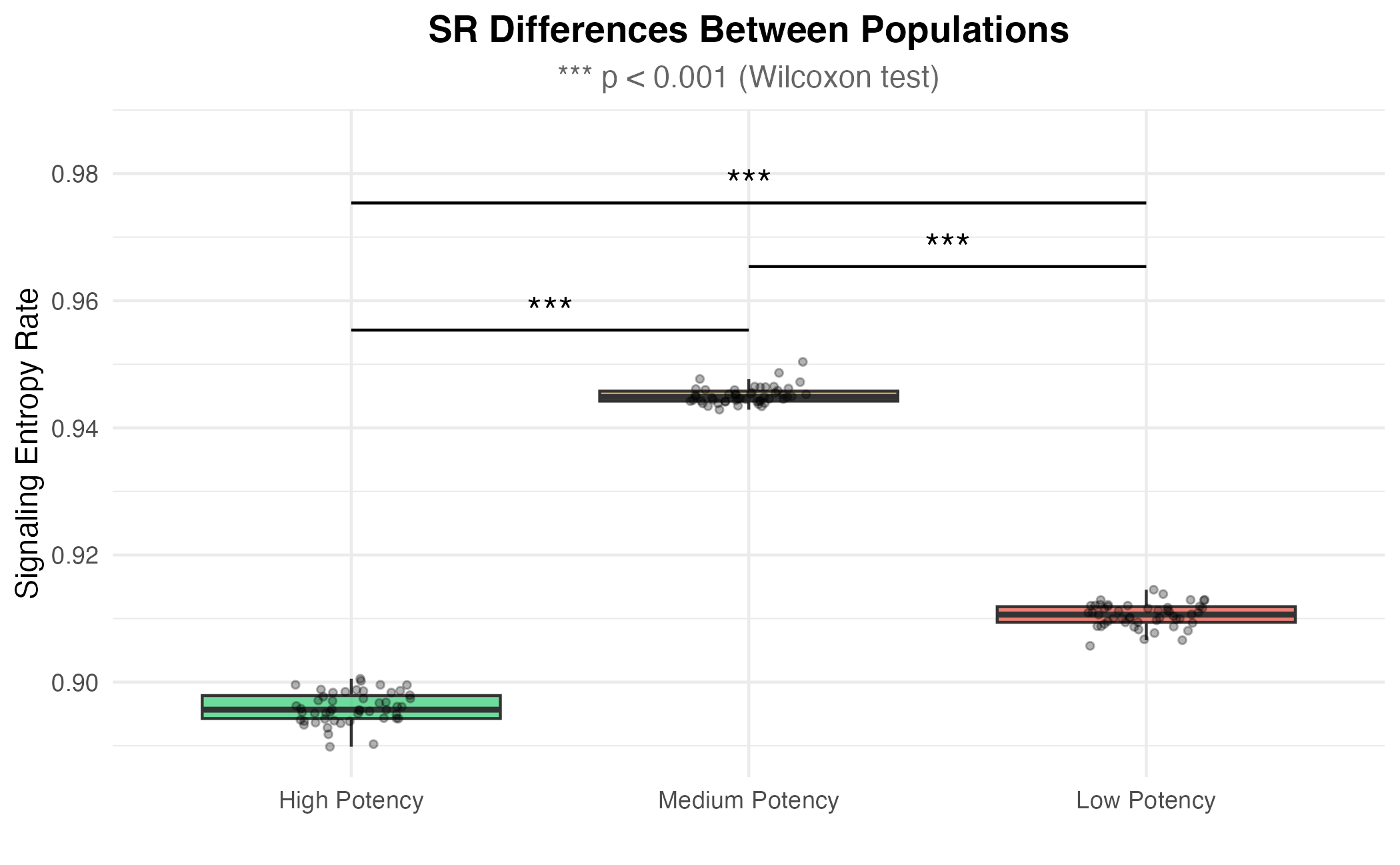
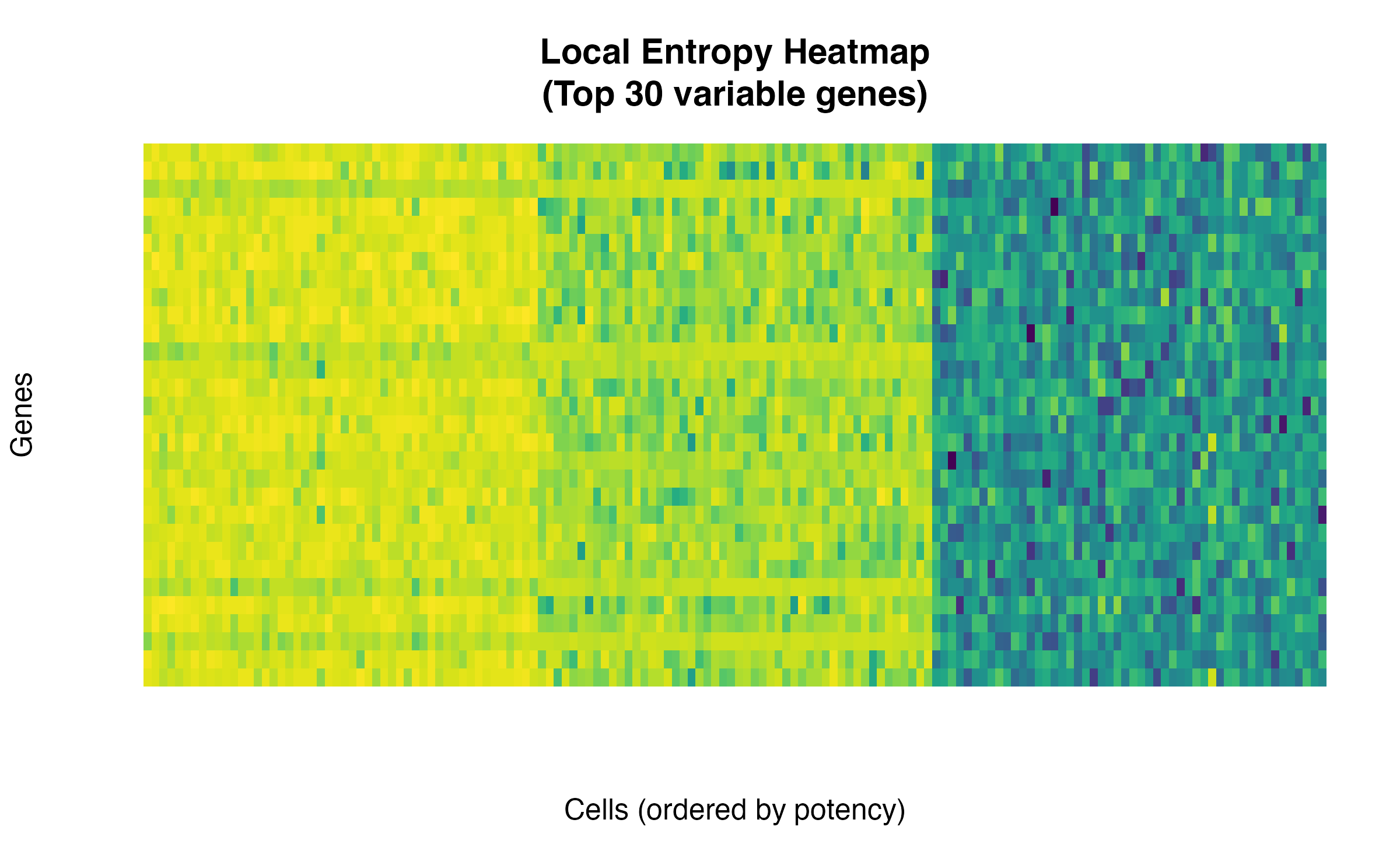
5. Local Entropy Heatmap
# Get top variable genes by local entropy variance
locS_var <- apply(sr$locS, 1, var)
top_idx <- order(locS_var, decreasing = TRUE)[1:30]

# Subset and scale
locS_top <- sr$locS[top_idx, ]
locS_scaled <- t(scale(t(locS_top)))

# Reorder columns by group
order_idx <- order(cell_groups)
locS_ordered <- locS_scaled[, order_idx]

# Use base R image for simplicity
image(
  t(locS_ordered),
  col = viridis::viridis(100),
  axes = FALSE,
  main = "Local Entropy Heatmap\n(Top 30 variable genes)",
  xlab = "Cells (ordered by potency)",
  ylab = "Genes"
)
6. Summary Statistics Table
# Summary statistics using base R
summary_list <- lapply(levels(df$Group), function(g) {
  sub <- df[df$Group == g, ]
  data.frame(
    Group = g,
    N = nrow(sub),
    SR_Mean = round(mean(sub$SR), 4),
    SR_SD = round(sd(sub$SR), 4),
    CCAT_Mean = round(mean(sub$CCAT), 4),
    CCAT_SD = round(sd(sub$CCAT), 4)
  )
})
summary_df <- do.call(rbind, summary_list)

knitr::kable(
  summary_df,
  caption = "Summary Statistics by Cell Population"
)| Group | N | SR_Mean | SR_SD | CCAT_Mean | CCAT_SD |
|---|---|---|---|---|---|
| High Potency | 50 | 0.8960 | 0.0024 | 0.0031 | 0.0136 |
| Medium Potency | 50 | 0.9451 | 0.0014 | 0.4213 | 0.0106 |
| Low Potency | 50 | 0.9105 | 0.0018 | 0.3945 | 0.0064 |
Publication Tips
- Color schemes: Use colorblind-friendly palettes (viridis, ColorBrewer)
- Font sizes: Ensure readability at final publication size
- Statistical annotations: Always include p-values or significance levels
- Error bars: Show SD or 95% CI for mean comparisons
- Sample sizes: Report n for each group
Session Info
sessionInfo()
#> R version 4.4.0 (2024-04-24)
#> Platform: aarch64-apple-darwin20
#> Running under: macOS 15.6.1
#>
#> Matrix products: default
#> BLAS:   /Library/Frameworks/R.framework/Versions/4.4-arm64/Resources/lib/libRblas.0.dylib
#> LAPACK: /Library/Frameworks/R.framework/Versions/4.4-arm64/Resources/lib/libRlapack.dylib;  LAPACK version 3.12.0
#>
#> locale:
#> [1] C
#>
#> time zone: Asia/Shanghai
#> tzcode source: internal
#>
#> attached base packages:
#> [1] stats     graphics  grDevices utils     datasets  methods   base
#>
#> other attached packages:
#> [1] viridis_0.6.5     viridisLite_0.4.2 ggplot2_4.0.1     SCENT_2.0.0
#>
#> loaded via a namespace (and not attached):
#>  [1] sass_0.4.10        generics_0.1.4     lattice_0.22-7     digest_0.6.39
#>  [5] magrittr_2.0.4     evaluate_1.0.5     grid_4.4.0         RColorBrewer_1.1-3
#>  [9] fastmap_1.2.0      jsonlite_2.0.0     Matrix_1.7-4       gridExtra_2.3
#> [13] mgcv_1.9-3         scales_1.4.0       textshaping_1.0.4  jquerylib_0.1.4
#> [17] cli_3.6.5          rlang_1.1.7        splines_4.4.0      withr_3.0.2
#> [21] cachem_1.1.0       yaml_2.3.12        otel_0.2.0         tools_4.4.0
#> [25] dplyr_1.1.4        vctrs_0.7.0        R6_2.6.1           lifecycle_1.0.5
#> [29] fs_1.6.6           htmlwidgets_1.6.4  ragg_1.5.0         pkgconfig_2.0.3
#> [33] desc_1.4.3         pkgdown_2.1.3      bslib_0.9.0        pillar_1.11.1
#> [37] gtable_0.3.6       glue_1.8.0         Rcpp_1.1.1         systemfonts_1.3.1
#> [41] xfun_0.56          tibble_3.3.1       tidyselect_1.2.1   knitr_1.51
#> [45] dichromat_2.0-0.1  farver_2.1.2       htmltools_0.5.9    nlme_3.1-168
#> [49] igraph_2.2.1       rmarkdown_2.30     labeling_0.4.3     compiler_4.4.0
#> [53] S7_0.2.1