Visualization Gallery
Zaoqu Liu, Robert K. Suter, Nagi G. Ayad
2026-02-03
Source:vignettes/visualization-gallery.Rmd
visualization-gallery.RmdIntroduction
scFOCAL generates a variety of publication-ready visualizations. This gallery showcases the main output types with customization examples.
1. Dimensional Reduction Plots
UMAP with Cell Type Annotations
set.seed(42)
n_cells <- 1500

# Generate mock UMAP data
umap_data <- data.frame(
  UMAP1 = c(rnorm(300, -3, 0.8), rnorm(300, 0, 0.9), rnorm(300, 3, 0.8),
            rnorm(300, -1.5, 0.7), rnorm(300, 1.5, 0.7)),
  UMAP2 = c(rnorm(300, 2, 0.7), rnorm(300, 3, 0.8), rnorm(300, 1, 0.7),
            rnorm(300, -2, 0.8), rnorm(300, -1, 0.7)),
  CellType = factor(rep(c("Mesenchymal", "Astrocyte-like", "Neural Progenitor",
                          "Immune", "Stromal"), each = 300))
)

ggplot(umap_data, aes(x = UMAP1, y = UMAP2, color = CellType)) +
  geom_point(size = 0.8, alpha = 0.7) +
  scale_color_brewer(palette = "Set2", name = "Cell Type") +
  labs(
    title = "Single-Cell UMAP Projection",
    subtitle = "Cell type annotations",
    x = "UMAP 1",
    y = "UMAP 2"
  ) +
  theme_minimal() +
  theme(
    legend.position = "right",
    plot.title = element_text(face = "bold", size = 14)
  ) +
  guides(color = guide_legend(override.aes = list(size = 3)))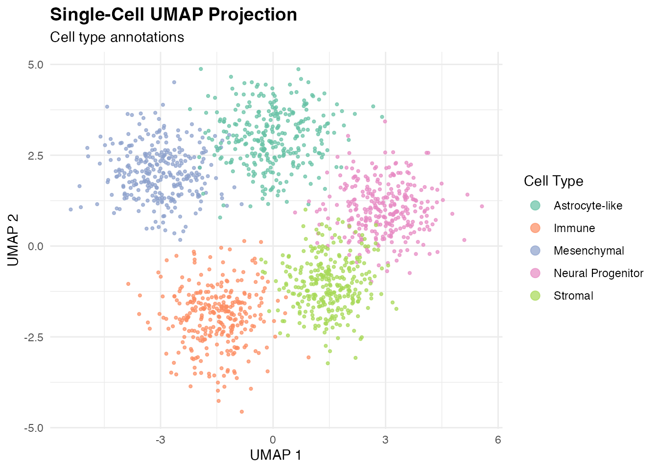
UMAP with Drug Connectivity
umap_data$Connectivity <- c(
  rnorm(300, -0.15, 0.1),   # MES - sensitive
  rnorm(300, 0.1, 0.12),    # AC - resistant
  rnorm(300, 0.05, 0.1),    # NPC
  rnorm(300, 0, 0.08),      # Immune
  rnorm(300, 0, 0.08)       # Stromal
)

ggplot(umap_data, aes(x = UMAP1, y = UMAP2, color = Connectivity)) +
  geom_point(size = 0.8, alpha = 0.7) +
  scale_color_gradient2(
    low = "#2166AC",
    mid = "white",
    high = "#B2182B",
    midpoint = 0,
    name = "Drug\nConnectivity"
  ) +
  labs(
    title = "Drug-Cell Connectivity Score",
    subtitle = "Temozolomide response prediction",
    x = "UMAP 1",
    y = "UMAP 2"
  ) +
  theme_minimal() +
  theme(plot.title = element_text(face = "bold", size = 14))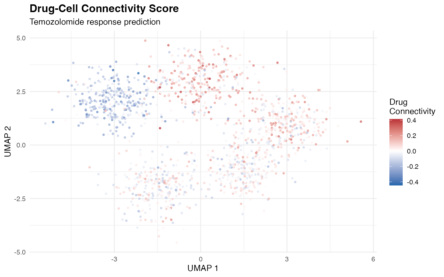
2. Violin Plots
Drug Connectivity by Cell Type
tumor_data <- umap_data[umap_data$CellType %in% c("Mesenchymal", "Astrocyte-like", "Neural Progenitor"),]

ggplot(tumor_data, aes(x = CellType, y = Connectivity, fill = CellType)) +
  geom_violin(alpha = 0.7, scale = "width") +
  geom_boxplot(width = 0.15, fill = "white", outlier.size = 0.5) +
  geom_hline(yintercept = 0, linetype = "dashed", color = "gray40") +
  scale_fill_brewer(palette = "Set2") +
  labs(
    title = "Drug Sensitivity by Tumor State",
    subtitle = "Violin plot with embedded boxplot",
    x = "",
    y = "Drug-Cell Connectivity"
  ) +
  theme_minimal() +
  theme(
    legend.position = "none",
    axis.text.x = element_text(angle = 30, hjust = 1),
    plot.title = element_text(face = "bold", size = 14)
  ) +
  annotate("text", x = 3.4, y = -0.3, label = "Sensitive",
           color = "#2166AC", fontface = "italic", size = 3.5) +
  annotate("text", x = 3.4, y = 0.3, label = "Resistant",
           color = "#B2182B", fontface = "italic", size = 3.5)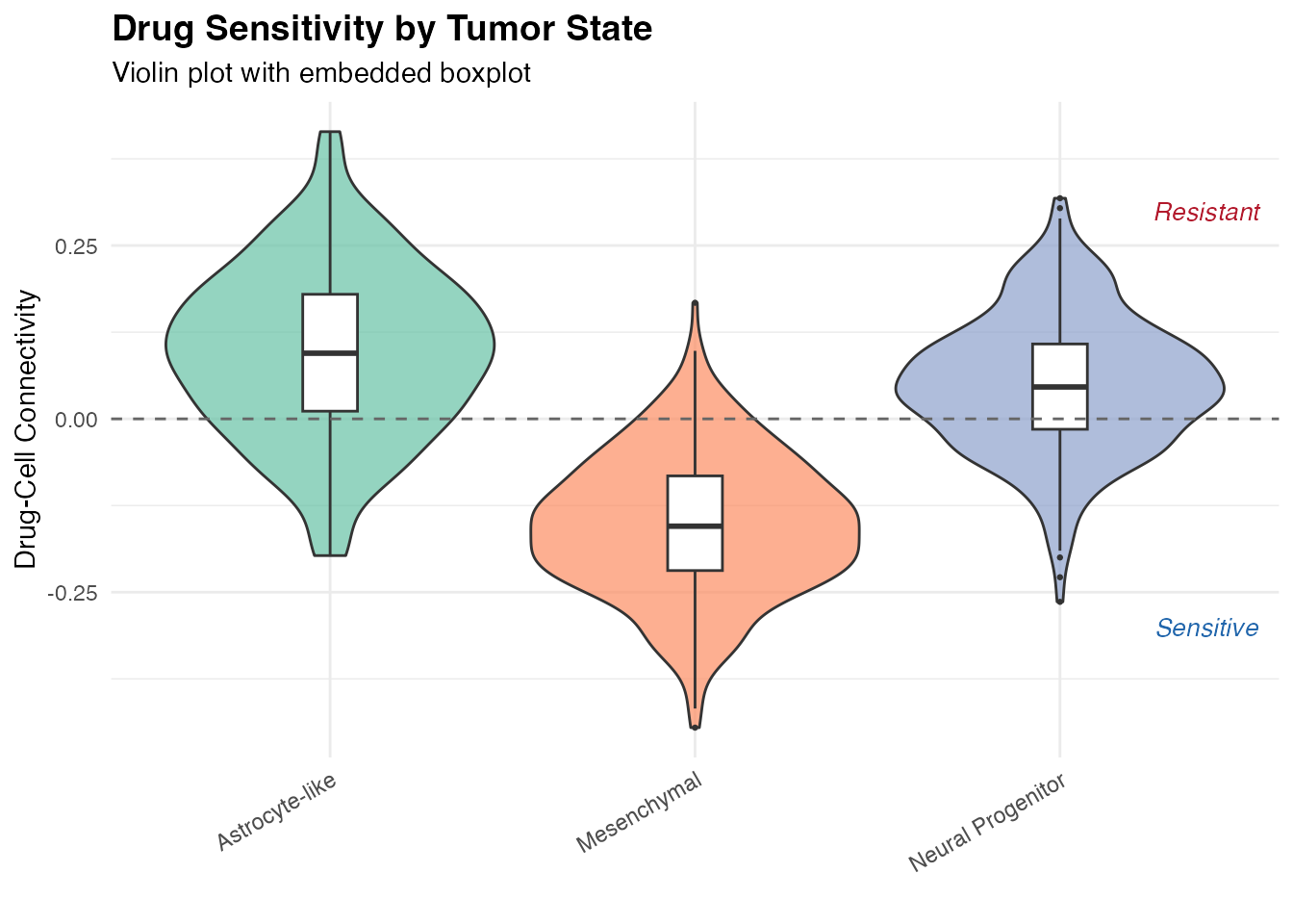
3. Heatmaps
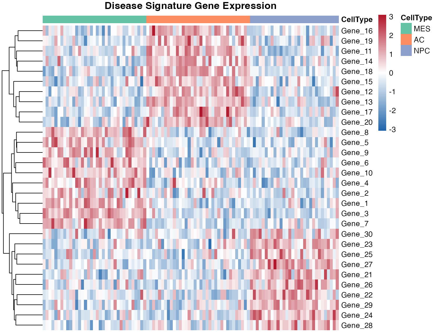
Disease Signature Heatmap
set.seed(123)
# Generate mock expression data
n_genes <- 30
n_cells <- 100

gene_names <- paste0("Gene_", 1:n_genes)
cell_types <- rep(c("MES", "AC", "NPC"), c(35, 35, 30))

# Create expression matrix with cell type-specific patterns
expr_matrix <- matrix(rnorm(n_genes * n_cells), nrow = n_genes, ncol = n_cells)
rownames(expr_matrix) <- gene_names
colnames(expr_matrix) <- paste0("Cell_", 1:n_cells)

# Add cell type-specific patterns
for (i in 1:10) {
  expr_matrix[i, cell_types == "MES"] <- expr_matrix[i, cell_types == "MES"] + 1.5
}
for (i in 11:20) {
  expr_matrix[i, cell_types == "AC"] <- expr_matrix[i, cell_types == "AC"] + 1.5
}
for (i in 21:30) {
  expr_matrix[i, cell_types == "NPC"] <- expr_matrix[i, cell_types == "NPC"] + 1.5
}

# Annotation
annotation_col <- data.frame(
  CellType = factor(cell_types),
  row.names = colnames(expr_matrix)
)

annotation_colors <- list(
  CellType = c(MES = "#66C2A5", AC = "#FC8D62", NPC = "#8DA0CB")
)

pheatmap(
  expr_matrix,
  scale = "row",
  show_colnames = FALSE,
  annotation_col = annotation_col,
  annotation_colors = annotation_colors,
  color = colorRampPalette(c("#2166AC", "white", "#B2182B"))(100),
  main = "Disease Signature Gene Expression",
  fontsize = 10,
  cluster_cols = FALSE
)
4. Volcano Plots
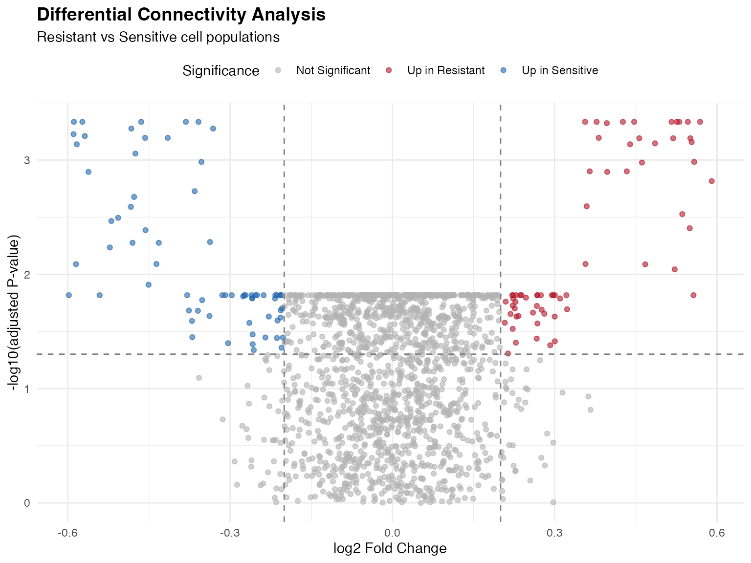
Differential Connectivity Volcano
set.seed(789)
n_compounds <- 1679

compound_names <- c("Temozolomide", "Vincristine", "Doxorubicin", "Erlotinib",
                    "Dasatinib", "Imatinib", "Sorafenib", "Sunitinib")

volcano_data <- data.frame(
  Compound = paste0("Compound_", 1:n_compounds),
  logFC = rnorm(n_compounds, 0, 0.12),
  P.Value = 10^(-runif(n_compounds, 0, 3))
)

# Add significant hits
sig_up <- sample(1:n_compounds, 30)
sig_down <- sample(setdiff(1:n_compounds, sig_up), 30)
volcano_data$logFC[sig_up] <- runif(30, 0.3, 0.6)
volcano_data$logFC[sig_down] <- runif(30, -0.6, -0.3)
volcano_data$P.Value[c(sig_up, sig_down)] <- 10^(-runif(60, 3, 6))

volcano_data$adj.P.Val <- p.adjust(volcano_data$P.Value, method = "fdr")

volcano_data$Significance <- case_when(
  volcano_data$logFC > 0.2 & volcano_data$adj.P.Val < 0.05 ~ "Up in Resistant",
  volcano_data$logFC < -0.2 & volcano_data$adj.P.Val < 0.05 ~ "Up in Sensitive",
  TRUE ~ "Not Significant"
)

# Add compound labels for top hits
volcano_data$Label <- ""
top_sig <- which(volcano_data$adj.P.Val < 0.001)
volcano_data$Label[top_sig[1:min(8, length(top_sig))]] <- compound_names[1:min(8, length(top_sig))]

ggplot(volcano_data, aes(x = logFC, y = -log10(adj.P.Val))) +
  geom_point(aes(color = Significance), alpha = 0.6, size = 1.5) +
  geom_hline(yintercept = -log10(0.05), linetype = "dashed", color = "gray50") +
  geom_vline(xintercept = c(-0.2, 0.2), linetype = "dashed", color = "gray50") +
  scale_color_manual(values = c(
    "Up in Resistant" = "#B2182B",
    "Up in Sensitive" = "#2166AC",
    "Not Significant" = "gray70"
  )) +
  labs(
    title = "Differential Connectivity Analysis",
    subtitle = "Resistant vs Sensitive cell populations",
    x = "log2 Fold Change",
    y = "-log10(adjusted P-value)"
  ) +
  theme_minimal() +
  theme(
    legend.position = "top",
    plot.title = element_text(face = "bold", size = 14)
  )
5. Reversal Score Visualization
Bar Plot of Top Reversal Compounds
reversal_data <- data.frame(
  Compound = compound_names[1:8],
  Reversal_Score = c(2.8, 2.5, 2.3, 2.1, 1.9, 1.8, 1.7, 1.6),
  MOA = c("Kinase Inhibitor", "DNA Damage", "Epigenetic", "Metabolic",
          "Kinase Inhibitor", "DNA Damage", "Epigenetic", "Other")
)

ggplot(reversal_data, aes(x = reorder(Compound, Reversal_Score), y = Reversal_Score, fill = MOA)) +
  geom_col(width = 0.7) +
  geom_hline(yintercept = 1, linetype = "dashed", color = "gray40") +
  coord_flip() +
  scale_fill_brewer(palette = "Set2", name = "Mechanism\nof Action") +
  labs(
    title = "Disease Signature Reversal Scores",
    subtitle = "Top compounds for Mesenchymal state reversal",
    x = "",
    y = "Reversal Score (Discordant / Concordant)"
  ) +
  theme_minimal() +
  theme(
    plot.title = element_text(face = "bold", size = 14),
    legend.position = "right"
  ) +
  annotate("text", x = 2, y = 1.5, label = "Reversal threshold",
           color = "gray40", fontface = "italic", size = 3)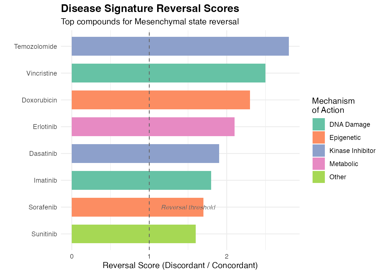
6. Multi-Panel Publication Figure
# Panel A: UMAP
p1 <- ggplot(umap_data, aes(x = UMAP1, y = UMAP2, color = Connectivity)) +
  geom_point(size = 0.5, alpha = 0.6) +
  scale_color_gradient2(low = "#2166AC", mid = "white", high = "#B2182B", midpoint = 0) +
  labs(title = "A) Drug Connectivity", x = "UMAP 1", y = "UMAP 2") +
  theme_minimal() +
  theme(legend.position = "bottom", plot.title = element_text(face = "bold"))

# Panel B: Violin
p2 <- ggplot(tumor_data, aes(x = CellType, y = Connectivity, fill = CellType)) +
  geom_violin(alpha = 0.7) +
  geom_boxplot(width = 0.1, fill = "white") +
  geom_hline(yintercept = 0, linetype = "dashed") +
  scale_fill_brewer(palette = "Set2") +
  labs(title = "B) By Cell Type", x = "", y = "Connectivity") +
  theme_minimal() +
  theme(legend.position = "none",
        axis.text.x = element_text(angle = 30, hjust = 1),
        plot.title = element_text(face = "bold"))

# Panel C: Volcano (subset)
p3 <- ggplot(volcano_data, aes(x = logFC, y = -log10(adj.P.Val), color = Significance)) +
  geom_point(alpha = 0.5, size = 1) +
  geom_hline(yintercept = -log10(0.05), linetype = "dashed") +
  geom_vline(xintercept = c(-0.2, 0.2), linetype = "dashed") +
  scale_color_manual(values = c("Up in Resistant" = "#B2182B",
                                 "Up in Sensitive" = "#2166AC",
                                 "Not Significant" = "gray70")) +
  labs(title = "C) Differential Connectivity", x = "logFC", y = "-log10(adj.P)") +
  theme_minimal() +
  theme(legend.position = "bottom", plot.title = element_text(face = "bold"))

# Panel D: Reversal
p4 <- ggplot(reversal_data, aes(x = reorder(Compound, Reversal_Score), y = Reversal_Score)) +
  geom_col(fill = "steelblue", width = 0.7) +
  geom_hline(yintercept = 1, linetype = "dashed") +
  coord_flip() +
  labs(title = "D) Top Reversal Compounds", x = "", y = "Reversal Score") +
  theme_minimal() +
  theme(plot.title = element_text(face = "bold"))

gridExtra::grid.arrange(p1, p2, p3, p4, ncol = 2, nrow = 2)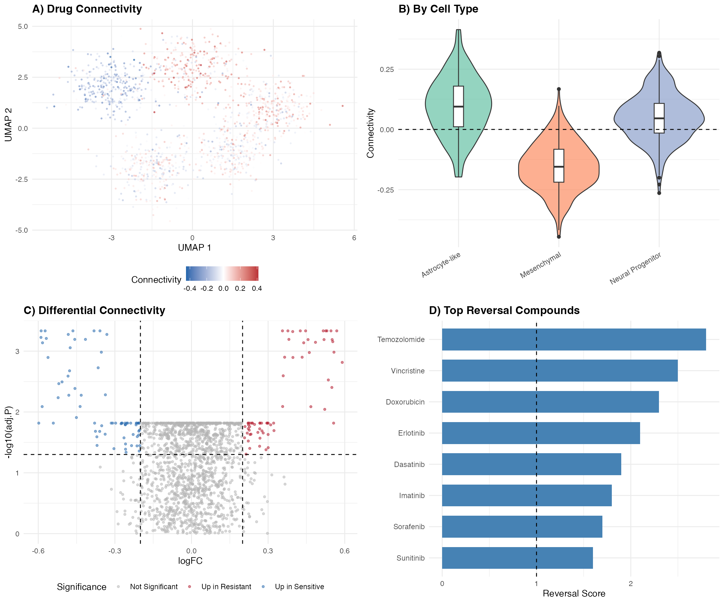
Customization Tips
Session Info
## R version 4.4.0 (2024-04-24)
## Platform: aarch64-apple-darwin20
## Running under: macOS 15.6.1
##
## Matrix products: default
## BLAS:   /System/Library/Frameworks/Accelerate.framework/Versions/A/Frameworks/vecLib.framework/Versions/A/libBLAS.dylib
## LAPACK: /Library/Frameworks/R.framework/Versions/4.4-arm64/Resources/lib/libRlapack.dylib;  LAPACK version 3.12.0
##
## locale:
## [1] C
##
## time zone: Asia/Shanghai
## tzcode source: internal
##
## attached base packages:
## [1] stats     graphics  grDevices utils     datasets  methods   base
##
## other attached packages:
## [1] pheatmap_1.0.13   viridis_0.6.5     viridisLite_0.4.2 tidyr_1.3.2
## [5] dplyr_1.1.4       ggplot2_4.0.1
##
## loaded via a namespace (and not attached):
##  [1] gtable_0.3.6       jsonlite_2.0.0     compiler_4.4.0     tidyselect_1.2.1
##  [5] dichromat_2.0-0.1  gridExtra_2.3      jquerylib_0.1.4    systemfonts_1.3.1
##  [9] scales_1.4.0       textshaping_1.0.4  yaml_2.3.12        fastmap_1.2.0
## [13] R6_2.6.1           labeling_0.4.3     generics_0.1.4     knitr_1.51
## [17] htmlwidgets_1.6.4  tibble_3.3.1       desc_1.4.3         bslib_0.9.0
## [21] pillar_1.11.1      RColorBrewer_1.1-3 rlang_1.1.7        cachem_1.1.0
## [25] xfun_0.56          fs_1.6.6           sass_0.4.10        S7_0.2.1
## [29] otel_0.2.0         cli_3.6.5          pkgdown_2.2.0      withr_3.0.2
## [33] magrittr_2.0.4     digest_0.6.39      grid_4.4.0         lifecycle_1.0.5
## [37] vctrs_0.7.1        evaluate_1.0.5     glue_1.8.0         farver_2.1.2
## [41] ragg_1.5.0         purrr_1.2.1        rmarkdown_2.30     tools_4.4.0
## [45] pkgconfig_2.0.3    htmltools_0.5.9