Introduction
Effective visualization is crucial for understanding and communicating scGate results. This guide covers various visualization techniques for exploring gating results, signature scores, and model structures.
Preparing Example Data
# Load example data
data(query.seurat)

# Create a multi-level model
model <- gating_model(level = 1, name = "Immune", signature = c("PTPRC"))
model <- gating_model(model = model, level = 2, name = "Tcell",
                      signature = c("CD3D", "CD3E"))

# Apply scGate with level saving
query.seurat <- scGate(
  data = query.seurat,
  model = model,
  reduction = "pca",
  save.levels = TRUE
)
Basic Visualizations
Gating Results on UMAP
The most common visualization shows Pure vs Impure cells:
# Side-by-side comparison
p1 <- DimPlot(query.seurat, group.by = "cell_type", label = TRUE, repel = TRUE) +
  ggtitle("Original Cell Types") +
  NoLegend()

p2 <- DimPlot(query.seurat, group.by = "is.pure",
              cols = c("Pure" = "#00ae60", "Impure" = "#e0e0e0")) +
  ggtitle("scGate Classification") +
  theme(legend.position = "bottom")

p1 + p2
Signature Score Visualization
Visualize UCell scores as a continuous gradient:
# Find UCell score columns
ucell_cols <- grep("_UCell$", colnames(query.seurat@meta.data), value = TRUE)
print(paste("Available UCell scores:", paste(ucell_cols, collapse = ", ")))

# Plot signature scores
if (length(ucell_cols) > 0) {
  p1 <- FeaturePlot(query.seurat, features = ucell_cols[1],
                    cols = c("gray95", "navy")) +
    ggtitle(paste(ucell_cols[1], "Score"))

  p2 <- DimPlot(query.seurat, group.by = "is.pure",
                cols = c("Pure" = "#00ae60", "Impure" = "gray80"))

  print(p1 + p2)
}
Level-by-Level Visualization
Using plot_levels()
scGate provides a built-in function to visualize results at each gating level:
# Get plots for each level
level_plots <- plot_levels(query.seurat)

# Combine plots
if (length(level_plots) > 0) {
  wrap_plots(level_plots, ncol = length(level_plots))
}
Custom Level Visualization
# Find level columns
level_cols <- grep("^is.pure\\.level", colnames(query.seurat@meta.data), value = TRUE)

if (length(level_cols) >= 1) {
  plots <- list()

  for (i in seq_along(level_cols)) {
    col <- level_cols[i]
    level_name <- gsub("is.pure\\.", "", col)

    plots[[i]] <- DimPlot(query.seurat, group.by = col,
                          cols = c("Pure" = "#00ae60", "Impure" = "#e0e0e0")) +
      ggtitle(paste("Level:", level_name)) +
      theme(legend.position = "bottom")
  }

  # Add final result
  plots[[length(plots) + 1]] <- DimPlot(query.seurat, group.by = "is.pure",
                                         cols = c("Pure" = "#00ae60", "Impure" = "#e0e0e0")) +
    ggtitle("Final Result") +
    theme(legend.position = "bottom")

  wrap_plots(plots, ncol = min(3, length(plots)))
}
Score Distribution Analysis
Violin Plots
if (length(ucell_cols) > 0) {
  # Prepare data
  plot_data <- data.frame(
    score = query.seurat@meta.data[[ucell_cols[1]]],
    classification = query.seurat$is.pure,
    cell_type = query.seurat$cell_type
  )

  # Violin plot by classification
  ggplot(plot_data, aes(x = classification, y = score, fill = classification)) +
    geom_violin(alpha = 0.7, scale = "width") +
    geom_boxplot(width = 0.15, fill = "white", alpha = 0.9) +
    scale_fill_manual(values = c("Pure" = "#00ae60", "Impure" = "#808080")) +
    labs(title = paste("Distribution of", ucell_cols[1]),
         x = "Classification",
         y = "UCell Score") +
    theme_minimal() +
    theme(legend.position = "none",
          plot.title = element_text(hjust = 0.5, face = "bold"))
}
Density Plots by Cell Type
if (length(ucell_cols) > 0) {
  ggplot(plot_data, aes(x = score, fill = cell_type)) +
    geom_density(alpha = 0.5) +
    geom_vline(xintercept = 0.2, linetype = "dashed", color = "red", linewidth = 1) +
    labs(title = paste("Score Distribution by Cell Type"),
         subtitle = "Red dashed line = default threshold (0.2)",
         x = "UCell Score",
         y = "Density") +
    theme_minimal() +
    theme(legend.position = "right")
}
UCell Score Ridge Plots
Using plot_UCell_scores()
scGate provides a built-in function for ridge plots:
# Plot UCell score distributions
tryCatch({
  plot_UCell_scores(query.seurat, model, combine = TRUE)
}, error = function(e) {
  message("Ridge plot requires ggridges package")
})
Confusion Matrix Visualization
Creating a Confusion Matrix
# Compare scGate results with original annotations
confusion_data <- table(
  Original = query.seurat$cell_type,
  scGate = query.seurat$is.pure
)

# Convert to data frame for plotting
conf_df <- as.data.frame(confusion_data)
names(conf_df) <- c("Original", "scGate", "Count")

# Calculate percentages within each original cell type
conf_df <- conf_df %>%
  dplyr::group_by(Original) %>%
  dplyr::mutate(Percentage = Count / sum(Count) * 100) %>%
  dplyr::ungroup()

# Create heatmap
ggplot(conf_df, aes(x = scGate, y = Original, fill = Percentage)) +
  geom_tile(color = "white", linewidth = 0.5) +
  geom_text(aes(label = sprintf("%.0f%%\n(n=%d)", Percentage, Count)),
            color = "black", size = 3) +
  scale_fill_gradient2(low = "white", mid = "#a8d5ba", high = "#00ae60",
                       midpoint = 50, limits = c(0, 100)) +
  labs(title = "scGate Classification by Cell Type",
       x = "scGate Result",
       y = "Original Annotation",
       fill = "Percentage") +
  theme_minimal() +
  theme(axis.text.x = element_text(angle = 0),
        plot.title = element_text(hjust = 0.5, face = "bold"),
        panel.grid = element_blank())
Publication-Ready Figures
Combined Summary Figure
# Create a comprehensive figure
if (length(ucell_cols) > 0) {
  # Panel A: UMAP with cell types
  pA <- DimPlot(query.seurat, group.by = "cell_type", label = TRUE,
                repel = TRUE, label.size = 3) +
    ggtitle("A. Original Annotation") +
    NoLegend() +
    theme(plot.title = element_text(face = "bold"))

  # Panel B: UMAP with scGate result
  pB <- DimPlot(query.seurat, group.by = "is.pure",
                cols = c("Pure" = "#00ae60", "Impure" = "#e0e0e0")) +
    ggtitle("B. scGate Classification") +
    theme(plot.title = element_text(face = "bold"),
          legend.position = "bottom")

  # Panel C: UCell scores
  pC <- FeaturePlot(query.seurat, features = ucell_cols[1],
                    cols = c("gray95", "navy")) +
    ggtitle("C. Signature Score") +
    theme(plot.title = element_text(face = "bold"))

  # Panel D: Score distribution
  pD <- ggplot(plot_data, aes(x = classification, y = score, fill = classification)) +
    geom_violin(alpha = 0.7) +
    geom_boxplot(width = 0.15, fill = "white") +
    scale_fill_manual(values = c("Pure" = "#00ae60", "Impure" = "#808080")) +
    labs(title = "D. Score Distribution", x = "", y = "UCell Score") +
    theme_minimal() +
    theme(legend.position = "none",
          plot.title = element_text(face = "bold"))

  # Combine
  (pA | pB) / (pC | pD)
}
Color Palettes
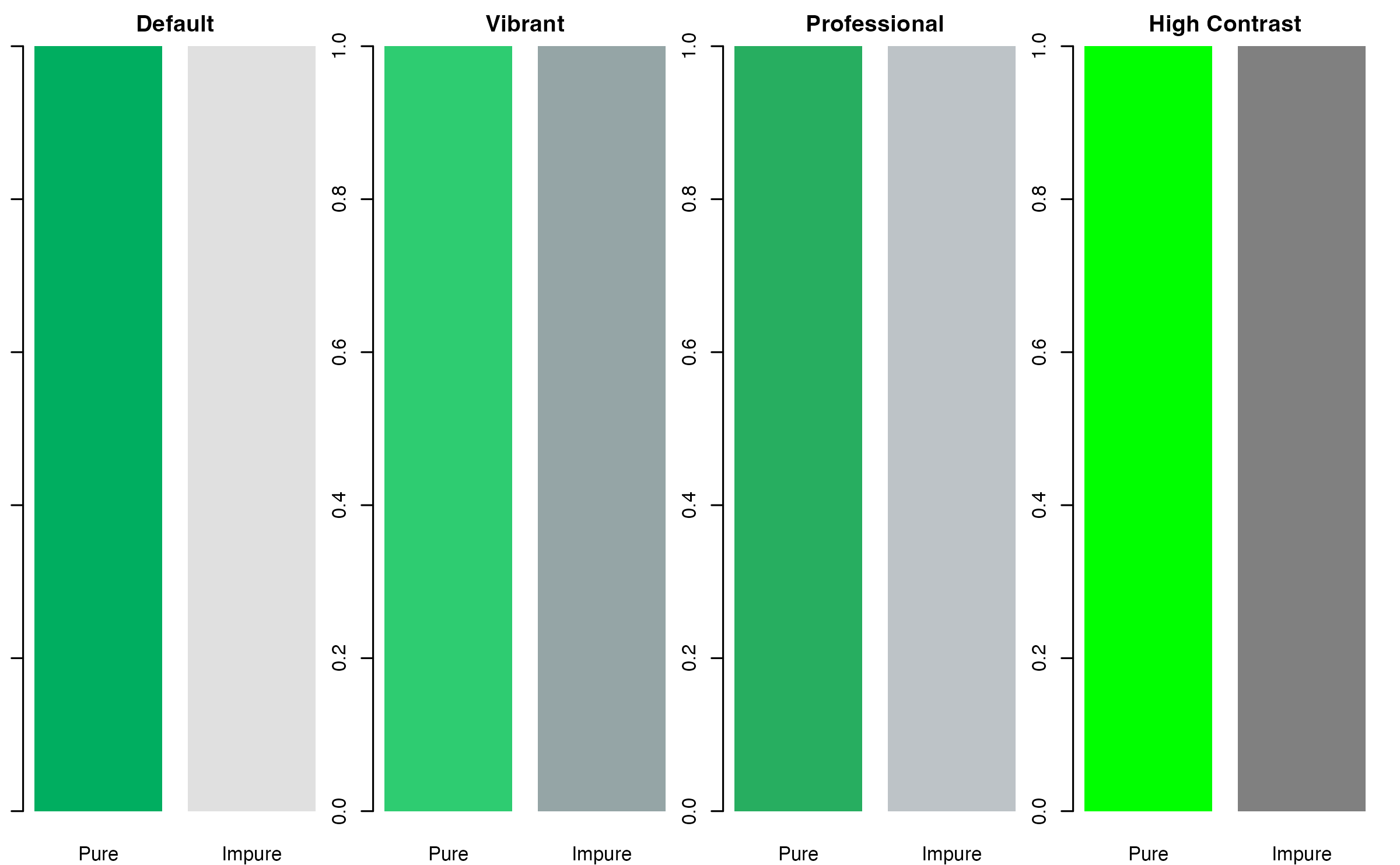
Recommended Color Schemes
# Define color palettes
palettes <- list(
  "Default" = c("Pure" = "#00ae60", "Impure" = "#e0e0e0"),
  "Vibrant" = c("Pure" = "#2ecc71", "Impure" = "#95a5a6"),
  "Professional" = c("Pure" = "#27ae60", "Impure" = "#bdc3c7"),
  "High Contrast" = c("Pure" = "#00ff00", "Impure" = "#808080")
)

# Display palettes
par(mfrow = c(1, 4), mar = c(2, 1, 2, 1))
for (name in names(palettes)) {
  barplot(c(1, 1), col = palettes[[name]], main = name,
          names.arg = c("Pure", "Impure"), border = NA)
}
Exporting Figures
High-Resolution Export
# Save as PDF (vector format, best for publications)
ggsave("scgate_results.pdf", width = 10, height = 8, dpi = 300)

# Save as PNG (raster format, good for presentations)
ggsave("scgate_results.png", width = 10, height = 8, dpi = 300)

# Save as TIFF (required by some journals)
ggsave("scgate_results.tiff", width = 10, height = 8, dpi = 300, compression = "lzw")
Tips for Effective Visualization
- Use consistent colors across all figures
- Include scale bars and legends
- Show both overview and detail views
- Compare with ground truth when available
- Use appropriate figure sizes for your target medium
Session Info
sessionInfo()
#> R version 4.4.0 (2024-04-24)
#> Platform: aarch64-apple-darwin20
#> Running under: macOS 15.6.1
#>
#> Matrix products: default
#> BLAS:   /Library/Frameworks/R.framework/Versions/4.4-arm64/Resources/lib/libRblas.0.dylib
#> LAPACK: /Library/Frameworks/R.framework/Versions/4.4-arm64/Resources/lib/libRlapack.dylib;  LAPACK version 3.12.0
#>
#> locale:
#> [1] C
#>
#> time zone: Asia/Shanghai
#> tzcode source: internal
#>
#> attached base packages:
#> [1] stats     graphics  grDevices utils     datasets  methods   base
#>
#> other attached packages:
#> [1] patchwork_1.3.2    ggplot2_4.0.1      SeuratObject_4.1.4 Seurat_4.4.0
#> [5] scGate_1.7.2
#>
#> loaded via a namespace (and not attached):
#>   [1] deldir_2.0-4           pbapply_1.7-4          gridExtra_2.3
#>   [4] rlang_1.1.7            magrittr_2.0.4         RcppAnnoy_0.0.23
#>   [7] otel_0.2.0             spatstat.geom_3.7-0    matrixStats_1.5.0
#>  [10] ggridges_0.5.7         compiler_4.4.0         png_0.1-8
#>  [13] systemfonts_1.3.1      vctrs_0.7.1            reshape2_1.4.5
#>  [16] stringr_1.6.0          pkgconfig_2.0.3        fastmap_1.2.0
#>  [19] promises_1.5.0         rmarkdown_2.30         ragg_1.5.0
#>  [22] purrr_1.2.1            xfun_0.56              cachem_1.1.0
#>  [25] jsonlite_2.0.0         goftest_1.2-3          later_1.4.5
#>  [28] BiocParallel_1.40.2    spatstat.utils_3.2-1   irlba_2.3.5.1
#>  [31] parallel_4.4.0         cluster_2.1.8.1        R6_2.6.1
#>  [34] ica_1.0-3              spatstat.data_3.1-9    stringi_1.8.7
#>  [37] bslib_0.9.0            RColorBrewer_1.1-3     reticulate_1.44.1
#>  [40] spatstat.univar_3.1-6  parallelly_1.46.1      lmtest_0.9-40
#>  [43] jquerylib_0.1.4        scattermore_1.2        Rcpp_1.1.1
#>  [46] knitr_1.51             tensor_1.5.1           future.apply_1.20.1
#>  [49] zoo_1.8-15             sctransform_0.4.3      httpuv_1.6.16
#>  [52] Matrix_1.7-4           splines_4.4.0          igraph_2.2.1
#>  [55] tidyselect_1.2.1       abind_1.4-8            dichromat_2.0-0.1
#>  [58] yaml_2.3.12            spatstat.random_3.4-4  spatstat.explore_3.7-0
#>  [61] codetools_0.2-20       miniUI_0.1.2           listenv_0.10.0
#>  [64] plyr_1.8.9             lattice_0.22-7         tibble_3.3.1
#>  [67] withr_3.0.2            shiny_1.12.1           S7_0.2.1
#>  [70] ROCR_1.0-12            evaluate_1.0.5         Rtsne_0.17
#>  [73] future_1.69.0          desc_1.4.3             survival_3.8-3
#>  [76] polyclip_1.10-7        fitdistrplus_1.2-5     pillar_1.11.1
#>  [79] KernSmooth_2.23-26     plotly_4.11.0          generics_0.1.4
#>  [82] sp_2.2-0               scales_1.4.0           globals_0.18.0
#>  [85] xtable_1.8-4           glue_1.8.0             lazyeval_0.2.2
#>  [88] tools_4.4.0            BiocNeighbors_2.0.1    data.table_1.18.0
#>  [91] RANN_2.6.2             dotCall64_1.2          fs_1.6.6
#>  [94] leiden_0.4.3.1         cowplot_1.2.0          grid_4.4.0
#>  [97] tidyr_1.3.2            colorspace_2.1-2       nlme_3.1-168
#> [100] cli_3.6.5              spatstat.sparse_3.1-0  textshaping_1.0.4
#> [103] spam_2.11-3            viridisLite_0.4.2      dplyr_1.1.4
#> [106] uwot_0.2.4             gtable_0.3.6           sass_0.4.10
#> [109] digest_0.6.39          progressr_0.18.0       ggrepel_0.9.6
#> [112] htmlwidgets_1.6.4      farver_2.1.2           htmltools_0.5.9
#> [115] pkgdown_2.1.3          lifecycle_1.0.5        httr_1.4.7
#> [118] mime_0.13              MASS_7.3-65