Visualization Gallery
Zaoqu Liu
Department of Interventional Radiology, The First Affiliated Hospital of Zhengzhou Universityliuzaoqu@163.com
Aimin Xie
Original Authoraiminyy1993@gmail.com
2026-01-23
Source:vignettes/visualization.Rmd
visualization.RmdIntroduction
This vignette demonstrates various visualization techniques for scPAS analysis results. We’ll cover:
- UMAP/t-SNE plots for risk scores
- Cell type enrichment analysis
- Volcano plots
- Heatmaps
- Violin plots
- Spatial transcriptomics visualization
Setup and Simulated Data
library(scPAS)
library(Seurat)
library(Matrix)
library(ggplot2)
library(RColorBrewer)
library(dplyr)

# Set theme
theme_set(theme_minimal())
Create Simulated scPAS Result
set.seed(42)

# Simulate single-cell data
n_genes <- 500
n_cells <- 800

# Create count matrix
counts <- matrix(
  rpois(n_genes * n_cells, lambda = 5),
  nrow = n_genes,
  ncol = n_cells
)
rownames(counts) <- paste0("Gene", 1:n_genes)
colnames(counts) <- paste0("Cell", 1:n_cells)

# Create Seurat object
sc_obj <- CreateSeuratObject(counts = counts, project = "VisDemo")

# Add cell type labels with different proportions
cell_types <- c(
  rep("T_cells", 200),
  rep("B_cells", 150),
  rep("Monocytes", 150),
  rep("NK_cells", 100),
  rep("Fibroblasts", 100),
  rep("Endothelial", 100)
)
sc_obj$celltype <- cell_types

# Run preprocessing
sc_obj <- NormalizeData(sc_obj, verbose = FALSE)
sc_obj <- FindVariableFeatures(sc_obj, verbose = FALSE)
sc_obj <- ScaleData(sc_obj, verbose = FALSE)
sc_obj <- RunPCA(sc_obj, verbose = FALSE)
sc_obj <- RunUMAP(sc_obj, dims = 1:20, verbose = FALSE)

# Simulate scPAS results
# Make T_cells and NK_cells enriched for scPAS+
# Make B_cells and Fibroblasts enriched for scPAS-
set.seed(42)
risk_scores <- rep(NA, n_cells)

# T_cells and NK_cells: higher risk
risk_scores[cell_types %in% c("T_cells", "NK_cells")] <-
  rnorm(sum(cell_types %in% c("T_cells", "NK_cells")), mean = 1.5, sd = 1.2)

# B_cells and Fibroblasts: lower risk
risk_scores[cell_types %in% c("B_cells", "Fibroblasts")] <-
  rnorm(sum(cell_types %in% c("B_cells", "Fibroblasts")), mean = -1.5, sd = 1.2)

# Others: neutral
risk_scores[cell_types %in% c("Monocytes", "Endothelial")] <-
  rnorm(sum(cell_types %in% c("Monocytes", "Endothelial")), mean = 0, sd = 0.8)

# Calculate p-values (simulated)
p_values <- 2 * pnorm(-abs(risk_scores))
fdr <- p.adjust(p_values, method = "BH")

# Classification
classification <- ifelse(
  fdr >= 0.05, "0",
  ifelse(risk_scores > 0, "scPAS+", "scPAS-")
)

# Add to metadata
sc_obj$scPAS_NRS <- risk_scores
sc_obj$scPAS_RS <- risk_scores * 0.01  # Raw scores
sc_obj$scPAS_Pvalue <- p_values
sc_obj$scPAS_FDR <- fdr
sc_obj$scPAS <- factor(classification, levels = c("scPAS-", "0", "scPAS+"))
Basic UMAP Plots
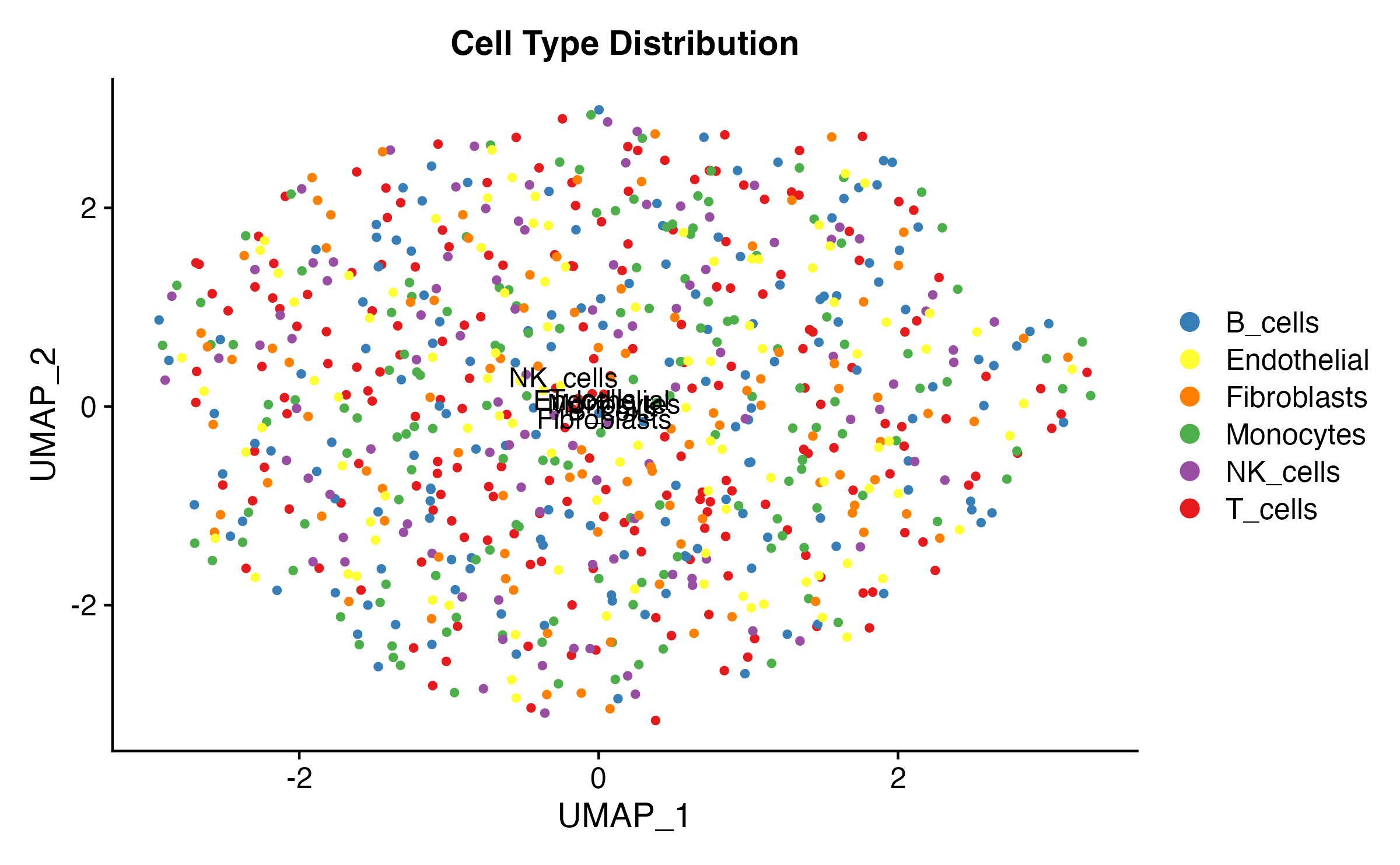
Cell Type Overview
# Define colors
celltype_colors <- c(
  "T_cells" = "#E41A1C",
  "B_cells" = "#377EB8",
  "Monocytes" = "#4DAF4A",
  "NK_cells" = "#984EA3",
  "Fibroblasts" = "#FF7F00",
  "Endothelial" = "#FFFF33"
)

DimPlot(
  sc_obj,
  group.by = "celltype",
  cols = celltype_colors,
  label = TRUE,
  label.size = 4,
  pt.size = 1
) +
  ggtitle("Cell Type Distribution") +
  theme(
    plot.title = element_text(hjust = 0.5, face = "bold", size = 14),
    legend.position = "right"
  )
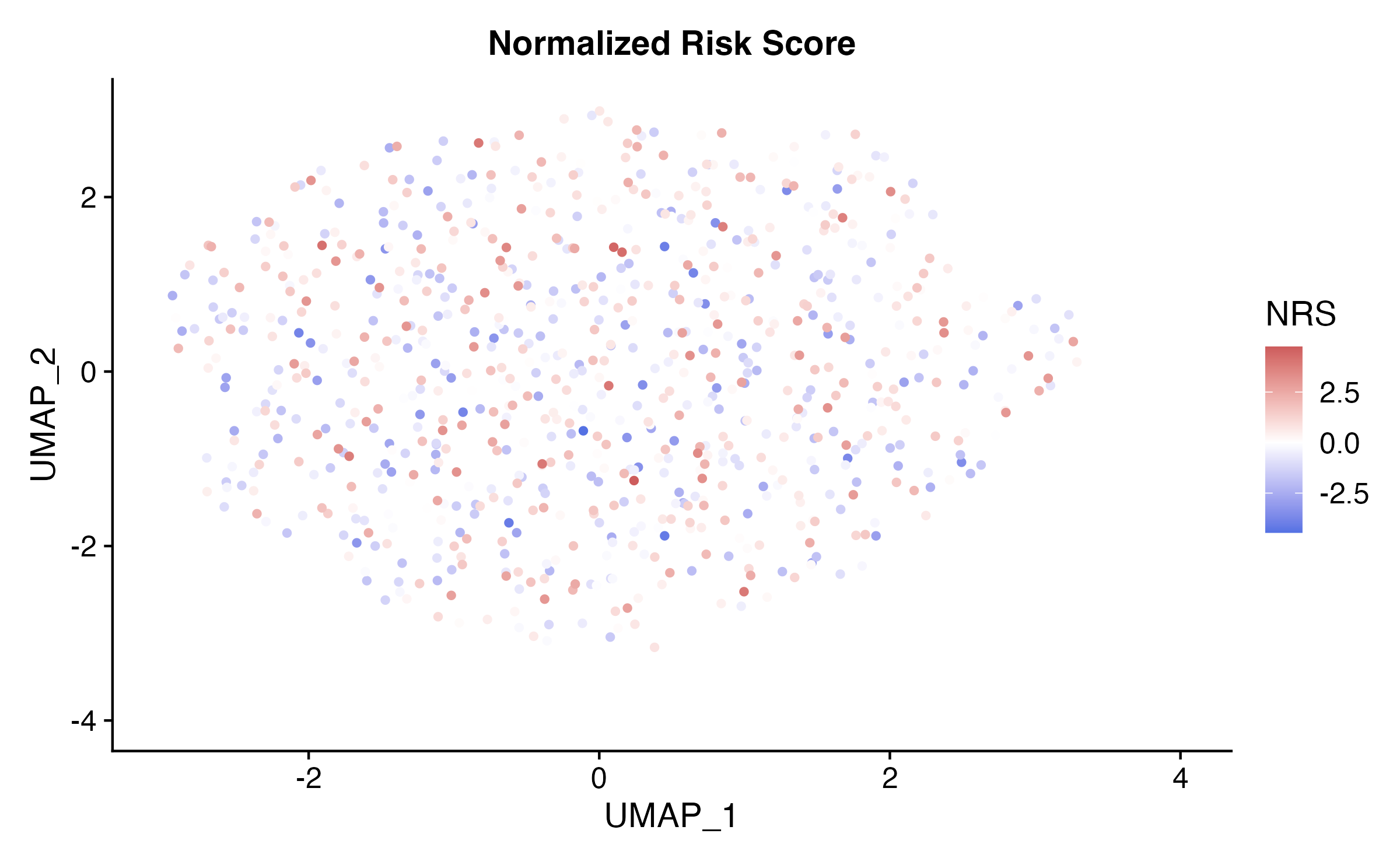
Risk Score Visualization
FeaturePlot(
  sc_obj,
  features = "scPAS_NRS",
  pt.size = 1,
  order = TRUE
) +
  scale_color_gradient2(
    low = "royalblue",
    mid = "white",
    high = "indianred",
    midpoint = 0,
    name = "NRS"
  ) +
  ggtitle("Normalized Risk Score") +
  theme(
    plot.title = element_text(hjust = 0.5, face = "bold", size = 14)
  )
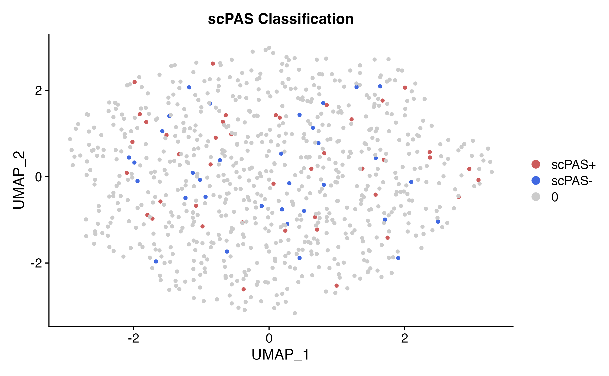
Cell Classification
# Classification colors
class_colors <- c("scPAS-" = "royalblue", "0" = "gray80", "scPAS+" = "indianred")

DimPlot(
  sc_obj,
  group.by = "scPAS",
  cols = class_colors,
  pt.size = 1,
  order = c("0", "scPAS-", "scPAS+")  # Draw significant cells on top
) +
  ggtitle("scPAS Classification") +
  theme(
    plot.title = element_text(hjust = 0.5, face = "bold", size = 14)
  )
Combined Multi-Panel Plot
library(patchwork)

p1 <- DimPlot(sc_obj, group.by = "celltype", cols = celltype_colors, label = TRUE) +
  ggtitle("Cell Types") + NoLegend()

p2 <- FeaturePlot(sc_obj, features = "scPAS_NRS", pt.size = 0.8) +
  scale_color_gradient2(low = "royalblue", mid = "white", high = "indianred", midpoint = 0) +
  ggtitle("Risk Score")

p3 <- DimPlot(sc_obj, group.by = "scPAS", cols = class_colors,
              order = c("0", "scPAS-", "scPAS+")) +
  ggtitle("Classification")

p1 | p2 | p3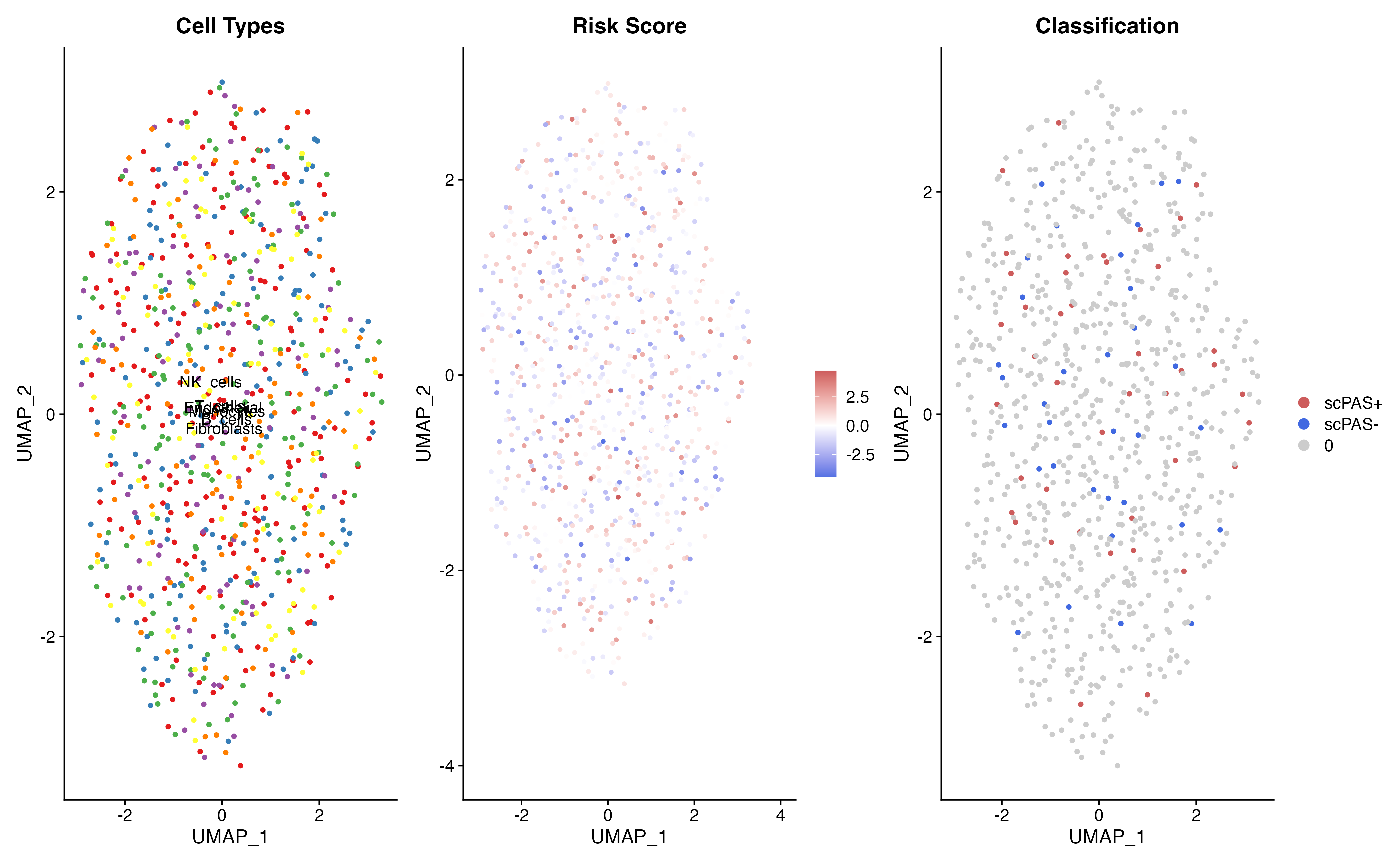
Cell Type Enrichment Analysis
Proportion Bar Plot
# Calculate proportions
prop_data <- as.data.frame(table(sc_obj$celltype, sc_obj$scPAS))
colnames(prop_data) <- c("CellType", "scPAS", "Count")

# Calculate proportions within each cell type
prop_data <- prop_data %>%
  dplyr::group_by(CellType) %>%
  dplyr::mutate(
    Total = sum(Count),
    Proportion = Count / Total
  ) %>%
  dplyr::ungroup()

ggplot(prop_data, aes(x = CellType, y = Proportion, fill = scPAS)) +
  geom_bar(stat = "identity", position = "stack", width = 0.7) +
  scale_fill_manual(values = class_colors) +
  labs(
    x = "Cell Type",
    y = "Proportion",
    title = "scPAS Classification by Cell Type",
    fill = "Classification"
  ) +
  theme(
    axis.text.x = element_text(angle = 45, hjust = 1),
    plot.title = element_text(hjust = 0.5, face = "bold"),
    legend.position = "right"
  ) +
  coord_flip()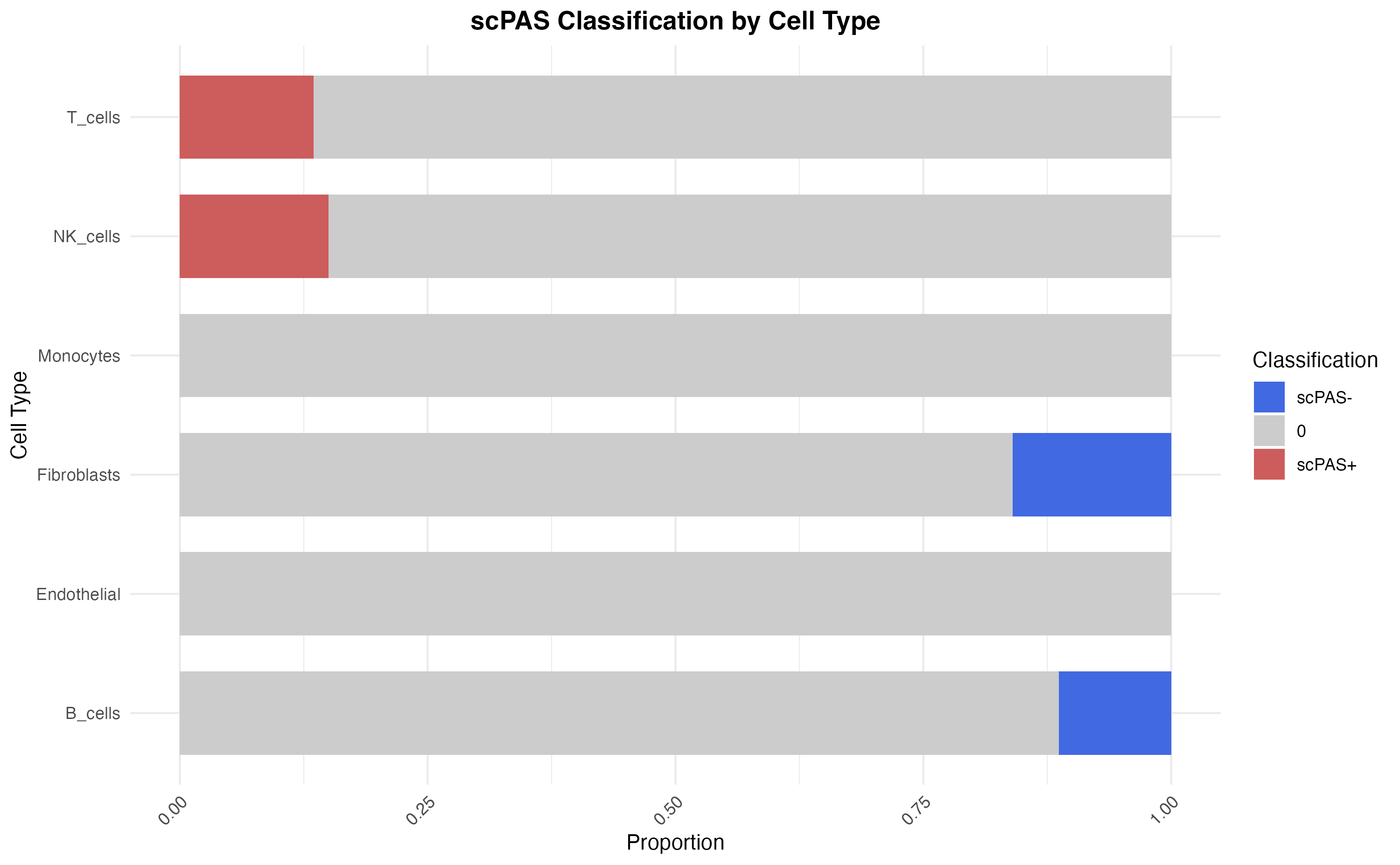
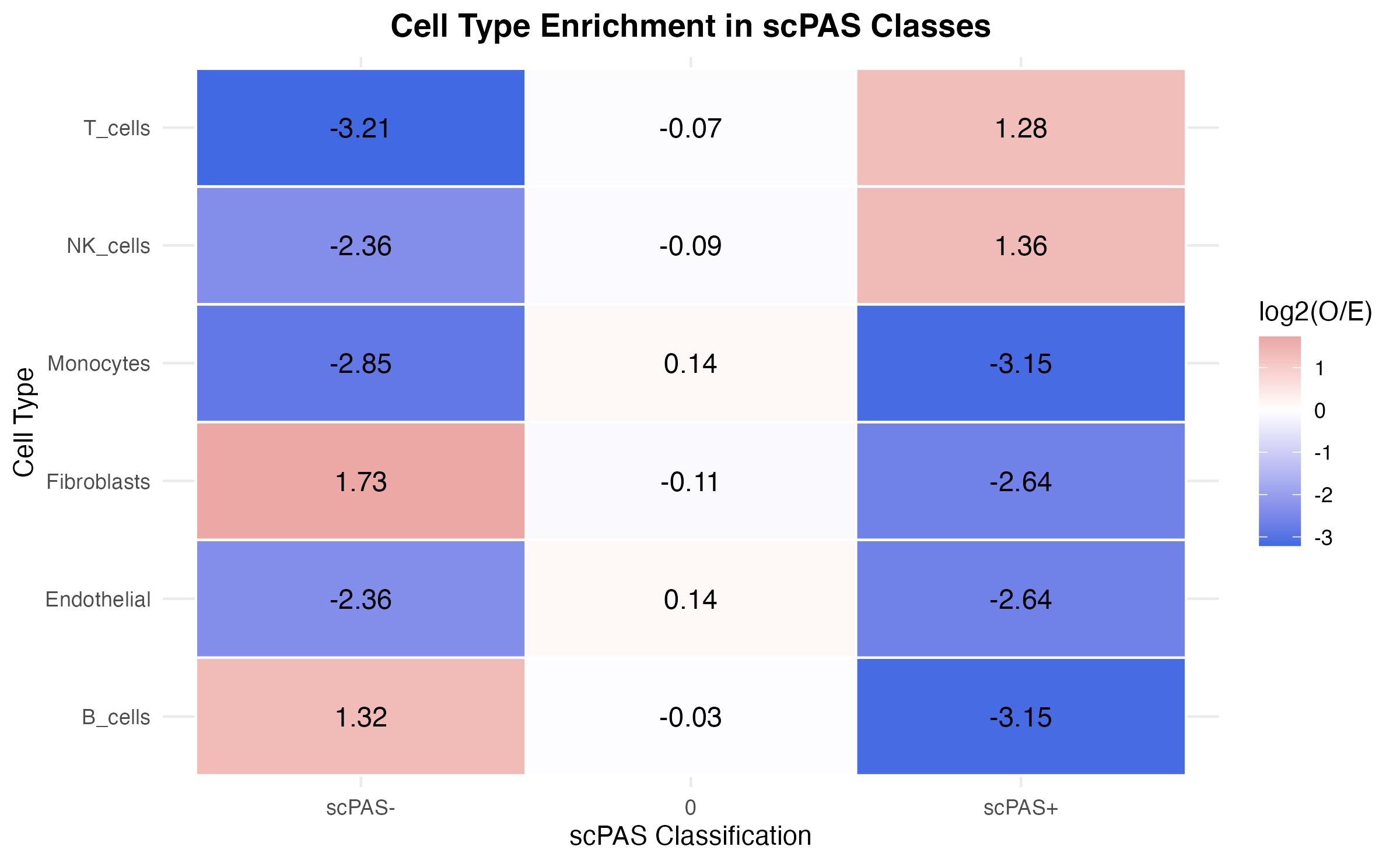
Enrichment Heatmap
# Calculate enrichment (observed / expected)
enrichment_matrix <- reshape2::dcast(prop_data, CellType ~ scPAS, value.var = "Count")
rownames(enrichment_matrix) <- enrichment_matrix$CellType
enrichment_matrix <- as.matrix(enrichment_matrix[, -1])

# Calculate expected counts
total_per_class <- colSums(enrichment_matrix)
total_per_type <- rowSums(enrichment_matrix)
grand_total <- sum(enrichment_matrix)

expected <- outer(total_per_type, total_per_class) / grand_total
enrichment <- log2((enrichment_matrix + 1) / (expected + 1))

# Plot heatmap
enrichment_df <- reshape2::melt(enrichment)
colnames(enrichment_df) <- c("CellType", "scPAS", "Enrichment")

ggplot(enrichment_df, aes(x = scPAS, y = CellType, fill = Enrichment)) +
  geom_tile(color = "white", size = 0.5) +
  geom_text(aes(label = round(Enrichment, 2)), color = "black", size = 4) +
  scale_fill_gradient2(
    low = "royalblue",
    mid = "white",
    high = "indianred",
    midpoint = 0,
    name = "log2(O/E)"
  ) +
  labs(
    x = "scPAS Classification",
    y = "Cell Type",
    title = "Cell Type Enrichment in scPAS Classes"
  ) +
  theme(
    plot.title = element_text(hjust = 0.5, face = "bold"),
    axis.text.x = element_text(angle = 0)
  )
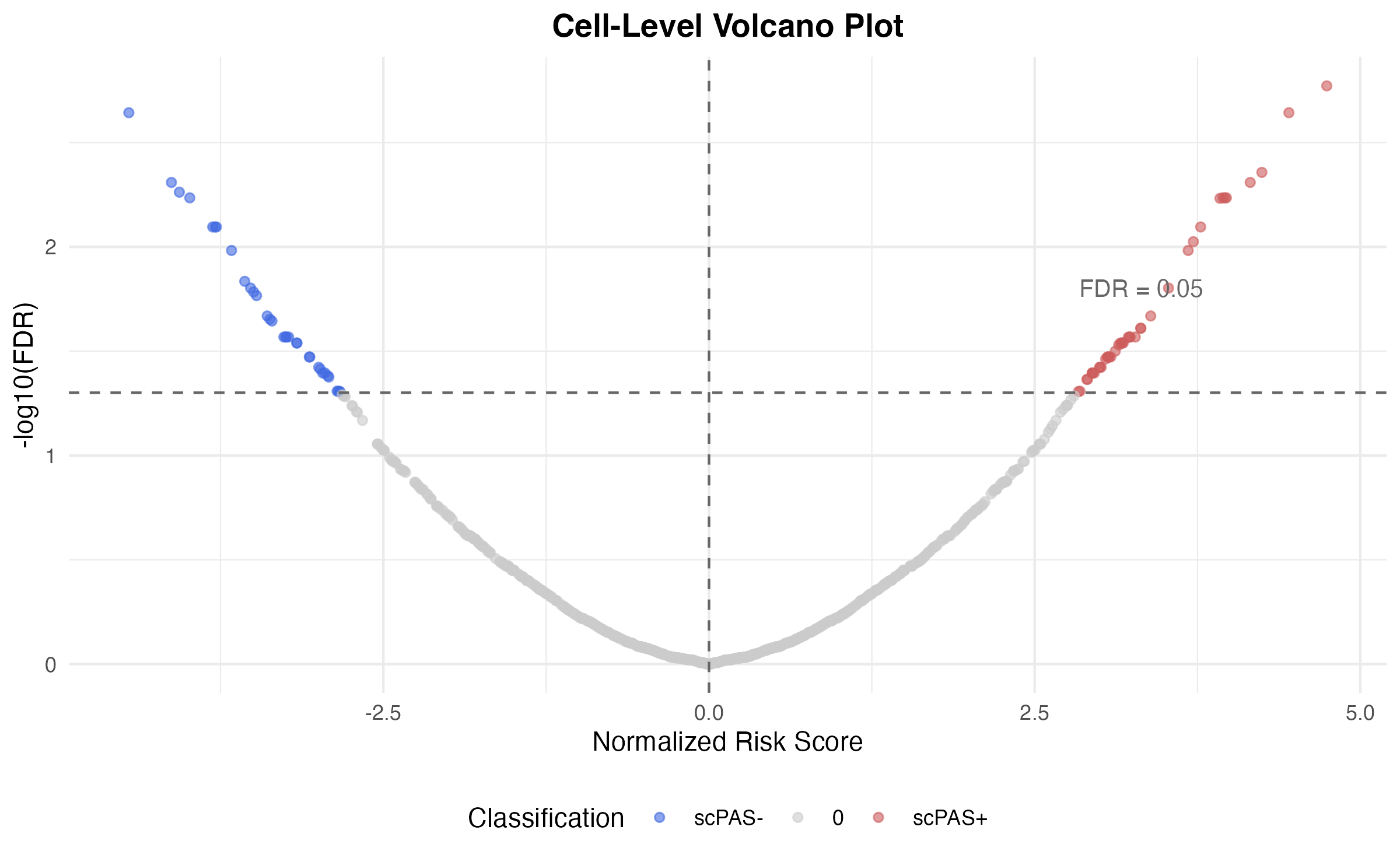
Volcano-Style Plot
# Create volcano-style data
volcano_data <- data.frame(
  NRS = sc_obj$scPAS_NRS,
  neg_log_FDR = -log10(sc_obj$scPAS_FDR + 1e-10),
  Classification = sc_obj$scPAS
)

ggplot(volcano_data, aes(x = NRS, y = neg_log_FDR, color = Classification)) +
  geom_point(alpha = 0.6, size = 1.5) +
  scale_color_manual(values = class_colors) +
  geom_hline(yintercept = -log10(0.05), linetype = "dashed", color = "gray40") +
  geom_vline(xintercept = 0, linetype = "dashed", color = "gray40") +
  annotate("text", x = max(volcano_data$NRS) * 0.7, y = -log10(0.05) + 0.5,
           label = "FDR = 0.05", color = "gray40", size = 3.5) +
  labs(
    x = "Normalized Risk Score",
    y = "-log10(FDR)",
    title = "Cell-Level Volcano Plot"
  ) +
  theme(
    plot.title = element_text(hjust = 0.5, face = "bold"),
    legend.position = "bottom"
  )
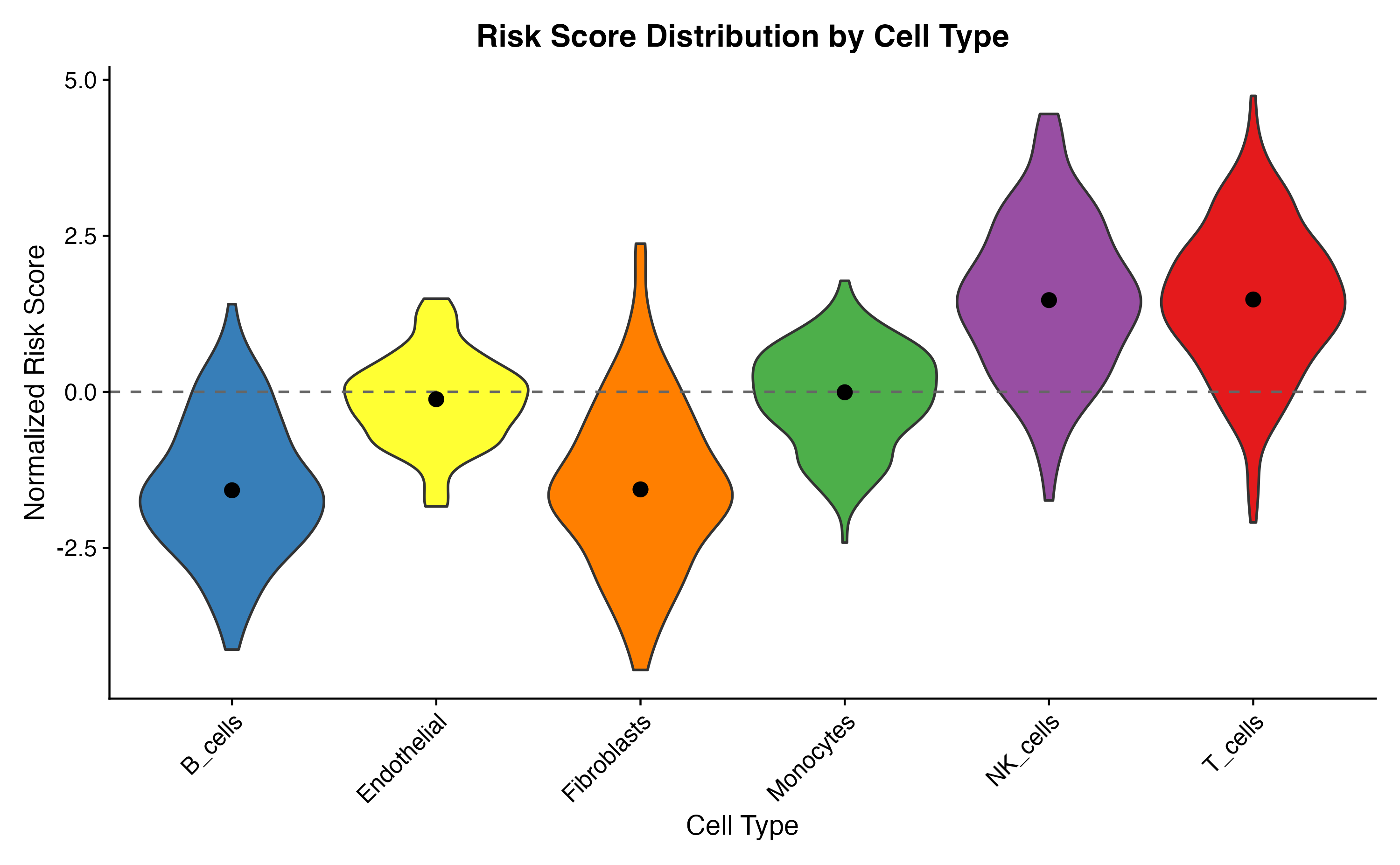
Violin Plots
Risk Score by Cell Type
VlnPlot(
  sc_obj,
  features = "scPAS_NRS",
  group.by = "celltype",
  cols = celltype_colors,
  pt.size = 0
) +
  geom_hline(yintercept = 0, linetype = "dashed", color = "gray40") +
  stat_summary(fun = median, geom = "point", size = 3, color = "black") +
  labs(
    x = "Cell Type",
    y = "Normalized Risk Score",
    title = "Risk Score Distribution by Cell Type"
  ) +
  theme(
    axis.text.x = element_text(angle = 45, hjust = 1),
    plot.title = element_text(hjust = 0.5, face = "bold"),
    legend.position = "none"
  )
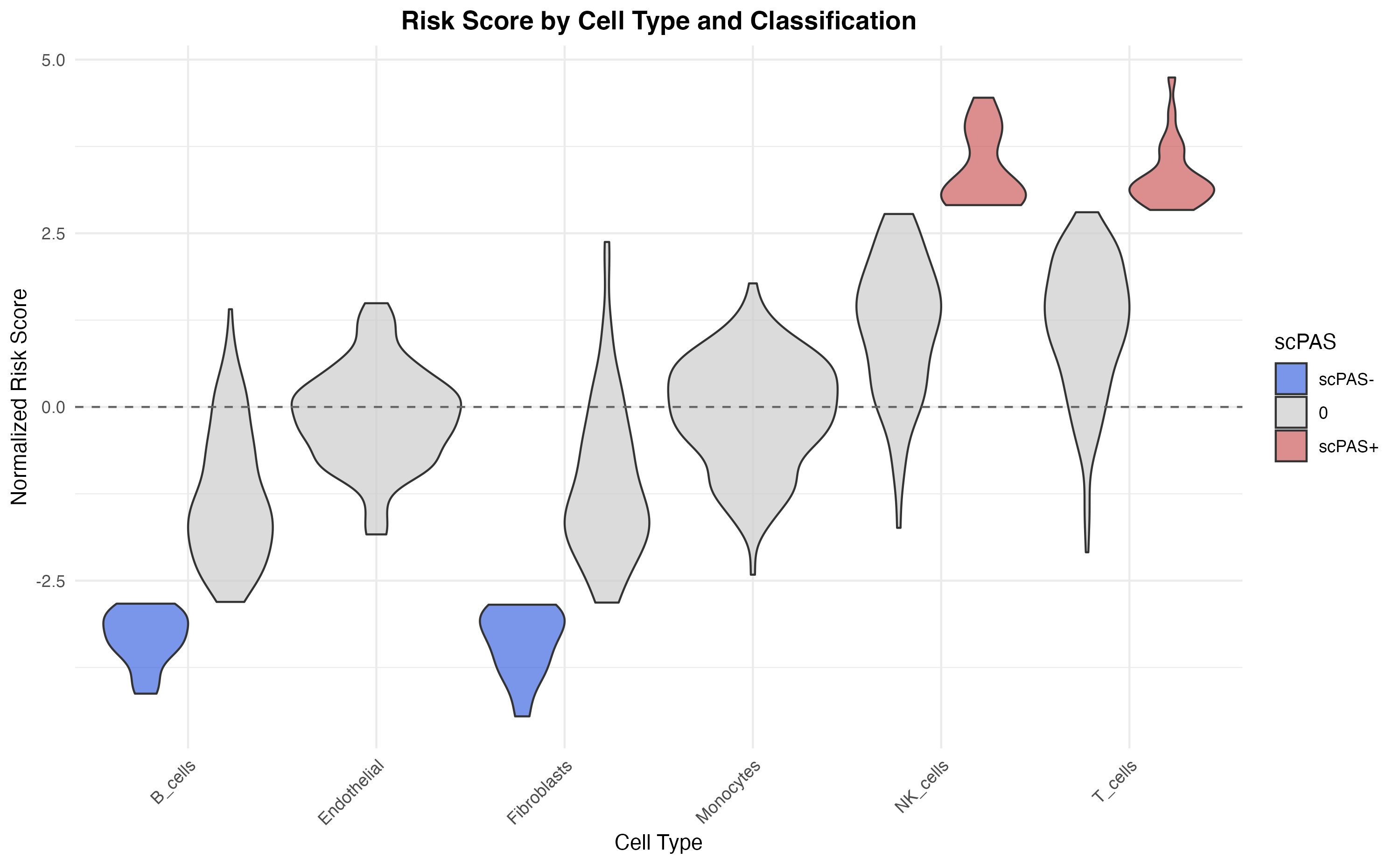
Split Violin by Classification
# Custom split violin
ggplot(sc_obj@meta.data, aes(x = celltype, y = scPAS_NRS, fill = scPAS)) +
  geom_violin(scale = "width", trim = TRUE, alpha = 0.7) +
  scale_fill_manual(values = class_colors) +
  geom_hline(yintercept = 0, linetype = "dashed", color = "gray40") +
  labs(
    x = "Cell Type",
    y = "Normalized Risk Score",
    title = "Risk Score by Cell Type and Classification",
    fill = "scPAS"
  ) +
  theme(
    axis.text.x = element_text(angle = 45, hjust = 1),
    plot.title = element_text(hjust = 0.5, face = "bold")
  )
Box Plots with Statistical Tests
# Calculate summary statistics
library(dplyr)
summary_stats <- sc_obj@meta.data %>%
  group_by(celltype) %>%
  summarise(
    median_NRS = median(scPAS_NRS),
    mean_NRS = mean(scPAS_NRS),
    n = n(),
    .groups = "drop"
  ) %>%
  arrange(desc(median_NRS))

# Reorder cell types
sc_obj@meta.data$celltype_ordered <- factor(
  sc_obj$celltype,
  levels = summary_stats$celltype
)

ggplot(sc_obj@meta.data, aes(x = celltype_ordered, y = scPAS_NRS, fill = celltype_ordered)) +
  geom_boxplot(outlier.size = 0.5, alpha = 0.8) +
  scale_fill_manual(values = celltype_colors[summary_stats$celltype]) +
  geom_hline(yintercept = 0, linetype = "dashed", color = "gray40") +
  labs(
    x = "Cell Type (ordered by median NRS)",
    y = "Normalized Risk Score",
    title = "Risk Score Distribution (Ordered)"
  ) +
  theme(
    axis.text.x = element_text(angle = 45, hjust = 1),
    plot.title = element_text(hjust = 0.5, face = "bold"),
    legend.position = "none"
  ) +
  annotate("text", x = 0.5, y = max(sc_obj$scPAS_NRS) * 0.9,
           label = paste("n =", nrow(sc_obj@meta.data)), hjust = 0, size = 3.5)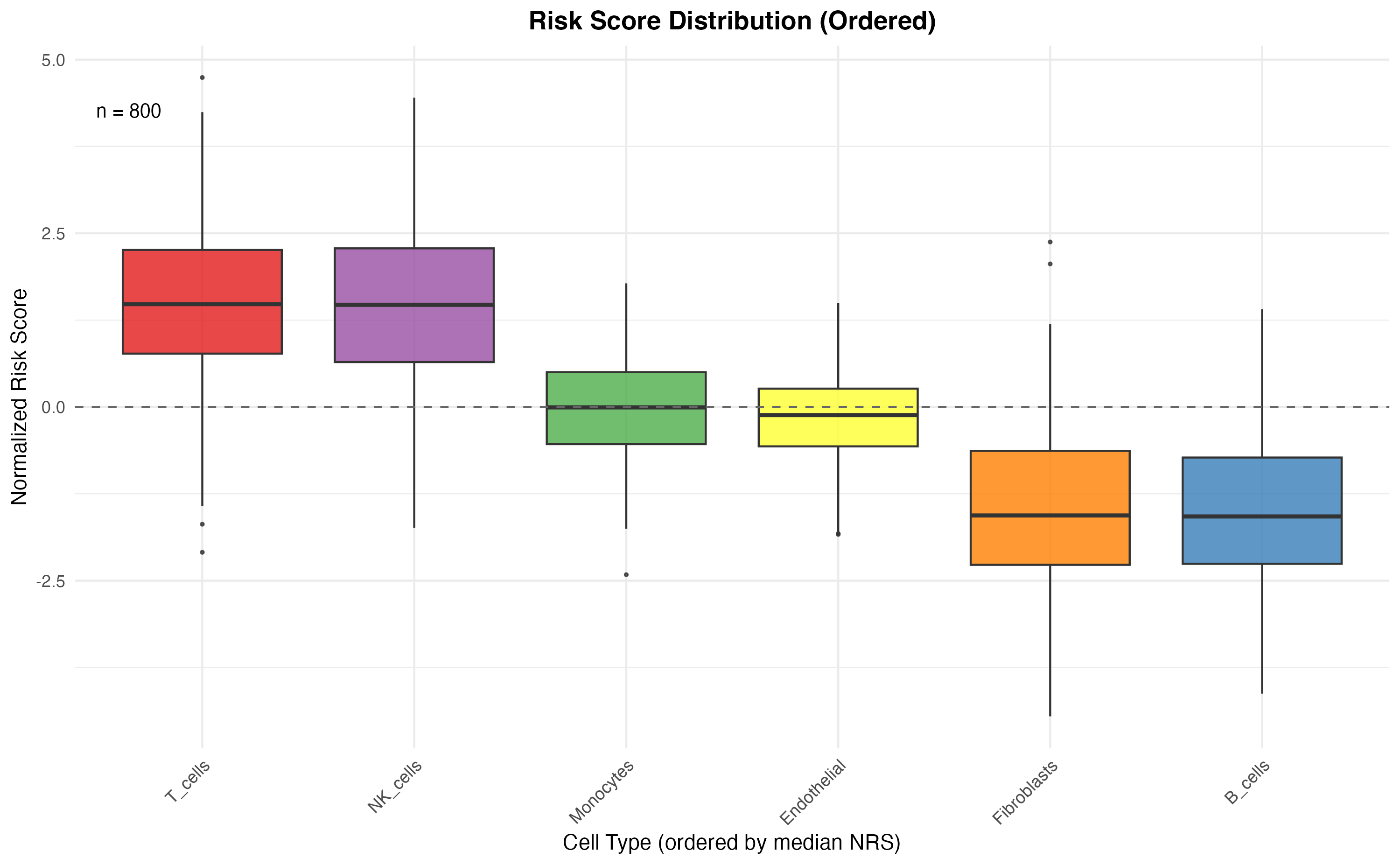
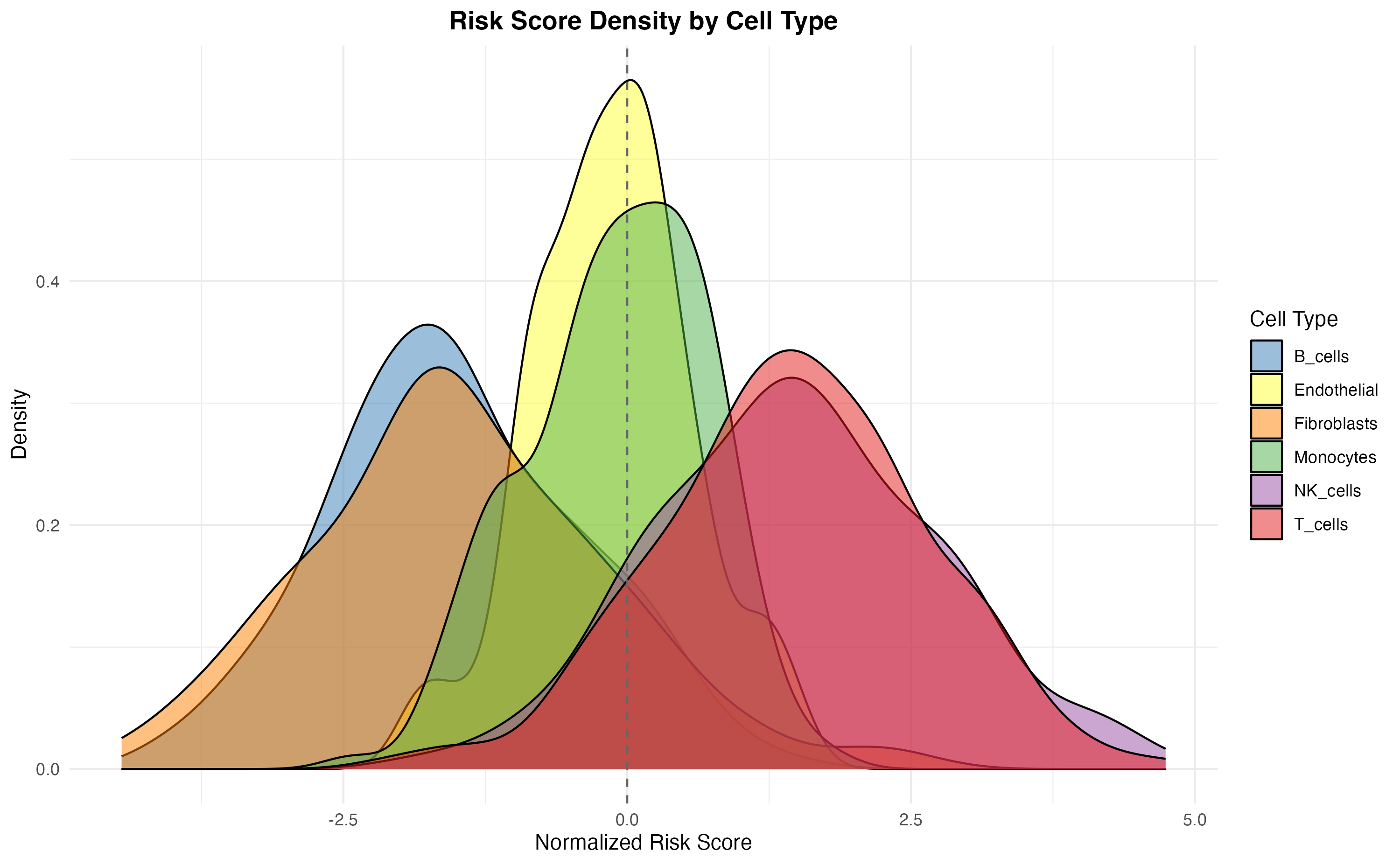
Density Plots
ggplot(sc_obj@meta.data, aes(x = scPAS_NRS, fill = celltype)) +
  geom_density(alpha = 0.5) +
  scale_fill_manual(values = celltype_colors) +
  geom_vline(xintercept = 0, linetype = "dashed", color = "gray40") +
  labs(
    x = "Normalized Risk Score",
    y = "Density",
    title = "Risk Score Density by Cell Type",
    fill = "Cell Type"
  ) +
  theme(
    plot.title = element_text(hjust = 0.5, face = "bold"),
    legend.position = "right"
  )
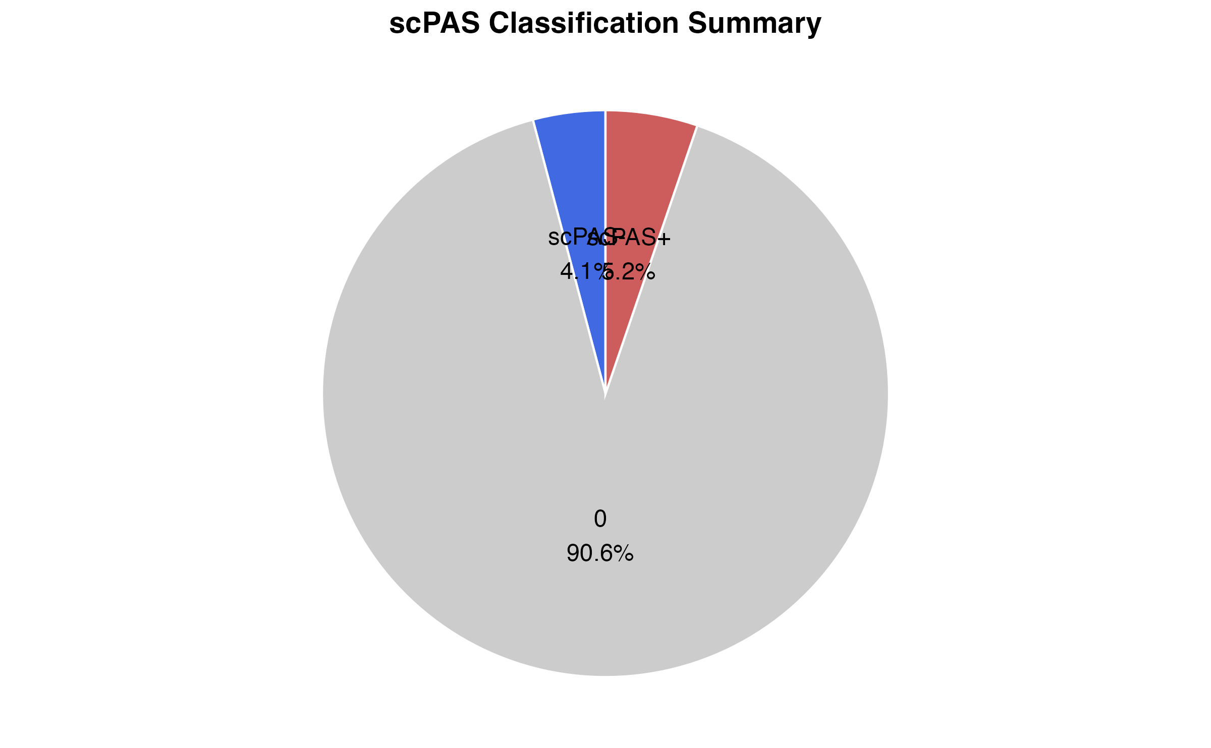
Pie Chart Summary
# Summary counts
pie_data <- as.data.frame(table(sc_obj$scPAS))
colnames(pie_data) <- c("Classification", "Count")
pie_data$Percentage <- pie_data$Count / sum(pie_data$Count) * 100
pie_data$Label <- paste0(pie_data$Classification, "\n", round(pie_data$Percentage, 1), "%")

ggplot(pie_data, aes(x = "", y = Count, fill = Classification)) +
  geom_bar(stat = "identity", width = 1, color = "white") +
  coord_polar(theta = "y") +
  scale_fill_manual(values = class_colors) +
  geom_text(aes(label = Label), position = position_stack(vjust = 0.5), size = 4) +
  labs(title = "scPAS Classification Summary") +
  theme_void() +
  theme(
    plot.title = element_text(hjust = 0.5, face = "bold", size = 14),
    legend.position = "none"
  )
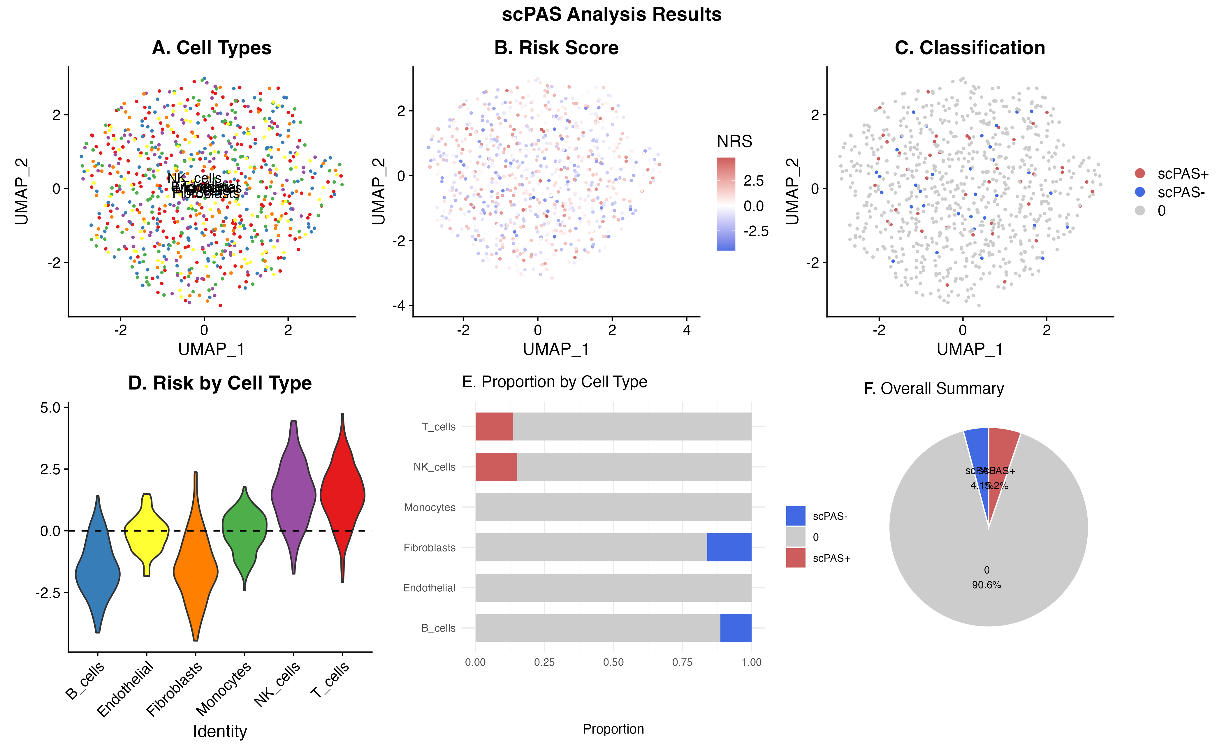
Publication-Ready Figure
# Create a publication-ready multi-panel figure
p1 <- DimPlot(sc_obj, group.by = "celltype", cols = celltype_colors, label = TRUE, pt.size = 0.5) +
  ggtitle("A. Cell Types") + theme(legend.position = "none")

p2 <- FeaturePlot(sc_obj, features = "scPAS_NRS", pt.size = 0.5) +
  scale_color_gradient2(low = "royalblue", mid = "white", high = "indianred", midpoint = 0, name = "NRS") +
  ggtitle("B. Risk Score")

p3 <- DimPlot(sc_obj, group.by = "scPAS", cols = class_colors, pt.size = 0.5,
              order = c("0", "scPAS-", "scPAS+")) +
  ggtitle("C. Classification")

p4 <- VlnPlot(sc_obj, features = "scPAS_NRS", group.by = "celltype",
              cols = celltype_colors, pt.size = 0) +
  geom_hline(yintercept = 0, linetype = "dashed") +
  ggtitle("D. Risk by Cell Type") + NoLegend() +
  theme(axis.text.x = element_text(angle = 45, hjust = 1))

p5 <- ggplot(prop_data, aes(x = CellType, y = Proportion, fill = scPAS)) +
  geom_bar(stat = "identity", position = "stack", width = 0.7) +
  scale_fill_manual(values = class_colors) +
  coord_flip() +
  labs(x = "", y = "Proportion", fill = "") +
  ggtitle("E. Proportion by Cell Type")

p6 <- ggplot(pie_data, aes(x = "", y = Count, fill = Classification)) +
  geom_bar(stat = "identity", width = 1, color = "white") +
  coord_polar(theta = "y") +
  scale_fill_manual(values = class_colors) +
  geom_text(aes(label = Label), position = position_stack(vjust = 0.5), size = 3) +
  theme_void() +
  ggtitle("F. Overall Summary") +
  theme(legend.position = "none")

# Combine
(p1 | p2 | p3) / (p4 | p5 | p6) +
  plot_annotation(
    title = "scPAS Analysis Results",
    theme = theme(plot.title = element_text(hjust = 0.5, face = "bold", size = 16))
  )
Saving Plots
# Save individual plots
ggsave("umap_celltype.pdf", plot = p1, width = 8, height = 6, dpi = 300)
ggsave("umap_risk_score.pdf", plot = p2, width = 8, height = 6, dpi = 300)
ggsave("umap_classification.pdf", plot = p3, width = 8, height = 6, dpi = 300)

# Save combined figure
combined_fig <- (p1 | p2 | p3) / (p4 | p5 | p6)
ggsave("scPAS_combined_figure.pdf", plot = combined_fig, width = 14, height = 10, dpi = 300)
ggsave("scPAS_combined_figure.png", plot = combined_fig, width = 14, height = 10, dpi = 300)
Session Information
sessionInfo()
#> R version 4.4.0 (2024-04-24)
#> Platform: aarch64-apple-darwin20
#> Running under: macOS 15.6.1
#>
#> Matrix products: default
#> BLAS:   /Library/Frameworks/R.framework/Versions/4.4-arm64/Resources/lib/libRblas.0.dylib
#> LAPACK: /Library/Frameworks/R.framework/Versions/4.4-arm64/Resources/lib/libRlapack.dylib;  LAPACK version 3.12.0
#>
#> locale:
#> [1] C
#>
#> time zone: Asia/Shanghai
#> tzcode source: internal
#>
#> attached base packages:
#> [1] stats     graphics  grDevices utils     datasets  methods   base
#>
#> other attached packages:
#> [1] patchwork_1.3.2    dplyr_1.1.4        RColorBrewer_1.1-3 ggplot2_4.0.1
#> [5] Matrix_1.7-4       SeuratObject_4.1.4 Seurat_4.4.0       scPAS_1.0.3
#>
#> loaded via a namespace (and not attached):
#>   [1] deldir_2.0-4           pbapply_1.7-4          gridExtra_2.3
#>   [4] rlang_1.1.7            magrittr_2.0.4         RcppAnnoy_0.0.23
#>   [7] otel_0.2.0             spatstat.geom_3.6-1    matrixStats_1.5.0
#>  [10] ggridges_0.5.7         compiler_4.4.0         png_0.1-8
#>  [13] systemfonts_1.3.1      vctrs_0.7.0            reshape2_1.4.5
#>  [16] stringr_1.6.0          pkgconfig_2.0.3        fastmap_1.2.0
#>  [19] labeling_0.4.3         promises_1.5.0         rmarkdown_2.30
#>  [22] ggbeeswarm_0.7.3       preprocessCore_1.68.0  ragg_1.5.0
#>  [25] purrr_1.2.1            xfun_0.56              cachem_1.1.0
#>  [28] jsonlite_2.0.0         goftest_1.2-3          later_1.4.5
#>  [31] spatstat.utils_3.2-1   irlba_2.3.5.1          parallel_4.4.0
#>  [34] cluster_2.1.8.1        R6_2.6.1               ica_1.0-3
#>  [37] spatstat.data_3.1-9    bslib_0.9.0            stringi_1.8.7
#>  [40] reticulate_1.44.1      spatstat.univar_3.1-6  parallelly_1.46.1
#>  [43] lmtest_0.9-40          jquerylib_0.1.4        scattermore_1.2
#>  [46] Rcpp_1.1.1             knitr_1.51             tensor_1.5.1
#>  [49] future.apply_1.20.1    zoo_1.8-15             sctransform_0.4.3
#>  [52] httpuv_1.6.16          splines_4.4.0          igraph_2.2.1
#>  [55] tidyselect_1.2.1       abind_1.4-8            dichromat_2.0-0.1
#>  [58] yaml_2.3.12            spatstat.random_3.4-3  spatstat.explore_3.6-0
#>  [61] codetools_0.2-20       miniUI_0.1.2           listenv_0.10.0
#>  [64] plyr_1.8.9             lattice_0.22-7         tibble_3.3.1
#>  [67] withr_3.0.2            shiny_1.12.1           S7_0.2.1
#>  [70] ROCR_1.0-11            ggrastr_1.0.2          evaluate_1.0.5
#>  [73] Rtsne_0.17             future_1.69.0          desc_1.4.3
#>  [76] survival_3.8-3         polyclip_1.10-7        fitdistrplus_1.2-4
#>  [79] pillar_1.11.1          KernSmooth_2.23-26     plotly_4.11.0
#>  [82] generics_0.1.4         sp_2.2-0               scales_1.4.0
#>  [85] globals_0.18.0         xtable_1.8-4           glue_1.8.0
#>  [88] lazyeval_0.2.2         tools_4.4.0            data.table_1.18.0
#>  [91] RSpectra_0.16-2        RANN_2.6.2             fs_1.6.6
#>  [94] leiden_0.4.3.1         cowplot_1.2.0          grid_4.4.0
#>  [97] tidyr_1.3.2            nlme_3.1-168           beeswarm_0.4.0
#> [100] vipor_0.4.7            cli_3.6.5              spatstat.sparse_3.1-0
#> [103] textshaping_1.0.4      viridisLite_0.4.2      uwot_0.2.4
#> [106] gtable_0.3.6           sass_0.4.10            digest_0.6.39
#> [109] progressr_0.18.0       ggrepel_0.9.6          htmlwidgets_1.6.4
#> [112] farver_2.1.2           htmltools_0.5.9        pkgdown_2.1.3
#> [115] lifecycle_1.0.5        httr_1.4.7             mime_0.13
#> [118] MASS_7.3-65