Visualization Gallery
Comprehensive Guide to CellOracleR Plotting Functions
Zaoqu Liu
2026-01-25
Source:vignettes/visualization-gallery.Rmd
visualization-gallery.RmdIntroduction
CellOracleR provides a comprehensive suite of visualization functions built on ggplot2. This gallery demonstrates the available plot types and customization options.
Cell Embedding Visualizations
Basic Cluster Plot
Visualize cell clusters in embedding space:
# Generate demo data
set.seed(42)
n_cells <- 500

# Create clusters with different distributions
demo_embedding <- data.frame(
  UMAP_1 = c(rnorm(200, -3, 0.8), rnorm(150, 2, 1), rnorm(150, 0, 0.6)),
  UMAP_2 = c(rnorm(200, 0, 0.8), rnorm(150, 2, 0.9), rnorm(150, -2, 0.7)),
  cluster = factor(c(rep("HSC", 200), rep("Monocyte", 150), rep("Erythroid", 150)))
)

# Cluster plot
ggplot(demo_embedding, aes(x = UMAP_1, y = UMAP_2, color = cluster)) +
  geom_point(alpha = 0.6, size = 1.5) +
  scale_color_manual(values = c("#E41A1C", "#377EB8", "#4DAF4A")) +
  labs(
    title = "Cell Clusters in UMAP Space",
    subtitle = "CellOracleR plot_cluster()",
    x = "UMAP 1",
    y = "UMAP 2",
    color = "Cell Type"
  ) +
  theme_minimal() +
  theme(
    panel.grid = element_blank(),
    legend.position = "right",
    plot.title = element_text(face = "bold", size = 14)
  ) +
  coord_fixed()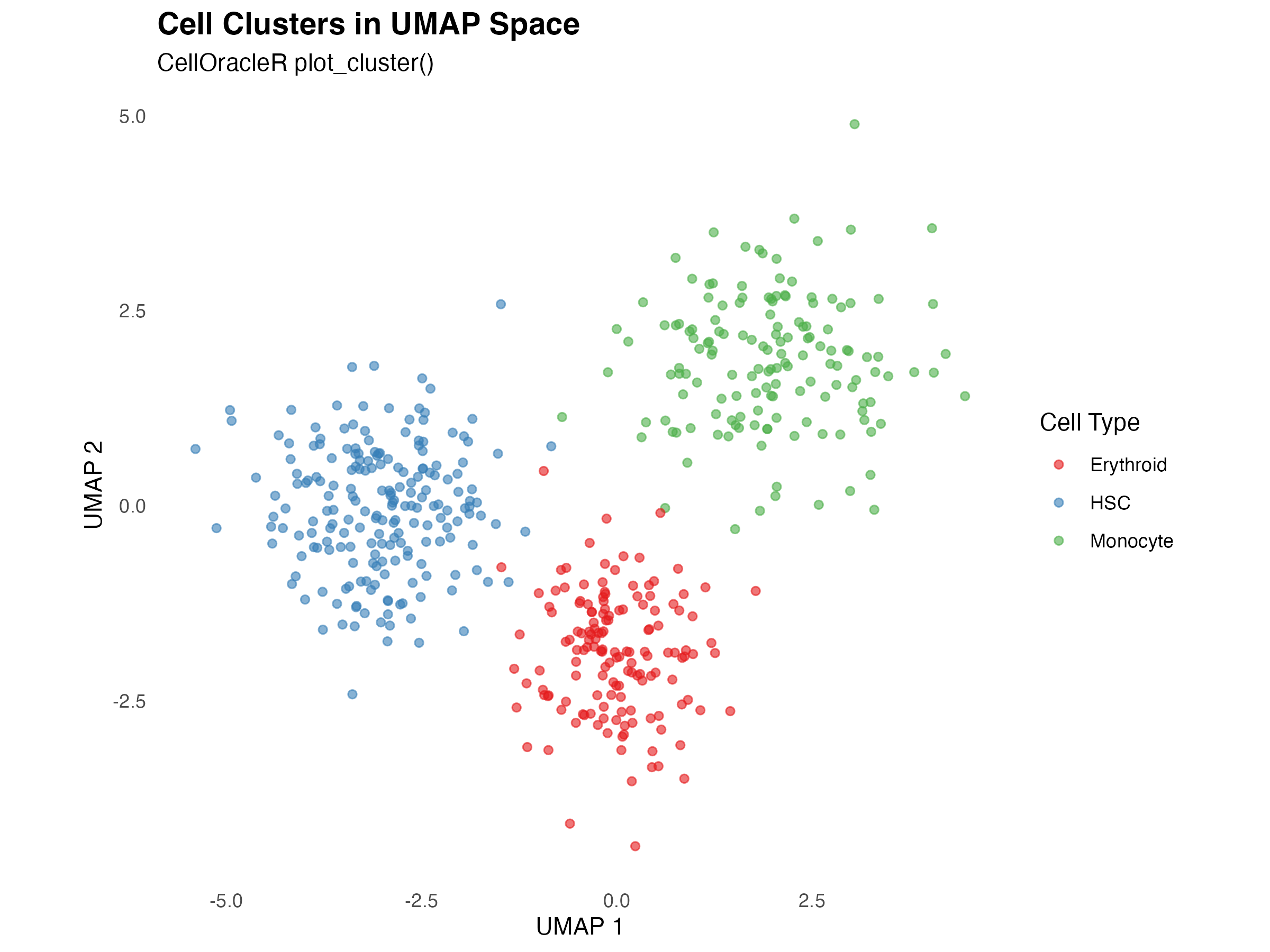
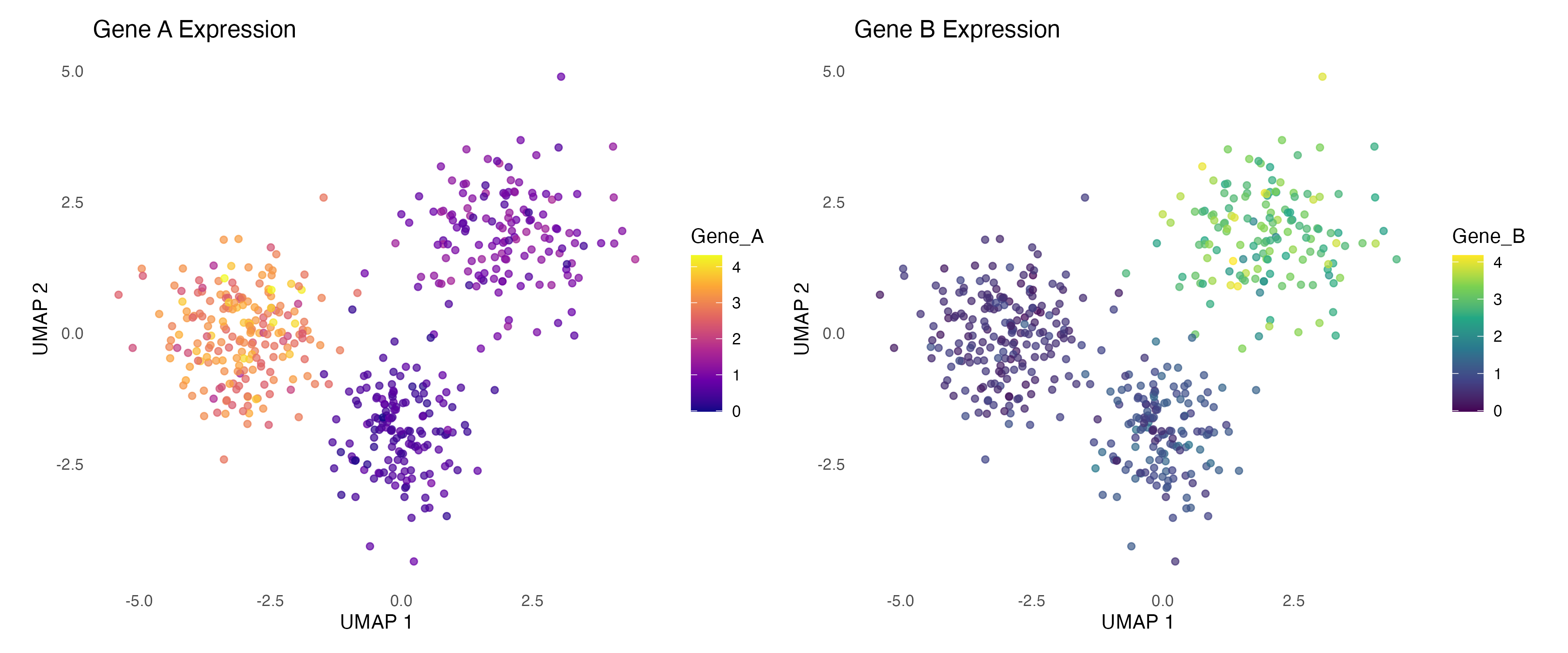
Gene Expression Overlay
Visualize gene expression on embedding:
# Add expression data
demo_embedding$Gene_A <- c(
  rnorm(200, 3, 0.5),   # High in HSC
  rnorm(150, 1, 0.3),   # Low in Monocyte
  rnorm(150, 0.5, 0.2)  # Very low in Erythroid
)

demo_embedding$Gene_B <- c(
  rnorm(200, 0.5, 0.2), # Low in HSC
  rnorm(150, 3, 0.5),   # High in Monocyte
  rnorm(150, 1, 0.3)    # Medium in Erythroid
)

# Create side-by-side plots
p1 <- ggplot(demo_embedding, aes(x = UMAP_1, y = UMAP_2, color = Gene_A)) +
  geom_point(alpha = 0.7, size = 1.5) +
  scale_color_viridis_c(option = "plasma") +
  labs(title = "Gene A Expression", x = "UMAP 1", y = "UMAP 2") +
  theme_minimal() +
  theme(panel.grid = element_blank()) +
  coord_fixed()

p2 <- ggplot(demo_embedding, aes(x = UMAP_1, y = UMAP_2, color = Gene_B)) +
  geom_point(alpha = 0.7, size = 1.5) +
  scale_color_viridis_c(option = "viridis") +
  labs(title = "Gene B Expression", x = "UMAP 1", y = "UMAP 2") +
  theme_minimal() +
  theme(panel.grid = element_blank()) +
  coord_fixed()

if (requireNamespace("patchwork", quietly = TRUE)) {
  library(patchwork)
  p1 + p2
} else {
  print(p1)
}
Simulation Flow Visualizations
Quiver Plot (Vector Field)
The quiver plot shows predicted cell movement directions:
# Create grid for quiver plot
grid_x <- seq(-5, 4, by = 1)
grid_y <- seq(-4, 4, by = 1)
grid_data <- expand.grid(x = grid_x, y = grid_y)

# Simulate flow vectors (pointing toward attractors)
attractor1 <- c(-3, 0)
attractor2 <- c(2, 2)

# Calculate vectors
grid_data$dx <- 0
grid_data$dy <- 0

for (i in 1:nrow(grid_data)) {
  # Distance to attractors
  d1 <- sqrt((grid_data$x[i] - attractor1[1])^2 + (grid_data$y[i] - attractor1[2])^2)
  d2 <- sqrt((grid_data$x[i] - attractor2[1])^2 + (grid_data$y[i] - attractor2[2])^2)

  # Weight by inverse distance
  w1 <- 1 / (d1 + 0.5)^2
  w2 <- 1 / (d2 + 0.5)^2

  # Combined direction
  grid_data$dx[i] <- w1 * (attractor1[1] - grid_data$x[i]) +
                     w2 * (attractor2[1] - grid_data$x[i])
  grid_data$dy[i] <- w1 * (attractor1[2] - grid_data$y[i]) +
                     w2 * (attractor2[2] - grid_data$y[i])

  # Normalize
  mag <- sqrt(grid_data$dx[i]^2 + grid_data$dy[i]^2)
  if (mag > 0) {
    grid_data$dx[i] <- grid_data$dx[i] / mag * 0.4
    grid_data$dy[i] <- grid_data$dy[i] / mag * 0.4
  }
}

# Calculate magnitude for coloring
grid_data$magnitude <- sqrt(grid_data$dx^2 + grid_data$dy^2)

ggplot() +
  geom_point(data = demo_embedding,
             aes(x = UMAP_1, y = UMAP_2, color = cluster),
             alpha = 0.3, size = 1) +
  geom_segment(data = grid_data,
               aes(x = x, y = y, xend = x + dx, yend = y + dy),
               arrow = arrow(length = unit(0.15, "cm"), type = "closed"),
               color = "black", size = 0.6) +
  scale_color_manual(values = c("#E41A1C", "#377EB8", "#4DAF4A")) +
  labs(
    title = "Simulation Flow Field (Quiver Plot)",
    subtitle = "Arrows indicate predicted cell movement direction",
    x = "UMAP 1",
    y = "UMAP 2"
  ) +
  theme_minimal() +
  theme(
    panel.grid = element_blank(),
    plot.title = element_text(face = "bold", size = 14)
  ) +
  coord_fixed()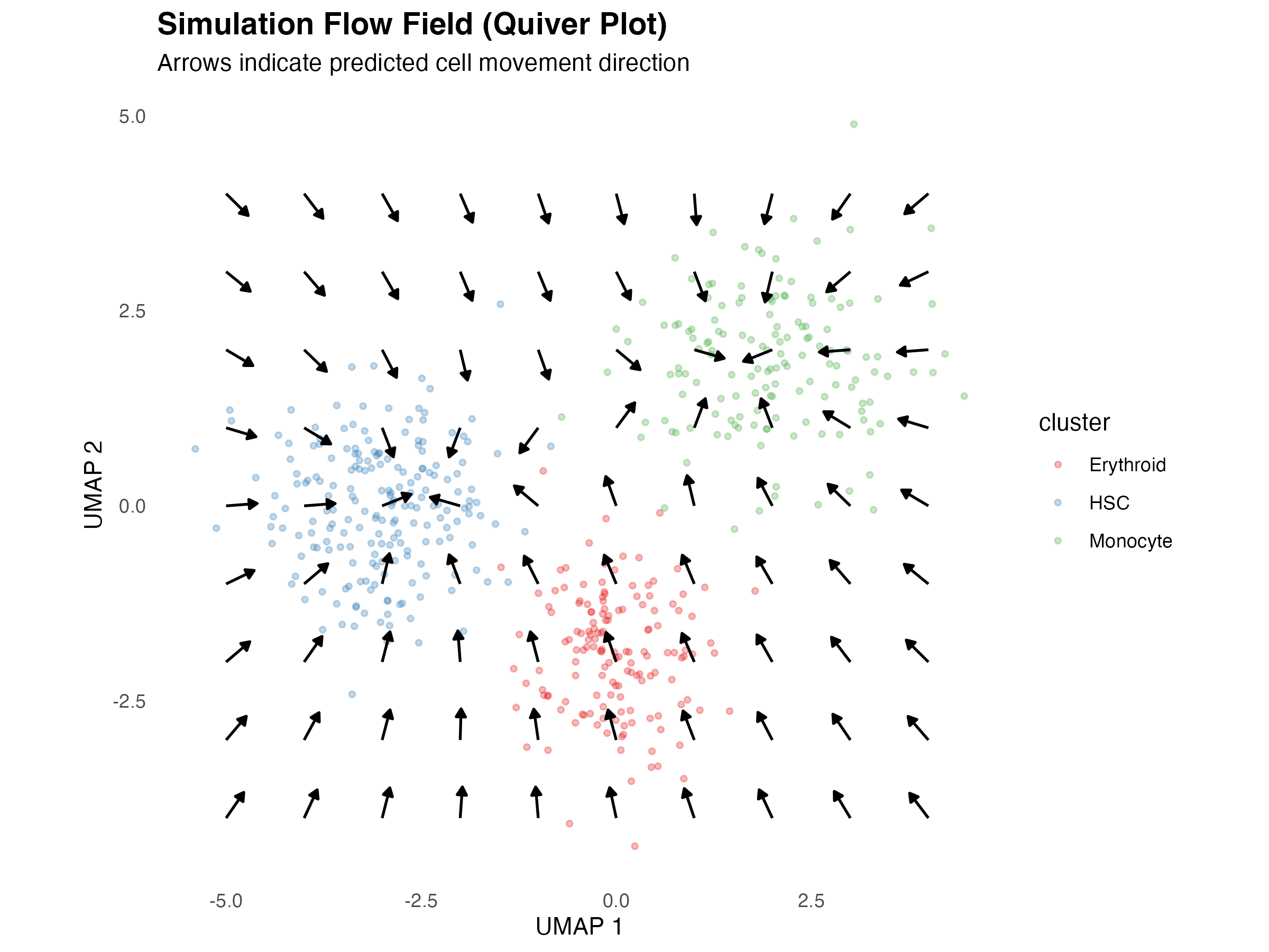
Streamline Plot
Smoother representation of flow patterns:
# Generate streamlines
set.seed(42)
n_streams <- 15
stream_length <- 50

streamlines <- list()
for (s in 1:n_streams) {
  # Random starting points
  start_x <- runif(1, -4, 3)
  start_y <- runif(1, -3, 3)

  stream <- data.frame(x = numeric(stream_length),
                       y = numeric(stream_length),
                       stream_id = s)
  stream$x[1] <- start_x
  stream$y[1] <- start_y

  for (i in 2:stream_length) {
    # Calculate direction
    d1 <- sqrt((stream$x[i-1] - attractor1[1])^2 + (stream$y[i-1] - attractor1[2])^2)
    d2 <- sqrt((stream$x[i-1] - attractor2[1])^2 + (stream$y[i-1] - attractor2[2])^2)

    w1 <- 1 / (d1 + 0.5)^2
    w2 <- 1 / (d2 + 0.5)^2

    dx <- w1 * (attractor1[1] - stream$x[i-1]) + w2 * (attractor2[1] - stream$x[i-1])
    dy <- w1 * (attractor1[2] - stream$y[i-1]) + w2 * (attractor2[2] - stream$y[i-1])

    mag <- sqrt(dx^2 + dy^2)
    if (mag > 0) {
      stream$x[i] <- stream$x[i-1] + dx / mag * 0.15
      stream$y[i] <- stream$y[i-1] + dy / mag * 0.15
    } else {
      stream$x[i] <- stream$x[i-1]
      stream$y[i] <- stream$y[i-1]
    }
  }
  stream$step <- 1:stream_length
  streamlines[[s]] <- stream
}

stream_df <- do.call(rbind, streamlines)

ggplot() +
  geom_point(data = demo_embedding,
             aes(x = UMAP_1, y = UMAP_2, color = cluster),
             alpha = 0.3, size = 1) +
  geom_path(data = stream_df,
            aes(x = x, y = y, group = stream_id, alpha = step),
            color = "darkblue", size = 0.8) +
  scale_color_manual(values = c("#E41A1C", "#377EB8", "#4DAF4A")) +
  scale_alpha_continuous(range = c(0.2, 1), guide = "none") +
  labs(
    title = "Simulation Streamlines",
    subtitle = "Continuous flow paths through the embedding",
    x = "UMAP 1",
    y = "UMAP 2"
  ) +
  theme_minimal() +
  theme(
    panel.grid = element_blank(),
    plot.title = element_text(face = "bold", size = 14)
  ) +
  coord_fixed()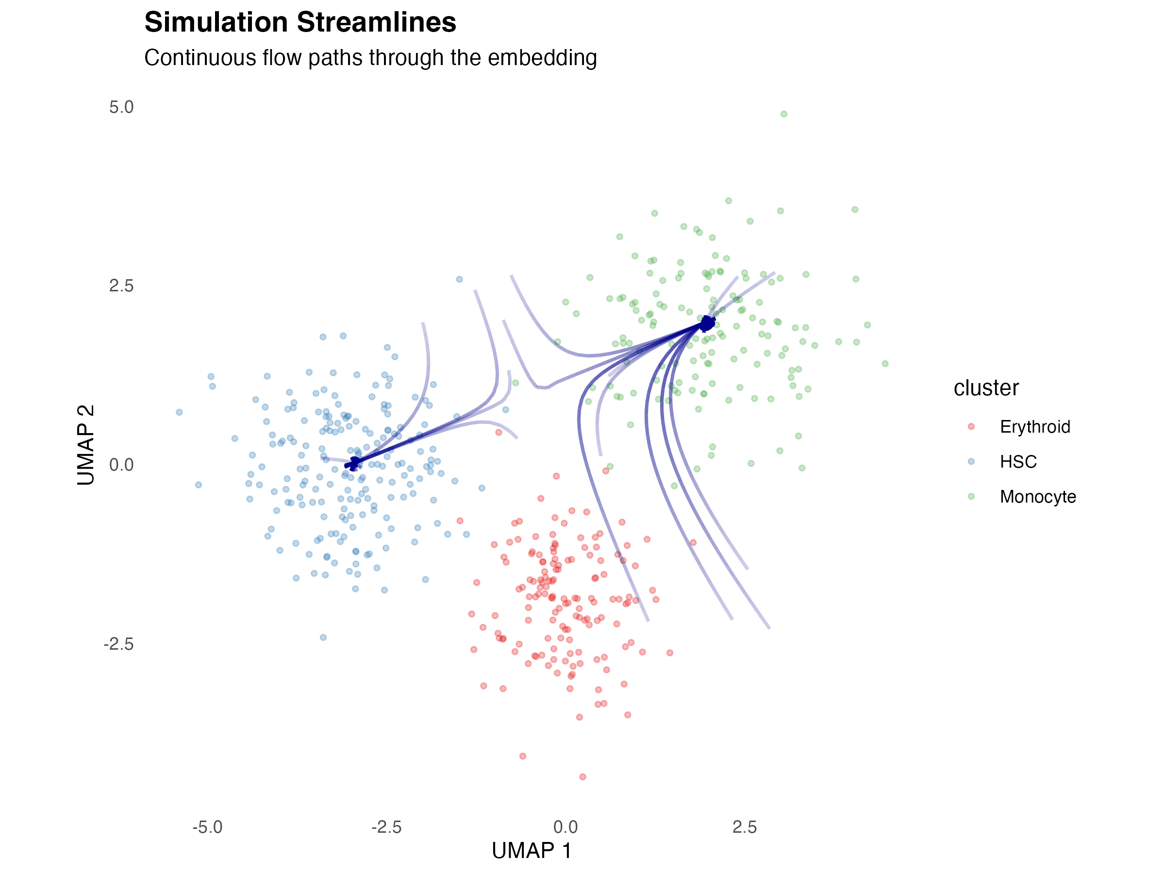
Network Visualizations
Network Graph
Visualize gene regulatory networks:
# Create demo network data
set.seed(42)
nodes <- data.frame(
  name = c("TF1", "TF2", "TF3", "Gene_A", "Gene_B", "Gene_C", "Gene_D", "Gene_E"),
  type = c(rep("TF", 3), rep("Target", 5)),
  degree = c(4, 3, 2, 2, 2, 1, 1, 1)
)

edges <- data.frame(
  from = c("TF1", "TF1", "TF1", "TF1", "TF2", "TF2", "TF2", "TF3", "TF3"),
  to = c("Gene_A", "Gene_B", "Gene_C", "Gene_D", "Gene_A", "Gene_B", "Gene_E", "Gene_C", "Gene_D"),
  weight = c(0.8, 0.6, 0.5, 0.3, 0.7, 0.4, 0.5, 0.6, 0.4)
)

# Create layout (circular for TFs, radial for targets)
node_pos <- data.frame(
  name = nodes$name,
  x = c(-2, 0, 2, -2, 0, 2, -1, 1),
  y = c(2, 2, 2, -1, -1, -1, -2, -2)
)

# Merge positions
edges_plot <- merge(edges, node_pos, by.x = "from", by.y = "name")
names(edges_plot)[4:5] <- c("x_from", "y_from")
edges_plot <- merge(edges_plot, node_pos, by.x = "to", by.y = "name")
names(edges_plot)[6:7] <- c("x_to", "y_to")

nodes <- merge(nodes, node_pos, by = "name")

ggplot() +
  geom_segment(data = edges_plot,
               aes(x = x_from, y = y_from, xend = x_to, yend = y_to,
                   alpha = weight),
               arrow = arrow(length = unit(0.25, "cm"), type = "closed"),
               color = "gray40", size = 1) +
  geom_point(data = nodes,
             aes(x = x, y = y, fill = type, size = degree),
             shape = 21, color = "black") +
  geom_text(data = nodes,
            aes(x = x, y = y, label = name),
            vjust = -1.5, size = 3.5, fontface = "bold") +
  scale_fill_manual(values = c("TF" = "#FF7043", "Target" = "#42A5F5")) +
  scale_size_continuous(range = c(6, 12)) +
  scale_alpha_continuous(range = c(0.3, 1)) +
  labs(
    title = "Gene Regulatory Network",
    subtitle = "TFs (orange) regulate target genes (blue)",
    fill = "Node Type",
    size = "Degree"
  ) +
  theme_void() +
  theme(
    plot.title = element_text(face = "bold", size = 14, hjust = 0.5),
    plot.subtitle = element_text(hjust = 0.5),
    legend.position = "bottom"
  ) +
  guides(alpha = "none")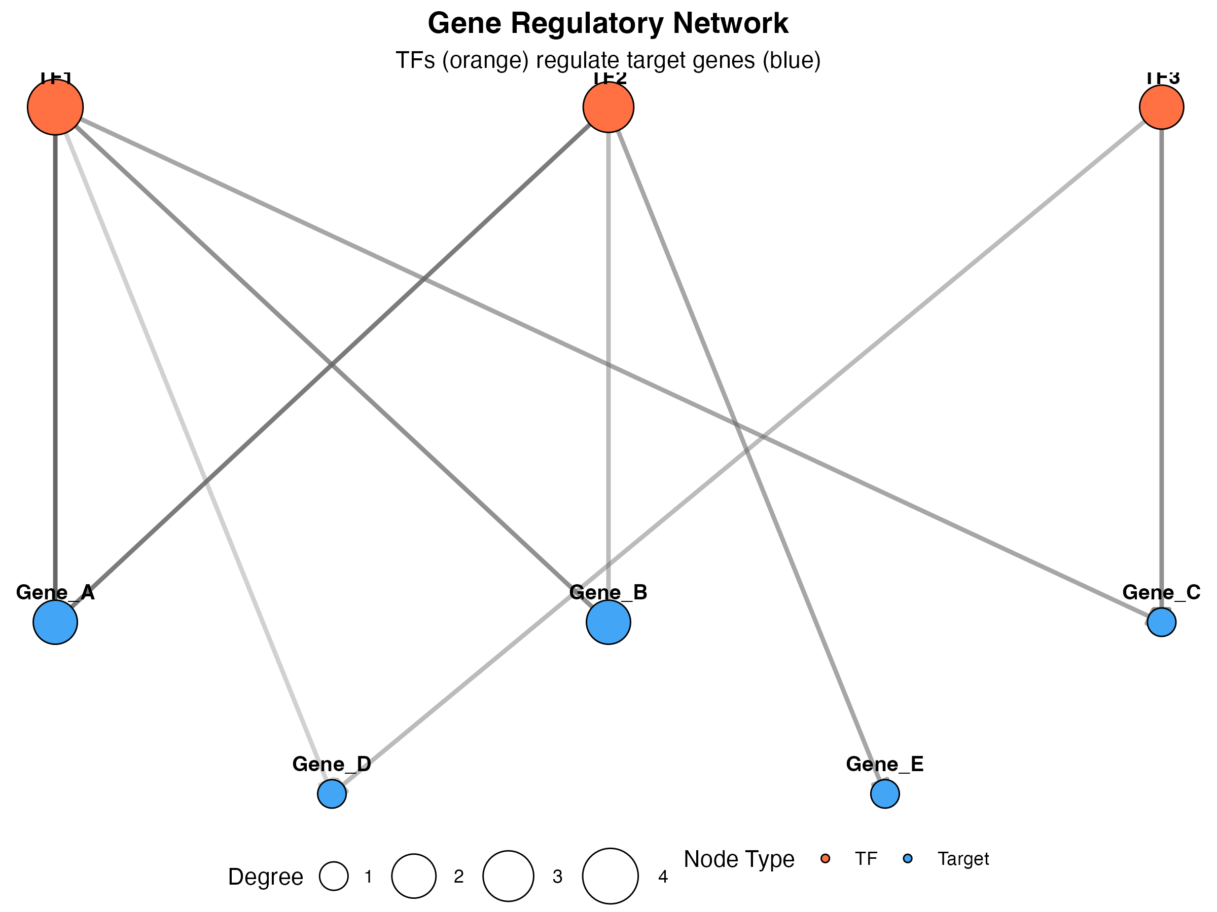
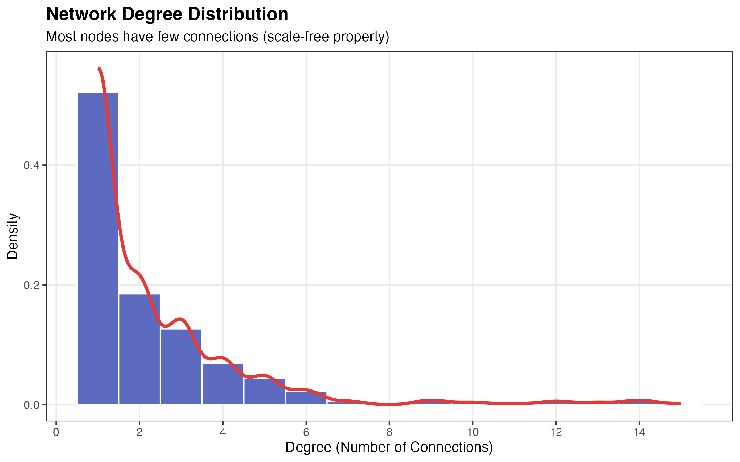
Degree Distribution
# Generate realistic degree distribution (power-law like)
set.seed(42)
degrees <- c(
  sample(1:3, 500, replace = TRUE, prob = c(0.6, 0.25, 0.15)),
  sample(4:6, 80, replace = TRUE, prob = c(0.5, 0.3, 0.2)),
  sample(7:15, 20, replace = TRUE)
)

degree_df <- data.frame(degree = degrees)

ggplot(degree_df, aes(x = degree)) +
  geom_histogram(aes(y = after_stat(density)),
                 binwidth = 1, fill = "#5C6BC0", color = "white") +
  geom_density(color = "#E53935", size = 1.2) +
  scale_x_continuous(breaks = seq(0, 15, 2)) +
  labs(
    title = "Network Degree Distribution",
    subtitle = "Most nodes have few connections (scale-free property)",
    x = "Degree (Number of Connections)",
    y = "Density"
  ) +
  theme_bw() +
  theme(
    plot.title = element_text(face = "bold", size = 14),
    panel.grid.minor = element_blank()
  )
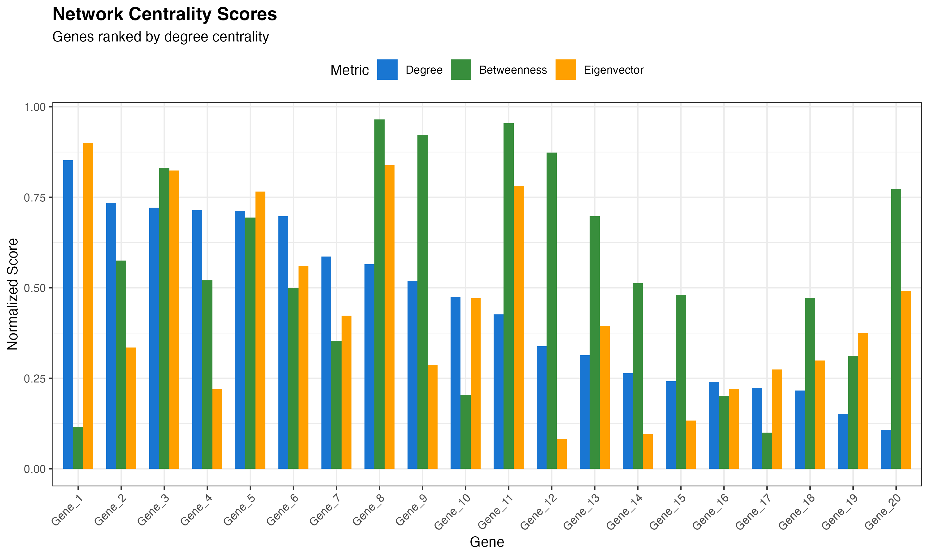
Network Scores Ranking
# Create mock network scores
scores_df <- data.frame(
  gene = paste0("Gene_", 1:20),
  degree = sort(runif(20, 0, 1), decreasing = TRUE),
  betweenness = runif(20, 0, 1),
  eigenvector = runif(20, 0, 1)
)
scores_df$gene <- factor(scores_df$gene, levels = scores_df$gene)

# Reshape for plotting
library(reshape2)
scores_long <- melt(scores_df, id.vars = "gene", variable.name = "metric", value.name = "score")

ggplot(scores_long, aes(x = gene, y = score, fill = metric)) +
  geom_col(position = "dodge", width = 0.7) +
  scale_fill_manual(
    values = c("#1976D2", "#388E3C", "#FFA000"),
    labels = c("Degree", "Betweenness", "Eigenvector")
  ) +
  labs(
    title = "Network Centrality Scores",
    subtitle = "Genes ranked by degree centrality",
    x = "Gene",
    y = "Normalized Score",
    fill = "Metric"
  ) +
  theme_bw() +
  theme(
    axis.text.x = element_text(angle = 45, hjust = 1),
    plot.title = element_text(face = "bold", size = 14),
    legend.position = "top"
  )
Pseudotime Visualizations
Pseudotime on Embedding
# Add pseudotime to demo data
demo_embedding$pseudotime <- with(demo_embedding, {
  # Pseudotime based on distance from HSC cluster center
  dist_from_origin <- sqrt((UMAP_1 + 3)^2 + UMAP_2^2)
  scales::rescale(dist_from_origin, to = c(0, 1))
})

ggplot(demo_embedding, aes(x = UMAP_1, y = UMAP_2, color = pseudotime)) +
  geom_point(alpha = 0.7, size = 1.5) +
  scale_color_viridis_c(option = "magma", direction = -1) +
  labs(
    title = "Pseudotime Trajectory",
    subtitle = "Color indicates developmental progression",
    x = "UMAP 1",
    y = "UMAP 2",
    color = "Pseudotime"
  ) +
  theme_minimal() +
  theme(
    panel.grid = element_blank(),
    plot.title = element_text(face = "bold", size = 14)
  ) +
  coord_fixed()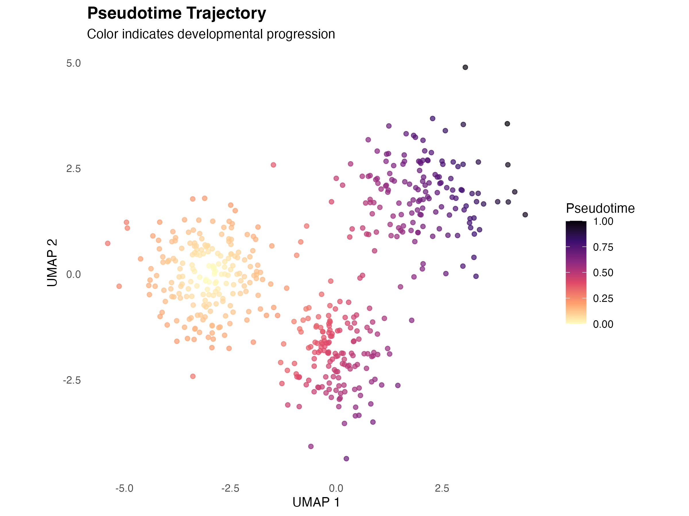
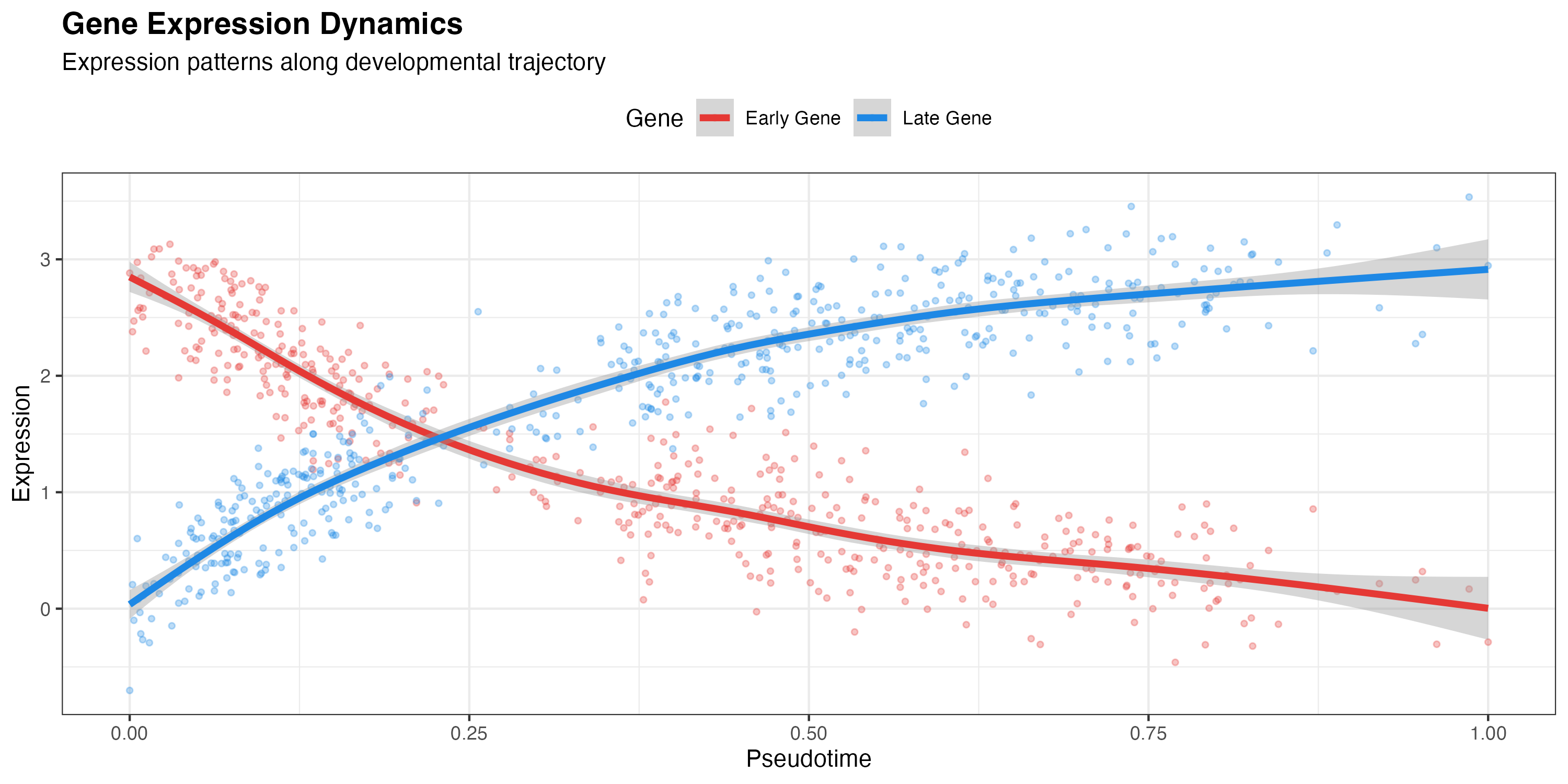
Gene Expression along Pseudotime
# Generate gene expression patterns
demo_embedding$Gene_early <- 3 * exp(-3 * demo_embedding$pseudotime) + rnorm(n_cells, 0, 0.3)
demo_embedding$Gene_late <- 3 * (1 - exp(-3 * demo_embedding$pseudotime)) + rnorm(n_cells, 0, 0.3)

# Reshape for plotting
expr_long <- melt(demo_embedding[, c("pseudotime", "Gene_early", "Gene_late")],
                  id.vars = "pseudotime",
                  variable.name = "gene",
                  value.name = "expression")

ggplot(expr_long, aes(x = pseudotime, y = expression, color = gene)) +
  geom_point(alpha = 0.3, size = 1) +
  geom_smooth(method = "gam", formula = y ~ s(x, bs = "cs"), size = 1.5) +
  scale_color_manual(
    values = c("#E53935", "#1E88E5"),
    labels = c("Early Gene", "Late Gene")
  ) +
  labs(
    title = "Gene Expression Dynamics",
    subtitle = "Expression patterns along developmental trajectory",
    x = "Pseudotime",
    y = "Expression",
    color = "Gene"
  ) +
  theme_bw() +
  theme(
    plot.title = element_text(face = "bold", size = 14),
    legend.position = "top"
  )
Comparison Visualizations
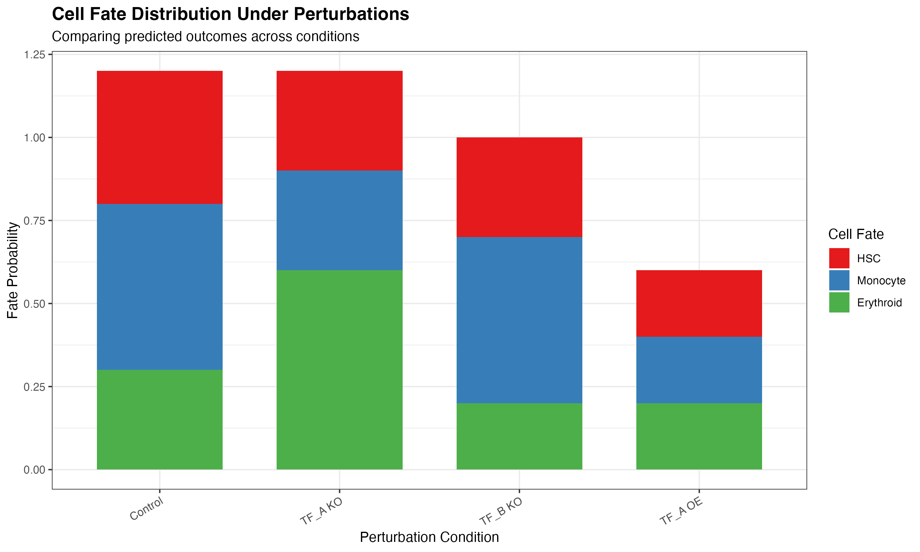
Perturbation Comparison
# Create comparison data
perturbations <- c("Control", "TF_A KO", "TF_B KO", "TF_A OE")
metrics <- c("HSC", "Monocyte", "Erythroid")

comparison_data <- expand.grid(
  perturbation = perturbations,
  fate = metrics
)

# Simulate fate probabilities
set.seed(42)
comparison_data$probability <- c(
  0.4, 0.3, 0.3,   # Control
  0.2, 0.5, 0.3,   # TF_A KO
  0.5, 0.2, 0.3,   # TF_B KO
  0.6, 0.2, 0.2    # TF_A OE
)

ggplot(comparison_data, aes(x = perturbation, y = probability, fill = fate)) +
  geom_col(position = "stack", width = 0.7) +
  scale_fill_manual(values = c("#E41A1C", "#377EB8", "#4DAF4A")) +
  labs(
    title = "Cell Fate Distribution Under Perturbations",
    subtitle = "Comparing predicted outcomes across conditions",
    x = "Perturbation Condition",
    y = "Fate Probability",
    fill = "Cell Fate"
  ) +
  theme_bw() +
  theme(
    plot.title = element_text(face = "bold", size = 14),
    axis.text.x = element_text(angle = 30, hjust = 1)
  )
Customization Guide
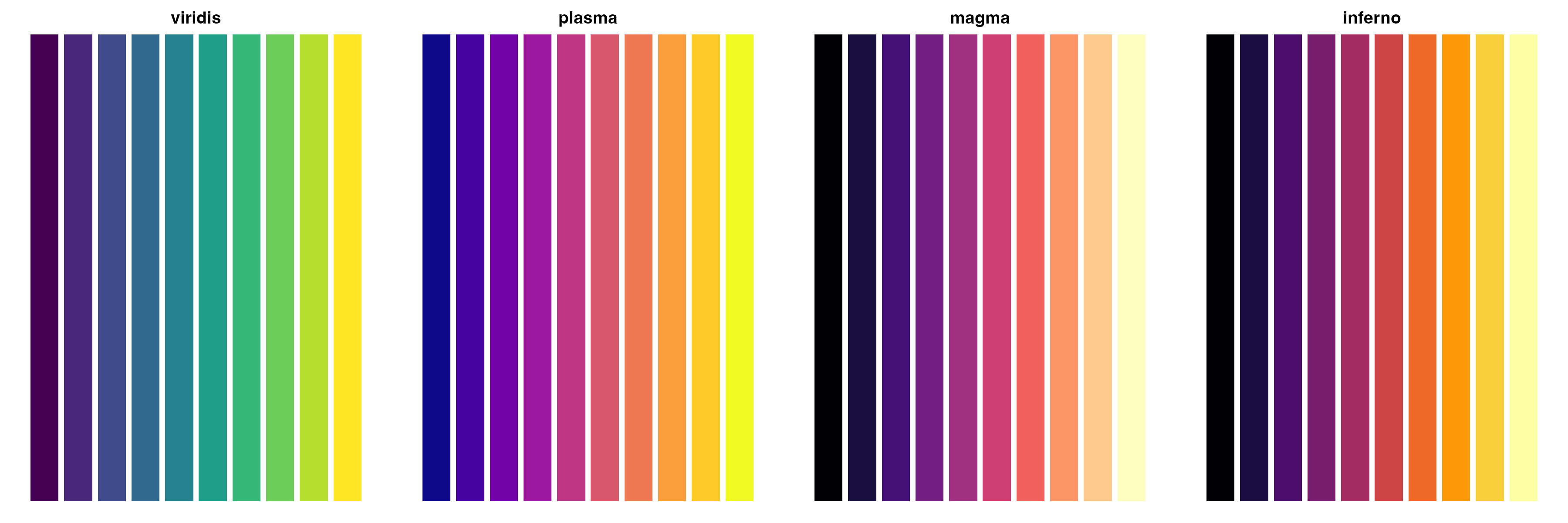
Color Palettes
CellOracleR visualizations support custom color schemes:
# Show available color schemes
palettes <- list(
  "viridis" = viridis::viridis(10),
  "plasma" = viridis::plasma(10),
  "magma" = viridis::magma(10),
  "inferno" = viridis::inferno(10)
)

par(mfrow = c(1, 4), mar = c(1, 1, 2, 1))
for (name in names(palettes)) {
  barplot(rep(1, 10), col = palettes[[name]], border = NA,
          main = name, axes = FALSE)
}
Theme Options
# Apply custom themes
library(CellOracleR)

plot_cluster(oracle, cluster_col = "cell_type") +
  theme_minimal() +
  theme(
    legend.position = "bottom",
    plot.title = element_text(face = "bold")
  )
Summary
CellOracleR provides publication-ready visualizations for:
| Function | Purpose |
|---|---|
plot_cluster() |
Cell clusters in embedding |
plot_gene_expression() |
Gene expression overlay |
plot_quiver() |
Vector field of cell movement |
plot_simulation_flow() |
Streamlined flow visualization |
plot_network_graph() |
GRN visualization |
plot_degree_distribution() |
Network topology |
plot_scores_as_rank() |
Gene ranking by network metrics |
plot_pseudotime() |
Developmental trajectory |
plot_simulation_combined() |
Multi-panel summary |
All functions return ggplot2 objects for easy customization and combination.
Session Info
sessionInfo()
#> R version 4.4.0 (2024-04-24)
#> Platform: aarch64-apple-darwin20
#> Running under: macOS 15.6.1
#>
#> Matrix products: default
#> BLAS:   /Library/Frameworks/R.framework/Versions/4.4-arm64/Resources/lib/libRblas.0.dylib
#> LAPACK: /Library/Frameworks/R.framework/Versions/4.4-arm64/Resources/lib/libRlapack.dylib;  LAPACK version 3.12.0
#>
#> locale:
#> [1] C
#>
#> time zone: Asia/Shanghai
#> tzcode source: internal
#>
#> attached base packages:
#> [1] stats     graphics  grDevices utils     datasets  methods   base
#>
#> other attached packages:
#> [1] reshape2_1.4.5  patchwork_1.3.2 Matrix_1.7-4    ggplot2_4.0.1
#>
#> loaded via a namespace (and not attached):
#>  [1] viridis_0.6.5      sass_0.4.10        generics_0.1.4     stringi_1.8.7
#>  [5] lattice_0.22-7     digest_0.6.39      magrittr_2.0.4     evaluate_1.0.5
#>  [9] grid_4.4.0         RColorBrewer_1.1-3 fastmap_1.2.0      plyr_1.8.9
#> [13] jsonlite_2.0.0     gridExtra_2.3      mgcv_1.9-3         viridisLite_0.4.2
#> [17] scales_1.4.0       textshaping_1.0.4  jquerylib_0.1.4    cli_3.6.5
#> [21] rlang_1.1.7        splines_4.4.0      withr_3.0.2        cachem_1.1.0
#> [25] yaml_2.3.12        otel_0.2.0         tools_4.4.0        dplyr_1.1.4
#> [29] vctrs_0.7.1        R6_2.6.1           lifecycle_1.0.5    stringr_1.6.0
#> [33] fs_1.6.6           htmlwidgets_1.6.4  ragg_1.5.0         pkgconfig_2.0.3
#> [37] desc_1.4.3         pkgdown_2.1.3      pillar_1.11.1      bslib_0.9.0
#> [41] gtable_0.3.6       glue_1.8.0         Rcpp_1.1.1         systemfonts_1.3.1
#> [45] xfun_0.56          tibble_3.3.1       tidyselect_1.2.1   knitr_1.51
#> [49] dichromat_2.0-0.1  farver_2.1.2       htmltools_0.5.9    nlme_3.1-168
#> [53] rmarkdown_2.30     labeling_0.4.3     compiler_4.4.0     S7_0.2.1