Introduction
This vignette demonstrates various visualization approaches for CellProgramMapper results. We cover:
- Usage matrix heatmaps
- Program activity on UMAP/t-SNE
- Score distributions
- Program correlation analysis
- Publication-ready figures
Load Example Data
library(CellProgramMapper)

# For visualization
if (!requireNamespace("ggplot2", quietly = TRUE)) {
  install.packages("ggplot2")
}
if (!requireNamespace("pheatmap", quietly = TRUE)) {
  install.packages("pheatmap")
}
library(ggplot2)
library(pheatmap)
Simulated Example Data
For demonstration, we create simulated results:
set.seed(42)

# Simulate usage matrix (cells × programs)
n_cells <- 500
n_programs <- 8

# Create usage with structure
group <- sample(1:4, n_cells, replace = TRUE)
usage <- matrix(0, nrow = n_cells, ncol = n_programs)

# Each group has dominant programs
for (i in 1:n_cells) {
  base_usage <- runif(n_programs, 0.01, 0.1)
  dominant <- ((group[i] - 1) * 2 + 1):((group[i] - 1) * 2 + 2)
  base_usage[dominant] <- runif(2, 0.3, 0.5)
  usage[i, ] <- base_usage / sum(base_usage)  # Normalize
}

colnames(usage) <- paste0("GEP", 1:n_programs)
rownames(usage) <- paste0("Cell", 1:n_cells)

# Simulate UMAP coordinates
umap <- data.frame(
  UMAP1 = c(rnorm(n_cells/4, -3, 1), rnorm(n_cells/4, 3, 1),
            rnorm(n_cells/4, 0, 1), rnorm(n_cells/4, 0, 1)),
  UMAP2 = c(rnorm(n_cells/4, 0, 1), rnorm(n_cells/4, 0, 1),
            rnorm(n_cells/4, -3, 1), rnorm(n_cells/4, 3, 1))
)
rownames(umap) <- rownames(usage)

# Simulate scores
scores <- data.frame(
  Exhaustion = rowSums(usage[, c("GEP1", "GEP2")]),
  Cytotoxicity = rowSums(usage[, c("GEP3", "GEP4")]),
  Proliferation = rowSums(usage[, c("GEP5", "GEP6")])
)
Usage Matrix Heatmap
The usage matrix shows the contribution of each GEP to each cell’s expression profile.
# Order cells by dominant program
dominant_program <- apply(usage, 1, which.max)
cell_order <- order(dominant_program, decreasing = FALSE)

# Create annotation
annotation_row <- data.frame(
  DominantGEP = factor(paste0("GEP", dominant_program))
)
rownames(annotation_row) <- rownames(usage)

# Color palette
colors <- colorRampPalette(c("#f7fbff", "#08306b"))(100)

pheatmap(
  usage[cell_order, ],
  cluster_rows = FALSE,
  cluster_cols = TRUE,
  show_rownames = FALSE,
  annotation_row = annotation_row[cell_order, , drop = FALSE],
  color = colors,
  main = "Cell × GEP Usage Matrix",
  fontsize = 10
)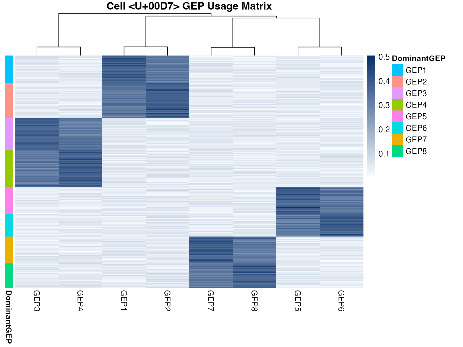
Usage matrix heatmap showing GEP contributions across cells
Program Activity on UMAP
Visualize GEP activity overlaid on dimensionality reduction.
# Combine data
plot_data <- cbind(umap, usage)

# Create multi-panel plot
par(mfrow = c(2, 4), mar = c(4, 4, 2, 2))

for (gep in colnames(usage)) {
  colors <- colorRampPalette(c("#f7f7f7", "#d73027"))(100)
  vals <- plot_data[[gep]]
  col_idx <- cut(vals, breaks = 100, labels = FALSE)

  plot(plot_data$UMAP1, plot_data$UMAP2,
       col = colors[col_idx], pch = 16, cex = 0.6,
       xlab = "UMAP1", ylab = "UMAP2",
       main = gep)
}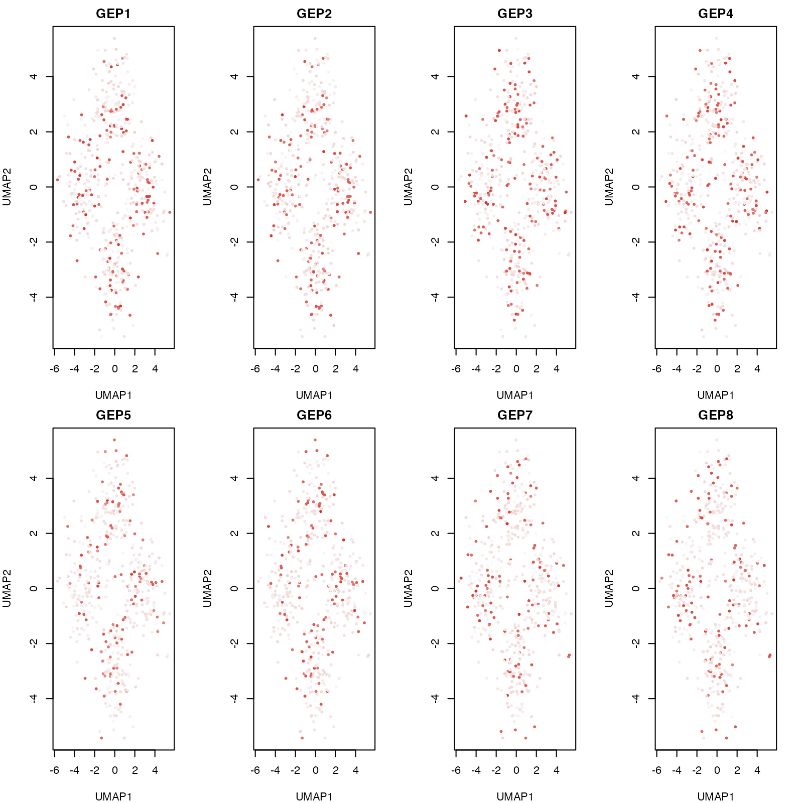
GEP activity visualized on UMAP coordinates
Score Distributions
Violin Plots
# Create data for violin plot
scores$Group <- factor(paste0("Group", group))

# Reshape for ggplot
library(reshape2)
#> Warning: package 'reshape2' was built under R version 4.4.1
scores_long <- melt(scores, id.vars = "Group",
                    variable.name = "Score", value.name = "Value")

ggplot(scores_long, aes(x = Group, y = Value, fill = Score)) +
  geom_violin(alpha = 0.7, scale = "width") +
  geom_boxplot(width = 0.1, fill = "white", alpha = 0.8) +
  facet_wrap(~Score, scales = "free_y") +
  theme_minimal() +
  labs(title = "Score Distributions by Group",
       x = "Cell Group", y = "Score Value") +
  theme(legend.position = "none",
        strip.text = element_text(face = "bold", size = 12))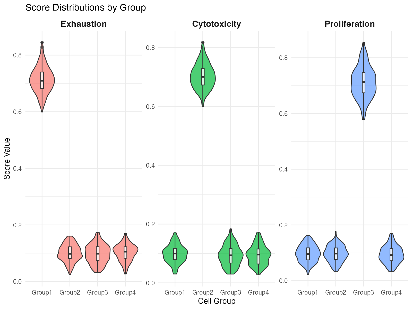
Score distributions across groups
Ridge Plot
# Simple ridge plot using base R
par(mfrow = c(3, 1), mar = c(3, 4, 2, 1))

for (score_name in c("Exhaustion", "Cytotoxicity", "Proliferation")) {
  # Get density for each group
  densities <- lapply(1:4, function(g) {
    d <- density(scores[[score_name]][scores$Group == paste0("Group", g)])
    data.frame(x = d$x, y = d$y, group = g)
  })

  # Plot
  x_range <- range(sapply(densities, function(d) range(d$x)))
  y_max <- max(sapply(densities, function(d) max(d$y))) * 1.2

  plot(NULL, xlim = x_range, ylim = c(-0.5, y_max * 4.5),
       xlab = score_name, ylab = "", yaxt = "n",
       main = paste0(score_name, " Score"))

  cols <- c("#e41a1c", "#377eb8", "#4daf4a", "#984ea3")

  for (i in 1:4) {
    d <- densities[[i]]
    offset <- (i - 1) * y_max
    polygon(c(d$x, rev(d$x)),
            c(d$y + offset, rep(offset, length(d$x))),
            col = adjustcolor(cols[i], alpha.f = 0.6),
            border = cols[i])
  }

  axis(2, at = (0:3) * y_max + y_max/2,
       labels = paste0("Group", 1:4), las = 1)
}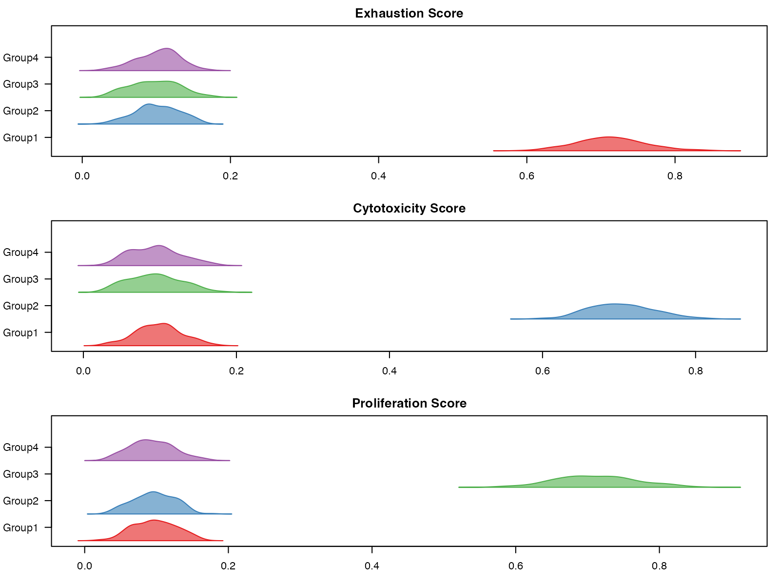
Ridge plot of score distributions
Program Correlation Analysis
Correlation Heatmap
# Compute correlation
usage_cor <- cor(usage)

# Custom color palette
cor_colors <- colorRampPalette(c("#2166ac", "#f7f7f7", "#b2182b"))(100)

pheatmap(
  usage_cor,
  color = cor_colors,
  breaks = seq(-1, 1, length.out = 101),
  display_numbers = TRUE,
  number_format = "%.2f",
  fontsize_number = 8,
  main = "GEP Correlation Matrix"
)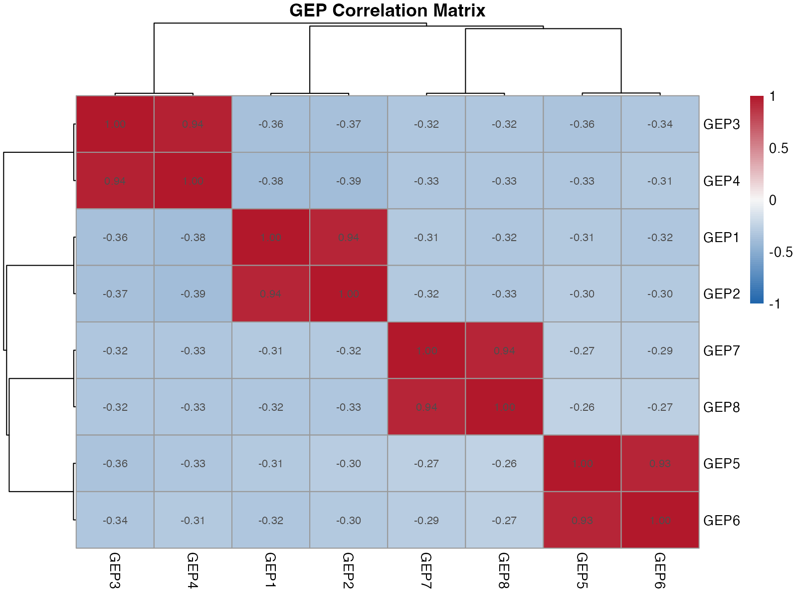
Correlation between GEPs
Network Visualization
# Simple network plot
par(mar = c(1, 1, 2, 1))
plot(NULL, xlim = c(-1.5, 1.5), ylim = c(-1.5, 1.5),
     xlab = "", ylab = "", axes = FALSE,
     main = "GEP Correlation Network")

# Arrange nodes in circle
n <- ncol(usage)
angles <- seq(0, 2*pi, length.out = n + 1)[1:n]
x_pos <- cos(angles)
y_pos <- sin(angles)

# Draw edges (correlations > 0.3)
for (i in 1:(n-1)) {
  for (j in (i+1):n) {
    r <- usage_cor[i, j]
    if (abs(r) > 0.3) {
      col <- if (r > 0) "#b2182b" else "#2166ac"
      lwd <- abs(r) * 3
      segments(x_pos[i], y_pos[i], x_pos[j], y_pos[j],
               col = adjustcolor(col, alpha.f = 0.5), lwd = lwd)
    }
  }
}

# Draw nodes
points(x_pos, y_pos, pch = 19, cex = 4, col = "#4a4a4a")
text(x_pos, y_pos, colnames(usage), col = "white", cex = 0.7, font = 2)

legend("topright",
       legend = c("Positive corr.", "Negative corr."),
       col = c("#b2182b", "#2166ac"),
       lwd = 2, bty = "n")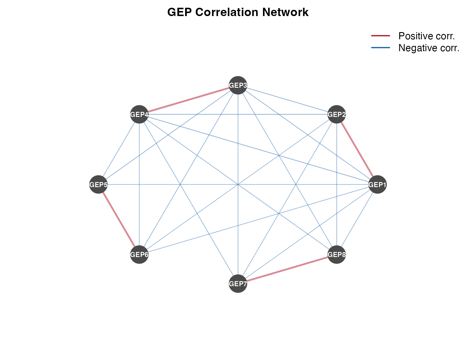
GEP correlation network
Publication-Ready Figures
Combined Panel Figure
par(mfrow = c(2, 2), mar = c(4, 4, 3, 2))

# Panel A: UMAP colored by dominant GEP
dominant <- factor(paste0("GEP", apply(usage, 1, which.max)))
cols <- rainbow(8, alpha = 0.7)
plot(umap$UMAP1, umap$UMAP2, col = cols[dominant], pch = 16,
     xlab = "UMAP1", ylab = "UMAP2", main = "A. Dominant GEP")
legend("topright", levels(dominant), col = cols, pch = 16, cex = 0.6, ncol = 2)

# Panel B: Usage bar plot (top cells)
top_cells <- head(order(usage[, "GEP1"], decreasing = TRUE), 20)
barplot(t(usage[top_cells, ]),
        col = cols, border = NA, las = 2,
        xlab = "", ylab = "Usage",
        main = "B. Top GEP1 Cells")

# Panel C: Score comparison
boxplot(Exhaustion ~ Group, data = scores,
        col = c("#e41a1c", "#377eb8", "#4daf4a", "#984ea3"),
        xlab = "Group", ylab = "Exhaustion Score",
        main = "C. Exhaustion by Group")

# Panel D: Program correlation
image(1:8, 1:8, usage_cor[8:1, ],
      col = cor_colors,
      xlab = "", ylab = "", axes = FALSE,
      main = "D. GEP Correlations")
axis(1, at = 1:8, labels = colnames(usage), las = 2, cex.axis = 0.8)
axis(2, at = 1:8, labels = rev(colnames(usage)), las = 1, cex.axis = 0.8)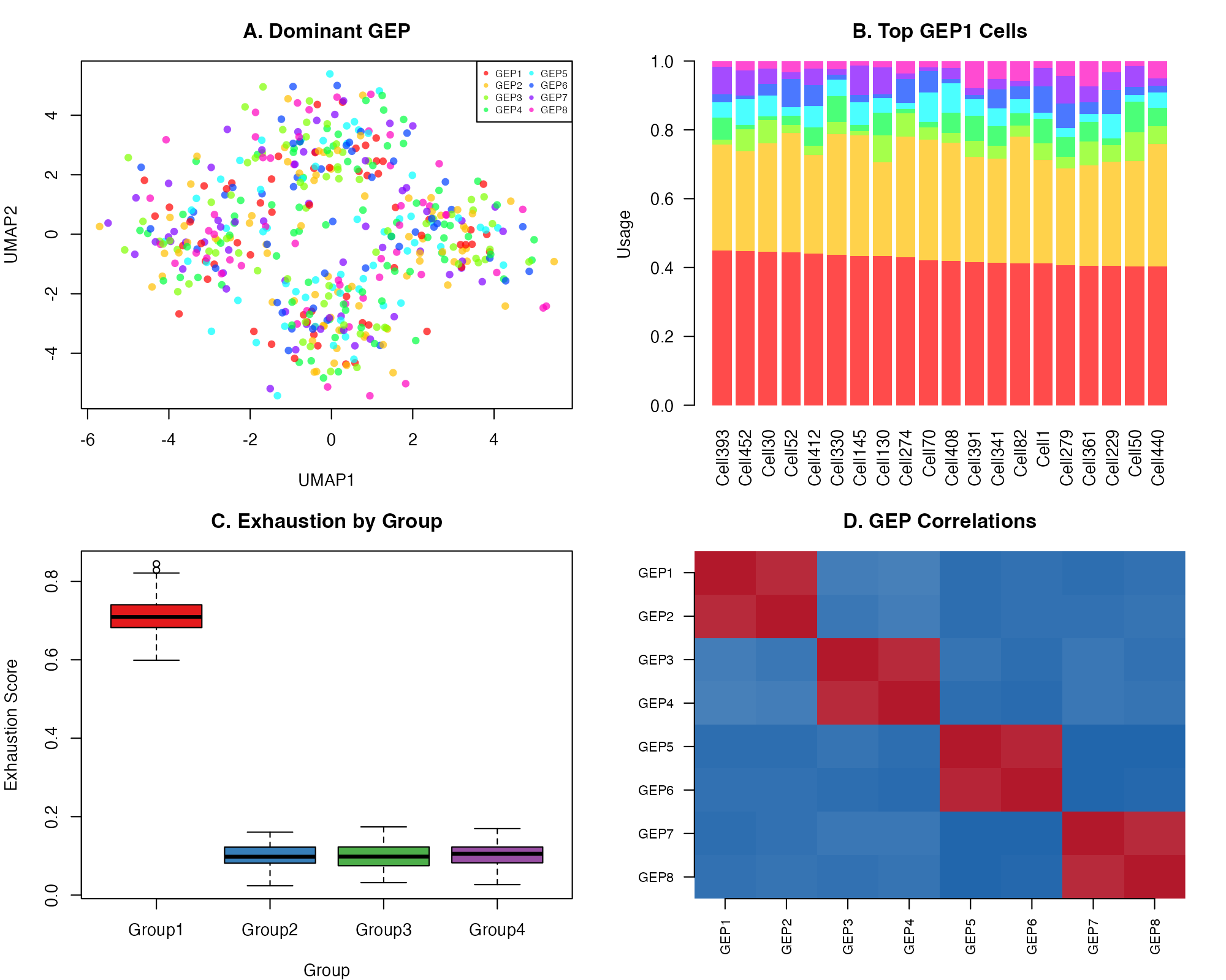
Publication-ready combined visualization
Saving High-Resolution Figures
# For publication (300 DPI)
pdf("figures/usage_heatmap.pdf", width = 8, height = 6)
pheatmap(usage[cell_order, ], ...)
dev.off()

# For presentations (PNG)
png("figures/umap_panel.png", width = 2400, height = 1800, res = 300)
# ... plotting code ...
dev.off()

# For vector graphics (SVG)
svg("figures/correlation_network.svg", width = 8, height = 6)
# ... plotting code ...
dev.off()
Integration with Seurat
When working with Seurat objects, use built-in visualization functions:
# Add results to Seurat
seurat_obj <- add_results_to_seurat(seurat_obj, result)

# Seurat's DimPlot
Seurat::DimPlot(seurat_obj, group.by = "Multinomial_Label",
                label = TRUE, repel = TRUE)

# Seurat's FeaturePlot for GEP usage
Seurat::FeaturePlot(seurat_obj,
                    features = c("GEP1", "GEP2", "GEP3", "GEP4"),
                    ncol = 2)

# Seurat's VlnPlot for scores
Seurat::VlnPlot(seurat_obj,
                features = "Exhaustion_Score",
                group.by = "seurat_clusters")
Tips for Effective Visualization
- Color choice: Use colorblind-friendly palettes
- Scale bars: Always include when showing continuous values
- Labels: Make text readable (≥8pt for publication)
- Consistency: Use same color scheme across related figures
- Simplicity: Avoid cluttering with unnecessary elements
Session Info
sessionInfo()
#> R version 4.4.0 (2024-04-24)
#> Platform: aarch64-apple-darwin20
#> Running under: macOS 15.6.1
#>
#> Matrix products: default
#> BLAS:   /Library/Frameworks/R.framework/Versions/4.4-arm64/Resources/lib/libRblas.0.dylib
#> LAPACK: /Library/Frameworks/R.framework/Versions/4.4-arm64/Resources/lib/libRlapack.dylib;  LAPACK version 3.12.0
#>
#> locale:
#> [1] C
#>
#> time zone: Asia/Shanghai
#> tzcode source: internal
#>
#> attached base packages:
#> [1] stats     graphics  grDevices utils     datasets  methods   base
#>
#> other attached packages:
#> [1] reshape2_1.4.5          pheatmap_1.0.13         ggplot2_4.0.1
#> [4] CellProgramMapper_1.0.0
#>
#> loaded via a namespace (and not attached):
#>  [1] rappdirs_0.3.4      sass_0.4.10         future_1.69.0
#>  [4] generics_0.1.4      stringi_1.8.7       lattice_0.22-7
#>  [7] listenv_0.10.0      digest_0.6.39       magrittr_2.0.4
#> [10] evaluate_1.0.5      grid_4.4.0          RColorBrewer_1.1-3
#> [13] fastmap_1.2.0       plyr_1.8.9          jsonlite_2.0.0
#> [16] Matrix_1.7-4        scales_1.4.0        codetools_0.2-20
#> [19] textshaping_1.0.4   jquerylib_0.1.4     cli_3.6.5
#> [22] rlang_1.1.7         parallelly_1.46.1   future.apply_1.20.1
#> [25] withr_3.0.2         cachem_1.1.0        yaml_2.3.12
#> [28] otel_0.2.0          tools_4.4.0         parallel_4.4.0
#> [31] dplyr_1.1.4         globals_0.18.0      curl_7.0.0
#> [34] vctrs_0.7.1         R6_2.6.1            lifecycle_1.0.5
#> [37] stringr_1.6.0       fs_1.6.6            htmlwidgets_1.6.4
#> [40] ragg_1.5.0          pkgconfig_2.0.3     desc_1.4.3
#> [43] pkgdown_2.2.0       bslib_0.9.0         pillar_1.11.1
#> [46] gtable_0.3.6        data.table_1.18.0   glue_1.8.0
#> [49] Rcpp_1.1.1          systemfonts_1.3.1   tidyselect_1.2.1
#> [52] xfun_0.56           tibble_3.3.1        knitr_1.51
#> [55] dichromat_2.0-0.1   farver_2.1.2        htmltools_0.5.9
#> [58] labeling_0.4.3      rmarkdown_2.30      compiler_4.4.0
#> [61] S7_0.2.1