This vignette covers advanced customization options in ggforge: themes, color palettes, multi-panel layouts, faceting, adding custom layers, data format flexibility, and statistical annotations.
# Sample data for examples
set.seed(8525)
df_box <- data.frame(
  group = rep(LETTERS[1:4], each = 25),
  value = c(rnorm(25, 10, 2), rnorm(25, 12, 2),
            rnorm(25, 11, 3), rnorm(25, 14, 2)),
  treatment = rep(c("Control", "Treatment"), 50),
  batch = rep(c("B1", "B2"), each = 50)
)

df_line <- data.frame(
  time = rep(c("T1", "T2", "T3", "T4"), 3),
  value = c(10, 15, 13, 20, 8, 12, 11, 18, 14, 16, 12, 19),
  group = rep(c("A", "B", "C"), each = 4)
)

# Wide format: each column is a group (like the BoxPlot example)
df_wide <- data.frame(
  GroupA = rnorm(25, 10, 2),
  GroupB = rnorm(25, 12, 2),
  GroupC = rnorm(25, 11, 2),
  GroupD = rnorm(25, 14, 2)
)
Theme System
ggforge provides three built-in themes:
-
theme_ggforge— Default theme based ontheme_classic(), clean and modern -
theme_ggforge_grid— Based ontheme_bw(), suited for grid-based plots (heatmaps, dot plots) -
theme_minimal_axes— Minimal theme with optional coordinate arrows
Choosing a Theme
p1 <- ggplot(df_box, aes(x = group, y = value)) +
  geom_boxplot(fill = "grey85") +
  theme_ggforge() +
  labs(title = "theme_ggforge (default)")
p1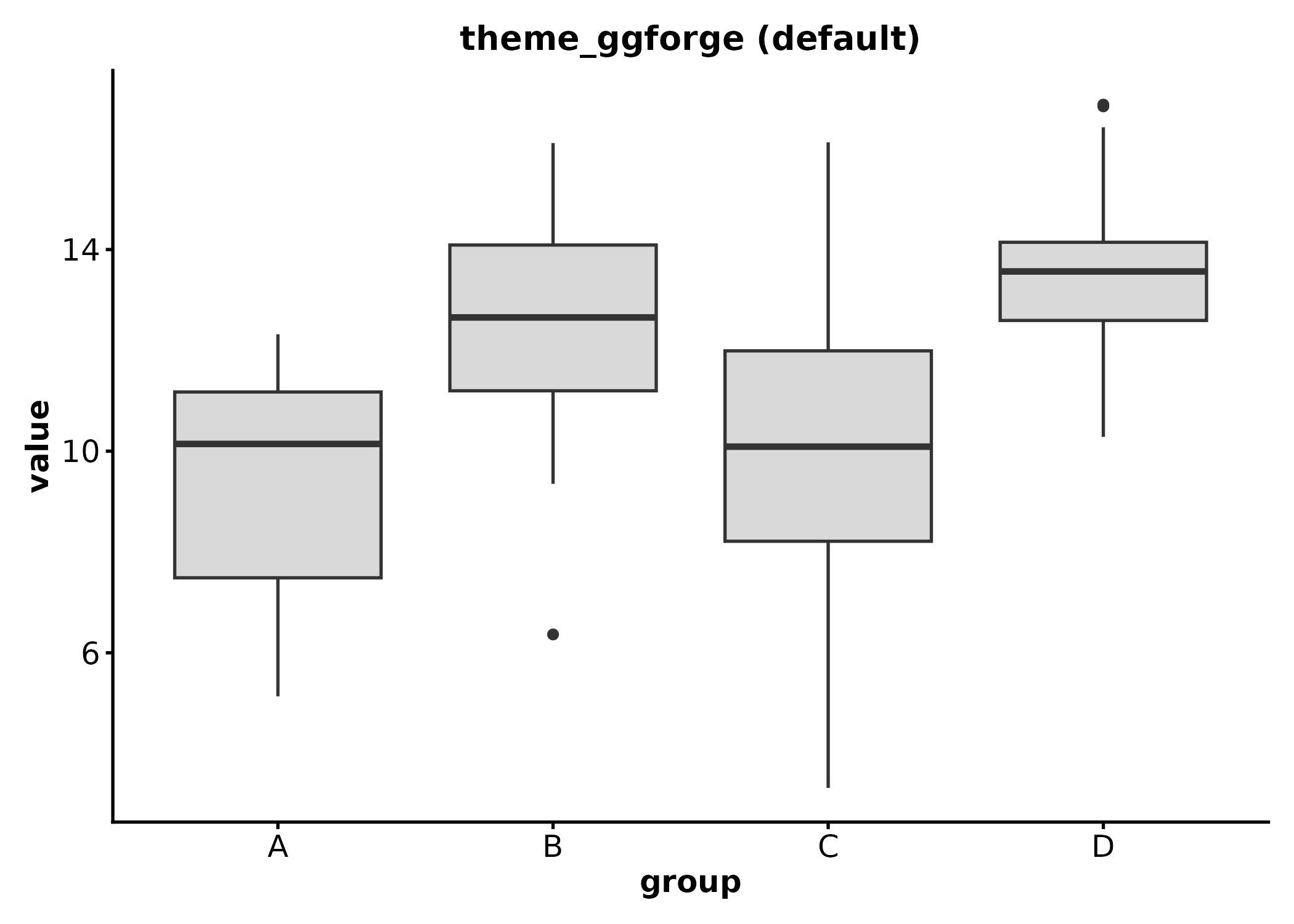
p2 <- ggplot(df_box, aes(x = group, y = value)) +
  geom_boxplot(fill = "grey85") +
  theme_ggforge_grid() +
  labs(title = "theme_ggforge_grid")
p2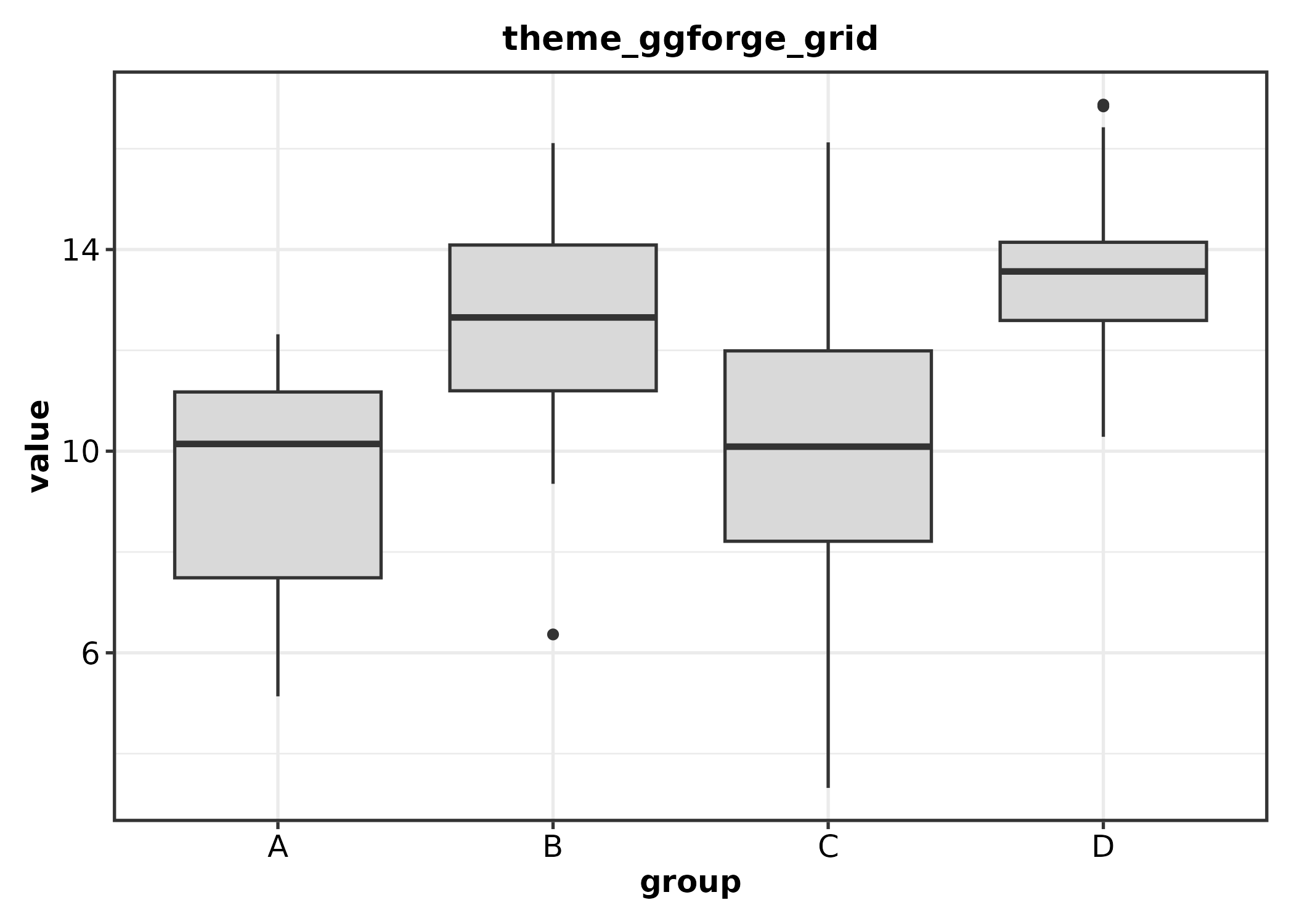
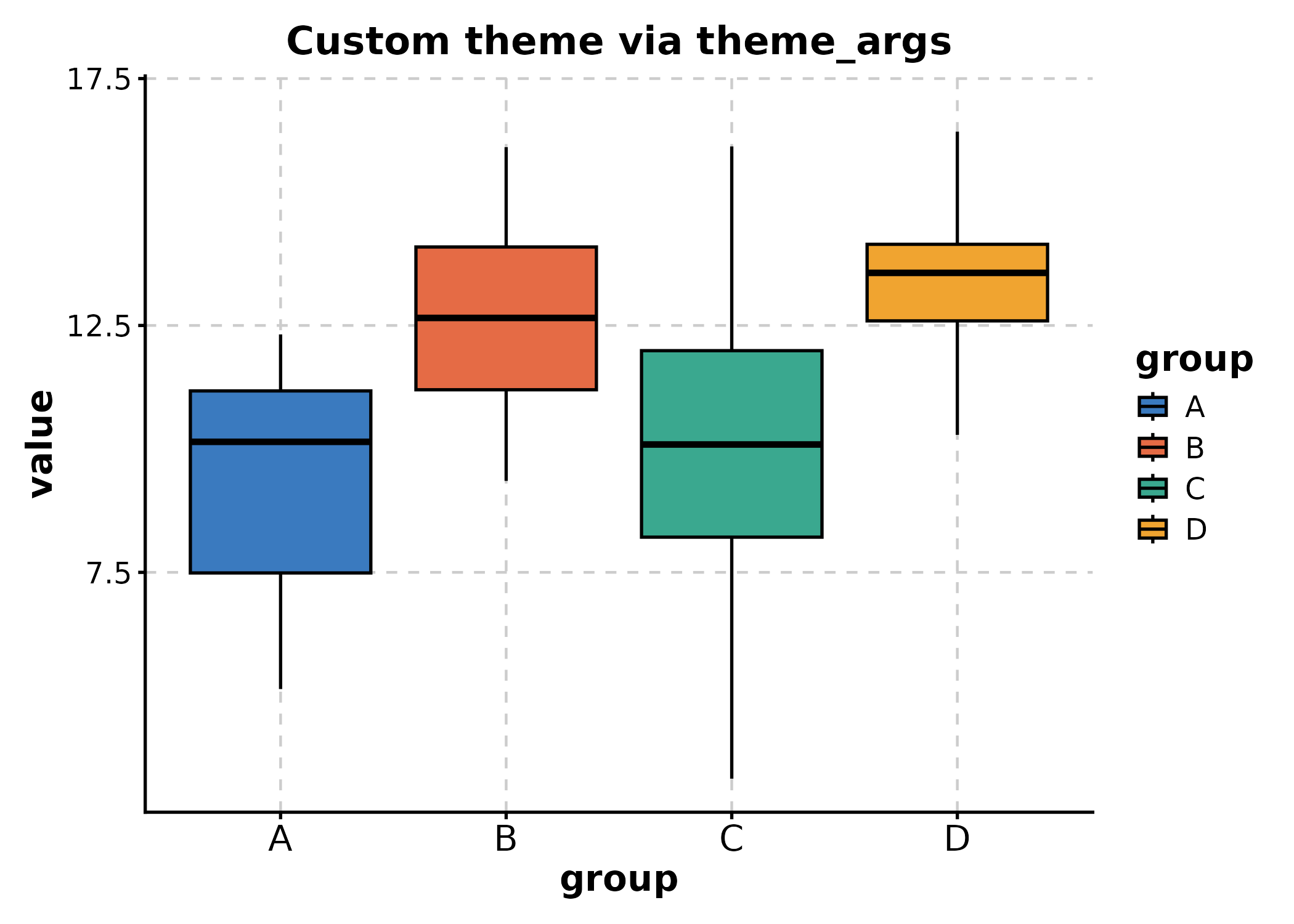
Customizing via theme_args
All ggforge plot functions accept theme_args, a list of
arguments passed to the theme function. Use it to customize font size,
base size, aspect ratio, or any valid theme()
arguments:
BoxPlot(df_box, x = "group", y = "value",
  theme_args = list(base_size = 14, aspect.ratio = 0.8),
  title = "Custom theme via theme_args"
)
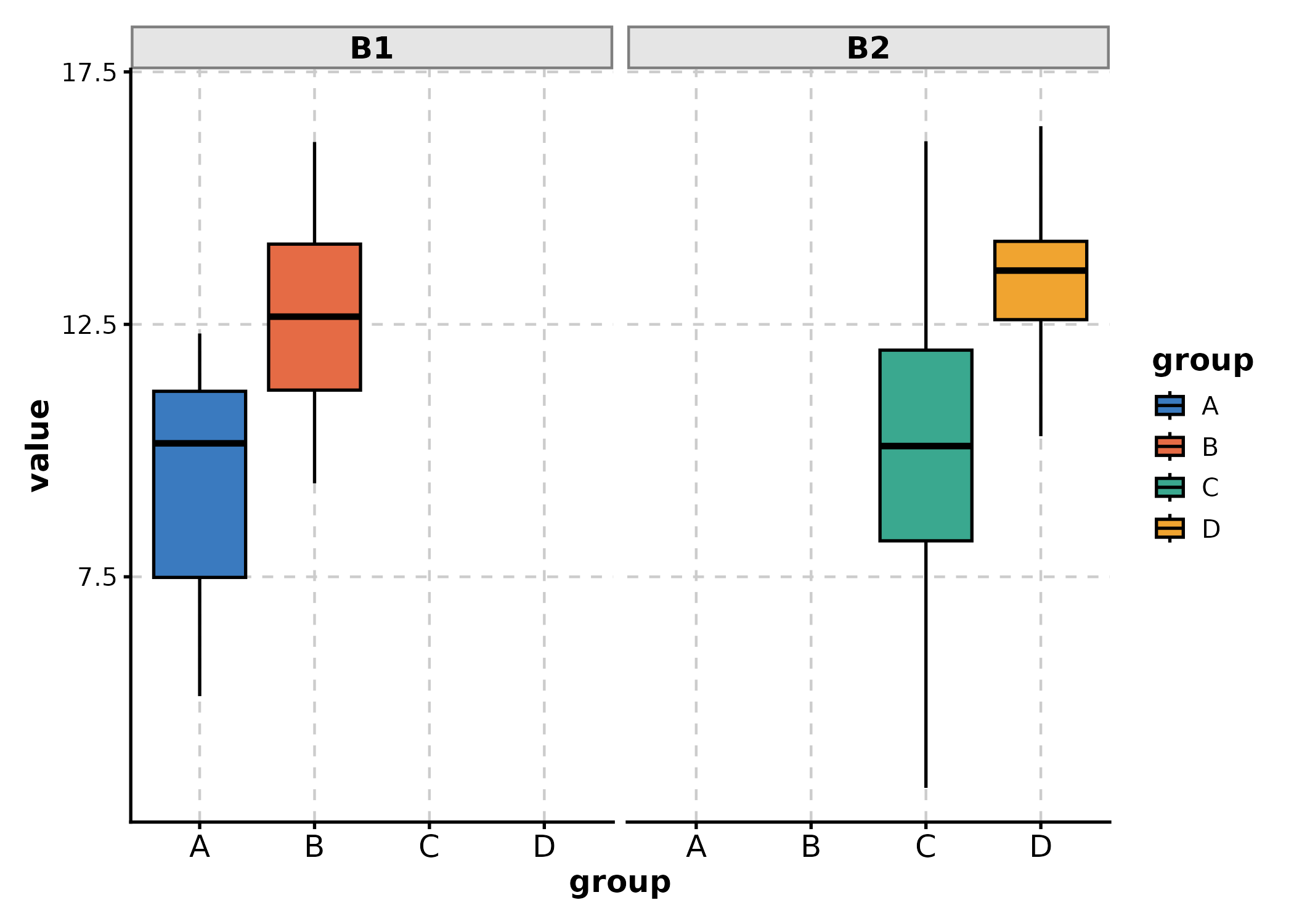
# Customize strip background for faceted plots
BoxPlot(df_box, x = "group", y = "value", facet_by = "batch",
  theme_args = list(
    strip.background = ggplot2::element_rect(fill = "grey90", colour = "grey50")
  )
)
Color Palettes
Browse Available Palettes
Use show_palettes() to inspect palette names or
visualize them:
# List discrete palette names
show_palettes(type = "discrete", return_names = TRUE)[1:15]
#>  [1] "Accent"  "Dark2"   "Paired"  "Pastel1" "Pastel2" "Set1"    "Set2"
#>  [8] "Set3"    "npg"     "aaas"    "nejm"    "lancet"  "jama"    "jco"
#> [15] "ucscgb"
# List continuous palette names
show_palettes(type = "continuous", return_names = TRUE)[1:10]
#>  [1] "BrBG"     "PiYG"     "PRGn"     "PuOr"     "RdBu"     "RdGy"
#>  [7] "RdYlBu"   "RdYlGn"   "Spectral" "Blues"
Journal Palettes
ggforge includes journal-style palettes from the ggsci package (e.g., npg, lancet, nejm, jco), ideal for publication figures:
p_npg <- BoxPlot(df_box, x = "group", y = "value", group_by = "treatment",
  palette = "npg", title = "NPG (Nature)")
p_lancet <- BoxPlot(df_box, x = "group", y = "value", group_by = "treatment",
  palette = "lancet", title = "Lancet")
p_nejm <- BoxPlot(df_box, x = "group", y = "value", group_by = "treatment",
  palette = "nejm", title = "NEJM")
p_jco <- BoxPlot(df_box, x = "group", y = "value", group_by = "treatment",
  palette = "jco", title = "JCO")

p_npg + p_lancet + p_nejm + p_jco +
  patchwork::plot_layout(ncol = 2, guides = "collect")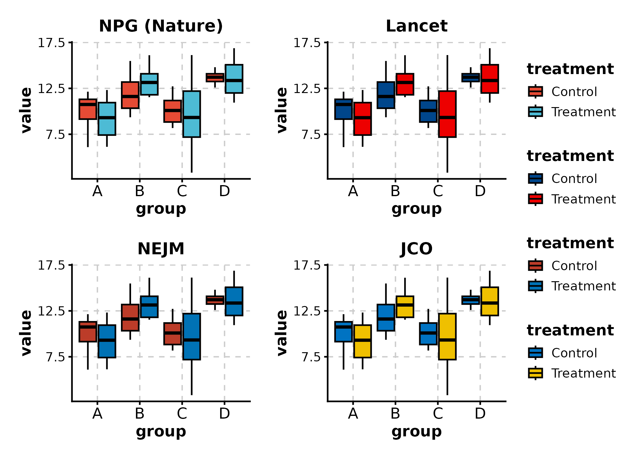
Custom Colors via palcolor
Override any palette with palcolor:
# Named vector maps group values to colors
BoxPlot(df_box, x = "group", y = "value", group_by = "treatment",
  palcolor = c(Control = "#2E86AB", Treatment = "#E94F37"),
  title = "Custom colors via palcolor"
)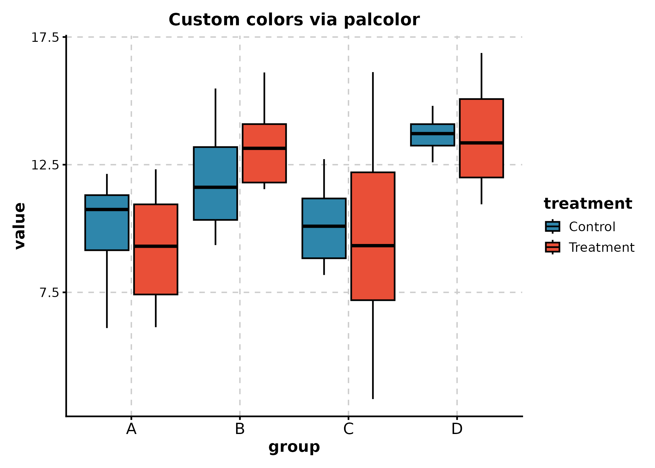
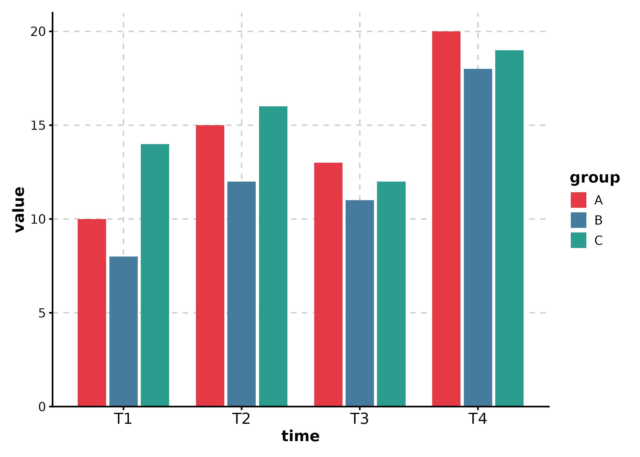
# Unnamed vector: colors applied in order of factor levels
BarPlot(df_line, x = "time", y = "value", group_by = "group",
  palcolor = c("#E63946", "#457B9D", "#2A9D8F")
)
Multi-Panel Layouts
split_by
Use split_by to split data into separate panels and
combine them automatically:
BoxPlot(df_box, x = "group", y = "value", split_by = "batch",
  title = "Split by batch")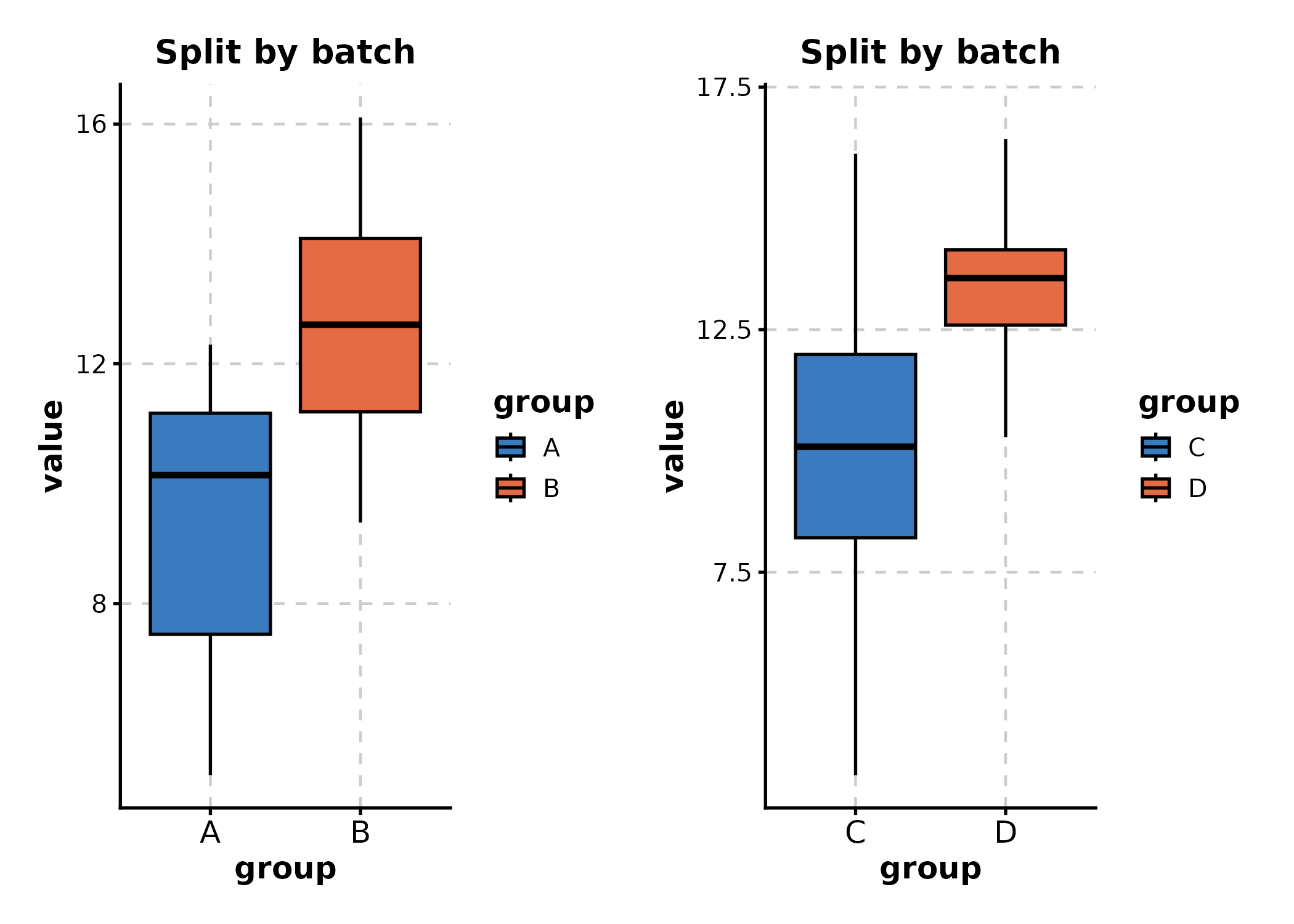
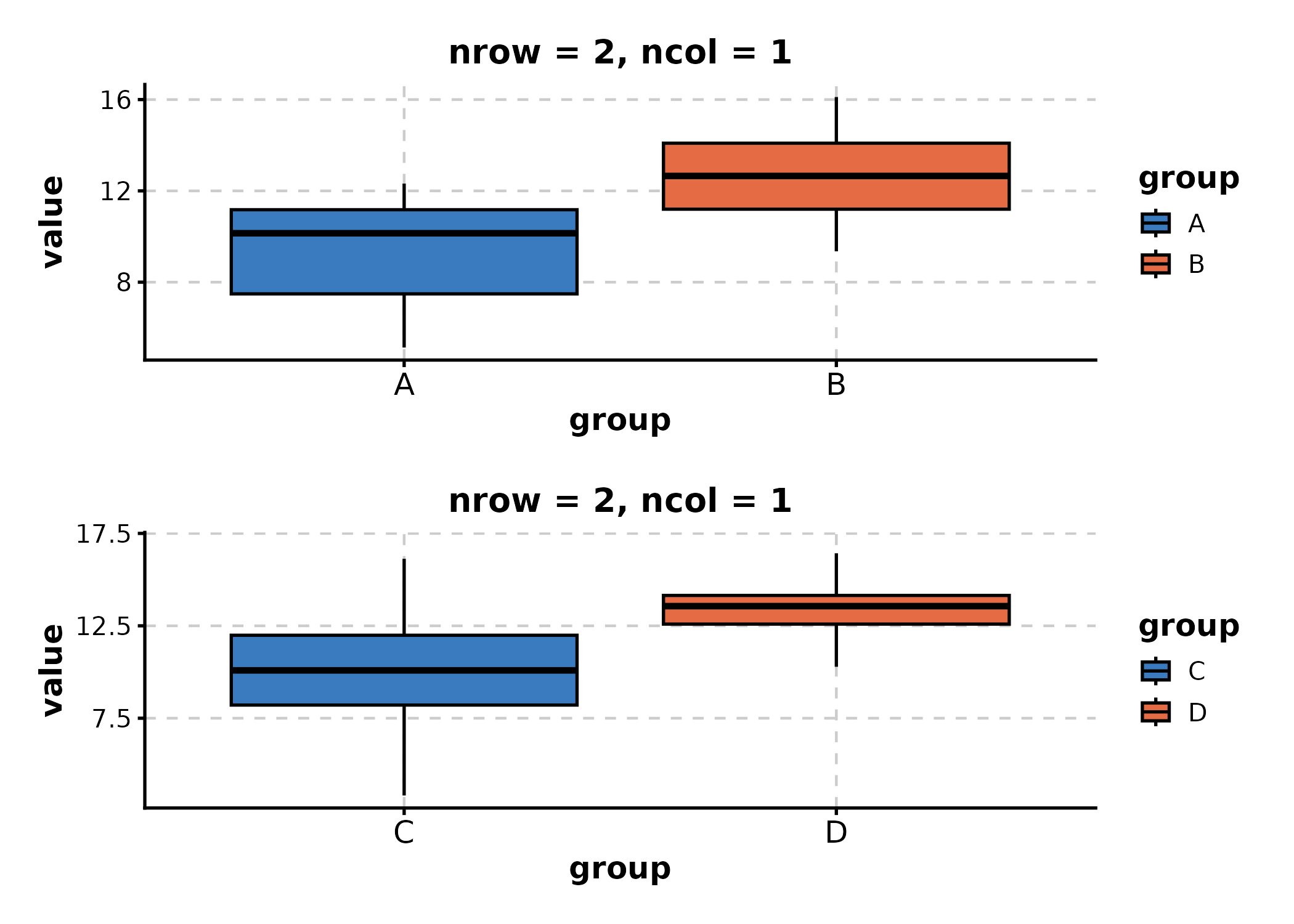
Controlling Layout: nrow, ncol, design
Control layout with nrow, ncol, and
byrow:
BoxPlot(df_box, x = "group", y = "value", split_by = "batch",
  nrow = 2, ncol = 1,
  title = "nrow = 2, ncol = 1"
)
Custom design
Use design for patchwork-style layout strings when
combining split plots:
# split_by creates 2 panels; design controls their arrangement
BoxPlot(df_box, x = "group", y = "value", split_by = "batch",
  design = "AB",  # A left, B right
  title = "Custom design"
)
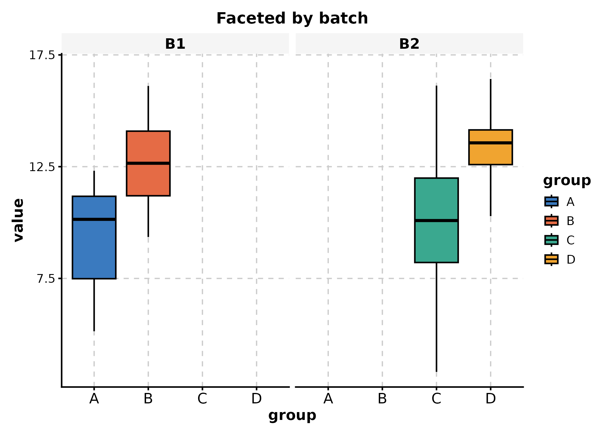
Faceting
Faceting keeps data in one plot but splits panels by a variable. Use
facet_by, facet_scales, and
facet_ncol:
BoxPlot(df_box, x = "group", y = "value", facet_by = "batch",
  title = "Faceted by batch"
)
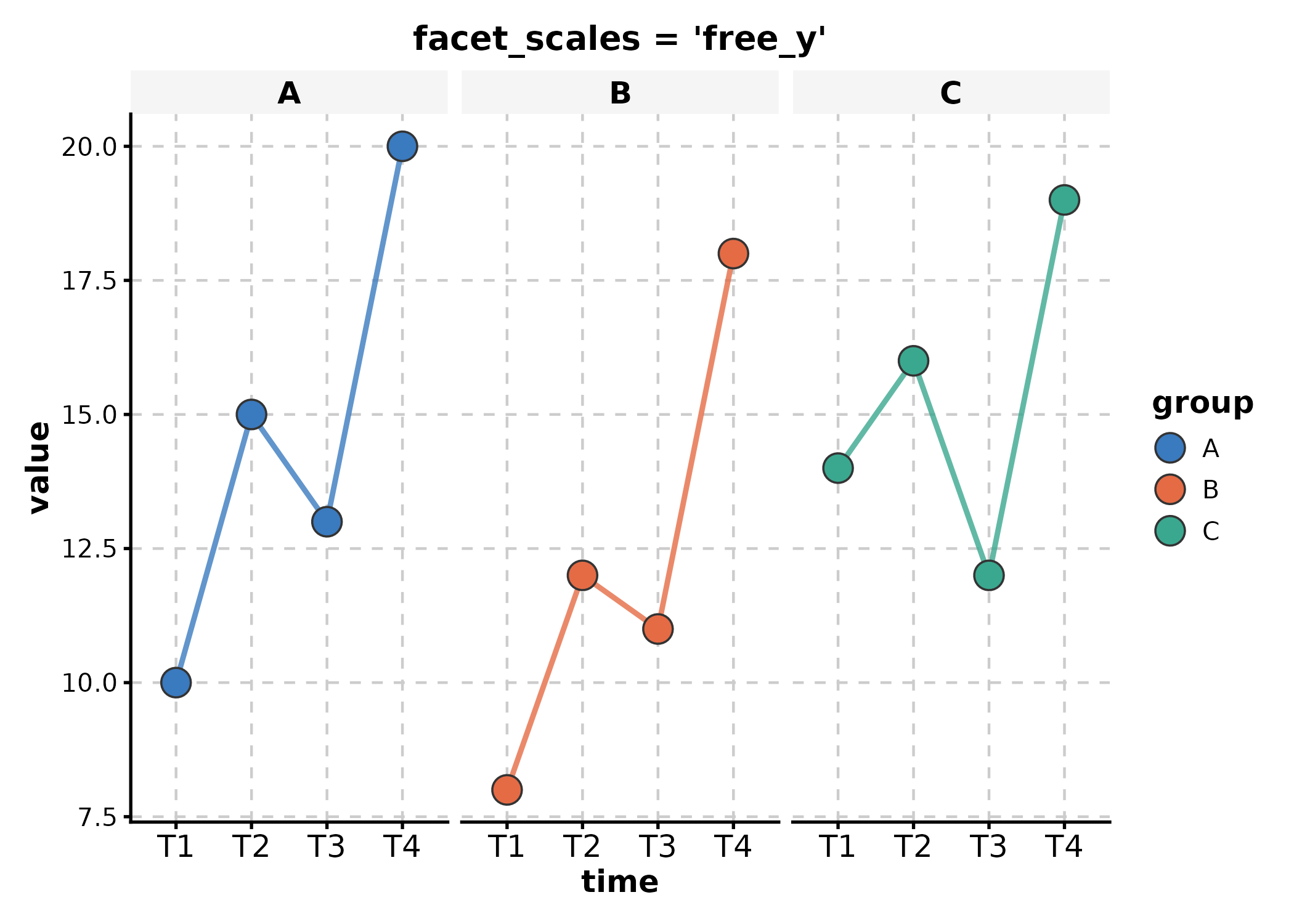
# Free y-axis scales per facet
LinePlot(df_line, x = "time", y = "value", group_by = "group",
  facet_by = "group", facet_scales = "free_y",
  title = "facet_scales = 'free_y'"
)
# Control facet layout
BoxPlot(df_box, x = "group", y = "value", facet_by = "batch",
  facet_ncol = 1, facet_byrow = TRUE,
  title = "facet_ncol = 1"
)
Adding Layers
ggforge returns standard ggplot objects. Add any ggplot2 layer with
+:
p <- BoxPlot(df_box, x = "group", y = "value", group_by = "treatment")

# Add horizontal reference line, custom label, and annotation
p +
  ggplot2::geom_hline(yintercept = 12, linetype = "dashed", color = "grey40") +
  ggplot2::annotate("text", x = 2.5, y = 13.5, label = "Reference threshold") +
  ggplot2::labs(subtitle = "With custom layers")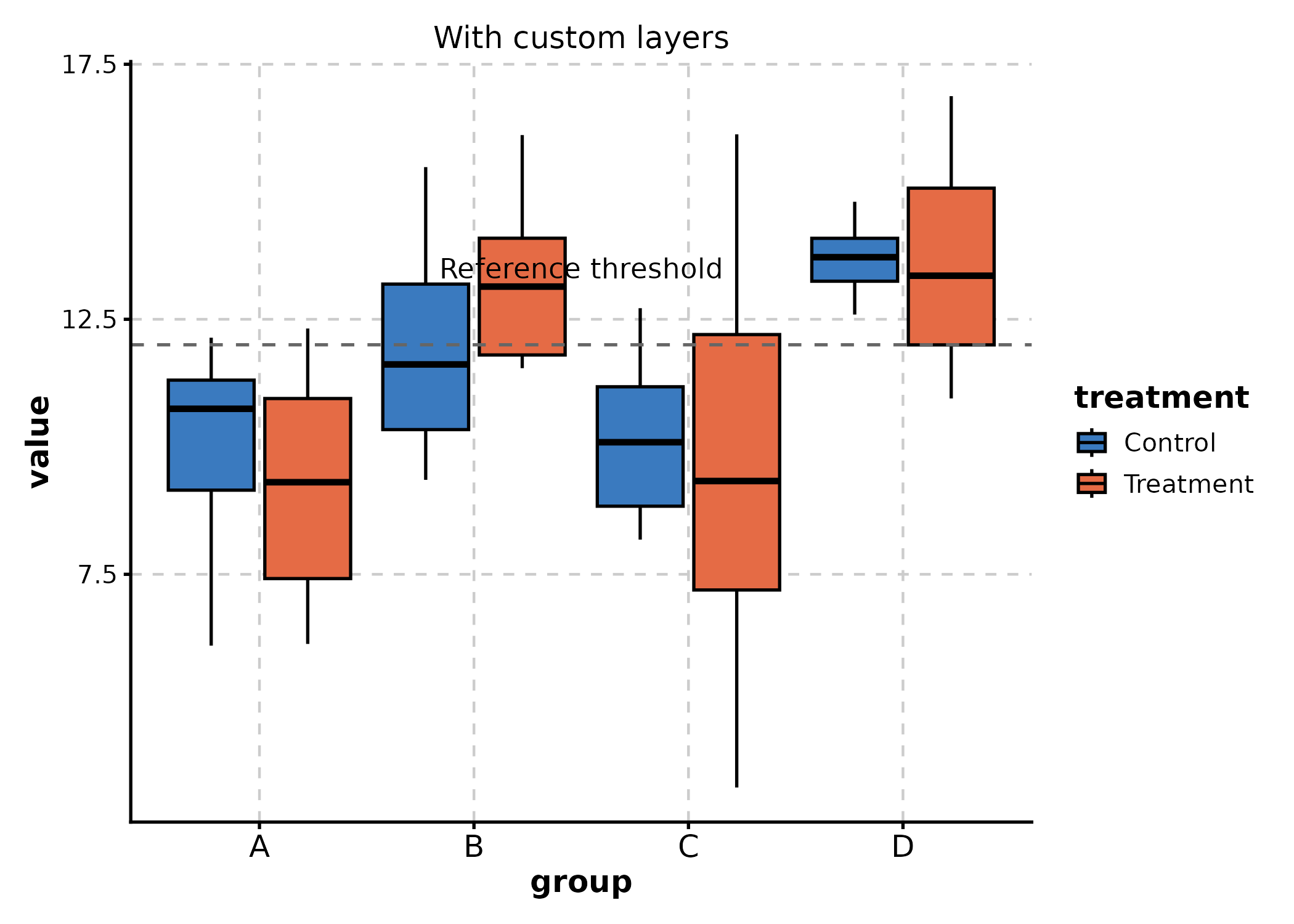
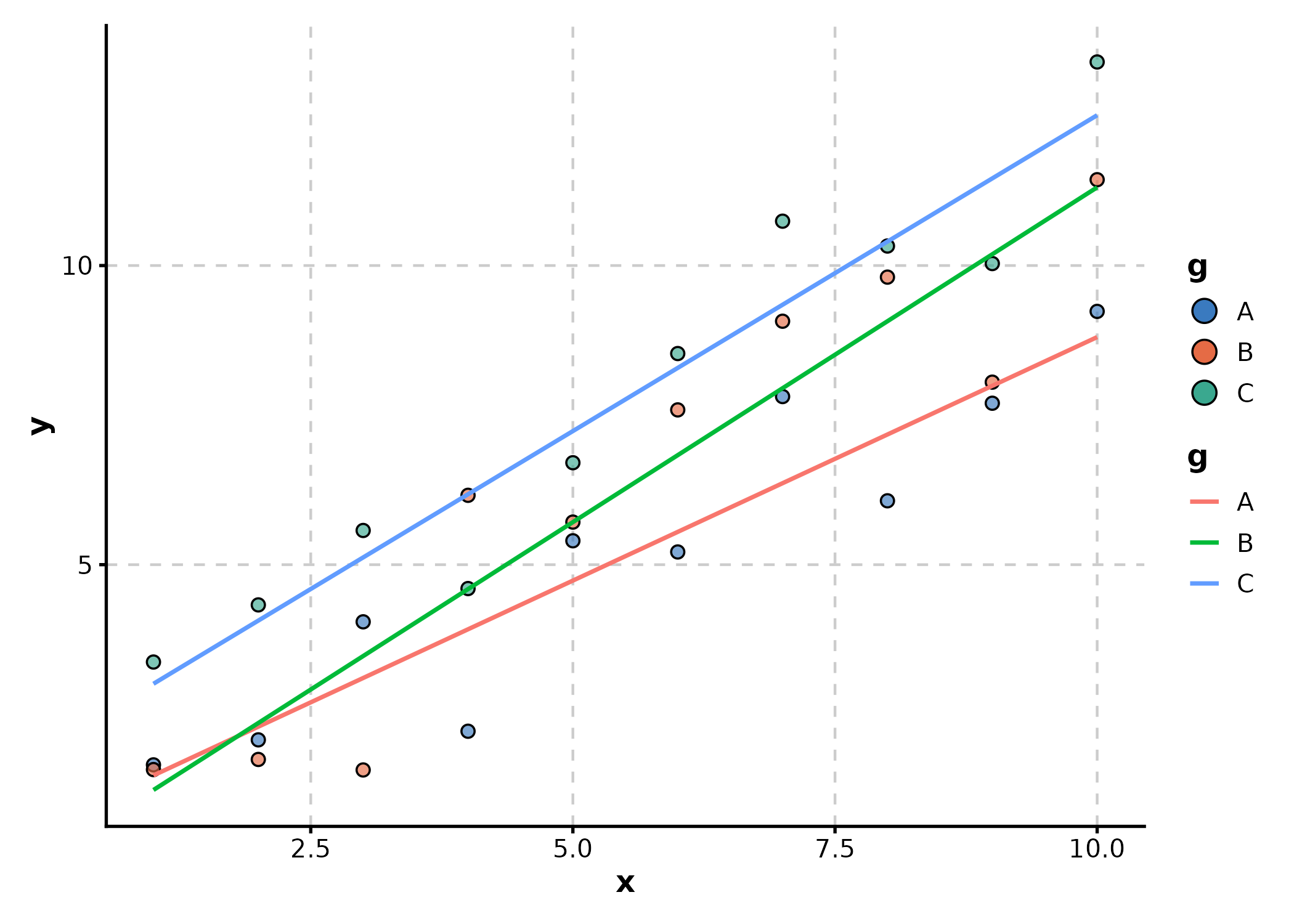
# Add smooth trend to a scatter plot
df_scatter <- data.frame(
  x = rep(1:10, 3),
  y = c(1:10 + rnorm(10), 2:11 + rnorm(10), 3:12 + rnorm(10)),
  g = rep(LETTERS[1:3], each = 10)
)

p <- ScatterPlot(df_scatter, x = "x", y = "y", color_by = "g")
p + ggplot2::geom_smooth(
  ggplot2::aes(x = x, y = y, color = g),
  method = "lm", se = FALSE, linewidth = 0.8,
  inherit.aes = FALSE, data = df_scatter
)
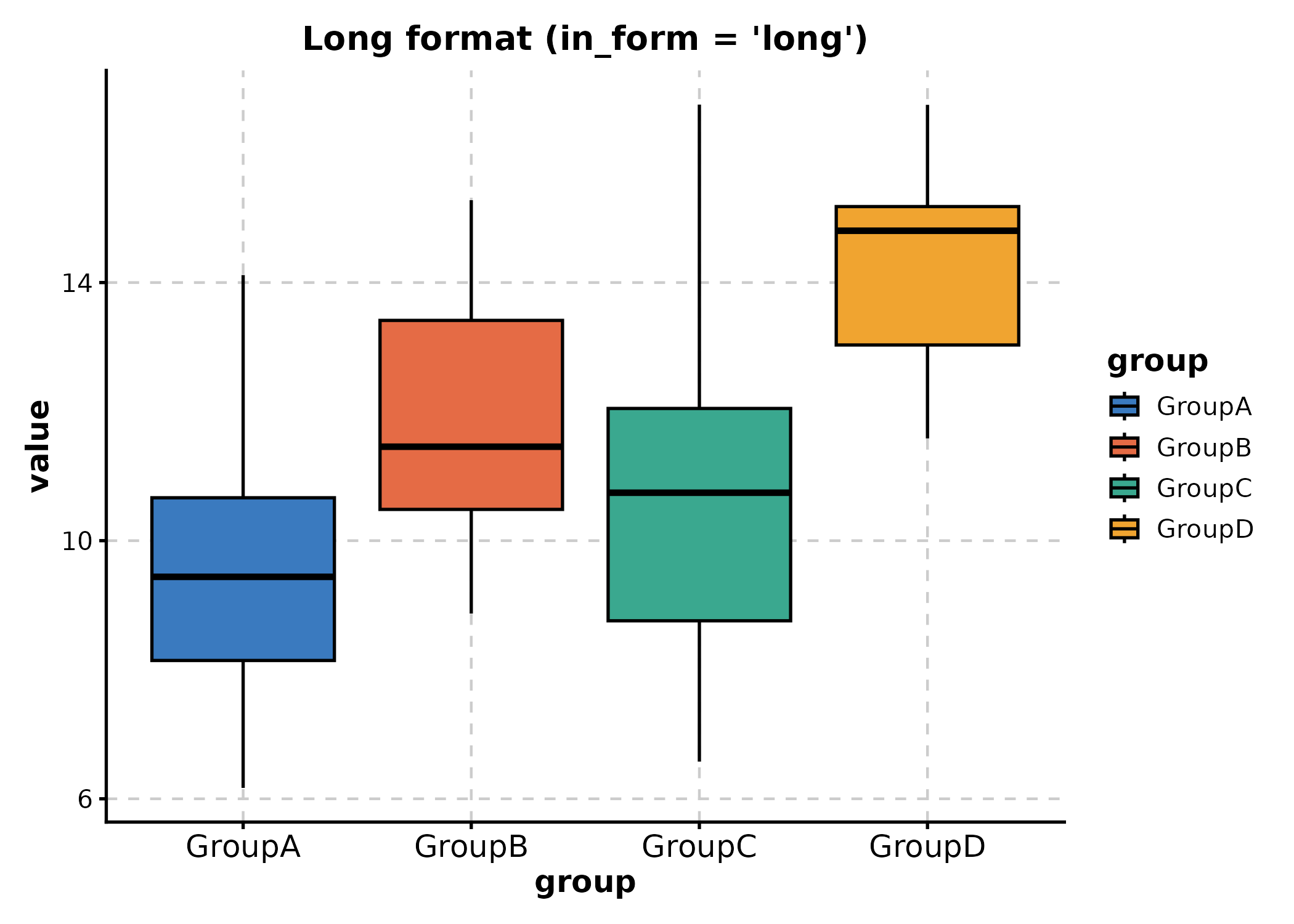
Data Format Flexibility
Many plots support both long and
wide formats via the in_form
parameter.
Long format (default)
Each row is one observation; x and y are
column names:
# Long: group, value columns
df_long <- tidyr::pivot_longer(df_wide, everything(), names_to = "group", values_to = "value")
BoxPlot(df_long, x = "group", y = "value",
  title = "Long format (in_form = 'long')"
)
Wide format
Each column is a group; x specifies the value columns to
pivot:
# Wide: each column (GroupA, GroupB, ...) is a group
BoxPlot(df_wide, x = c("GroupA", "GroupB", "GroupC", "GroupD"), in_form = "wide",
  title = "Wide format (in_form = 'wide')"
)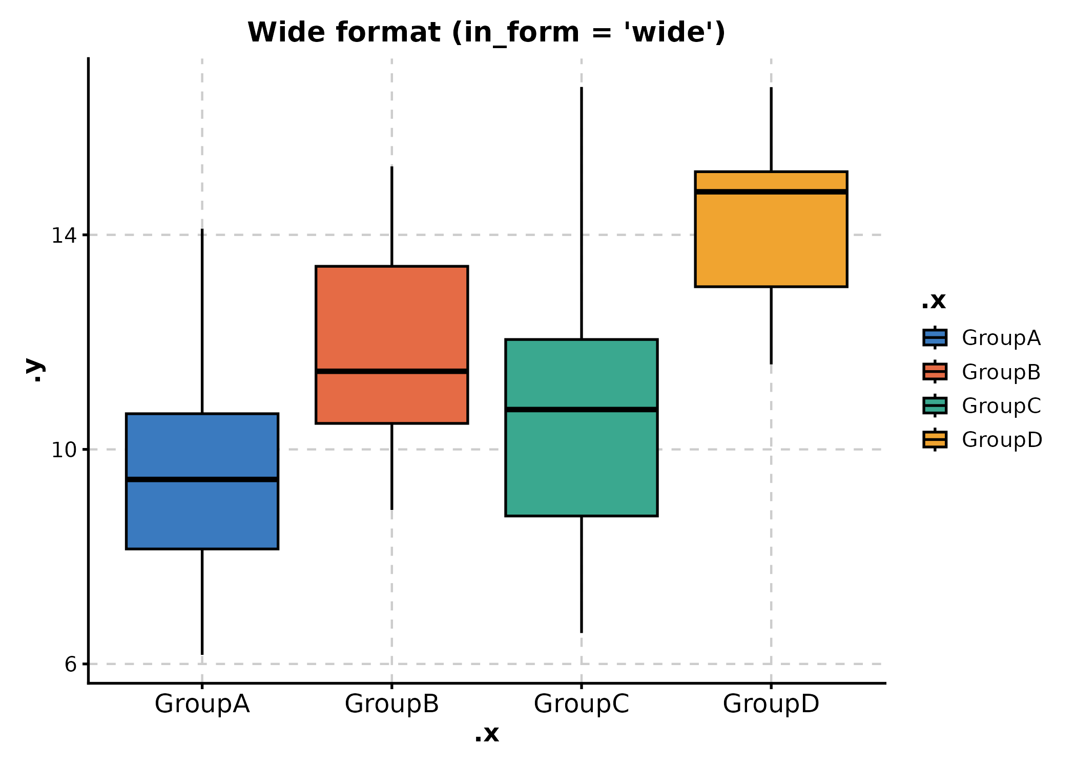
in_form is supported by BoxPlot,
ViolinPlot, JitterPlot,
RidgePlot, AreaPlot, SankeyPlot,
Heatmap, GSEAPlot, and others. Check each
function’s help for supported values.
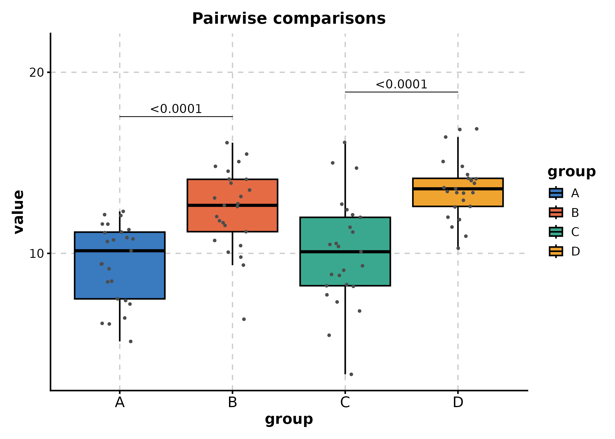
Statistical Annotations
BoxPlot and ViolinPlot
Add significance testing with comparisons,
ref_group, pairwise_method, and related
arguments:
# Pairwise comparisons
BoxPlot(df_box, x = "group", y = "value",
  comparisons = list(
    c("A", "B"),
    c("C", "D")
  ),
  pairwise_method = "wilcox.test",
  add_point = TRUE,
  title = "Pairwise comparisons"
)
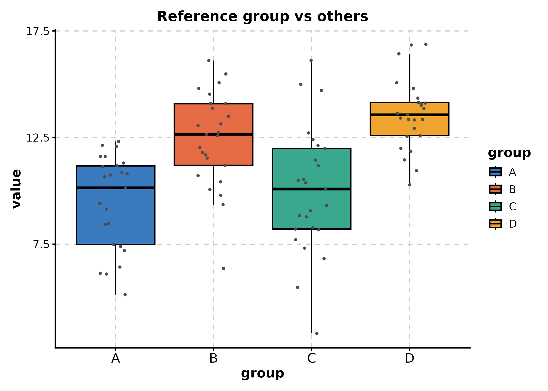
# Compare all groups to a reference
BoxPlot(df_box, x = "group", y = "value",
  ref_group = "A",
  pairwise_method = "wilcox.test",
  add_point = TRUE,
  title = "Reference group vs others"
)
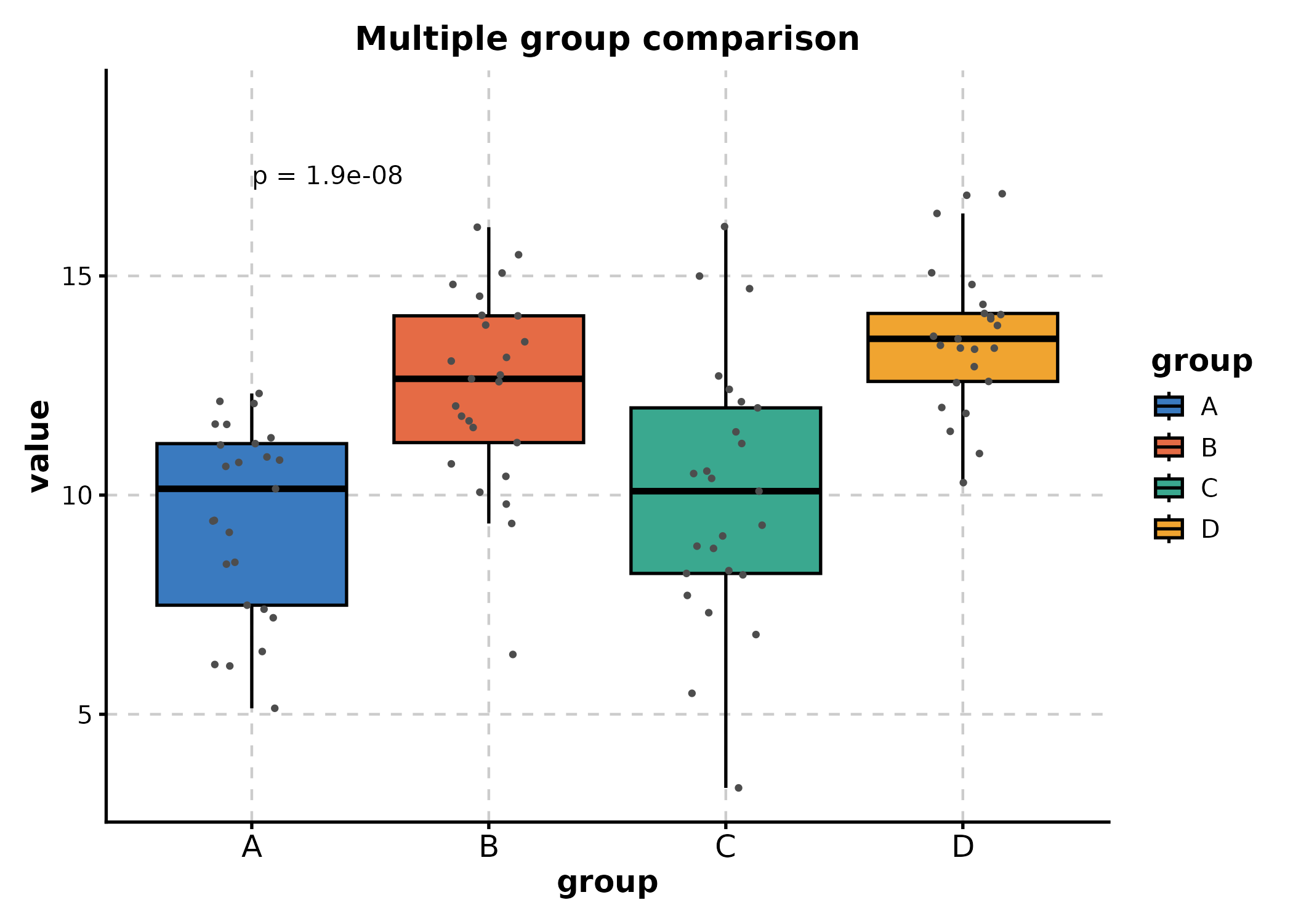
# Multiple group comparison (Kruskal-Wallis)
BoxPlot(df_box, x = "group", y = "value",
  multiplegroup_comparisons = TRUE,
  multiple_method = "kruskal.test",
  add_point = TRUE,
  title = "Multiple group comparison"
)
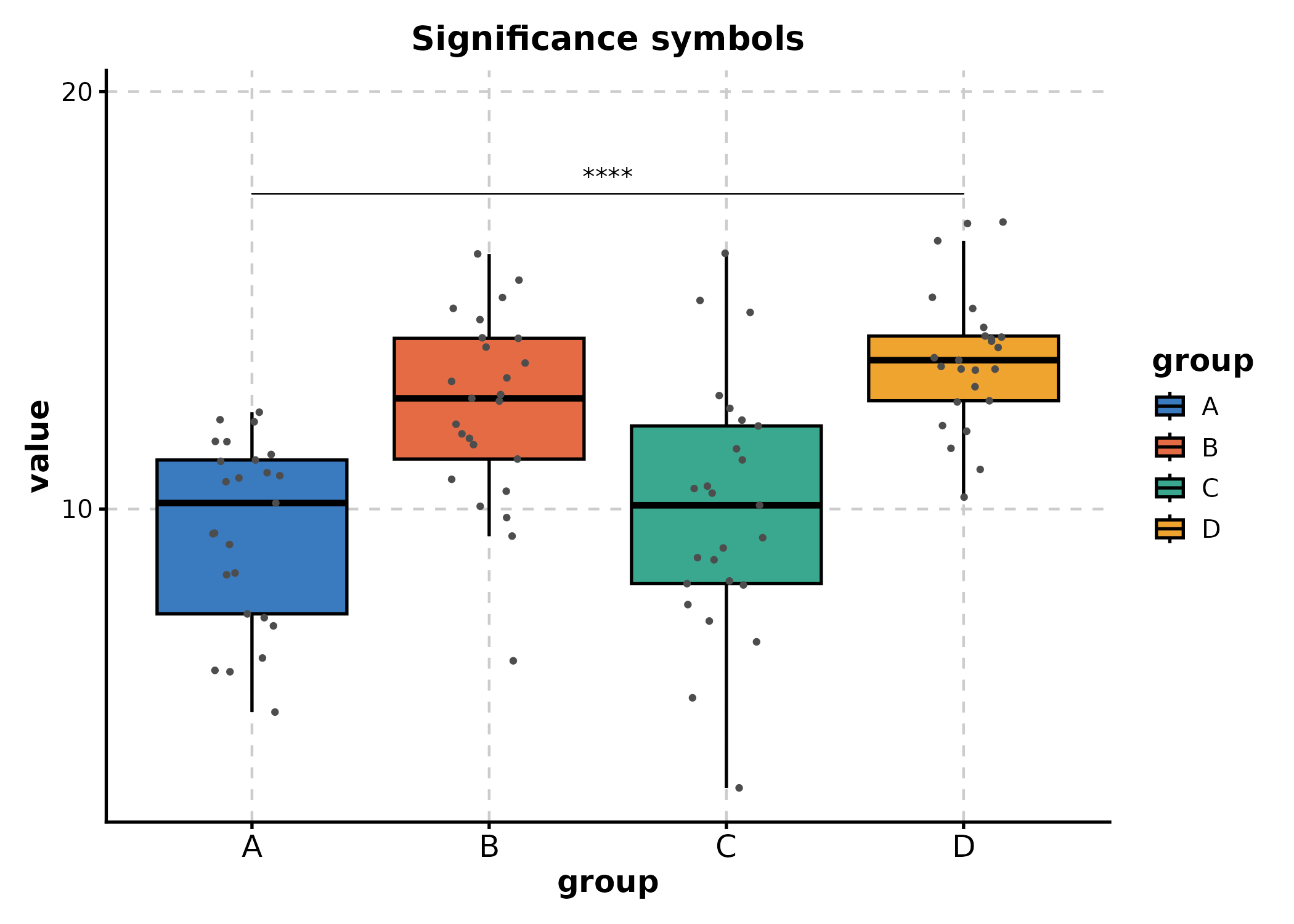
# Use significance symbols instead of p-values
BoxPlot(df_box, x = "group", y = "value",
  comparisons = list(c("A", "D"), c("B", "D")),
  sig_label = "p.signif",
  hide_ns = TRUE,
  add_point = TRUE,
  title = "Significance symbols"
)
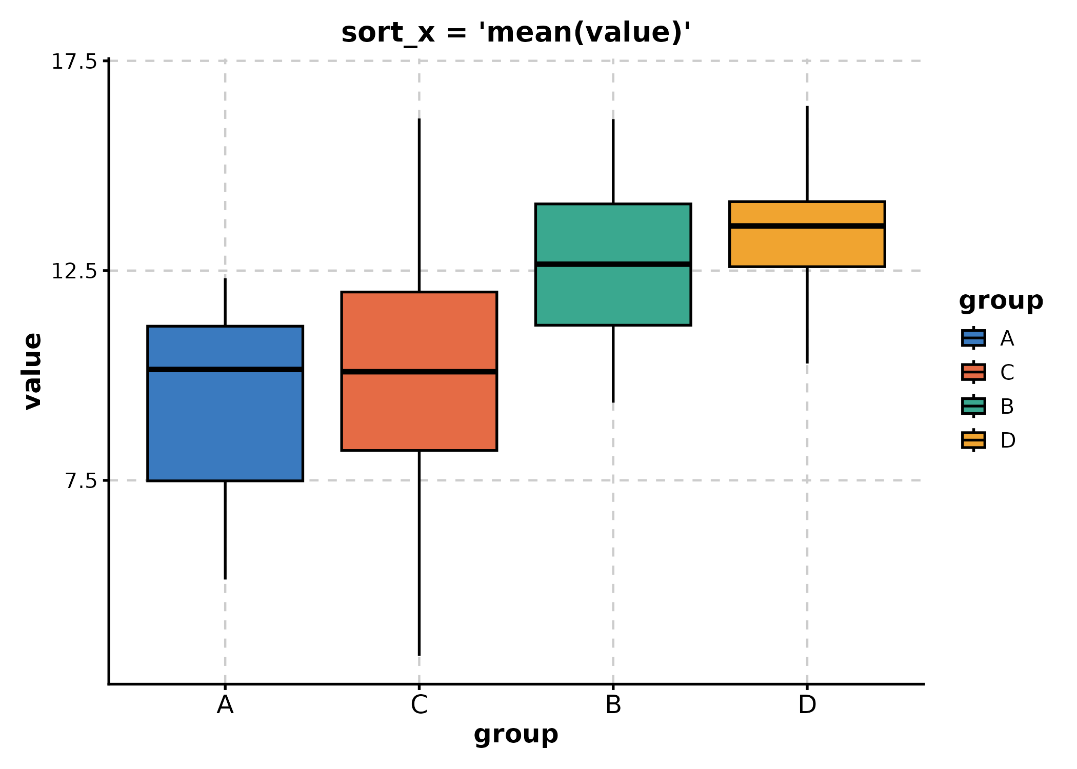
sort_x
Order x-axis categories by a summary expression:
# Sort by ascending mean
BoxPlot(df_box, x = "group", y = "value",
  sort_x = "mean(value)",
  title = "sort_x = 'mean(value)'"
)
# Sort by descending median
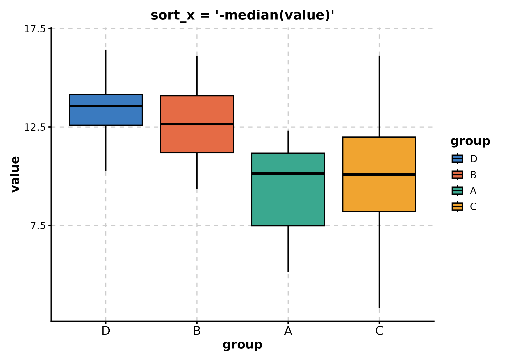
BoxPlot(df_box, x = "group", y = "value",
sort_x = "-median(value)",
title = "sort_x = '-median(value)'"
)
Legacy values like "mean_asc", "mean_desc",
"median_asc", "median_desc" are also
supported.
Summary
| Feature | Key Parameters |
|---|---|
| Themes |
theme, theme_args
|
| Palettes |
palette, palcolor,
show_palettes()
|
| Multi-panel |
split_by, nrow, ncol,
design
|
| Faceting |
facet_by, facet_scales,
facet_ncol
|
| Custom layers |
+ (ggplot2 layers) |
| Data format | in_form |
For more examples, see the Introduction and Tutorial vignettes.
Interactive Conversion (v2.0)
Any ggplot object can be converted to an interactive plotly widget
via ggforge_interactive():
p <- BoxPlot(df_box, x = "group", y = "value", group_by = "treatment",
  palette = "lancet")

ggforge_interactive(p)
This works with any ggforge plot, adding tooltips and zoom/pan interactivity.
Scatter3D() and Surface3D() produce native
plotly 3D plots: