This tutorial demonstrates every plotting function in ggforge (77
total) with practical examples. Functions requiring optional packages
that may not be available use eval=FALSE.
1. Statistics
BoxPlot
treat <- data.frame(
  group = rep(c("Control", "Low Dose", "High Dose"), each = 35),
  response = c(rnorm(35, 5, 1.5), rnorm(35, 7, 2), rnorm(35, 10, 2)),
  sex = sample(c("Male", "Female"), 105, replace = TRUE)
)

BoxPlot(treat, x = "group", y = "response", palette = "lancet",
  add_point = TRUE, pt_alpha = 0.3,
  title = "Basic Box Plot")
BoxPlot(treat, x = "group", y = "response", group_by = "sex",
  palette = "npg", add_point = TRUE, pt_alpha = 0.4,
  comparisons = TRUE, title = "Grouped with Comparisons")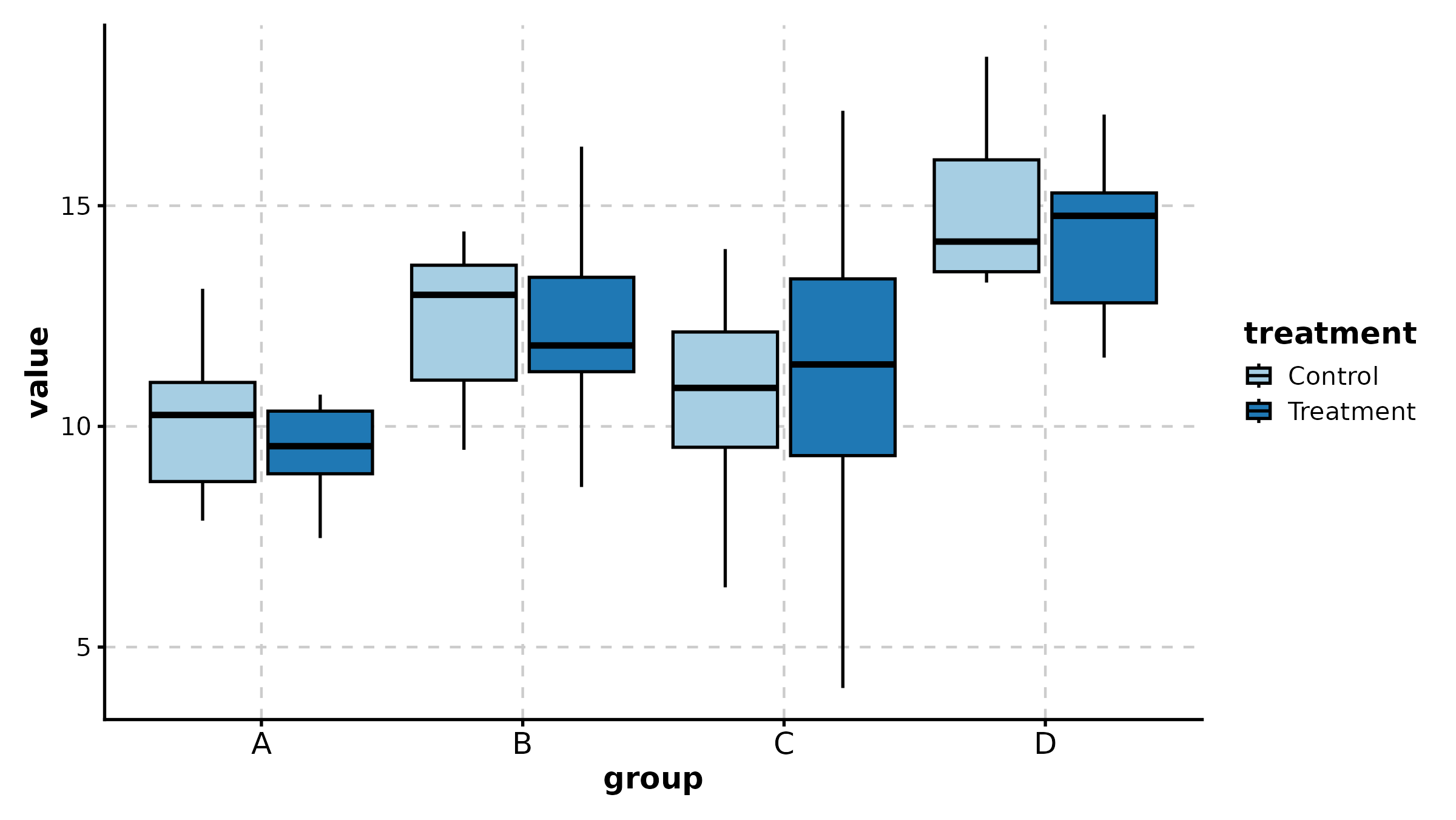
BoxPlot(treat, x = "group", y = "response", palette = "Set2",
  fill_mode = "mean", comparisons = list(c("Control", "High Dose")),
  sig_label = "p.signif", title = "Fill by Mean + Significance Symbols")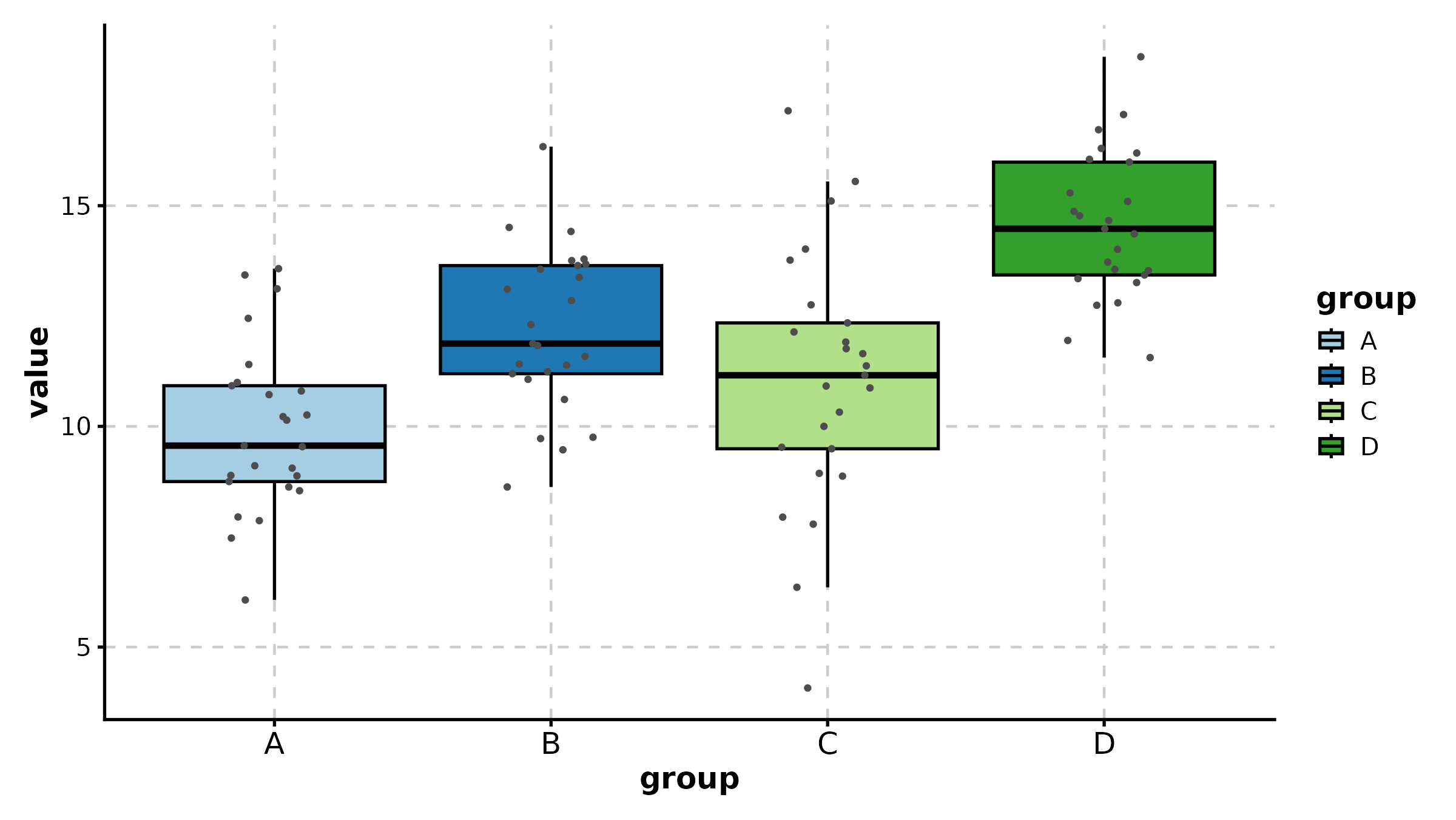
ViolinPlot
ViolinPlot(treat, x = "group", y = "response", palette = "npg",
  add_box = TRUE, add_point = TRUE, pt_alpha = 0.3,
  title = "Violin with Box Overlay")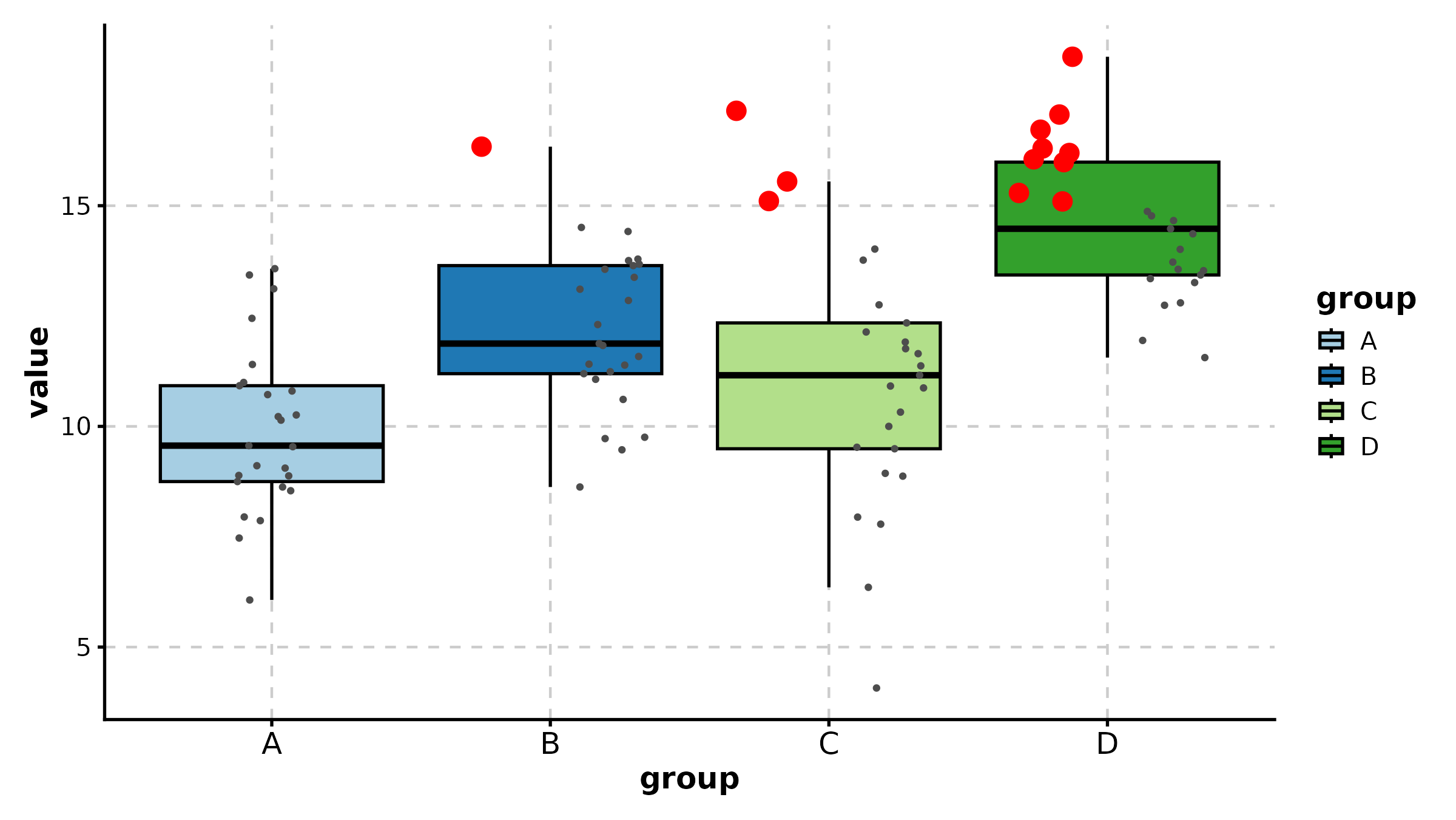
ViolinPlot(treat, x = "group", y = "response", group_by = "sex",
  palette = "jco", add_box = TRUE,
  title = "Grouped Violin")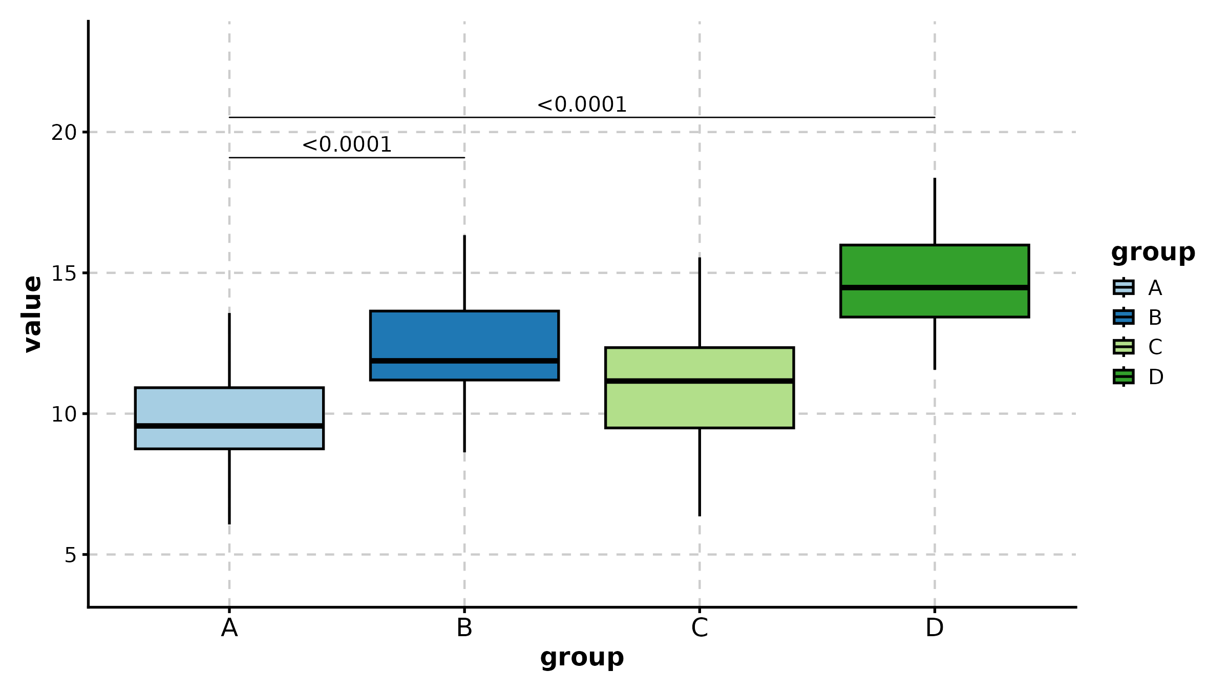
ViolinPlot(treat, x = "group", y = "response",
  fill_mode = "median", palette = "RdYlBu",
  title = "Fill by Median (Gradient)")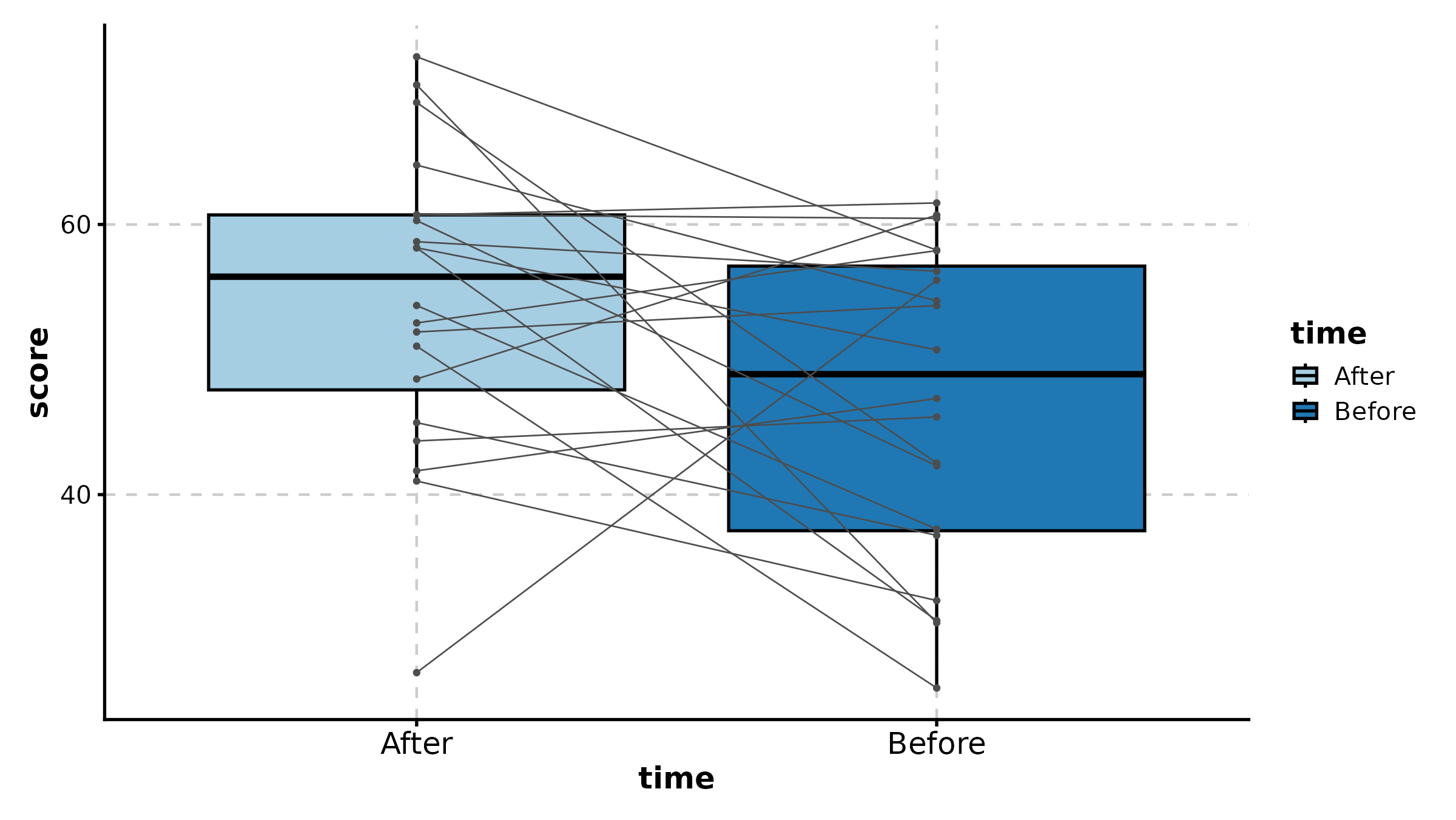
ScatterPlot
sdata <- data.frame(
  expr_A = rnorm(120, 8, 2), expr_B = rnorm(120, 8, 2),
  tissue = sample(c("Normal", "Tumor"), 120, replace = TRUE)
)
sdata$expr_B <- sdata$expr_B + 0.6 * sdata$expr_A + rnorm(120, 0, 1.5)

ScatterPlot(sdata, x = "expr_A", y = "expr_B", group_by = "tissue",
  palette = "jco", add_smooth = TRUE, add_stat = TRUE,
  title = "Grouped Correlation")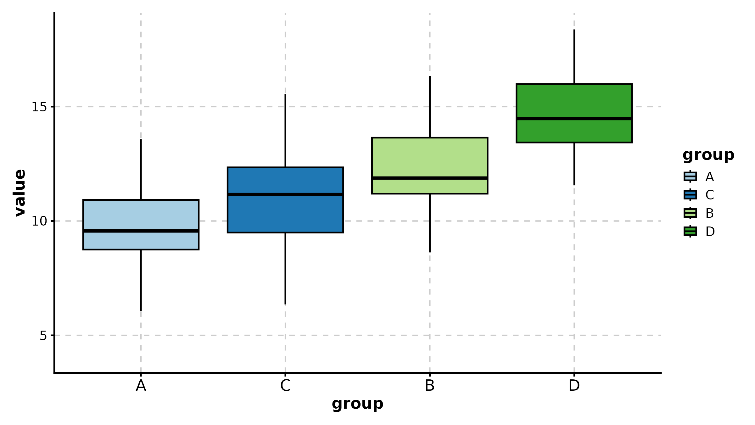
ScatterPlot(sdata, x = "expr_A", y = "expr_B",
  color_by = "expr_B", palette = "viridis",
  title = "Continuous Color Mapping")
ScatterPlot(sdata, x = "expr_A", y = "expr_B",
  group_by = "tissue", split_by = "tissue",
  palette = "npg", add_smooth = TRUE,
  combine = TRUE, nrow = 1,
  title = "Split by Tissue")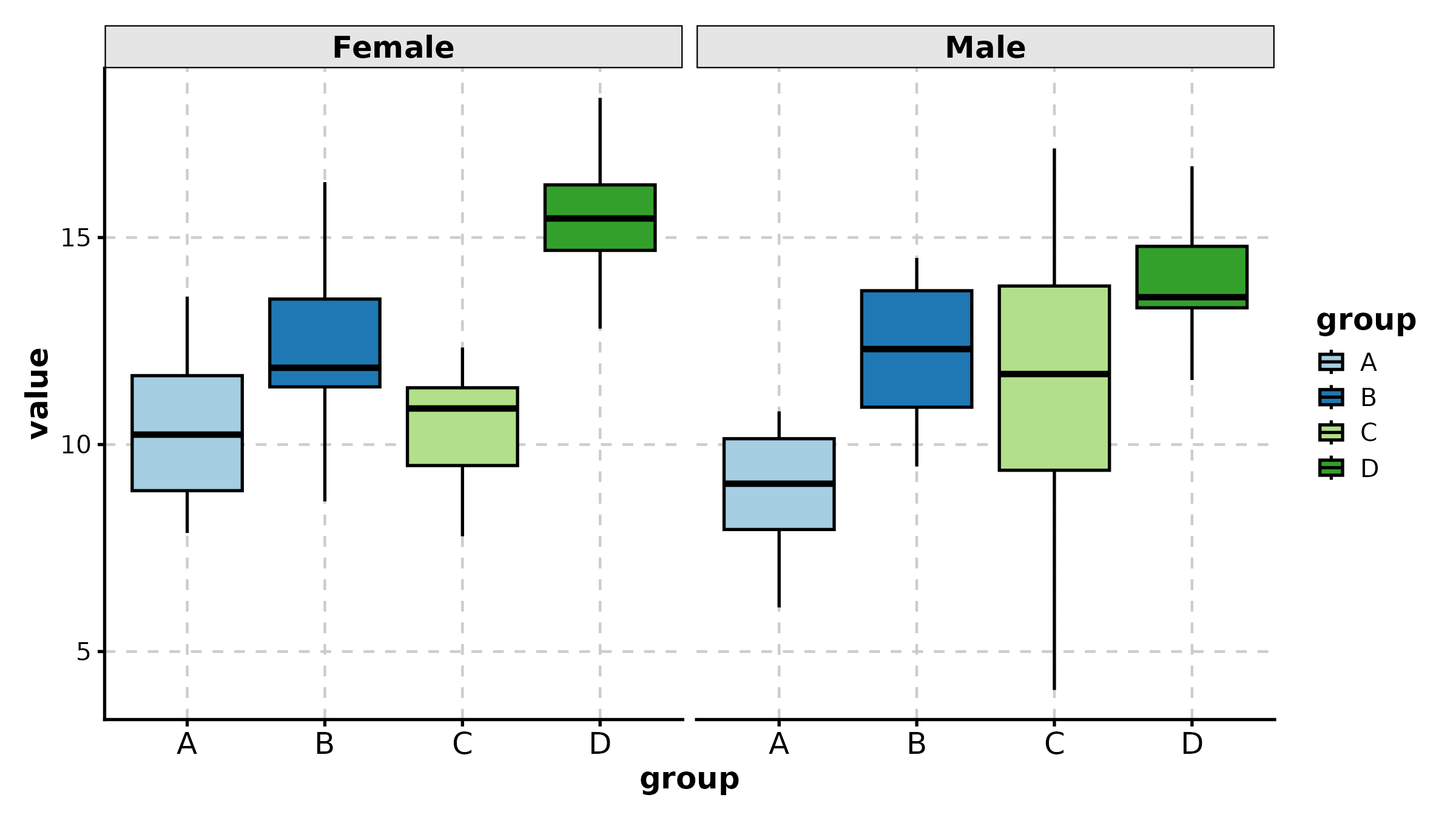
LinePlot
time_course <- data.frame(
  day = rep(c(0, 3, 7, 14, 21, 28), 2),
  volume = c(100, 120, 180, 320, 500, 780, 100, 110, 130, 150, 170, 200),
  arm = rep(c("Vehicle", "Treatment"), each = 6)
)

LinePlot(time_course, x = "day", y = "volume", group_by = "arm",
  palette = "lancet", title = "Tumor Growth Curve",
  xlab = "Day", ylab = "Volume (mm3)")
LinePlot(time_course, x = "day", y = "volume", group_by = "arm",
  palette = "nejm", add_bg = TRUE, add_smooth = TRUE,
  title = "With Background and Smooth")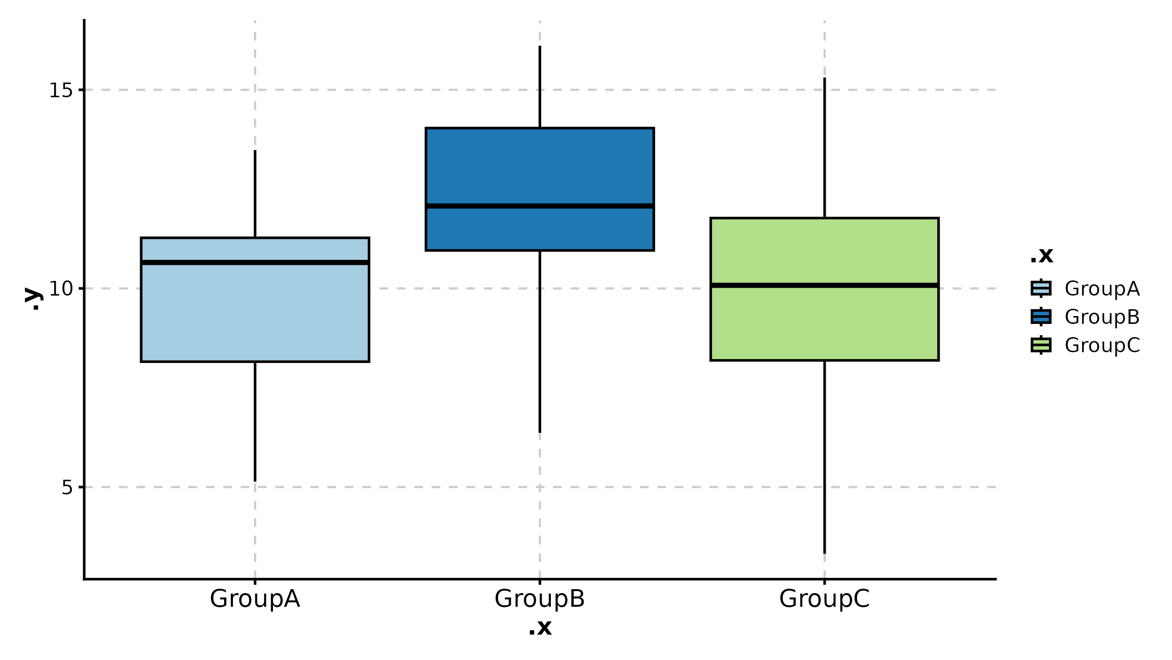
BarPlot
cell_freq <- data.frame(
  sample = rep(c("Patient 1", "Patient 2", "Patient 3"), each = 4),
  celltype = rep(c("T cell", "B cell", "Myeloid", "Stromal"), 3),
  fraction = c(0.45, 0.15, 0.25, 0.15, 0.30, 0.25, 0.30, 0.15,
               0.50, 0.10, 0.20, 0.20)
)

BarPlot(cell_freq, x = "sample", y = "fraction", group_by = "celltype",
  position = "stack", palette = "npg", label = TRUE,
  title = "Stacked Bar Plot")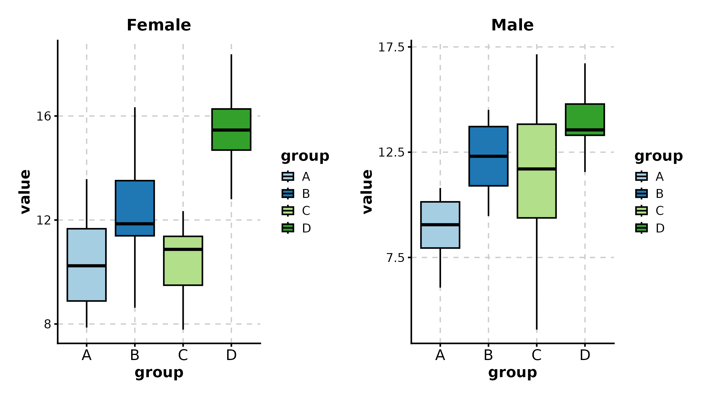
BarPlot(cell_freq, x = "sample", y = "fraction", group_by = "celltype",
  position = "dodge", palette = "Set2",
  title = "Grouped (Dodged) Bar Plot")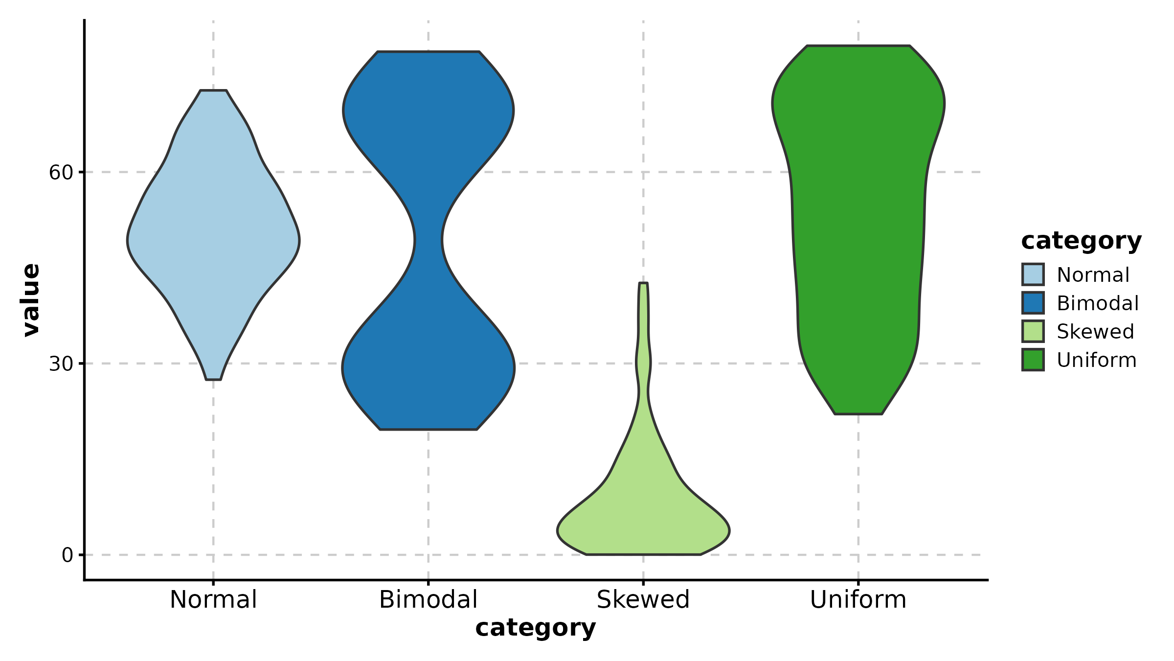
BarPlot(treat, x = "group", y = "response", palette = "lancet",
  add_errorbar = TRUE, errorbar_type = "se",
  title = "Mean with Standard Error")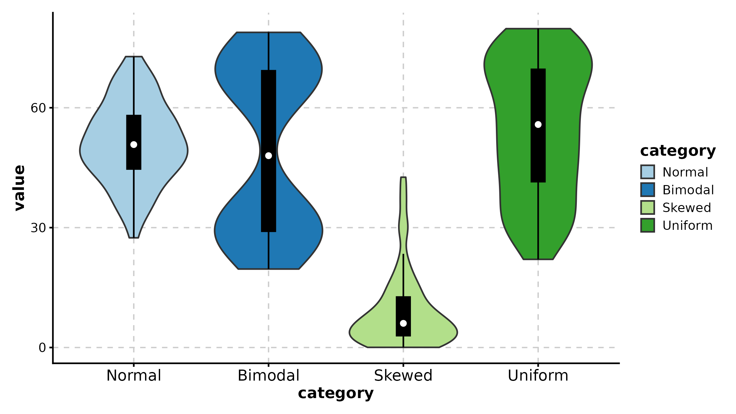
DensityPlot
DensityPlot(treat, x = "response", group_by = "group",
  palette = "npg", add_rug = TRUE,
  title = "Density with Rug")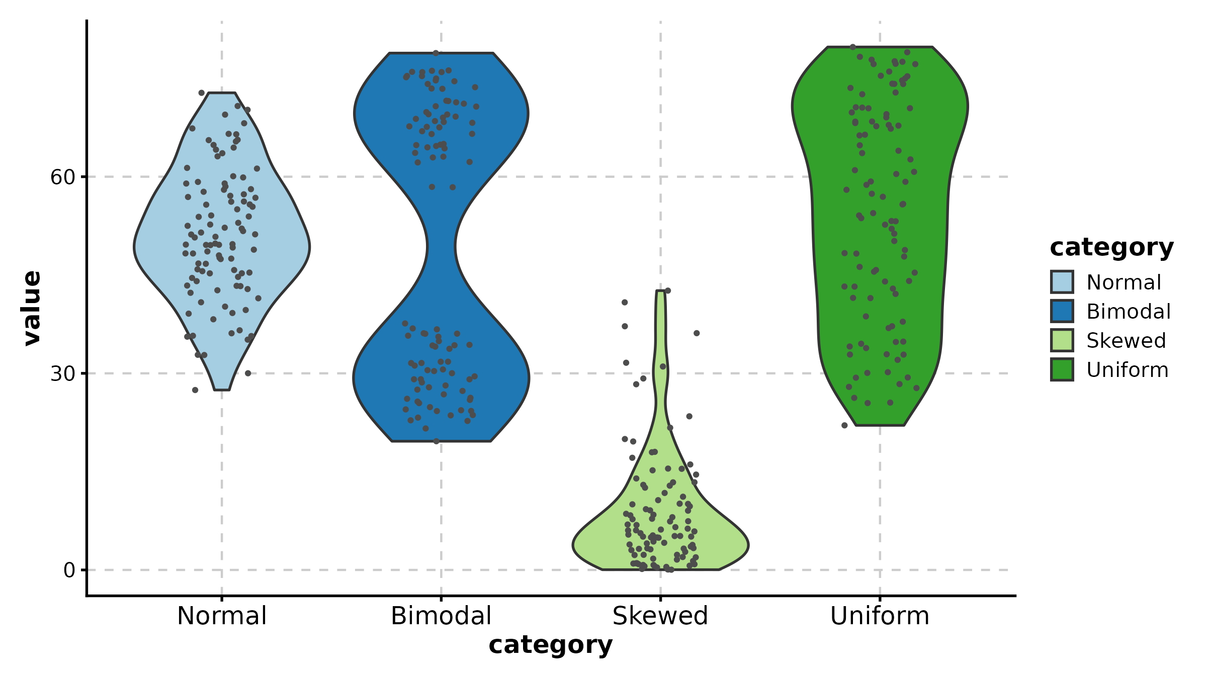
DensityPlot(treat, x = "response", group_by = "group",
  facet_by = "sex", palette = "Set1",
  title = "Faceted Density")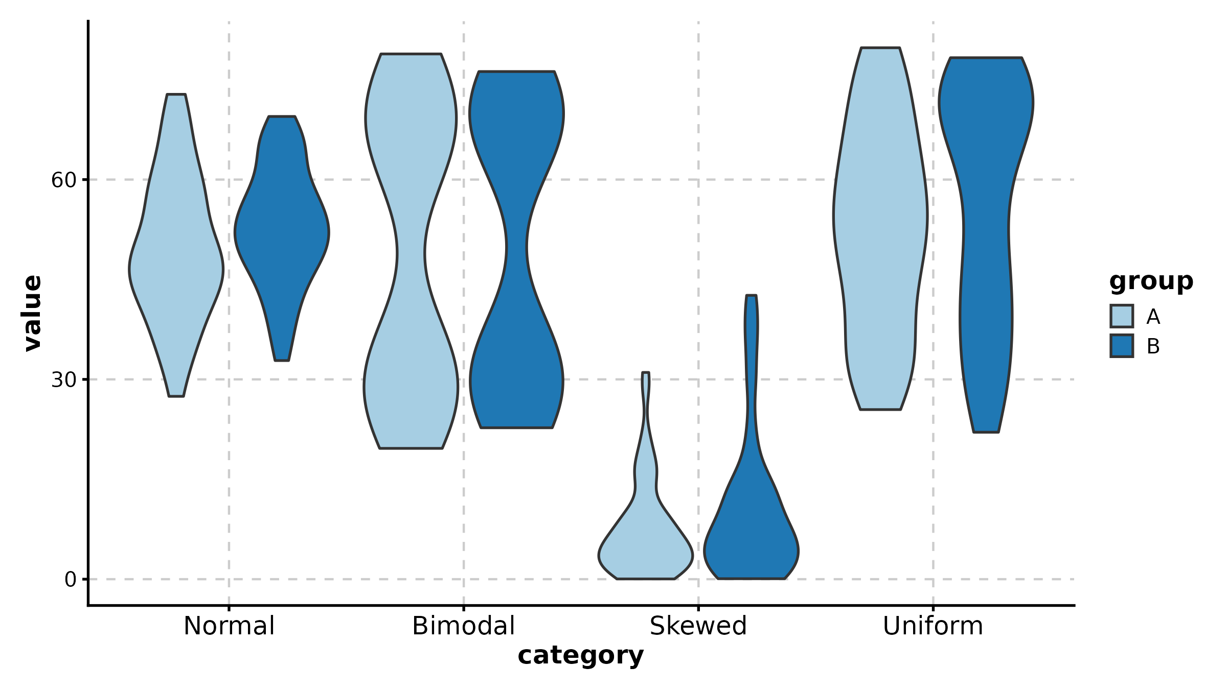
JitterPlot
JitterPlot(treat, x = "group", y = "response", palette = "Set2",
  title = "Basic Jitter Plot")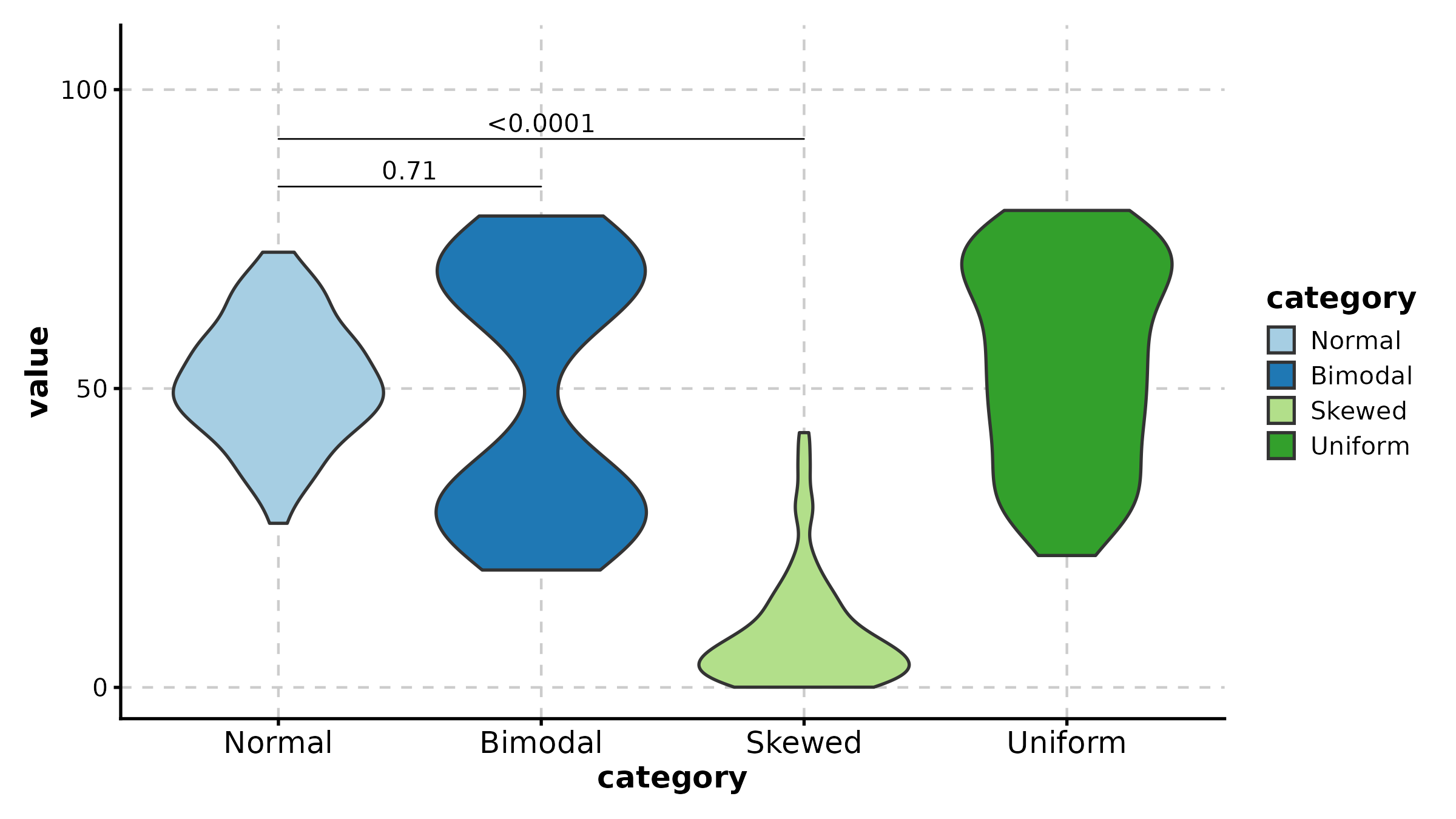
JitterPlot(treat, x = "group", y = "response", group_by = "sex",
  palette = "npg", title = "Grouped Jitter")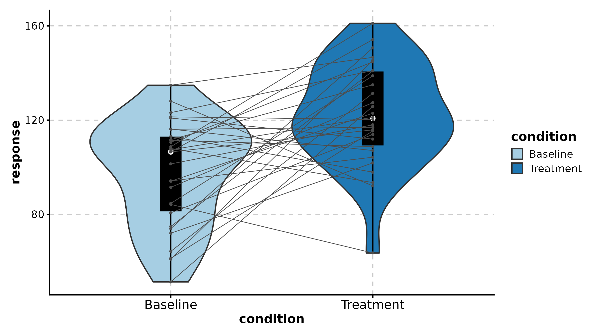
BeeswarmPlot
BeeswarmPlot(treat, x = "group", y = "response", palette = "npg",
  title = "Beeswarm Layout")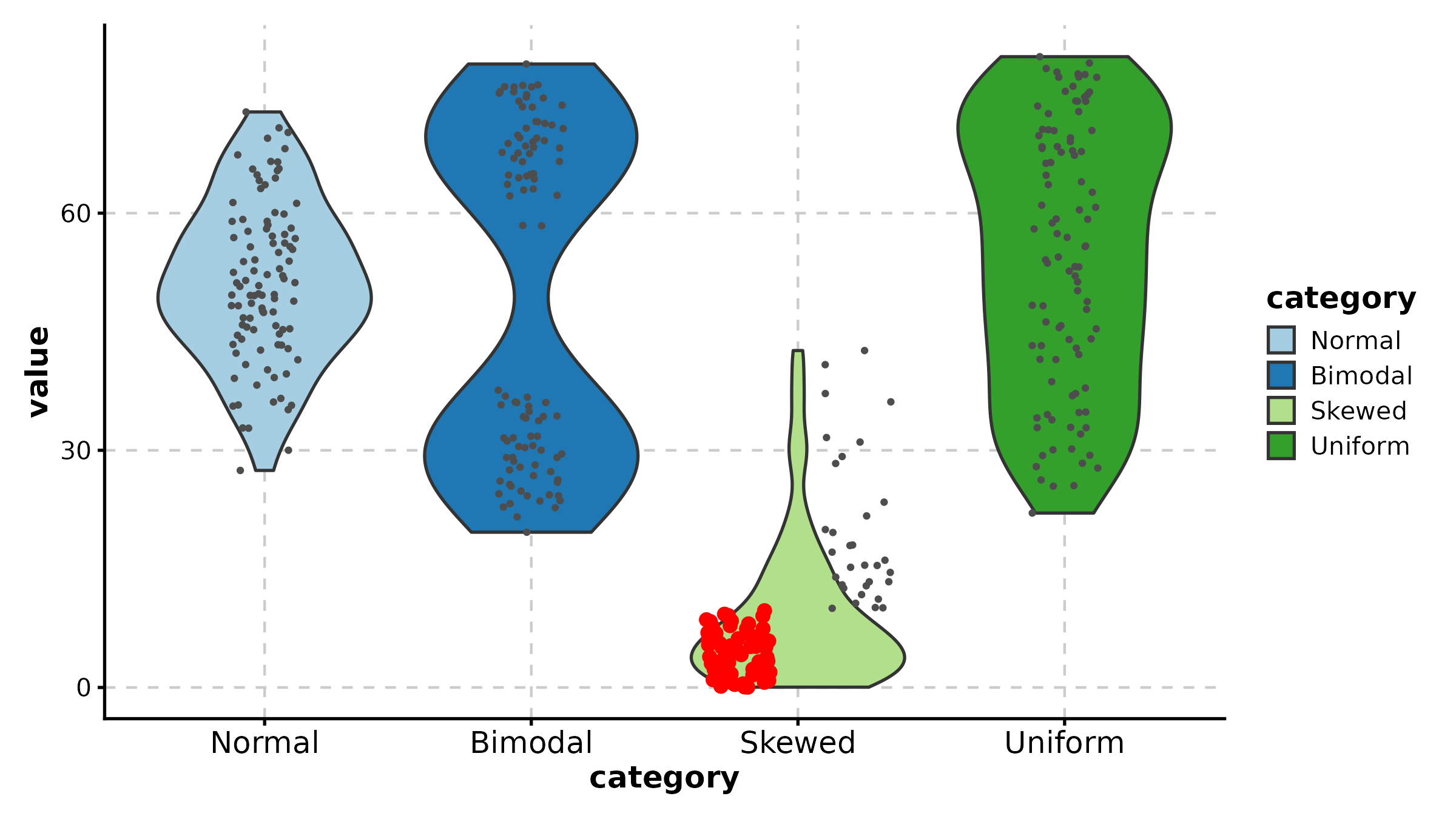
Histogram
Histogram(data.frame(score = c(rnorm(200, 5, 2), rnorm(200, 10, 2)),
  group = rep(c("A", "B"), each = 200)),
  x = "score", group_by = "group", palette = "Set1",
  title = "Histogram")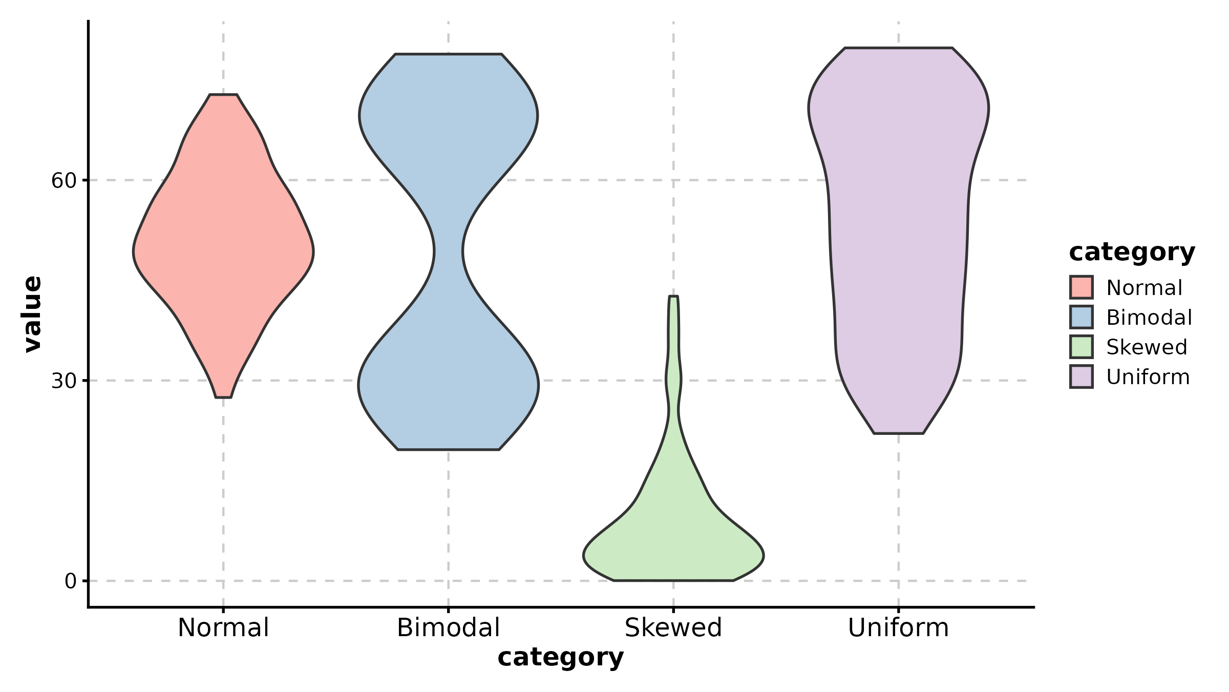
RidgePlot
ridge_df <- data.frame(
  value = c(rnorm(100, 3), rnorm(100, 5), rnorm(100, 7), rnorm(100, 9)),
  celltype = rep(c("T cell", "B cell", "Myeloid", "NK"), each = 100)
)

RidgePlot(ridge_df, x = "value", group_by = "celltype",
  palette = "npg", title = "Ridge Plot")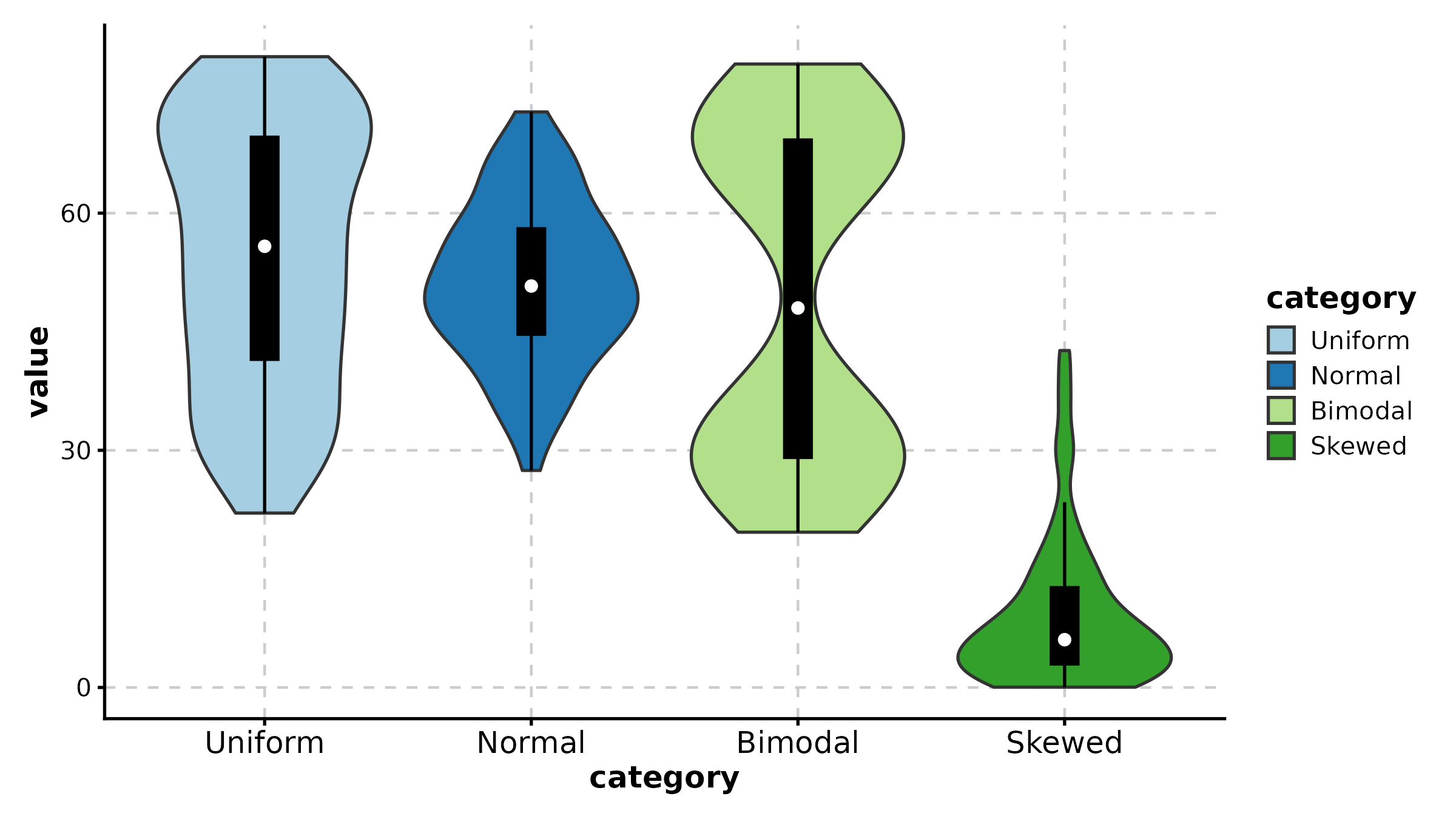
RidgePlot(ridge_df, x = "value", group_by = "celltype",
  palette = "Set2", add_vline = TRUE, vline_color = TRUE,
  title = "Ridge with Median Lines")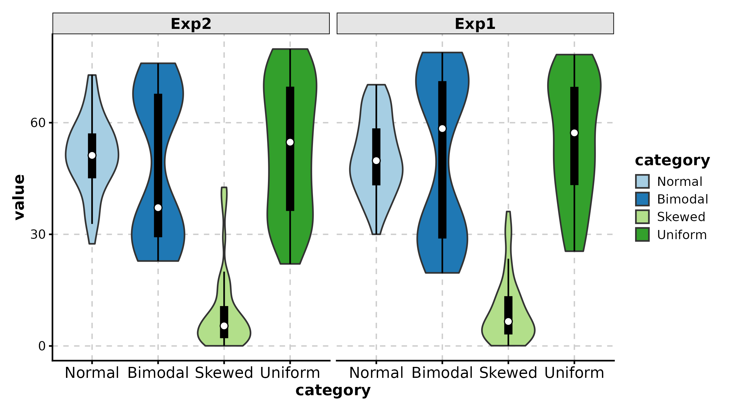
AreaPlot
comp <- data.frame(
  time = rep(paste0("T", 1:6), 3),
  fraction = c(0.50, 0.45, 0.40, 0.35, 0.30, 0.25,
               0.30, 0.30, 0.35, 0.35, 0.40, 0.40,
               0.20, 0.25, 0.25, 0.30, 0.30, 0.35),
  celltype = rep(c("Epithelial", "Immune", "Stromal"), each = 6)
)

AreaPlot(comp, x = "time", y = "fraction", group_by = "celltype",
  palette = "nejm", title = "Stacked Area")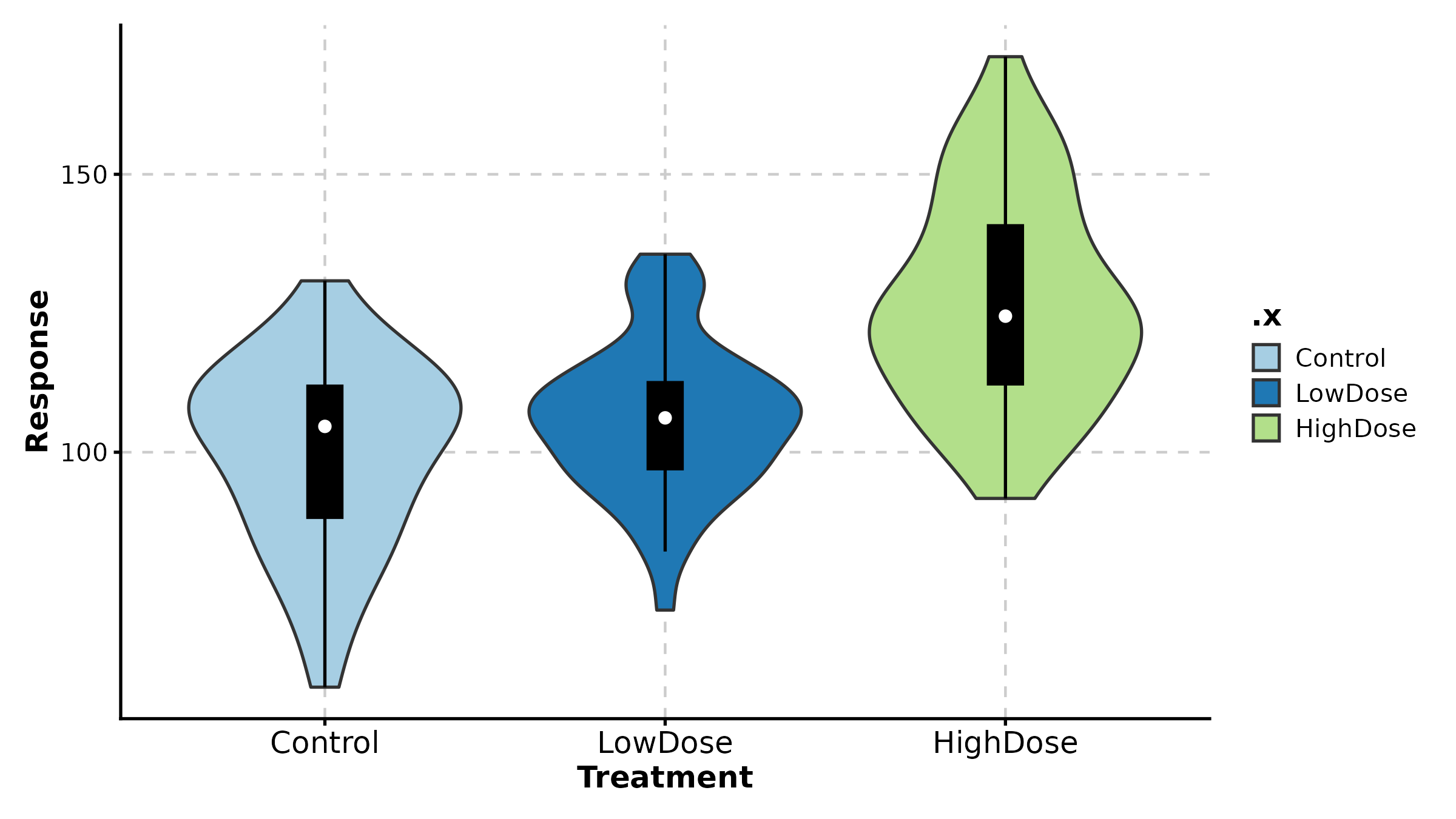
AreaPlot(comp, x = "time", y = "fraction", group_by = "celltype",
  palette = "Set2", scale_y = TRUE,
  title = "100% Stacked Area")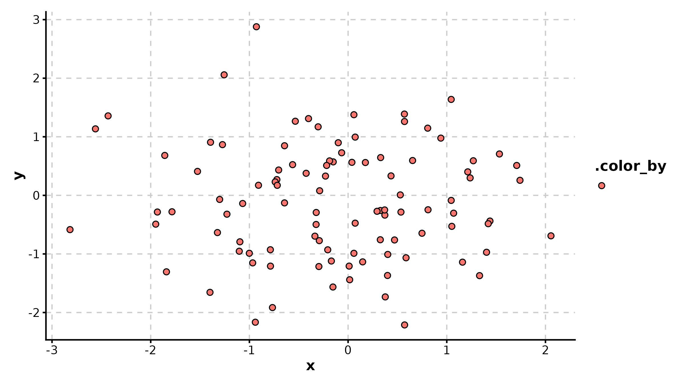
TrendPlot
trend_df <- data.frame(
  timepoint = rep(LETTERS[1:5], 2),
  value = c(2, 5, 8, 6, 3, 4, 7, 11, 9, 5),
  cohort = rep(c("Cohort 1", "Cohort 2"), each = 5)
)

TrendPlot(trend_df, x = "timepoint", y = "value", group_by = "cohort",
  palette = "Set1", title = "Trend Comparison")

TrendPlot(trend_df, x = "timepoint", y = "value", group_by = "cohort",
  palette = "nejm", scale_y = TRUE,
  title = "Scaled Trend")
QQPlot
QQPlot(data.frame(values = rnorm(200)), val = "values",
  band = TRUE, title = "Normal Q-Q Plot")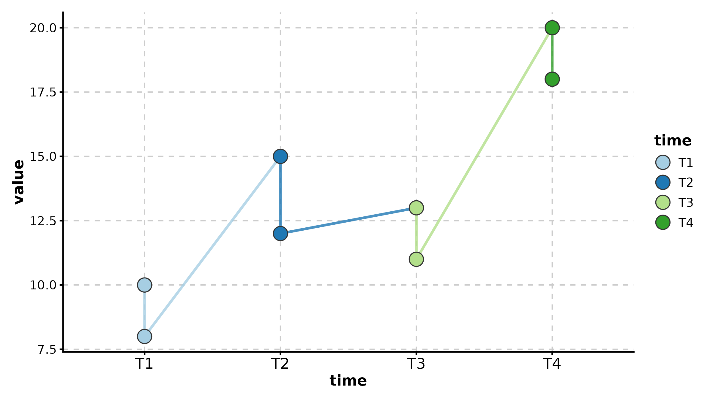
DotPlot
dot_df <- data.frame(
  gene = rep(c("CD3D", "CD8A", "MS4A1", "CD68", "NKG7"), 4),
  cluster = rep(paste0("C", 1:4), each = 5),
  avg_expr = runif(20, -1, 2),
  pct_expr = runif(20, 0.1, 0.9)
)

DotPlot(dot_df, x = "gene", y = "cluster",
  size_by = "pct_expr", fill_by = "avg_expr",
  palette = "RdBu", title = "Marker Expression Dot Plot")
DotPlot(dot_df, x = "gene", y = "cluster",
  size_by = "pct_expr", fill_by = "avg_expr",
  fill_cutoff = 0, palette = "RdBu", add_bg = TRUE,
  title = "With Background and Cutoff")
CorPlot
cor_df <- data.frame(
  BRCA1 = rnorm(80), TP53 = rnorm(80),
  tissue = sample(c("Normal", "Tumor"), 80, replace = TRUE)
)
cor_df$TP53 <- cor_df$BRCA1 * 0.7 + rnorm(80, sd = 0.5)

CorPlot(cor_df, x = "BRCA1", y = "TP53", group_by = "tissue",
  palette = "jco", add_smooth = TRUE, title = "Gene Correlation")
CorPlot(cor_df, x = "BRCA1", y = "TP53",
  palette = "lancet", add_smooth = TRUE,
  anno_items = c("n", "eq", "r2", "pearson"),
  title = "With Full Annotations")
LollipopPlot
x is the numeric value axis, y is the
category axis.
lollipop_df <- data.frame(
  pathway = paste0("Pathway ", LETTERS[1:8]),
  score = c(3.2, 2.8, 2.5, 2.1, -1.5, -1.9, -2.3, -2.7)
)

LollipopPlot(lollipop_df, x = "score", y = "pathway",
  palette = "Set2", title = "Lollipop Plot")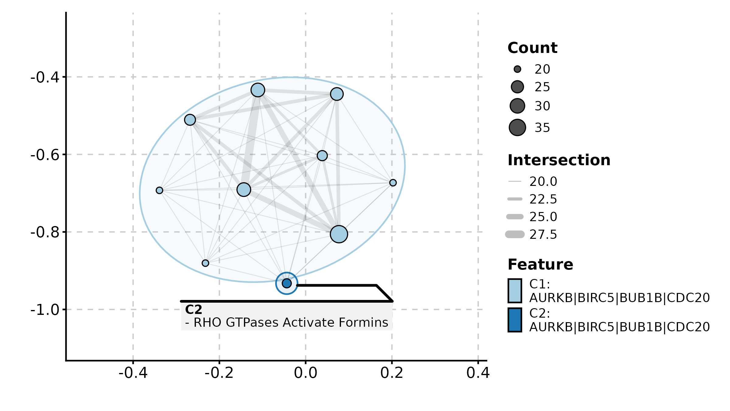
LollipopPlot(lollipop_df, x = "score", y = "pathway",
  fill_by = "score", palette = "RdBu",
  title = "Color by Score")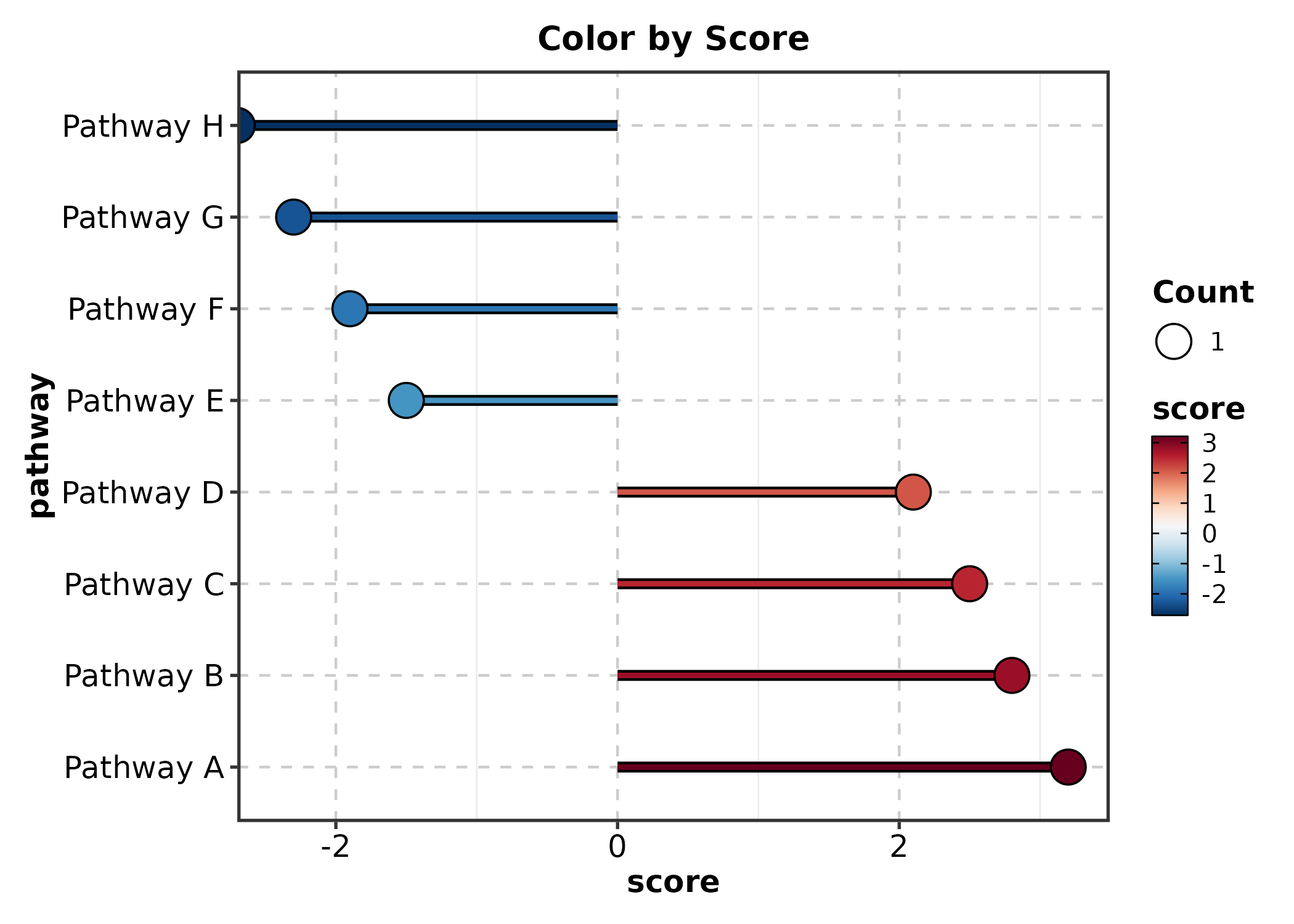
SplitBarPlot
x is the numeric value, y is the category
label. Positive and negative values are split automatically.
split_bar <- data.frame(
  term = paste0("GO:", 1:10),
  nes = c(2.1, 1.8, 1.5, 1.3, 1.1, -1.2, -1.4, -1.7, -1.9, -2.3)
)

SplitBarPlot(split_bar, x = "nes", y = "term",
  palette = "RdBu", title = "NES Split Bar")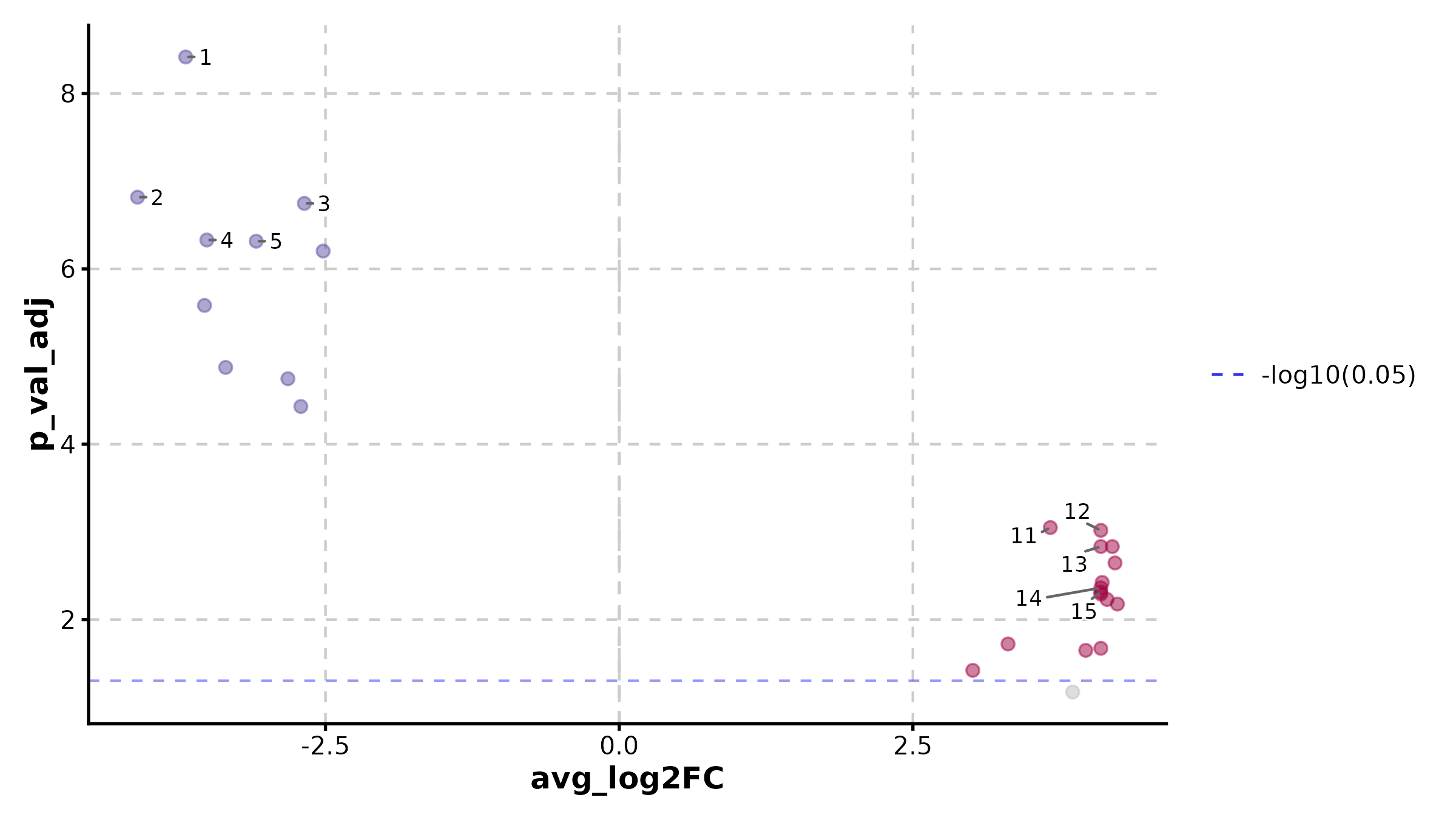
SplitBarPlot(split_bar, x = "nes", y = "term",
  palette = "RdBu", flip = TRUE,
  title = "Horizontal Split Bar")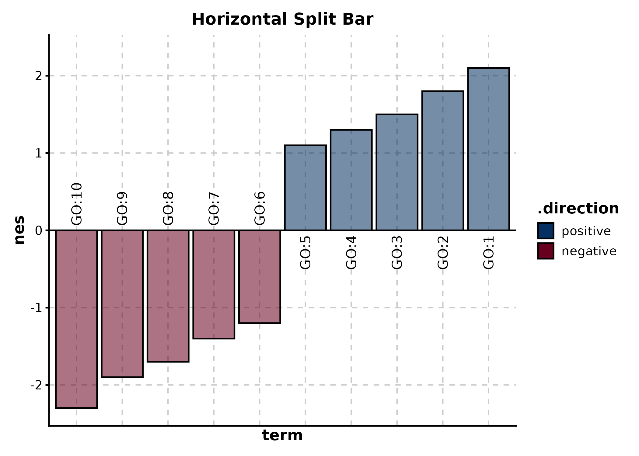
WaterfallPlot
Alias for SplitBarPlot. x = numeric,
y = category.
wf_df <- data.frame(
  patient = paste0("Pt", 1:20),
  change = sort(runif(20, -80, 40), decreasing = TRUE)
)

WaterfallPlot(wf_df, x = "change", y = "patient",
  palette = "RdBu", title = "Tumor Size Change (%)")
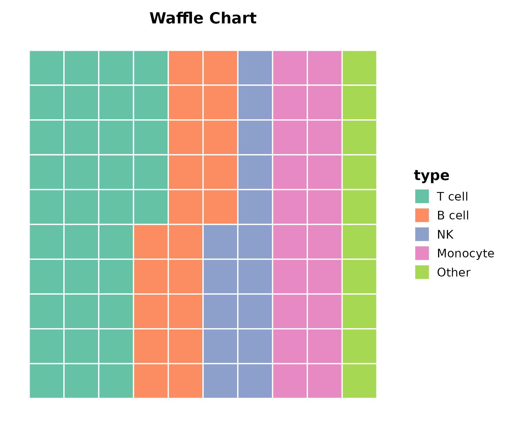
PieChart
cell_comp <- data.frame(
  type = c("T cell", "B cell", "NK", "Monocyte", "Other"),
  count = c(35, 20, 15, 20, 10)
)

PieChart(cell_comp, x = "type", y = "count", palette = "Set2",
  title = "Cell Composition")
RingPlot
RingPlot(cell_comp, x = "type", y = "count", group_by = "type",
  palette = "Set2", title = "Ring Chart")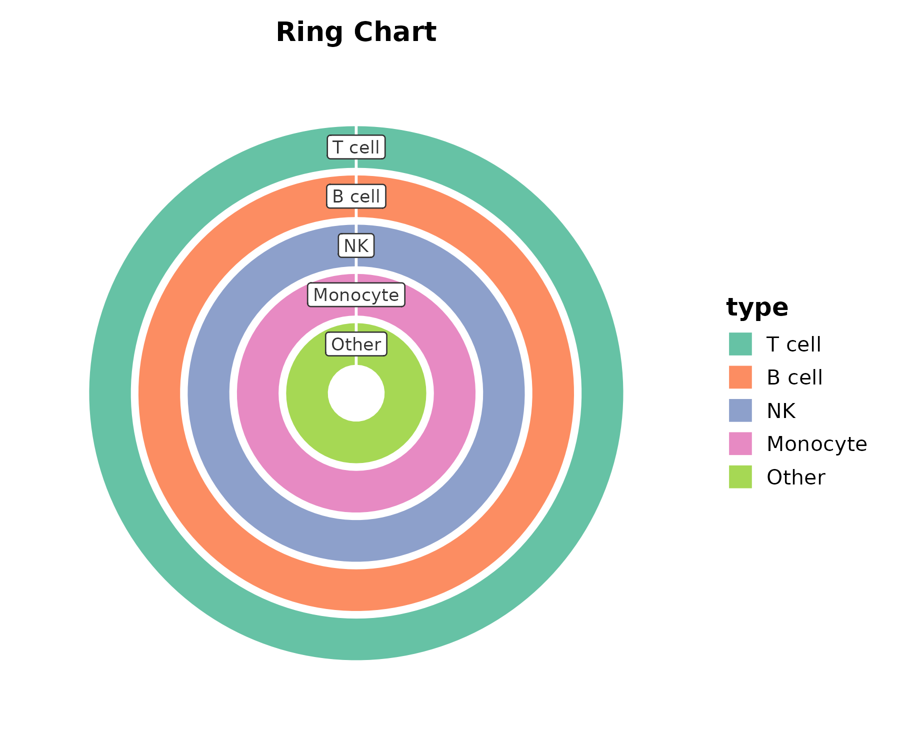
RadarPlot
radar_df <- data.frame(
  metric = rep(c("Proliferation", "Apoptosis", "Migration",
                 "Invasion", "Angiogenesis"), 2),
  value = c(8, 4, 7, 3, 6, 5, 8, 4, 9, 3),
  group = rep(c("Wild Type", "Mutant"), each = 5)
)

RadarPlot(radar_df, x = "metric", y = "value", group_by = "group",
  scale_y = "none", palette = "Set1", title = "Radar Plot")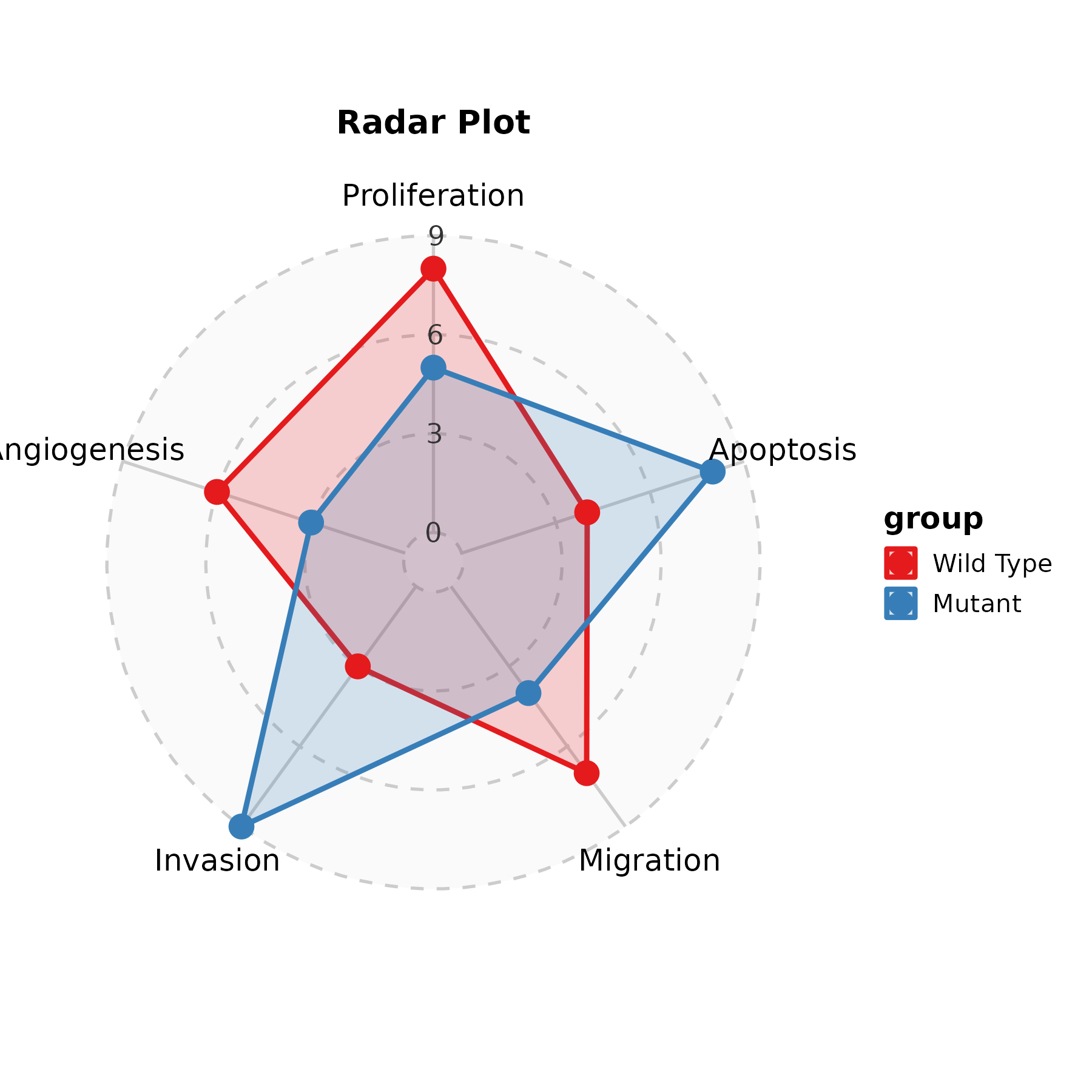
SpiderPlot
SpiderPlot(radar_df, x = "metric", y = "value", group_by = "group",
  scale_y = "none", palette = "lancet", title = "Spider Plot")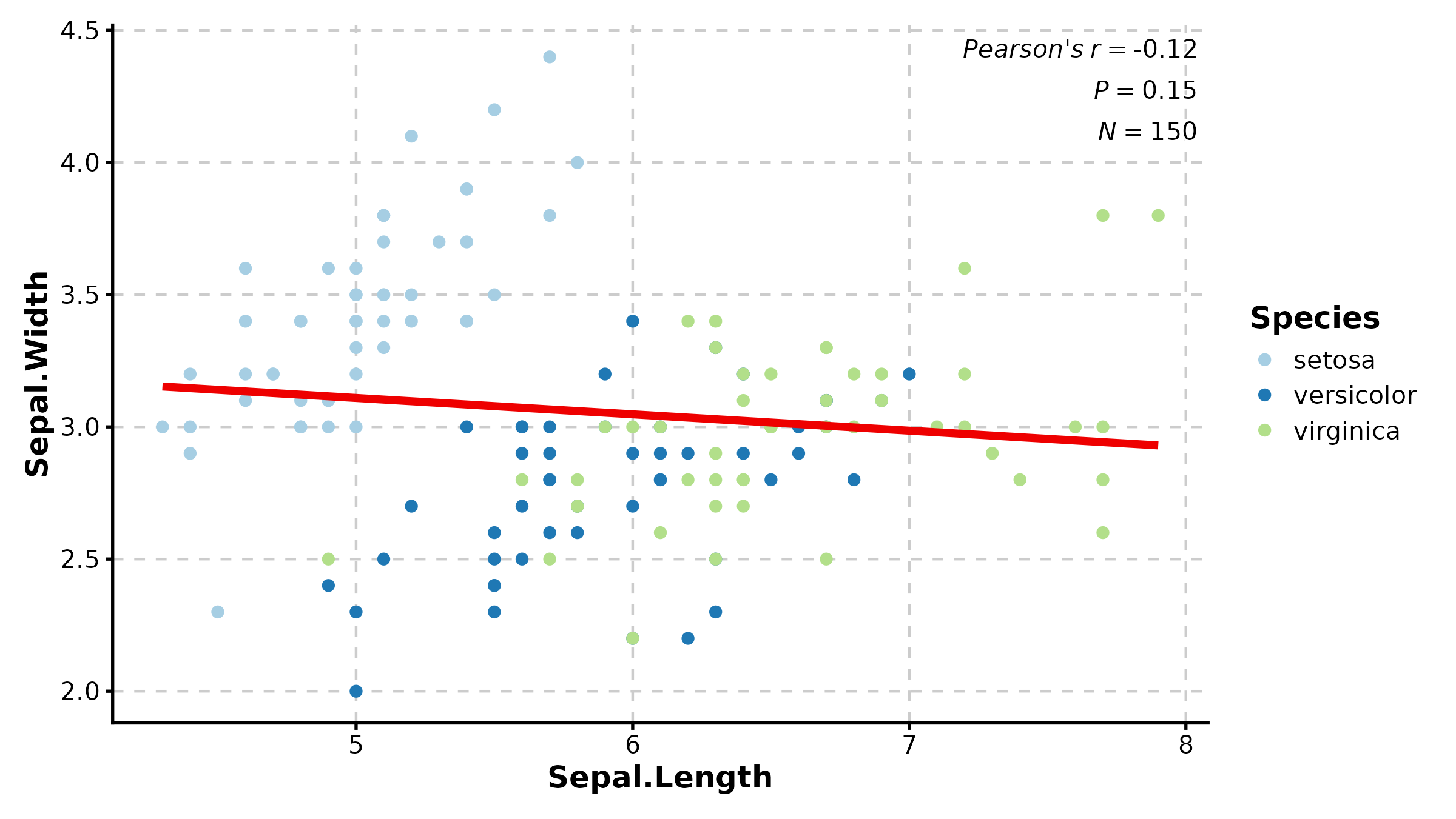
2. Enrichment & Pathway
EnrichMap
data(enrich_example)

EnrichMap(enrich_example, top_term = 20, layout = "fr",
  palette = "Spectral", title = "GO Enrichment Map")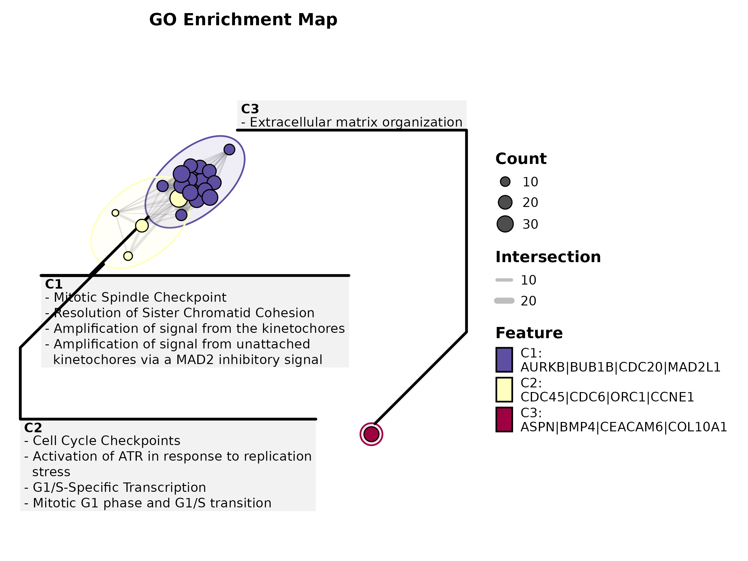
EnrichMap(enrich_example, top_term = 15, show_keyword = TRUE,
  label = "term", title = "With Keyword Clustering")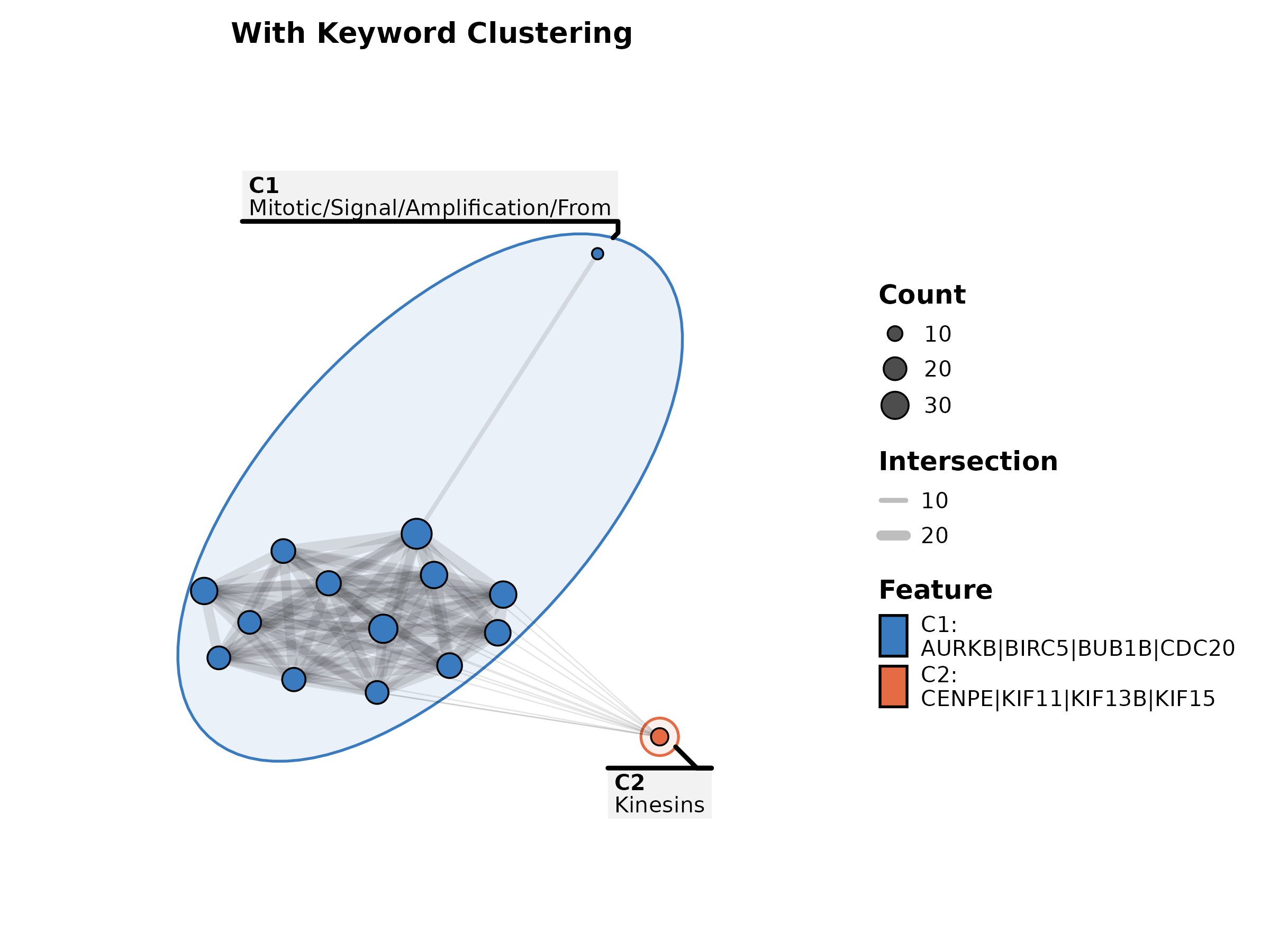
EnrichNetwork
data(enrich_multidb_example)

EnrichNetwork(enrich_multidb_example, top_term = 15, layout = "fr",
  palette = "Set3", title = "Enrichment Network")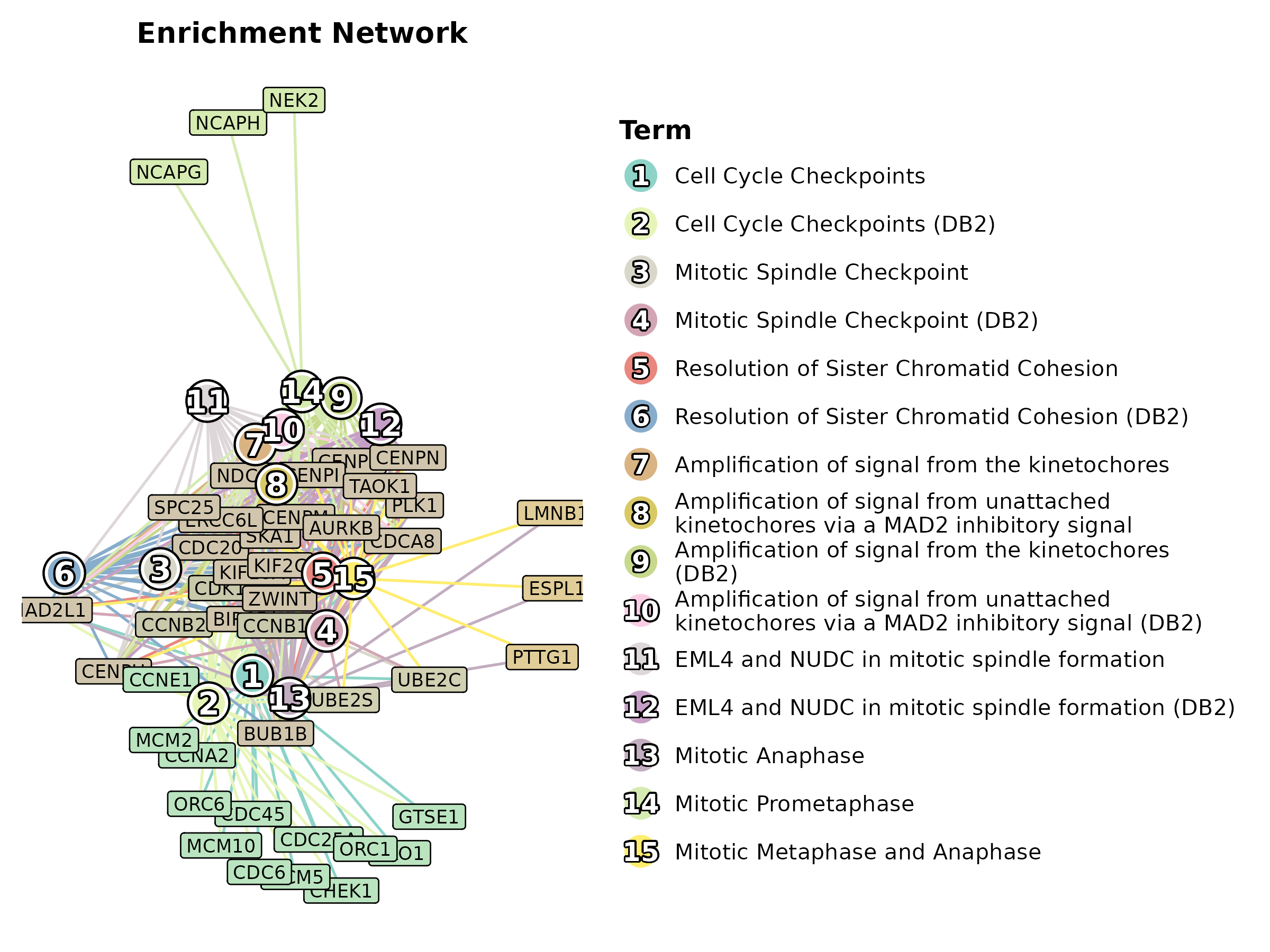
EnrichNetwork(enrich_multidb_example, top_term = 20, layout = "circle",
  palette = "Paired", title = "Circular Layout")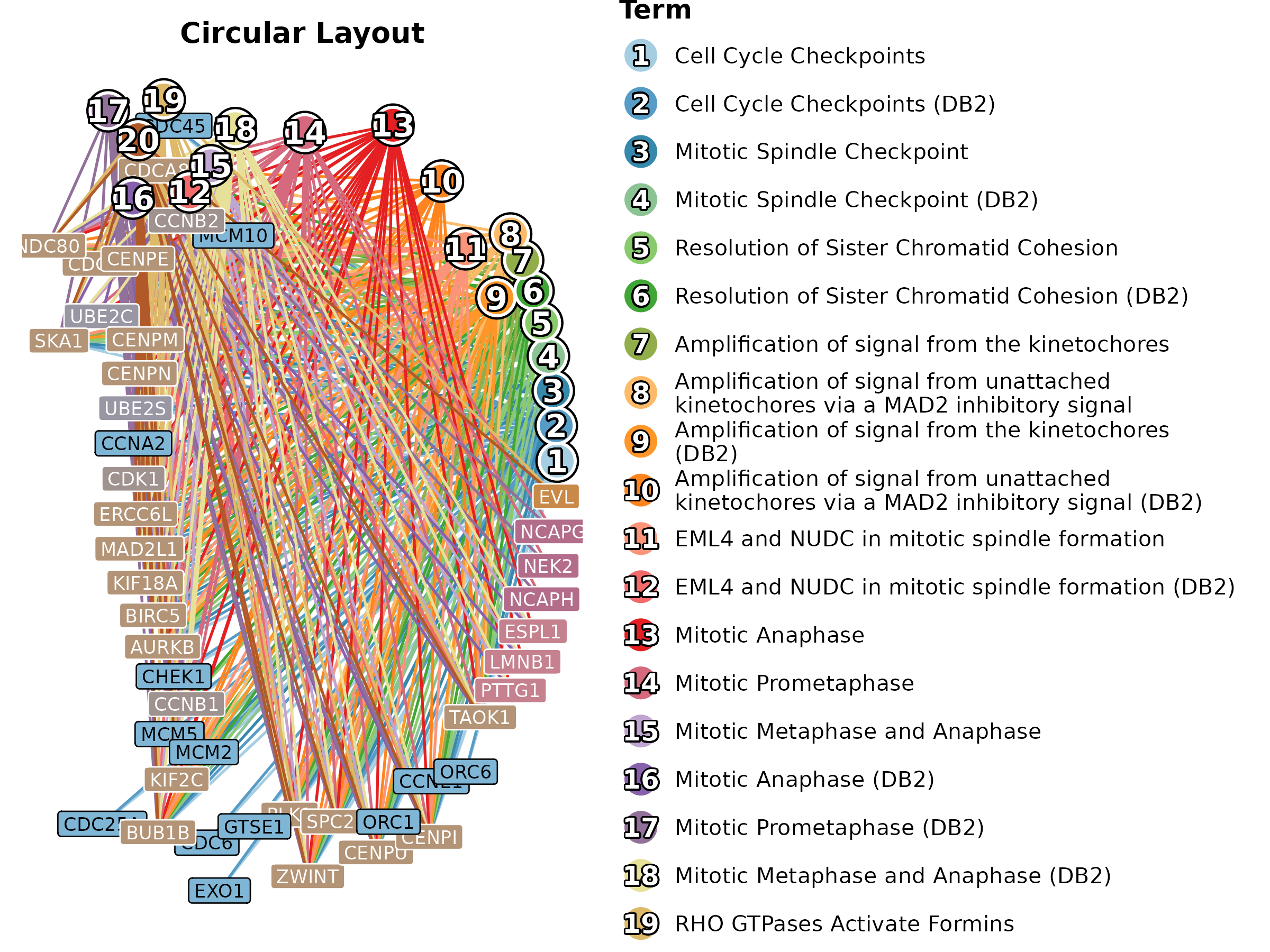
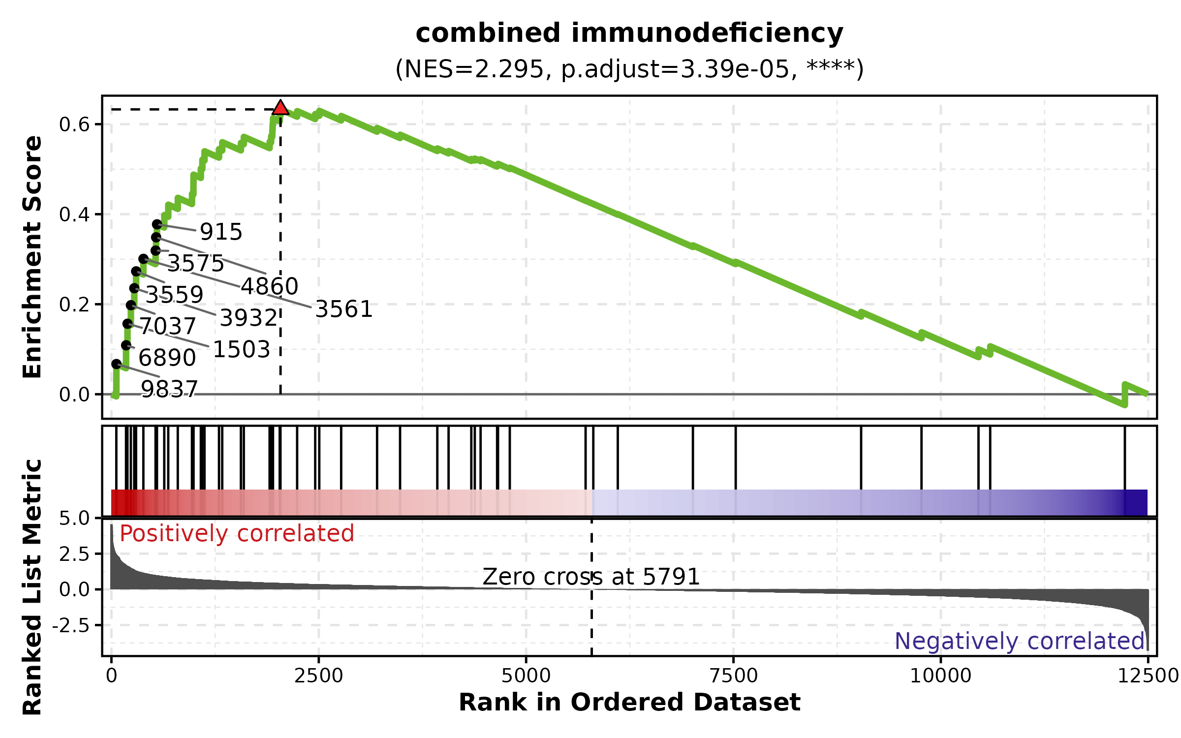
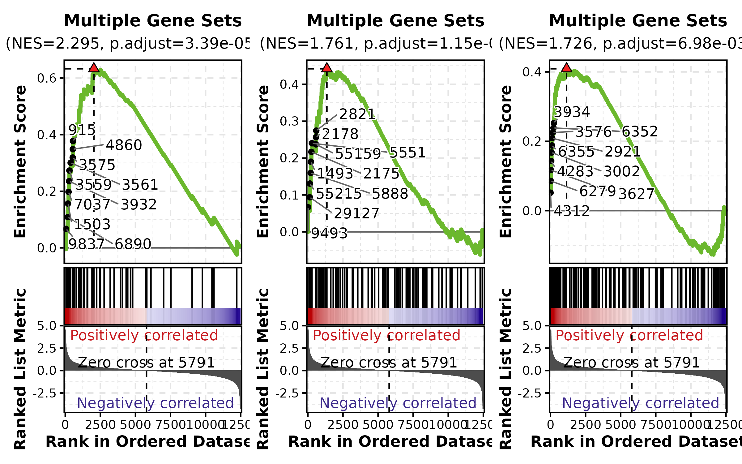
GSEASummaryPlot
data(gsea_example)

GSEASummaryPlot(gsea_example, top_term = 15, palette = "RdBu",
  title = "GSEA Summary")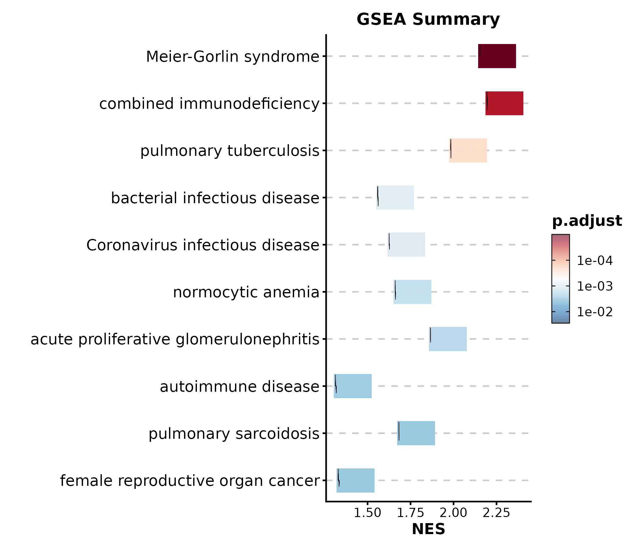
GSEASummaryPlot(gsea_example, top_term = 10, palette = "PiYG",
  title = "Top 10 Pathways")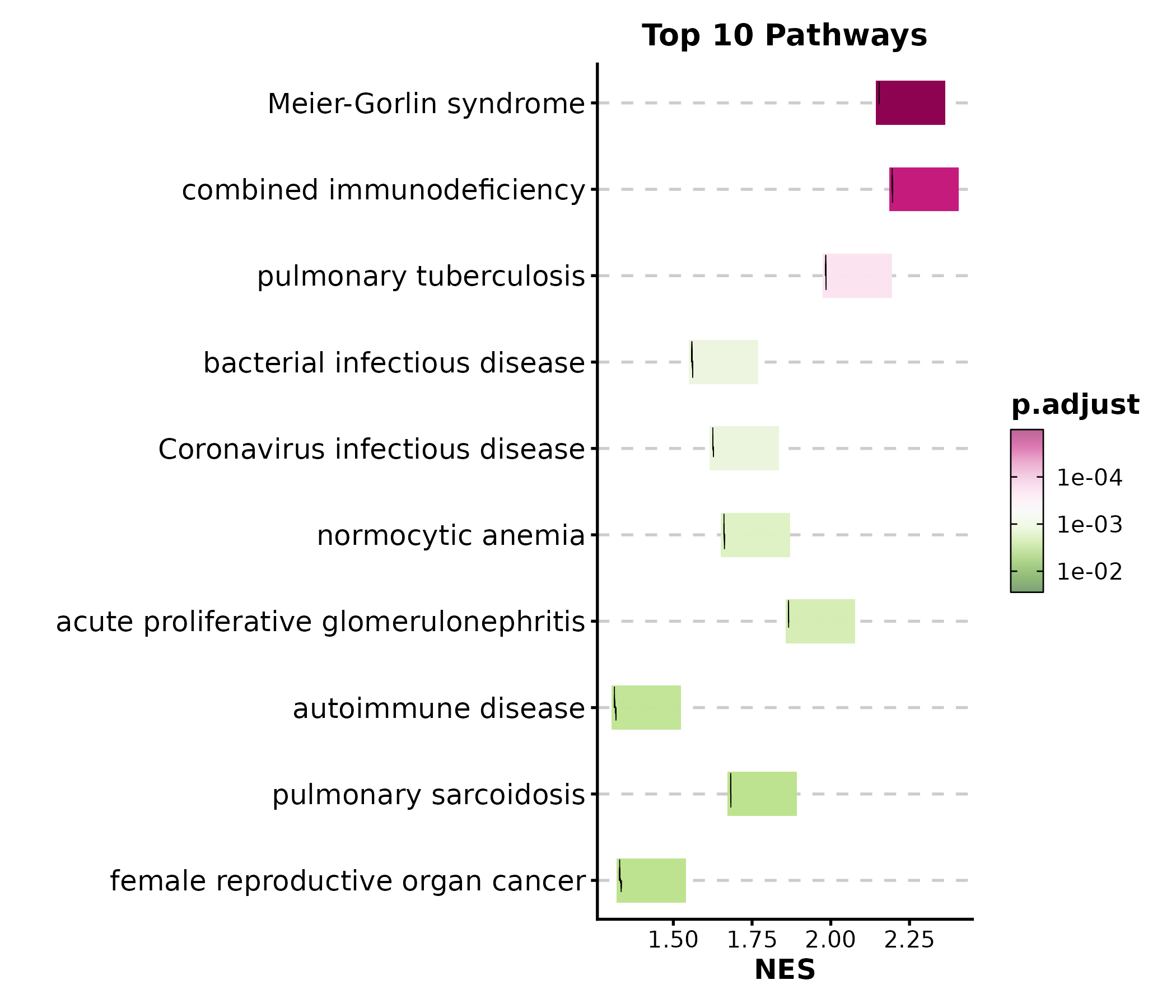
3. Single-Cell & Spatial
DimPlot
data(dim_example)

DimPlot(dim_example, dims = c("basis_1", "basis_2"),
  group_by = "clusters", palette = "igv",
  pt_size = 1.2, label = TRUE, label_insitu = TRUE,
  title = "UMAP Clustering")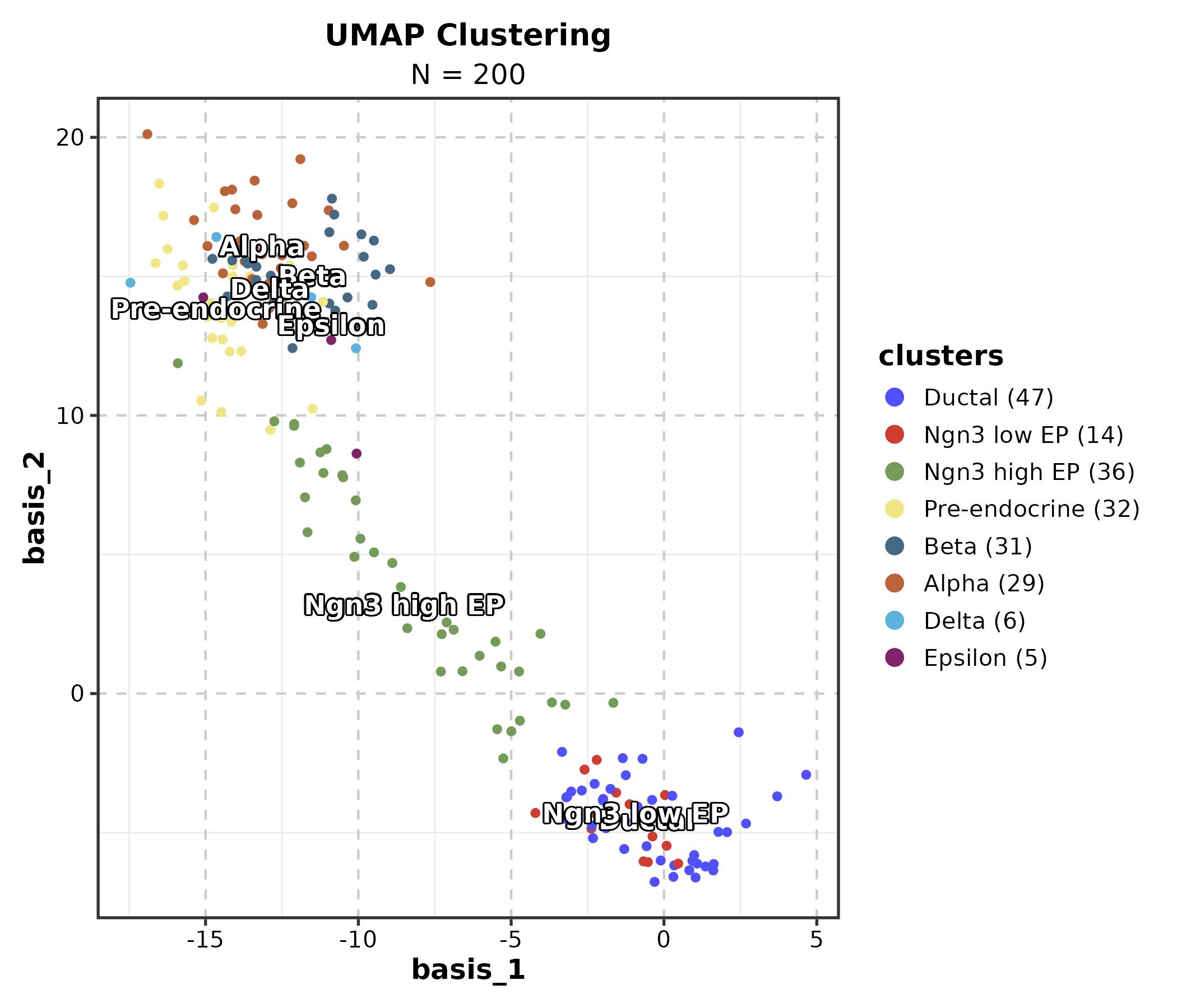
DimPlot(dim_example, dims = c("basis_1", "basis_2"),
  group_by = "clusters", palette = "Set3",
  add_density = TRUE, title = "With Density Contours")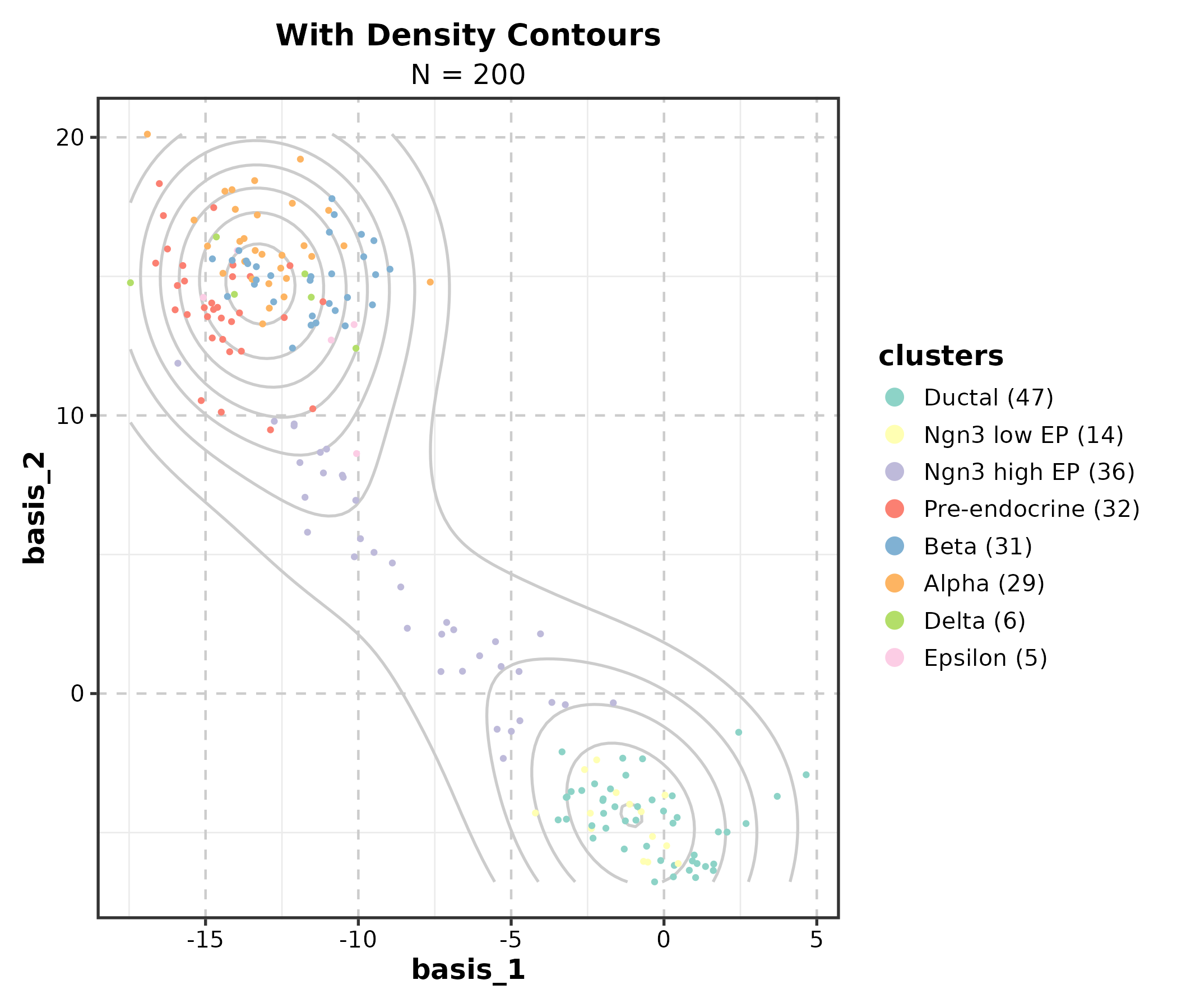
DimPlot(dim_example, dims = c("basis_1", "basis_2"),
  group_by = "clusters", palette = "igv",
  split_by = "group", combine = TRUE, nrow = 1,
  title = "Split by Group")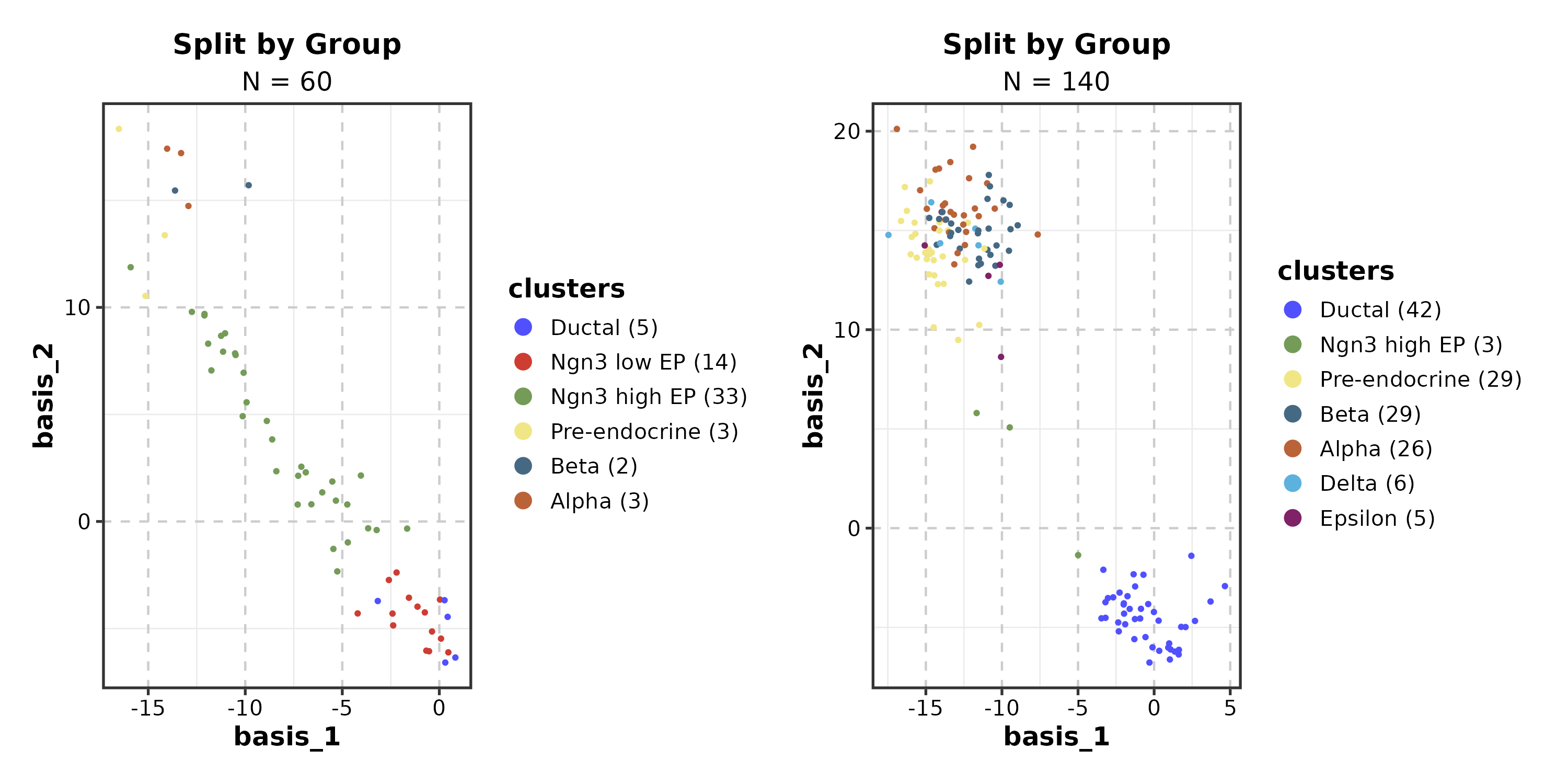
FeatureDimPlot
dim_example$CD3D <- rnorm(nrow(dim_example))

FeatureDimPlot(dim_example, dims = c("basis_1", "basis_2"),
  features = "CD3D", palette = "viridis", pt_size = 1.2,
  title = "Feature Expression")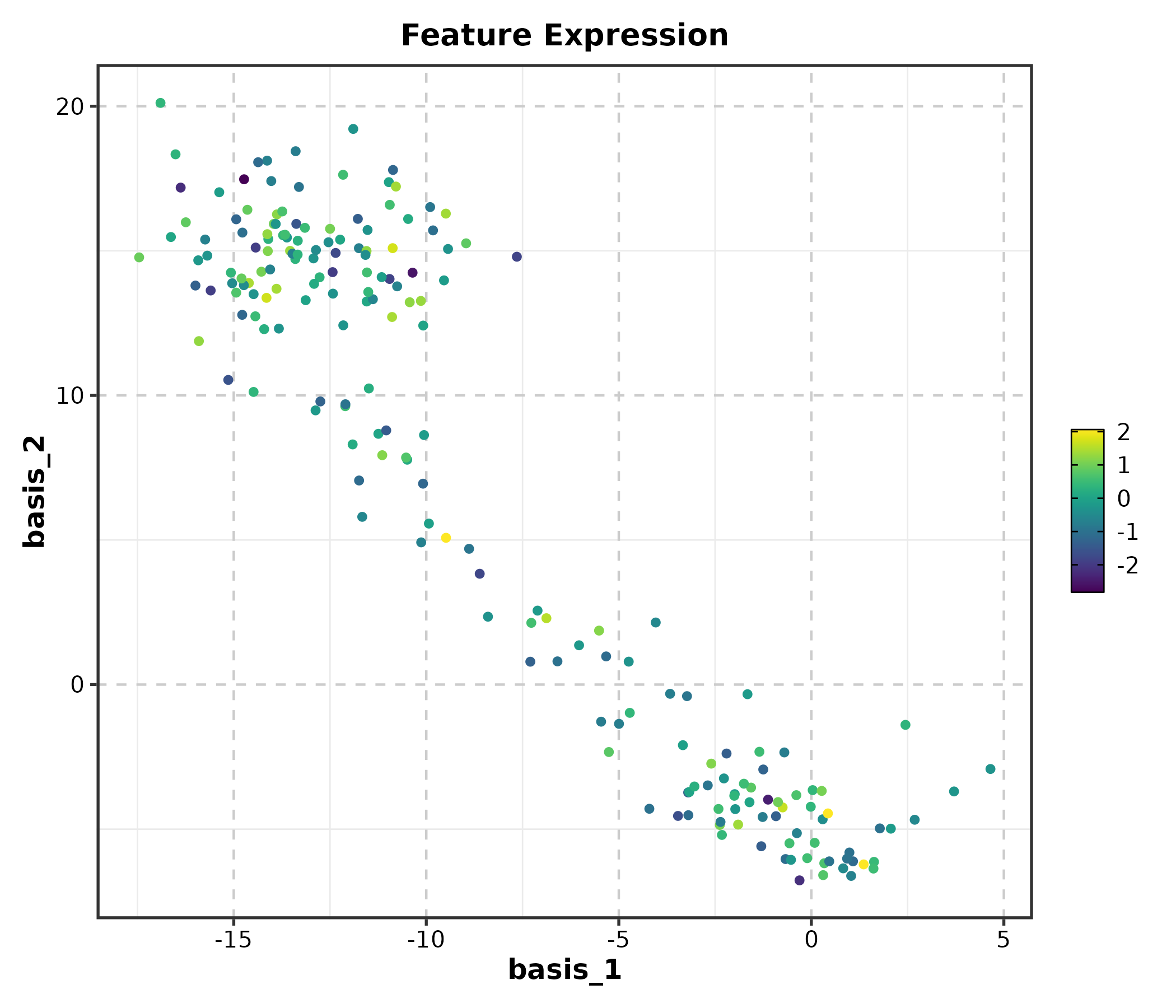
FeatureDimPlot(dim_example, dims = c("basis_1", "basis_2"),
  features = "CD3D", palette = "RdBu", pt_size = 1.2,
  title = "Diverging Palette")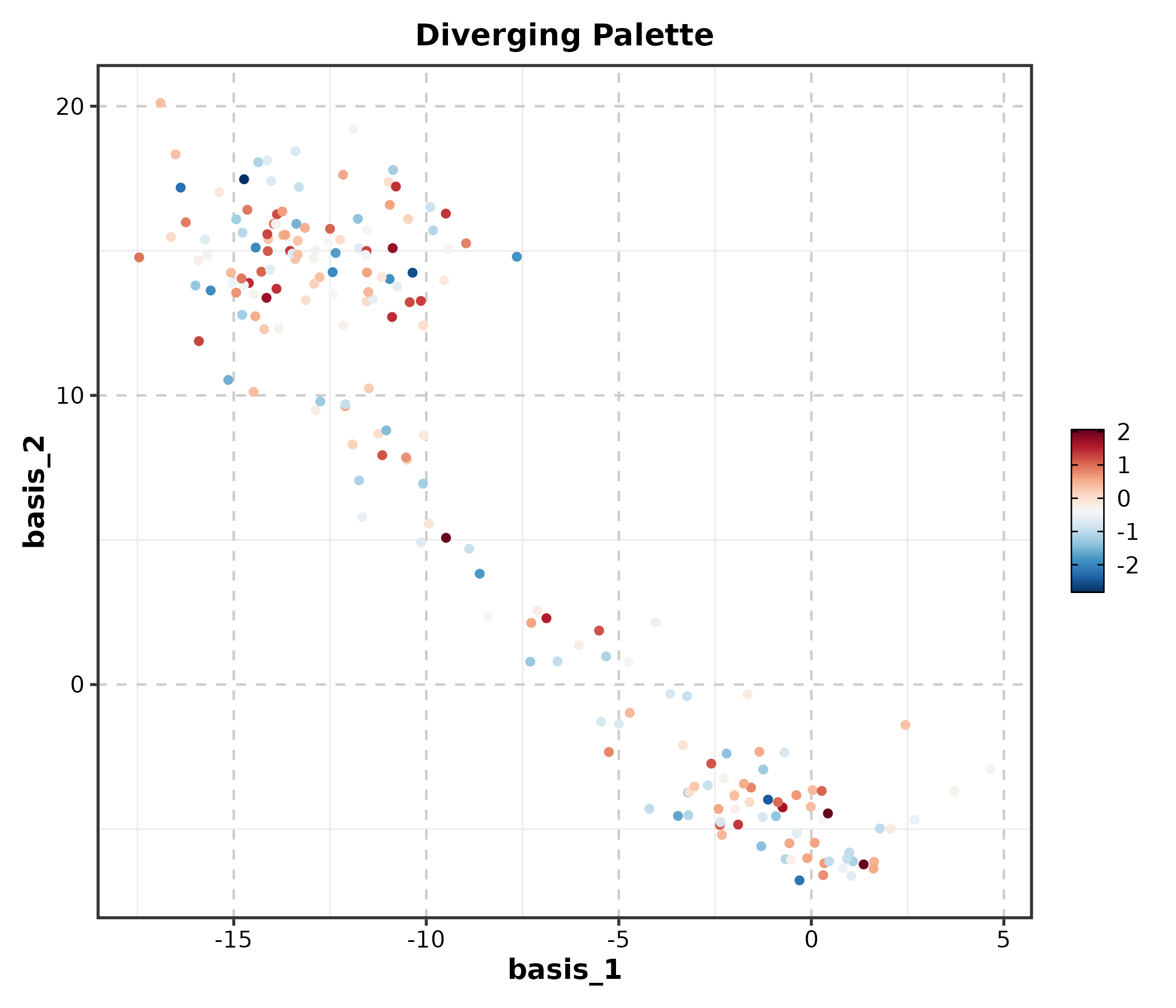
VelocityPlot
embedding <- as.matrix(dim_example[, c("basis_1", "basis_2")])
v_embedding <- as.matrix(dim_example[, c("stochasticbasis_1", "stochasticbasis_2")])

VelocityPlot(embedding = embedding, v_embedding = v_embedding,
  plot_type = "grid", title = "RNA Velocity Field")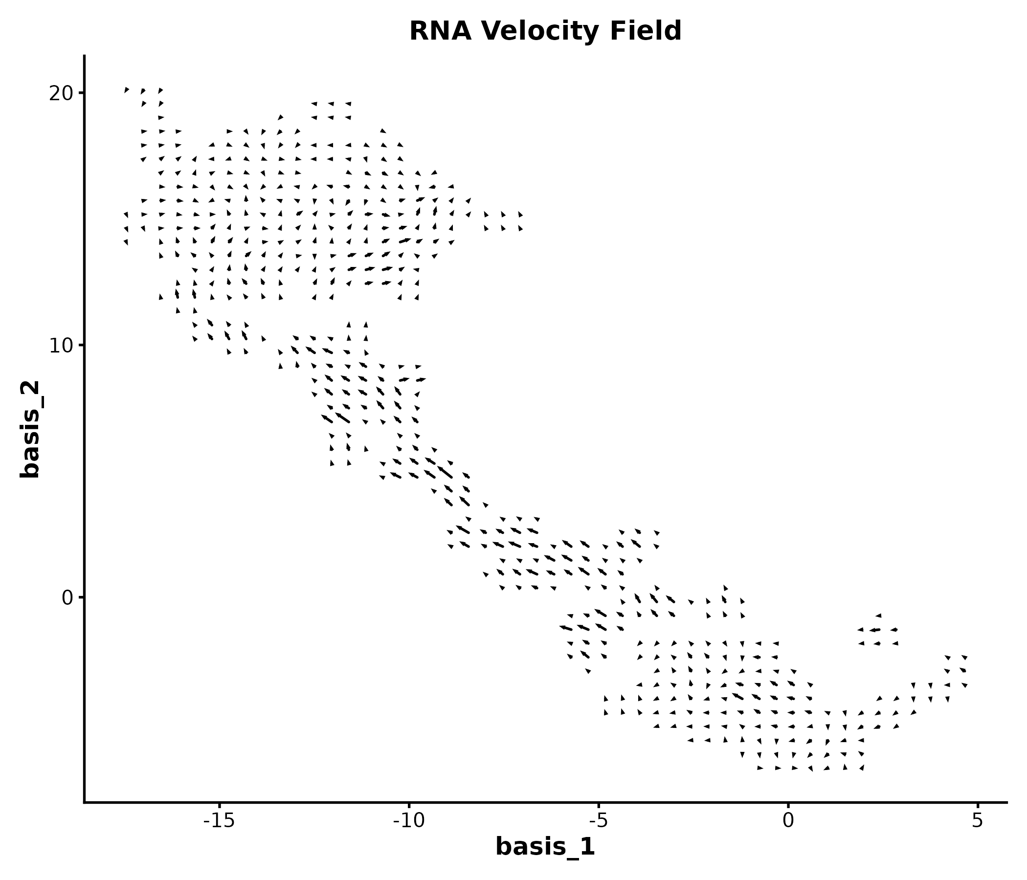
TrajectoryPlot
dim_example$pseudotime <- abs(rnorm(nrow(dim_example)))

TrajectoryPlot(dim_example, dims = c("basis_1", "basis_2"),
  pseudotime = "pseudotime", group_by = "clusters",
  palette = "viridis", title = "Pseudotime Trajectory")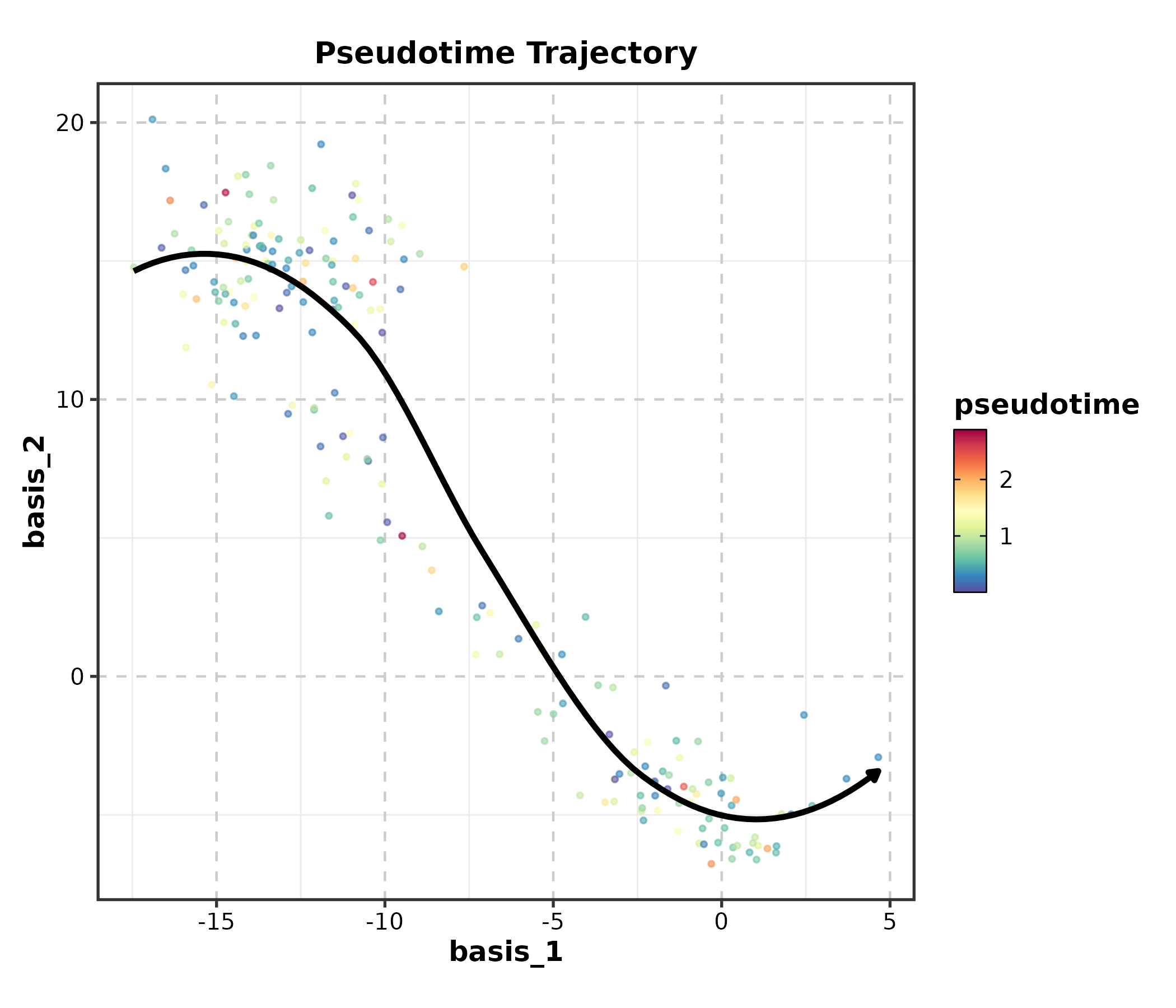
StackedViolinPlot
marker_df <- data.frame(
  cluster = sample(c("T cell", "B cell", "NK", "Mono"), 200, replace = TRUE),
  CD3D = rnorm(200, 3), CD8A = rnorm(200, 2),
  MS4A1 = rnorm(200, 4), NKG7 = rnorm(200, 1)
)

StackedViolinPlot(marker_df,
  features = c("CD3D", "CD8A", "MS4A1", "NKG7"),
  group_by = "cluster", palette = "npg",
  title = "Marker Gene Expression")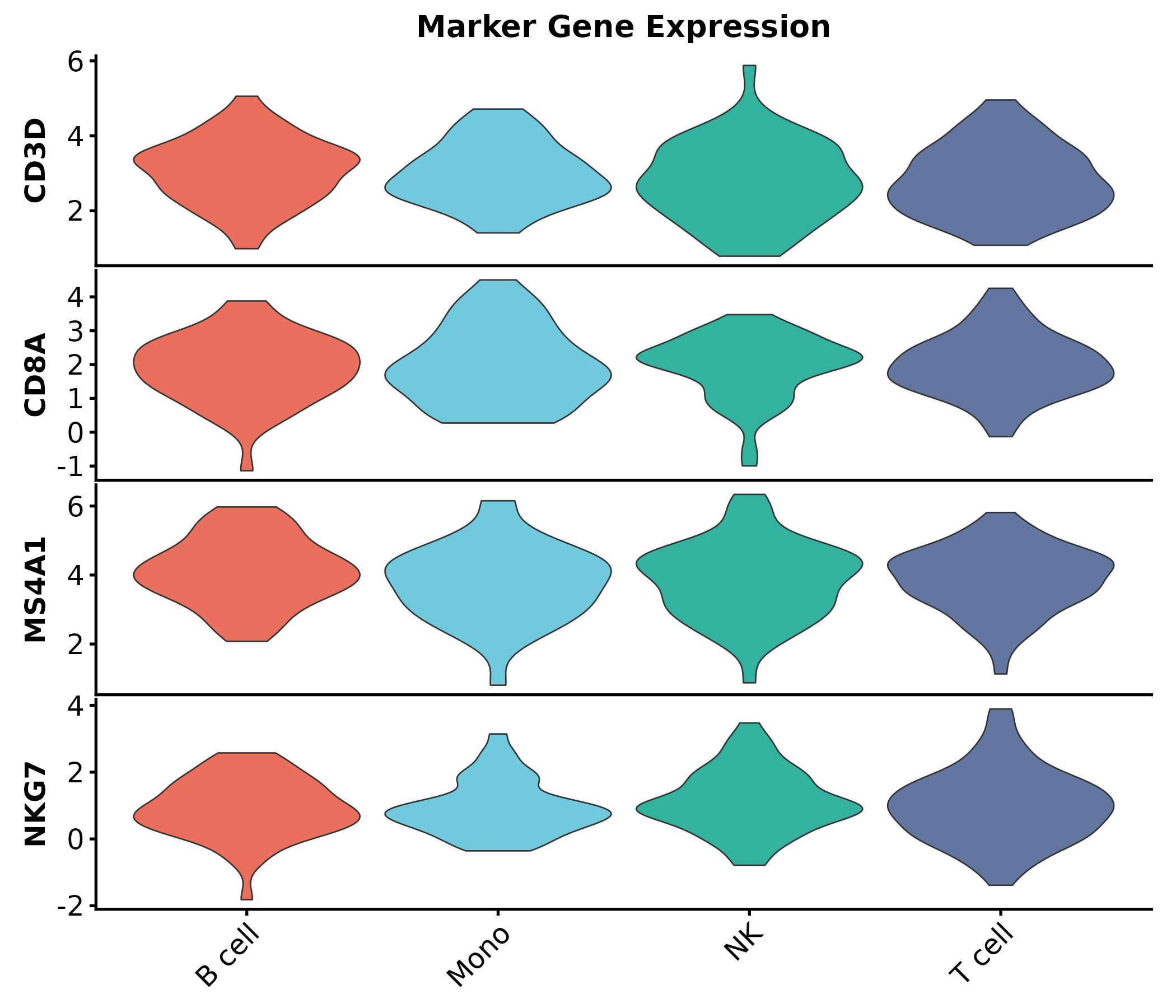
ClustreePlot
Requires clustree and a Seurat object or data frame with
resolution columns.
ClustreePlot(seurat_obj, prefix = "RNA_snn_res.",
  title = "Clustering Resolution Tree")
SpatImagePlot / SpatPointsPlot / SpatShapesPlot / SpatMasksPlot
These require spatial data objects (SpatRaster, SpatVector). See
?SpatImagePlot for details.
SpatImagePlot(spe, feature = "gene_of_interest",
  palette = "viridis", title = "Spatial Expression")

SpatPointsPlot(spe, group_by = "celltype",
  palette = "igv", title = "Spatial Cell Types")

SpatShapesPlot(spe, group_by = "region",
  palette = "Set3", title = "Spatial Regions")

SpatMasksPlot(spe, group_by = "mask_type",
  palette = "Set2", title = "Spatial Masks")
4. Genomics
VolcanoPlot
real_genes <- c("TP53","EGFR","MYC","KRAS","BRCA1","CDK4","PTEN","RB1",
                "PIK3CA","AKT1","CD274","CTLA4","PDCD1","IDO1","VEGFA",
                "BRAF","JAK2","STAT3","NRAS","HAVCR2")
deg <- data.frame(
  gene = c(real_genes, paste0("Gene", 1:480)),
  log2FC = c(rnorm(10, 2.5, 0.8), rnorm(10, -2.5, 0.8), rnorm(480, 0, 0.8)),
  padj = c(runif(20, 1e-10, 1e-3), runif(480, 0.01, 1))
)

VolcanoPlot(deg, x = "log2FC", y = "padj", label_by = "gene",
  x_cutoff = 1, y_cutoff = 0.05, nlabel = 10,
  title = "Volcano Plot")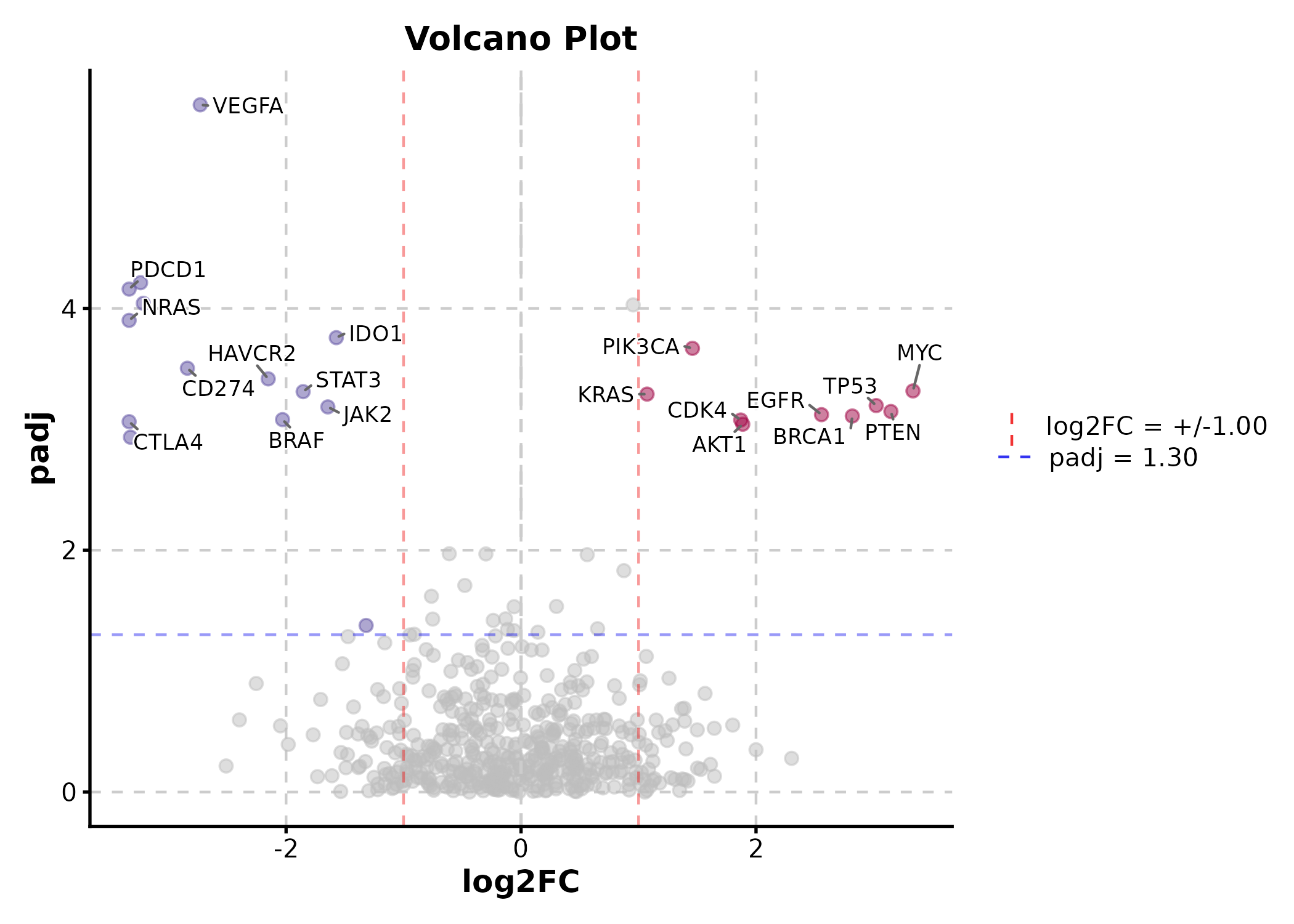
VolcanoPlot(deg, x = "log2FC", y = "padj", label_by = "gene",
  x_cutoff = 1, y_cutoff = 0.05, nlabel = 5,
  flip_negatives = TRUE, title = "Mirrored Volcano")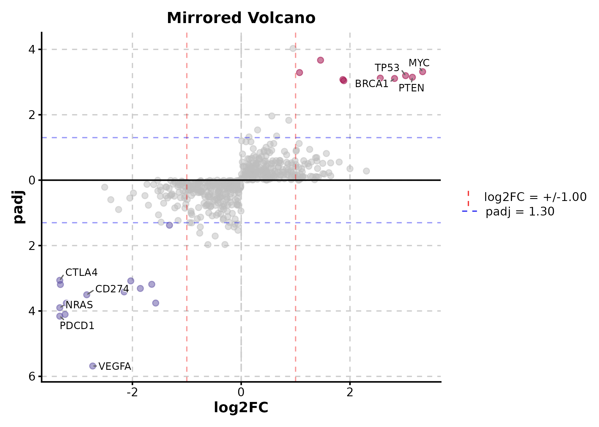
deg$group <- sample(c("Responder", "NonResponder"), 500, replace = TRUE)
VolcanoPlot(deg, x = "log2FC", y = "padj", label_by = "gene",
  x_cutoff = 1, y_cutoff = 0.05, nlabel = 5,
  facet_by = "group", title = "Faceted Volcano")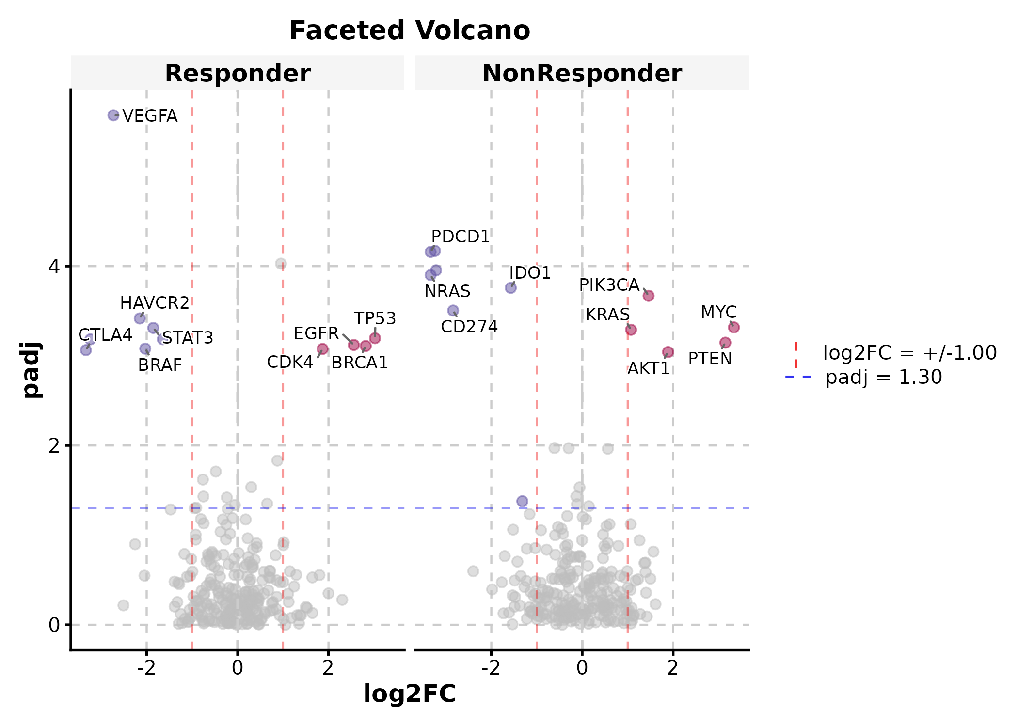
ManhattanPlot
gwas <- data.frame(
  chr = rep(paste0("chr", 1:22), each = 500),
  pos = rep(1:500, 22) * 1e5,
  pvalue = runif(11000, 0, 1)
)
gwas$pvalue[sample(11000, 30)] <- runif(30, 0, 1e-8)

ManhattanPlot(gwas, chr_by = "chr", pos_by = "pos", pval_by = "pvalue",
  signif = 5e-8, title = "GWAS Results")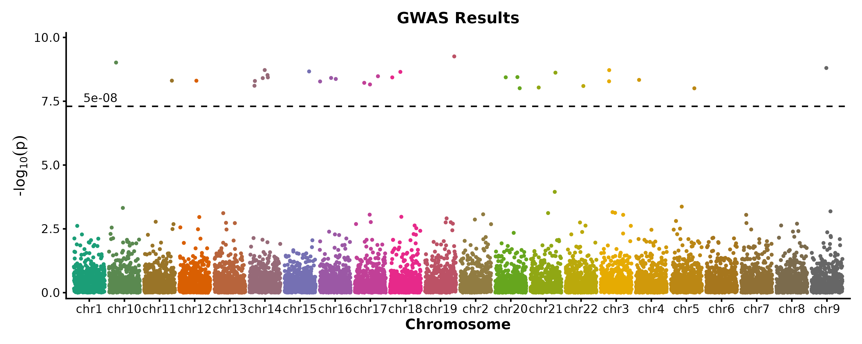
VennDiagram
gene_sets <- list(
  "RNA-seq" = paste0("Gene", 1:100),
  "Proteomics" = paste0("Gene", 50:150),
  "Metabolomics" = paste0("Gene", 80:160)
)

VennDiagram(gene_sets, palette = "Set2", title = "Multi-Omics Overlap")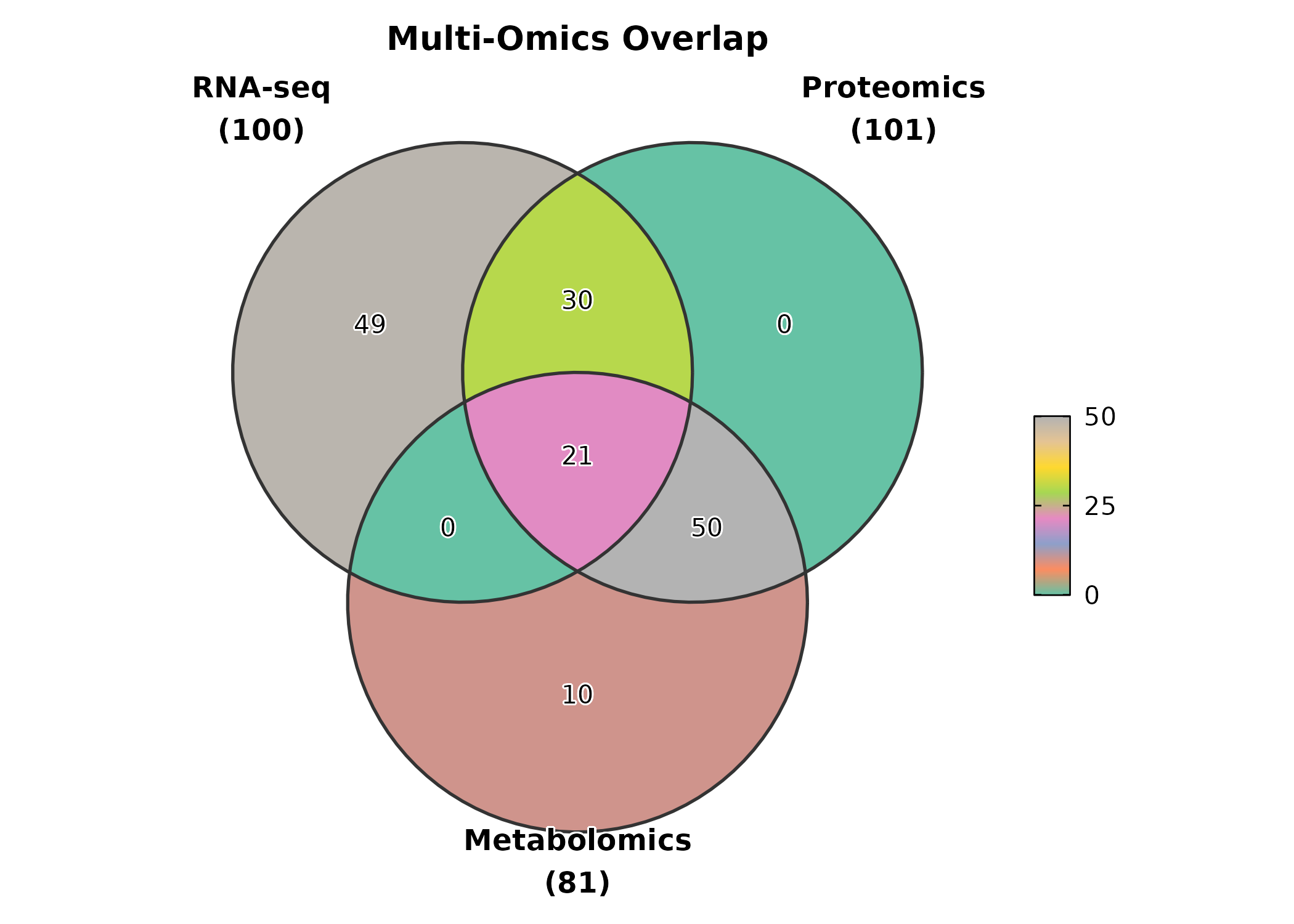
VennDiagram(gene_sets, palette = "material-indigo",
  label = "both", alpha = 0.6,
  title = "With Count + Percentage")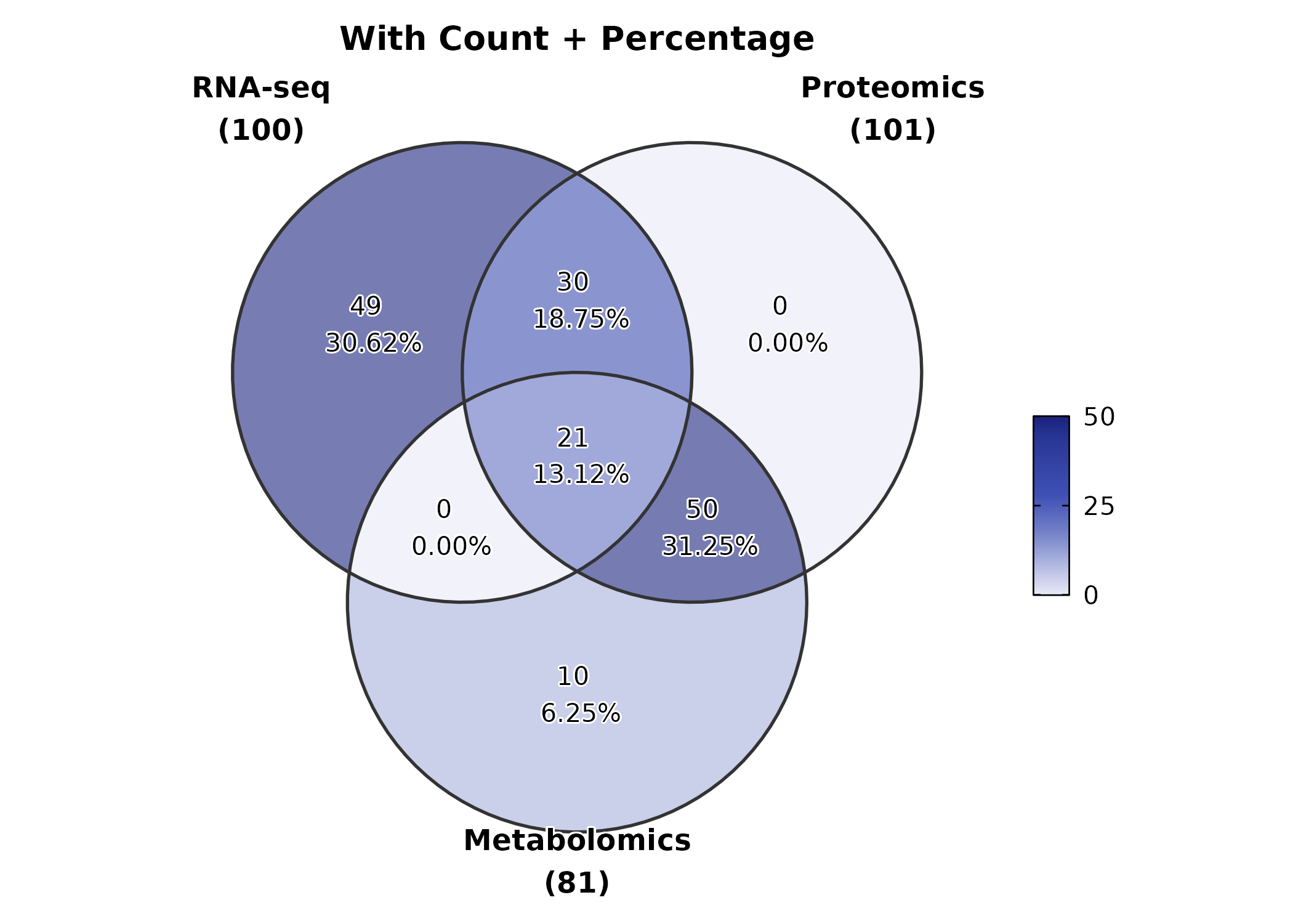
5. Clinical & Prediction
KMPlot
surv <- data.frame(
  time = c(rexp(80, 0.008), rexp(70, 0.015)),
  status = sample(0:1, 150, replace = TRUE, prob = c(0.35, 0.65)),
  risk = rep(c("Low", "High"), c(80, 70))
)

KMPlot(surv, time = "time", status = "status", group_by = "risk",
  palette = "jco", show_risk_table = TRUE, show_pval = TRUE,
  title = "Kaplan-Meier Curve")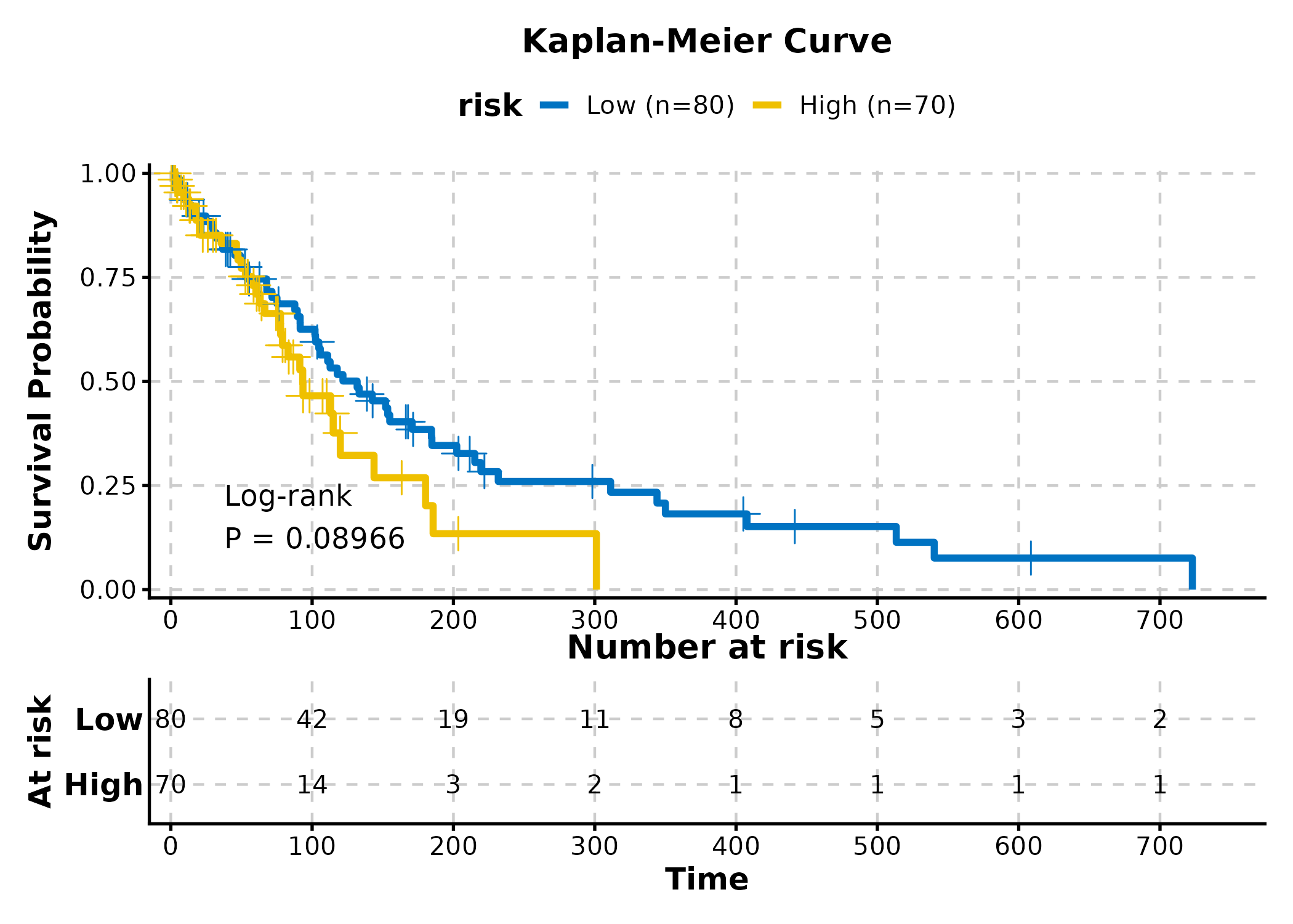
KMPlot(surv, time = "time", status = "status", group_by = "risk",
  palette = "lancet", show_conf_int = TRUE,
  show_median_line = "hv", title = "With CI and Median")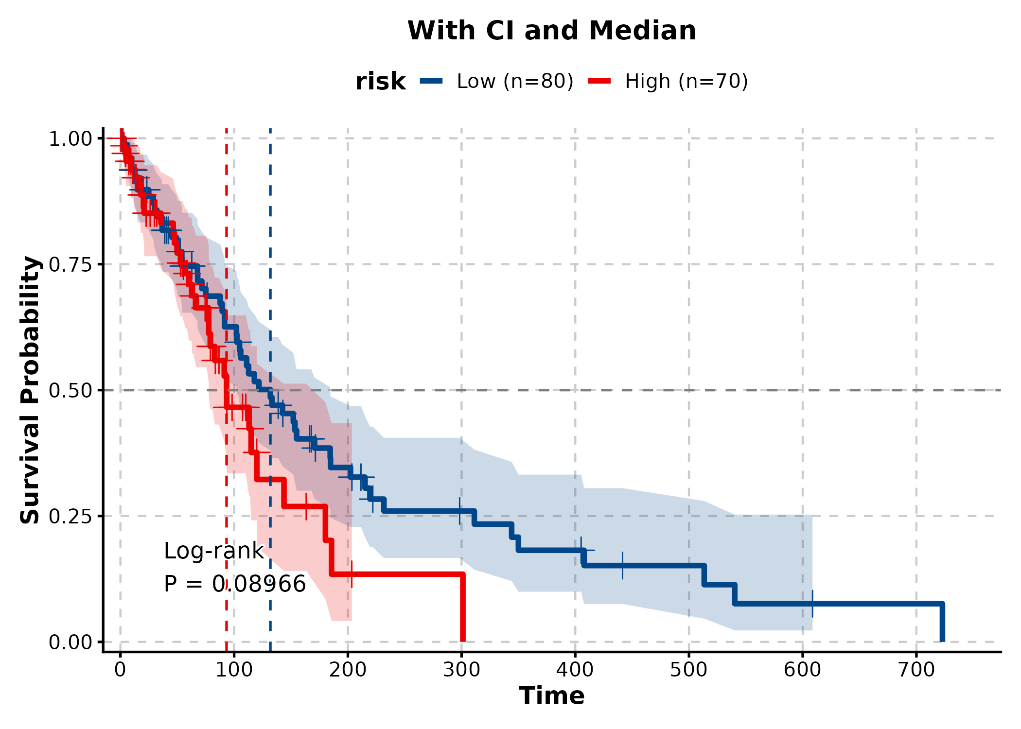
KMPlot(surv, time = "time", status = "status", group_by = "risk",
  palette = "nejm", show_risk_table = TRUE, show_pval = TRUE,
  show_conf_int = TRUE, title = "Publication-Ready KM")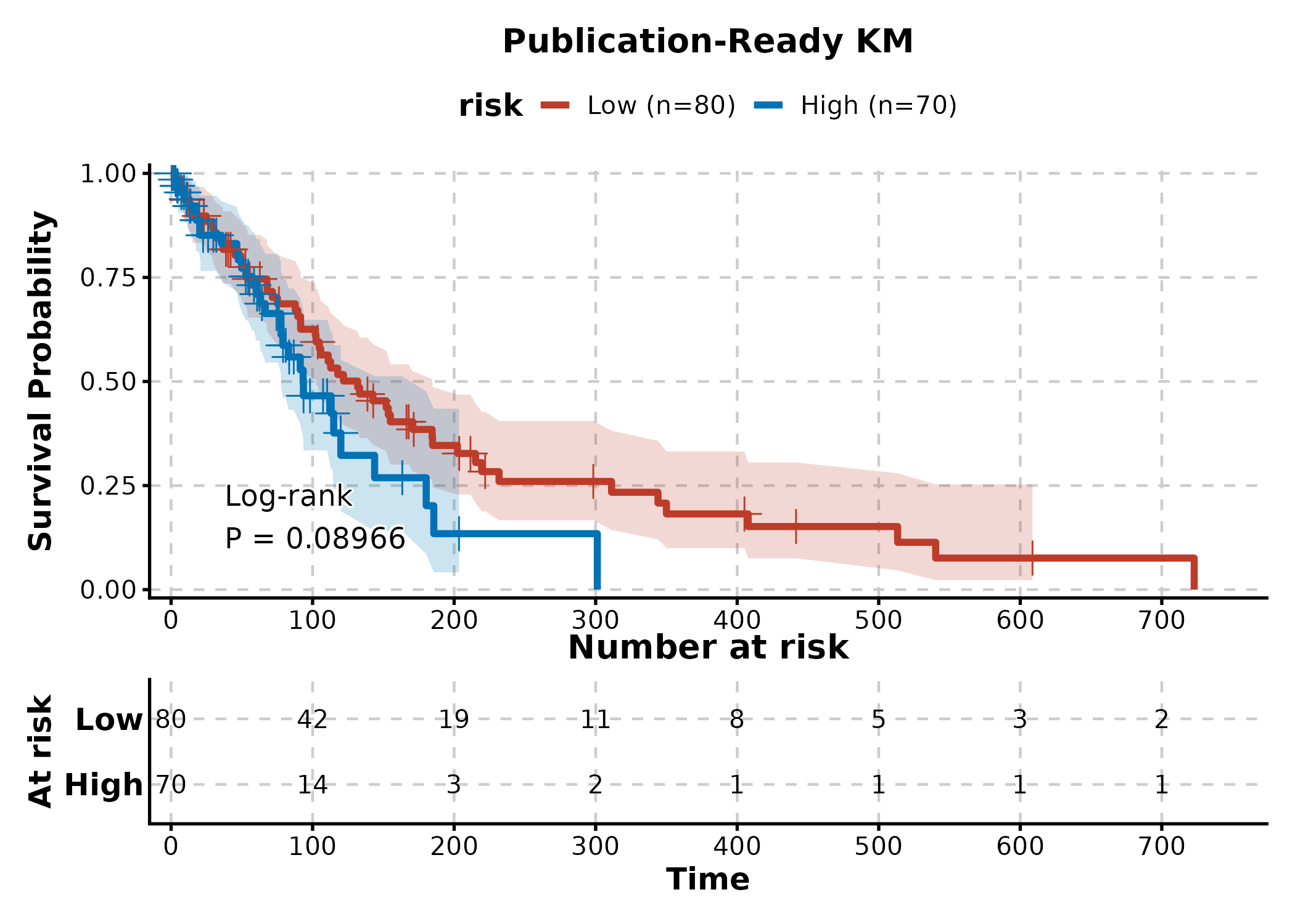
CoxPlot
cox_df <- data.frame(
  time = rexp(200, 0.01),
  event = sample(0:1, 200, replace = TRUE, prob = c(0.3, 0.7)),
  age = rnorm(200, 60, 10),
  gender = sample(c("Male", "Female"), 200, replace = TRUE),
  stage = sample(c("I-II", "III-IV"), 200, replace = TRUE)
)

CoxPlot(cox_df, time = "time", event = "event",
  vars = c("age", "gender", "stage"),
  plot_type = "forest", palette = "nejm",
  title = "Cox Forest Plot")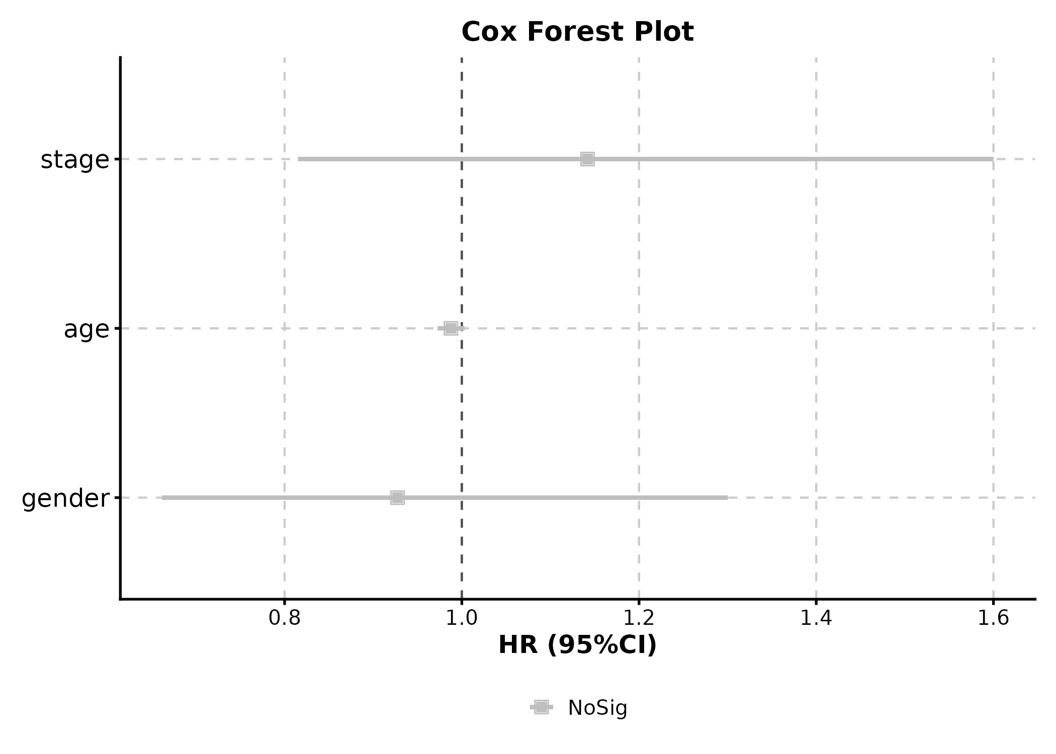
CoxPlot(cox_df, time = "time", event = "event",
  vars = c("age", "gender", "stage"),
  plot_type = "forest2", palette = "lancet", digits = 2,
  title = "Detailed Forest with Stats Table")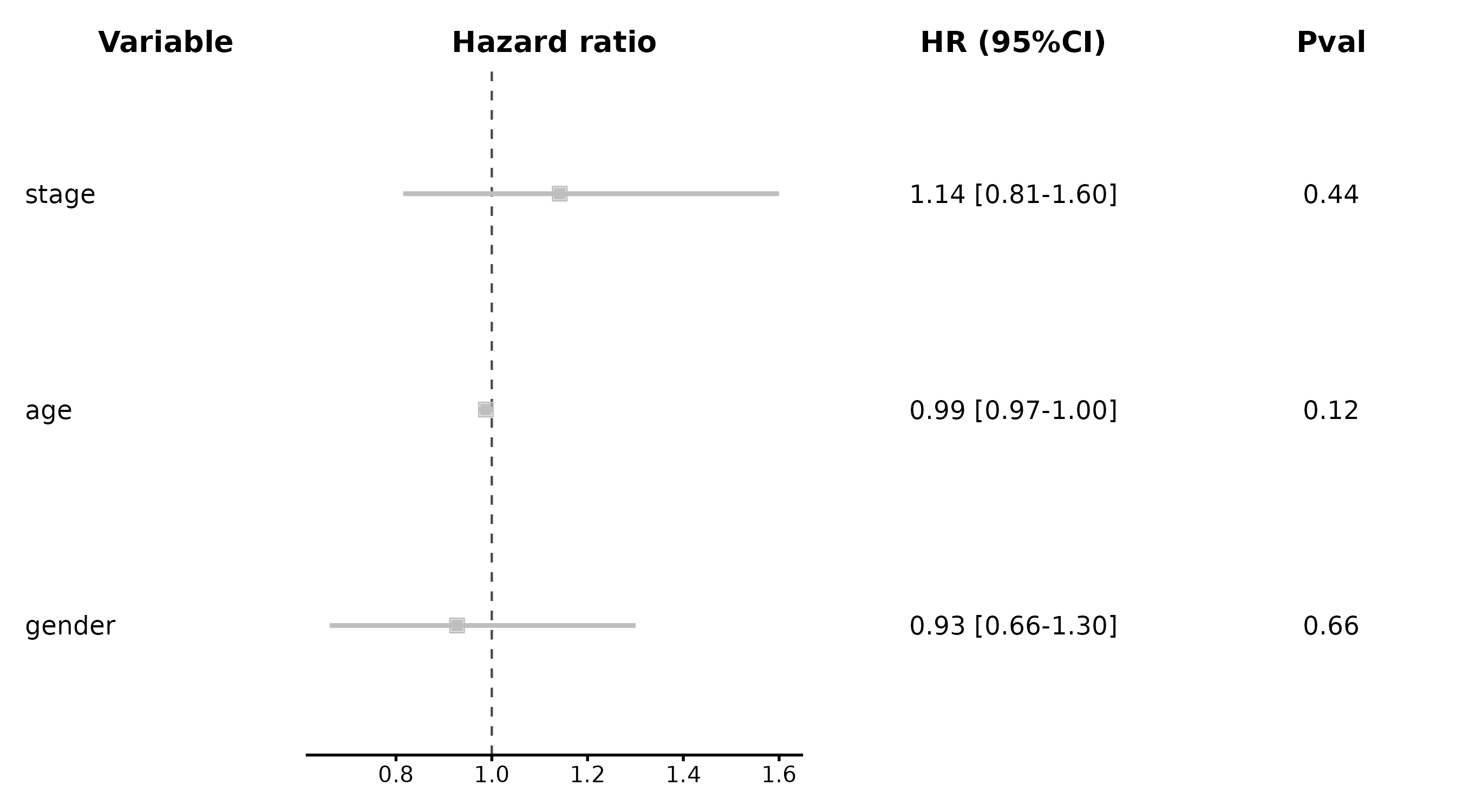
ROCCurve
roc_df <- data.frame(
  truth = sample(0:1, 200, replace = TRUE),
  score = rnorm(200)
)
roc_df$score <- roc_df$score + roc_df$truth * 1.5

ROCCurve(roc_df, truth_by = "truth", score_by = "score",
  palette = "lancet", title = "ROC Analysis")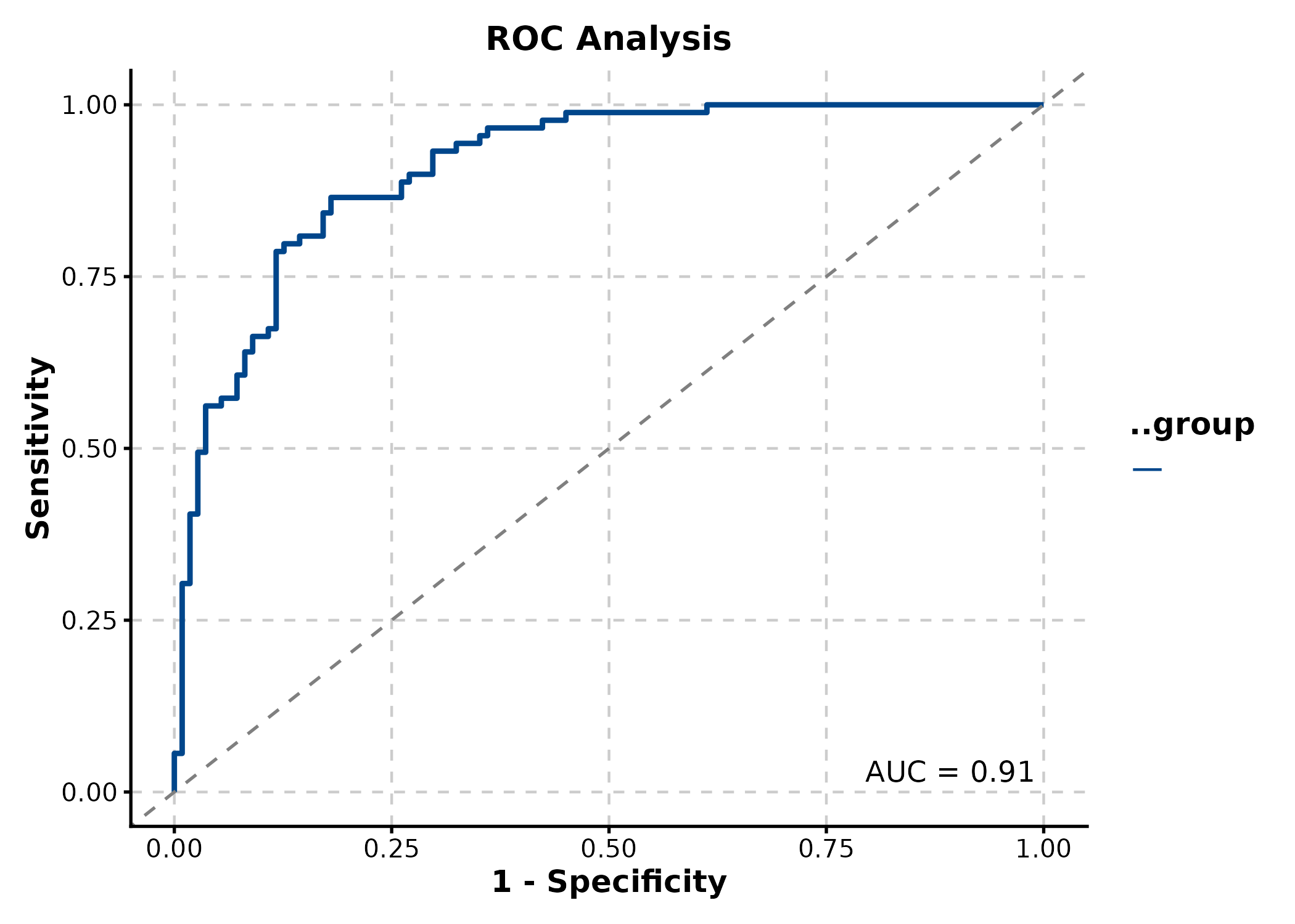
CalibrationPlot
predicted = predicted probabilities,
observed = binary outcome.
cal_df <- data.frame(
  outcome = sample(0:1, 500, replace = TRUE),
  pred = runif(500)
)
cal_df$pred <- ifelse(cal_df$outcome == 1,
  pmin(cal_df$pred + 0.2, 1), pmax(cal_df$pred - 0.2, 0))

CalibrationPlot(cal_df, predicted = "pred", observed = "outcome",
  title = "Calibration (LOESS)")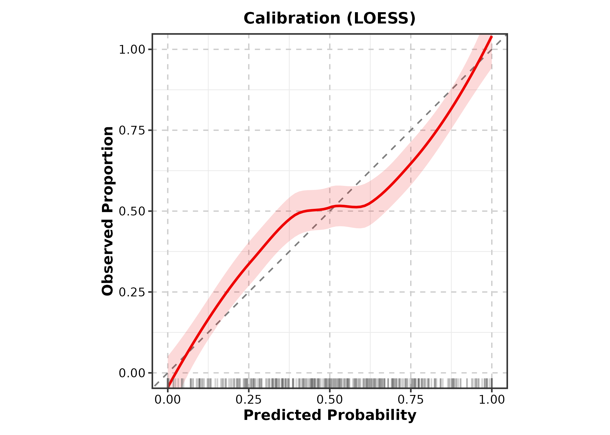
CalibrationPlot(cal_df, predicted = "pred", observed = "outcome",
  method = "bins", title = "Calibration (Bins)")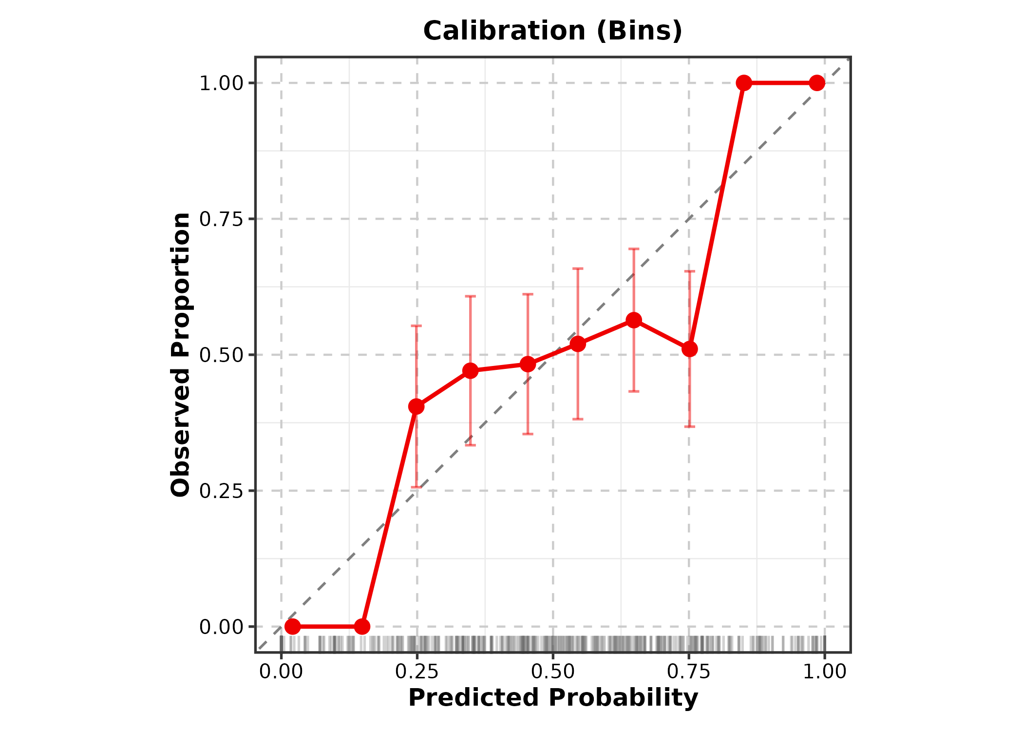
DecisionCurvePlot
outcome = binary outcome column, predictors
= predicted probability column(s).
DecisionCurvePlot(cal_df, outcome = "outcome", predictors = "pred",
  title = "Decision Curve Analysis")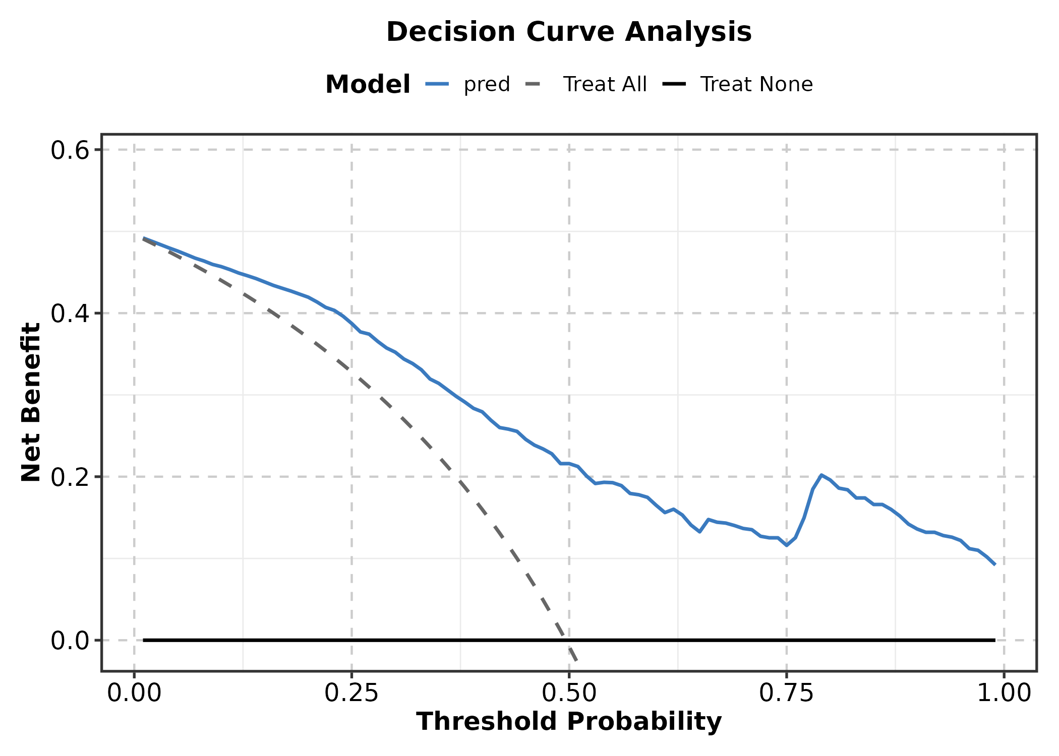
6. Networks & Relationships
Heatmap
genes <- c("CD3D","CD3E","CD8A","FOXP3","CD19","MS4A1",
           "CD68","CSF1R","NCAM1","NKG7")
mat <- matrix(rnorm(120, 0, 1.5), nrow = 10,
  dimnames = list(genes, paste0("S", 1:12)))
mat[1:4, 1:4] <- mat[1:4, 1:4] + 2
mat[5:6, 5:8] <- mat[5:6, 5:8] + 2
mat[9:10, 9:12] <- mat[9:10, 9:12] + 2

Heatmap(mat, palette = "RdBu",
  show_row_names = TRUE, show_column_names = TRUE,
  title = "Basic Heatmap")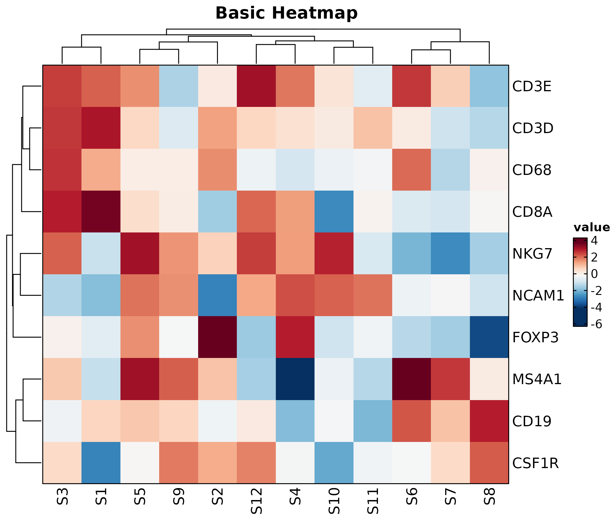
Heatmap(mat, palette = "viridis", values_by = "z-score",
  show_row_names = TRUE, show_column_names = TRUE,
  rows_name = "Genes", columns_name = "Samples",
  title = "Z-score Normalized")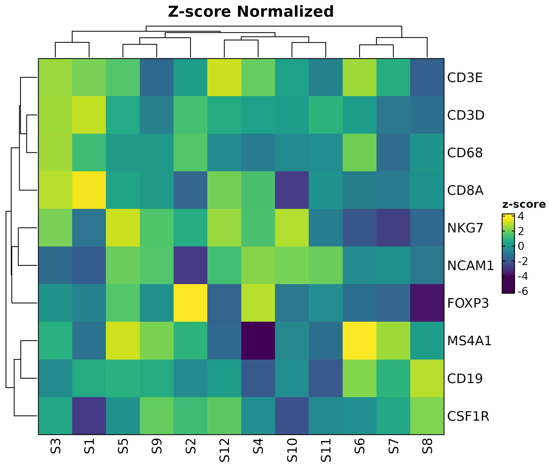
rows_data <- data.frame(
  rows = genes,
  module = c(rep("T cell", 4), rep("B cell", 2),
             rep("Myeloid", 2), rep("NK", 2))
)

Heatmap(mat, palette = "RdBu",
  rows_data = rows_data,
  rows_annotation = list(Module = "module"),
  rows_annotation_palette = list(Module = "Set2"),
  show_row_names = TRUE, show_column_names = TRUE,
  title = "With Row Annotation")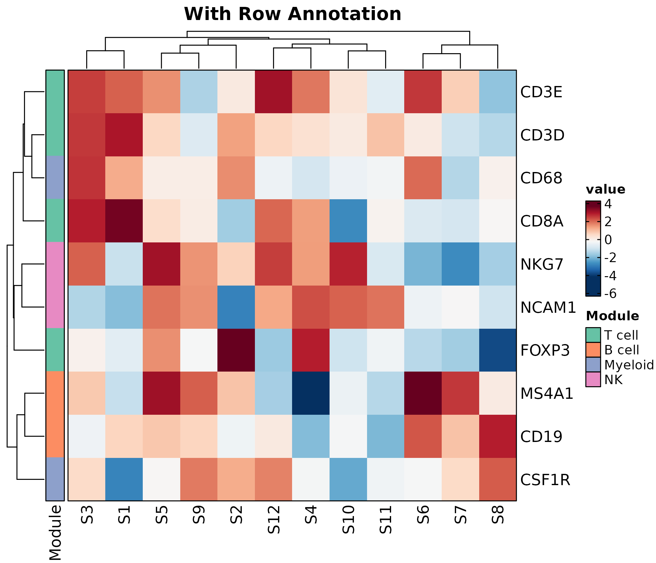
ChordPlot
interactions <- data.frame(
  from = c("CD4 T", "CD8 T", "B cell", "NK", "Monocyte"),
  to = c("Fibroblast", "Endothelial", "Fibroblast", "Tumor", "Tumor"),
  weight = c(15, 20, 10, 25, 18)
)

ChordPlot(interactions, from = "from", to = "to", y = "weight",
  palette = "Set3", title = "Chord Diagram")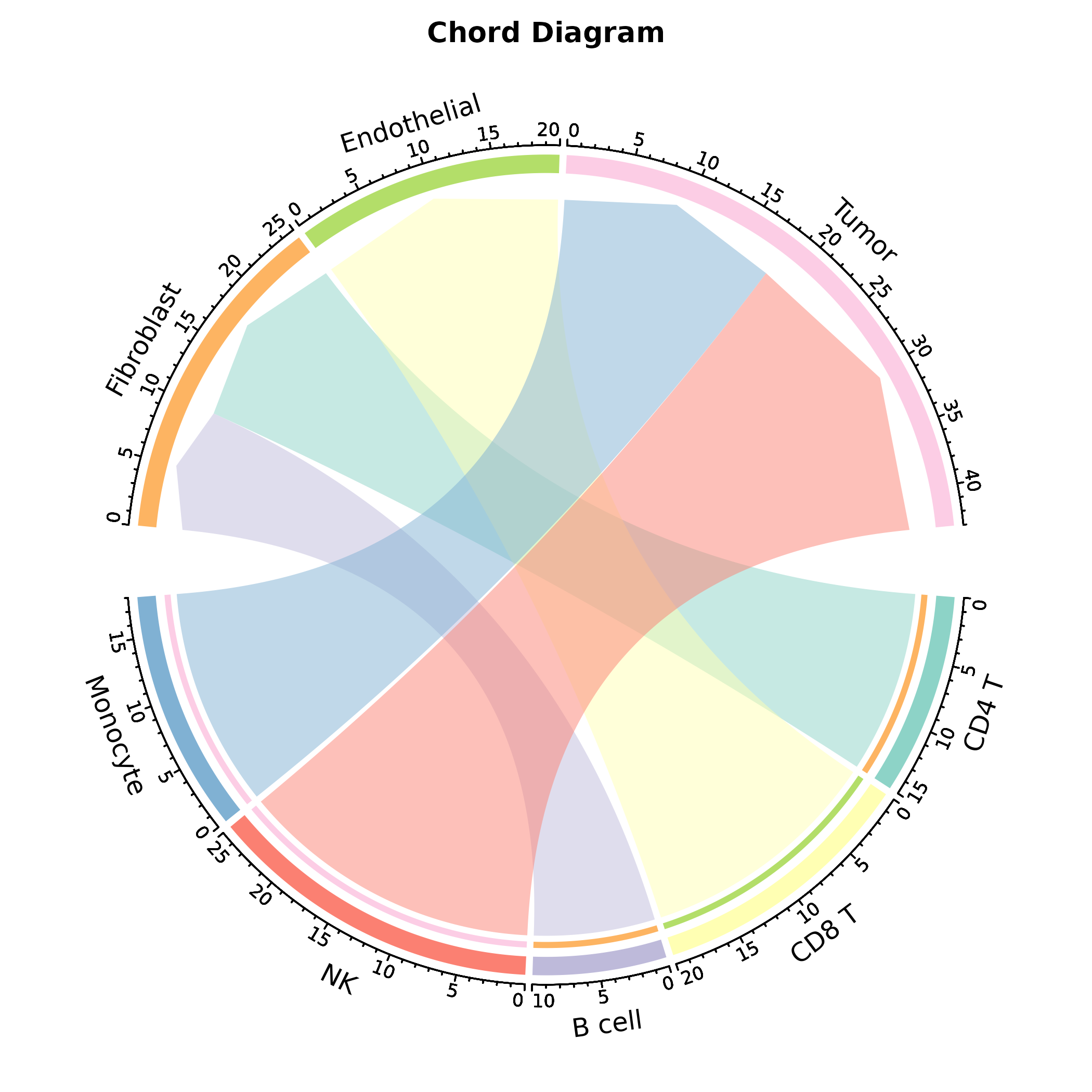
ChordPlot(interactions, from = "from", to = "to", y = "weight",
  links_color = "to", labels_rot = TRUE,
  palette = "Paired", title = "Colored by Target")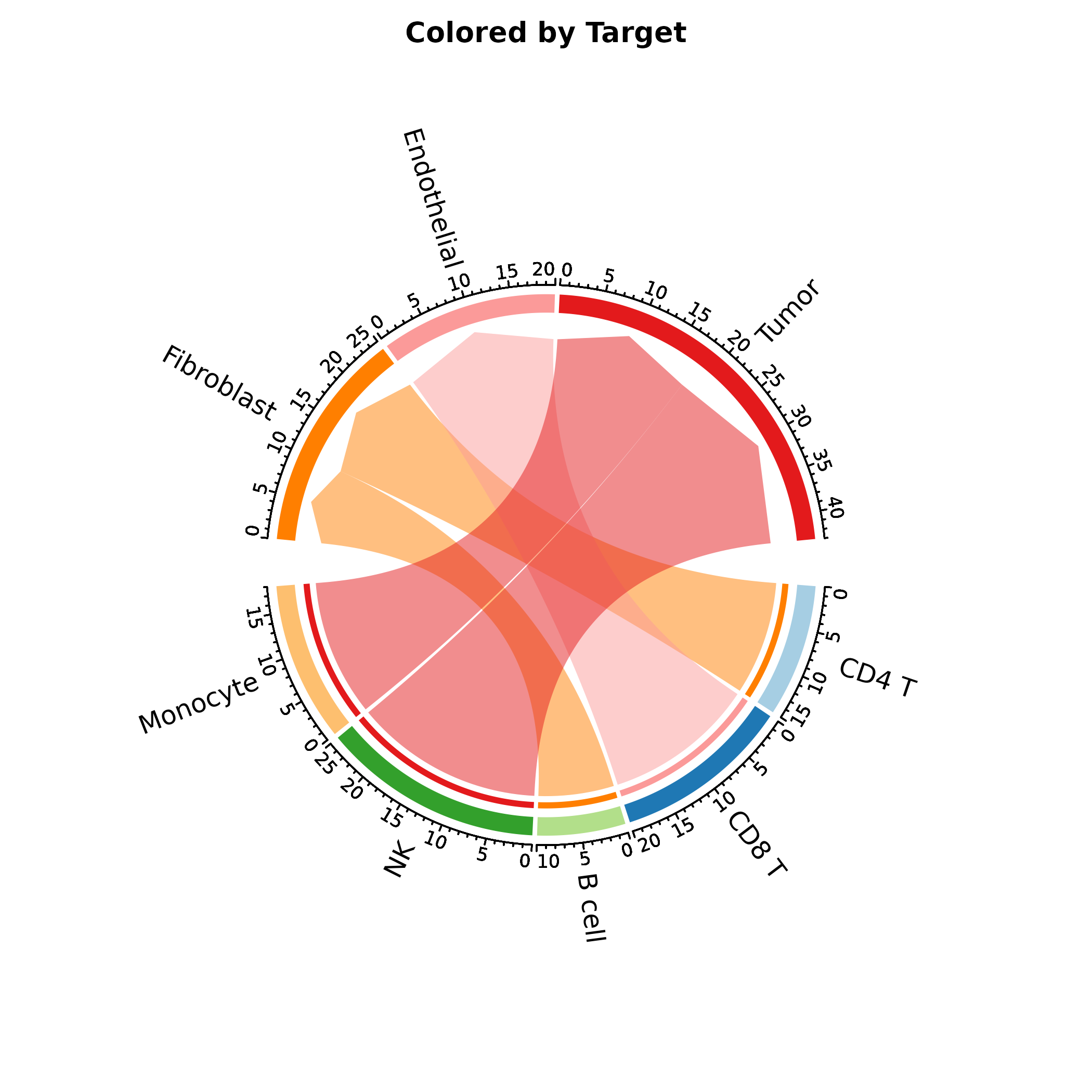
CircosPlot
Alias for ChordPlot.
CircosPlot(interactions, from = "from", to = "to", y = "weight",
  palette = "Set3", title = "Circos Plot")
SankeyPlot
flow <- data.frame(
  diagnosis = rep(c("Early", "Advanced", "Metastatic"), each = 3),
  outcome = rep(c("CR", "PR", "PD"), 3),
  n = c(40, 8, 2, 10, 20, 10, 2, 8, 20)
)

SankeyPlot(flow, x = c("diagnosis", "outcome"), y = "n",
  links_fill_by = "diagnosis", palette = "Set3",
  title = "Treatment Flow")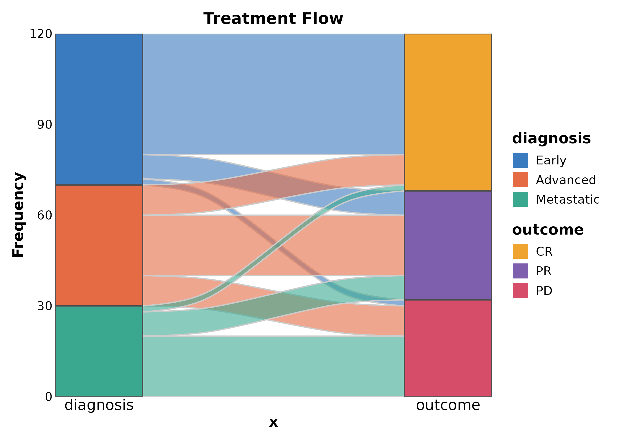
SankeyPlot(flow, x = c("diagnosis", "outcome"), y = "n",
  links_fill_by = "outcome", palette = "npg",
  title = "Colored by Outcome")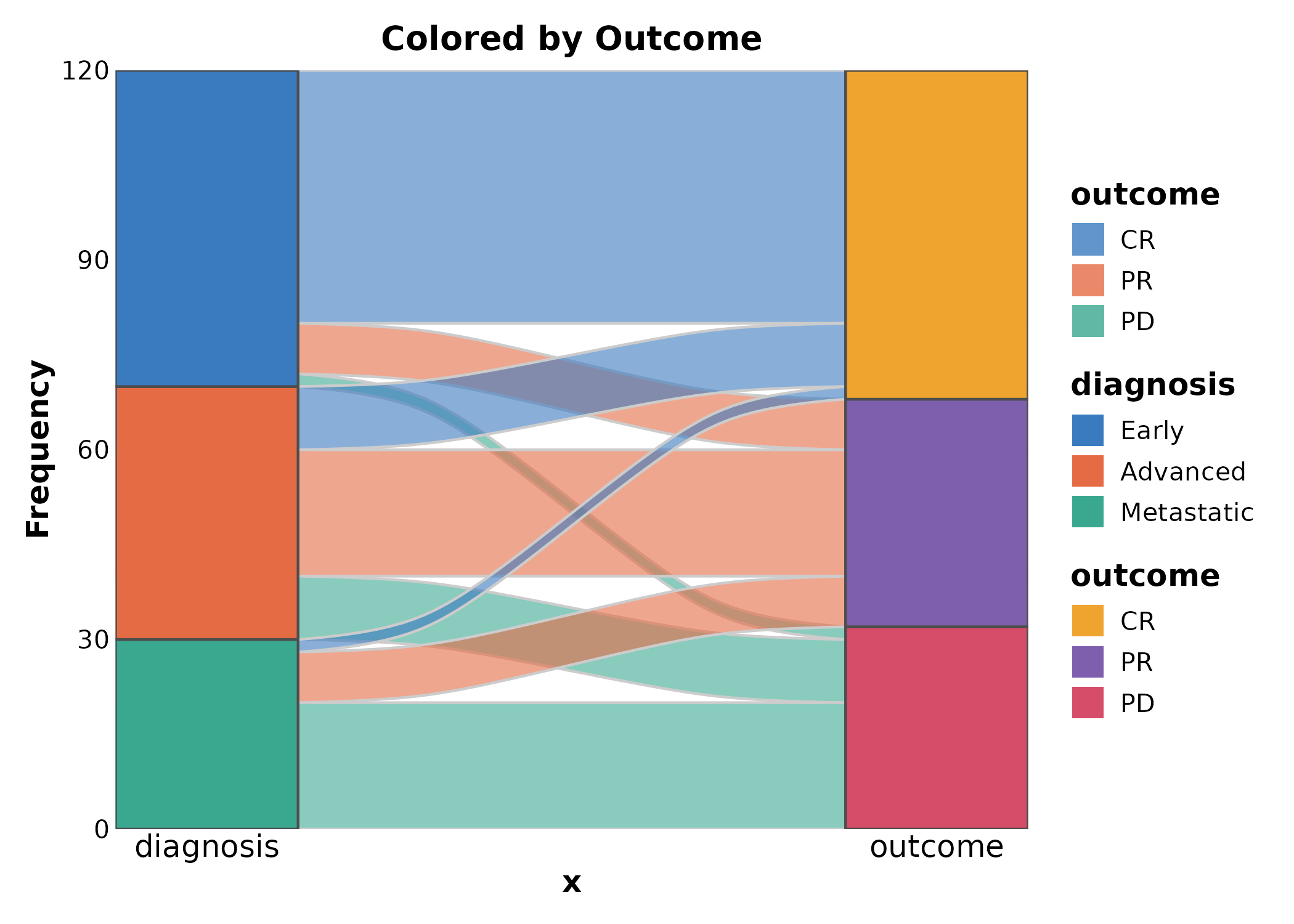
AlluvialPlot
Alias for SankeyPlot.
AlluvialPlot(flow, x = c("diagnosis", "outcome"), y = "n",
  links_fill_by = "diagnosis", palette = "Paired",
  title = "Alluvial Plot")
Network
edges <- data.frame(
  from = c("TP53", "EGFR", "MYC", "KRAS", "BRCA1", "PTEN"),
  to = c("MDM2", "ERBB2", "MAX", "BRAF", "RAD51", "AKT1"),
  score = c(0.9, 0.85, 0.8, 0.75, 0.7, 0.65)
)
nodes <- data.frame(
  name = unique(c(edges$from, edges$to)),
  type = c("Oncogene","Oncogene","Oncogene","Oncogene",
           "TSG","TSG","TSG","Oncogene","Oncogene",
           "Oncogene","TSG","Oncogene")
)

Network(edges, nodes, link_weight_by = "score",
  node_fill_by = "type", layout = "fr",
  title = "Protein Interaction Network")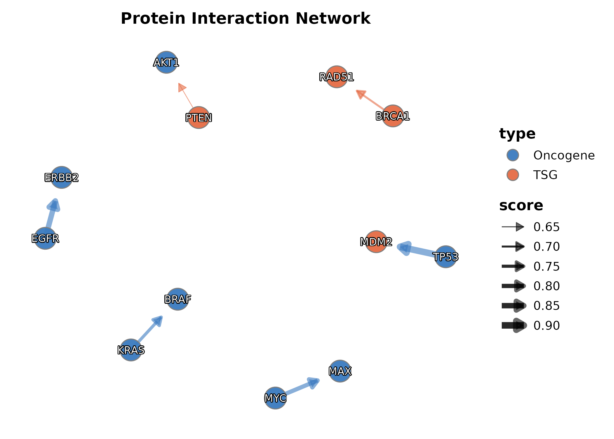
7. Specialized
DumbbellPlot
x_start and x_end are the numeric value
columns, y is the category.
dumb <- data.frame(
  gene = paste0("Gene", LETTERS[1:8]),
  before = rnorm(8, 5, 1.5), after = rnorm(8, 8, 1.5)
)

DumbbellPlot(dumb, x_start = "before", x_end = "after", y = "gene",
  palette = "Set1", title = "Before vs After Treatment")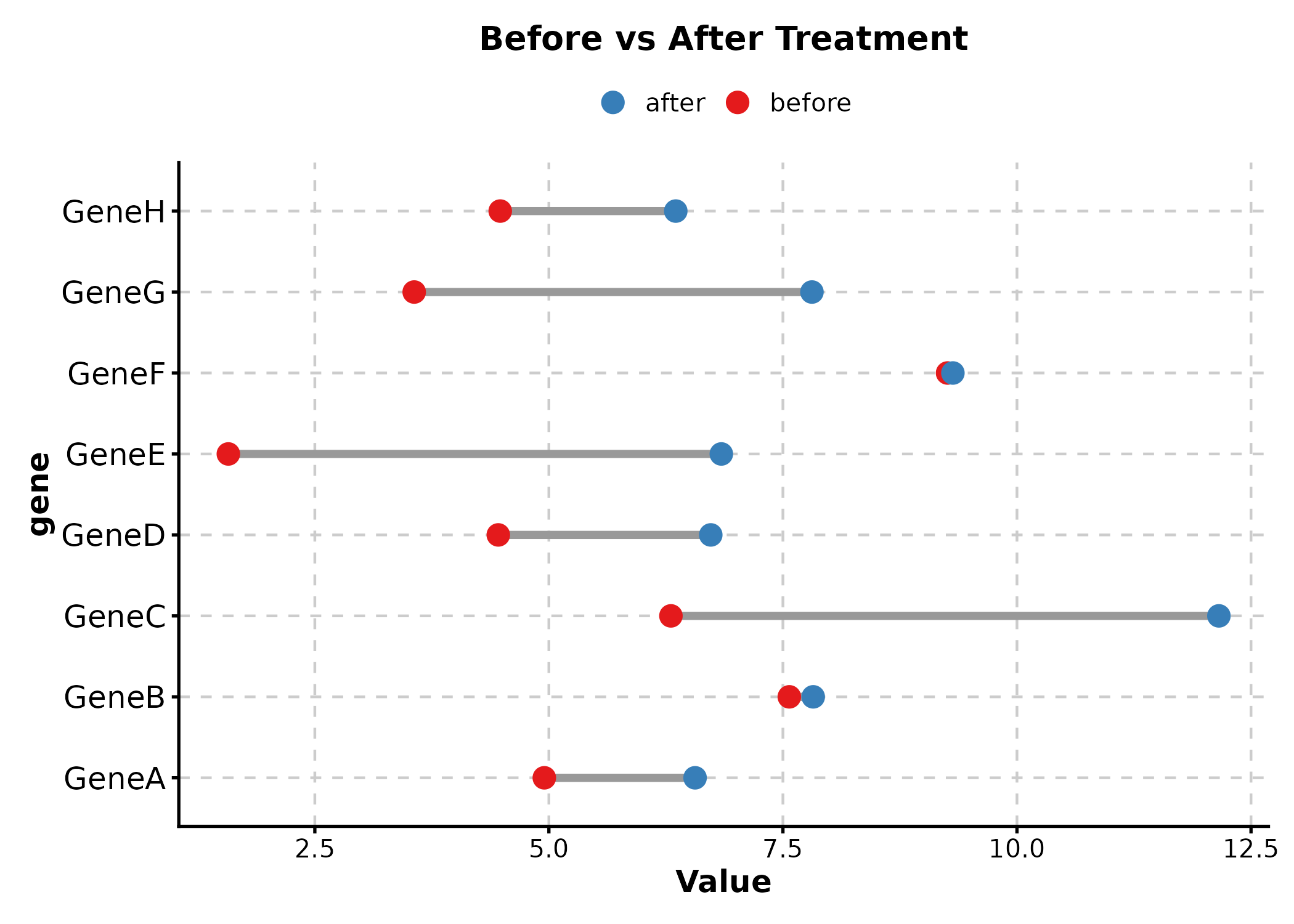
DumbbellPlot(dumb, x_start = "before", x_end = "after", y = "gene",
  palette = "lancet", sort_y = "desc",
  title = "Sorted by Difference")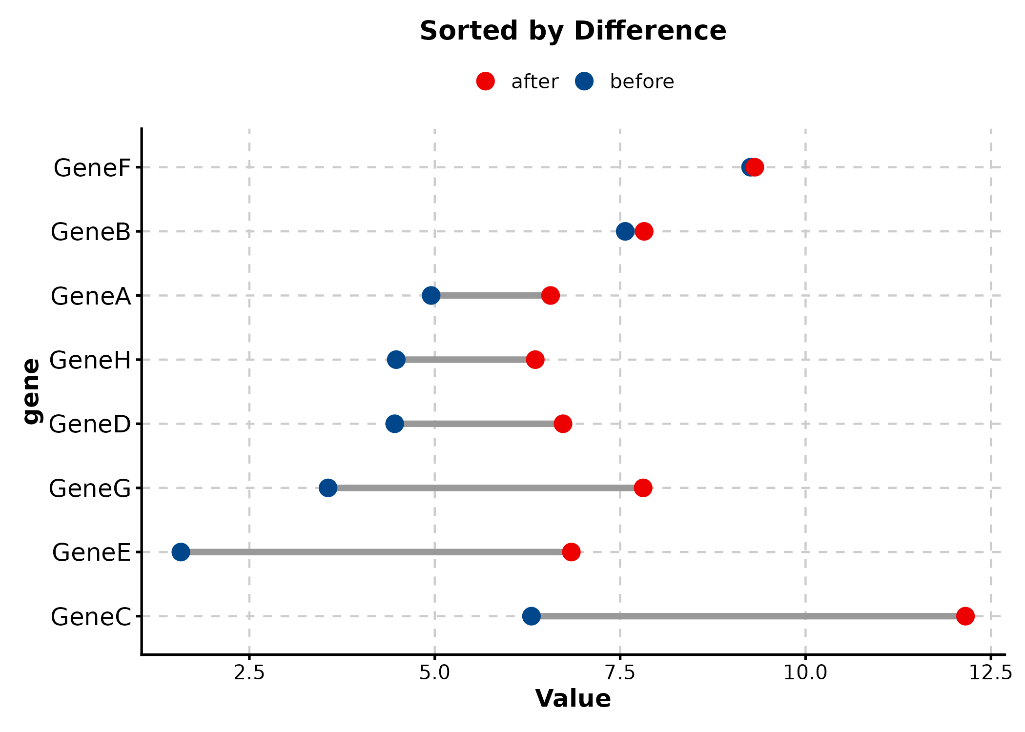
StreamGraph
stream_df <- data.frame(
  year = rep(2015:2024, 4),
  count = abs(rnorm(40, 50, 20)),
  category = rep(c("Immunotherapy", "Targeted", "Chemo", "Radiation"), each = 10)
)

StreamGraph(stream_df, x = "year", y = "count", group_by = "category",
  palette = "Set2", title = "Treatment Trends")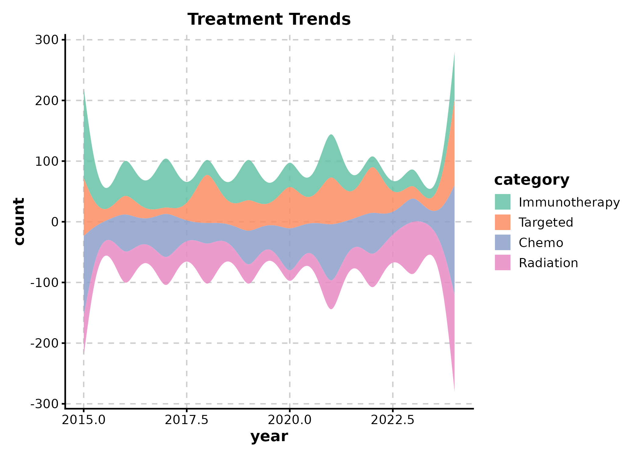
TreemapPlot
area = numeric size column, label = text
label, fill = fill group.
treemap_df <- data.frame(
  pathway = c("PI3K-Akt", "MAPK", "Wnt", "p53", "Cell Cycle",
              "Apoptosis", "JAK-STAT", "NF-kB"),
  gene_count = c(45, 38, 32, 28, 25, 22, 18, 15),
  category = c("Signaling","Signaling","Signaling","TSG",
               "Cell Cycle","Death","Signaling","Signaling")
)

TreemapPlot(treemap_df, area = "gene_count", label = "pathway",
  fill = "category", palette = "Set2",
  title = "Pathway Gene Counts")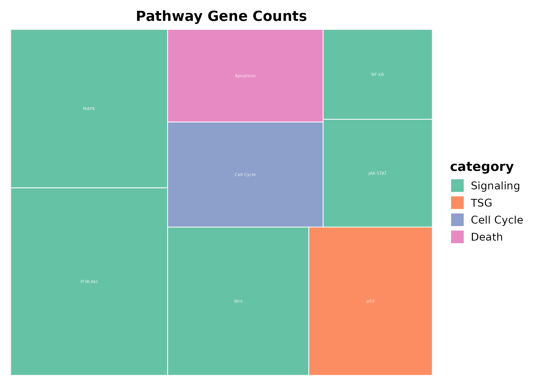
ParallelCoordPlot
ParallelCoordPlot(iris,
  columns = c("Sepal.Length", "Sepal.Width", "Petal.Length", "Petal.Width"),
  group_by = "Species", palette = "Set1",
  title = "Iris Features")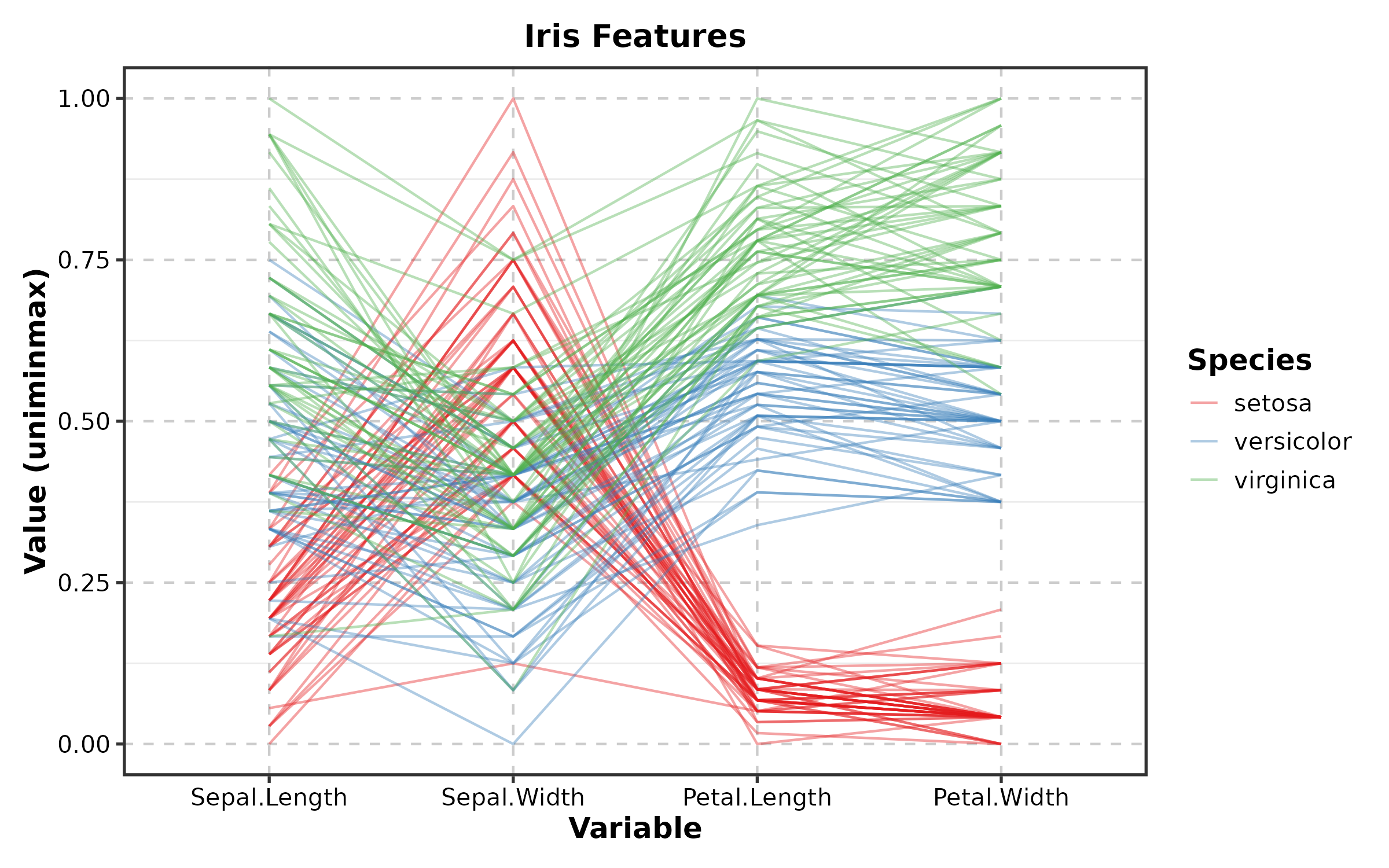
TimelinePlot
events <- data.frame(
  event = c("Diagnosis", "Surgery", "Chemo", "Radiation", "Follow-up"),
  start = as.Date(c("2024-01-15", "2024-02-10", "2024-03-01",
                     "2024-06-01", "2024-09-01")),
  end = as.Date(c("2024-01-15", "2024-02-12", "2024-05-15",
                   "2024-07-15", "2024-12-01"))
)

TimelinePlot(events, start = "start", end = "end", label = "event",
  palette = "Set2", title = "Treatment Timeline")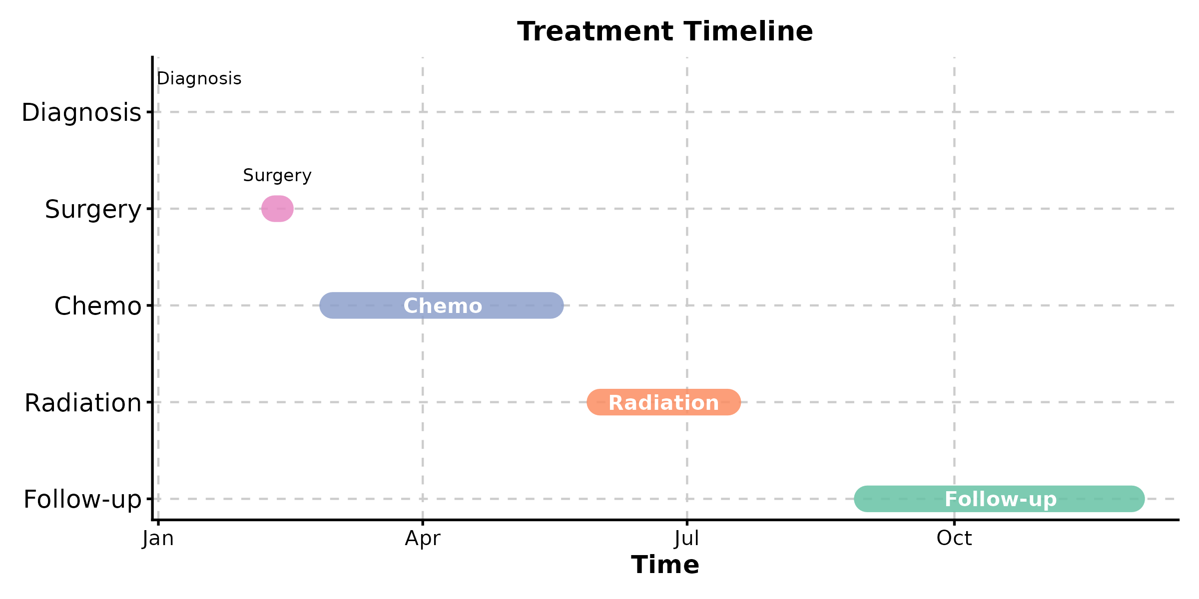
DendrogramPlot
DendrogramPlot(mtcars[1:15, ],
  columns = c("mpg", "disp", "hp", "wt", "qsec"),
  k = 3, palette = "Set1",
  title = "Hierarchical Clustering")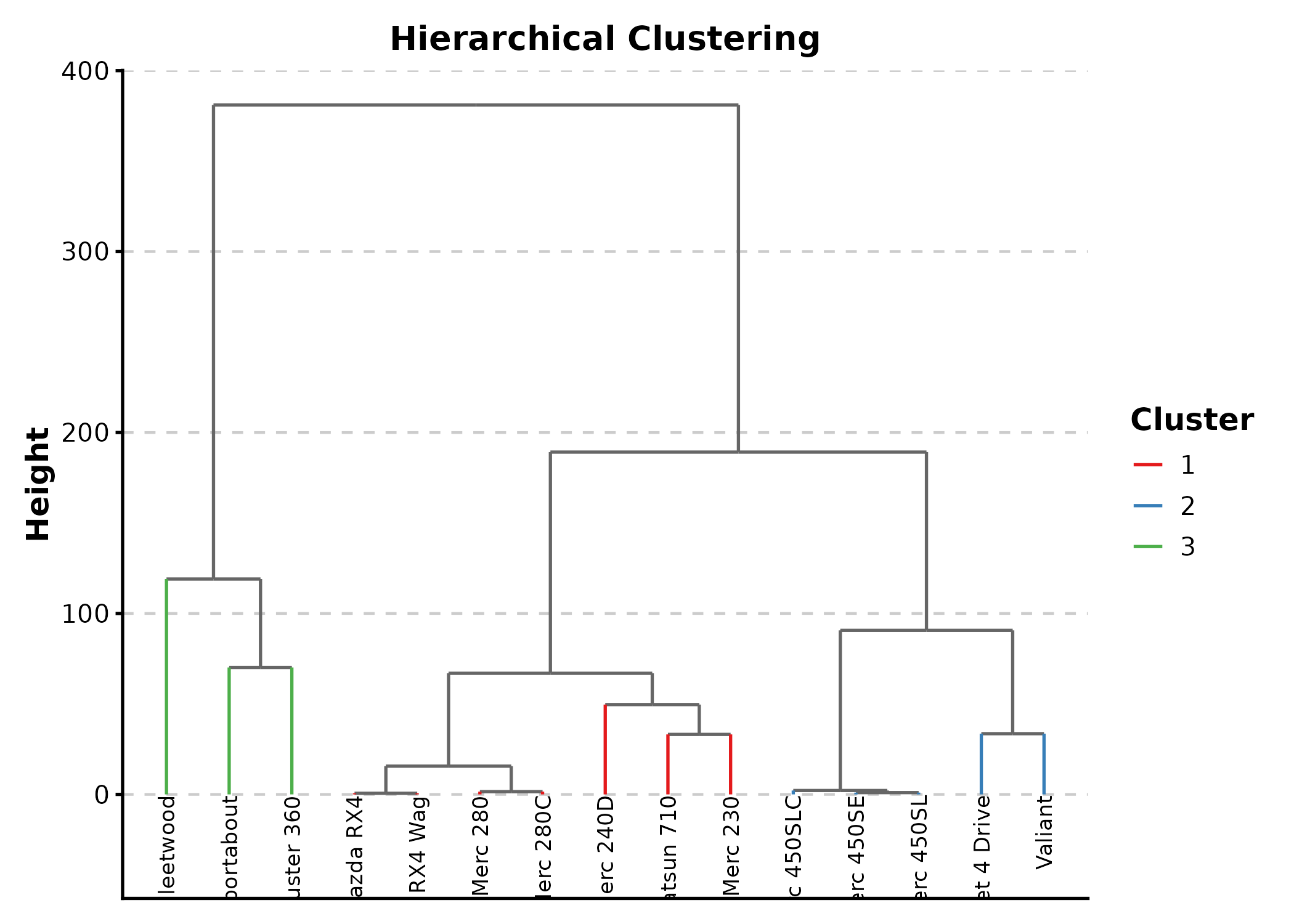
SunburstPlot
Requires plotly. Returns interactive output.
SunburstPlot(sunburst_data,
  labels = "label", parents = "parent", values = "count",
  title = "Hierarchical Composition")
WordCloudPlot
terms <- data.frame(
  word = c("apoptosis", "proliferation", "migration", "invasion",
           "angiogenesis", "metastasis", "differentiation",
           "inflammation", "autophagy", "senescence"),
  score = c(8, 7, 6, 5, 9, 4, 7, 8, 3, 4)
)

WordCloudPlot(terms, word_by = "word", score_by = "score",
  palette = "Spectral", title = "Biological Processes")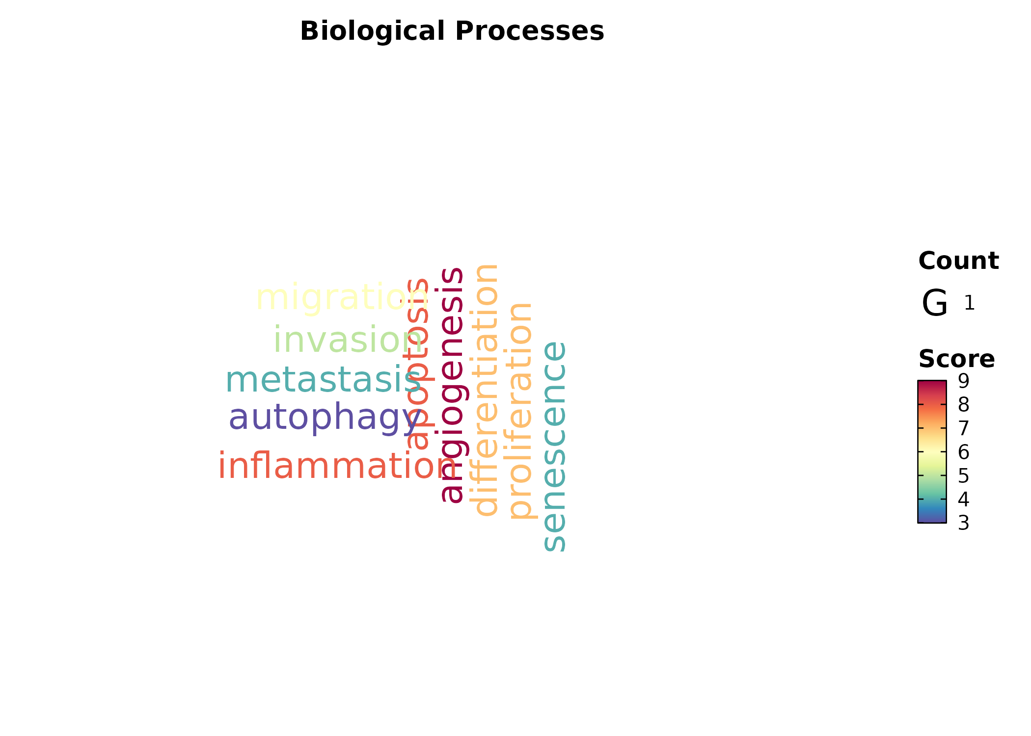
RarefactionPlot
RarefactionPlot(inext_result, palette = "Set1",
  title = "Species Rarefaction")
8. Earth & Environmental
ContourPlot
grid_data <- expand.grid(
  x = seq(-3, 3, length.out = 50),
  y = seq(-3, 3, length.out = 50)
)
grid_data$z <- with(grid_data, sin(x) * cos(y) * exp(-(x^2 + y^2) / 8))

ContourPlot(grid_data, x = "x", y = "y", z = "z",
  type = "filled", palette = "Spectral",
  title = "Filled Contour")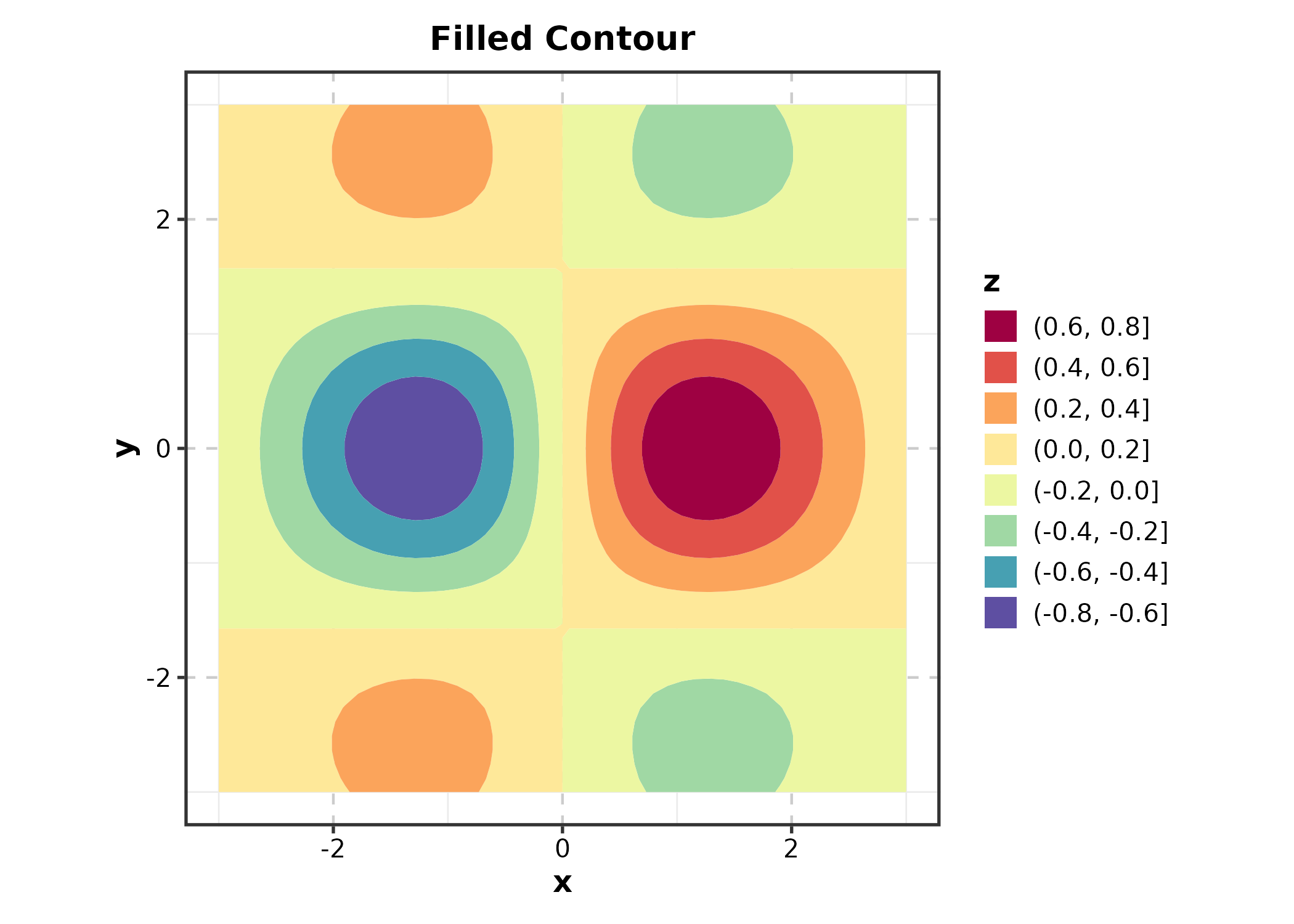
ContourPlot(grid_data, x = "x", y = "y", z = "z",
  type = "lines", palette = "viridis",
  title = "Contour Lines")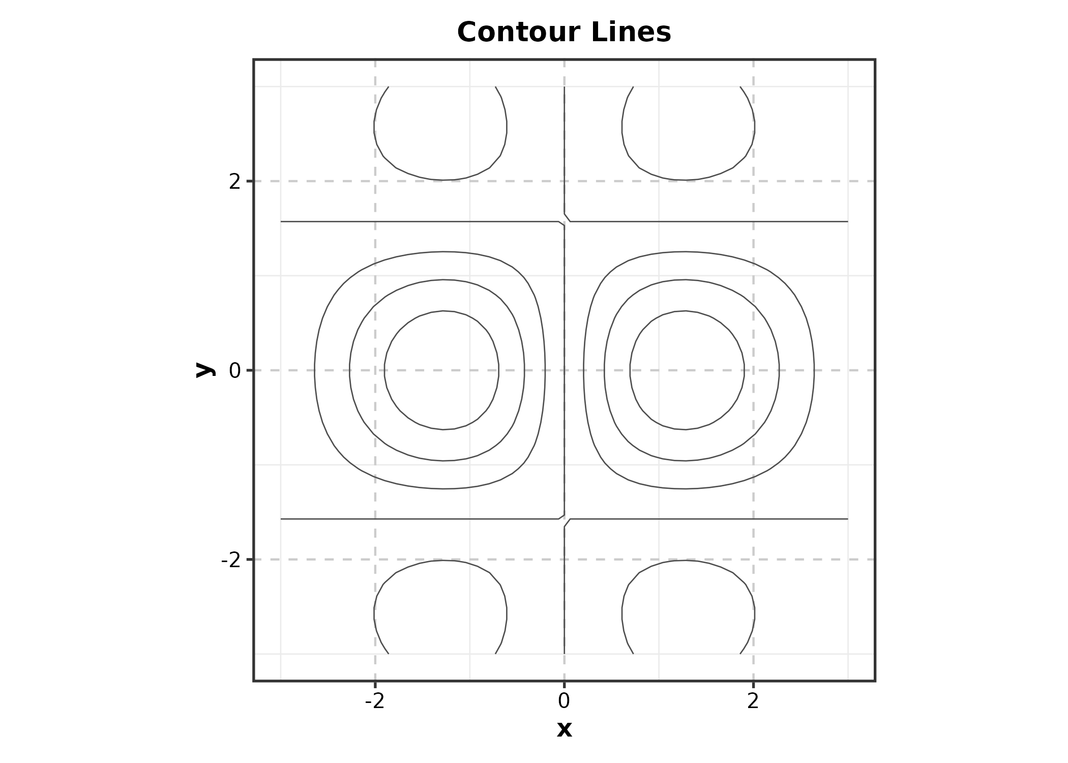
ContourPlot(grid_data, x = "x", y = "y", z = "z",
  type = "both", palette = "RdBu",
  title = "Lines on Filled")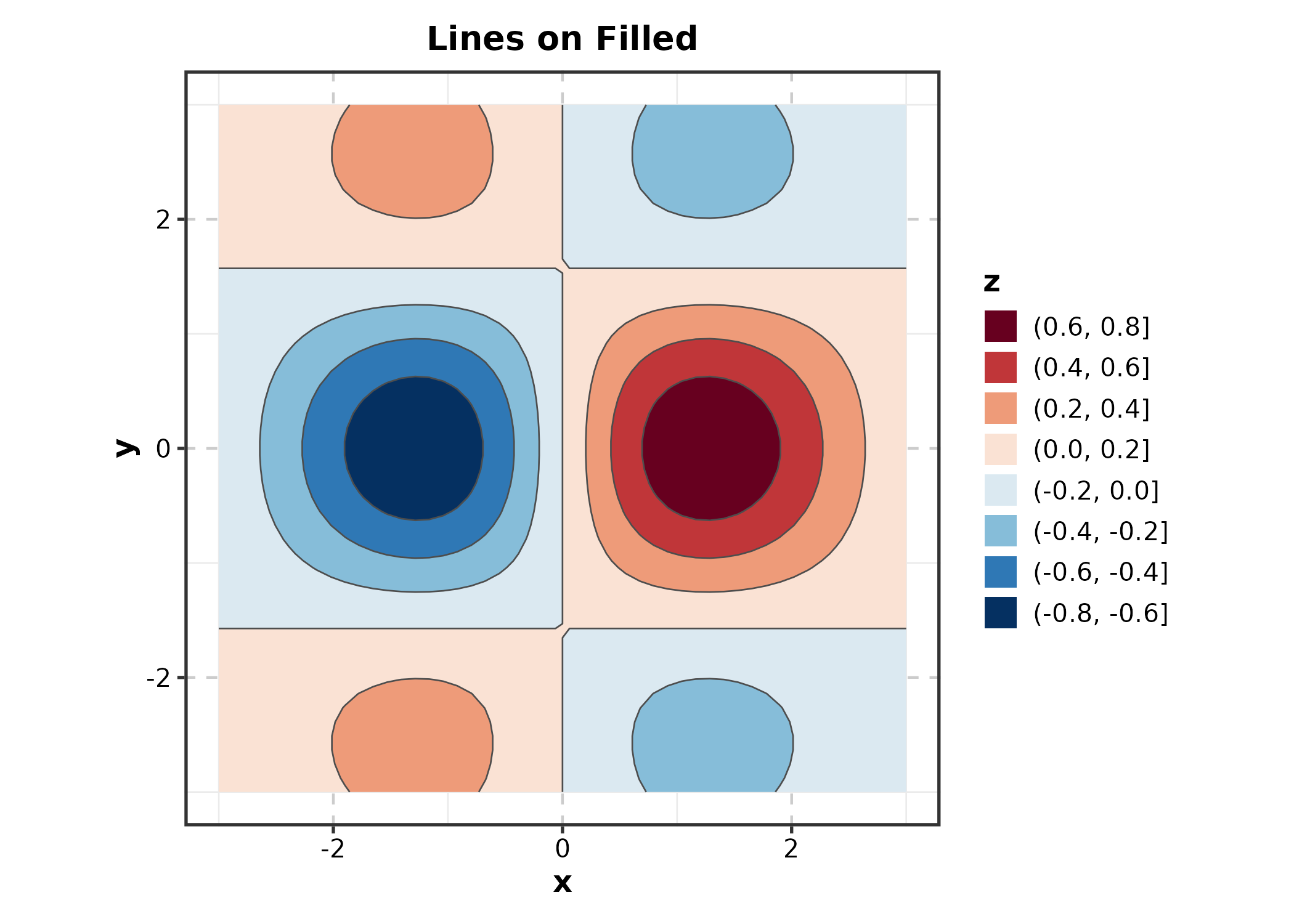
TernaryPlot
Requires ggtern (namespace may conflict with
ggplot2).
ternary_df <- data.frame(
  sand = c(0.4, 0.2, 0.6), silt = c(0.3, 0.5, 0.2),
  clay = c(0.3, 0.3, 0.2), type = c("Loam", "Silty", "Sandy")
)

TernaryPlot(ternary_df, x = "sand", y = "silt", z = "clay",
  group_by = "type", palette = "Set1",
  title = "Soil Composition")
PolarPlot
theta = angle variable, r = radius
variable.
wind <- data.frame(
  direction = rep(seq(0, 350, by = 10), 3),
  speed = abs(rnorm(108, 10, 5)),
  season = rep(c("Spring", "Summer", "Autumn"), each = 36)
)

PolarPlot(wind, theta = "direction", r = "speed",
  group_by = "season", palette = "Set2",
  title = "Wind Pattern")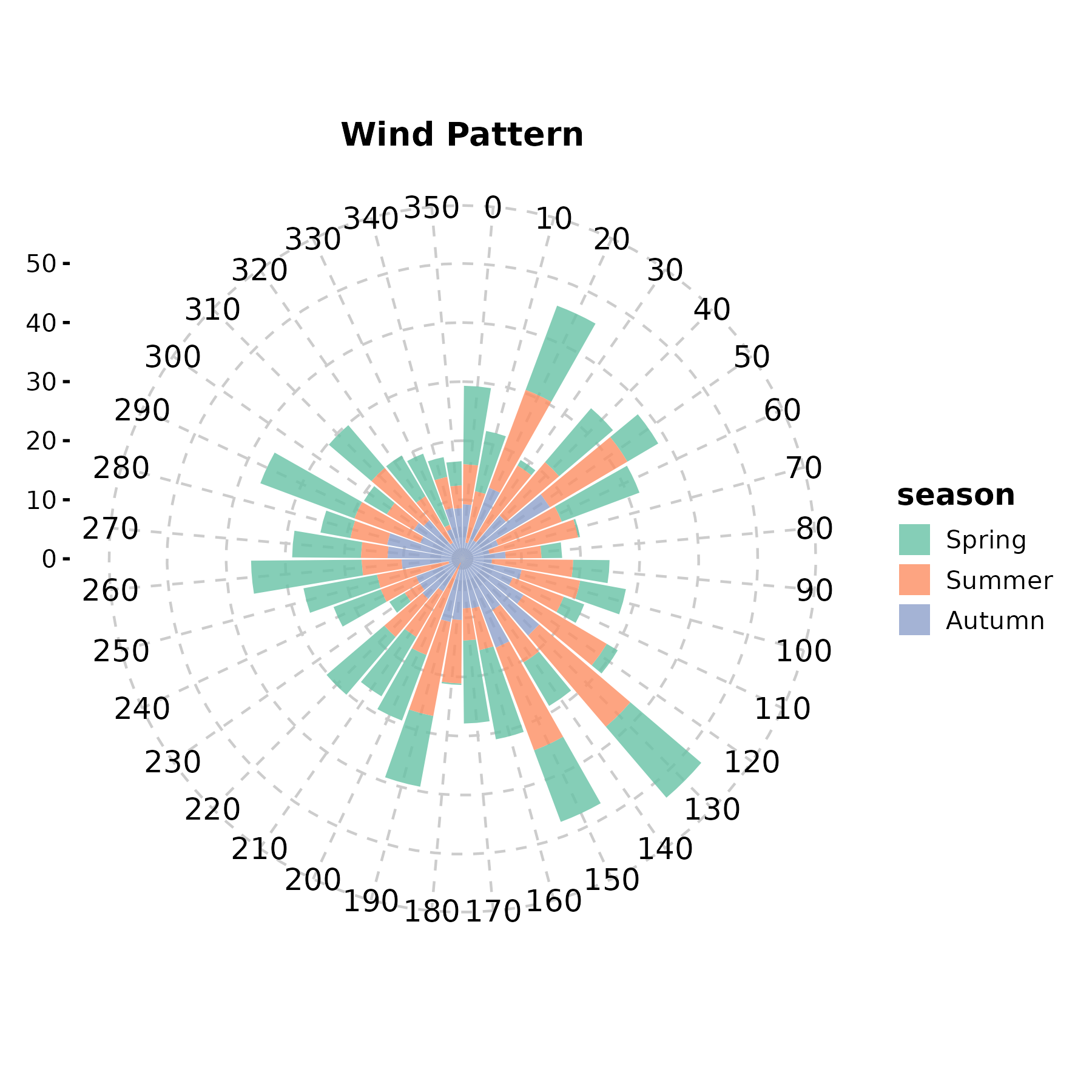
PolarPlot(wind, theta = "direction", r = "speed",
  group_by = "season", palette = "npg", type = "scatter",
  title = "Polar Scatter")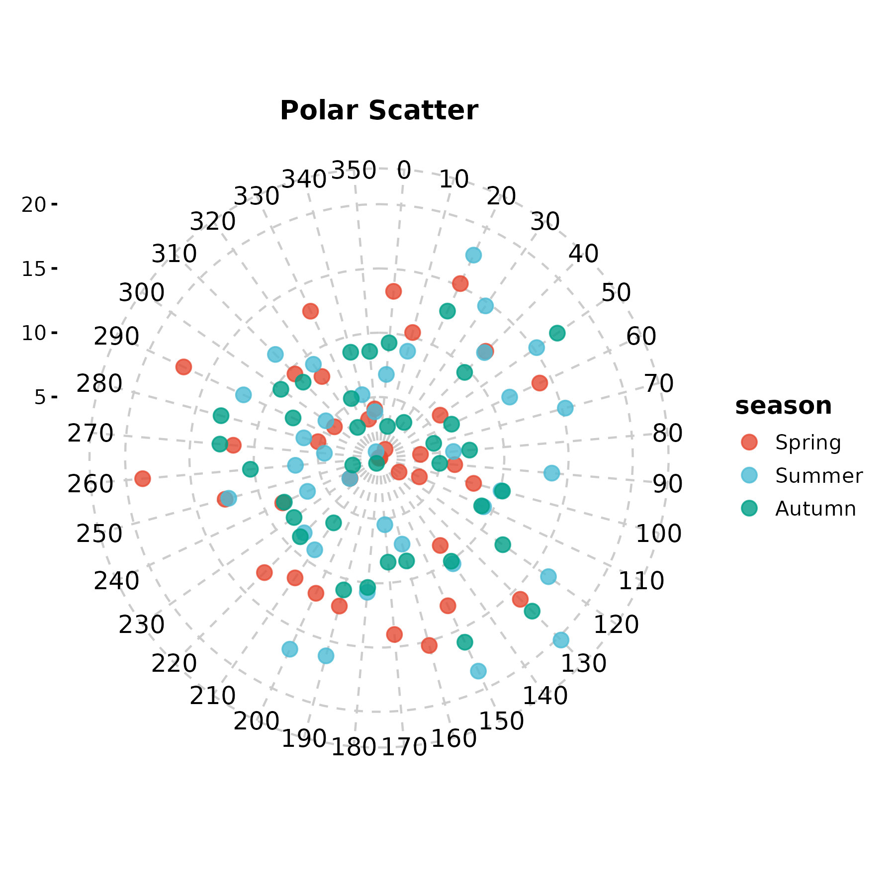
WindRosePlot
Alias for PolarPlot.
WindRosePlot(wind, theta = "direction", r = "speed",
  group_by = "season", palette = "Set1",
  title = "Wind Rose")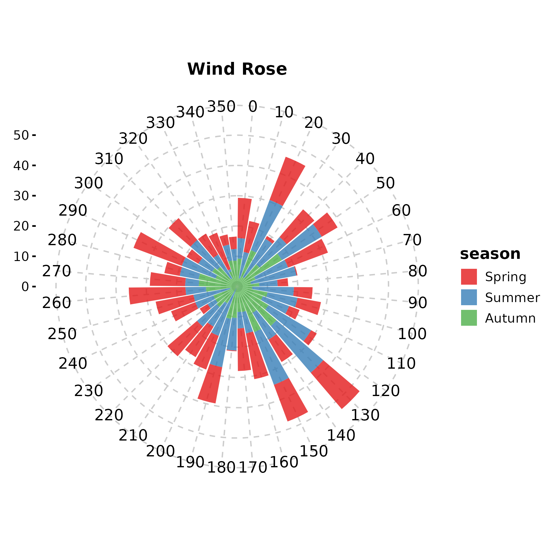
MapPlot
Requires rnaturalearth and
rnaturalearthdata.
cities <- data.frame(
  lon = c(-73.9, -87.6, -118.2, -122.4),
  lat = c(40.7, 41.9, 34.1, 37.8),
  pop = c(8.3, 2.7, 3.9, 0.87)
)

MapPlot(cities, type = "point", point_x = "lon", point_y = "lat",
  value = "pop", color_name = "Population (M)")
9. Meta-Analysis & Agreement
ForestPlot
estimate, ci_lower, ci_upper
are the effect size columns. is_summary marks diamond
rows.
meta <- data.frame(
  study = c("Smith 2018", "Chen 2019", "Garcia 2020",
            "Kim 2021", "Patel 2022", "Overall"),
  or = c(1.32, 0.85, 1.51, 1.08, 0.92, 1.12),
  lower = c(0.95, 0.60, 1.05, 0.78, 0.65, 0.93),
  upper = c(1.84, 1.20, 2.17, 1.50, 1.30, 1.35),
  weight = c(22, 18, 15, 25, 20, NA),
  is_summary = c(FALSE, FALSE, FALSE, FALSE, FALSE, TRUE)
)

ForestPlot(meta, estimate = "or", ci_lower = "lower", ci_upper = "upper",
  label = "study", weight = "weight", is_summary = "is_summary",
  null_value = 1, log_scale = TRUE,
  title = "Meta-Analysis Forest Plot")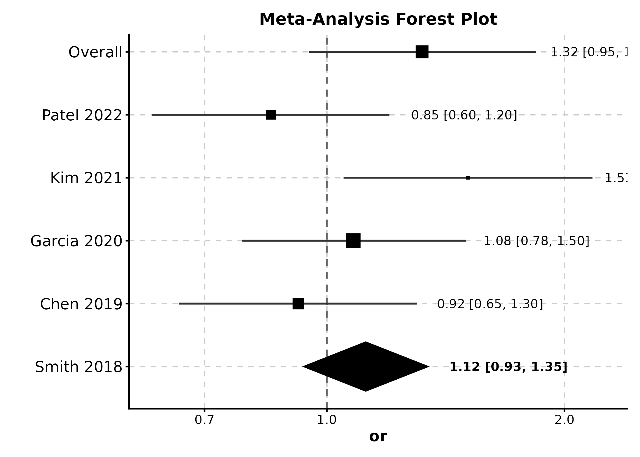
ForestPlot(meta, estimate = "or", ci_lower = "lower", ci_upper = "upper",
  label = "study", weight = "weight", is_summary = "is_summary",
  null_value = 1, show_values = TRUE,
  title = "With Value Labels")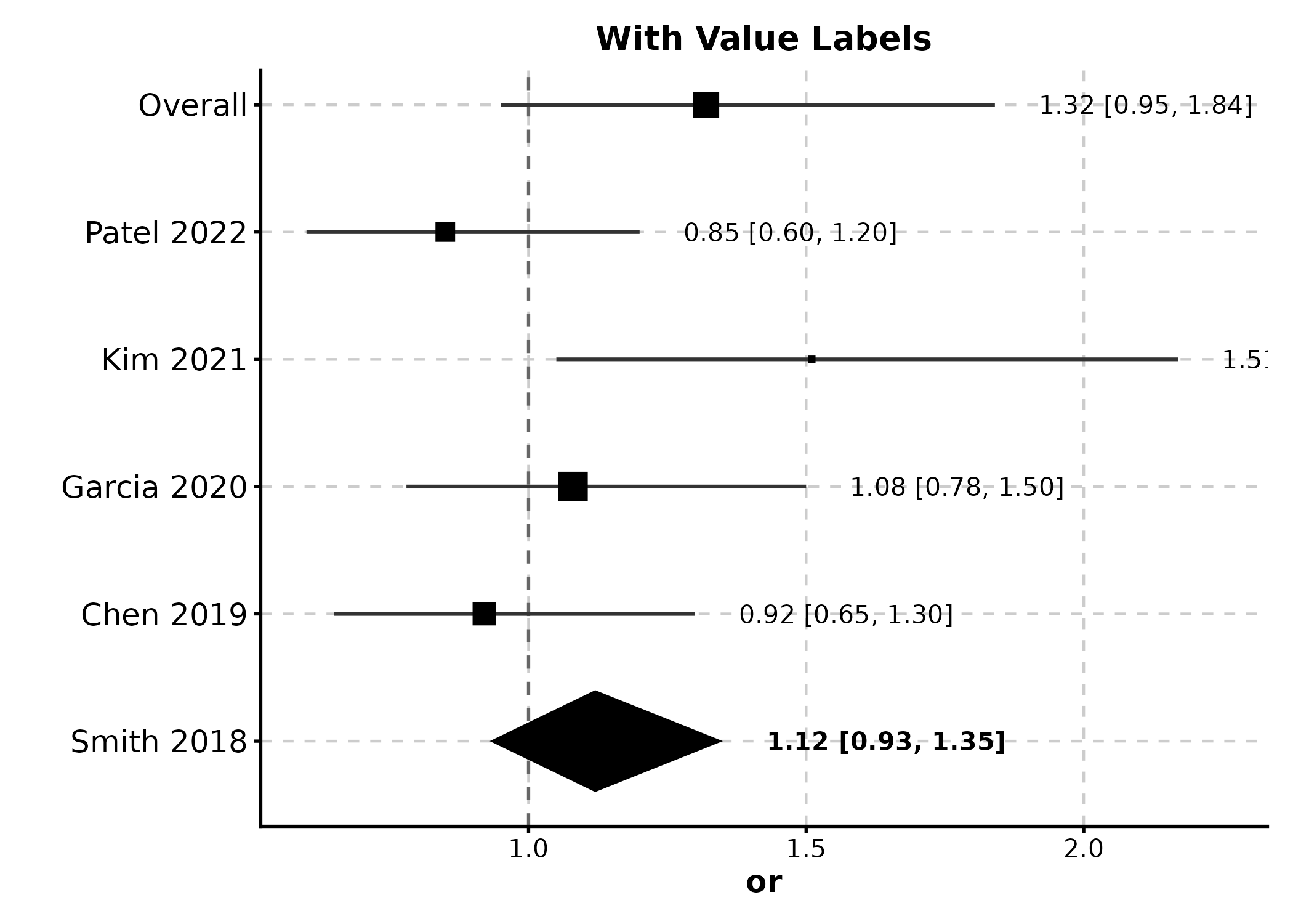
FunnelPlot
estimate = effect sizes, se = standard
errors.
funnel_df <- data.frame(
  effect = rnorm(20, 0.5, 0.3),
  se = runif(20, 0.05, 0.4)
)

FunnelPlot(funnel_df, estimate = "effect", se = "se",
  title = "Publication Bias Assessment")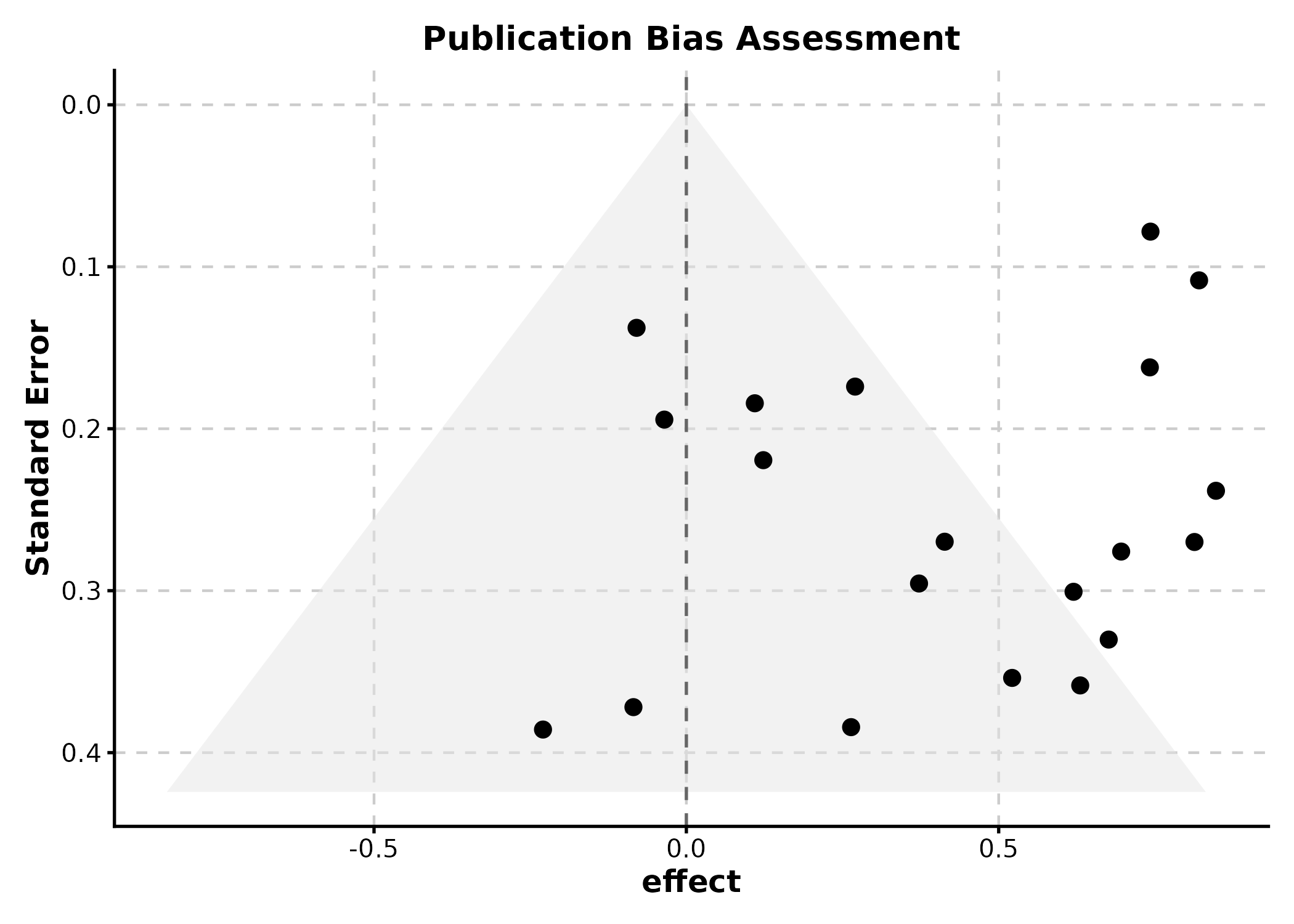
BlandAltmanPlot
method1 and method2 are the two measurement
columns.
ba_df <- data.frame(
  method_A = rnorm(50, 100, 15),
  method_B = rnorm(50, 100, 15)
)
ba_df$method_B <- ba_df$method_A + rnorm(50, 2, 5)

BlandAltmanPlot(ba_df, method1 = "method_A", method2 = "method_B",
  title = "Method Agreement")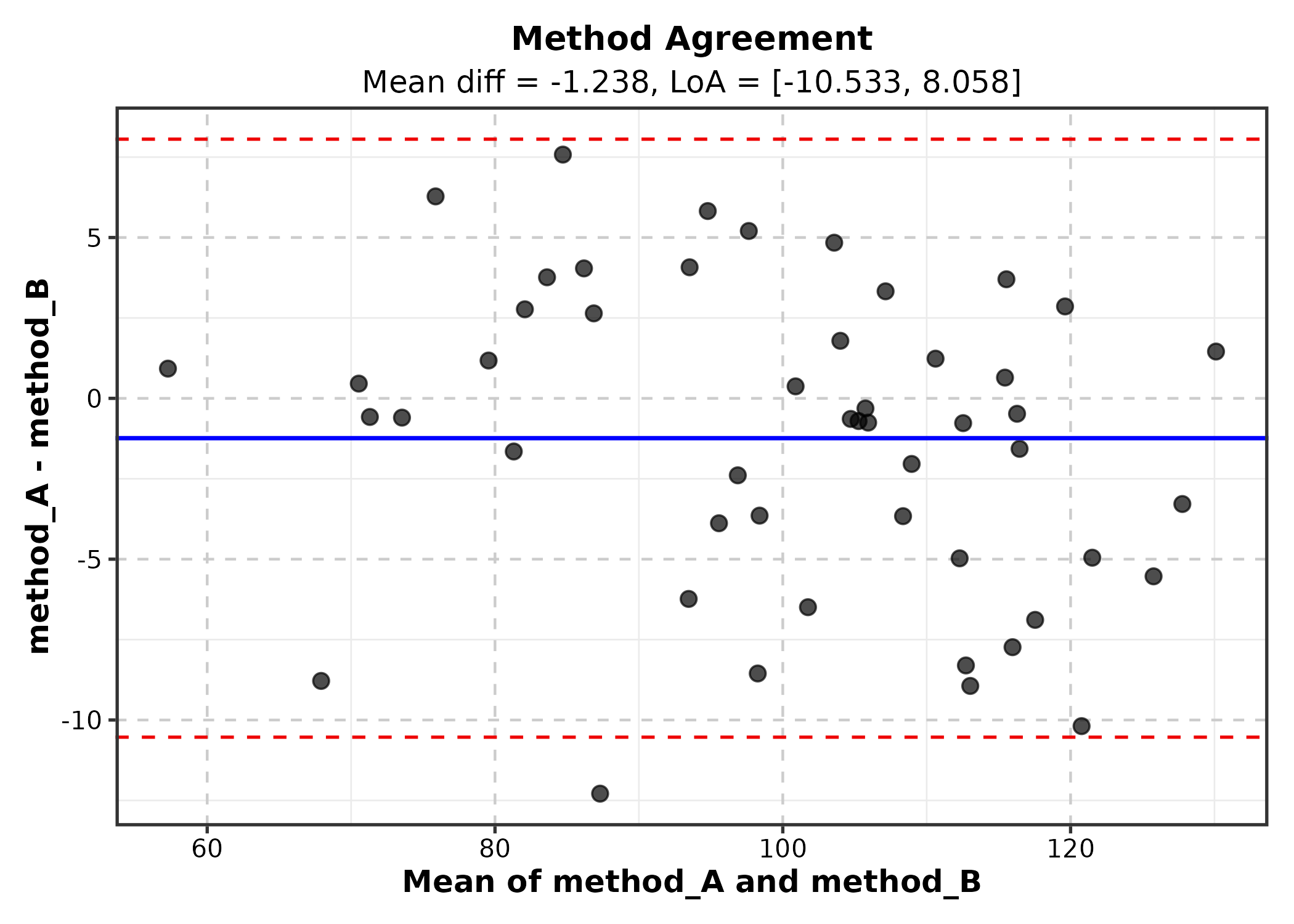
10. Ecology & Evolution
OrdinationPlot
Requires pre-computed ordination coordinates (e.g., from
vegan::metaMDS).
library(vegan)
ord <- metaMDS(species_mat, k = 2, trace = 0)
ord_df <- as.data.frame(scores(ord, display = "sites"))
ord_df$habitat <- env$habitat

OrdinationPlot(ord_df, x = "NMDS1", y = "NMDS2",
  group_by = "habitat", palette = "Set1",
  title = "NMDS Ordination")
PhyloTreePlot
tree <- ape::rtree(12, tip.label = paste0("Species_", LETTERS[1:12]))

PhyloTreePlot(tree, palette = "Set2",
  title = "Phylogenetic Tree")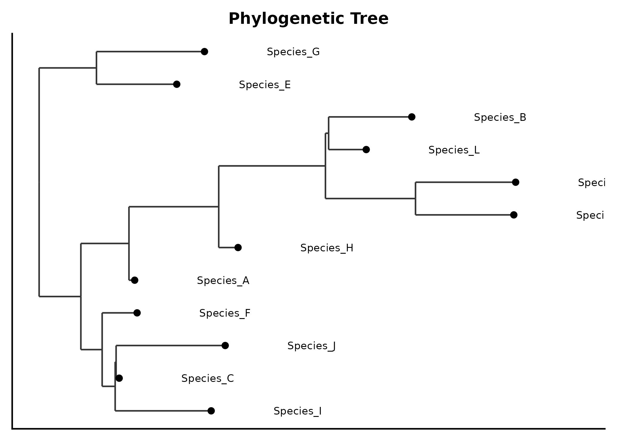
RankAbundancePlot
species = species names, abundance =
abundance values.
rank_df <- data.frame(
  species = paste0("Sp", 1:30),
  abundance = sort(rpois(30, 20), decreasing = TRUE),
  community = sample(c("Site A", "Site B"), 30, replace = TRUE)
)

RankAbundancePlot(rank_df, species = "species", abundance = "abundance",
  group_by = "community", palette = "Set1",
  title = "Rank-Abundance Curve")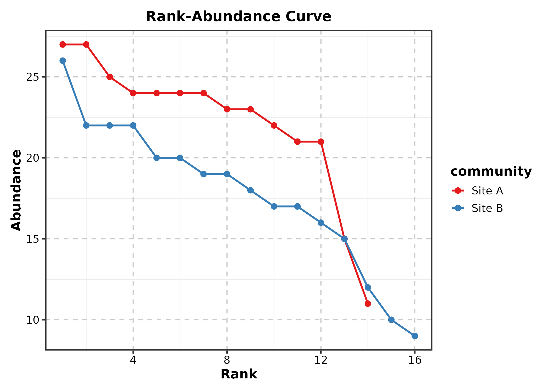
11. Physics & Engineering
QuiverPlot
field <- expand.grid(x = seq(-2, 2, 0.4), y = seq(-2, 2, 0.4))
field$u <- -field$y
field$v <- field$x

QuiverPlot(field, x = "x", y = "y", u = "u", v = "v",
  title = "Vector Field")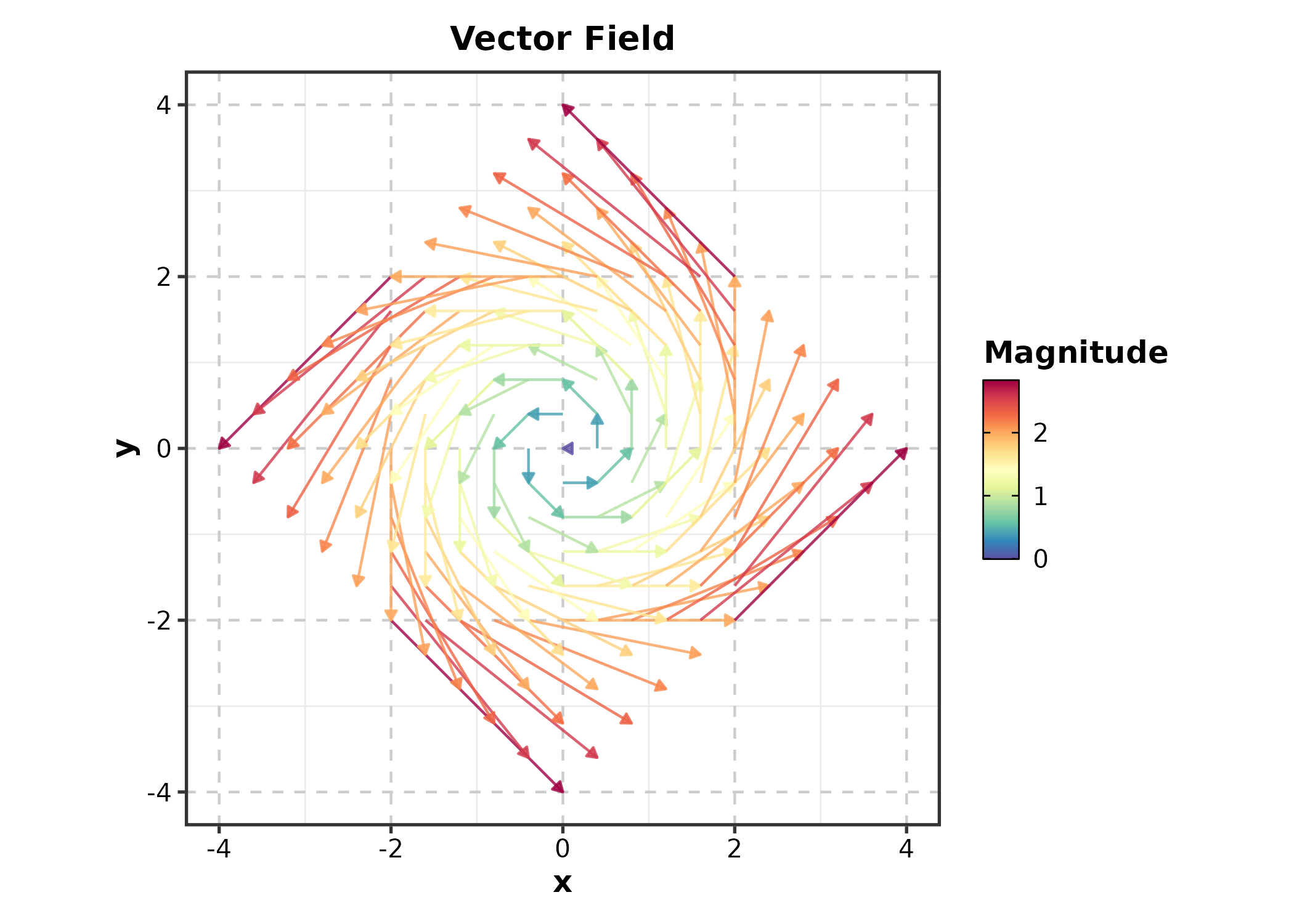
StreamlinePlot
StreamlinePlot(field, x = "x", y = "y", u = "u", v = "v",
  title = "Flow Streamlines")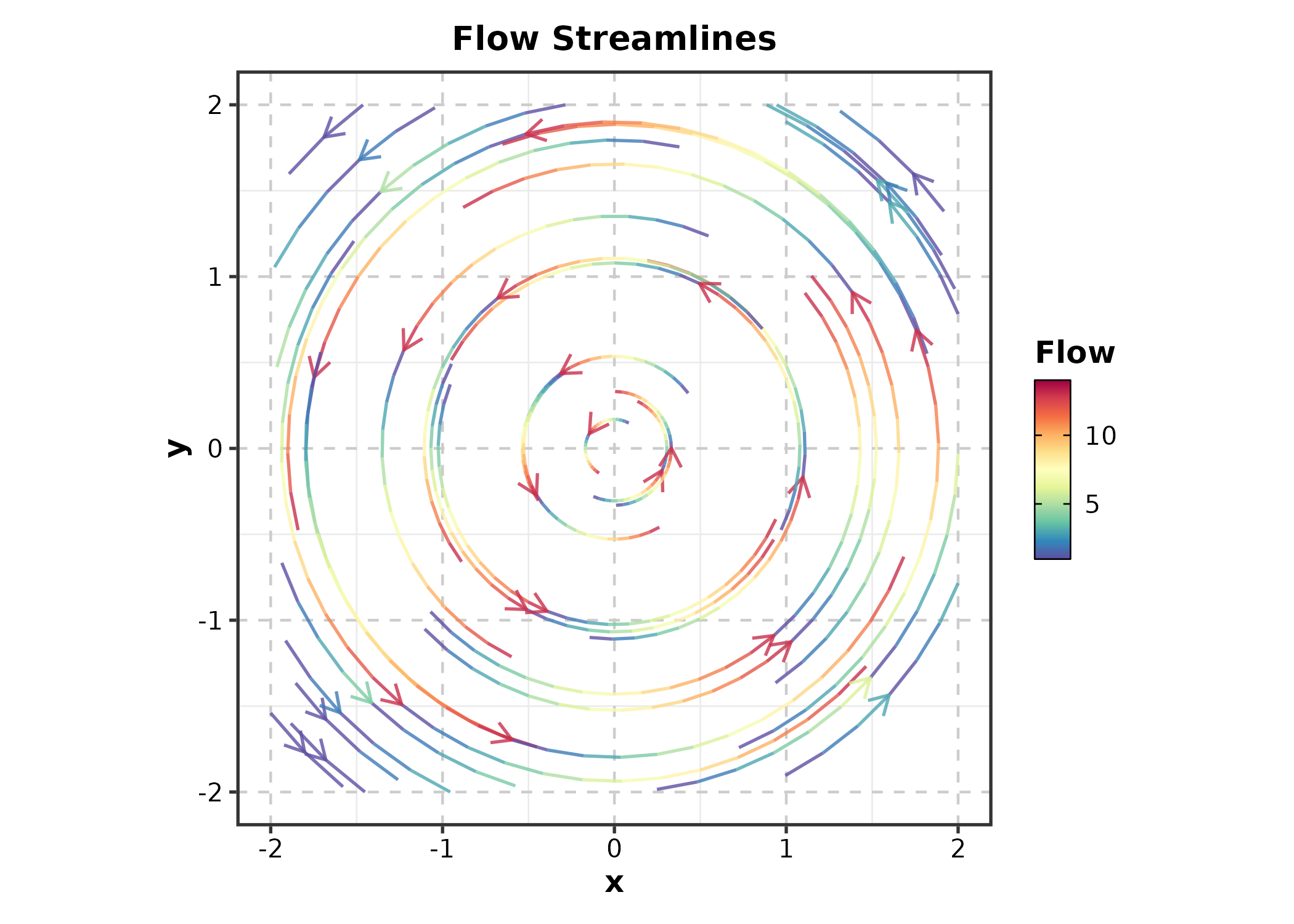
12. 3D & Interactive
ggforge_interactive
Converts any ggplot to an interactive plotly widget.
p <- BoxPlot(treat, x = "group", y = "response", palette = "lancet")
ggforge_interactive(p)
13. Machine Learning
ConfusionMatrixPlot
truth = actual labels, predicted =
predicted labels.
set.seed(42)
pred_df <- data.frame(
  actual = sample(c("Benign", "Malignant", "Normal"), 300,
    replace = TRUE, prob = c(0.4, 0.35, 0.25)),
  predicted = sample(c("Benign", "Malignant", "Normal"), 300,
    replace = TRUE, prob = c(0.38, 0.37, 0.25))
)
diag_idx <- sample(300, 200)
pred_df$predicted[diag_idx] <- pred_df$actual[diag_idx]

ConfusionMatrixPlot(pred_df, truth = "actual", predicted = "predicted",
  palette = "Blues", title = "Classification Results")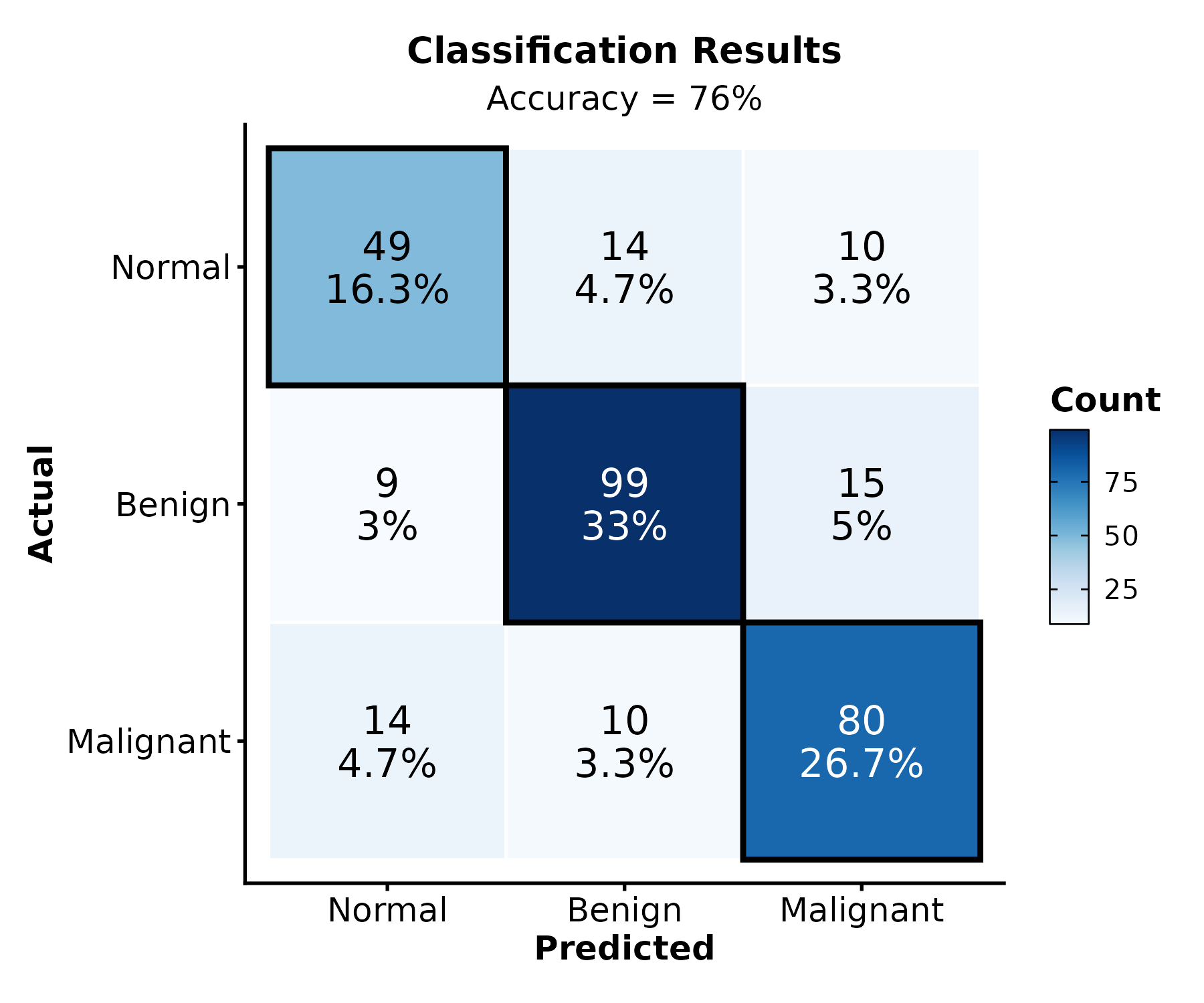
ConfusionMatrixPlot(pred_df, truth = "actual", predicted = "predicted",
  normalize = "row", palette = "Greens",
  title = "Row-Normalized")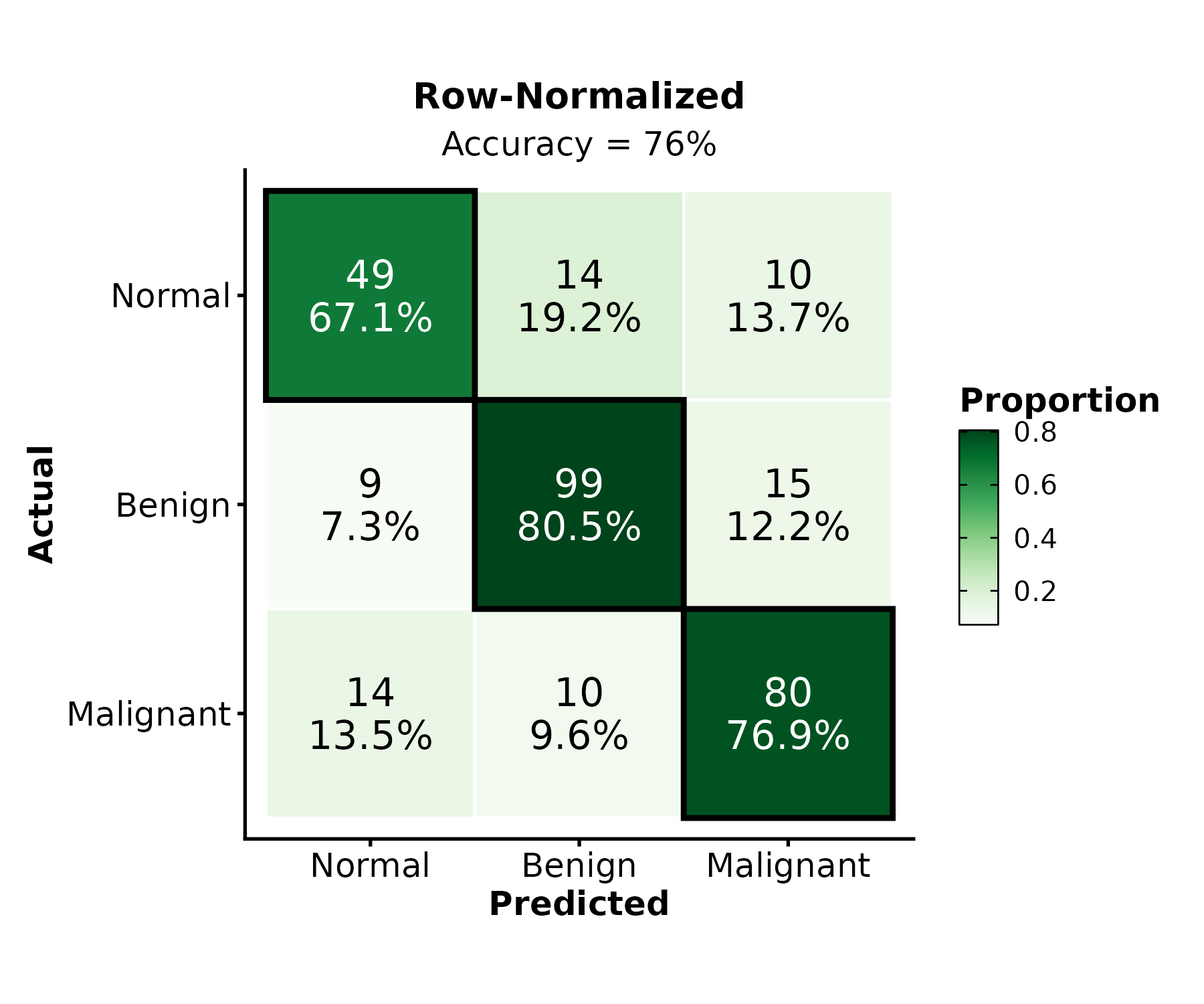
Session Info
sessionInfo()
#> R version 4.6.0 (2026-04-24)
#> Platform: x86_64-pc-linux-gnu
#> Running under: Ubuntu 24.04.4 LTS
#>
#> Matrix products: default
#> BLAS:   /usr/lib/x86_64-linux-gnu/openblas-pthread/libblas.so.3
#> LAPACK: /usr/lib/x86_64-linux-gnu/openblas-pthread/libopenblasp-r0.3.26.so;  LAPACK version 3.12.0
#>
#> locale:
#>  [1] LC_CTYPE=C.UTF-8       LC_NUMERIC=C           LC_TIME=C.UTF-8
#>  [4] LC_COLLATE=C.UTF-8     LC_MONETARY=C.UTF-8    LC_MESSAGES=C.UTF-8
#>  [7] LC_PAPER=C.UTF-8       LC_NAME=C              LC_ADDRESS=C
#> [10] LC_TELEPHONE=C         LC_MEASUREMENT=C.UTF-8 LC_IDENTIFICATION=C
#>
#> time zone: UTC
#> tzcode source: system (glibc)
#>
#> attached base packages:
#> [1] stats     graphics  grDevices utils     datasets  methods   base
#>
#> other attached packages:
#> [1] dplyr_1.2.1   ggforge_2.0.1 ggplot2_4.0.3
#>
#> loaded via a namespace (and not attached):
#>   [1] RColorBrewer_1.1-3      ggdendro_0.2.0          jsonlite_2.0.0
#>   [4] shape_1.4.6.1           magrittr_2.0.5          magick_2.9.1
#>   [7] ggbeeswarm_0.7.3        farver_2.1.2            rmarkdown_2.31
#>  [10] GlobalOptions_0.1.4     fs_2.1.0                ragg_1.5.2
#>  [13] vctrs_0.7.3             Cairo_1.7-0             memoise_2.0.1
#>  [16] rstatix_0.7.3           htmltools_0.5.9         forcats_1.0.1
#>  [19] broom_1.0.13            gridGraphics_0.5-1      Formula_1.2-5
#>  [22] sass_0.4.10             pracma_2.4.6            bslib_0.11.0
#>  [25] htmlwidgets_1.6.4       desc_1.4.3              plyr_1.8.9
#>  [28] zoo_1.8-15              cachem_1.1.0            ggfittext_0.10.3
#>  [31] commonmark_2.0.0        igraph_2.3.2            lifecycle_1.0.5
#>  [34] iterators_1.0.14        pkgconfig_2.0.3         Matrix_1.7-5
#>  [37] R6_2.6.1                fastmap_1.2.0           clue_0.3-68
#>  [40] digest_0.6.39           colorspace_2.1-2        ggnewscale_0.5.2
#>  [43] patchwork_1.3.2         S4Vectors_0.50.1        metR_0.18.3
#>  [46] textshaping_1.0.5       ggpubr_0.6.3            labeling_0.4.3
#>  [49] mgcv_1.9-4              polyclip_1.10-7         abind_1.4-8
#>  [52] compiler_4.6.0          withr_3.0.2             doParallel_1.0.17
#>  [55] S7_0.2.2                backports_1.5.1         carData_3.0-6
#>  [58] viridis_0.6.5           ggupset_0.4.1           ggforce_0.5.0
#>  [61] ggsignif_0.6.4          MASS_7.3-65             proxyC_0.5.2
#>  [64] rjson_0.2.23            caTools_1.18.3          tools_4.6.0
#>  [67] vipor_0.4.7             otel_0.2.0              beeswarm_0.4.0
#>  [70] ape_5.8-1               qqconf_1.3.2            glue_1.8.1
#>  [73] treemapify_2.6.0        nlme_3.1-169            gridtext_0.1.6
#>  [76] grid_4.6.0              checkmate_2.3.4         cluster_2.1.8.2
#>  [79] generics_0.1.4          isoband_0.3.0           qqplotr_0.0.7
#>  [82] gtable_0.3.6            tidyr_1.3.2             data.table_1.18.4
#>  [85] ggVennDiagram_1.5.7     tidygraph_1.3.1         xml2_1.5.2
#>  [88] car_3.1-5               BiocGenerics_0.58.1     markdown_2.0
#>  [91] ggrepel_0.9.8           foreach_1.5.2           pillar_1.11.1
#>  [94] stringr_1.6.0           robustbase_0.99-7       circlize_0.4.18
#>  [97] splines_4.6.0           tweenr_2.0.3            lattice_0.22-9
#> [100] survival_3.8-6          tidyselect_1.2.1        ComplexHeatmap_2.28.0
#> [103] knitr_1.51              gridExtra_2.3           litedown_0.9
#> [106] IRanges_2.46.0          svglite_2.2.2           stats4_4.6.0
#> [109] ggmanh_1.16.0           xfun_0.58               graphlayouts_1.2.3
#> [112] plotROC_2.3.3           matrixStats_1.5.0       DEoptimR_1.2-0
#> [115] stringi_1.8.7           yaml_2.3.12             evaluate_1.0.5
#> [118] codetools_0.2-20        ggwordcloud_0.6.2       ggraph_2.2.2
#> [121] twosamples_2.0.1        tibble_3.3.1            cli_3.6.6
#> [124] pbmcapply_1.5.1         systemfonts_1.3.2       jquerylib_0.1.4
#> [127] dichromat_2.0-0.1       Rcpp_1.1.1-1.1          png_0.1-9
#> [130] parallel_4.6.0          ggstream_0.1.0          pkgdown_2.2.0
#> [133] ggalluvial_0.12.6       opdisDownsampling_1.0.1 bitops_1.0-9
#> [136] viridisLite_0.4.3       ggridges_0.5.7          scales_1.4.0
#> [139] purrr_1.2.2             crayon_1.5.3            GetoptLong_1.1.1
#> [142] rlang_1.2.0