Create box plots with optional grouping, faceting, and statistical comparisons. Box plots display the distribution of continuous data through their quartiles, showing the median, interquartile range, and potential outliers.
Usage
BoxPlot(
  data,
  x,
  x_sep = "_",
  y = NULL,
  in_form = c("long", "wide"),
  split_by = NULL,
  split_by_sep = "_",
  symnum_args = NULL,
  sort_x = NULL,
  flip = FALSE,
  keep_empty = FALSE,
  group_by = NULL,
  group_by_sep = "_",
  group_name = NULL,
  paired_by = NULL,
  x_text_angle = NULL,
  step_increase = 0.1,
  fill_mode = ifelse(!is.null(group_by), "dodge", "x"),
  fill_reverse = FALSE,
  theme = "theme_ggforge",
  theme_args = list(),
  palette = "forge",
  palcolor = NULL,
  alpha = 1,
  aspect.ratio = NULL,
  legend.position = "right",
  legend.direction = "vertical",
  add_point = FALSE,
  pt_color = "grey30",
  pt_size = NULL,
  pt_alpha = 1,
  jitter_width = NULL,
  jitter_height = 0,
  add_beeswarm = FALSE,
  beeswarm_method = "swarm",
  beeswarm_cex = 1,
  beeswarm_priority = "ascending",
  beeswarm_dodge = 0.9,
  stack = FALSE,
  y_max = NULL,
  y_min = NULL,
  add_trend = FALSE,
  trend_color = NULL,
  trend_linewidth = 1,
  trend_ptsize = 2,
  add_stat = NULL,
  stat_name = NULL,
  stat_color = "black",
  stat_size = 1,
  stat_stroke = 1,
  stat_shape = 25,
  add_bg = FALSE,
  bg_palette = "stripe",
  bg_palcolor = NULL,
  bg_alpha = 0.2,
  add_line = NULL,
  line_color = "red2",
  line_width = 0.6,
  line_type = 2,
  highlight = NULL,
  highlight_color = "red2",
  highlight_size = 1,
  highlight_alpha = 1,
  comparisons = NULL,
  ref_group = NULL,
  pairwise_method = "wilcox.test",
  multiplegroup_comparisons = FALSE,
  multiple_method = "kruskal.test",
  sig_label = "p.format",
  sig_labelsize = 3.5,
  hide_ns = FALSE,
  facet_by = NULL,
  facet_scales = "fixed",
  facet_ncol = NULL,
  facet_nrow = NULL,
  facet_byrow = TRUE,
  title = NULL,
  subtitle = NULL,
  xlab = NULL,
  ylab = NULL,
  seed = 8525,
  combine = TRUE,
  nrow = NULL,
  ncol = NULL,
  byrow = TRUE,
  axes = NULL,
  axis_titles = axes,
  guides = NULL,
  ...
)
Arguments
- data
A data frame containing the data to plot
- x
Column for x-axis (discrete). Can be a single column name or multiple columns that will be concatenated.
- x_sep
Separator for concatenating multiple x columns.
- y
Column for y-axis (numeric). The response variable.
- in_form
Input data form: "long" (default) or "wide"
- split_by
Column name(s) to split data into multiple plots
- split_by_sep
Separator when concatenating multiple split_by columns
- symnum_args
Symbolic number coding arguments for significance
- sort_x
Expression string to sort x-axis values, or NULL for no sorting. Legacy values supported: "none", "mean_asc", "mean_desc", "mean", "median_asc", "median_desc", "median". Custom expressions also accepted (e.g., "mean(value)", "-median(value)").
- flip
Logical; flip coordinates to create horizontal plots
- keep_empty
Logical; keep empty factor levels on x-axis
- group_by
Column for grouping (creates dodged/side-by-side plots)
- group_by_sep
Separator when concatenating multiple group_by columns
- group_name
Legend name for groups
- paired_by
Column identifying paired observations (for paired tests)
- x_text_angle
Angle for x-axis text labels
- step_increase
Step increase for comparison brackets
- fill_mode
Fill coloring mode: "dodge", "x", "mean", or "median"
- fill_reverse
Logical; reverse gradient fills
- theme
Theme name (string) or theme function
- theme_args
List of arguments passed to theme function
- palette
Color palette name
- palcolor
Custom colors for palette
- alpha
Transparency level (0-1)
- aspect.ratio
Aspect ratio of plot panel
- legend.position
Legend position: "none", "left", "right", "bottom", "top"
- legend.direction
Legend direction: "horizontal" or "vertical"
- add_point
Logical; add jittered data points
- pt_color
Point color (default: "grey30")
- pt_size
Point size (auto-calculated if NULL)
- pt_alpha
Point transparency (0-1)
- jitter_width
Jitter width for points
- jitter_height
Jitter height for points
- add_beeswarm
Logical; use beeswarm layout instead of jitter for points. Requires the ggbeeswarm package. Not compatible with paired_by.
- beeswarm_method
Beeswarm method: "swarm", "compactswarm", "hex", "square", or "center"
- beeswarm_cex
Scaling for point spacing in beeswarm (default: 1)
- beeswarm_priority
Point layout priority: "ascending", "descending", "density", or "random"
- beeswarm_dodge
Dodge width for grouped beeswarm points (default: 0.9)
- stack
Logical; stack facets vertically/horizontally
- y_max
Y-axis maximum (numeric or "qXX" for quantile)
- y_min
Y-axis minimum (numeric or "qXX" for quantile)
- add_trend
Logical; add trend line connecting medians
- trend_color
Trend line color
- trend_linewidth
Trend line width
- trend_ptsize
Trend point size
- add_stat
Function to add stat summary (e.g., mean)
- stat_name
Stat legend name
- stat_color
Stat point color
- stat_size
Stat point size
- stat_stroke
Stat point stroke width
- stat_shape
Stat point shape
- add_bg
Logical; add alternating background
- bg_palette
Background color palette
- bg_palcolor
Background custom colors
- bg_alpha
Background transparency
- add_line
Numeric; add horizontal reference line at this value
- line_color
Reference line color
- line_width
Reference line width
- line_type
Reference line type
- highlight
Points to highlight (logical, indices, or expression)
- highlight_color
Highlight color
- highlight_size
Highlight size
- highlight_alpha
Highlight transparency
- comparisons
Pairwise comparisons (list of pairs or TRUE for all)
- ref_group
Reference group for comparisons
- pairwise_method
Statistical method for pairwise comparisons
- multiplegroup_comparisons
Logical; perform multiple group comparisons
- multiple_method
Statistical method for multiple comparisons
- sig_label
Significance label format: "p.format" or "p.signif"
- sig_labelsize
Significance label font size
- hide_ns
Logical; hide non-significant comparisons
- facet_by
Column name(s) for faceting the plot
- facet_scales
Scales for facets: "fixed", "free", "free_x", "free_y"
- facet_ncol
Number of columns in facet layout
- facet_nrow
Number of rows in facet layout
- facet_byrow
Fill facets by row (TRUE) or column (FALSE)
- title
Plot title
- subtitle
Plot subtitle
- xlab
X-axis label
- ylab
Y-axis label
- seed
Random seed for reproducibility
- combine
Whether to combine split plots into one
- nrow
Number of rows when combining plots
- ncol
Number of columns when combining plots
- byrow
Fill combined plots by row
- axes
How to handle axes in combined plots ("keep", "collect", "collect_x", "collect_y")
- axis_titles
How to handle axis titles in combined plots
- guides
How to handle guides in combined plots ("collect", "keep", "auto")
- ...
Additional arguments passed to atomic plotting functions.
See also
Examples
# \donttest{
# ============================================================
# Basic Examples
# ============================================================
# Create sample data
set.seed(123)
data <- data.frame(
group = rep(LETTERS[1:4], each = 25),
value = c(
rnorm(25, 10, 2), rnorm(25, 12, 2),
rnorm(25, 11, 3), rnorm(25, 14, 2)
),
treatment = rep(c("Control", "Treatment"), 50),
gender = sample(c("Male", "Female"), 100, replace = TRUE)
)
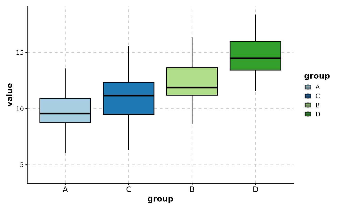
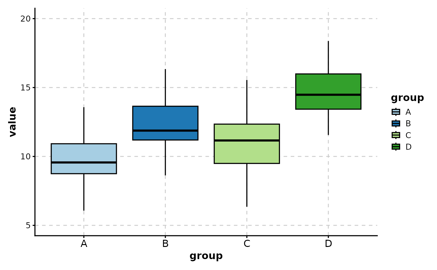
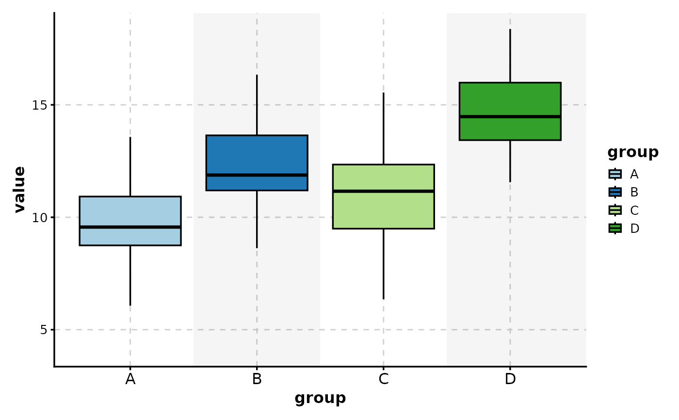
# Simple box plot
BoxPlot(data, x = "group", y = "value")
 # Box plot with custom labels
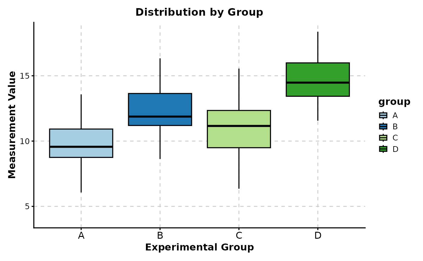
BoxPlot(data,
x = "group", y = "value",
title = "Distribution by Group",
xlab = "Experimental Group",
ylab = "Measurement Value"
)
# Box plot with custom labels
BoxPlot(data,
x = "group", y = "value",
title = "Distribution by Group",
xlab = "Experimental Group",
ylab = "Measurement Value"
)
 # ============================================================
# Grouped Box Plots
# ============================================================
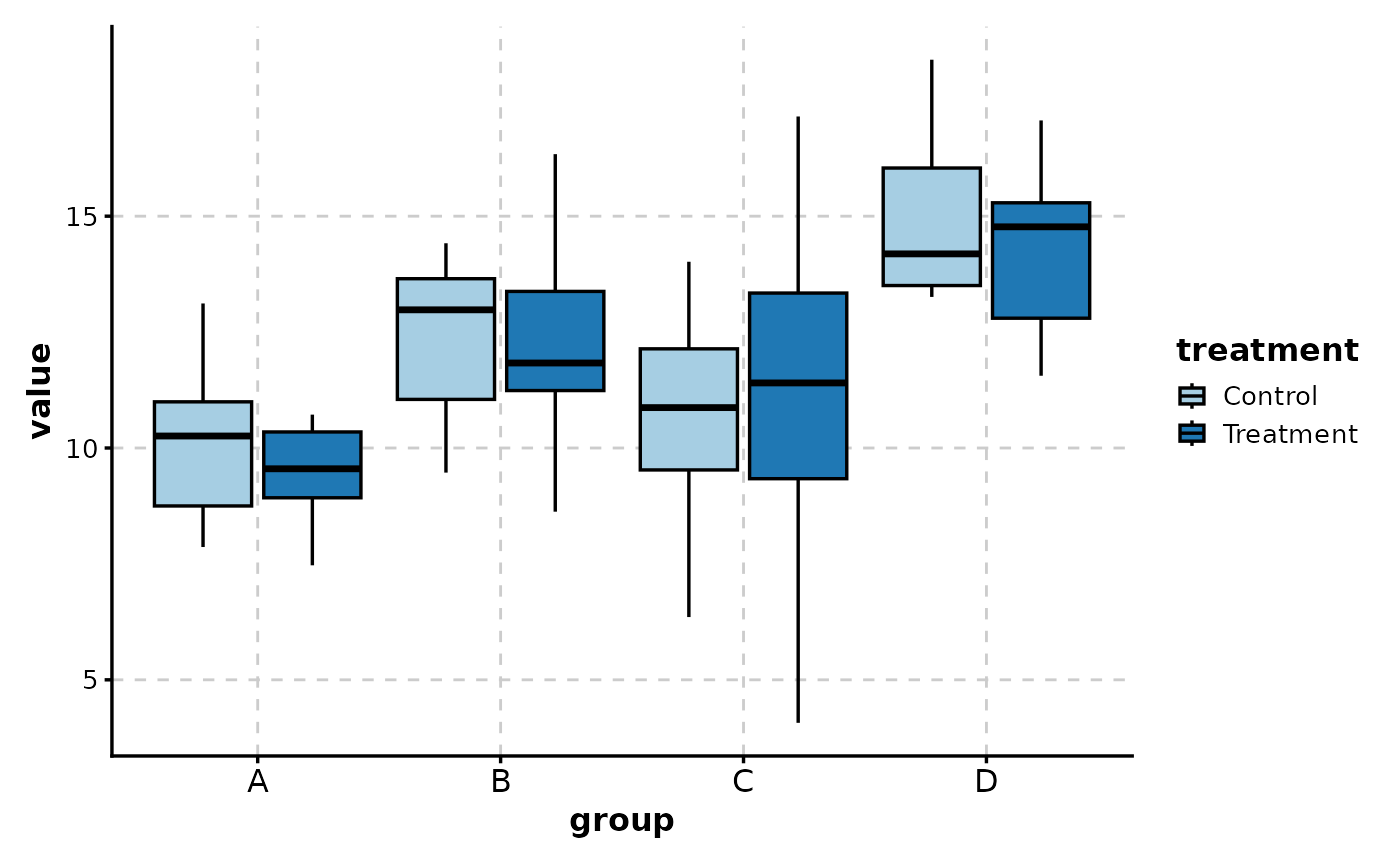
# Side-by-side (dodged) box plots by treatment
BoxPlot(data, x = "group", y = "value", group_by = "treatment")
# ============================================================
# Grouped Box Plots
# ============================================================
# Side-by-side (dodged) box plots by treatment
BoxPlot(data, x = "group", y = "value", group_by = "treatment")
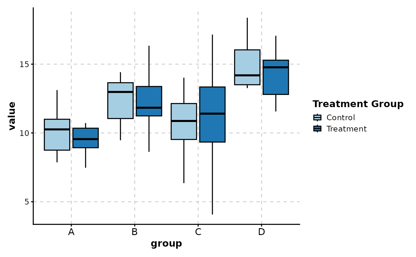
 # With custom group legend name
BoxPlot(data,
x = "group", y = "value",
group_by = "treatment",
group_name = "Treatment Group"
)
# With custom group legend name
BoxPlot(data,
x = "group", y = "value",
group_by = "treatment",
group_name = "Treatment Group"
)
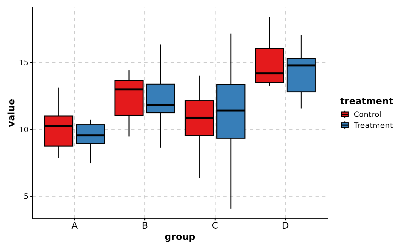
 # With custom color palette
BoxPlot(data,
x = "group", y = "value",
group_by = "treatment",
palette = "Set1"
)
# With custom color palette
BoxPlot(data,
x = "group", y = "value",
group_by = "treatment",
palette = "Set1"
)
 # ============================================================
# Adding Data Points
# ============================================================
# Add jittered points to show individual observations
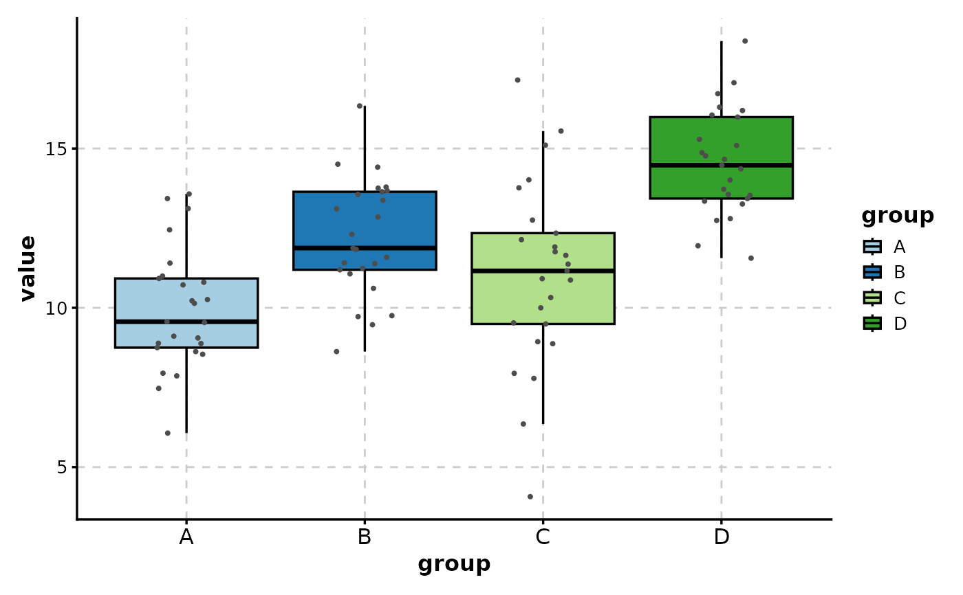
BoxPlot(data, x = "group", y = "value", add_point = TRUE)
# ============================================================
# Adding Data Points
# ============================================================
# Add jittered points to show individual observations
BoxPlot(data, x = "group", y = "value", add_point = TRUE)
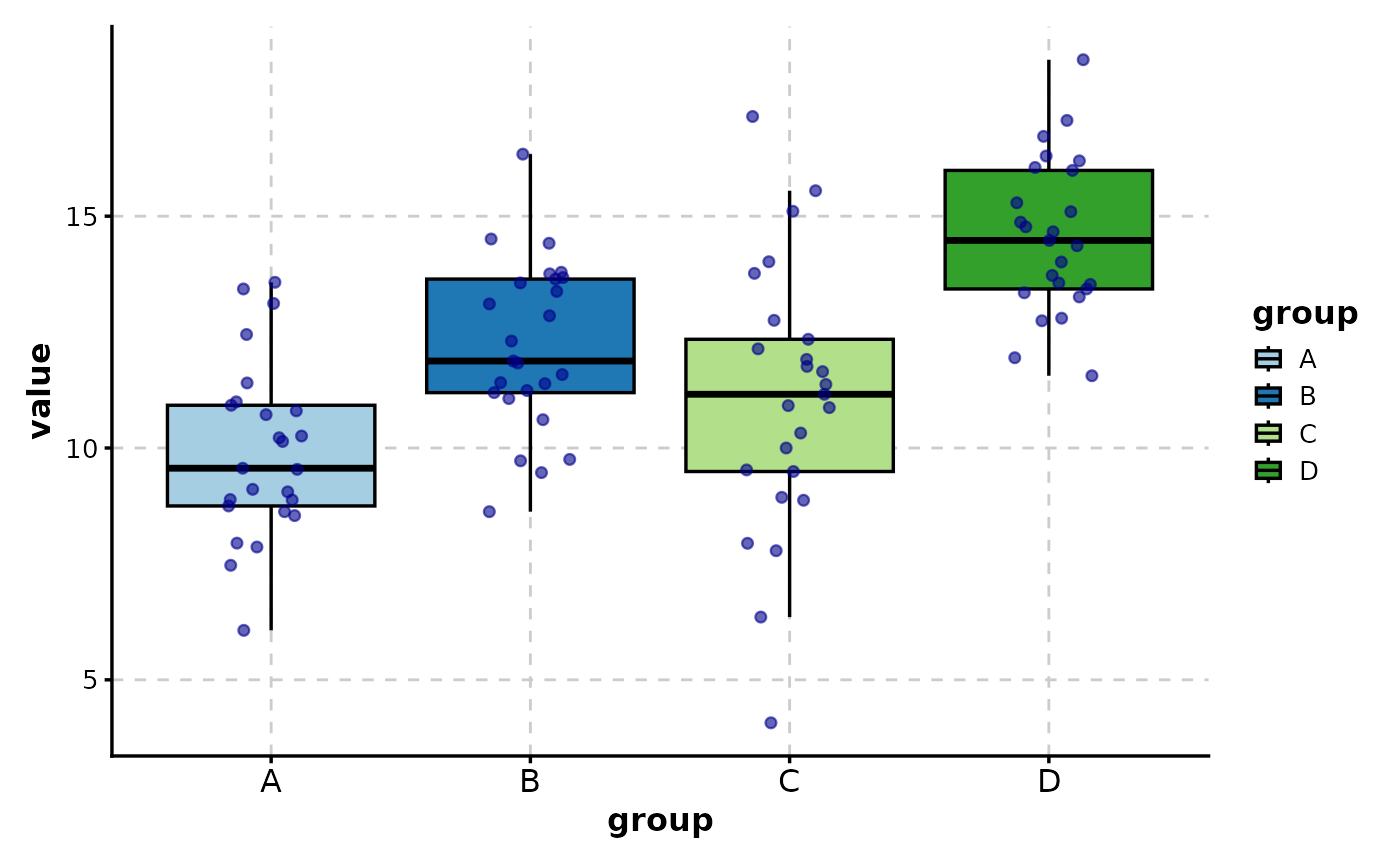
 # Customize point appearance
BoxPlot(data,
x = "group", y = "value",
add_point = TRUE,
pt_color = "darkblue",
pt_size = 1.5,
pt_alpha = 0.6
)
# Customize point appearance
BoxPlot(data,
x = "group", y = "value",
add_point = TRUE,
pt_color = "darkblue",
pt_size = 1.5,
pt_alpha = 0.6
)
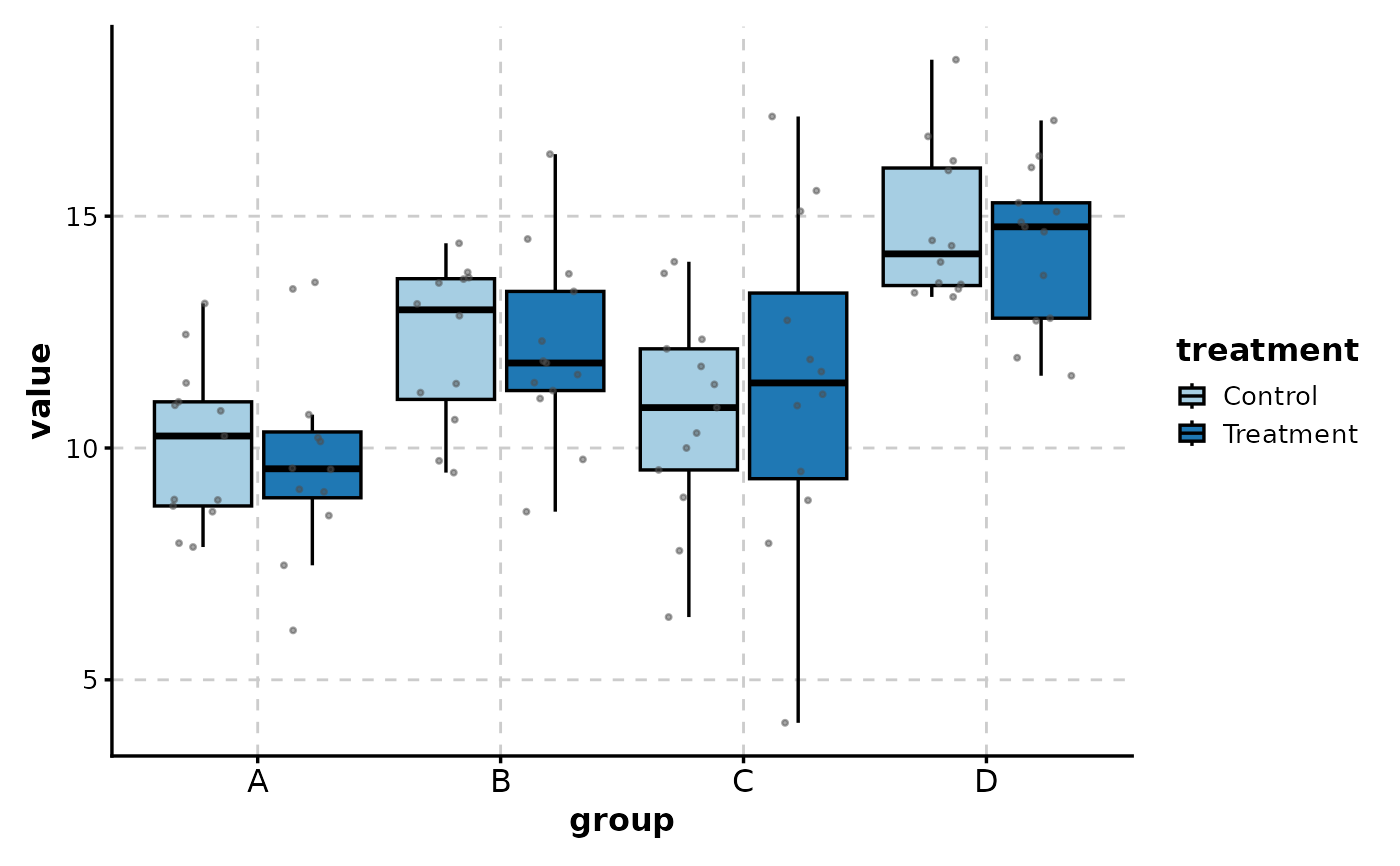
 # With grouped data
BoxPlot(data,
x = "group", y = "value",
group_by = "treatment",
add_point = TRUE,
pt_alpha = 0.5
)
# With grouped data
BoxPlot(data,
x = "group", y = "value",
group_by = "treatment",
add_point = TRUE,
pt_alpha = 0.5
)
 # ============================================================
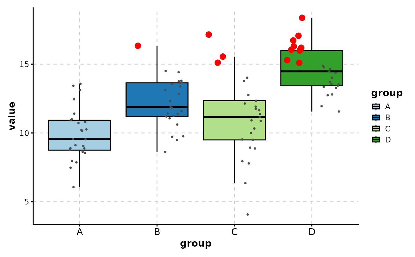
# Highlighting Specific Points
# ============================================================
# Highlight outliers or specific observations
BoxPlot(data,
x = "group", y = "value",
add_point = TRUE,
highlight = "value > 15",
highlight_color = "red",
highlight_size = 3
)
# ============================================================
# Highlighting Specific Points
# ============================================================
# Highlight outliers or specific observations
BoxPlot(data,
x = "group", y = "value",
add_point = TRUE,
highlight = "value > 15",
highlight_color = "red",
highlight_size = 3
)
 # Highlight by row indices
BoxPlot(data,
x = "group", y = "value",
add_point = TRUE,
highlight = c(1, 5, 10, 15),
highlight_color = "orange"
)
# Highlight by row indices
BoxPlot(data,
x = "group", y = "value",
add_point = TRUE,
highlight = c(1, 5, 10, 15),
highlight_color = "orange"
)
 # ============================================================
# Statistical Comparisons
# ============================================================
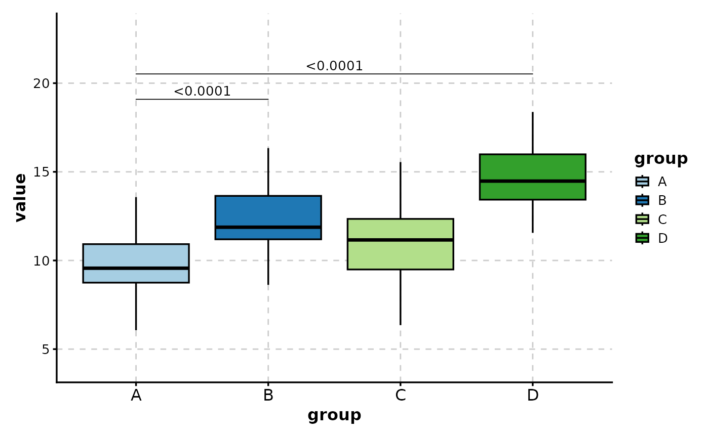
# Compare specific pairs
BoxPlot(data,
x = "group", y = "value",
comparisons = list(c("A", "B"), c("A", "D"))
)
# ============================================================
# Statistical Comparisons
# ============================================================
# Compare specific pairs
BoxPlot(data,
x = "group", y = "value",
comparisons = list(c("A", "B"), c("A", "D"))
)
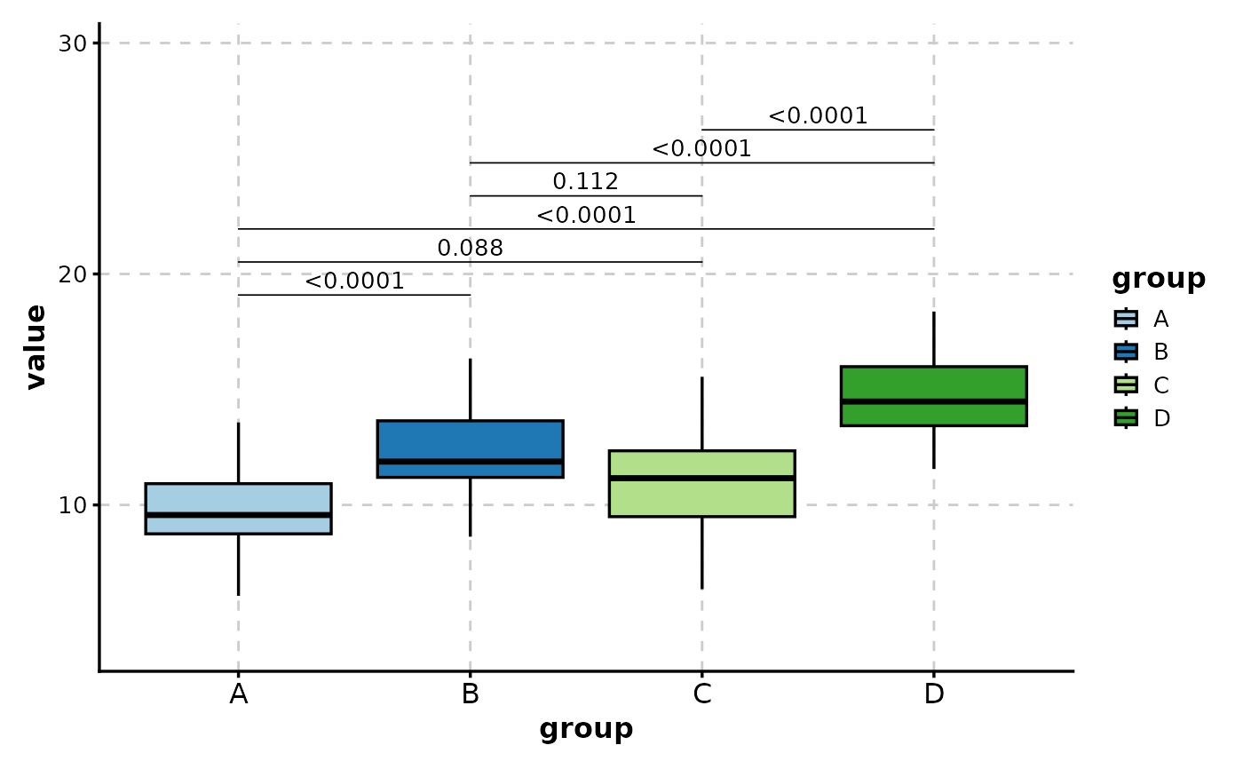
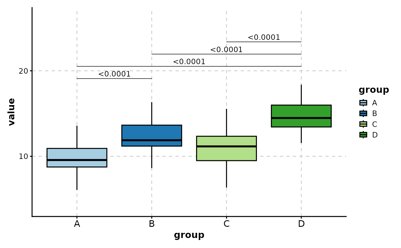
 # Compare all pairs
BoxPlot(data,
x = "group", y = "value",
comparisons = TRUE
)
# Compare all pairs
BoxPlot(data,
x = "group", y = "value",
comparisons = TRUE
)
 # Use t-test instead of Wilcoxon
BoxPlot(data,
x = "group", y = "value",
comparisons = list(c("A", "D")),
pairwise_method = "t.test"
)
# Use t-test instead of Wilcoxon
BoxPlot(data,
x = "group", y = "value",
comparisons = list(c("A", "D")),
pairwise_method = "t.test"
)
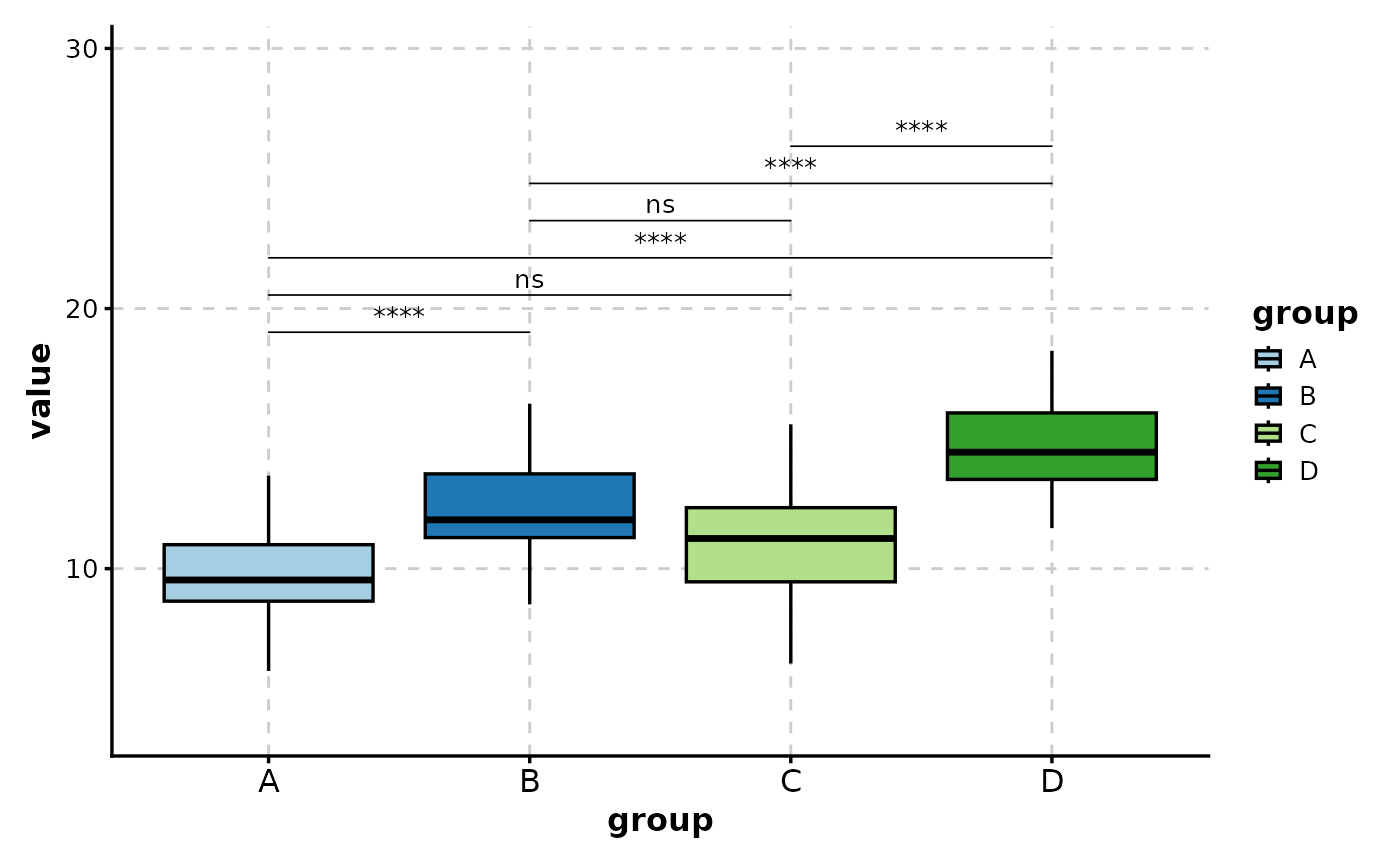
 # Show significance symbols instead of p-values
BoxPlot(data,
x = "group", y = "value",
comparisons = TRUE,
sig_label = "p.signif"
)
# Show significance symbols instead of p-values
BoxPlot(data,
x = "group", y = "value",
comparisons = TRUE,
sig_label = "p.signif"
)
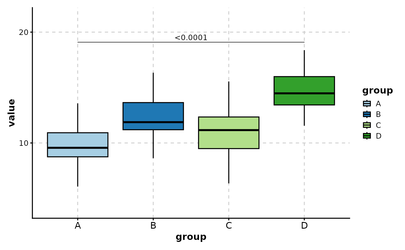
 # Hide non-significant comparisons
BoxPlot(data,
x = "group", y = "value",
comparisons = TRUE,
hide_ns = TRUE
)
# Hide non-significant comparisons
BoxPlot(data,
x = "group", y = "value",
comparisons = TRUE,
hide_ns = TRUE
)
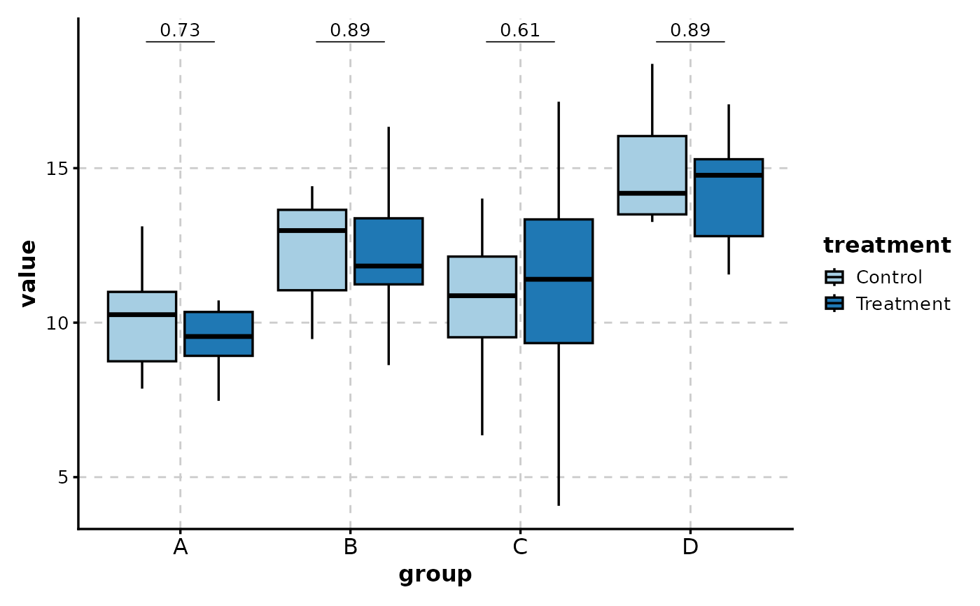
 # With grouped data - compare groups within each x category
BoxPlot(data,
x = "group", y = "value",
group_by = "treatment",
comparisons = TRUE
)
# With grouped data - compare groups within each x category
BoxPlot(data,
x = "group", y = "value",
group_by = "treatment",
comparisons = TRUE
)
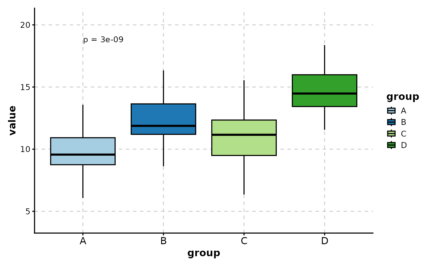
 # Multiple group comparison (Kruskal-Wallis)
BoxPlot(data,
x = "group", y = "value",
multiplegroup_comparisons = TRUE
)
# Multiple group comparison (Kruskal-Wallis)
BoxPlot(data,
x = "group", y = "value",
multiplegroup_comparisons = TRUE
)
 # ============================================================
# Paired Data Analysis
# ============================================================
# Create paired data (before/after measurements)
paired_data <- data.frame(
time = factor(rep(c("Before", "After"), each = 20)),
subject = factor(rep(1:20, 2)),
score = c(rnorm(20, 50, 10), rnorm(20, 55, 10))
)
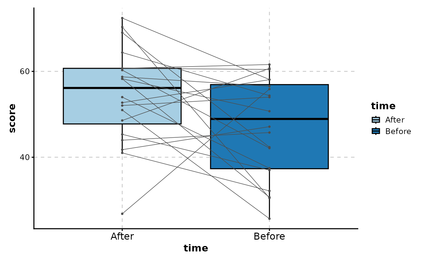
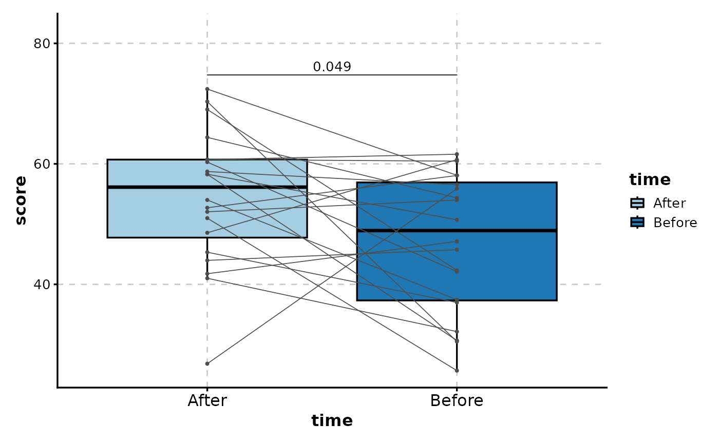
# Paired box plot with connecting lines
BoxPlot(paired_data,
x = "time", y = "score",
paired_by = "subject",
add_point = TRUE
)
# ============================================================
# Paired Data Analysis
# ============================================================
# Create paired data (before/after measurements)
paired_data <- data.frame(
time = factor(rep(c("Before", "After"), each = 20)),
subject = factor(rep(1:20, 2)),
score = c(rnorm(20, 50, 10), rnorm(20, 55, 10))
)
# Paired box plot with connecting lines
BoxPlot(paired_data,
x = "time", y = "score",
paired_by = "subject",
add_point = TRUE
)
 # With paired statistical test
BoxPlot(paired_data,
x = "time", y = "score",
paired_by = "subject",
comparisons = list(c("Before", "After")),
pairwise_method = "t.test"
)
#> Warning: Forcing `add_point = TRUE` when `paired_by` is provided.
# With paired statistical test
BoxPlot(paired_data,
x = "time", y = "score",
paired_by = "subject",
comparisons = list(c("Before", "After")),
pairwise_method = "t.test"
)
#> Warning: Forcing `add_point = TRUE` when `paired_by` is provided.
 # ============================================================
# Sorting and Orientation
# ============================================================
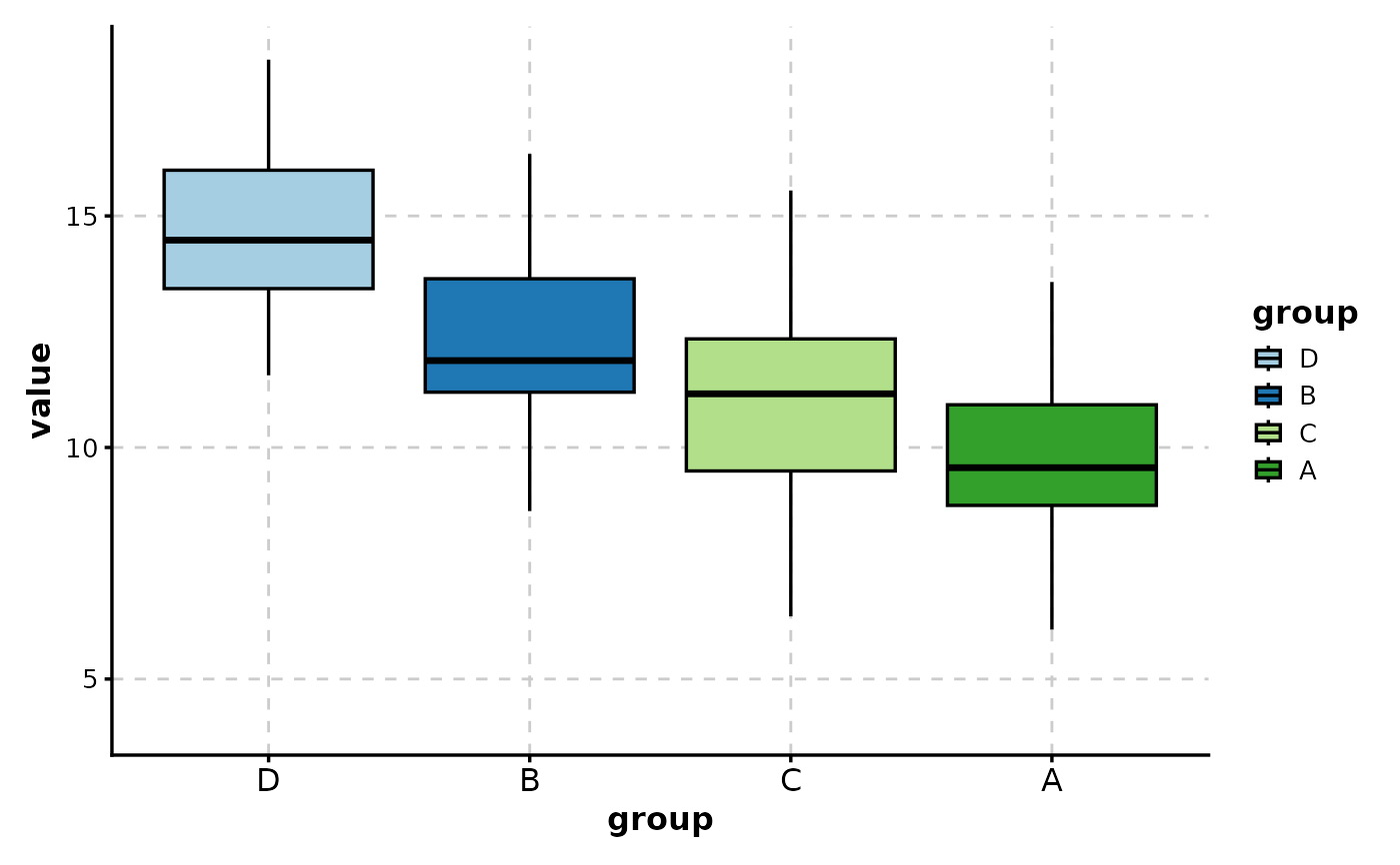
# Sort by mean value (ascending)
BoxPlot(data, x = "group", y = "value", sort_x = "mean_asc")
# ============================================================
# Sorting and Orientation
# ============================================================
# Sort by mean value (ascending)
BoxPlot(data, x = "group", y = "value", sort_x = "mean_asc")
 # Sort by median value (descending)
BoxPlot(data, x = "group", y = "value", sort_x = "median_desc")
# Sort by median value (descending)
BoxPlot(data, x = "group", y = "value", sort_x = "median_desc")
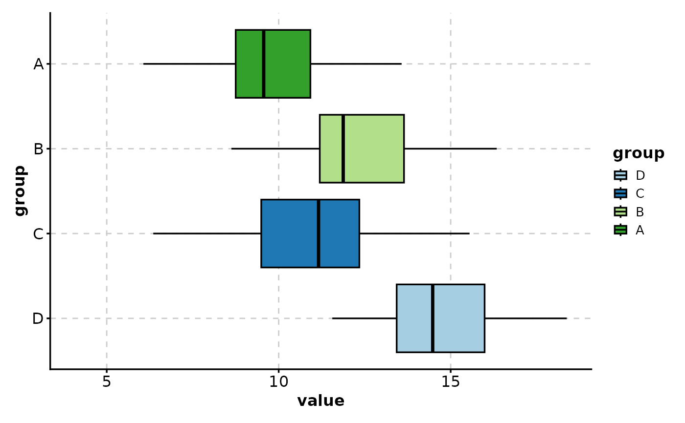
 # Horizontal box plot
BoxPlot(data, x = "group", y = "value", flip = TRUE)
# Horizontal box plot
BoxPlot(data, x = "group", y = "value", flip = TRUE)
 # ============================================================
# Axis Customization
# ============================================================
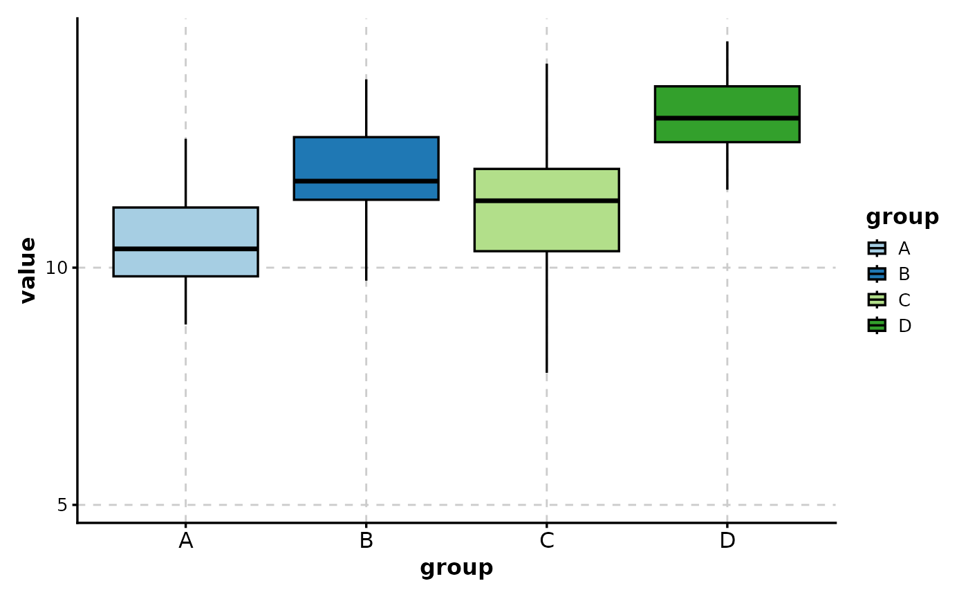
# Set y-axis limits
BoxPlot(data,
x = "group", y = "value",
y_min = 5, y_max = 20
)
# ============================================================
# Axis Customization
# ============================================================
# Set y-axis limits
BoxPlot(data,
x = "group", y = "value",
y_min = 5, y_max = 20
)
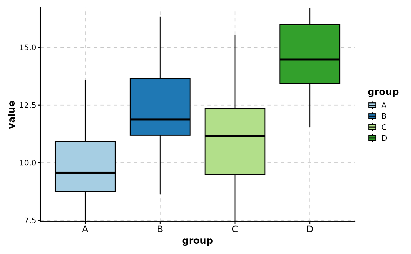
 # Use quantiles for y-axis limits (exclude extreme values)
BoxPlot(data,
x = "group", y = "value",
y_min = "q5", y_max = "q95"
)
# Use quantiles for y-axis limits (exclude extreme values)
BoxPlot(data,
x = "group", y = "value",
y_min = "q5", y_max = "q95"
)
 # Log-transform y-axis
pos_data <- data
pos_data$value <- abs(pos_data$value) + 1
BoxPlot(pos_data,
x = "group", y = "value",
y_trans = "log10"
)
# Log-transform y-axis
pos_data <- data
pos_data$value <- abs(pos_data$value) + 1
BoxPlot(pos_data,
x = "group", y = "value",
y_trans = "log10"
)
 # ============================================================
# Visual Enhancements
# ============================================================
# Add trend line connecting medians
BoxPlot(data, x = "group", y = "value", add_trend = TRUE)
# ============================================================
# Visual Enhancements
# ============================================================
# Add trend line connecting medians
BoxPlot(data, x = "group", y = "value", add_trend = TRUE)
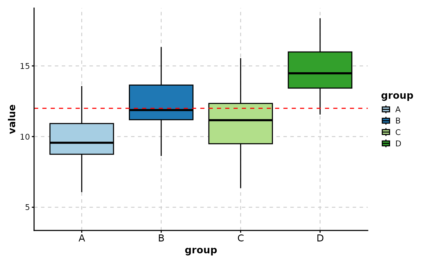
 # Add reference line
BoxPlot(data,
x = "group", y = "value",
add_line = 12,
line_color = "red",
line_type = 2
)
# Add reference line
BoxPlot(data,
x = "group", y = "value",
add_line = 12,
line_color = "red",
line_type = 2
)
 # Add alternating background
BoxPlot(data,
x = "group", y = "value",
add_bg = TRUE,
bg_alpha = 0.1
)
# Add alternating background
BoxPlot(data,
x = "group", y = "value",
add_bg = TRUE,
bg_alpha = 0.1
)
 # Add mean indicator
BoxPlot(data,
x = "group", y = "value",
add_stat = mean,
stat_name = "Mean",
stat_color = "red",
stat_shape = 18
)
# Add mean indicator
BoxPlot(data,
x = "group", y = "value",
add_stat = mean,
stat_name = "Mean",
stat_color = "red",
stat_shape = 18
)
 # ============================================================
# Faceting
# ============================================================
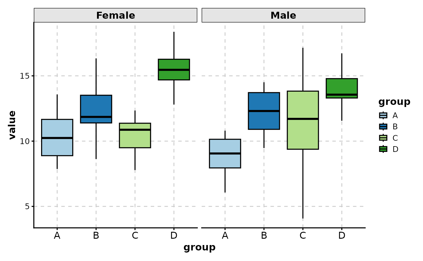
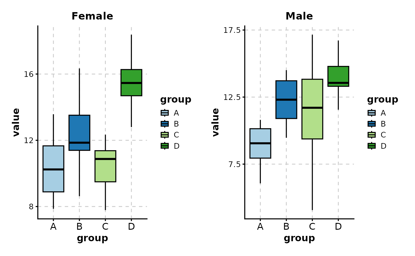
# Facet by another variable
BoxPlot(data,
x = "group", y = "value",
facet_by = "gender"
)
# ============================================================
# Faceting
# ============================================================
# Facet by another variable
BoxPlot(data,
x = "group", y = "value",
facet_by = "gender"
)
 # Control facet layout
BoxPlot(data,
x = "group", y = "value",
facet_by = "gender",
facet_ncol = 2
)
# Control facet layout
BoxPlot(data,
x = "group", y = "value",
facet_by = "gender",
facet_ncol = 2
)
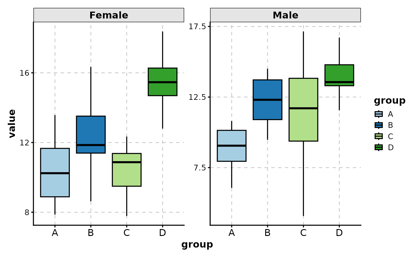
 # Free y-axis scales per facet
BoxPlot(data,
x = "group", y = "value",
facet_by = "gender",
facet_scales = "free_y"
)
# Free y-axis scales per facet
BoxPlot(data,
x = "group", y = "value",
facet_by = "gender",
facet_scales = "free_y"
)
 # ============================================================
# Fill Modes
# ============================================================
# Fill by x-axis category (default when no group_by)
BoxPlot(data, x = "group", y = "value", fill_mode = "x")
# ============================================================
# Fill Modes
# ============================================================
# Fill by x-axis category (default when no group_by)
BoxPlot(data, x = "group", y = "value", fill_mode = "x")
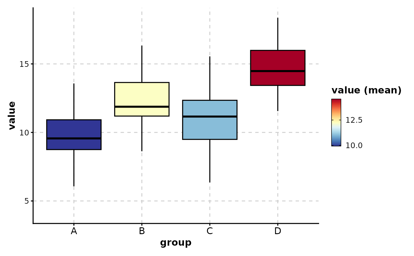
 # Fill by mean value (gradient)
BoxPlot(data,
x = "group", y = "value",
fill_mode = "mean",
palette = "RdYlBu"
)
# Fill by mean value (gradient)
BoxPlot(data,
x = "group", y = "value",
fill_mode = "mean",
palette = "RdYlBu"
)
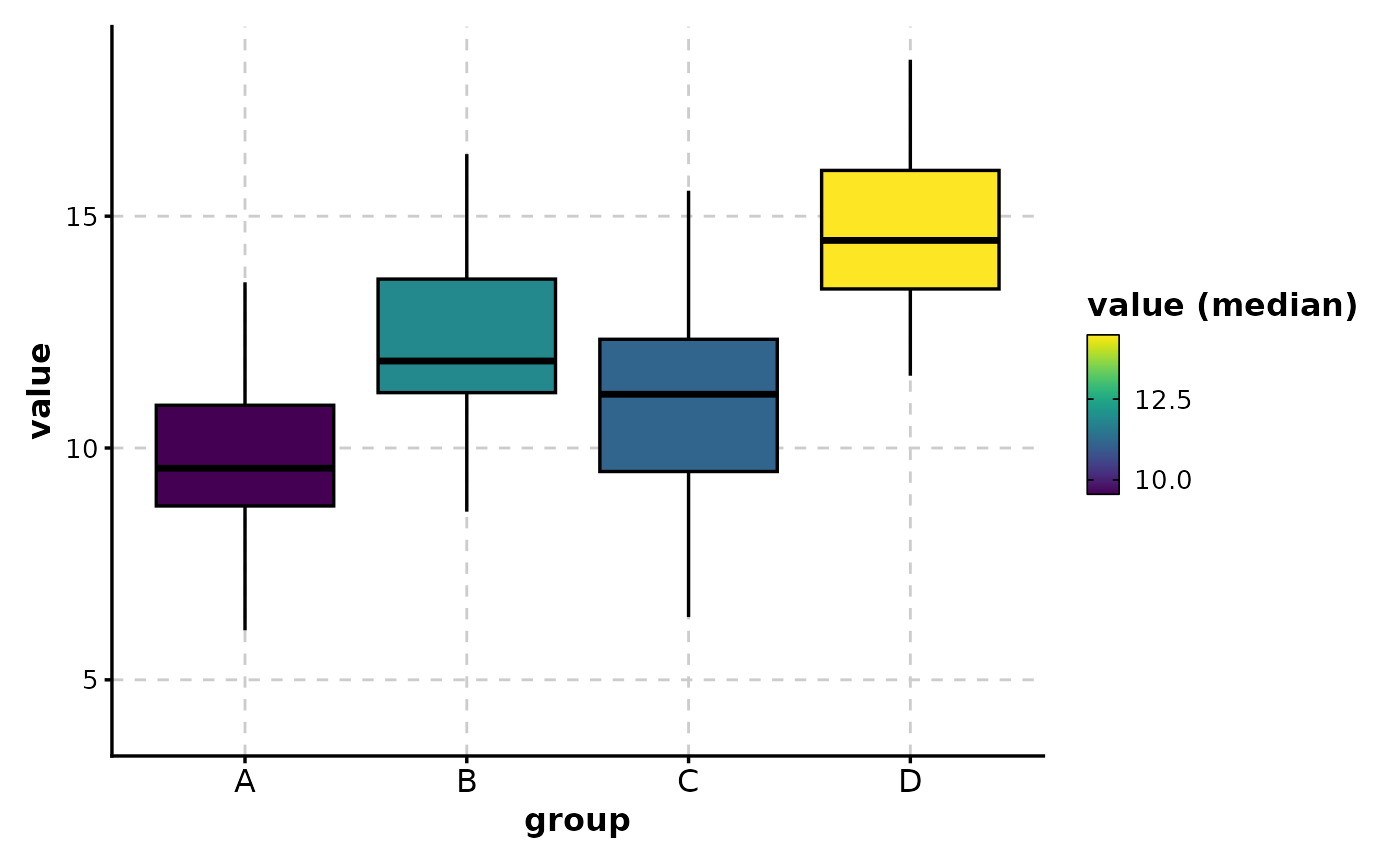
 # Fill by median value (gradient)
BoxPlot(data,
x = "group", y = "value",
fill_mode = "median",
palette = "viridis"
)
# Fill by median value (gradient)
BoxPlot(data,
x = "group", y = "value",
fill_mode = "median",
palette = "viridis"
)
 # ============================================================
# Wide Format Data
# ============================================================
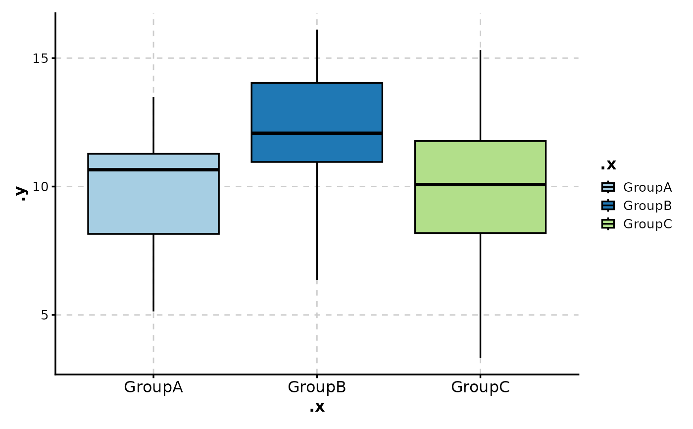
# Wide format: each column is a group
wide_data <- data.frame(
GroupA = rnorm(30, 10, 2),
GroupB = rnorm(30, 12, 2),
GroupC = rnorm(30, 11, 3)
)
BoxPlot(wide_data,
x = c("GroupA", "GroupB", "GroupC"),
in_form = "wide"
)
# ============================================================
# Wide Format Data
# ============================================================
# Wide format: each column is a group
wide_data <- data.frame(
GroupA = rnorm(30, 10, 2),
GroupB = rnorm(30, 12, 2),
GroupC = rnorm(30, 11, 3)
)
BoxPlot(wide_data,
x = c("GroupA", "GroupB", "GroupC"),
in_form = "wide"
)
 # ============================================================
# Splitting into Multiple Plots
# ============================================================
# Create separate plots by a variable
BoxPlot(data,
x = "group", y = "value",
split_by = "gender",
combine = TRUE,
ncol = 2
)
# ============================================================
# Splitting into Multiple Plots
# ============================================================
# Create separate plots by a variable
BoxPlot(data,
x = "group", y = "value",
split_by = "gender",
combine = TRUE,
ncol = 2
)
 # ============================================================
# Theme and Style Customization
# ============================================================
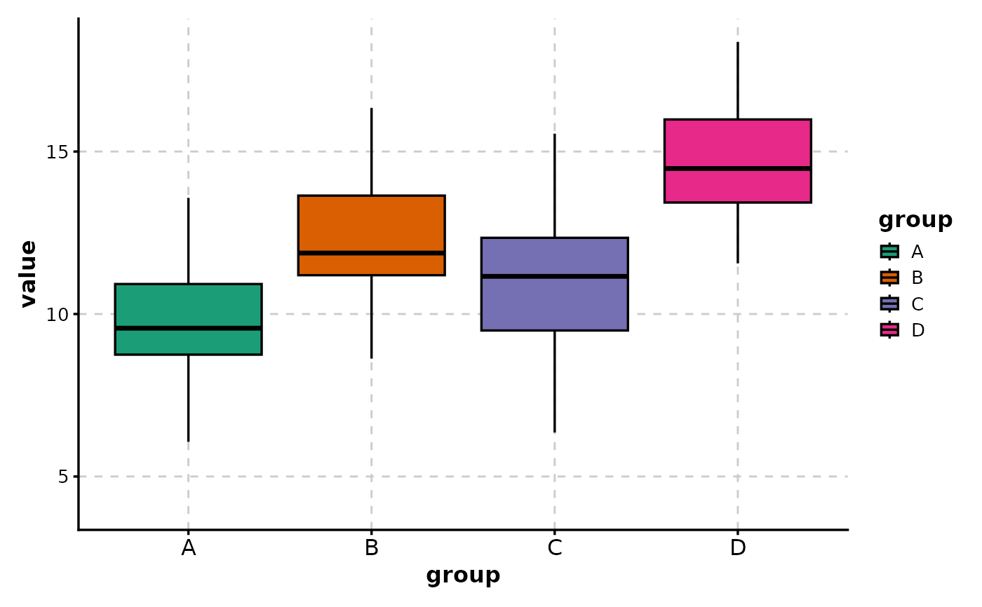
# Custom color palette
BoxPlot(data,
x = "group", y = "value",
palette = "Dark2"
)
# ============================================================
# Theme and Style Customization
# ============================================================
# Custom color palette
BoxPlot(data,
x = "group", y = "value",
palette = "Dark2"
)
 # Custom colors
BoxPlot(data,
x = "group", y = "value",
palcolor = c(
"A" = "#E41A1C", "B" = "#377EB8",
"C" = "#4DAF4A", "D" = "#984EA3"
)
)
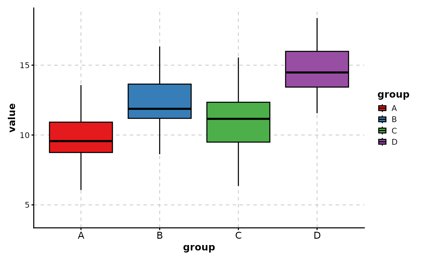
# Custom colors
BoxPlot(data,
x = "group", y = "value",
palcolor = c(
"A" = "#E41A1C", "B" = "#377EB8",
"C" = "#4DAF4A", "D" = "#984EA3"
)
)
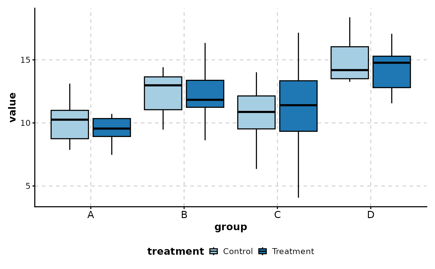
 # Legend position
BoxPlot(data,
x = "group", y = "value",
group_by = "treatment",
legend.position = "bottom",
legend.direction = "horizontal"
)
# Legend position
BoxPlot(data,
x = "group", y = "value",
group_by = "treatment",
legend.position = "bottom",
legend.direction = "horizontal"
)
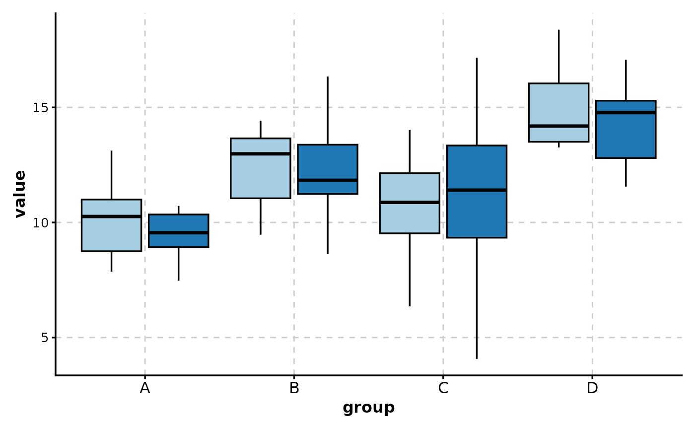
 # Hide legend
BoxPlot(data,
x = "group", y = "value",
group_by = "treatment",
legend.position = "none"
)
# Hide legend
BoxPlot(data,
x = "group", y = "value",
group_by = "treatment",
legend.position = "none"
)
 # }
# }