Introduction
ggforge is a ggplot2 extension that provides 77 high-level plotting functions with publication-oriented defaults. It is inspired by and modified from plotthis by Panwen Wang, with enhancements for broader scientific coverage and a unified API.
Key Features
- 77 plotting functions across 13 scientific categories
- Unified API:
data,x,y,group_by,split_by,palettework consistently - Intelligent variable type detection and automatic styling
- 200+ color palettes (RColorBrewer, ggsci, viridis, Tableau, and more)
- Multi-panel layouts via
split_by+combinepowered by patchwork - Publication-oriented themes and typography
Installation
install.packages("ggforge", repos = "https://zaoqu-liu.r-universe.dev")Core Concepts
Unified API
All ggforge functions follow a consistent pattern:
PlotFunction(
  data,                    # Data frame or matrix
  x, y,                    # Primary aesthetics
  group_by = NULL,         # Grouping variable (discrete colors)
  split_by = NULL,         # Split into multiple panels
  palette = "Paired",      # Color palette name
  theme = "theme_ggforge", # Theme function
  ...                      # Function-specific parameters
)
Intelligent Type Detection
ggforge detects variable types and applies appropriate styling:
- Continuous → gradient color scales
- Discrete → categorical color palettes
- Temporal → time axis formatting
Split and Combine
Create multi-panel figures with split_by:
BoxPlot(..., split_by = "group", combine = TRUE, nrow = 1)Category 1: Statistics
Scatter Plot
scatter_data <- data.frame(
  gene_A = rnorm(100, 8, 2), gene_B = rnorm(100, 8, 2),
  tissue = sample(c("Normal", "Tumor"), 100, replace = TRUE)
)
scatter_data$gene_B <- scatter_data$gene_B + 0.6 * scatter_data$gene_A

ScatterPlot(scatter_data, x = "gene_A", y = "gene_B",
  group_by = "tissue", palette = "npg",
  add_smooth = TRUE, add_stat = TRUE,
  title = "Gene Expression Correlation")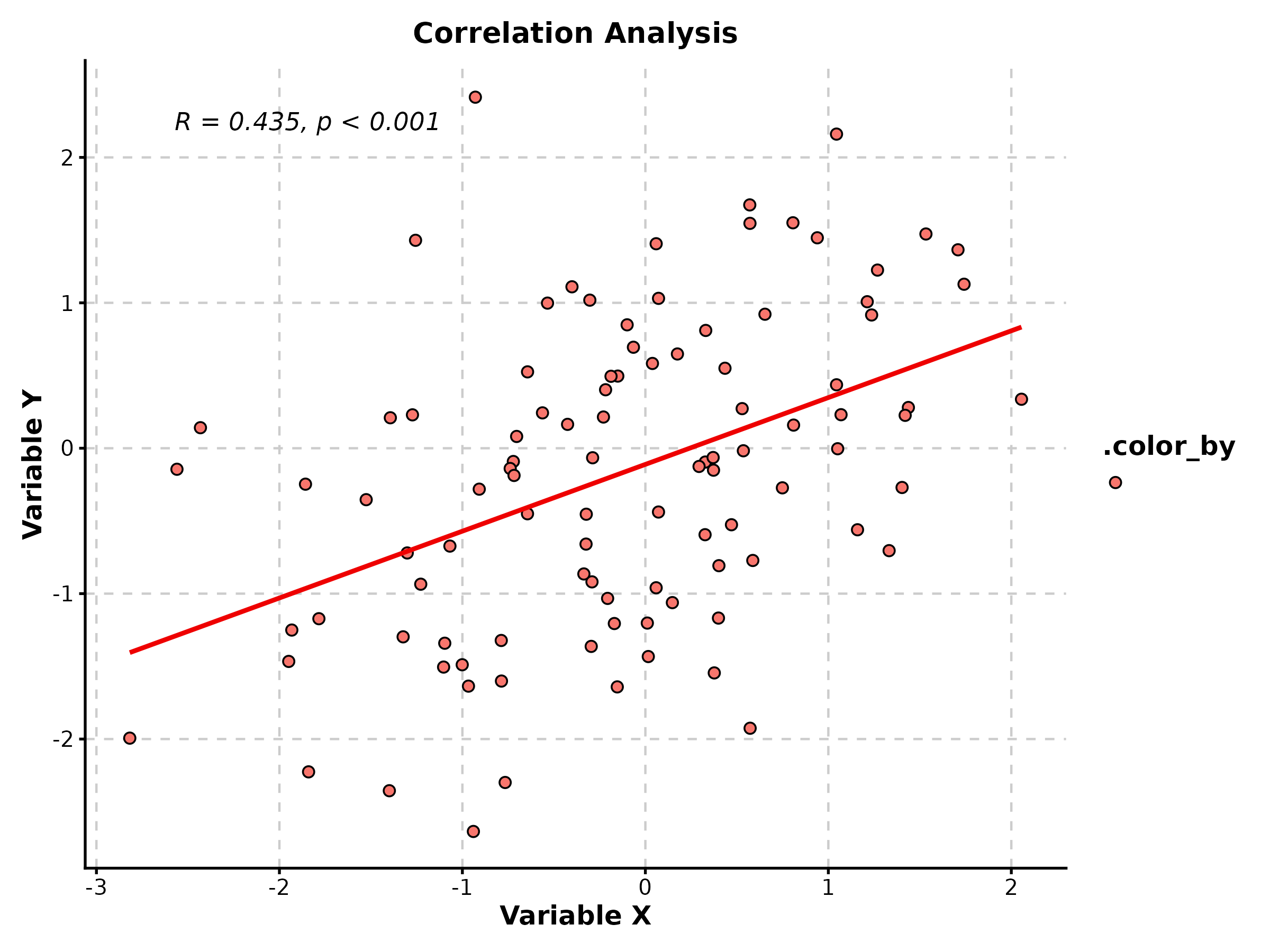
Box Plot
treat_data <- data.frame(
  group = rep(c("Control", "Low", "High"), each = 40),
  response = c(rnorm(40, 10, 2), rnorm(40, 12, 2.5), rnorm(40, 15, 2))
)

BoxPlot(treat_data, x = "group", y = "response", palette = "lancet",
  add_point = TRUE, pt_alpha = 0.3,
  comparisons = list(c("Control", "High")),
  title = "Treatment Response", ylab = "Expression Level")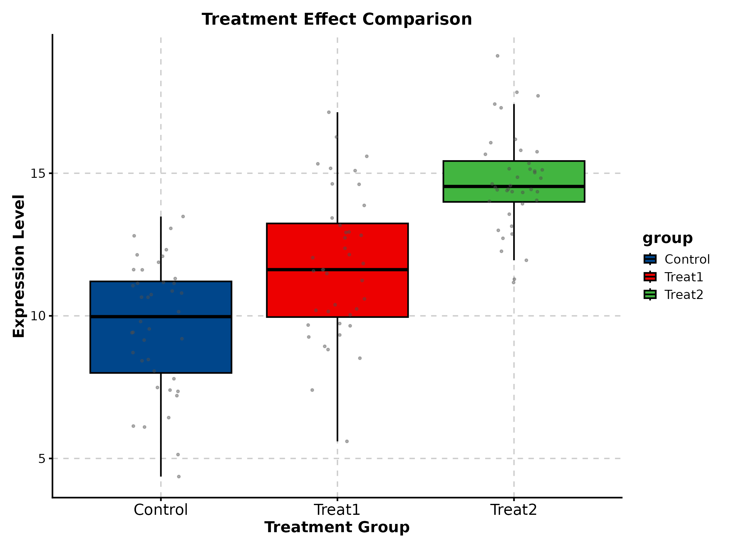
Violin Plot
ViolinPlot(treat_data, x = "group", y = "response", palette = "npg",
  add_box = TRUE, add_point = TRUE, pt_alpha = 0.3,
  title = "Distribution Comparison")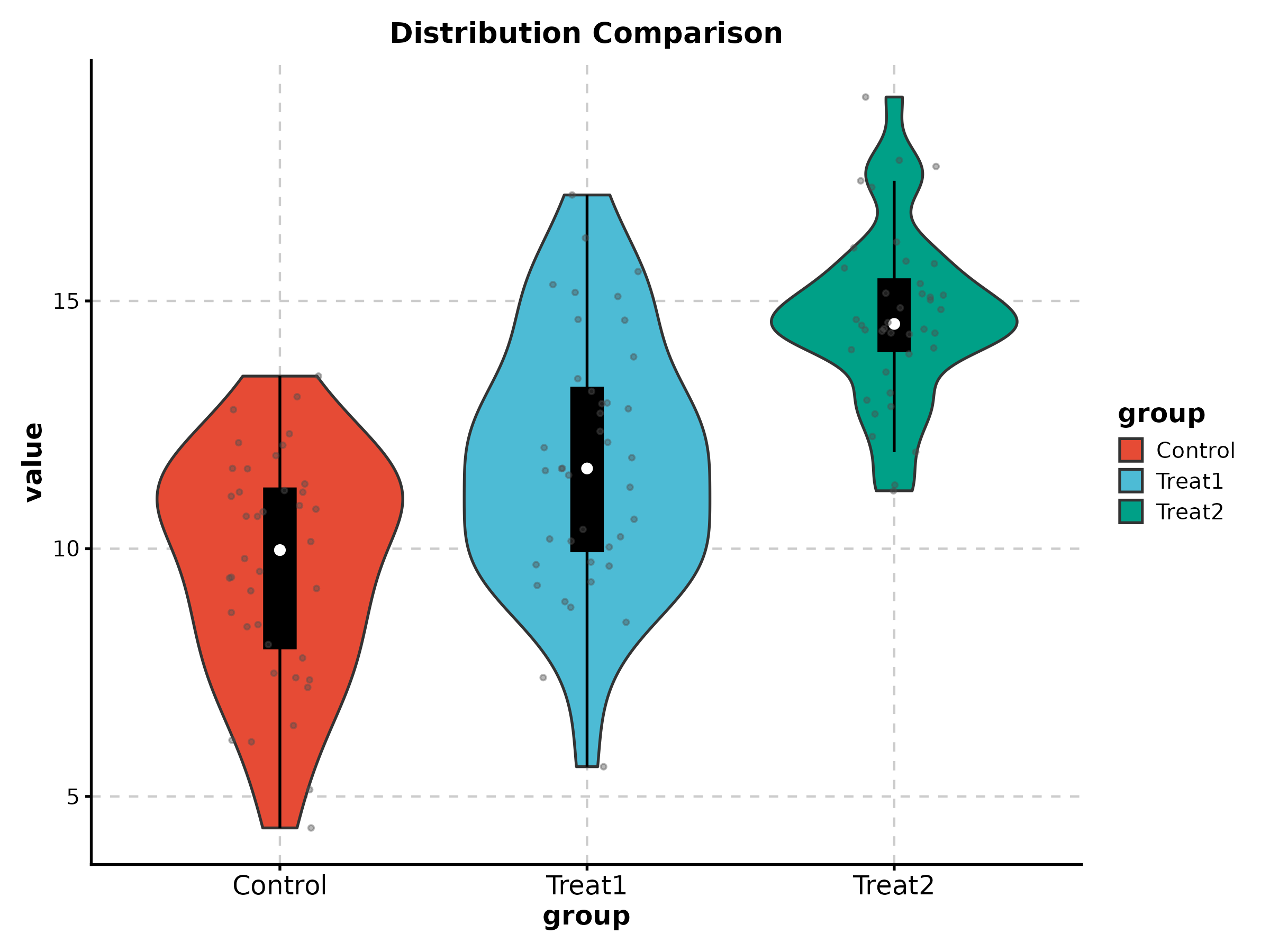
Density Plot
DensityPlot(treat_data, x = "response", group_by = "group",
  palette = "npg", add_rug = TRUE,
  title = "Response Distribution")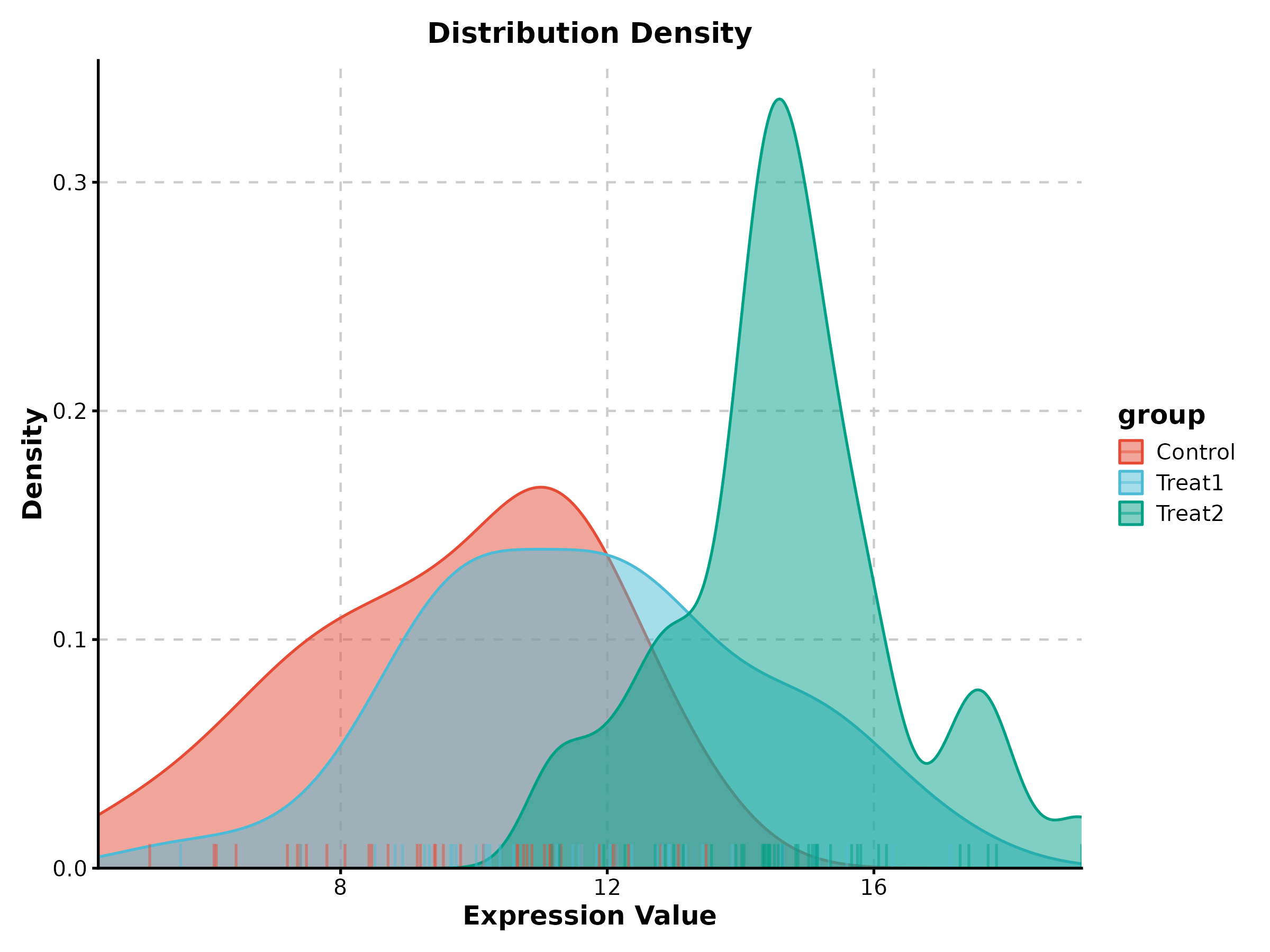
Bar Plot
BarPlot(treat_data, x = "group", y = "response", palette = "Set2",
  add_errorbar = TRUE, errorbar_type = "se",
  title = "Mean with Standard Error")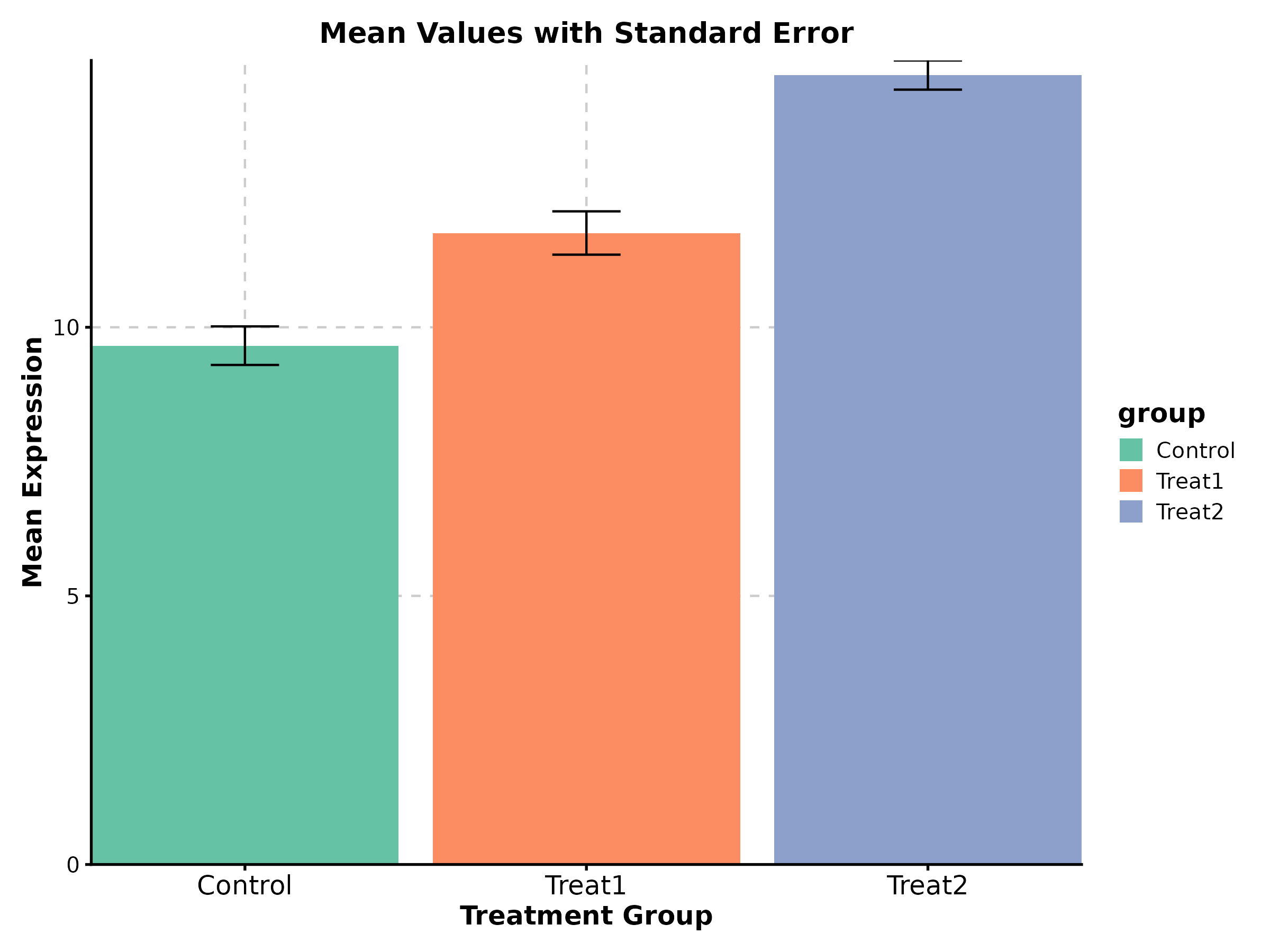
Line Plot
time_data <- data.frame(
  day = rep(c(0, 7, 14, 21, 28), 2),
  size = c(100, 150, 250, 400, 650, 100, 120, 140, 160, 190),
  arm = rep(c("Vehicle", "Treatment"), each = 5)
)

LinePlot(time_data, x = "day", y = "size", group_by = "arm",
  palette = "nejm", title = "Tumor Growth",
  xlab = "Day", ylab = "Volume (mm³)")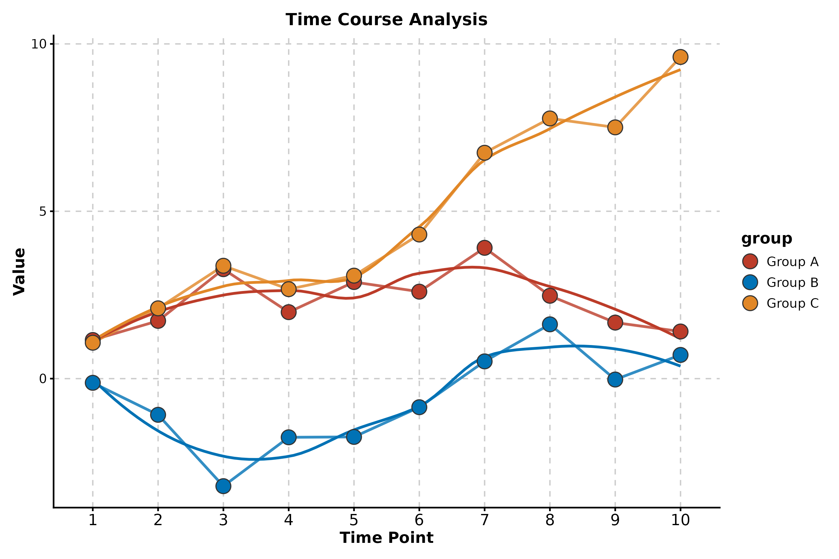
Category 2: Enrichment & Pathway
Enrichment Network
data("enrich_multidb_example")

EnrichNetwork(enrich_multidb_example, top_term = 15,
  layout = "fr", palette = "Set3",
  title = "Pathway Network")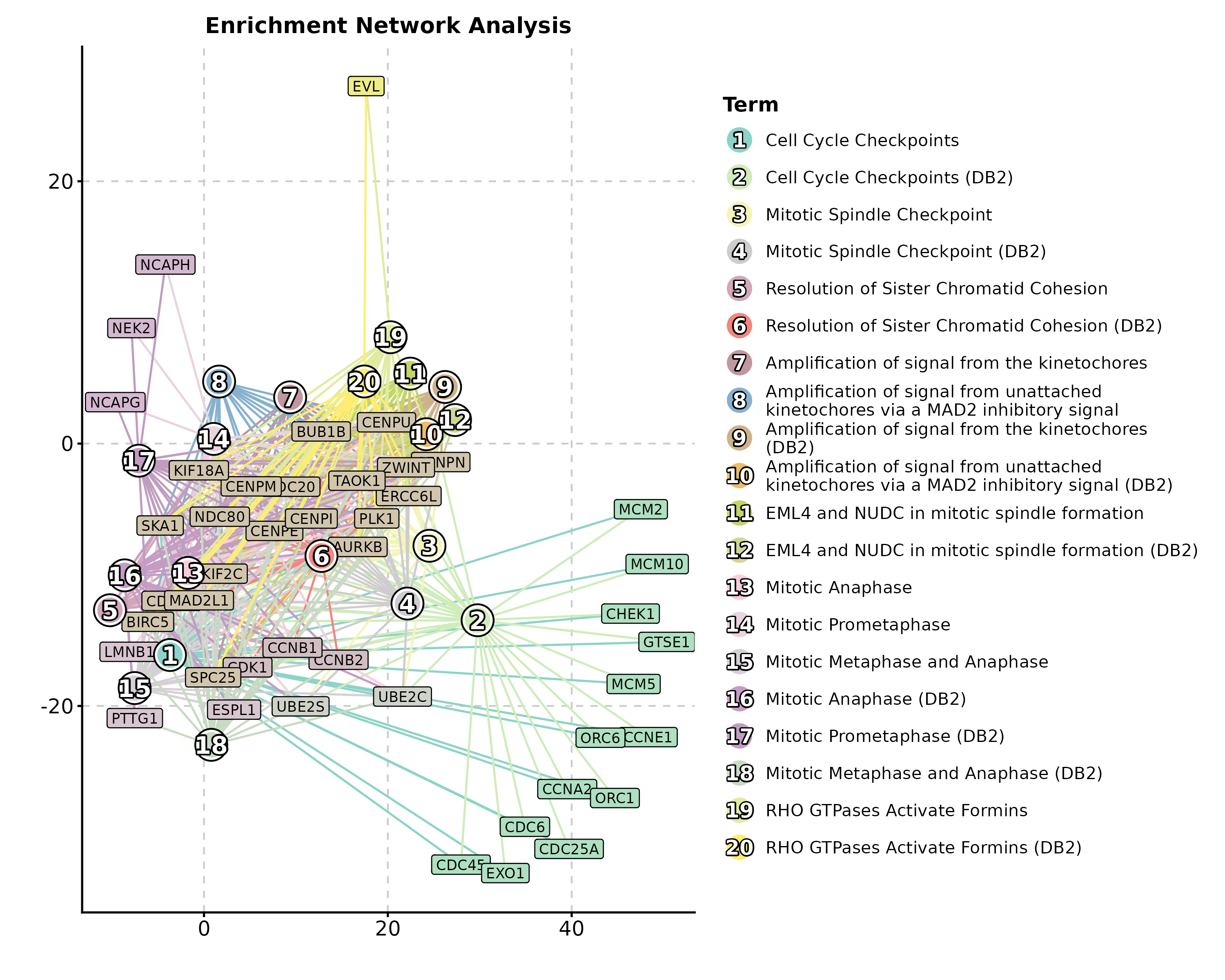
Enrichment Map
data("enrich_example")

EnrichMap(enrich_example, top_term = 20,
  layout = "fr", palette = "Spectral",
  title = "GO Enrichment Map")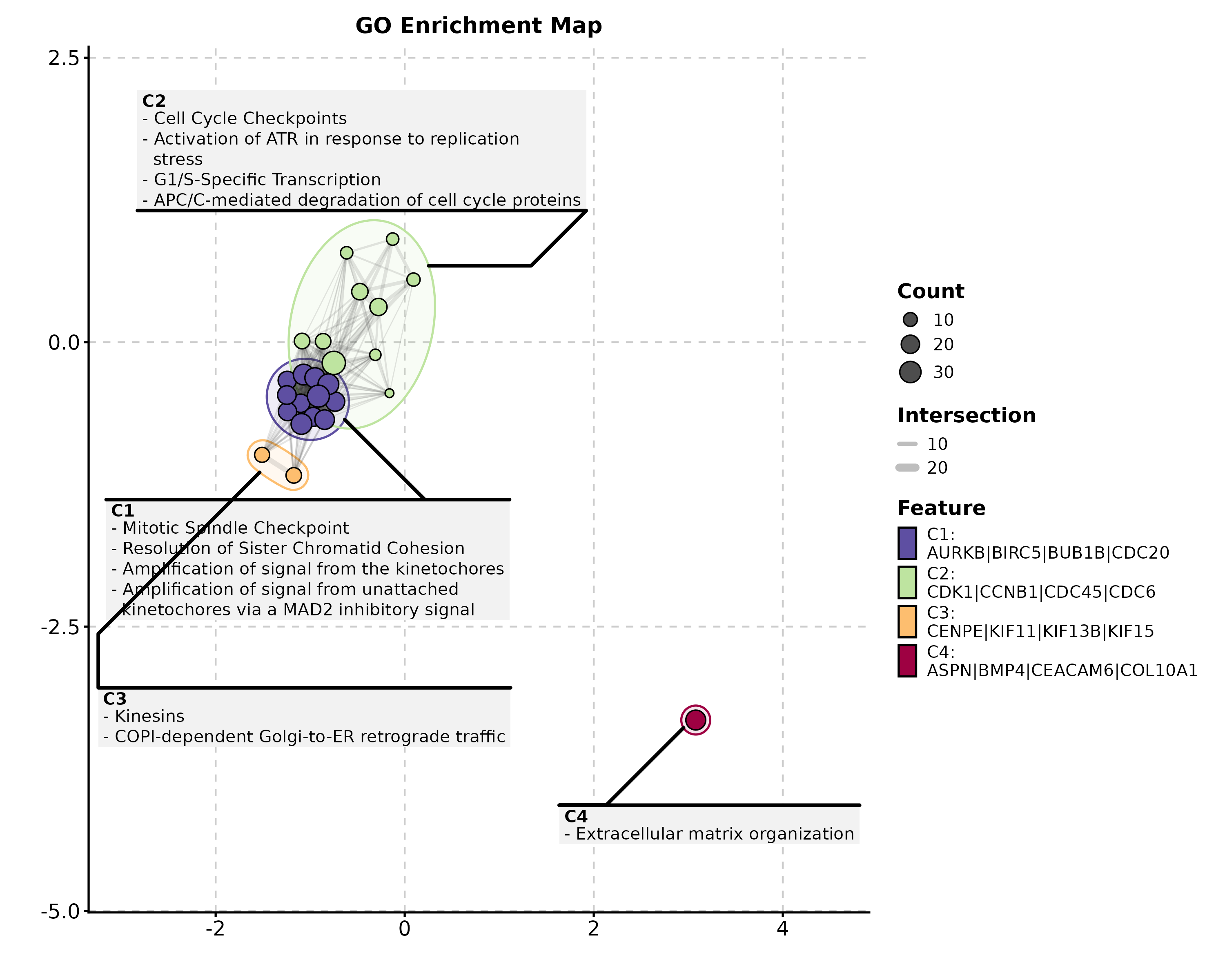
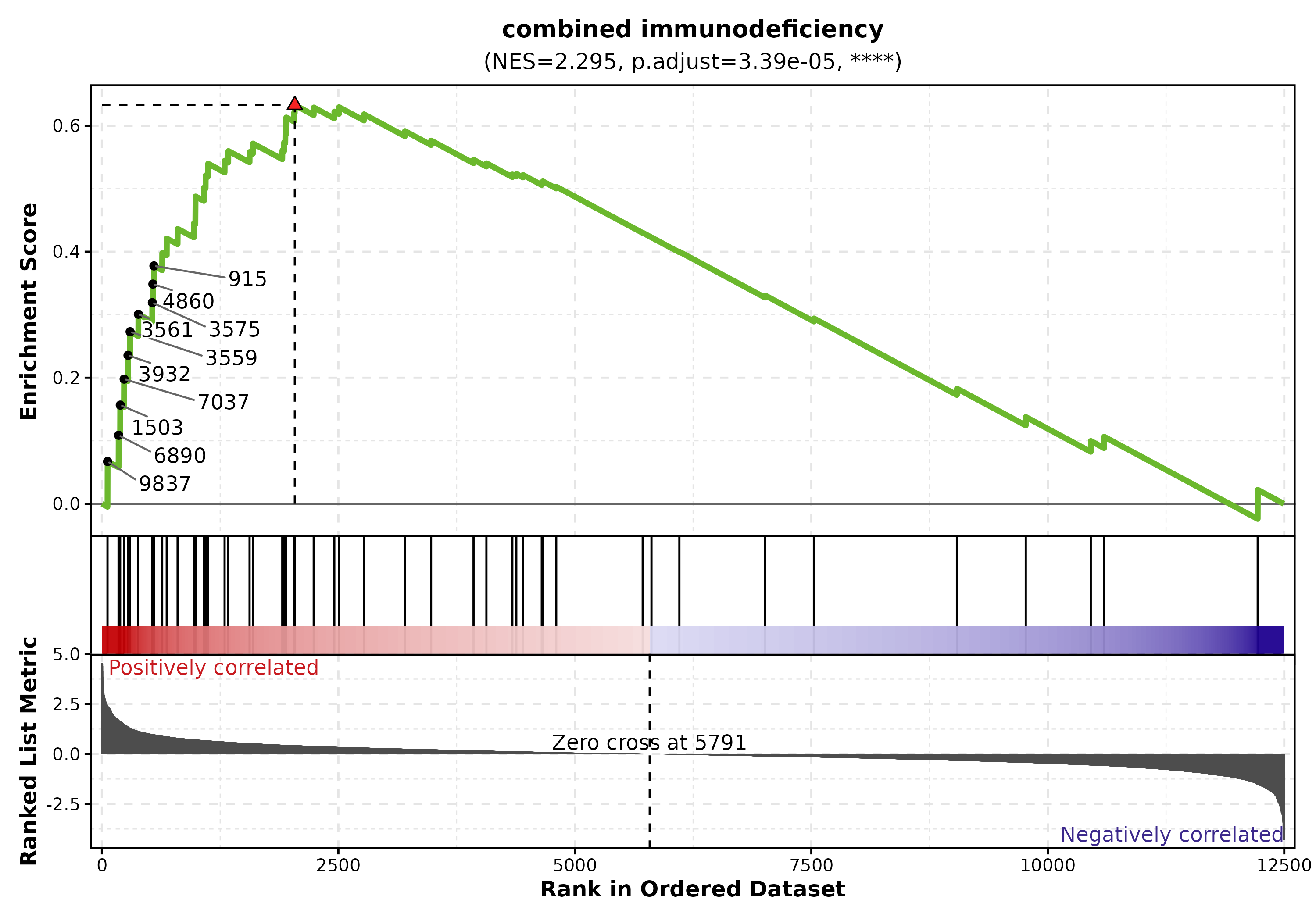
GSEA Summary
data("gsea_example")

GSEASummaryPlot(gsea_example, top_term = 15, palette = "RdBu",
  title = "GSEA Results")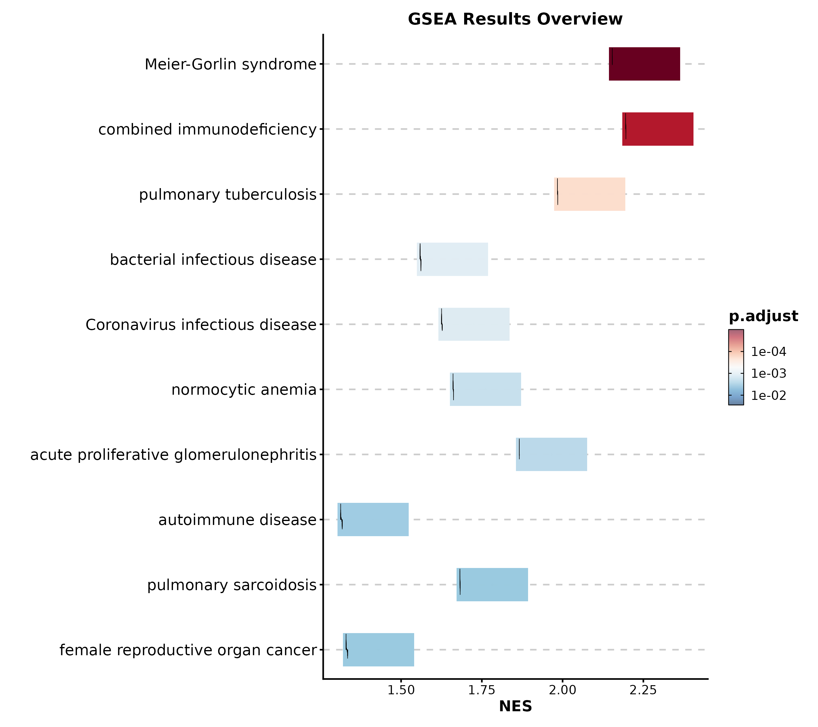
Category 3: Single-Cell & Spatial
Dimension Reduction
data("dim_example")

DimPlot(dim_example, dims = c("basis_1", "basis_2"),
  group_by = "clusters", palette = "igv",
  pt_size = 1.2, label = TRUE, label_insitu = TRUE,
  title = "UMAP Cell Clustering")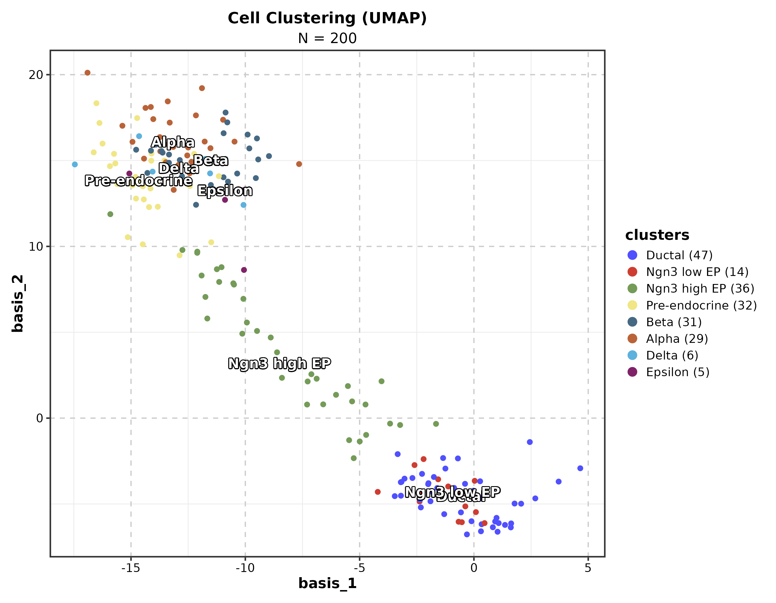
Feature Expression
dim_example$marker <- rnorm(nrow(dim_example))

FeatureDimPlot(dim_example, dims = c("basis_1", "basis_2"),
  features = "marker", palette = "viridis", pt_size = 1.2,
  title = "Feature Expression on UMAP")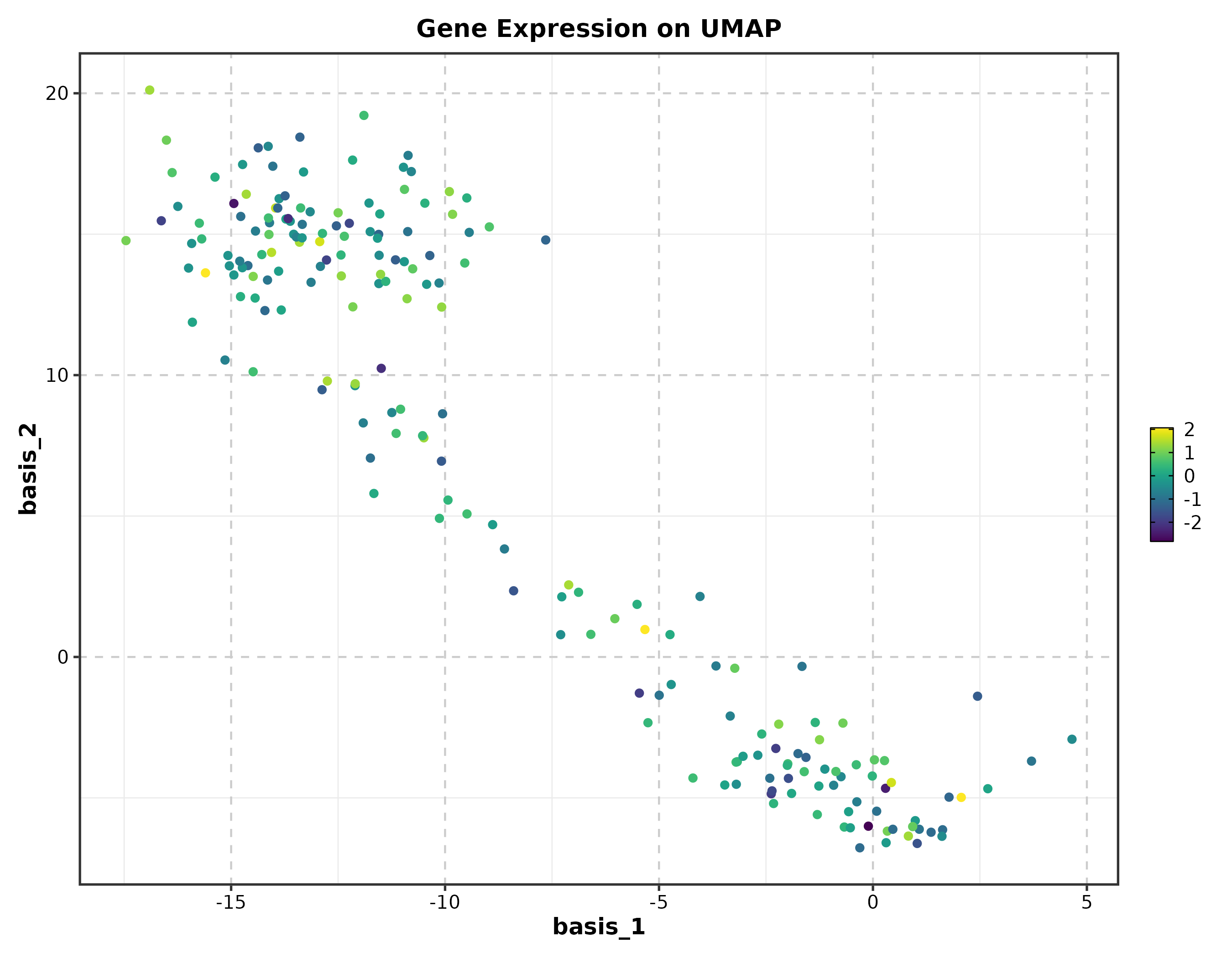
RNA Velocity
embedding <- as.matrix(dim_example[, c("basis_1", "basis_2")])
v_embedding <- as.matrix(dim_example[, c("stochasticbasis_1", "stochasticbasis_2")])

VelocityPlot(embedding = embedding, v_embedding = v_embedding,
  plot_type = "grid", title = "RNA Velocity")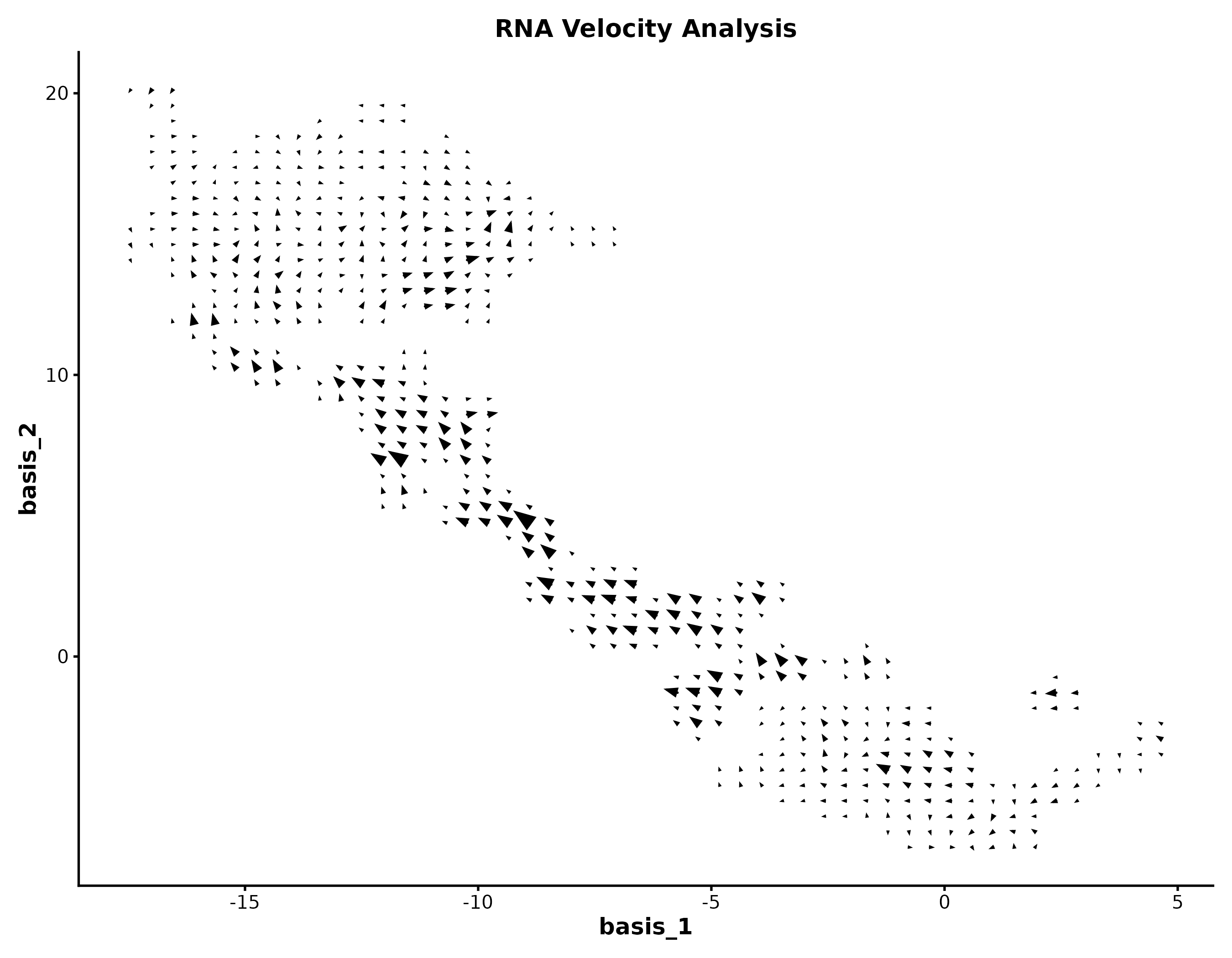
Category 4: Genomics
Volcano Plot
genes <- c("TP53","EGFR","MYC","KRAS","BRCA1","CDK4","PTEN","RB1",
           "PIK3CA","AKT1","CD274","CTLA4","PDCD1","IDO1","VEGFA",
           "BRAF","JAK2","STAT3","NRAS","HAVCR2")
deg <- data.frame(
  gene = c(genes, paste0("Gene", 1:480)),
  log2FC = c(rnorm(10, 2.5, 0.8), rnorm(10, -2.5, 0.8), rnorm(480, 0, 0.8)),
  padj = c(runif(20, 1e-10, 1e-3), runif(480, 0.01, 1))
)

VolcanoPlot(deg, x = "log2FC", y = "padj", label_by = "gene",
  x_cutoff = 1, y_cutoff = 0.05, nlabel = 10,
  title = "Differential Expression")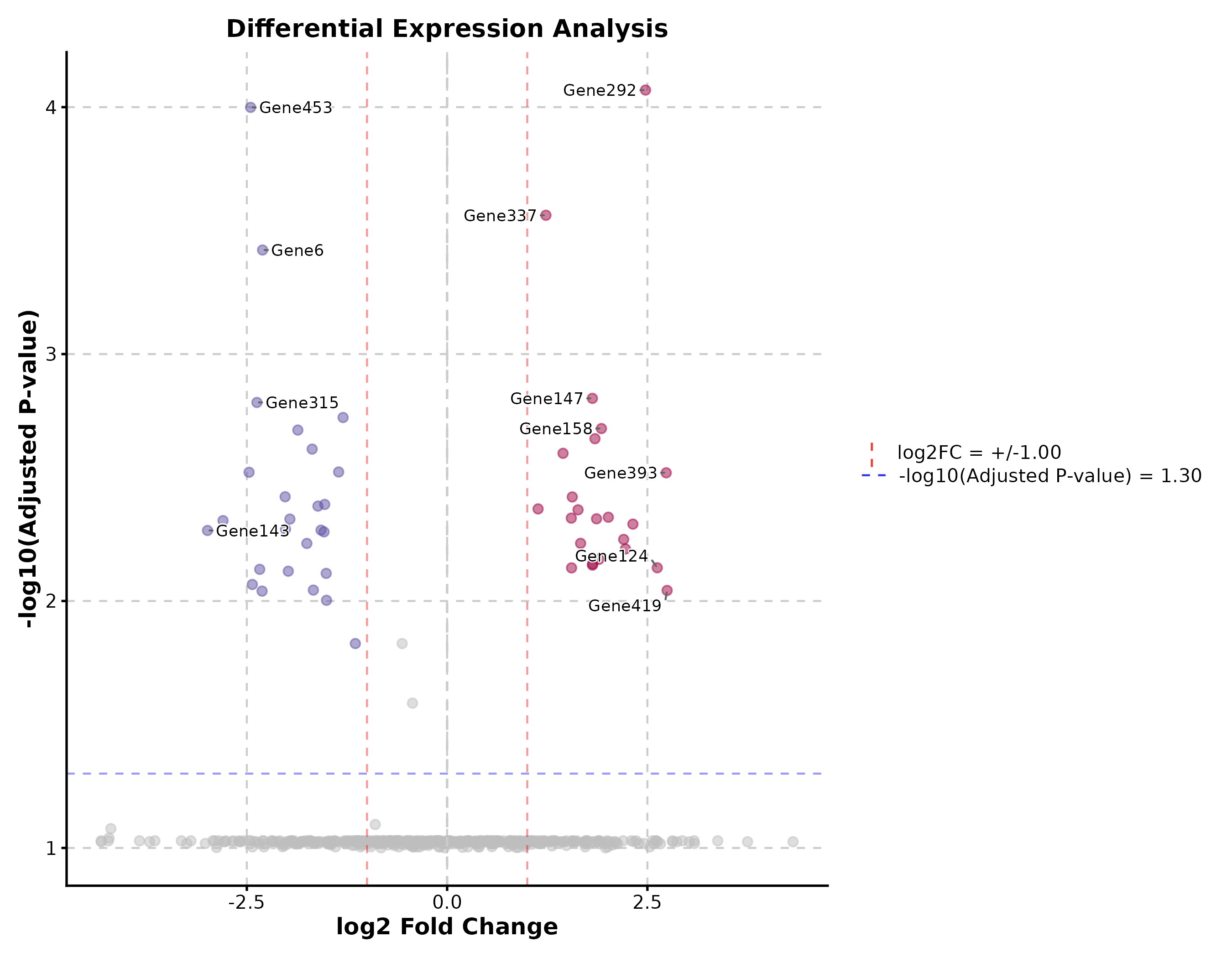
Manhattan Plot
gwas <- data.frame(
  chr = rep(paste0("chr", 1:22), each = 500),
  pos = rep(1:500, 22) * 1e5,
  pvalue = runif(11000, 0, 1)
)
gwas$pvalue[sample(11000, 30)] <- runif(30, 0, 1e-8)

ManhattanPlot(gwas, chr_by = "chr", pos_by = "pos", pval_by = "pvalue",
  signif = 5e-8, title = "GWAS Results")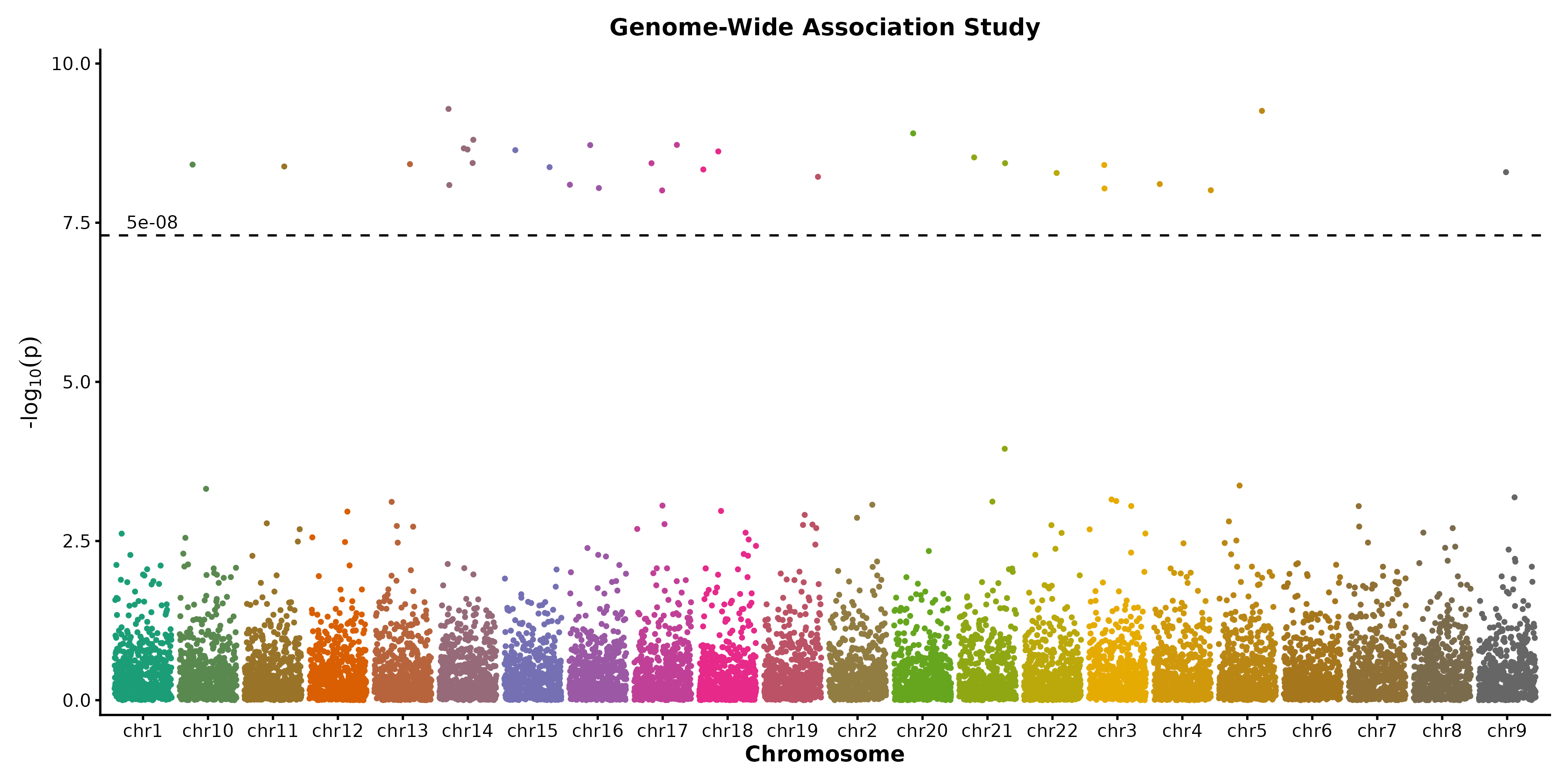
Category 5: Clinical & Prediction
Kaplan-Meier Curve
surv_data <- data.frame(
  time = c(rexp(80, 0.008), rexp(70, 0.015)),
  status = sample(0:1, 150, replace = TRUE, prob = c(0.35, 0.65)),
  risk = rep(c("Low", "High"), c(80, 70))
)

KMPlot(surv_data, time = "time", status = "status", group_by = "risk",
  palette = "jco", show_risk_table = TRUE, show_pval = TRUE,
  title = "Overall Survival")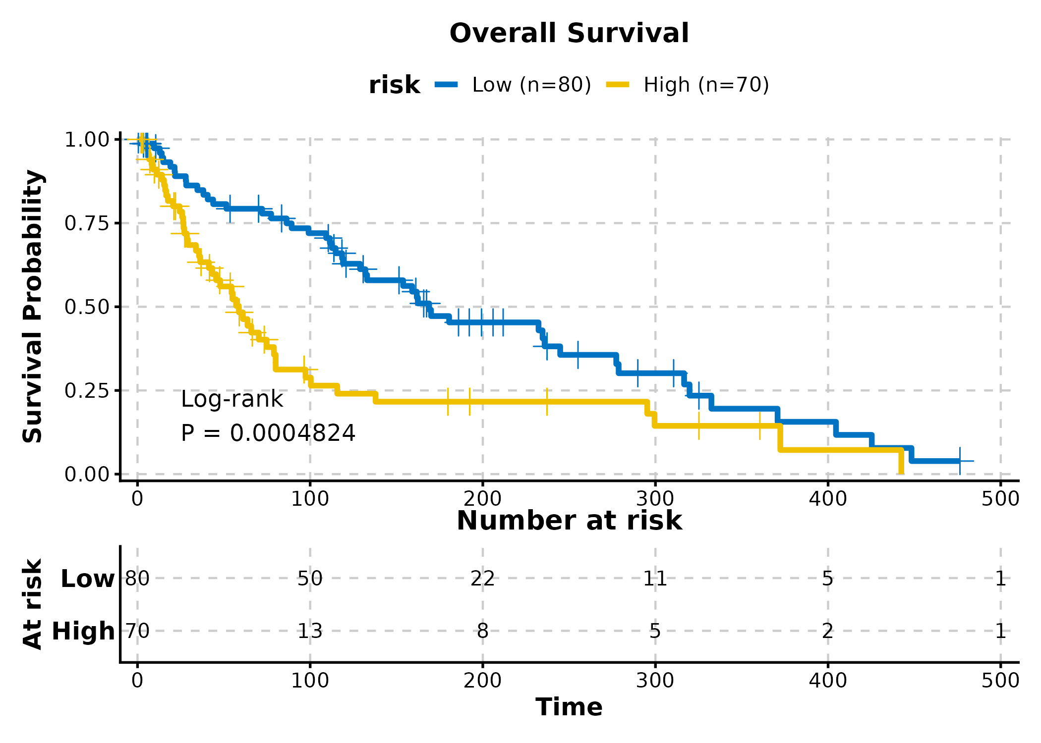
Cox Regression
cox_data <- data.frame(
  time = rexp(200, 0.01),
  event = sample(0:1, 200, replace = TRUE, prob = c(0.3, 0.7)),
  age = rnorm(200, 60, 10),
  gender = sample(c("Male", "Female"), 200, replace = TRUE),
  stage = sample(c("I-II", "III-IV"), 200, replace = TRUE)
)

CoxPlot(cox_data, time = "time", event = "event",
  vars = c("age", "gender", "stage"),
  plot_type = "forest", palette = "nejm",
  title = "Cox Forest Plot")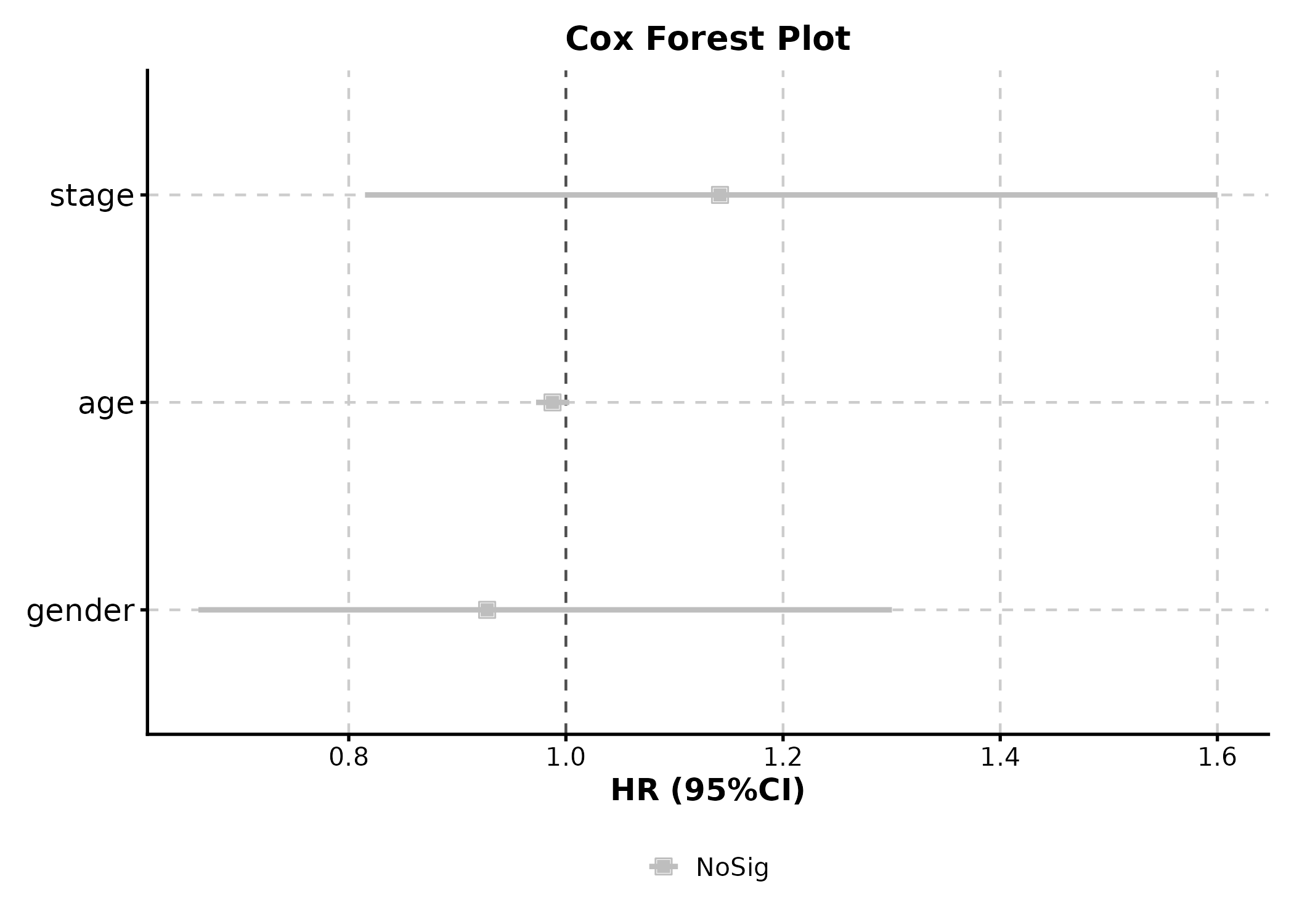
ROC Curve
roc_data <- data.frame(
  truth = sample(0:1, 200, replace = TRUE),
  score = rnorm(200)
)
roc_data$score <- roc_data$score + roc_data$truth * 1.5

ROCCurve(roc_data, truth_by = "truth", score_by = "score",
  palette = "lancet", title = "ROC Analysis")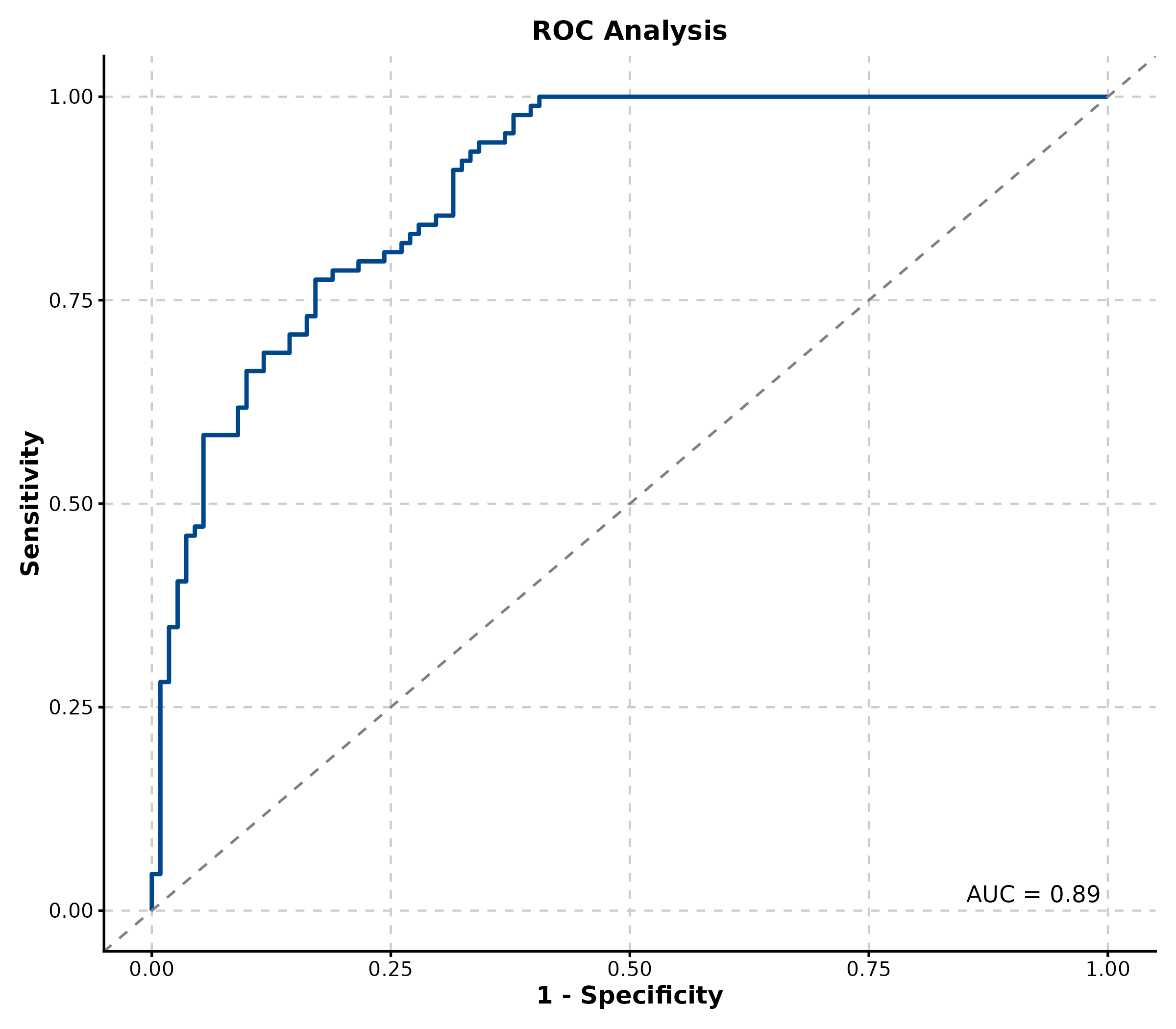
Decision Curve Analysis
New in v2.0.
dca_data <- data.frame(
  truth = sample(0:1, 300, replace = TRUE),
  model = runif(300)
)
dca_data$model <- ifelse(dca_data$truth == 1,
  pmin(dca_data$model + 0.2, 1),
  pmax(dca_data$model - 0.2, 0))

DecisionCurvePlot(dca_data, outcome = "truth", predictors = "model",
  title = "Decision Curve Analysis")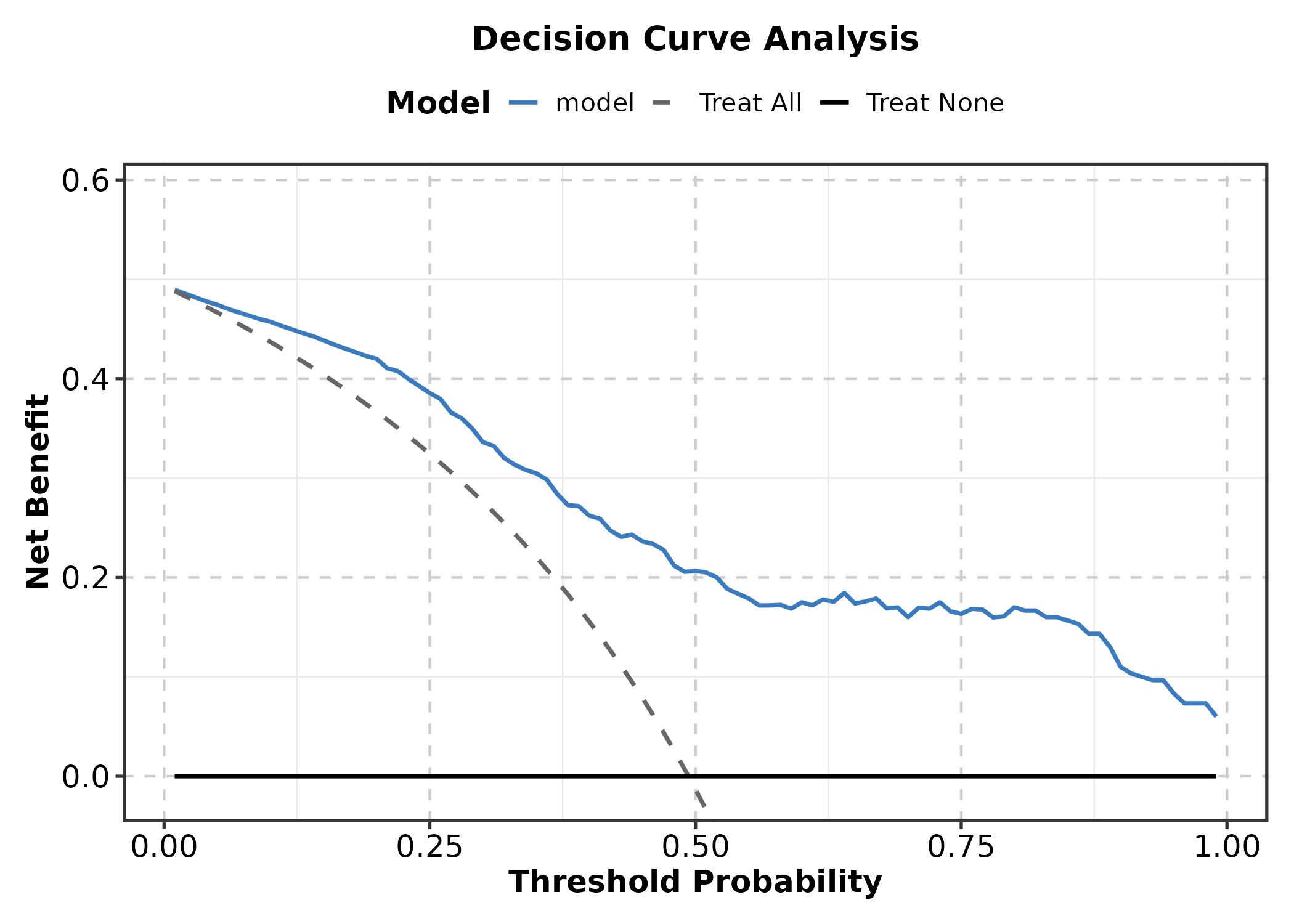
Category 6: Networks & Relationships
Heatmap
mat <- matrix(rnorm(120, 0, 1.5), nrow = 10,
  dimnames = list(paste0("Gene", 1:10), paste0("Sample", 1:12)))
mat[1:4, 1:4] <- mat[1:4, 1:4] + 2
mat[5:7, 5:8] <- mat[5:7, 5:8] + 2
mat[8:10, 9:12] <- mat[8:10, 9:12] + 2

Heatmap(mat, palette = "RdBu",
  show_row_names = TRUE, show_column_names = TRUE,
  title = "Expression Heatmap")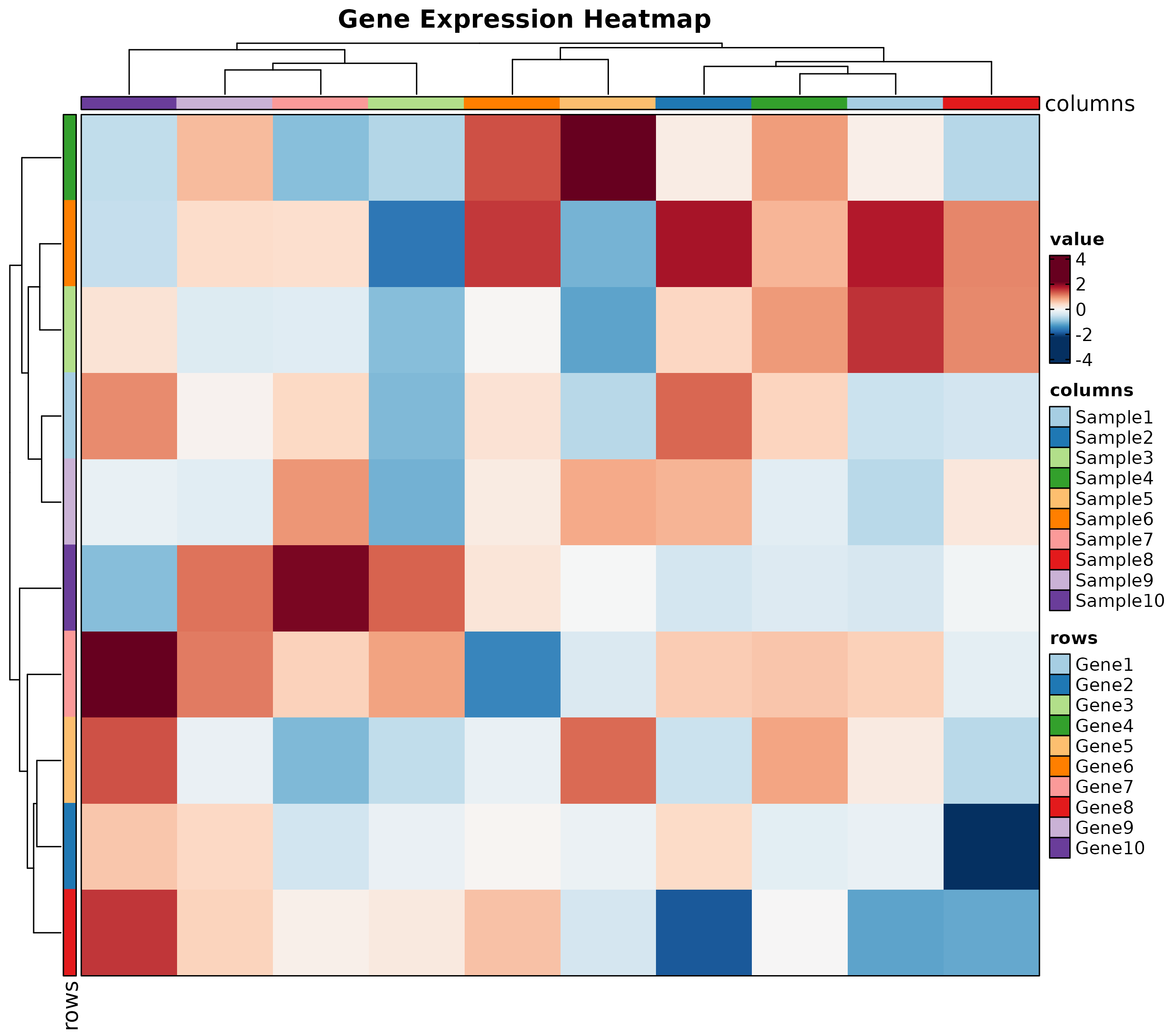
Chord Diagram
chord_data <- data.frame(
  from = c("CD4 T", "CD8 T", "B cell", "NK", "Monocyte"),
  to = c("Fibroblast", "Endothelial", "Fibroblast", "Tumor", "Tumor"),
  value = c(15, 20, 10, 25, 18)
)

ChordPlot(chord_data, from = "from", to = "to", y = "value",
  palette = "Set3", title = "Cell Interaction")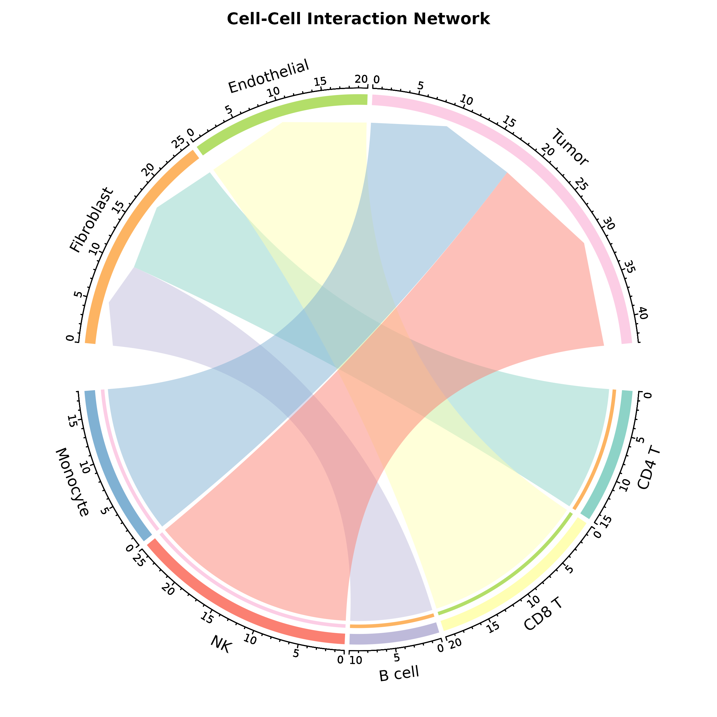
Sankey Plot
flow <- data.frame(
  diagnosis = rep(c("Early", "Advanced", "Metastatic"), each = 3),
  outcome = rep(c("Complete Response", "Partial Response", "Progressive"), 3),
  n = c(40, 8, 2, 10, 20, 10, 2, 8, 20)
)

SankeyPlot(flow, x = c("diagnosis", "outcome"), y = "n",
  links_fill_by = "diagnosis", palette = "Set3",
  title = "Treatment Outcome Flow")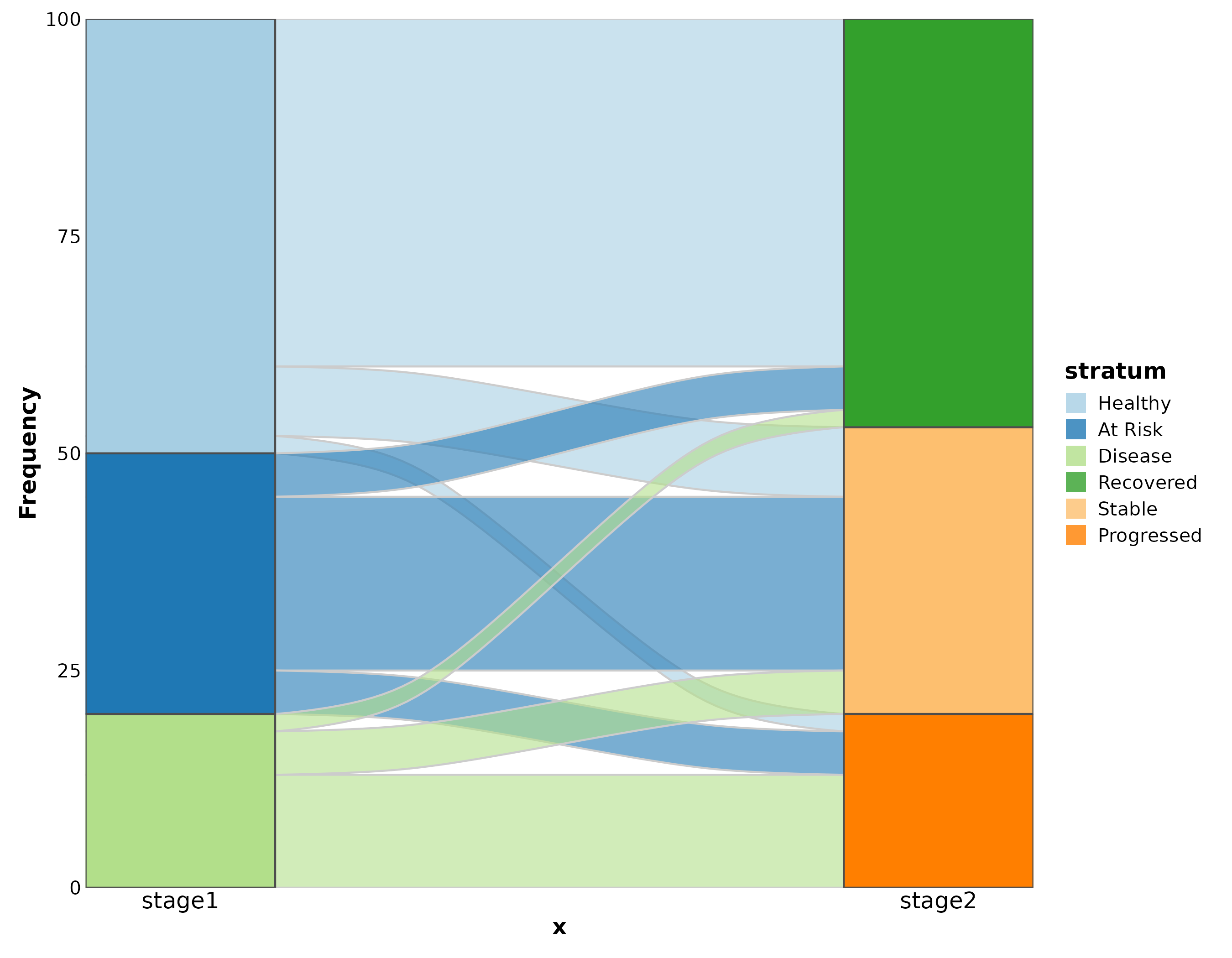
Category 7: Specialized
Dumbbell Plot
New in v2.0.
dumb <- data.frame(
  gene = paste0("Gene", LETTERS[1:8]),
  before = rnorm(8, 5, 1.5), after = rnorm(8, 8, 1.5)
)

DumbbellPlot(dumb, x_start = "before", x_end = "after", y = "gene",
  palette = "Set1",
  title = "Pre- vs Post-Treatment")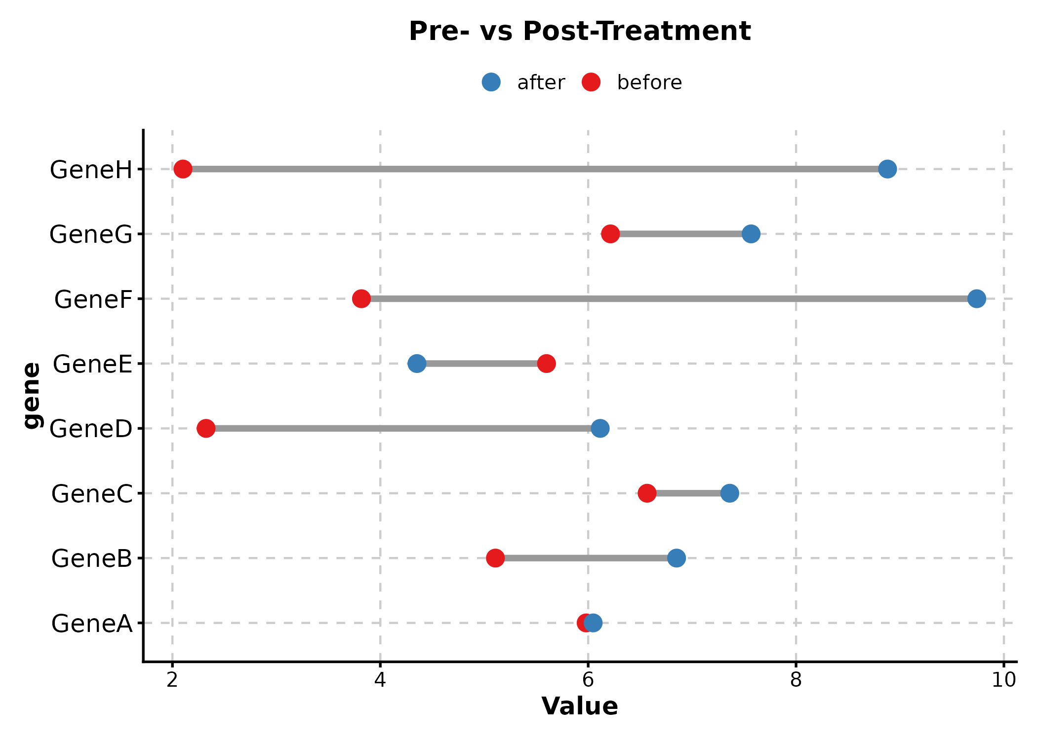
Waffle Plot
New in v2.0.
cell_comp <- data.frame(
  type = c("T cell", "B cell", "NK", "Monocyte", "Other"),
  count = c(35, 20, 15, 20, 10)
)

WafflePlot(cell_comp, x = "type", y = "count",
  palette = "Set2", title = "Cell Proportions")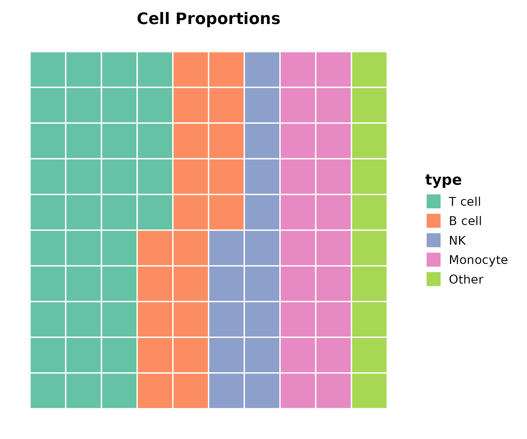
Timeline Plot
New in v2.0.
events <- data.frame(
  event = c("Diagnosis", "Surgery", "Chemo", "Radiation", "Follow-up"),
  start = as.Date(c("2024-01-15", "2024-02-10", "2024-03-01",
                     "2024-06-01", "2024-09-01")),
  end = as.Date(c("2024-01-15", "2024-02-12", "2024-05-15",
                   "2024-07-15", "2024-12-01"))
)

TimelinePlot(events, start = "start", end = "end", label = "event",
  palette = "Set2", title = "Treatment Timeline")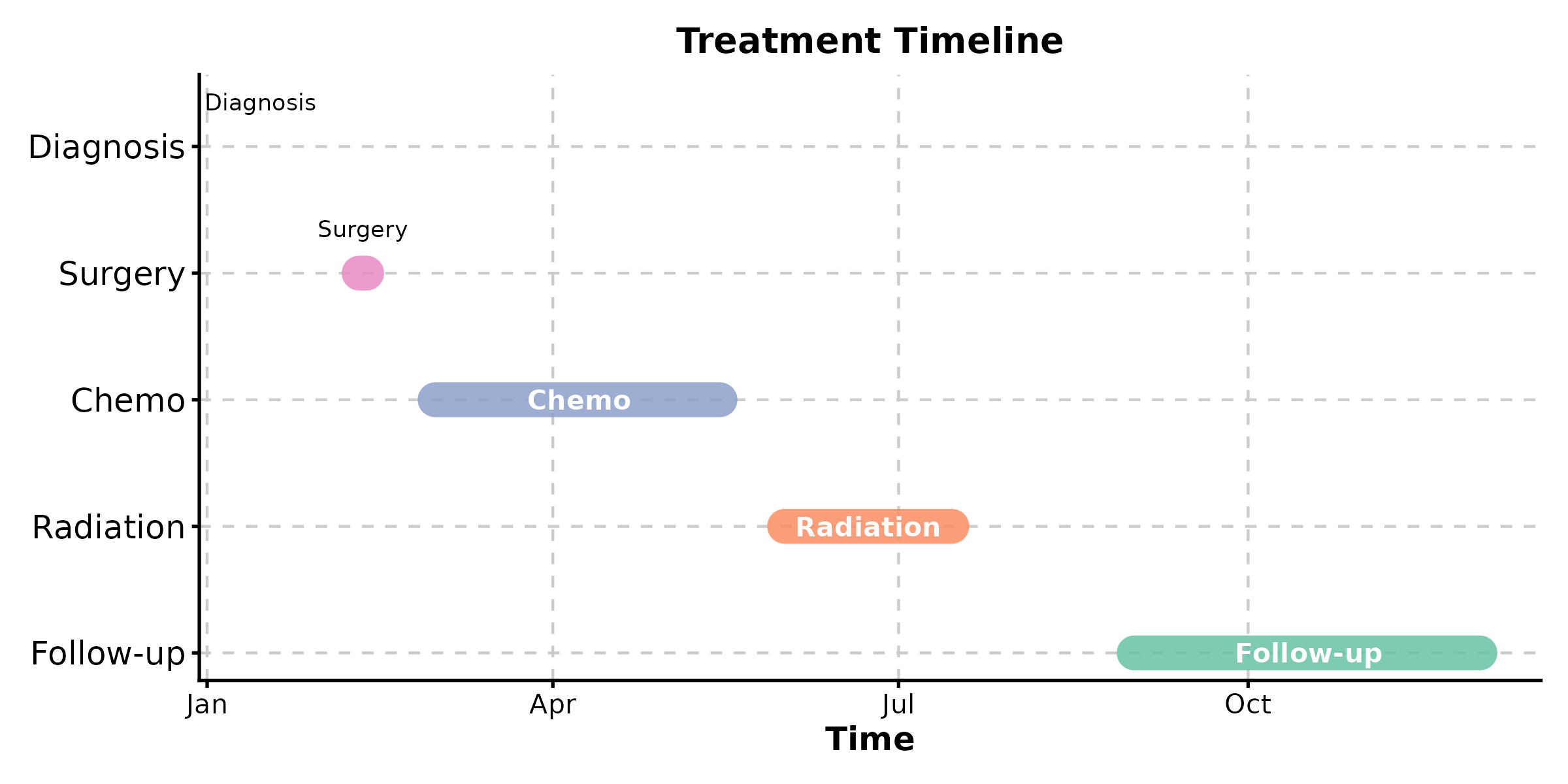
Category 8: Earth & Environmental
New in v2.0.
Contour Plot
grid <- expand.grid(
  x = seq(-3, 3, length.out = 50),
  y = seq(-3, 3, length.out = 50)
)
grid$z <- with(grid, sin(x) * cos(y) * exp(-(x^2 + y^2) / 8))

ContourPlot(grid, x = "x", y = "y", z = "z",
  type = "filled", palette = "Spectral",
  title = "Scalar Field")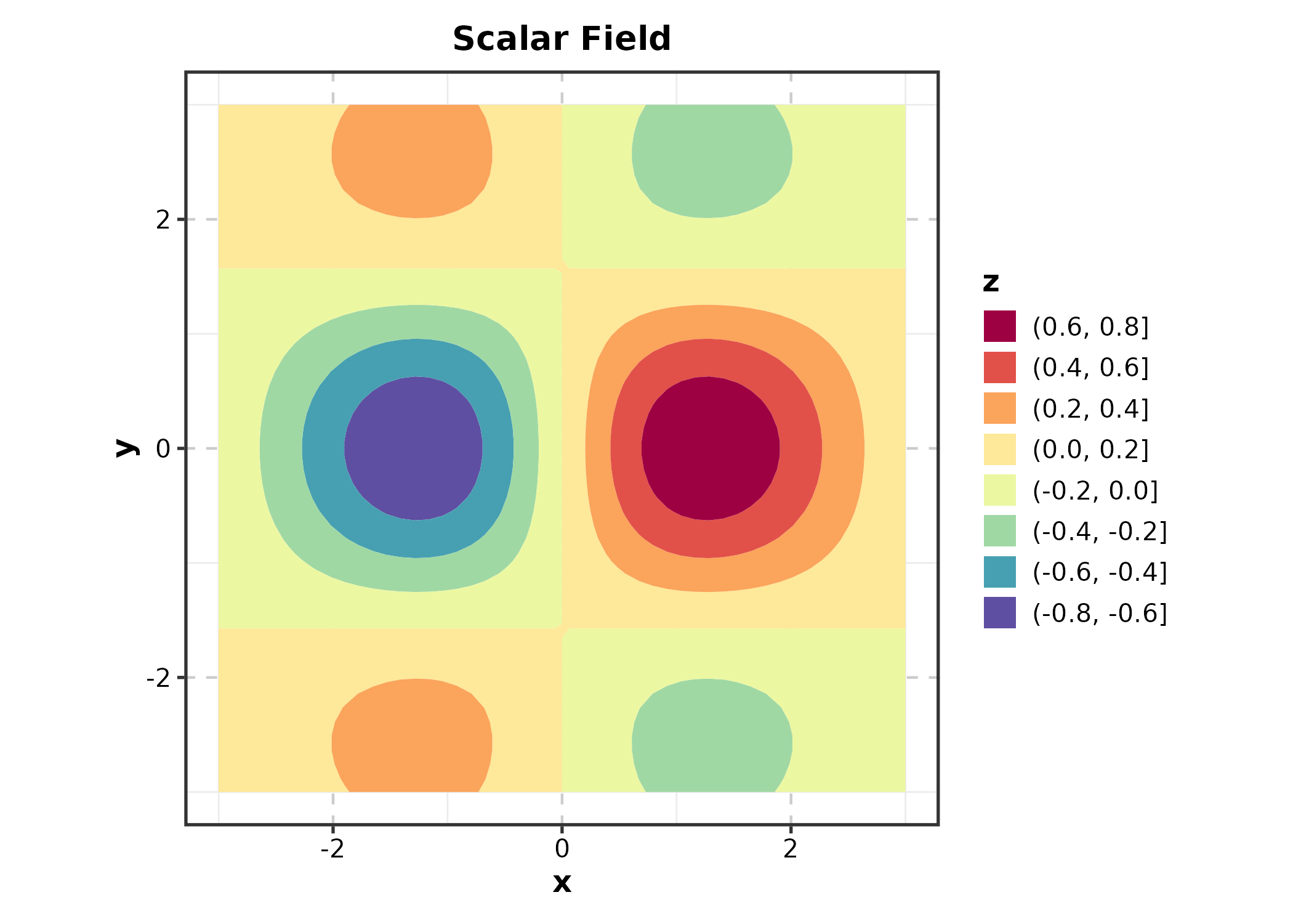
Category 9: Meta-Analysis & Agreement
New in v2.0.
Forest Plot
meta <- data.frame(
  study = c("Study A", "Study B", "Study C", "Study D", "Overall"),
  or = c(1.32, 0.85, 1.51, 1.08, 1.15),
  lower = c(0.95, 0.60, 1.05, 0.78, 0.95),
  upper = c(1.84, 1.20, 2.17, 1.50, 1.38),
  weight = c(25, 20, 18, 22, NA),
  is_summary = c(FALSE, FALSE, FALSE, FALSE, TRUE)
)

ForestPlot(meta, estimate = "or", ci_lower = "lower", ci_upper = "upper",
  label = "study", weight = "weight", is_summary = "is_summary",
  null_value = 1, title = "Meta-Analysis")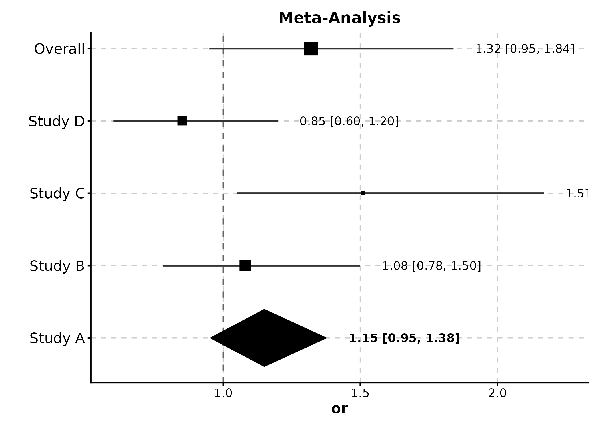
Bland-Altman Plot
agree <- data.frame(
  method_A = rnorm(50, 100, 15),
  method_B = rnorm(50, 100, 15)
)
agree$method_B <- agree$method_A + rnorm(50, 2, 5)

BlandAltmanPlot(agree, method1 = "method_A", method2 = "method_B",
  title = "Method Agreement")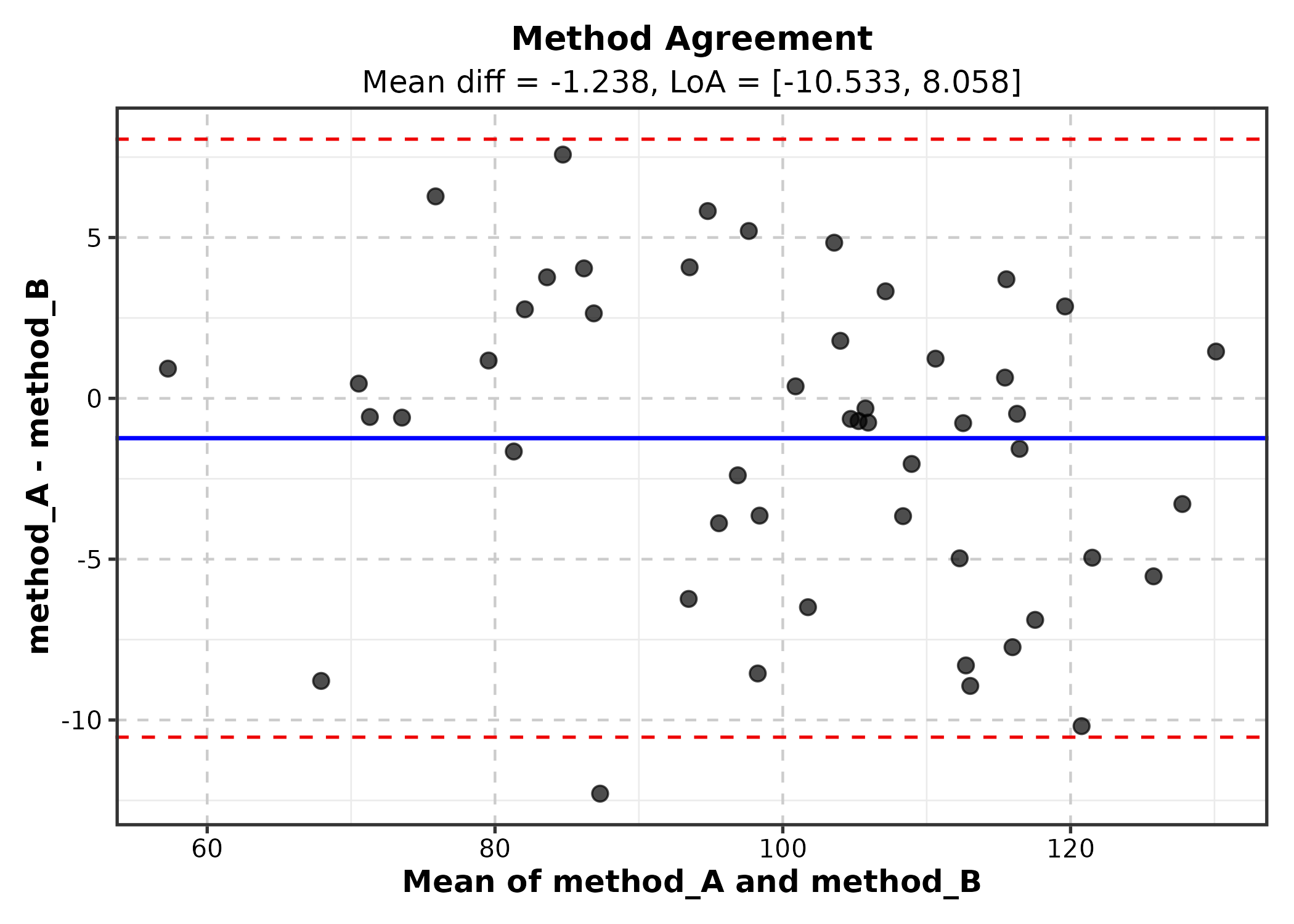
Category 10: Ecology & Evolution
New in v2.0.
Ordination Plot
Requires pre-computed ordination coordinates.
library(vegan)
ord <- metaMDS(sp_mat, k = 2, trace = 0)
ord_df <- as.data.frame(scores(ord, display = "sites"))
ord_df$habitat <- env$habitat

OrdinationPlot(ord_df, x = "NMDS1", y = "NMDS2",
  group_by = "habitat", palette = "Set1",
  title = "Community Ordination")
Phylogenetic Tree
tree <- ape::rtree(12, tip.label = paste0("Species_", LETTERS[1:12]))

PhyloTreePlot(tree, palette = "Set2",
  title = "Phylogenetic Tree")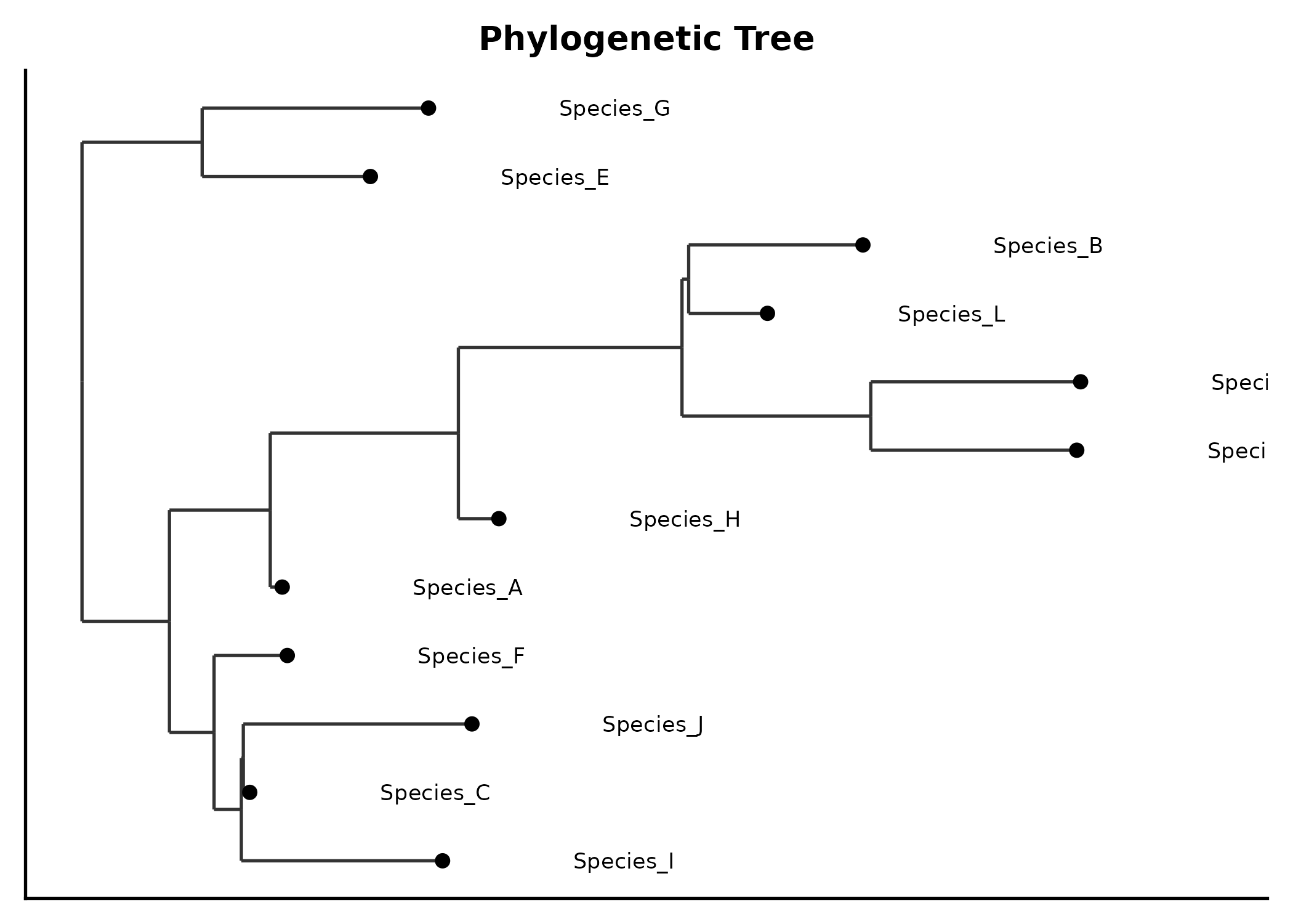
Category 11: Physics & Engineering
New in v2.0.
Quiver Plot
field <- expand.grid(x = seq(-2, 2, 0.4), y = seq(-2, 2, 0.4))
field$u <- -field$y
field$v <- field$x

QuiverPlot(field, x = "x", y = "y", u = "u", v = "v",
  title = "Vector Field")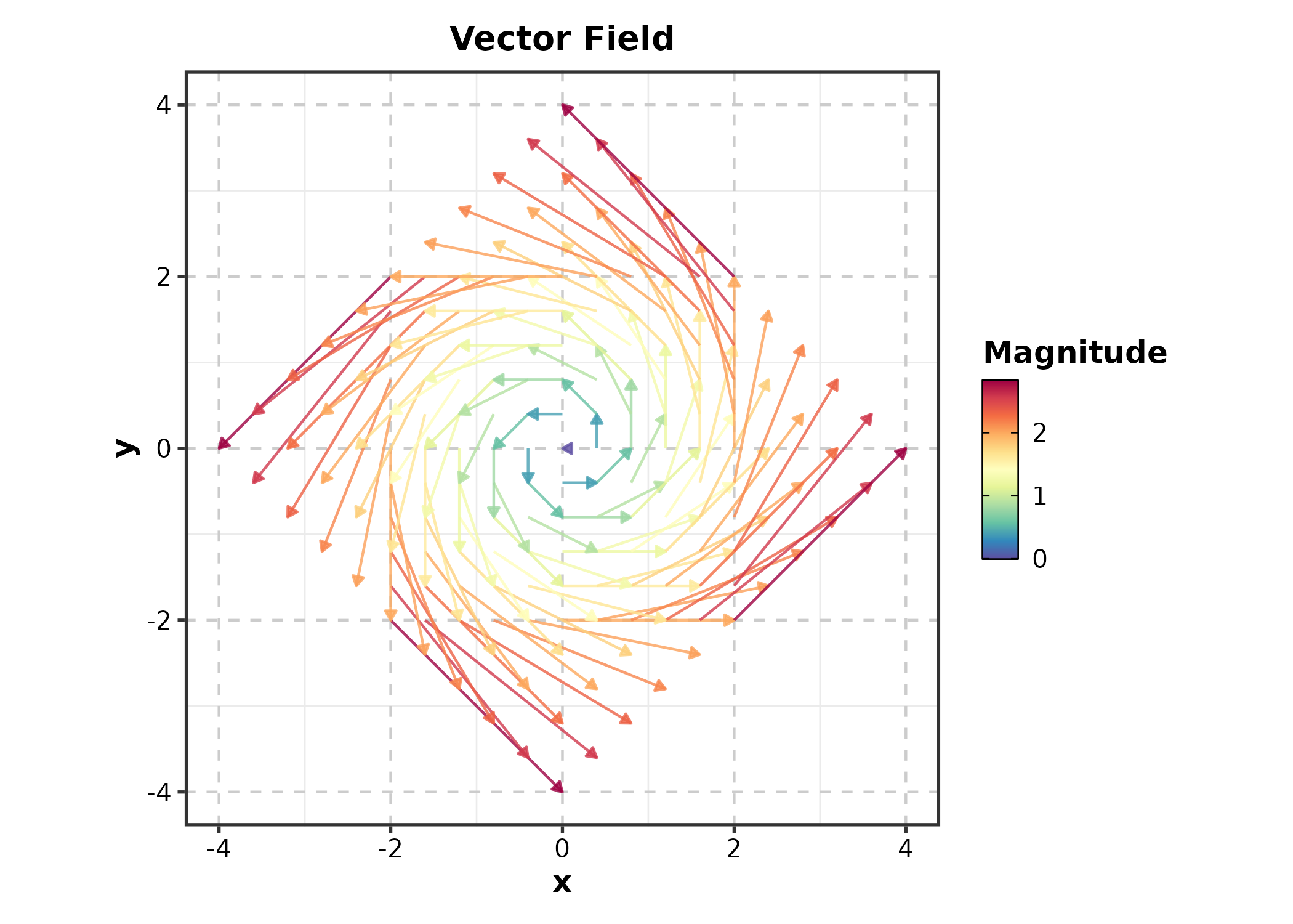
Category 13: Machine Learning
New in v2.0.
Confusion Matrix
set.seed(42)
pred <- data.frame(
  actual = sample(c("Positive", "Negative"), 200,
    replace = TRUE, prob = c(0.4, 0.6)),
  predicted = sample(c("Positive", "Negative"), 200,
    replace = TRUE, prob = c(0.45, 0.55))
)
correct <- sample(200, 150)
pred$predicted[correct] <- pred$actual[correct]

ConfusionMatrixPlot(pred, truth = "actual", predicted = "predicted",
  palette = "Blues", title = "Classification Result")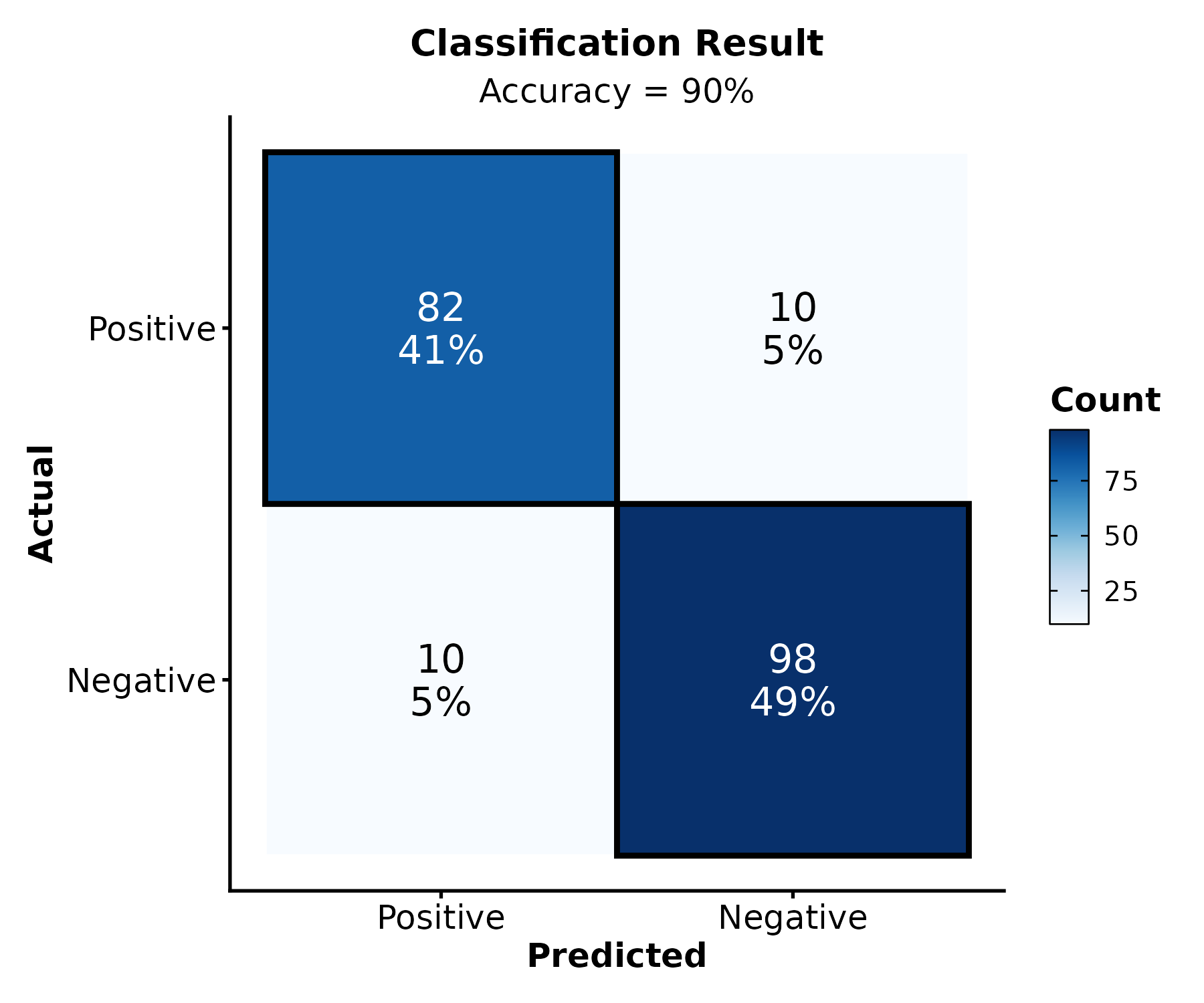
Discovering Functions
Use ggforge_gallery() to browse available functions by
category:
ggforge_gallery()
ggforge_gallery("enrichment")
ggforge_gallery("survival")
Getting Help
-
Documentation:
?FunctionNameorhelp(FunctionName) -
Examples:
example(FunctionName) - GitHub Issues: https://github.com/Zaoqu-Liu/ggforge/issues
Acknowledgments
ggforge is built upon plotthis by Panwen Wang. Thanks also to ggplot2 and the R community.
Session Info
sessionInfo()
#> R version 4.6.0 (2026-04-24)
#> Platform: x86_64-pc-linux-gnu
#> Running under: Ubuntu 24.04.4 LTS
#>
#> Matrix products: default
#> BLAS:   /usr/lib/x86_64-linux-gnu/openblas-pthread/libblas.so.3
#> LAPACK: /usr/lib/x86_64-linux-gnu/openblas-pthread/libopenblasp-r0.3.26.so;  LAPACK version 3.12.0
#>
#> locale:
#>  [1] LC_CTYPE=C.UTF-8       LC_NUMERIC=C           LC_TIME=C.UTF-8
#>  [4] LC_COLLATE=C.UTF-8     LC_MONETARY=C.UTF-8    LC_MESSAGES=C.UTF-8
#>  [7] LC_PAPER=C.UTF-8       LC_NAME=C              LC_ADDRESS=C
#> [10] LC_TELEPHONE=C         LC_MEASUREMENT=C.UTF-8 LC_IDENTIFICATION=C
#>
#> time zone: UTC
#> tzcode source: system (glibc)
#>
#> attached base packages:
#> [1] stats     graphics  grDevices utils     datasets  methods   base
#>
#> other attached packages:
#> [1] dplyr_1.2.1   ggforge_2.0.1 ggplot2_4.0.3
#>
#> loaded via a namespace (and not attached):
#>   [1] gridExtra_2.3         rlang_1.2.0           magrittr_2.0.5
#>   [4] clue_0.3-68           GetoptLong_1.1.1      otel_0.2.0
#>   [7] matrixStats_1.5.0     compiler_4.6.0        mgcv_1.9-4
#>  [10] png_0.1-9             systemfonts_1.3.2     vctrs_0.7.3
#>  [13] ggalluvial_0.12.6     stringr_1.6.0         pkgconfig_2.0.3
#>  [16] shape_1.4.6.1         crayon_1.5.3          fastmap_1.2.0
#>  [19] magick_2.9.1          backports_1.5.1       labeling_0.4.3
#>  [22] ggraph_2.2.2          rmarkdown_2.31        ragg_1.5.2
#>  [25] purrr_1.2.2           xfun_0.58             cachem_1.1.0
#>  [28] jsonlite_2.0.0        tweenr_2.0.3          broom_1.0.13
#>  [31] parallel_4.6.0        cluster_2.1.8.2       R6_2.6.1
#>  [34] bslib_0.11.0          stringi_1.8.7         RColorBrewer_1.1-3
#>  [37] car_3.1-5             jquerylib_0.1.4       ggmanh_1.16.0
#>  [40] Rcpp_1.1.1-1.1        iterators_1.0.14      knitr_1.51
#>  [43] zoo_1.8-15            IRanges_2.46.0        Matrix_1.7-5
#>  [46] splines_4.6.0         igraph_2.3.2          tidyselect_1.2.1
#>  [49] abind_1.4-8           dichromat_2.0-0.1     yaml_2.3.12
#>  [52] viridis_0.6.5         doParallel_1.0.17     codetools_0.2-20
#>  [55] plyr_1.8.9            lattice_0.22-9        tibble_3.3.1
#>  [58] withr_3.0.2           S7_0.2.2              evaluate_1.0.5
#>  [61] gridGraphics_0.5-1    desc_1.4.3            survival_3.8-6
#>  [64] isoband_0.3.0         polyclip_1.10-7       circlize_0.4.18
#>  [67] pillar_1.11.1         ggpubr_0.6.3          carData_3.0-6
#>  [70] checkmate_2.3.4       foreach_1.5.2         stats4_4.6.0
#>  [73] generics_0.1.4        metR_0.18.3           S4Vectors_0.50.1
#>  [76] scales_1.4.0          glue_1.8.1            proxyC_0.5.2
#>  [79] tools_4.6.0           ggnewscale_0.5.2      data.table_1.18.4
#>  [82] ggsignif_0.6.4        forcats_1.0.1         fs_2.1.0
#>  [85] graphlayouts_1.2.3    Cairo_1.7-0           tidygraph_1.3.1
#>  [88] grid_4.6.0            tidyr_1.3.2           ape_5.8-1
#>  [91] colorspace_2.1-2      nlme_3.1-169          patchwork_1.3.2
#>  [94] ggforce_0.5.0         Formula_1.2-5         cli_3.6.6
#>  [97] textshaping_1.0.5     plotROC_2.3.3         viridisLite_0.4.3
#> [100] ComplexHeatmap_2.28.0 gtable_0.3.6          rstatix_0.7.3
#> [103] sass_0.4.10           digest_0.6.39         BiocGenerics_0.58.1
#> [106] ggrepel_0.9.8         rjson_0.2.23          htmlwidgets_1.6.4
#> [109] farver_2.1.2          memoise_2.0.1         htmltools_0.5.9
#> [112] pkgdown_2.2.0         lifecycle_1.0.5       GlobalOptions_0.1.4
#> [115] MASS_7.3-65