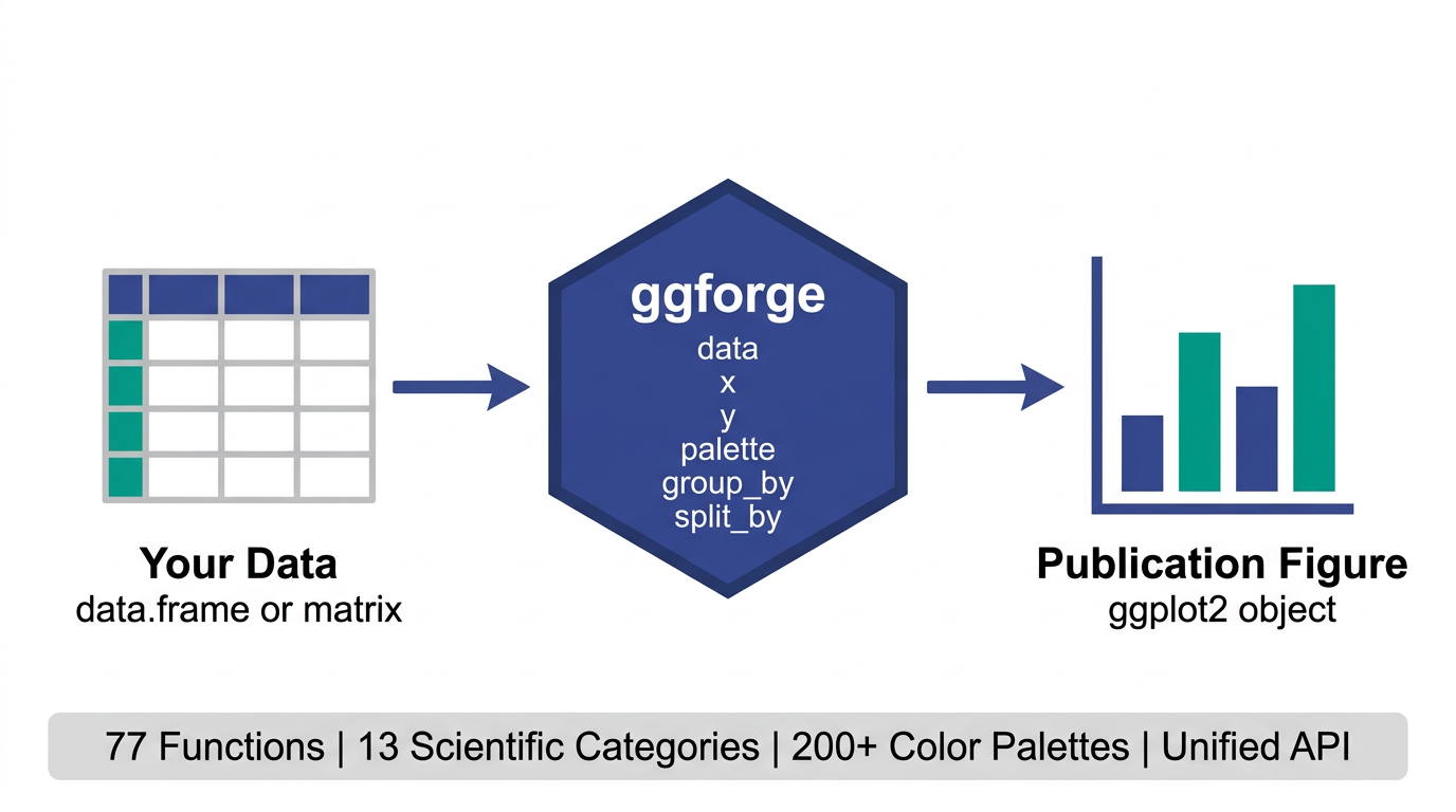
77 functions · 13 categories · 200+ palettes · 1 unified API
A ggplot2 extension that wraps common scientific plotting patterns into high-level functions with publication-oriented defaults. Instead of manually adjusting themes, palettes, and annotations every time, ggforge tries to give you a reasonable starting point — so you spend more time on the science and less on the styling.
Installation
install.packages("ggforge", repos = "https://zaoqu-liu.r-universe.dev")

# or from GitHub
remotes::install_github("Zaoqu-Liu/ggforge")Why ggforge?
Getting a figure from “it works” to “ready for submission” often takes as much effort as the analysis itself — tweaking themes, picking colors, adding statistical annotations. ggforge wraps these common patterns into sensible defaults.
clinical <- data.frame(
  arm = rep(c("Placebo", "Drug A", "Drug B"), each = 30),
  response = c(rnorm(30, 5, 2), rnorm(30, 7, 2), rnorm(30, 9, 2.5))
)

p_default <- ggplot(clinical, aes(arm, response, fill = arm)) +
  geom_boxplot() +
  labs(x = "Treatment Arm", y = "Response")

p_forge <- BoxPlot(clinical, x = "arm", y = "response",
  palette = "lancet", add_point = TRUE, pt_alpha = 0.3,
  comparisons = list(c("Placebo", "Drug A"), c("Placebo", "Drug B")),
  xlab = "Treatment Arm", ylab = "Response")

p_default + p_forge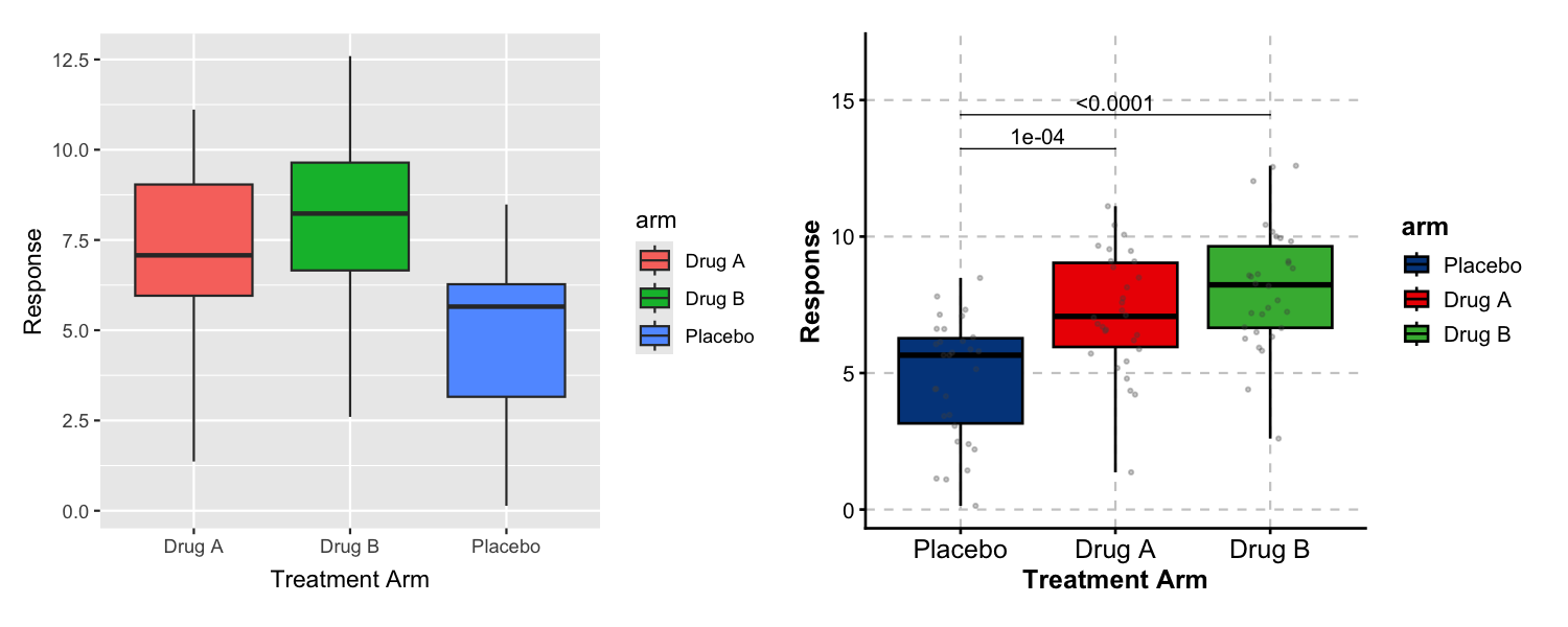
Left: ggplot2 with defaults. Right: ggforge adds curated colors, data points, and statistical comparisons in a single function call.
Gallery
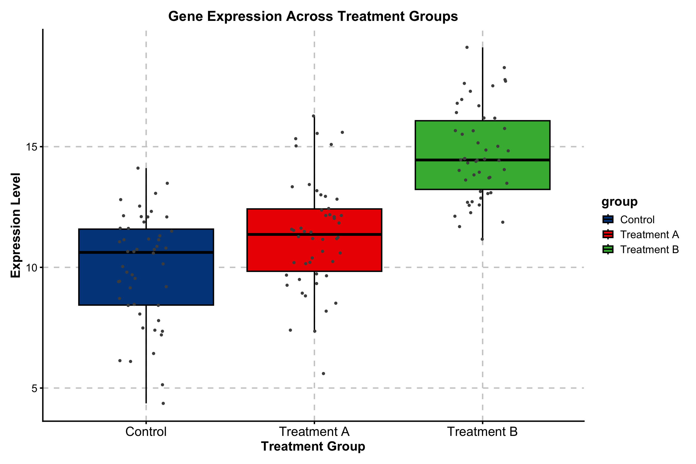
Box Plot — Statistical Comparisons
Built-in pairwise testing with Wilcoxon, t-test, or Kruskal-Wallis. Significance brackets and p-value formatting require no extra packages.
expr_data <- data.frame(
  subtype = rep(c("Basal", "Her2", "LumA", "LumB"), each = 40),
  score = c(rnorm(40, 8, 1.5), rnorm(40, 6, 2),
            rnorm(40, 4, 1.5), rnorm(40, 5, 2))
)

BoxPlot(
  expr_data, x = "subtype", y = "score",
  palette = "npg",
  add_point = TRUE, pt_alpha = 0.3,
  comparisons = list(c("Basal", "LumA"), c("Her2", "LumB")),
  title = "Immune Score by Molecular Subtype",
  xlab = "Subtype", ylab = "Immune Score"
)
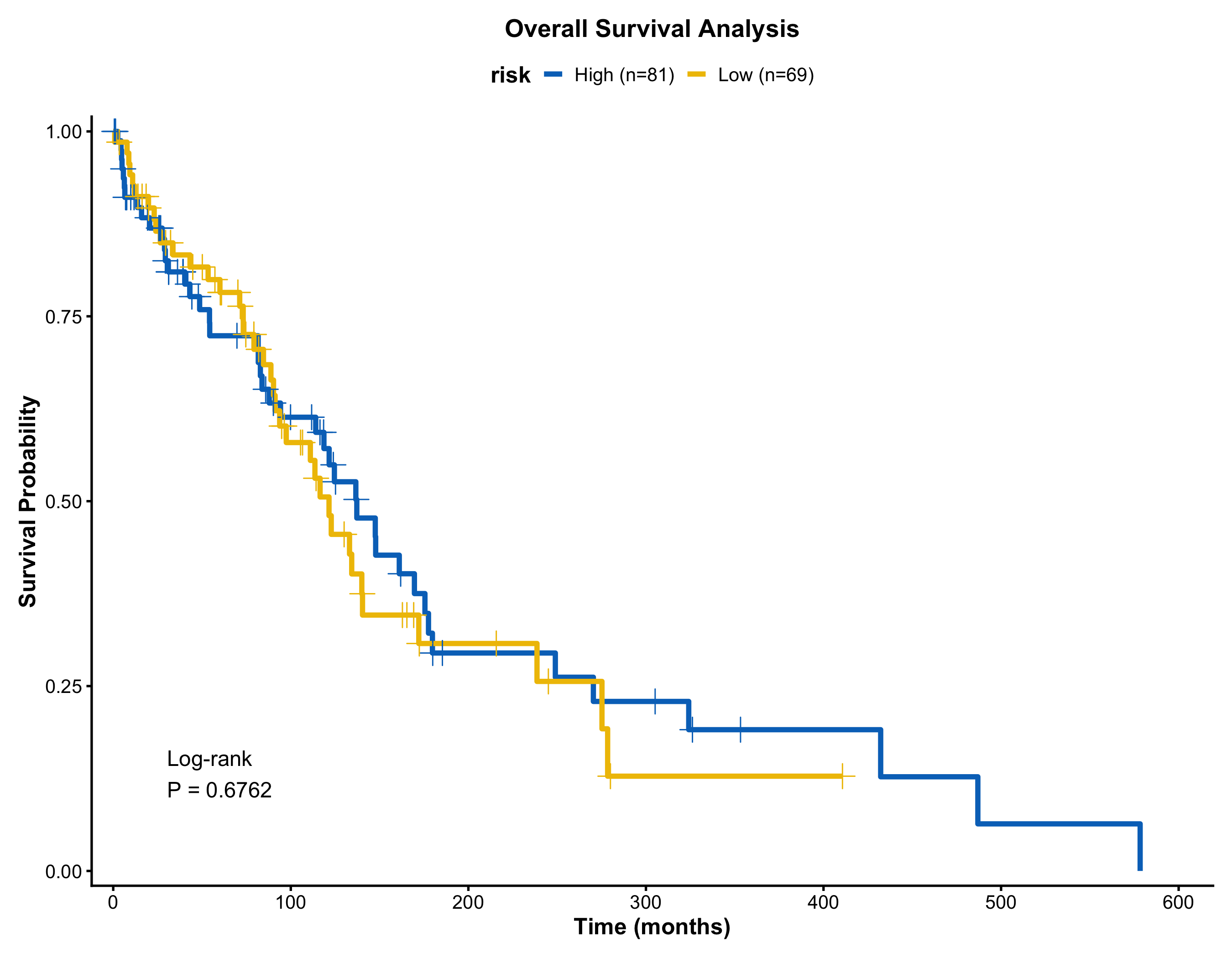
Kaplan-Meier Survival Curve
Risk table, log-rank p-value, confidence intervals, and median lines — toggled by simple flags.
surv_data <- data.frame(
  time = c(rexp(80, 0.008), rexp(70, 0.015)),
  status = sample(0:1, 150, replace = TRUE, prob = c(0.35, 0.65)),
  risk = rep(c("Low Risk", "High Risk"), c(80, 70))
)

KMPlot(
  surv_data, time = "time", status = "status", group_by = "risk",
  palette = "jco",
  show_risk_table = TRUE,
  show_pval = TRUE,
  show_conf_int = TRUE,
  title = "Overall Survival by Risk Group",
  xlab = "Time (months)"
)
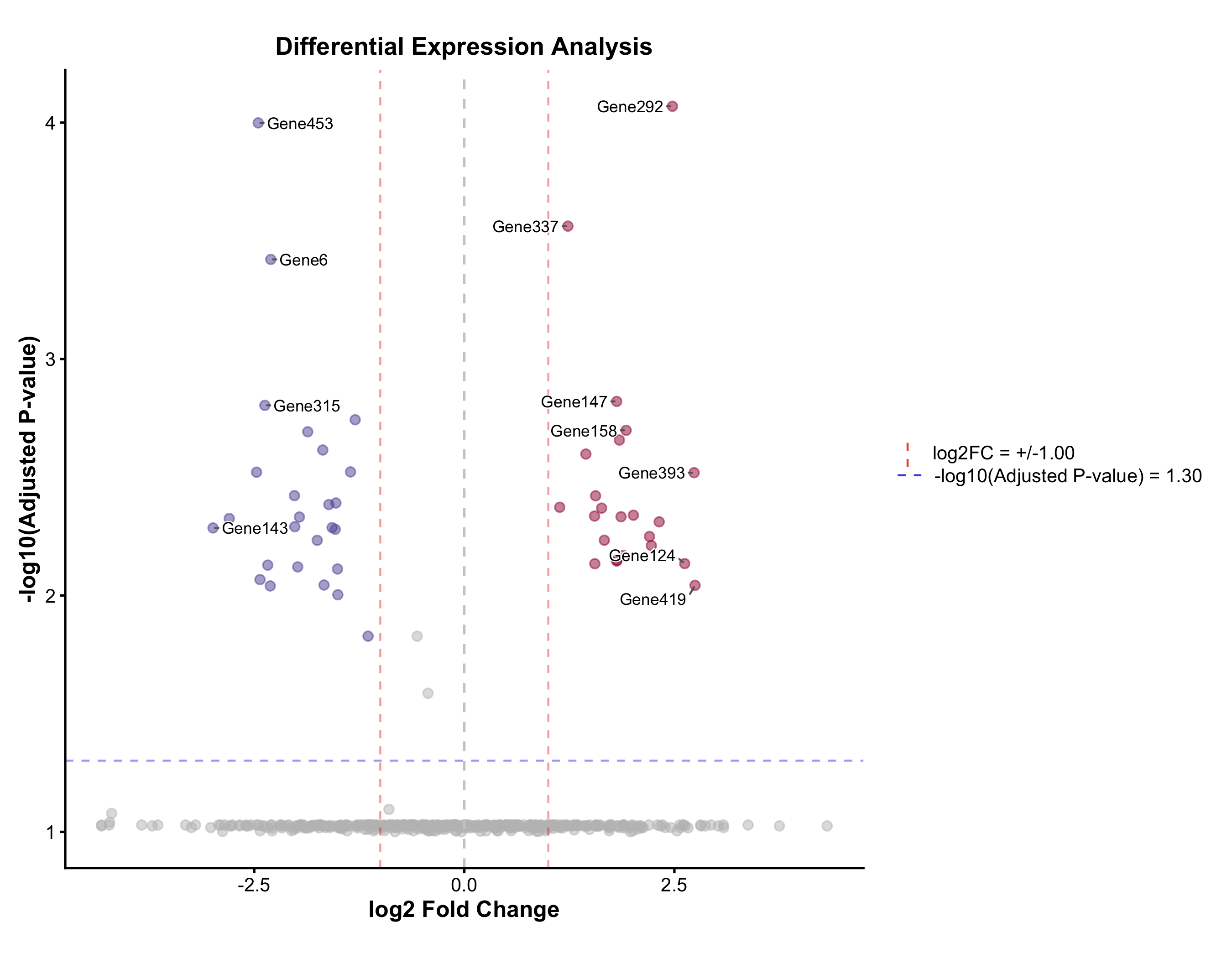
Volcano Plot
Automatic up / down / non-significant coloring, adjustable fold-change and p-value cutoffs, and label placement via ggrepel.
real_genes <- c("TP53","EGFR","MYC","KRAS","BRCA1","CDK4","PTEN","RB1",
                "PIK3CA","AKT1","BRAF","JAK2","STAT3","NRAS","VEGFA",
                "CD274","CTLA4","PDCD1","IDO1","HAVCR2")
deg <- data.frame(
  gene = c(real_genes, paste0("Gene", 1:480)),
  log2FC = c(rnorm(10, 2.5, 0.8), rnorm(10, -2.5, 0.8), rnorm(480, 0, 0.8)),
  padj = c(runif(20, 1e-10, 1e-3), runif(480, 0.01, 1))
)

VolcanoPlot(
  deg, x = "log2FC", y = "padj", label_by = "gene",
  x_cutoff = 1, y_cutoff = 0.05, nlabel = 10,
  title = "Differential Expression Analysis",
  xlab = "log2 Fold Change", ylab = "-log10(Adjusted P)"
)
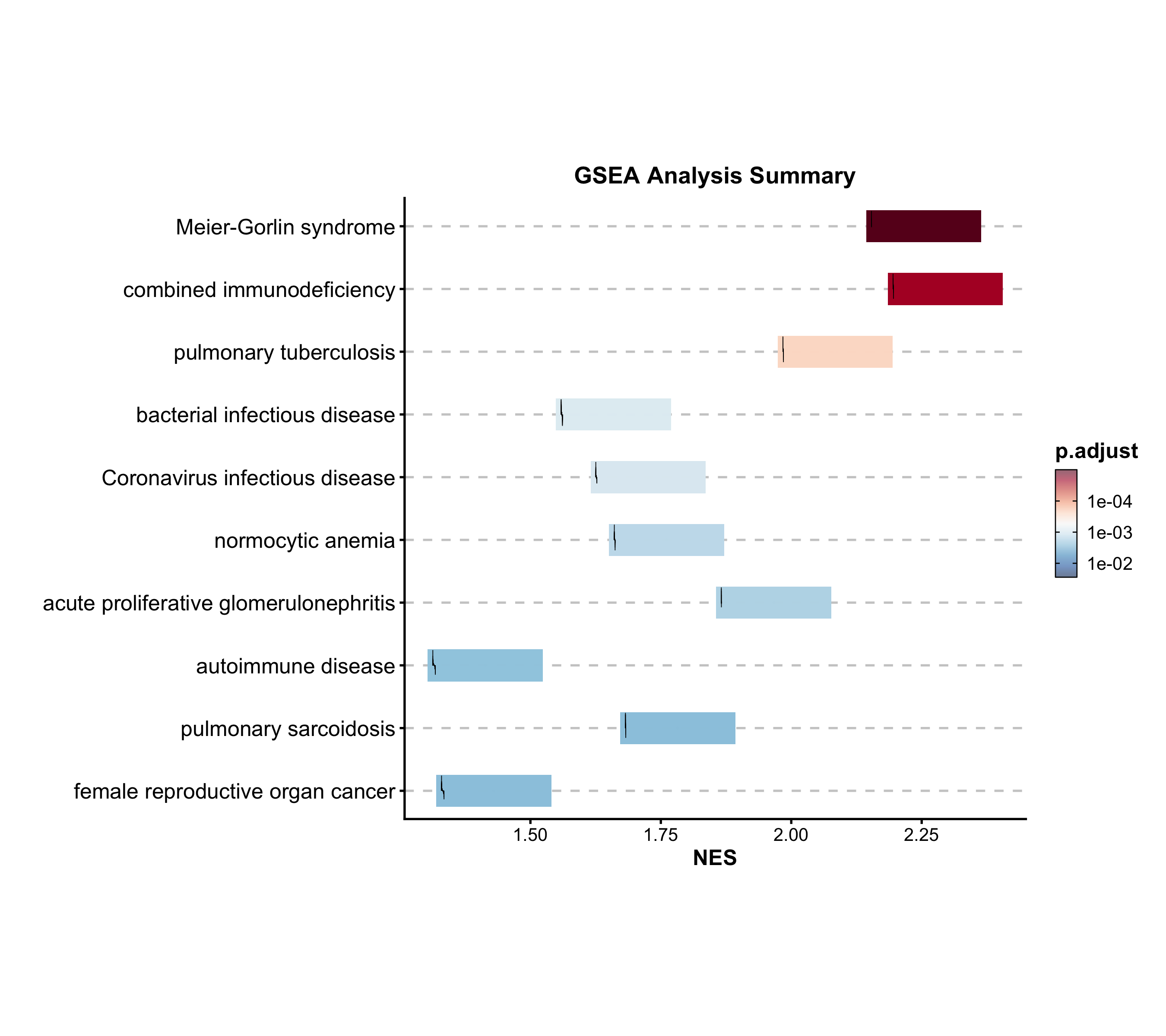
GSEA Summary
Summarize multiple gene set enrichment results. Color maps to NES, size to significance.
data("gsea_example")

GSEASummaryPlot(
  gsea_example, top_term = 20, palette = "RdBu",
  title = "Gene Set Enrichment Analysis"
)
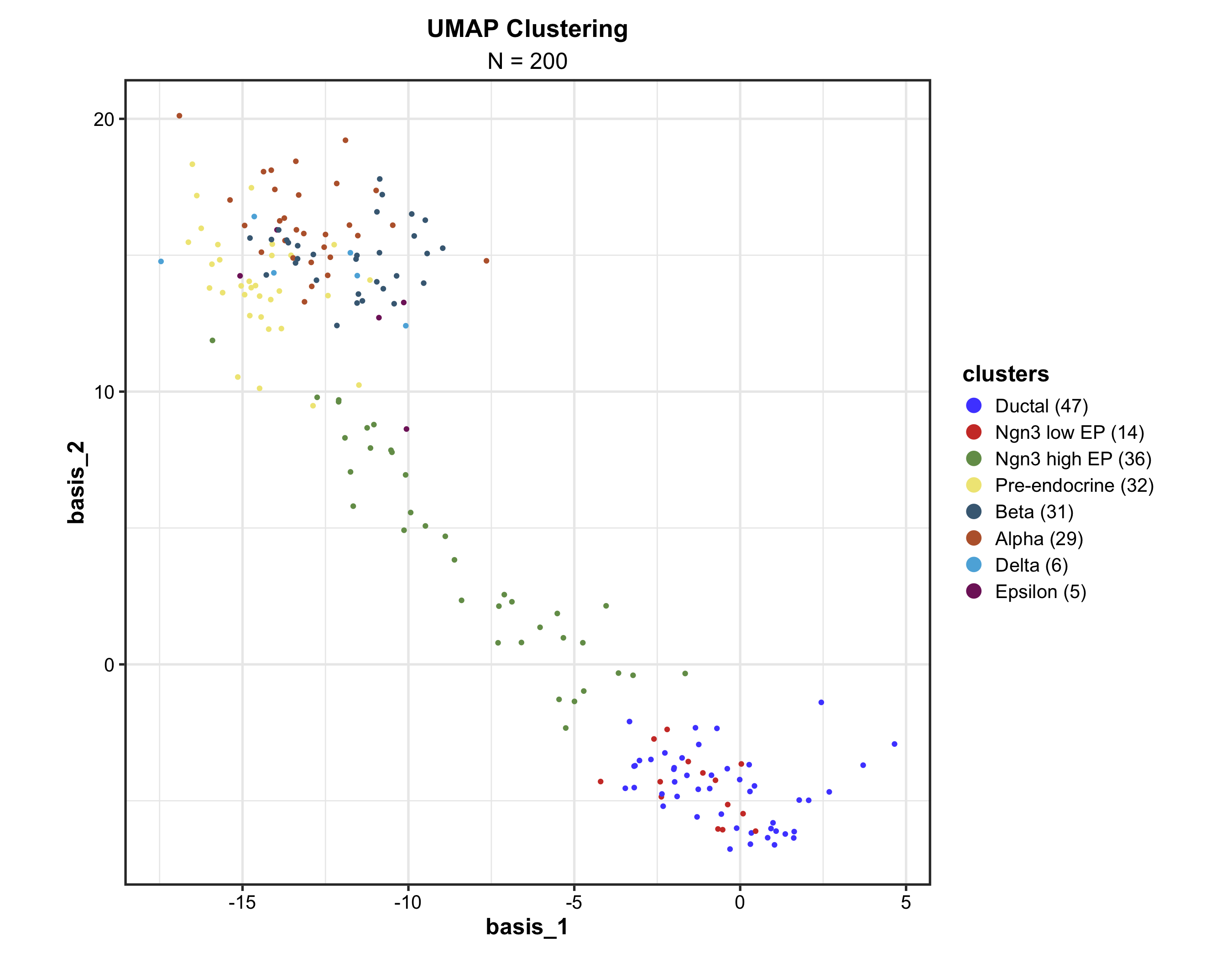
Dimension Reduction (UMAP)
Supports cluster labeling, hull/ellipse marks, density overlays, hex binning for large datasets, and 3D mode via plotly.
data("dim_example")

DimPlot(
  dim_example, dims = c("basis_1", "basis_2"),
  group_by = "clusters", palette = "igv",
  pt_size = 1.2,
  label = TRUE, label_insitu = TRUE,
  title = "UMAP Cell Clustering"
)
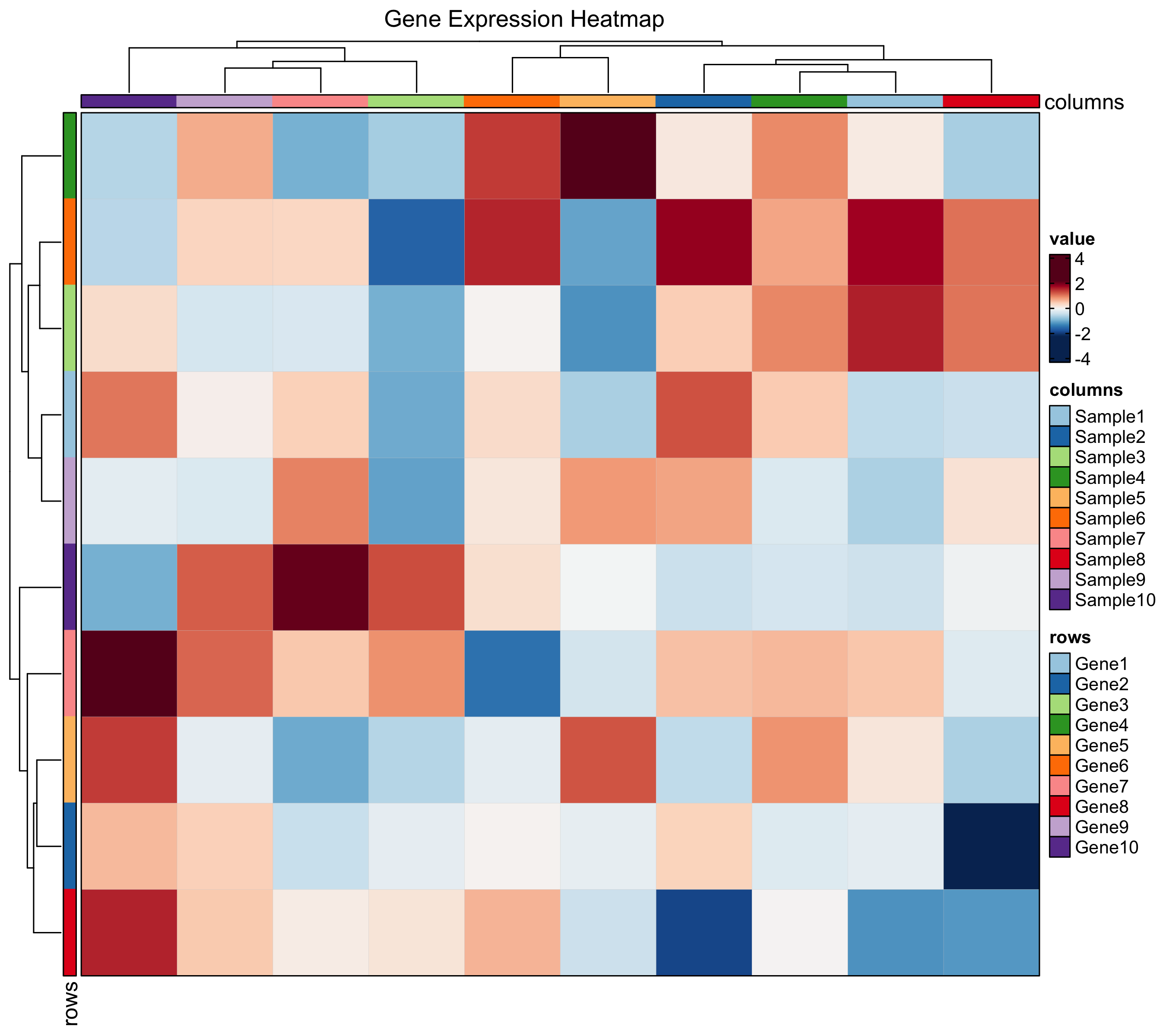
Heatmap
Enhanced heatmaps via ComplexHeatmap with simplified syntax. Supports annotations, grouping, z-score normalization, and multiple cell types (dot, bar, violin, pie).
immune_genes <- c("CD3D","CD3E","CD8A","FOXP3","CD19","MS4A1",
                   "CD68","CSF1R","NCAM1","NKG7")
mat <- matrix(rnorm(120, 0, 1.5), nrow = 10,
              dimnames = list(immune_genes, paste0("S", 1:12)))
mat[1:4, 1:4] <- mat[1:4, 1:4] + 2
mat[5:6, 5:8] <- mat[5:6, 5:8] + 2.5
mat[7:8, 5:8] <- mat[7:8, 5:8] + 1.5
mat[9:10, 9:12] <- mat[9:10, 9:12] + 2

Heatmap(
  mat, palette = "RdBu",
  show_row_names = TRUE, show_column_names = TRUE,
  title = "Immune Marker Expression"
)
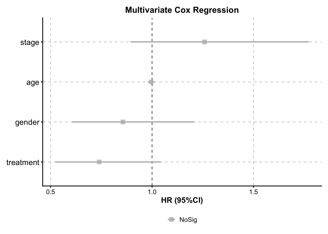
Cox Regression — Forest Plot
Multivariate Cox model forest plot. Automatic HR calculation, color-coded risk direction, and confidence intervals.
cox_data <- data.frame(
  time = c(rexp(100, 0.008), rexp(100, 0.012)),
  event = sample(0:1, 200, replace = TRUE, prob = c(0.3, 0.7)),
  age = rnorm(200, 60, 10),
  gender = sample(c("Male", "Female"), 200, replace = TRUE),
  stage = sample(c("I-II", "III-IV"), 200, replace = TRUE),
  treatment = sample(c("Standard", "Experimental"), 200, replace = TRUE)
)

CoxPlot(
  cox_data, time = "time", event = "event",
  vars = c("age", "gender", "stage", "treatment"),
  plot_type = "forest", palette = "nejm",
  title = "Multivariate Cox Regression"
)
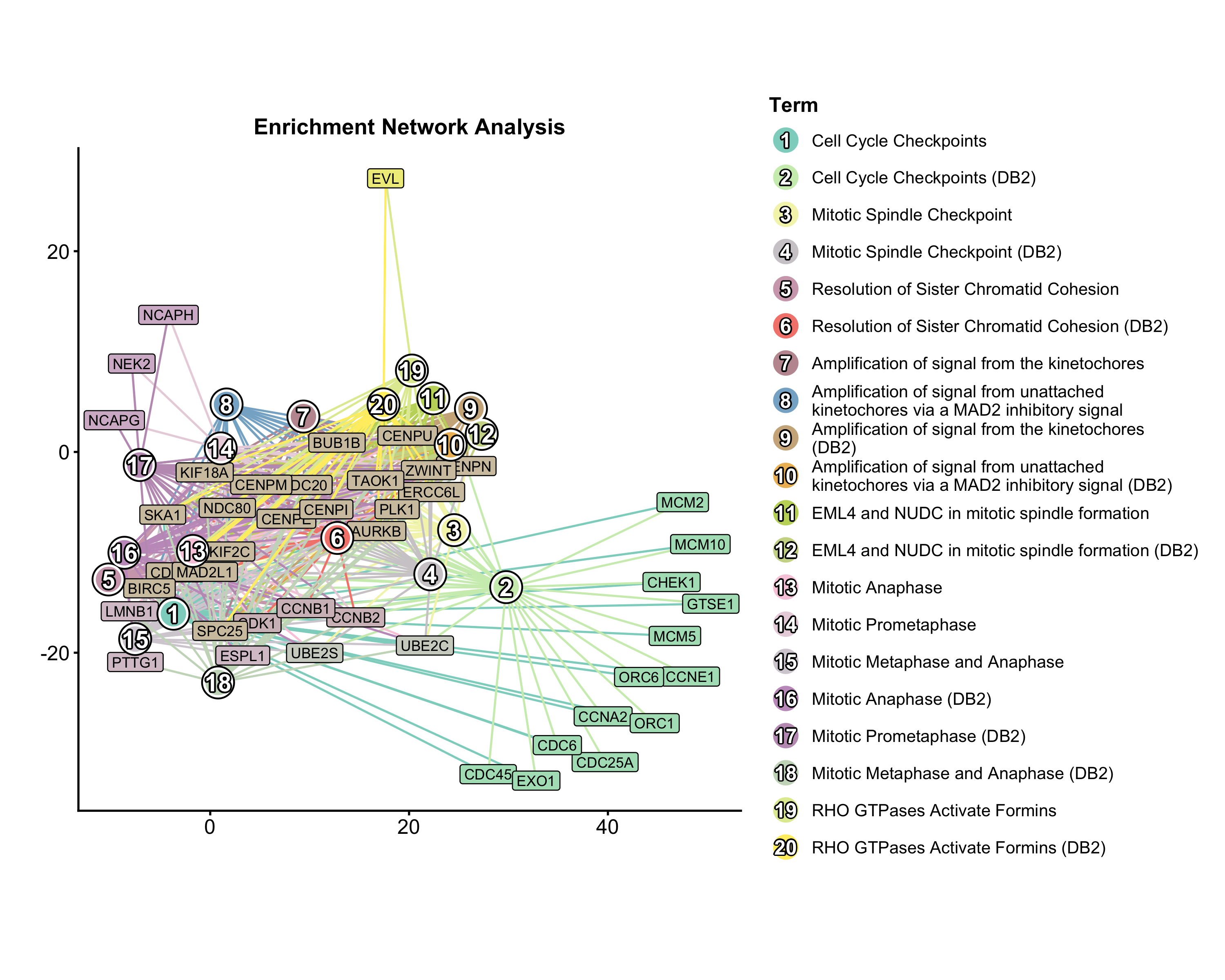
Enrichment Network
Pathway network from enrichment results. Nodes = pathways, edges = shared genes, node size = significance.
data("enrich_multidb_example")

EnrichNetwork(
  enrich_multidb_example, top_term = 20, layout = "fr",
  palette = "Set3",
  title = "Pathway Network"
)
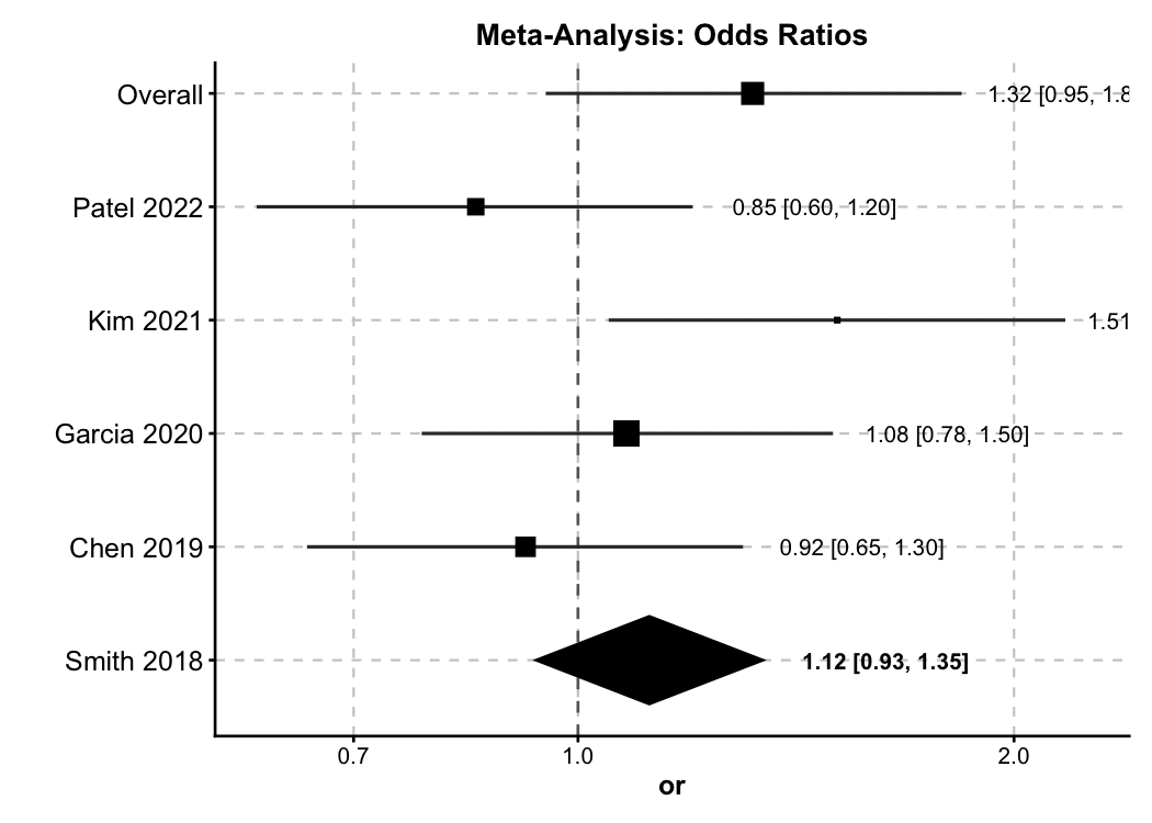
Forest Plot — Meta-Analysis
New in v2.0. General-purpose forest plot supporting OR / RR / HR / SMD with diamond summaries and subgroup analysis.
meta <- data.frame(
  study = c("Smith 2018", "Chen 2019", "Garcia 2020",
            "Kim 2021", "Patel 2022", "Overall"),
  or = c(1.32, 0.85, 1.51, 1.08, 0.92, 1.12),
  lower = c(0.95, 0.60, 1.05, 0.78, 0.65, 0.93),
  upper = c(1.84, 1.20, 2.17, 1.50, 1.30, 1.35),
  weight = c(22, 18, 15, 25, 20, NA),
  is_summary = c(FALSE, FALSE, FALSE, FALSE, FALSE, TRUE)
)

ForestPlot(
  meta, estimate = "or", ci_lower = "lower", ci_upper = "upper",
  label = "study", weight = "weight", is_summary = "is_summary",
  null_value = 1, log_scale = TRUE,
  title = "Meta-Analysis: Odds Ratios"
)
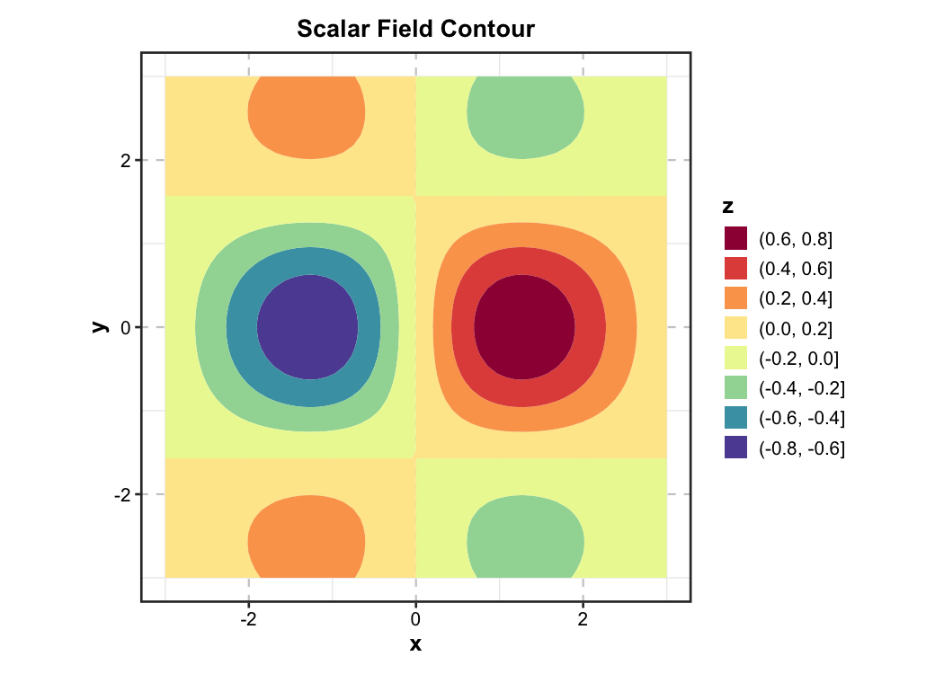
Contour Plot — Earth Science
New in v2.0. 2D filled contour for scalar fields — used in physics, chemistry, geology, and meteorology.
grid_data <- expand.grid(
  x = seq(-3, 3, length.out = 60),
  y = seq(-3, 3, length.out = 60)
)
grid_data$z <- with(grid_data, sin(x) * cos(y) * exp(-(x^2 + y^2) / 8))

ContourPlot(
  grid_data, x = "x", y = "y", z = "z",
  type = "filled", palette = "Spectral",
  title = "Scalar Field Contour"
)
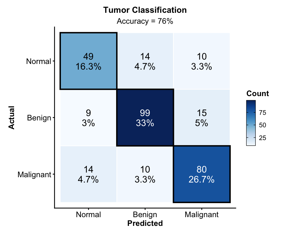
Confusion Matrix — Machine Learning
New in v2.0. Classification evaluation with counts, percentages, diagonal highlighting, and accuracy annotation.
set.seed(42)
cm_data <- data.frame(
  actual = sample(c("Benign", "Malignant", "Normal"), 300,
    replace = TRUE, prob = c(0.4, 0.35, 0.25)),
  predicted = sample(c("Benign", "Malignant", "Normal"), 300,
    replace = TRUE, prob = c(0.38, 0.37, 0.25))
)
diag_idx <- sample(300, 200)
cm_data$predicted[diag_idx] <- cm_data$actual[diag_idx]

ConfusionMatrixPlot(
  cm_data, truth = "actual", predicted = "predicted",
  palette = "Blues",
  title = "Tumor Classification"
)
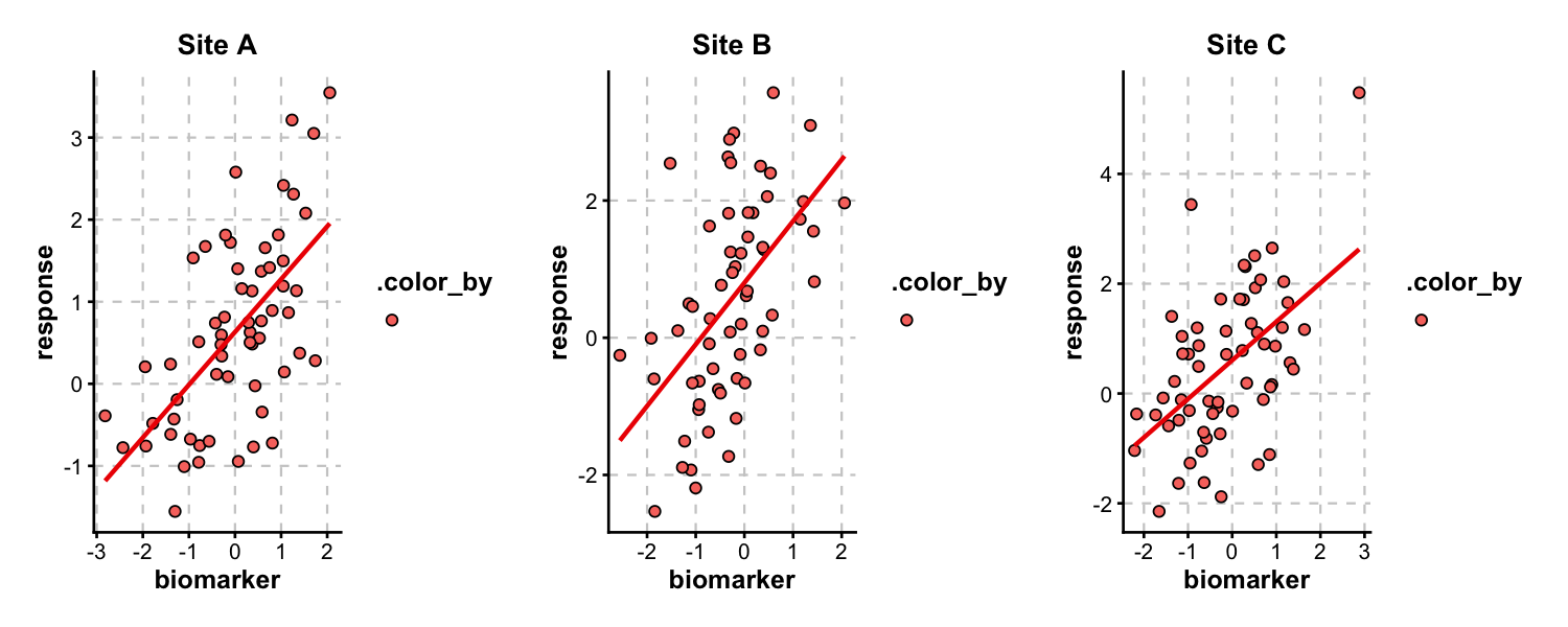
Multi-Panel Layouts
split_by splits data into separate panels and combines them via patchwork. Control layout with nrow, ncol, or design.
trial_data <- data.frame(
  biomarker = rnorm(180),
  response = rnorm(180),
  site = rep(c("Site A", "Site B", "Site C"), each = 60),
  arm = rep(rep(c("Control", "Treatment"), each = 30), 3)
)
trial_data$response <- trial_data$response +
  0.6 * trial_data$biomarker +
  ifelse(trial_data$arm == "Treatment", 1.5, 0)

ScatterPlot(
  trial_data, x = "biomarker", y = "response",
  group_by = "arm", split_by = "site",
  palette = "nejm", add_smooth = TRUE,
  combine = TRUE, nrow = 1
)
Architecture
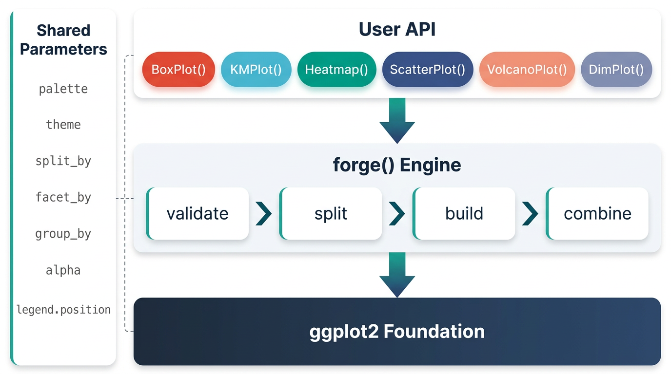
ggforge is organized in layers: a configuration/spec system at the base, a shared parameter + validation layer, a theme/palette engine, and a plot builder that powers all 77 functions through a consistent interface. Every function returns a standard ggplot object — add any layer or theme with +.
All 13 Categories
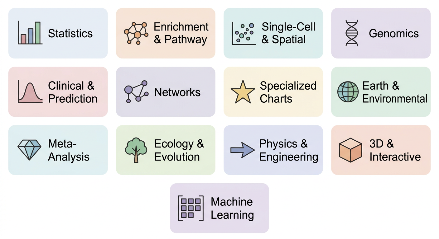
| Category | Functions |
|---|---|
| Statistics |
BoxPlot ViolinPlot DensityPlot RidgePlot JitterPlot BeeswarmPlot Histogram QQPlot ScatterPlot LinePlot BarPlot AreaPlot TrendPlot DotPlot CorPlot CorPairsPlot LollipopPlot WaterfallPlot SplitBarPlot RadarPlot SpiderPlot PieChart RingPlot
|
| Enrichment & Pathway |
EnrichMap EnrichNetwork GSEASummaryPlot GSEAPlot
|
| Single-Cell & Spatial |
DimPlot FeatureDimPlot VelocityPlot TrajectoryPlot StackedViolinPlot ClustreePlot SpatImagePlot SpatPointsPlot SpatShapesPlot SpatMasksPlot
|
| Genomics |
VolcanoPlot ManhattanPlot VennDiagram UpsetPlot
|
| Clinical & Prediction |
KMPlot CoxPlot ROCCurve NomogramPlot CalibrationPlot DecisionCurvePlot
|
| Networks & Relationships |
Heatmap ChordPlot CircosPlot SankeyPlot AlluvialPlot Network
|
| Specialized |
DumbbellPlot StreamGraph TreemapPlot ParallelCoordPlot WafflePlot TimelinePlot DendrogramPlot SunburstPlot WordCloudPlot RarefactionPlot
|
| Earth & Environmental |
ContourPlot TernaryPlot PolarPlot WindRosePlot MapPlot
|
| Meta-Analysis |
ForestPlot FunnelPlot BlandAltmanPlot
|
| Ecology & Evolution |
OrdinationPlot PhyloTreePlot RankAbundancePlot
|
| Physics & Engineering |
QuiverPlot StreamlinePlot
|
| 3D & Interactive |
Scatter3D Surface3D ggforge_interactive
|
| Machine Learning | ConfusionMatrixPlot |
Design Philosophy
- Sensible defaults — Journal-oriented aesthetics (typography, palettes, annotations) are built in, so the first draft is often close enough
-
One API — Learn the pattern once (
data,x,y,group_by,split_by,palette), apply it to 77 functions -
Full ggplot2 compatibility — Every function returns a ggplot object; customize further with
+ - Batteries included — 200+ color palettes, multi-panel layouts via patchwork, and statistical annotations are all built in
AI Agent Integration
ggforge is designed to work seamlessly with AI coding agents (Cursor, Claude Code, OpenCode, etc.). Instead of writing 50+ lines of raw ggplot2 code, the agent calls one ggforge function with the right parameters.
One-command setup:
This deploys skill files and rules to your IDE so the agent automatically uses ggforge for all R plotting tasks. Supports:
-
Cursor IDE — Skill (
~/.cursor/skills/ggforge/) + Rule (~/.cursor/rules/) -
Claude Code — Skill (
~/.claude/skills/ggforge/) + directive in~/.claude/CLAUDE.md
To remove: ggforge_agent_uninstall()
Built-in function discovery:
ggforge_gallery()                   # browse all 77 functions by category
ggforge_gallery("clinical")         # filter by domain
ggforge_gallery("BoxPlot")          # quick-reference card for a specific function
ggforge_gallery(format = "data")    # structured data.frame for programmatic use
Smart error recovery for agents:
BoxPlot(iris, x = "specie")
#> Error: Column(s) not found in data: "specie"
#> ℹ Available columns: "Sepal.Length", "Sepal.Width", ...
#> ℹ Did you mean: "Species"?
Documentation
- Website: https://zaoqu-liu.github.io/ggforge
- Getting Started: https://zaoqu-liu.github.io/ggforge/articles/introduction.html
- Tutorial: https://zaoqu-liu.github.io/ggforge/articles/tutorial.html
- Gallery: https://zaoqu-liu.github.io/ggforge/articles/gallery.html
- Reference: https://zaoqu-liu.github.io/ggforge/reference/
License
GPL-3. See LICENSE.md for details.
Author
Zaoqu Liu
- ORCID: 0000-0002-0452-742X
- Email: liuzaoqu@163.com
- Affiliation: Chinese Academy of Medical Sciences and Peking Union Medical College