Creates a summary visualization of GSEA (Gene Set Enrichment Analysis) results, showing normalized enrichment scores (NES) with integrated line plots for each term.
Usage
GSEASummaryPlot(
  data,
  in_form = c("auto", "dose", "fgsea"),
  gene_ranks = "@gene_ranks",
  gene_sets = "@gene_sets",
  top_term = 10,
  metric = "p.adjust",
  cutoff = 0.05,
  character_width = 50,
  line_plot_size = 0.25,
  metric_name = metric,
  nonsig_name = "Insignificant",
  linewidth = 0.2,
  line_by = c("prerank", "running_score"),
  title = NULL,
  subtitle = NULL,
  xlab = NULL,
  ylab = NULL,
  alpha = 0.6,
  aspect.ratio = NULL,
  legend.position = "right",
  legend.direction = "vertical",
  theme = "theme_ggforge",
  theme_args = list(),
  palette = "Spectral",
  palcolor = NULL,
  seed = 8525,
  ...
)
Arguments
- data
A data frame of GSEA results For example, from
DOSE::gseDO()orfgsea::fgsea(). Required columns areID,Description,NES,p.adjust,pvalue. TheIDcolumn is used to match the gene sets.- in_form
The format of the input data
fgsea: The input data is from thefgseapackage.dose: The input data is from theDOSEpackage.auto: Automatically detect the format of the input data. When "leadingEdge" is in the input data, it will be treated as "fgsea"; otherwise, if "core_enrichment" is in the input data, it will be treated as "dose".
- gene_ranks
A numeric vector of gene ranks with genes as names The gene ranks are used to plot the gene sets. If
gene_ranksis a character vector starting with@, the gene ranks will be taken from the attribute ofdata.- gene_sets
A list of gene sets, typically from a record of a GMT file The names of the list should match the
IDcolumn ofdata. Ifgene_setsis a character vector starting with@, the gene sets will be taken from the attribute ofdata.- top_term
An integer to select the top terms
- metric
The metric to use for the significance of the terms Typically the column name of p values or adjusted p values. It is also used to select the top terms.
- cutoff
The cutoff for the significance of the terms The terms will not be filtered with this cutoff; they are only filtered by the
top_termranked by themetric. The cutoff here is used to show the significance of the terms on the plot. For the terms that are not significant, the color will be grey.- character_width
The width of the characters in the y-axis
- line_plot_size
The size of the line plots
- metric_name
The name of the metric to show in the color bar
- nonsig_name
The name of the legend for the nonsignificant terms
- linewidth
The width of the lines in the line plots
- line_by
The method to calculate the line plots.
prerank: Use the gene ranks as heights to plot the line plots.running_score: Use the running score to plot the line plots.
- title
Plot title
- subtitle
Plot subtitle
- xlab
X-axis label
- ylab
Y-axis label
- alpha
Transparency level (0-1)
- aspect.ratio
Aspect ratio of plot panel
- legend.position
Legend position: "none", "left", "right", "bottom", "top"
- legend.direction
Legend direction: "horizontal" or "vertical"
- theme
Theme name (string) or theme function
- theme_args
List of arguments passed to theme function
- palette
Color palette name
- palcolor
Custom colors for palette
- seed
Random seed for reproducibility
- ...
Additional arguments passed to atomic plotting functions.
See also
Other enrichment-plots:
EnrichMap(),
EnrichNetwork(),
GSEAPlot()
Examples
# \donttest{
data(gsea_example)
# Basic usage
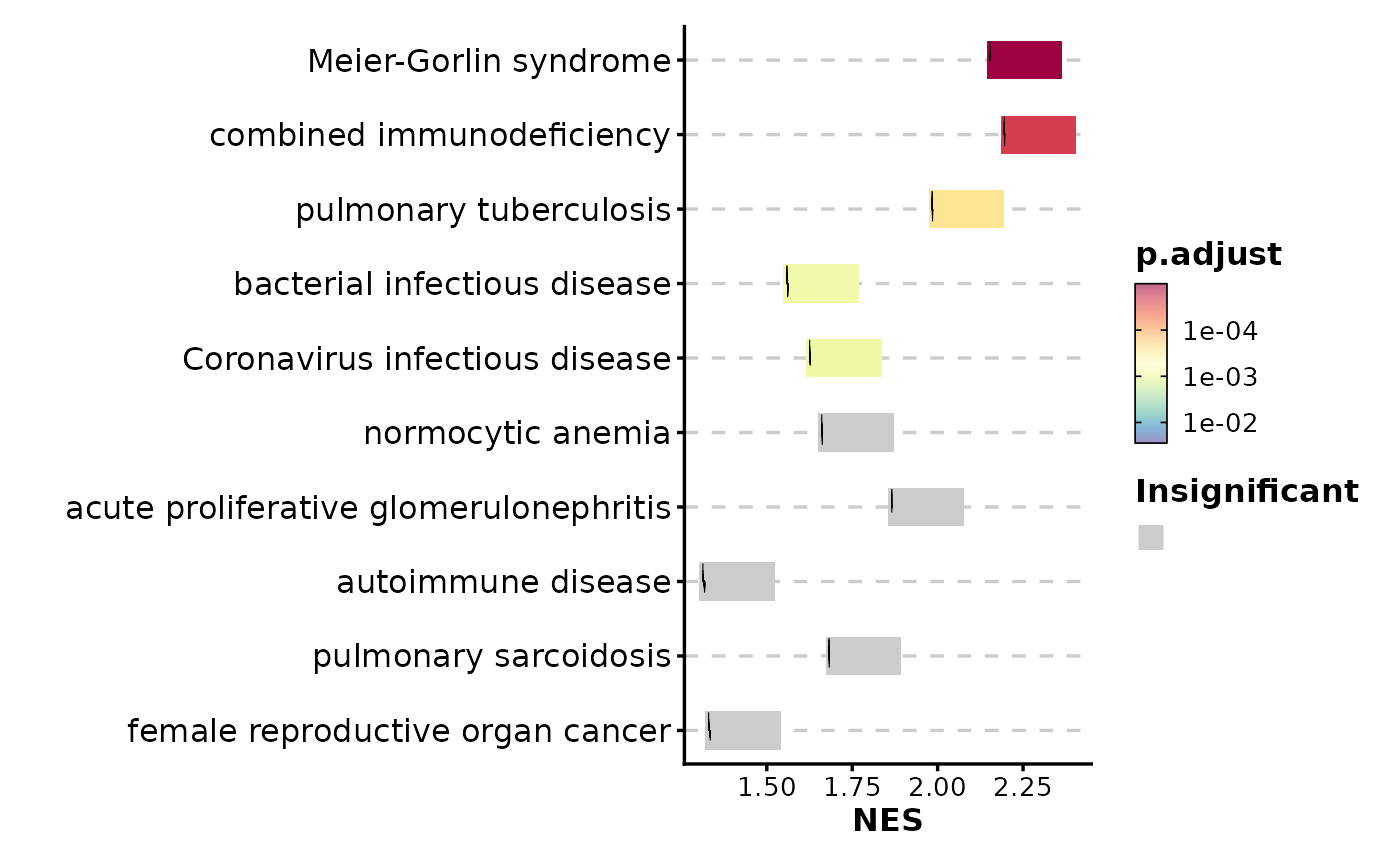
GSEASummaryPlot(gsea_example)
 # Use running score instead of prerank
GSEASummaryPlot(gsea_example, line_by = "running_score")
# Use running score instead of prerank
GSEASummaryPlot(gsea_example, line_by = "running_score")
 # Adjust significance cutoff
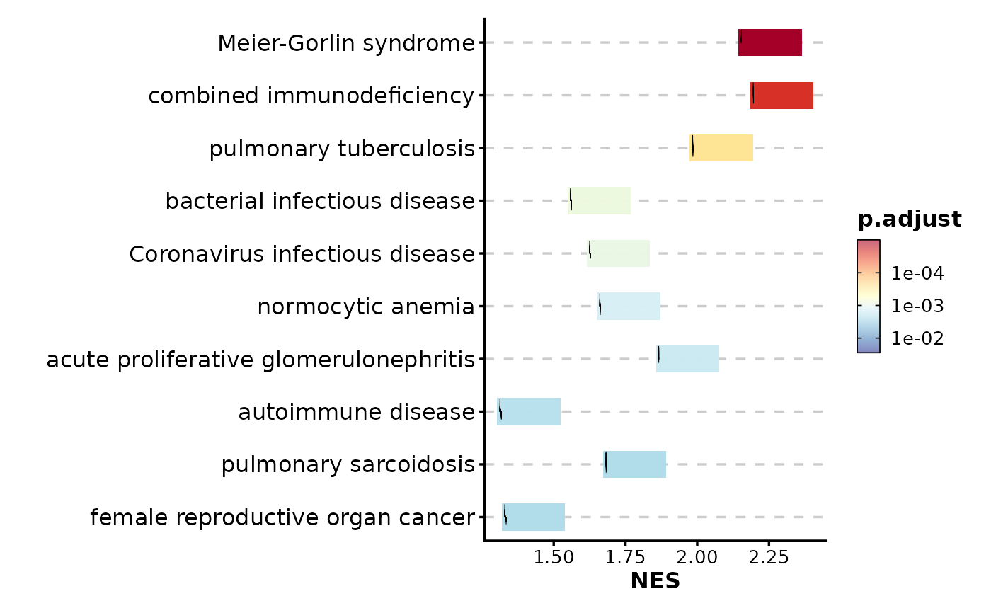
GSEASummaryPlot(gsea_example, cutoff = 0.01)
# Adjust significance cutoff
GSEASummaryPlot(gsea_example, cutoff = 0.01)
 # Show more terms
GSEASummaryPlot(gsea_example, top_term = 15)
# Show more terms
GSEASummaryPlot(gsea_example, top_term = 15)
 # Customize color palette
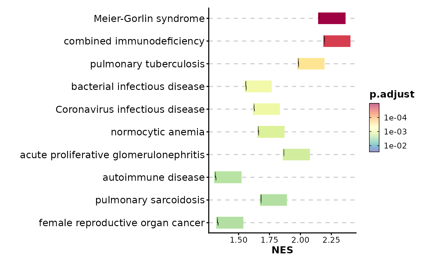
GSEASummaryPlot(gsea_example, palette = "RdYlBu")
# Customize color palette
GSEASummaryPlot(gsea_example, palette = "RdYlBu")
 # Adjust character width for long pathway names
GSEASummaryPlot(gsea_example, character_width = 70)
# Adjust character width for long pathway names
GSEASummaryPlot(gsea_example, character_width = 70)
 # }
# }