Introduction
This vignette demonstrates various visualization techniques for analyzing darwin optimization results. Effective visualization is crucial for understanding the trade-offs in multi-objective optimization and selecting appropriate solutions.
Prepare Example Data
# Create reference expression matrix
n_celltypes <- 6
n_genes <- 300

reference <- matrix(
  abs(rnorm(n_celltypes * n_genes, mean = 2)),
  nrow = n_celltypes,
  ncol = n_genes
)
rownames(reference) <- c("B_cells", "T_cells", "NK_cells", "Monocytes", "Dendritic", "Neutrophils")
colnames(reference) <- paste0("Gene", 1:n_genes)

# Add cell-type specific markers
for (i in 1:n_celltypes) {
  markers <- ((i - 1) * 15 + 1):(i * 15)
  reference[i, markers] <- reference[i, markers] + runif(15, 3, 6)
}

# Run optimization
dw <- darwin(reference)
dw$optimize(
  ngen = 80,
  pop_size = 80,
  objectives = c("correlation", "distance"),
  weights = c(-1, 1),
  verbose = FALSE,
  parallel = FALSE
)
Pareto Front Visualization
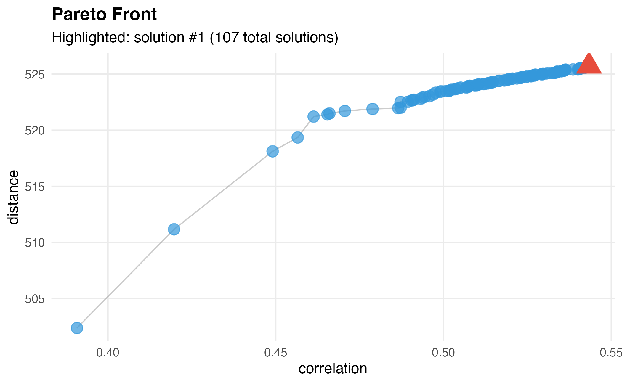
Basic Pareto Plot
dw$plot()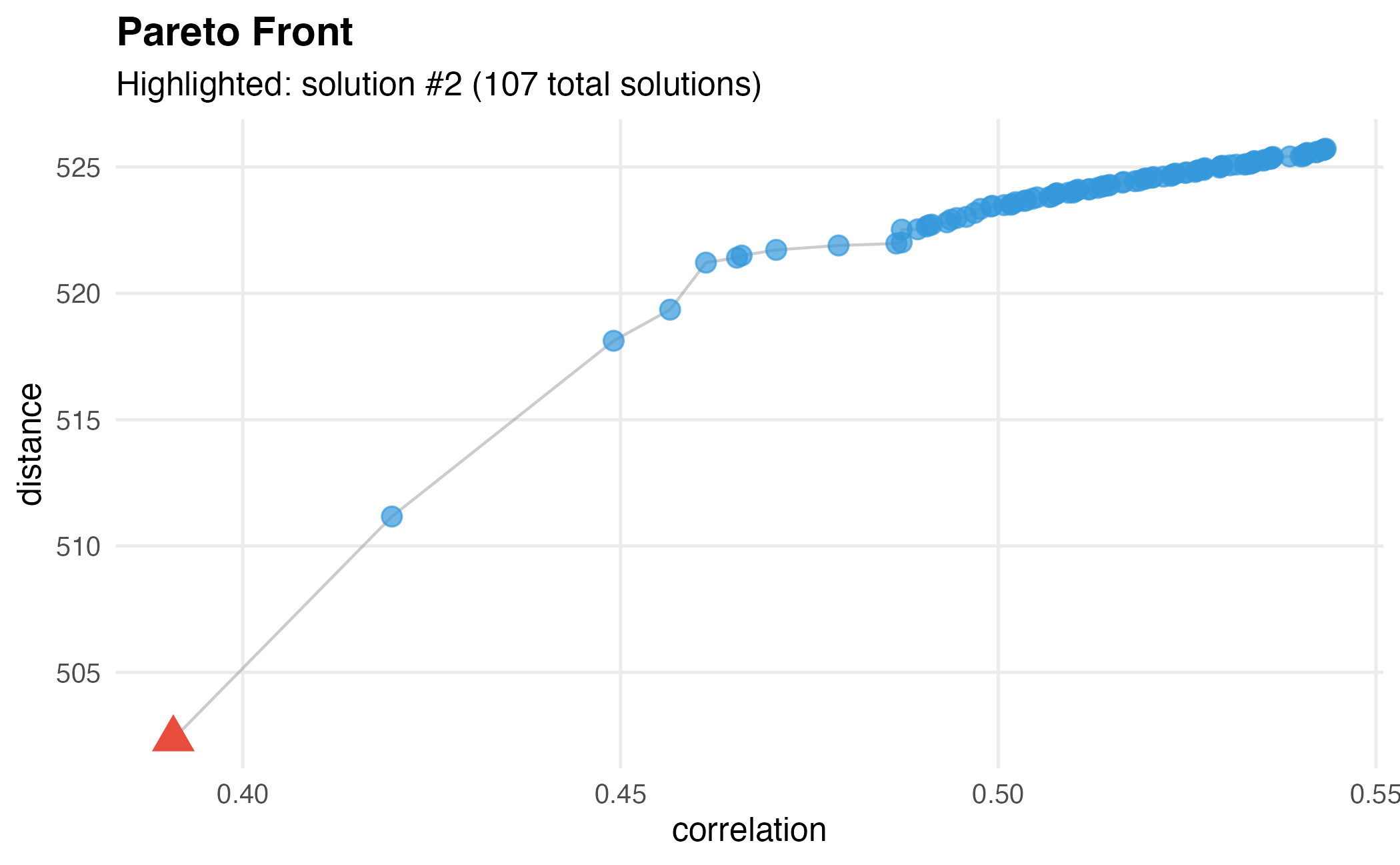
Basic Pareto front visualization showing the trade-off between objectives.
Customized Pareto Plot
# Highlight solution with best distance
dw$plot(
  index = c(2, -1),  # Objective 2, last rank (highest distance)
  point_size = 4,
  highlight_size = 7
)
Customized Pareto front with different highlighted solution.
Manual Pareto Plot with ggplot2
# Get fitness data
fitness <- dw$get_fitness()
pareto <- dw$get_pareto()
n_genes_per_solution <- sapply(pareto, sum)

# Create data frame
df <- data.frame(
  correlation = fitness$correlation,
  distance = fitness$distance,
  n_genes = n_genes_per_solution,
  solution_id = 1:nrow(fitness)
)

# Custom plot
ggplot(df, aes(x = correlation, y = distance)) +
  geom_point(aes(size = n_genes, color = n_genes), alpha = 0.7) +
  geom_line(color = "gray50", alpha = 0.5) +
  scale_color_viridis_c(option = "plasma") +
  scale_size_continuous(range = c(2, 8)) +
  labs(
    title = "Pareto Front Analysis",
    subtitle = paste(nrow(df), "Pareto-optimal solutions"),
    x = "Correlation (lower is better)",
    y = "Distance (higher is better)",
    color = "Number of\nGenes",
    size = "Number of\nGenes"
  ) +
  theme_minimal(base_size = 12) +
  theme(
    plot.title = element_text(face = "bold"),
    legend.position = "right"
  )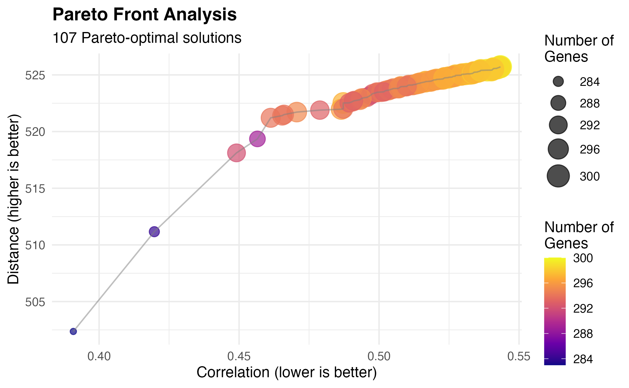
Fully customized Pareto front visualization.
Gene Selection Analysis
Gene Count Distribution
df_genes <- data.frame(n_genes = n_genes_per_solution)

ggplot(df_genes, aes(x = n_genes)) +
  geom_histogram(bins = 20, fill = "#3498db", color = "white", alpha = 0.8) +
  geom_vline(xintercept = median(n_genes_per_solution),
             color = "#e74c3c", linetype = "dashed", linewidth = 1) +
  annotate("text", x = median(n_genes_per_solution) + 5, y = Inf,
           label = paste("Median:", median(n_genes_per_solution)),
           vjust = 2, color = "#e74c3c") +
  labs(
    title = "Distribution of Selected Gene Counts",
    subtitle = "Across all Pareto-optimal solutions",
    x = "Number of Selected Genes",
    y = "Frequency"
  ) +
  theme_minimal(base_size = 12)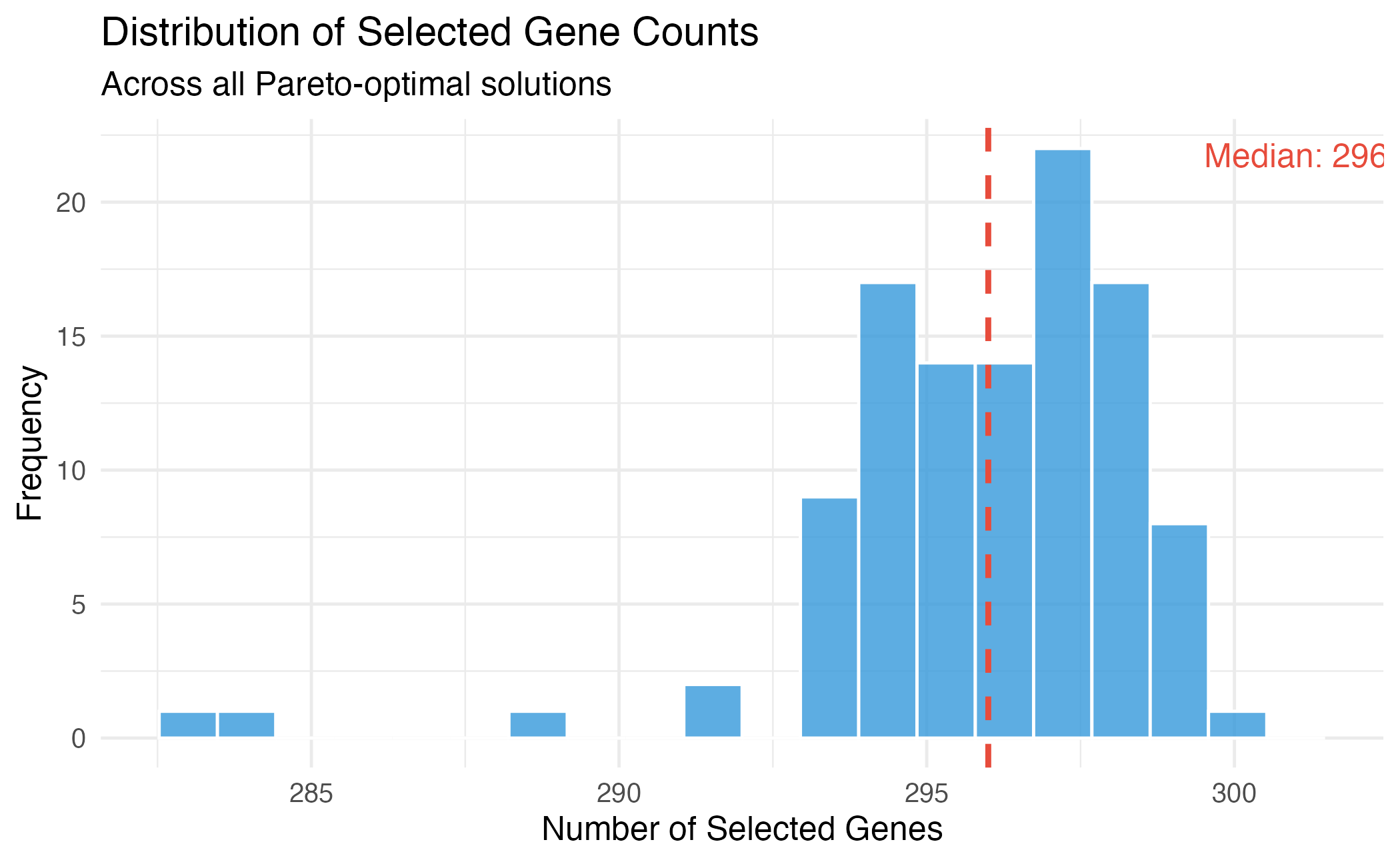
Distribution of selected gene counts across Pareto-optimal solutions.
Fitness vs Gene Count
library(ggplot2)

# Long format for faceting
df_long <- rbind(
  data.frame(n_genes = n_genes_per_solution,
             value = fitness$correlation,
             objective = "Correlation"),
  data.frame(n_genes = n_genes_per_solution,
             value = fitness$distance,
             objective = "Distance")
)

ggplot(df_long, aes(x = n_genes, y = value)) +
  geom_point(alpha = 0.6, color = "#3498db") +
  geom_smooth(method = "loess", se = TRUE, color = "#e74c3c") +
  facet_wrap(~objective, scales = "free_y") +
  labs(
    title = "Objectives vs Number of Selected Genes",
    x = "Number of Selected Genes",
    y = "Objective Value"
  ) +
  theme_minimal(base_size = 12)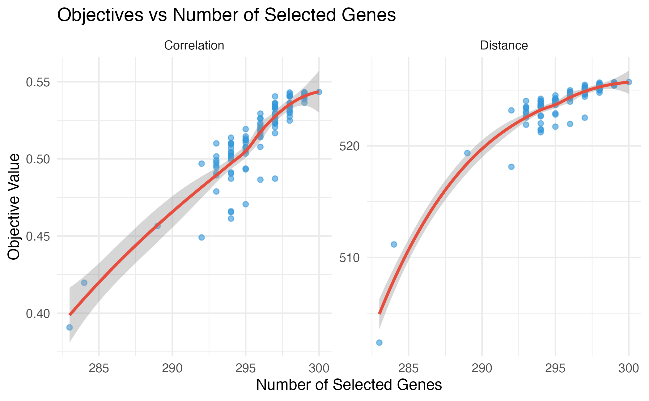
Relationship between number of genes and objective values.
Expression Profile Visualization
Heatmap of Selected Genes
# Select a solution
dw$select(weights = c(-1, 1))
selection <- dw$get_selection()
selected_data <- reference[, selection]

# For visualization, show top 50 most variable genes
gene_vars <- apply(selected_data, 2, var)
top_genes <- names(sort(gene_vars, decreasing = TRUE))[1:min(50, ncol(selected_data))]
plot_data <- selected_data[, top_genes]

# Scale for visualization
plot_data_scaled <- t(scale(t(plot_data)))

# Convert to long format
df_heat <- expand.grid(
  CellType = rownames(plot_data_scaled),
  Gene = colnames(plot_data_scaled)
)
df_heat$Expression <- as.vector(plot_data_scaled)

ggplot(df_heat, aes(x = Gene, y = CellType, fill = Expression)) +
  geom_tile() +
  scale_fill_gradient2(low = "#3498db", mid = "white", high = "#e74c3c",
                       midpoint = 0, limits = c(-3, 3), oob = scales::squish) +
  labs(
    title = "Expression Heatmap of Selected Genes",
    subtitle = paste("Top", length(top_genes), "most variable genes"),
    x = "Genes",
    y = "Cell Type",
    fill = "Scaled\nExpression"
  ) +
  theme_minimal(base_size = 10) +
  theme(
    axis.text.x = element_blank(),
    axis.ticks.x = element_blank()
  )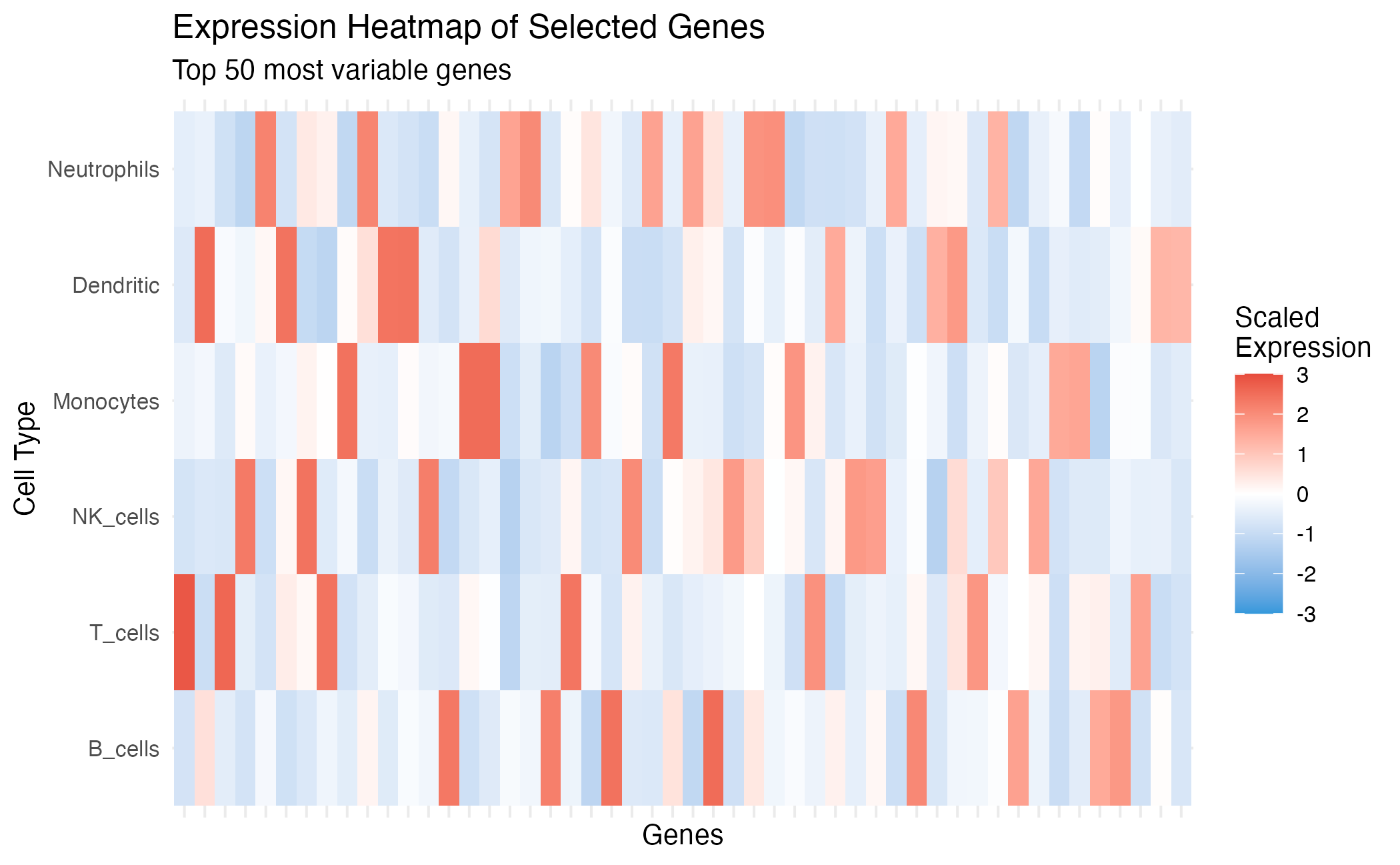
Expression heatmap of selected marker genes.
Cell Type Similarity
# Compute correlation matrix
corr_selected <- cor(t(selected_data))

df_corr <- expand.grid(
  CT1 = rownames(corr_selected),
  CT2 = colnames(corr_selected)
)
df_corr$Correlation <- as.vector(corr_selected)

ggplot(df_corr, aes(x = CT1, y = CT2, fill = Correlation)) +
  geom_tile() +
  geom_text(aes(label = round(Correlation, 2)), size = 3) +
  scale_fill_gradient2(low = "#3498db", mid = "white", high = "#e74c3c",
                       midpoint = 0, limits = c(-1, 1)) +
  labs(
    title = "Cell Type Correlation Matrix",
    subtitle = "Based on selected marker genes",
    x = "", y = ""
  ) +
  theme_minimal(base_size = 12) +
  coord_fixed() +
  theme(axis.text.x = element_text(angle = 45, hjust = 1))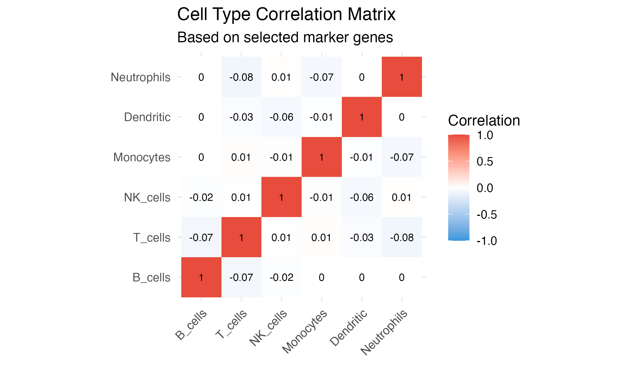
Cell type similarity based on selected genes.
Solution Comparison
Compare Different Selection Methods
# Get multiple solutions
dw$select(weights = c(-1, 1))
sol_weighted <- dw$get_selection()

dw$select(index = 1)
sol_first <- dw$get_selection()

dw$select(index = c(1, 1))  # Best correlation
sol_best_corr <- dw$get_selection()

dw$select(index = c(2, -1))  # Best distance
sol_best_dist <- dw$get_selection()

# Compare
comparison <- data.frame(
  Method = c("Weighted", "First", "Best Correlation", "Best Distance"),
  N_Genes = c(sum(sol_weighted), sum(sol_first), sum(sol_best_corr), sum(sol_best_dist)),
  Correlation = c(
    compute_correlation(reference[, sol_weighted]),
    compute_correlation(reference[, sol_first]),
    compute_correlation(reference[, sol_best_corr]),
    compute_correlation(reference[, sol_best_dist])
  ),
  Distance = c(
    compute_distance(reference[, sol_weighted]),
    compute_distance(reference[, sol_first]),
    compute_distance(reference[, sol_best_corr]),
    compute_distance(reference[, sol_best_dist])
  )
)

knitr::kable(comparison, digits = 2, caption = "Comparison of different selection methods")| Method | N_Genes | Correlation | Distance |
|---|---|---|---|
| Weighted | 283 | 0.39 | 502.36 |
| First | 300 | 0.54 | 525.72 |
| Best Correlation | 283 | 0.39 | 502.36 |
| Best Distance | 300 | 0.54 | 525.72 |
# Plot comparison
df_comp <- data.frame(
  Correlation = comparison$Correlation,
  Distance = comparison$Distance,
  Method = comparison$Method
)

ggplot(df, aes(x = correlation, y = distance)) +
  geom_point(color = "gray70", alpha = 0.5, size = 2) +
  geom_line(color = "gray70", alpha = 0.5) +
  geom_point(data = df_comp, aes(x = Correlation, y = Distance, color = Method),
             size = 5) +
  scale_color_brewer(palette = "Set1") +
  labs(
    title = "Solution Comparison on Pareto Front",
    x = "Correlation",
    y = "Distance"
  ) +
  theme_minimal(base_size = 12) +
  theme(legend.position = "bottom")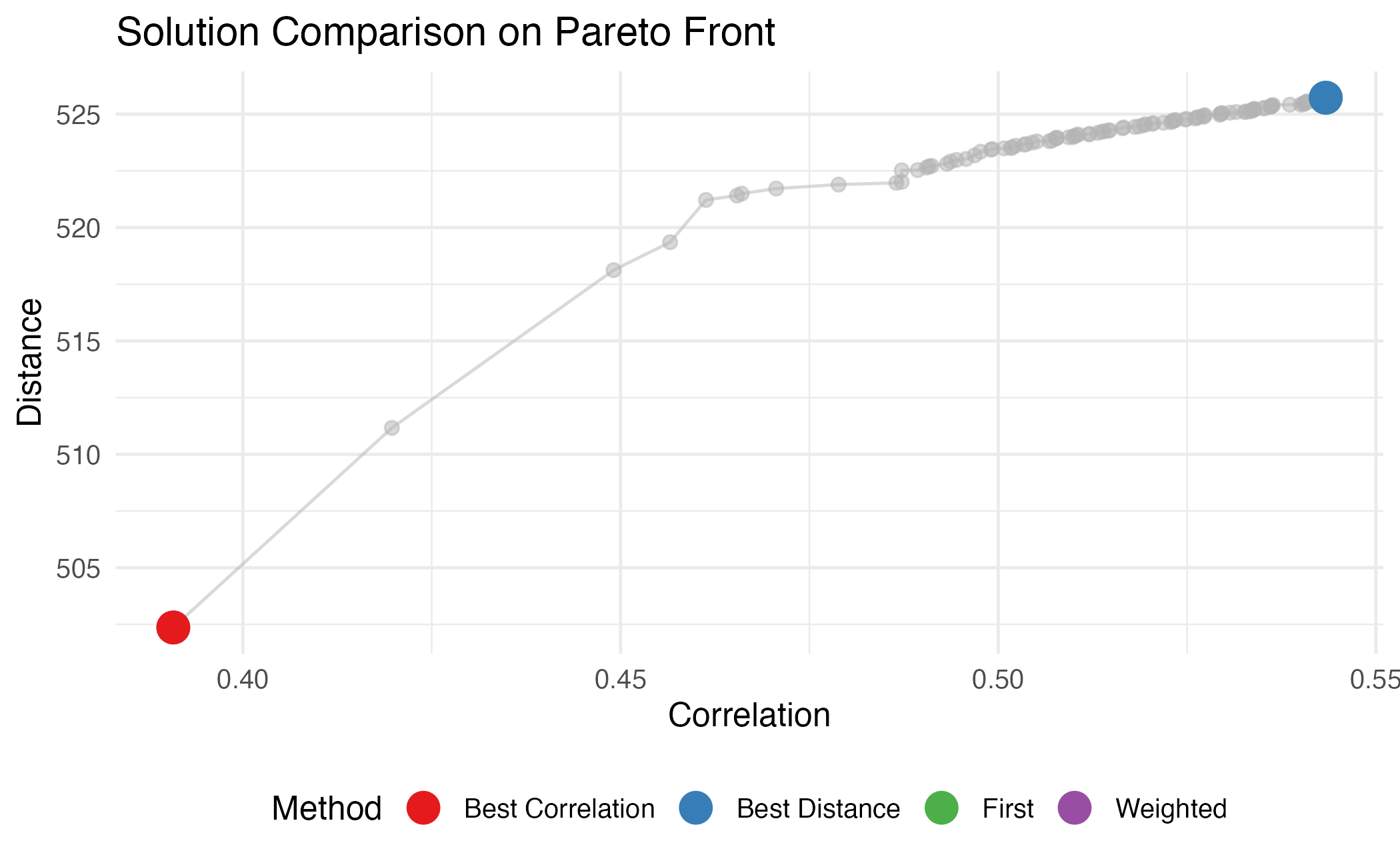
Visual comparison of selection methods on the Pareto front.
Advanced: 3D Pareto Front
For three objectives, we can visualize in 3D:
# Example with 3 objectives (not run)
dw3 <- darwin(reference)
dw3$optimize(
  ngen = 50,
  objectives = c("correlation", "distance", "condition"),
  weights = c(-1, 1, -1),
  verbose = FALSE
)

# Would use plotly for 3D visualization
# library(plotly)
# fitness3 <- dw3$get_fitness()
# plot_ly(fitness3, x = ~correlation, y = ~distance, z = ~condition,
#         type = "scatter3d", mode = "markers")
Summary
Effective visualization of darwin results helps in:
- Understanding trade-offs between objectives
- Comparing different selection strategies
- Validating that selected genes provide good cell type separation
- Communicating results to collaborators
Session Info
sessionInfo()
#> R version 4.4.0 (2024-04-24)
#> Platform: aarch64-apple-darwin20
#> Running under: macOS 15.6.1
#>
#> Matrix products: default
#> BLAS:   /Library/Frameworks/R.framework/Versions/4.4-arm64/Resources/lib/libRblas.0.dylib
#> LAPACK: /Library/Frameworks/R.framework/Versions/4.4-arm64/Resources/lib/libRlapack.dylib;  LAPACK version 3.12.0
#>
#> locale:
#> [1] C
#>
#> time zone: Asia/Shanghai
#> tzcode source: internal
#>
#> attached base packages:
#> [1] stats     graphics  grDevices utils     datasets  methods   base
#>
#> other attached packages:
#> [1] ggplot2_4.0.1 darwin_1.0.0
#>
#> loaded via a namespace (and not attached):
#>  [1] sass_0.4.10         future_1.69.0       generics_0.1.4
#>  [4] lattice_0.22-7      listenv_0.10.0      digest_0.6.39
#>  [7] magrittr_2.0.4      evaluate_1.0.5      grid_4.4.0
#> [10] RColorBrewer_1.1-3  fastmap_1.2.0       jsonlite_2.0.0
#> [13] Matrix_1.7-4        mgcv_1.9-3          viridisLite_0.4.2
#> [16] scales_1.4.0        codetools_0.2-20    textshaping_1.0.4
#> [19] jquerylib_0.1.4     cli_3.6.5           rlang_1.1.7
#> [22] parallelly_1.46.1   future.apply_1.20.1 splines_4.4.0
#> [25] withr_3.0.2         cachem_1.1.0        yaml_2.3.12
#> [28] otel_0.2.0          tools_4.4.0         parallel_4.4.0
#> [31] dplyr_1.1.4         globals_0.18.0      vctrs_0.7.1
#> [34] R6_2.6.1            lifecycle_1.0.5     fs_1.6.6
#> [37] htmlwidgets_1.6.4   ragg_1.5.0          pkgconfig_2.0.3
#> [40] desc_1.4.3          pkgdown_2.1.3       pillar_1.11.1
#> [43] bslib_0.9.0         gtable_0.3.6        glue_1.8.0
#> [46] Rcpp_1.1.1          systemfonts_1.3.1   xfun_0.56
#> [49] tibble_3.3.1        tidyselect_1.2.1    knitr_1.51
#> [52] dichromat_2.0-0.1   farver_2.1.2        nlme_3.1-168
#> [55] htmltools_0.5.9     rmarkdown_2.30      labeling_0.4.3
#> [58] compiler_4.4.0      S7_0.2.1